Boots is the UK's leading health and beauty retailer — with over 170 years of heritage, more than 2,000 stores nationwide, and an ecommerce platform serving millions of customers every month. The brand sits at a unique intersection of pharmacy, wellness, beauty, and everyday essentials, which means digital experiences need to handle everything from prescription services to gifting with equal clarity and care.
As a consultant Product Designer embedded within the Boots.com digital team, I worked across six distinct workstreams — each targeting a different part of the customer journey, from guided product discovery and search to checkout, transactional communications, and compliance-driven features.
My role
Senior Product Designer, embedded across multiple ecommerce workstreams at Boots.com — spanning guided discovery, navigation, search, checkout, transactional communications, and compliance-led features. All delivered from research through to high-fidelity handoff.
- UX research & analytics review
- Mobile-first interaction design
- Heuristic evaluation & audits
- High-fidelity prototyping
- Design system contributions
- Accessibility review (WCAG 2.1 AA)
- Dev handoff & QA support
Collaborators
The challenge
Boots is the UK's leading health and beauty retailer — 170+ years of heritage, 2,000+ stores, and an ecommerce platform serving millions of customers every month.
At that scale, even small points of friction in search, navigation, and product discovery add up. The experience needed to be more intuitive and accessible without losing commercial impact.
My approach
As part of the product design team, I focused on high-impact areas of Boots.com — working mobile-first through user research, wireframing, prototyping, and high-fidelity design.
Every change was made with accessibility and the existing design system in mind, so improvements scaled consistently across the platform.
Six workstreams. One shared goal — make Boots.com easier to trust and easier to use.
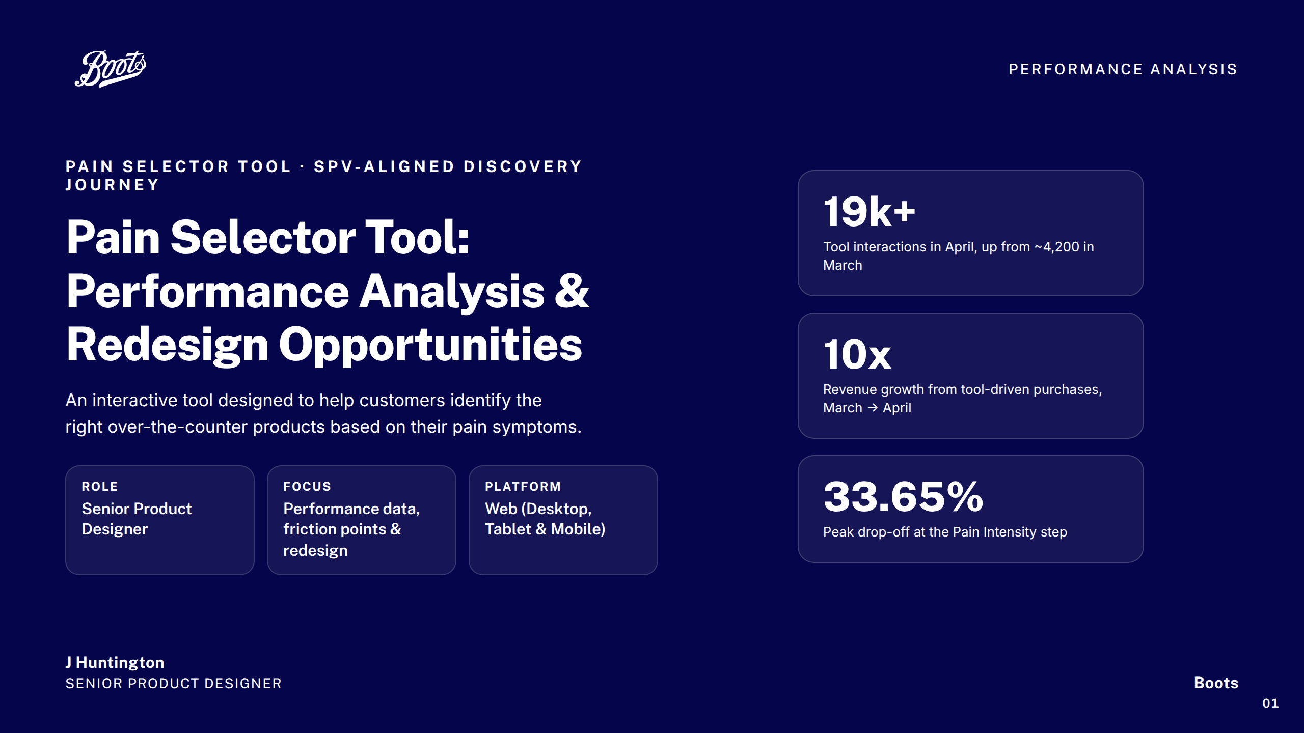
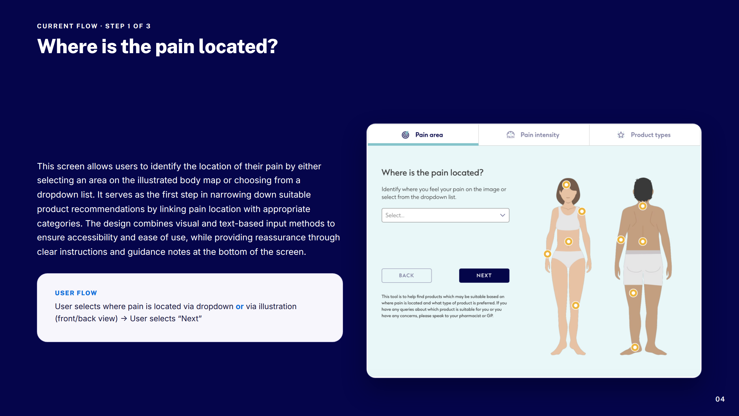
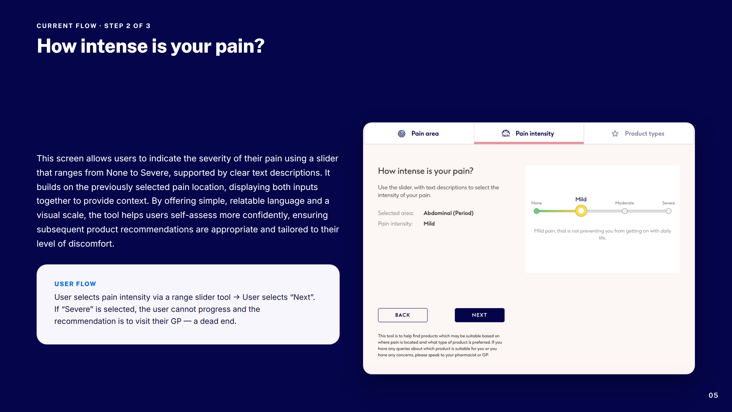
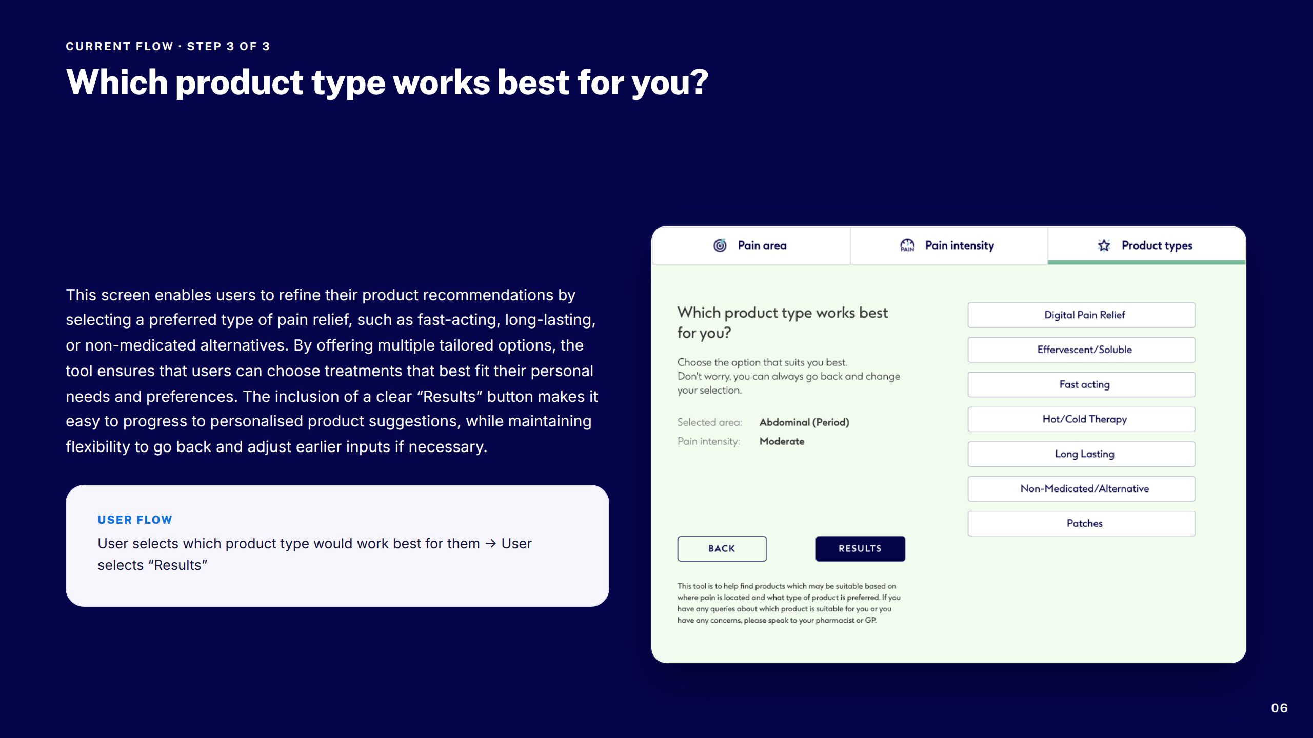
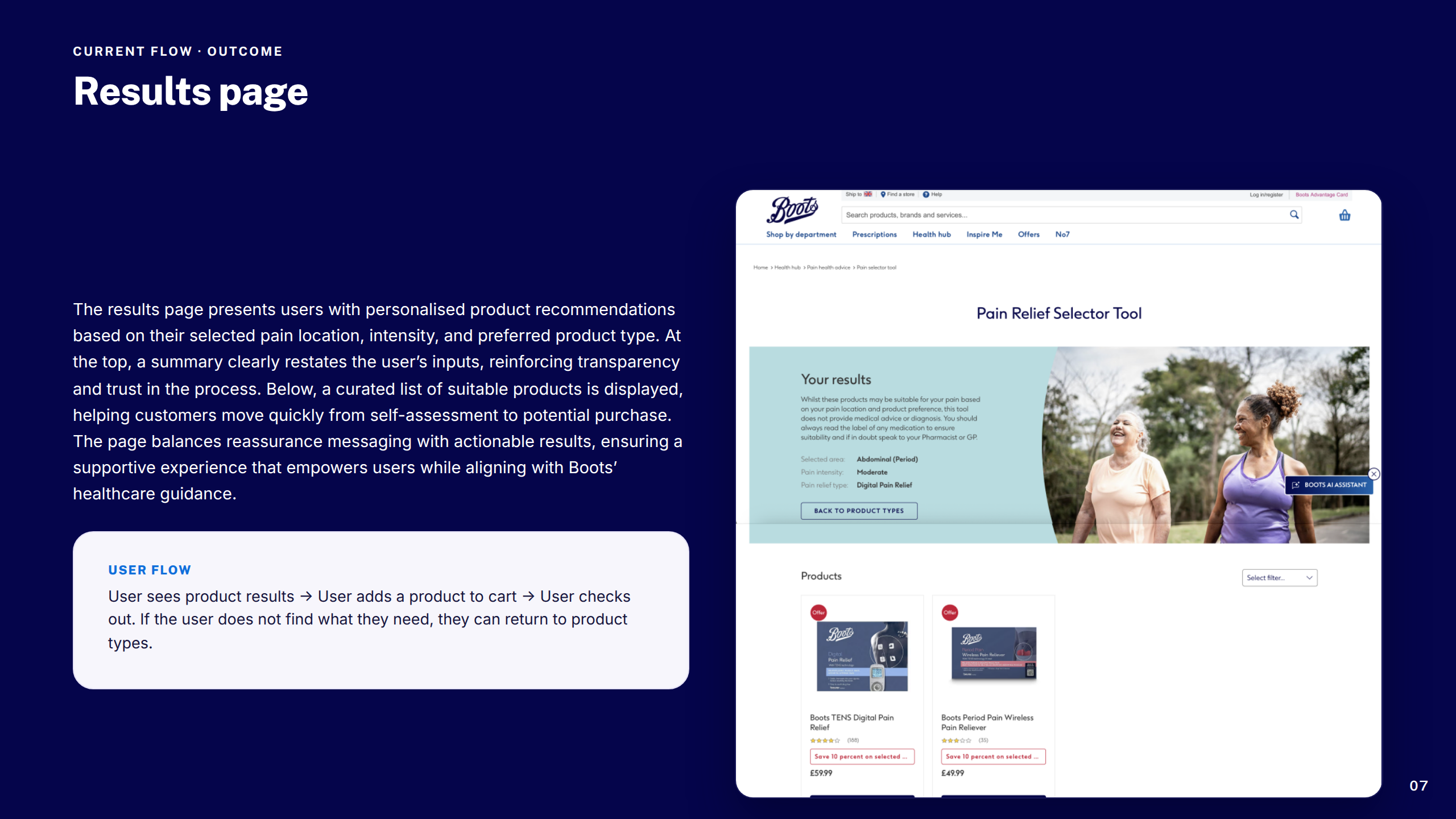
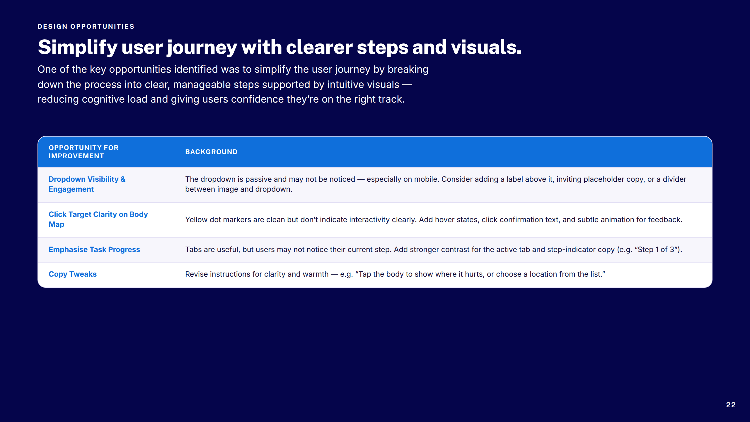
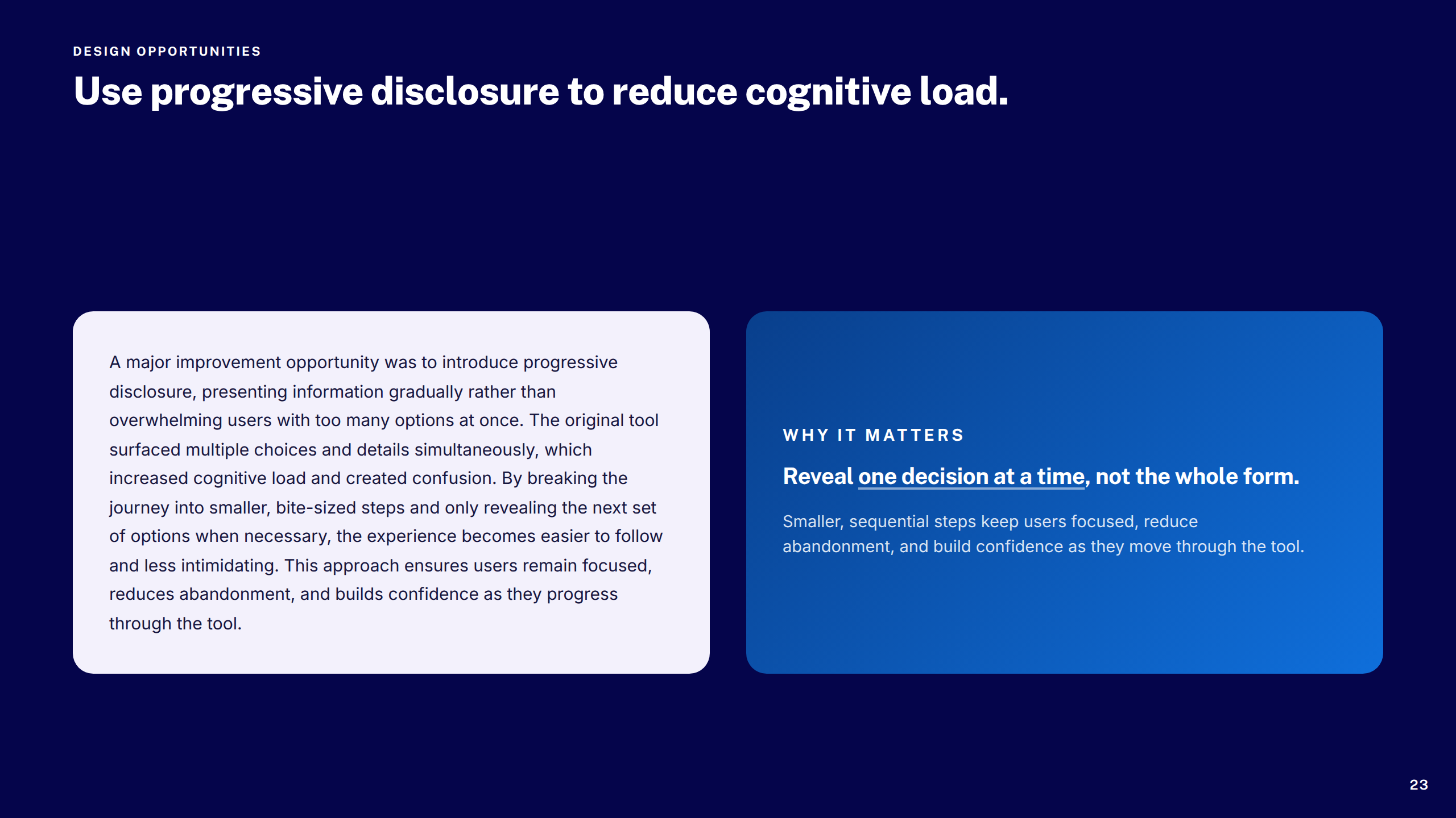
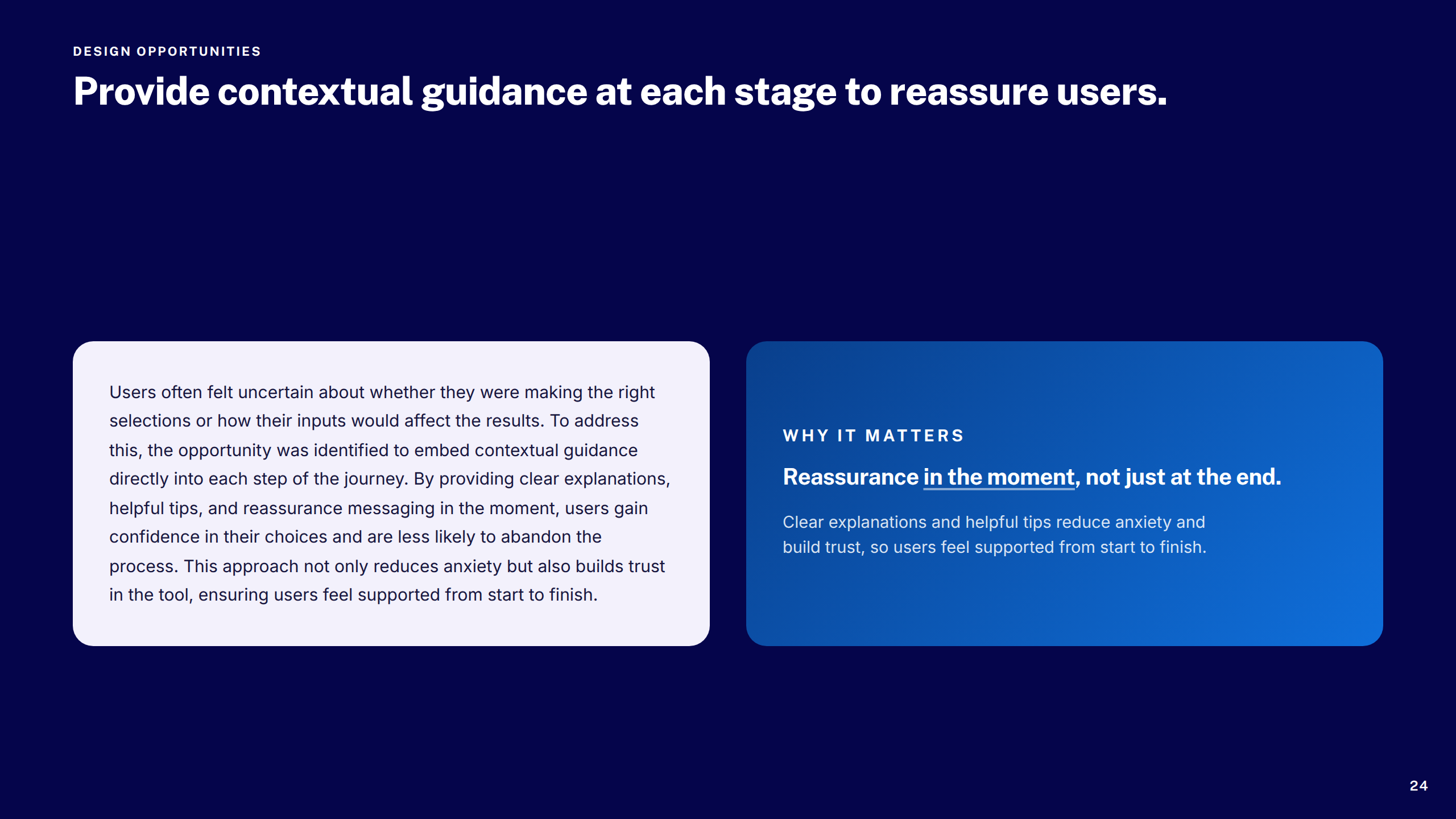
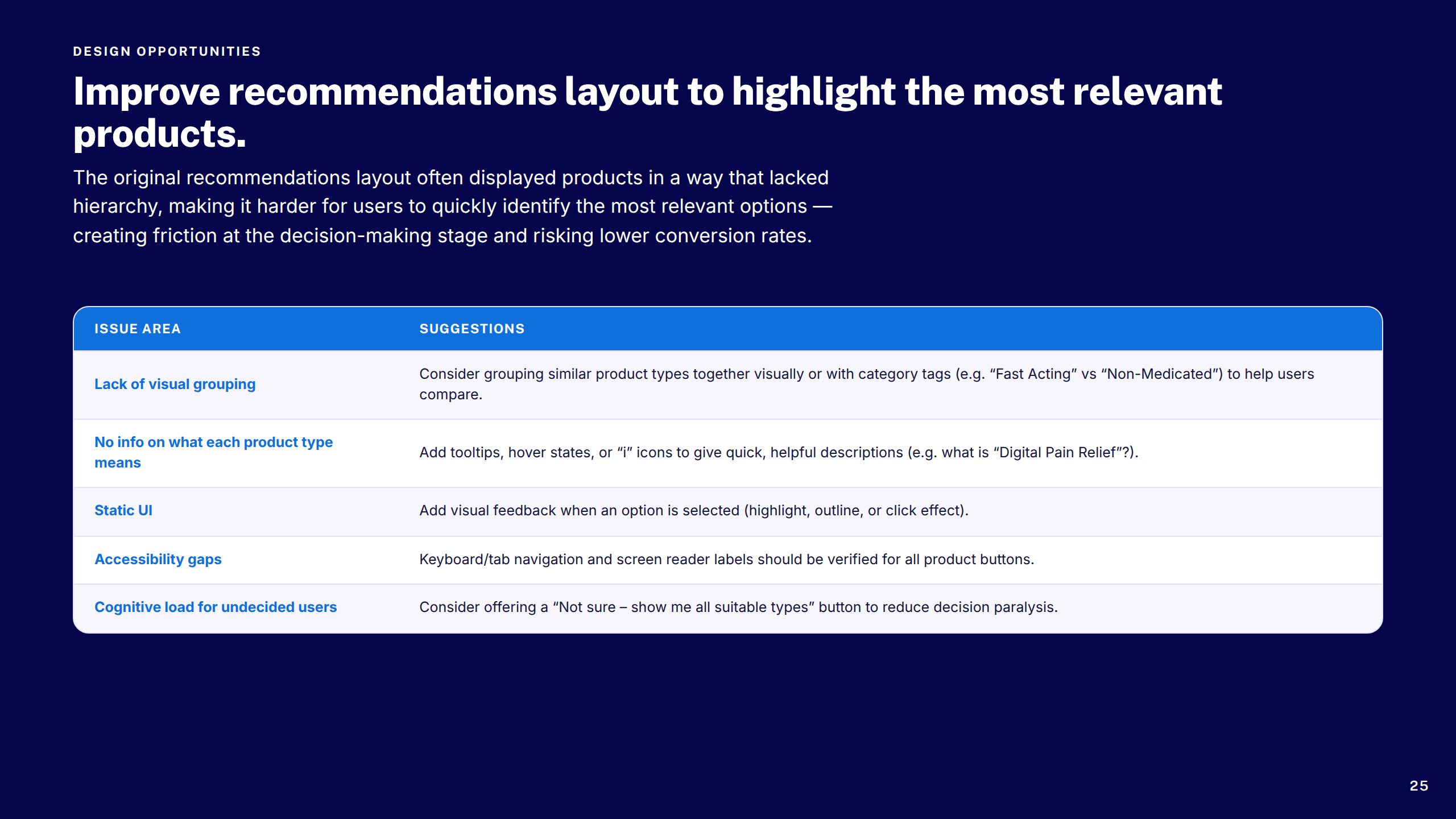
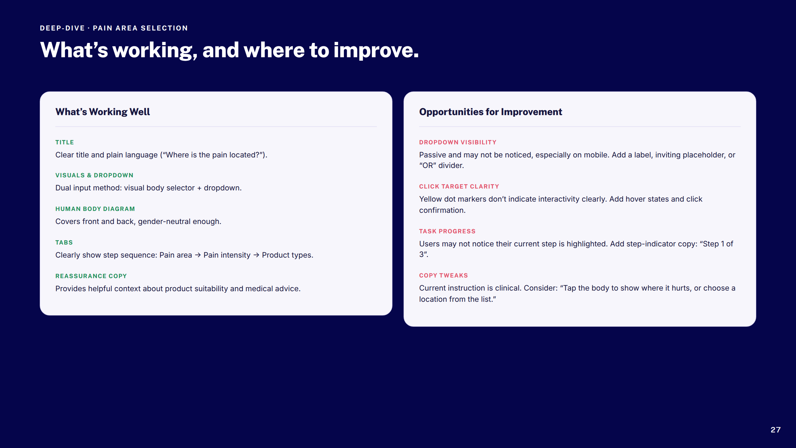
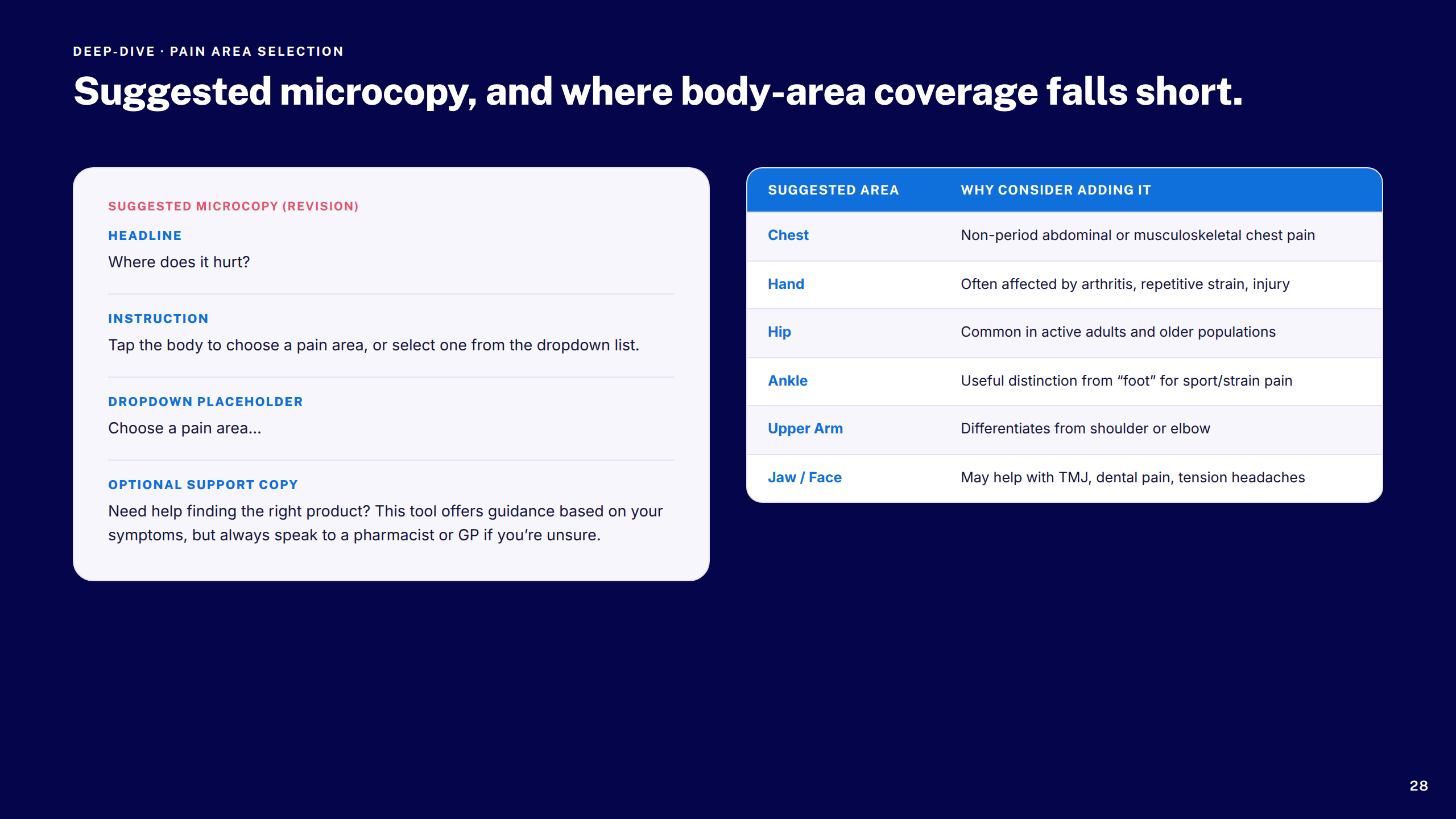
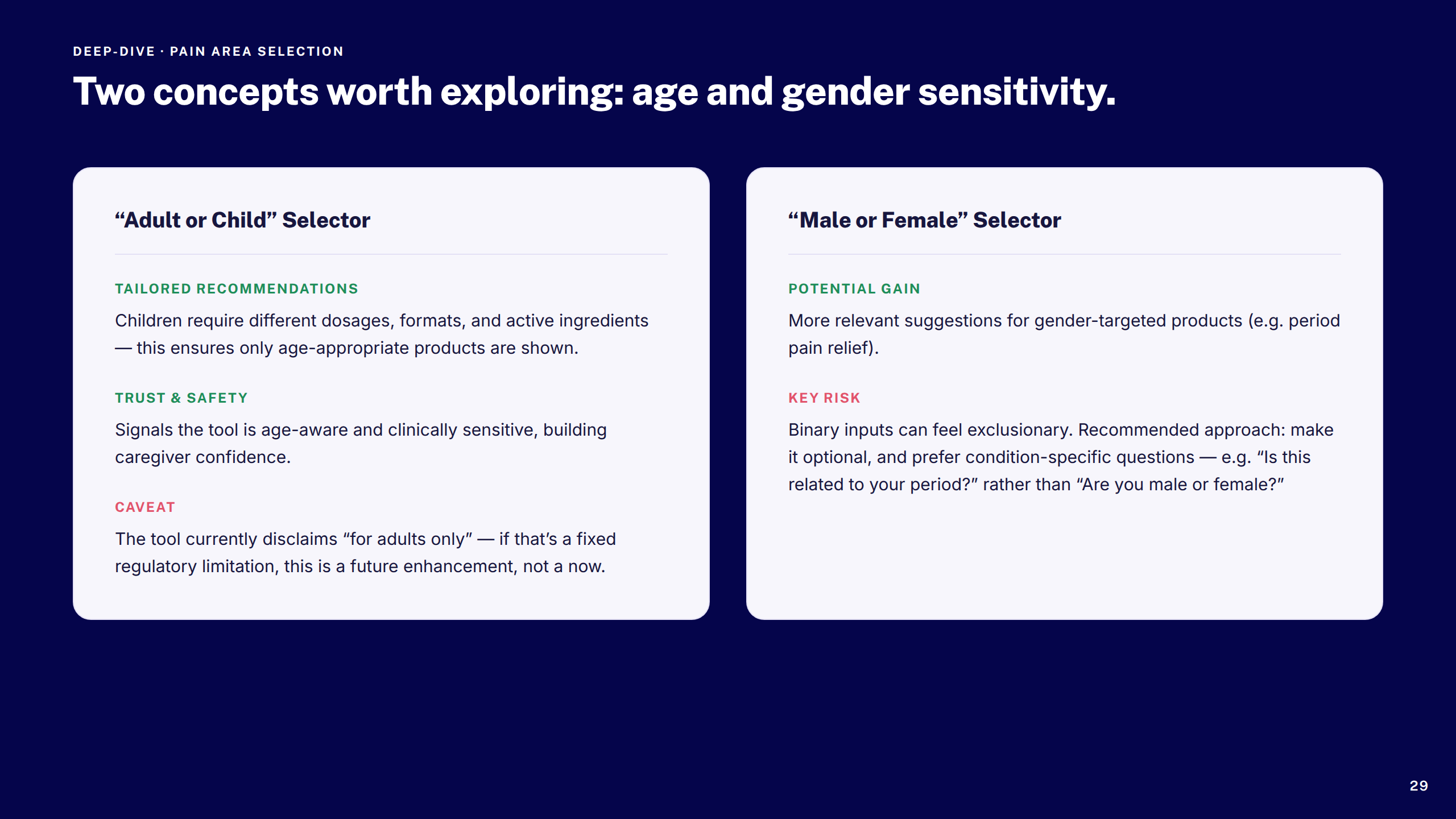
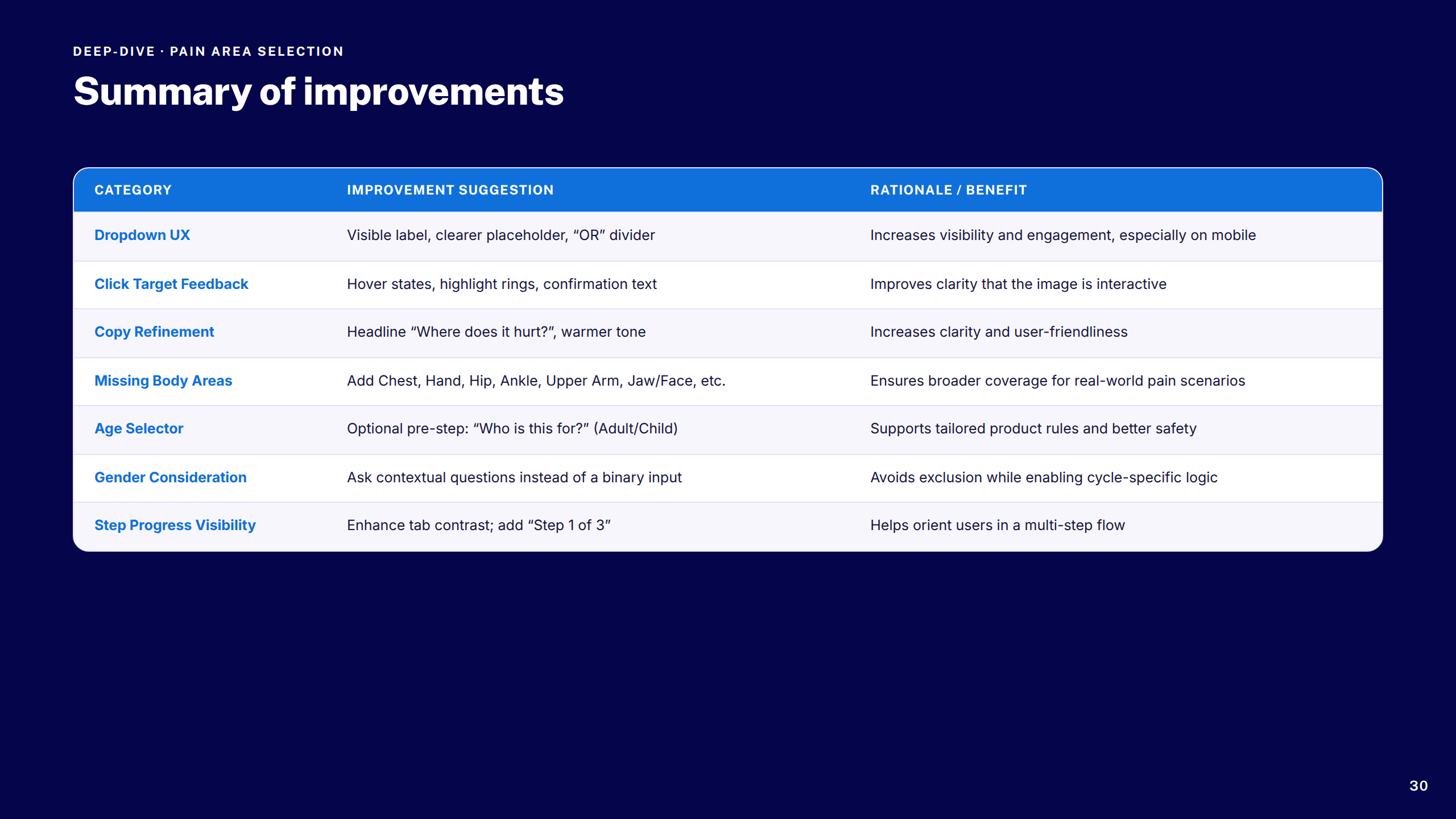
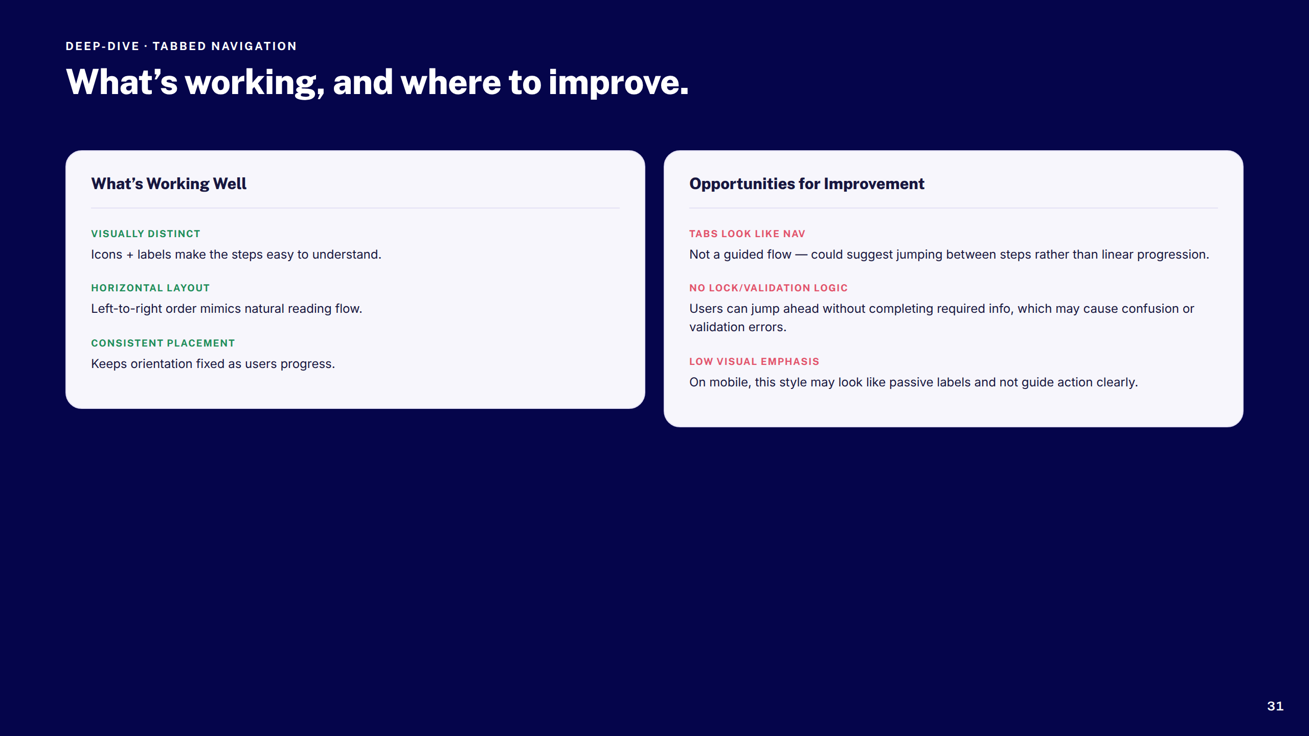
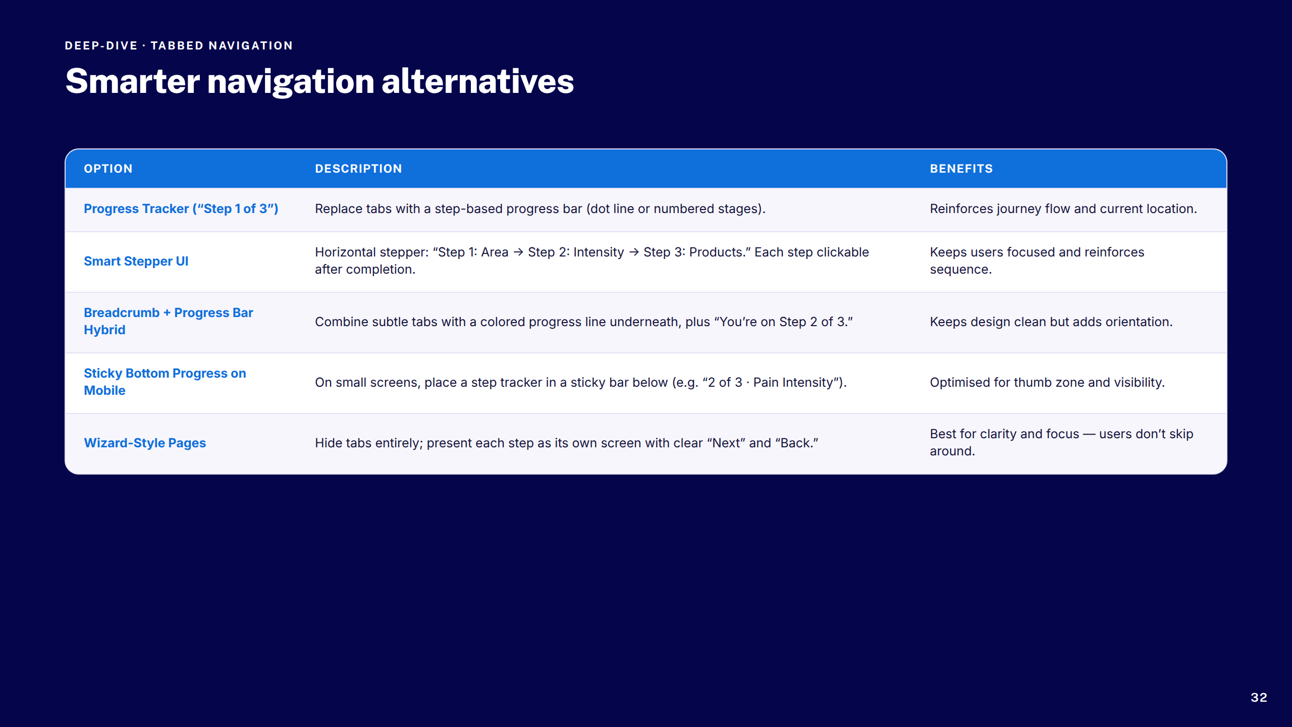
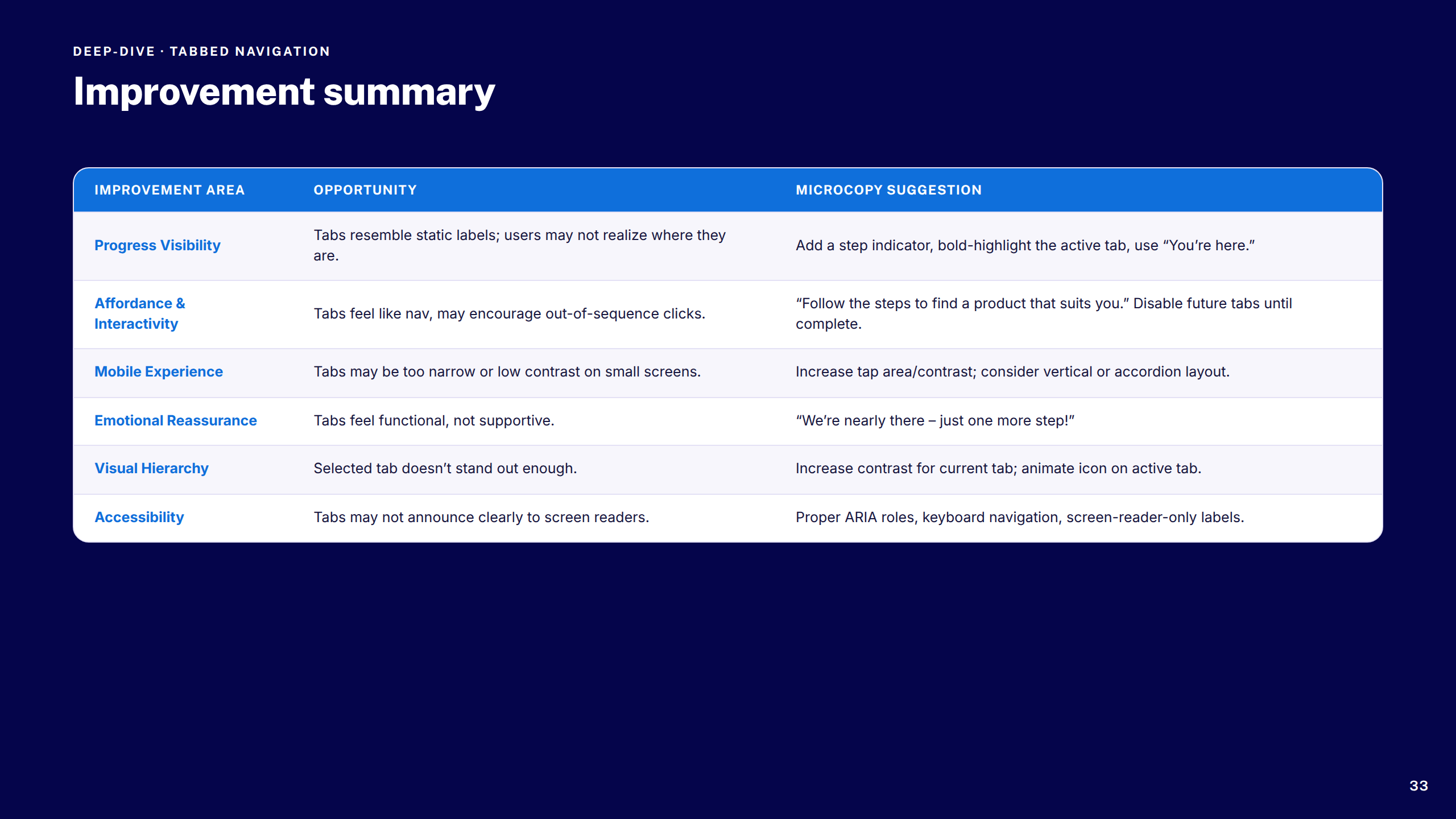
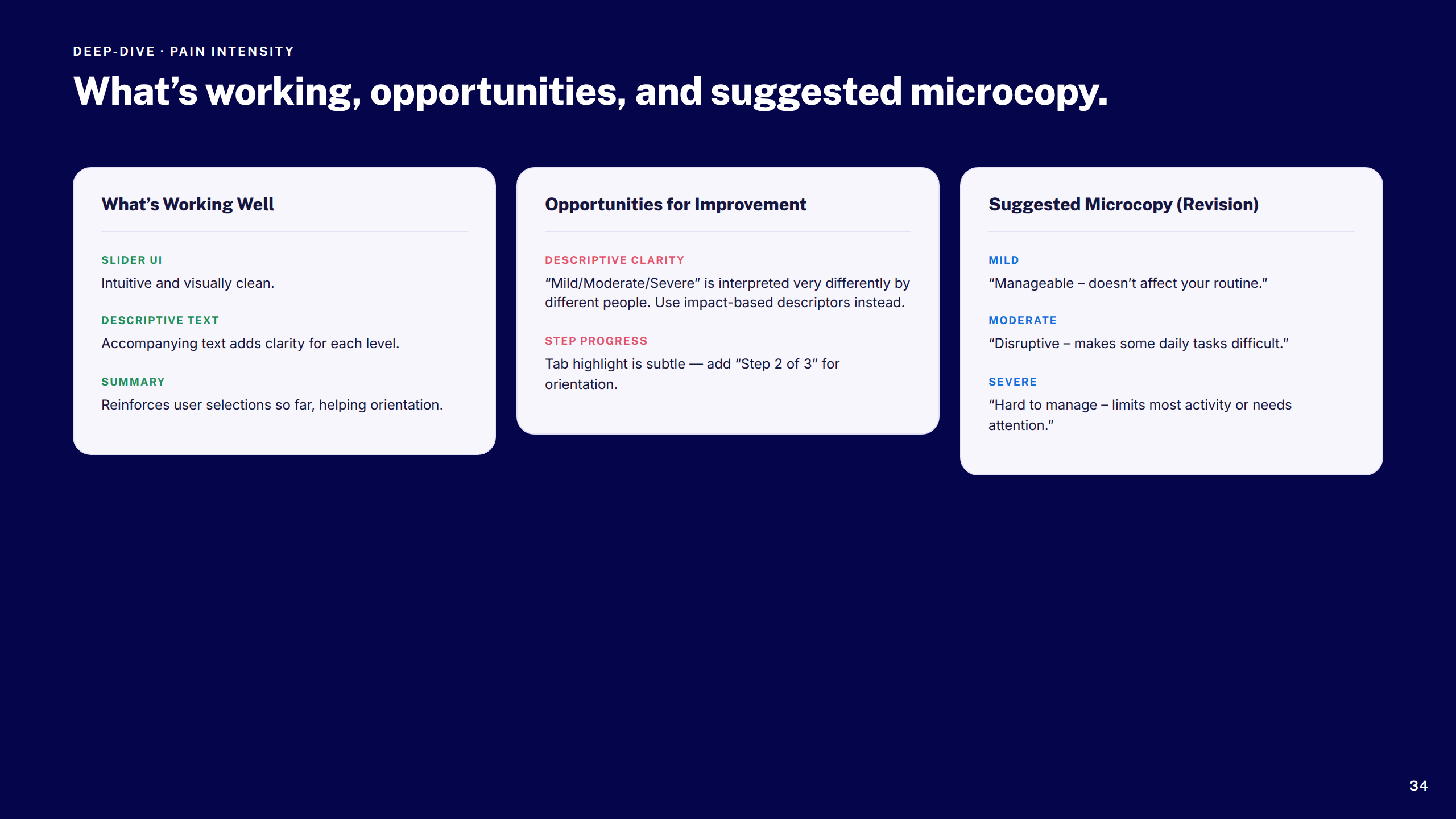
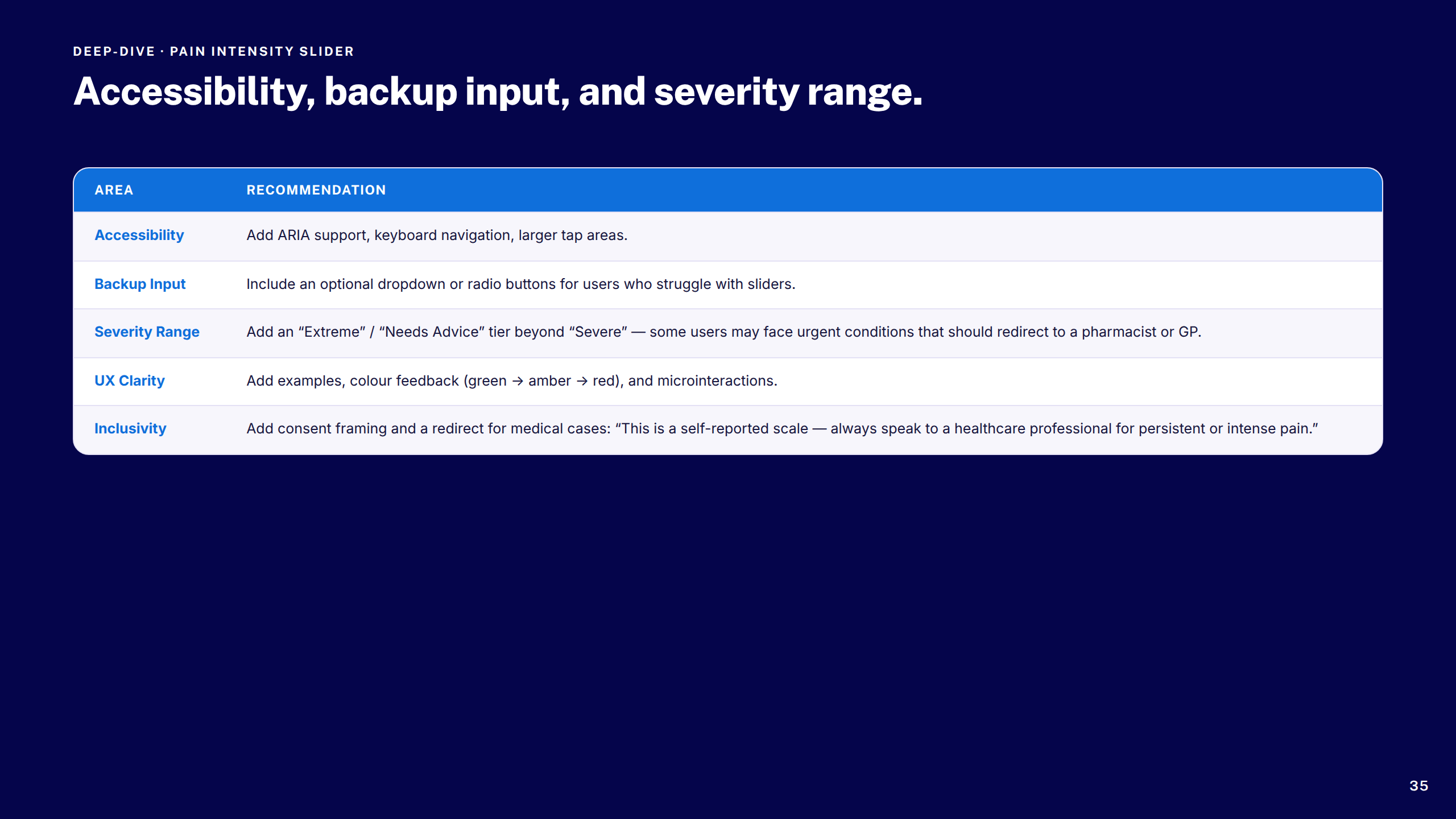
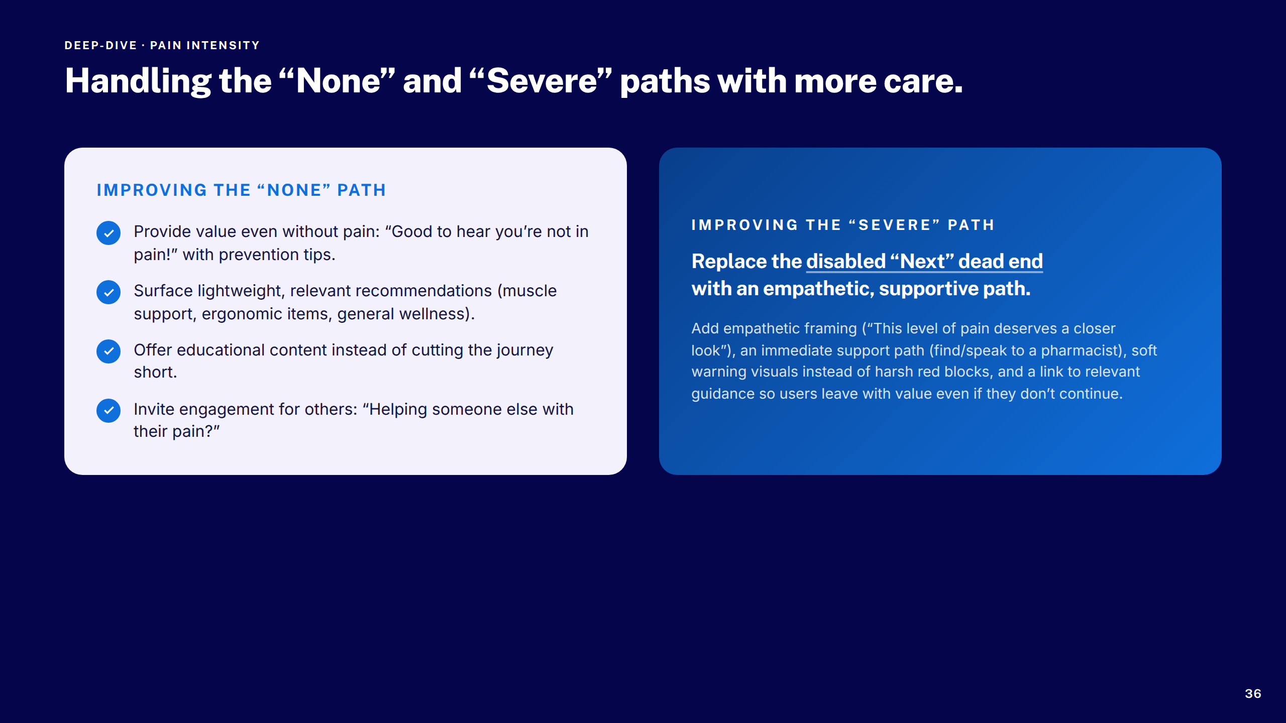
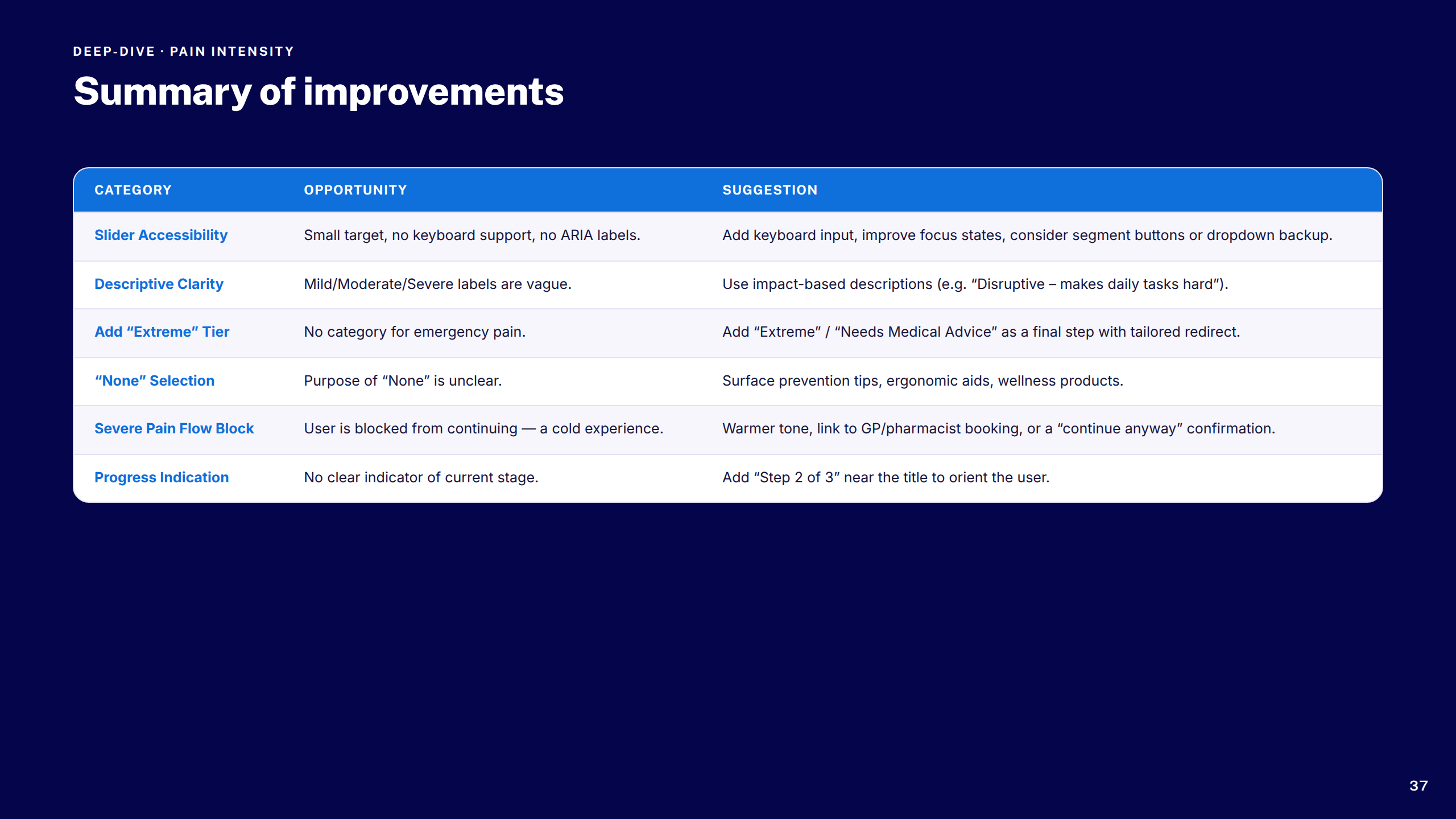
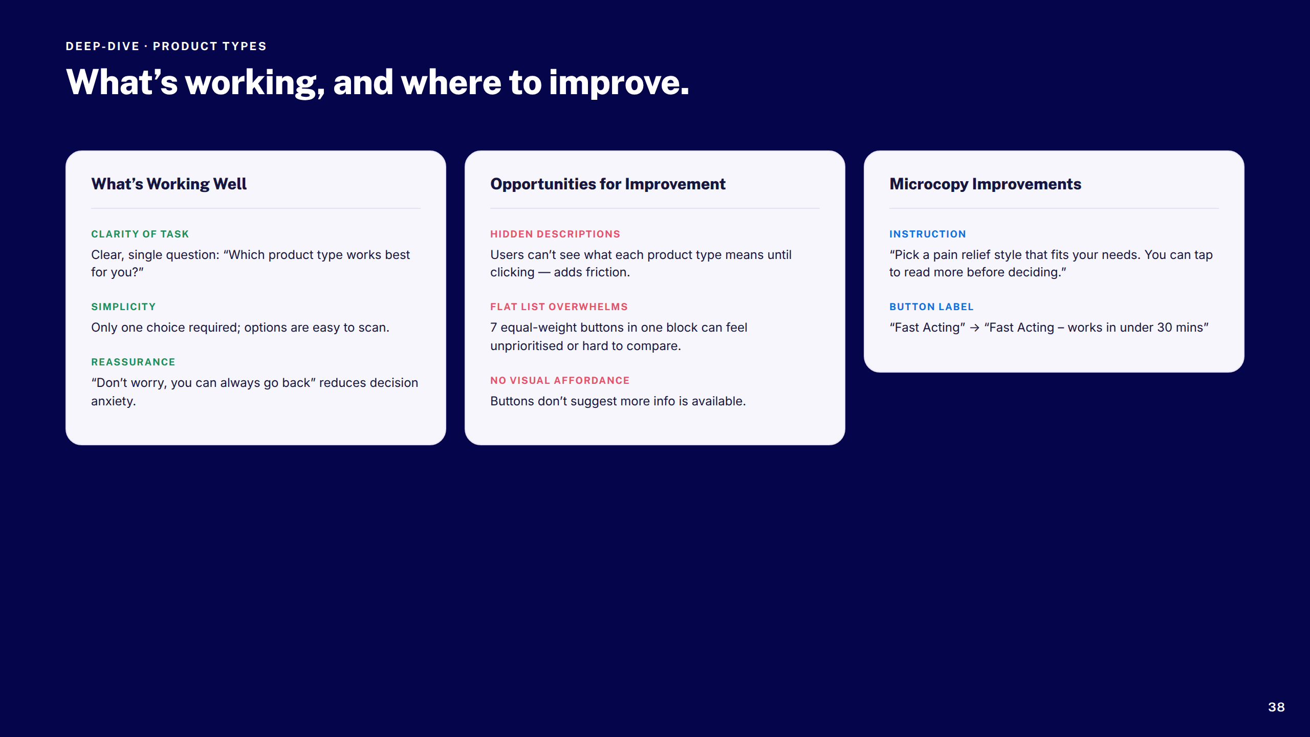
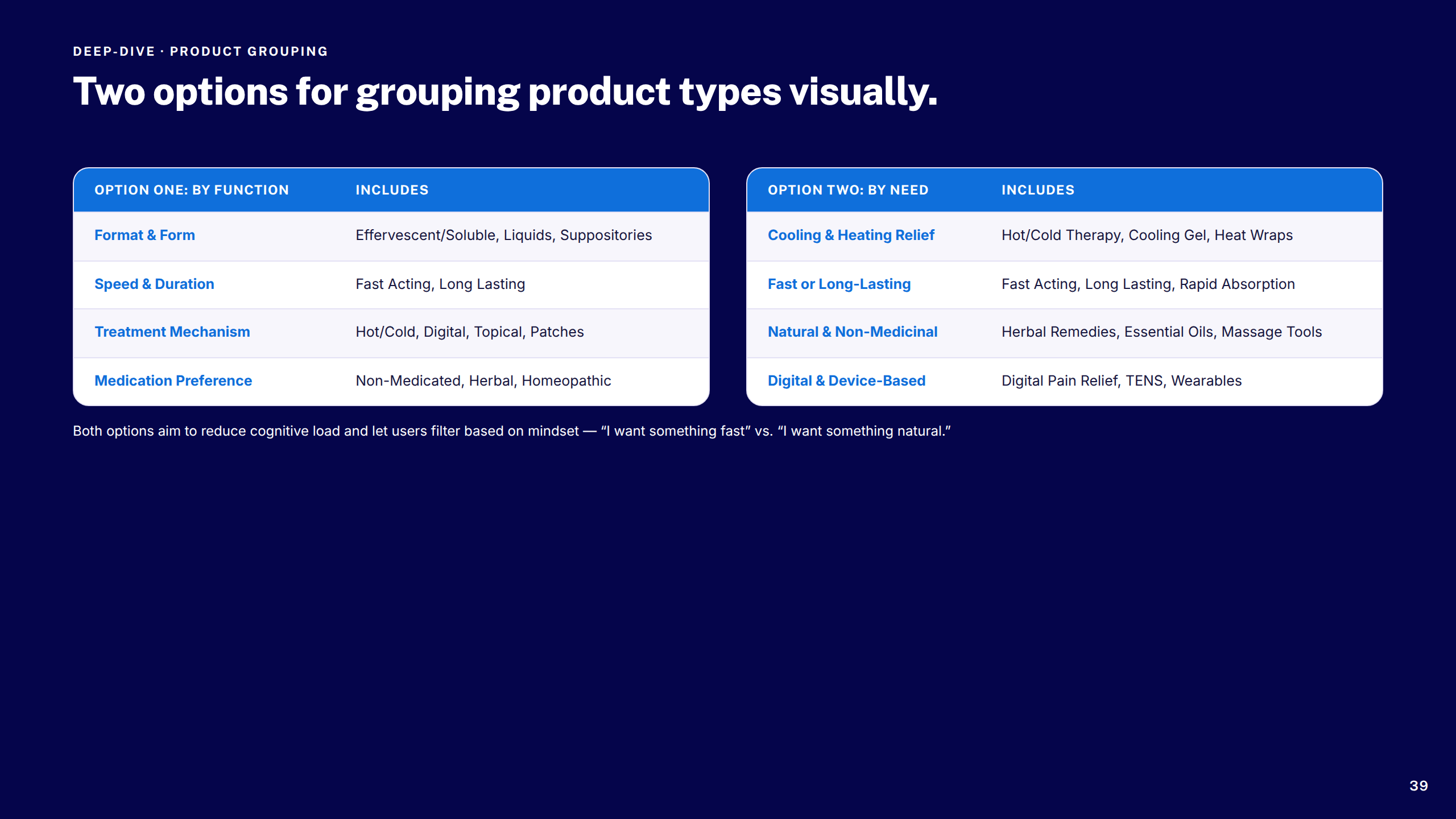
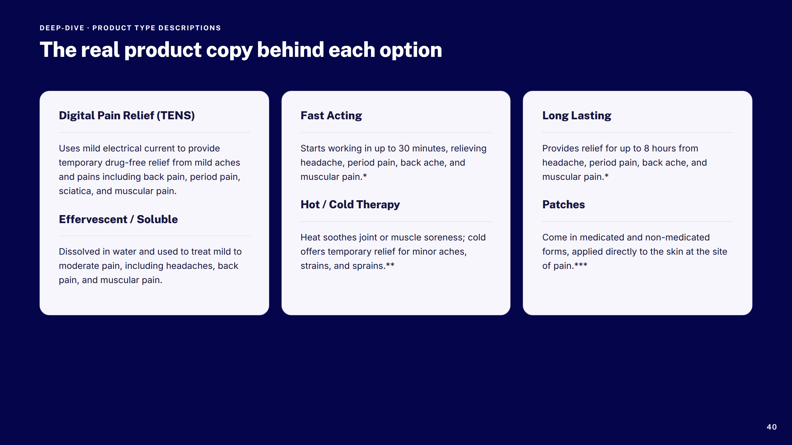
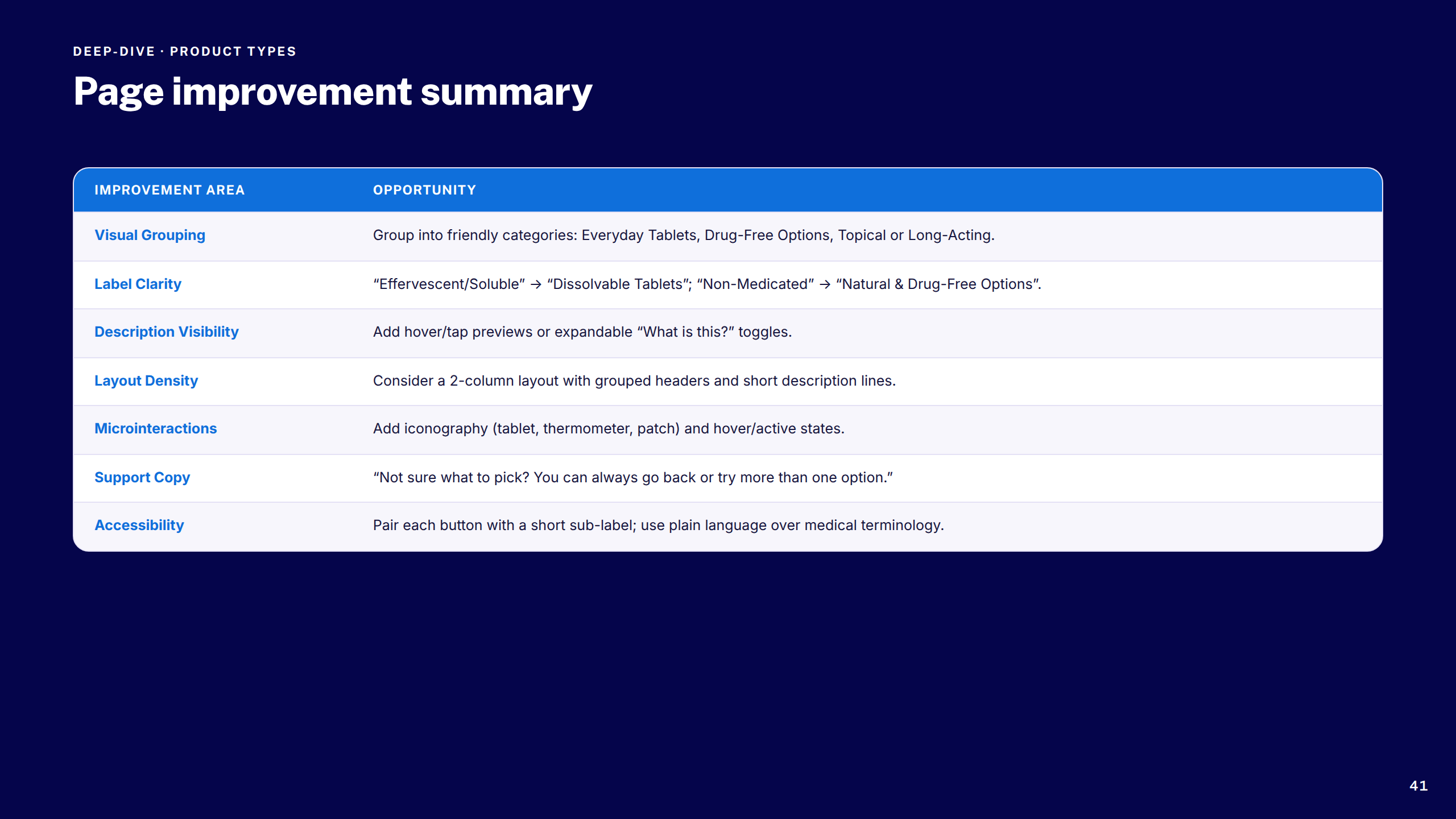
A structured, accessible discovery journey that took customers from symptom to the right product — turning a complex decision tree into a fast, trustworthy experience across all devices.
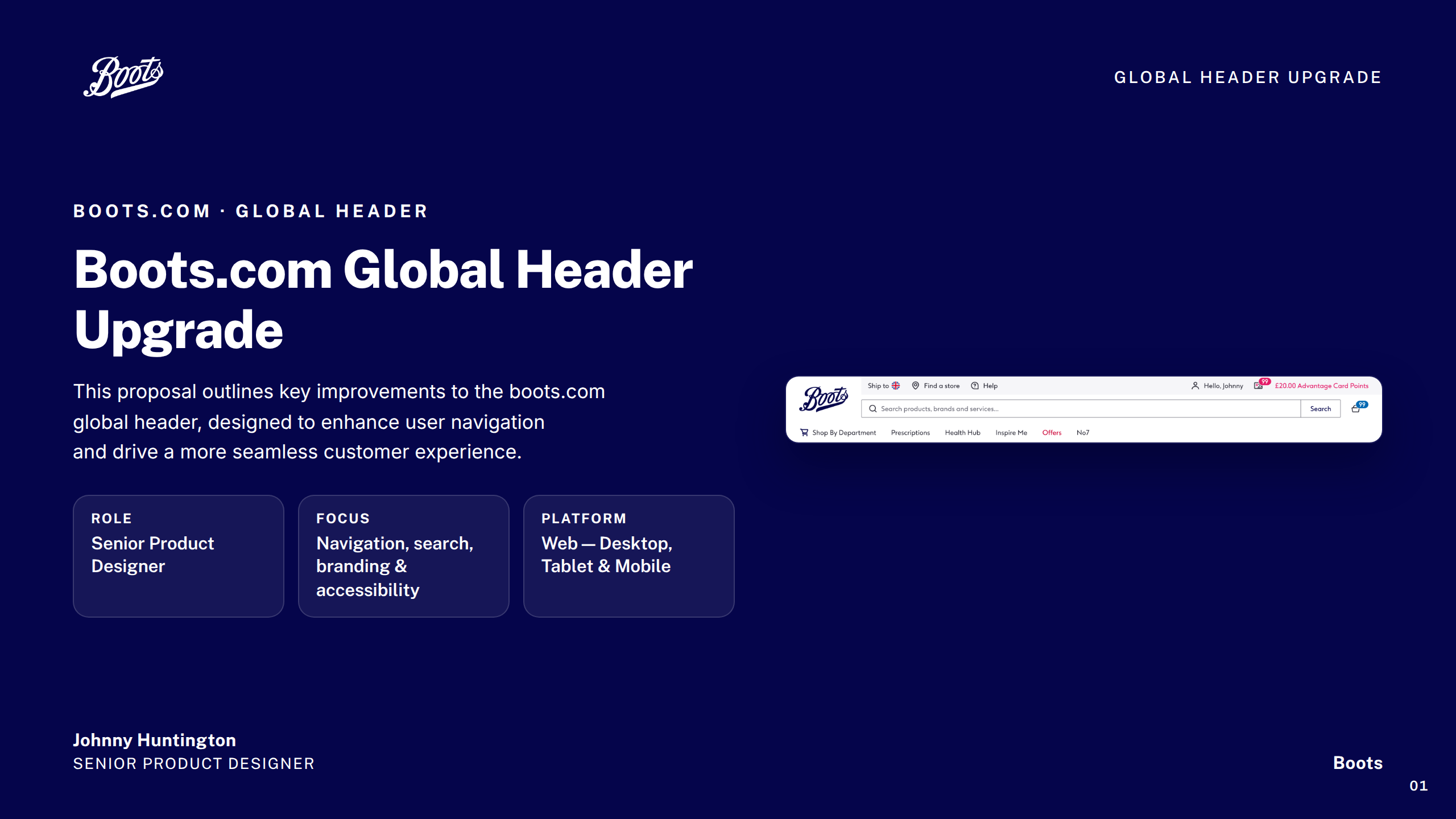
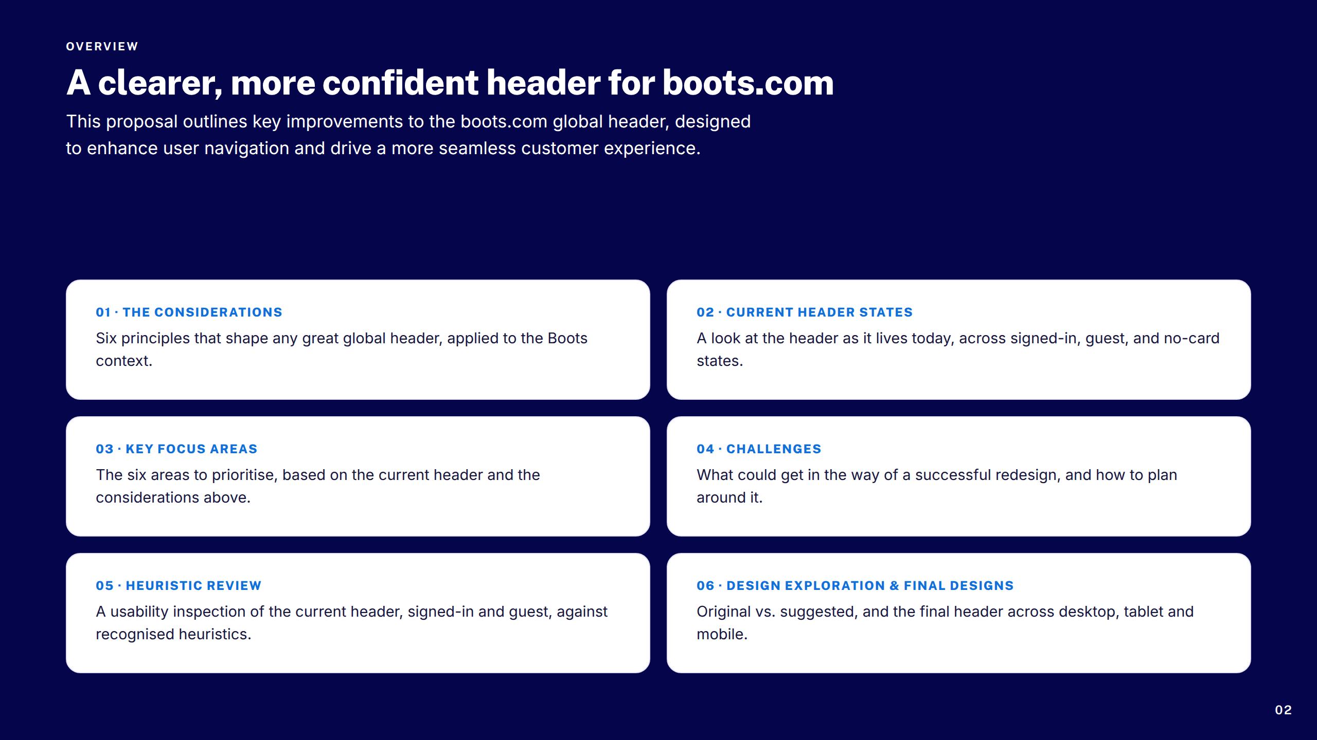
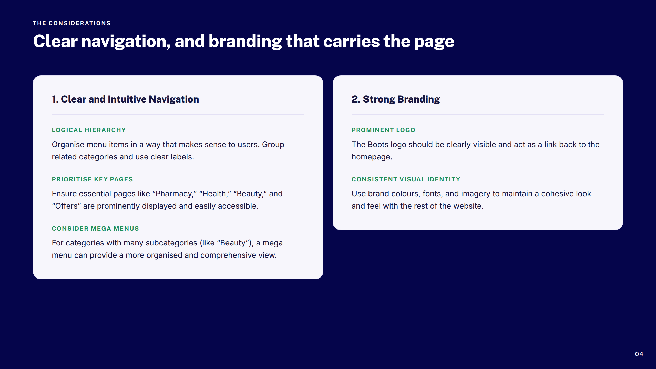
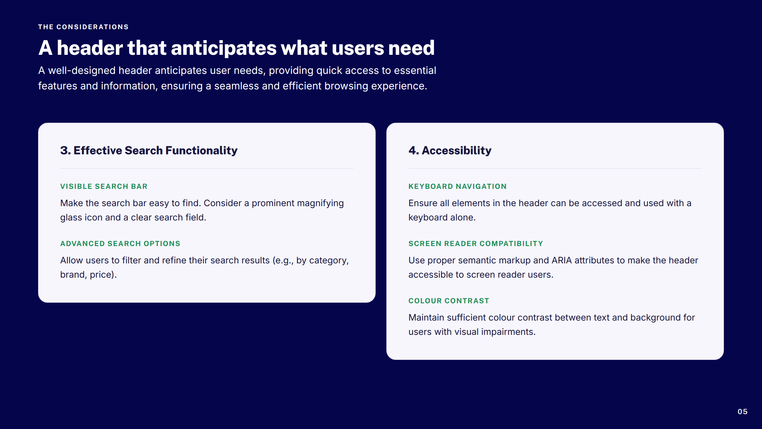
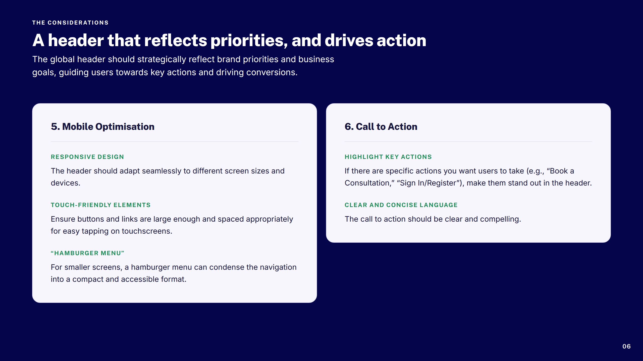
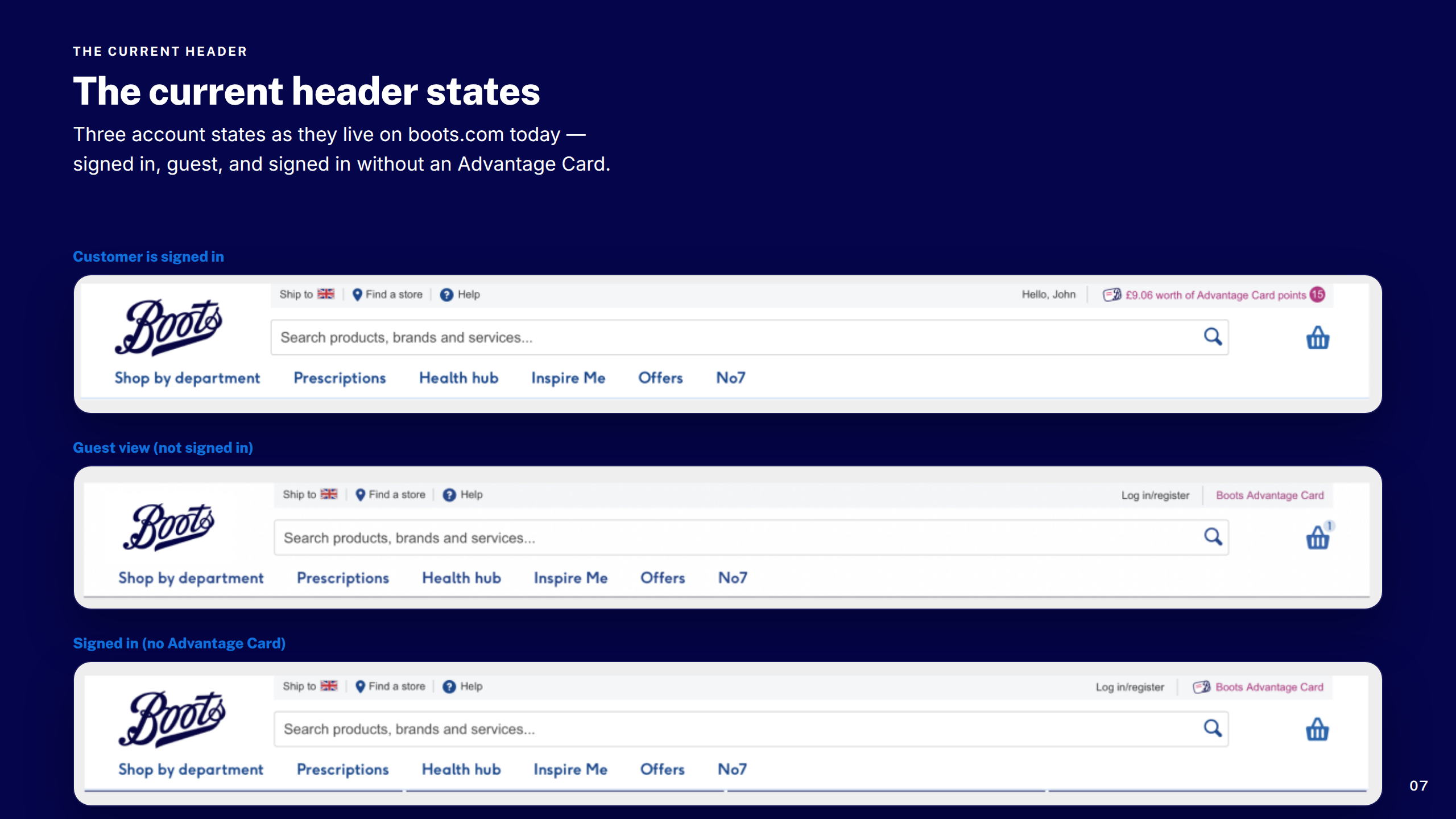
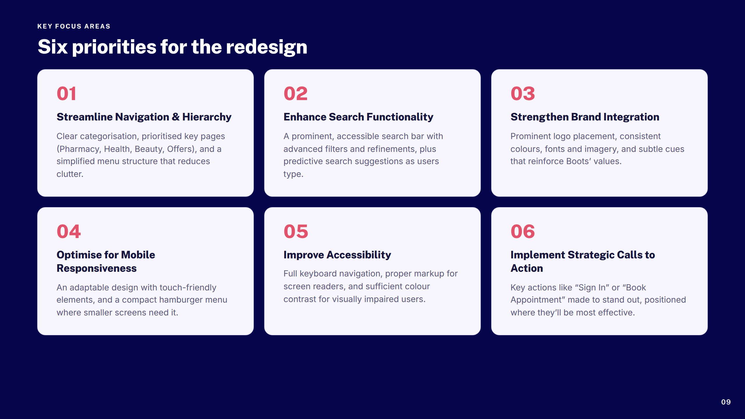
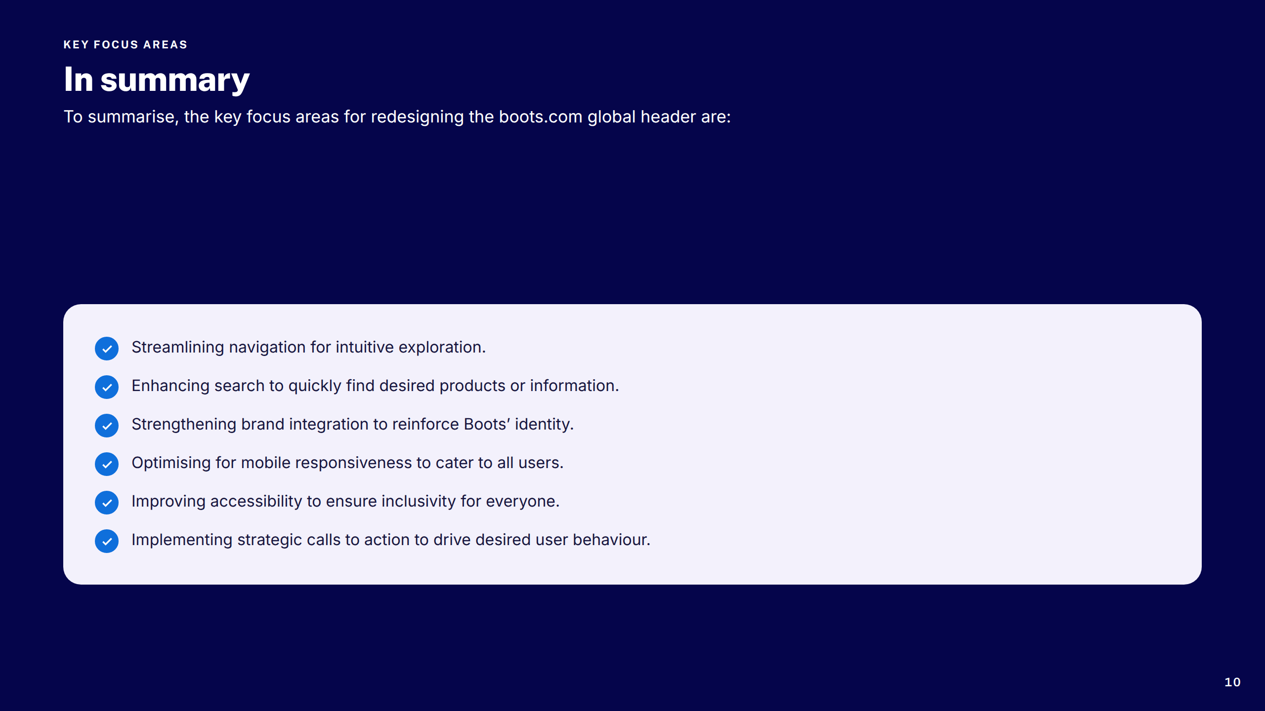
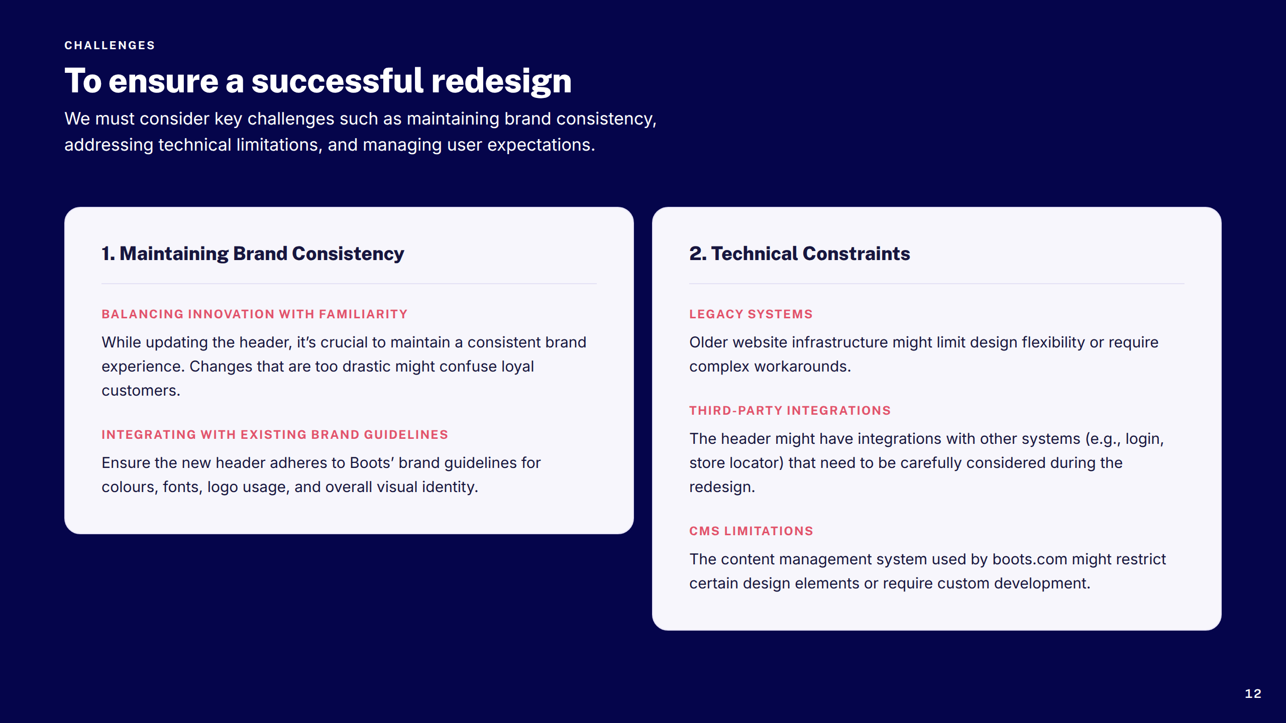
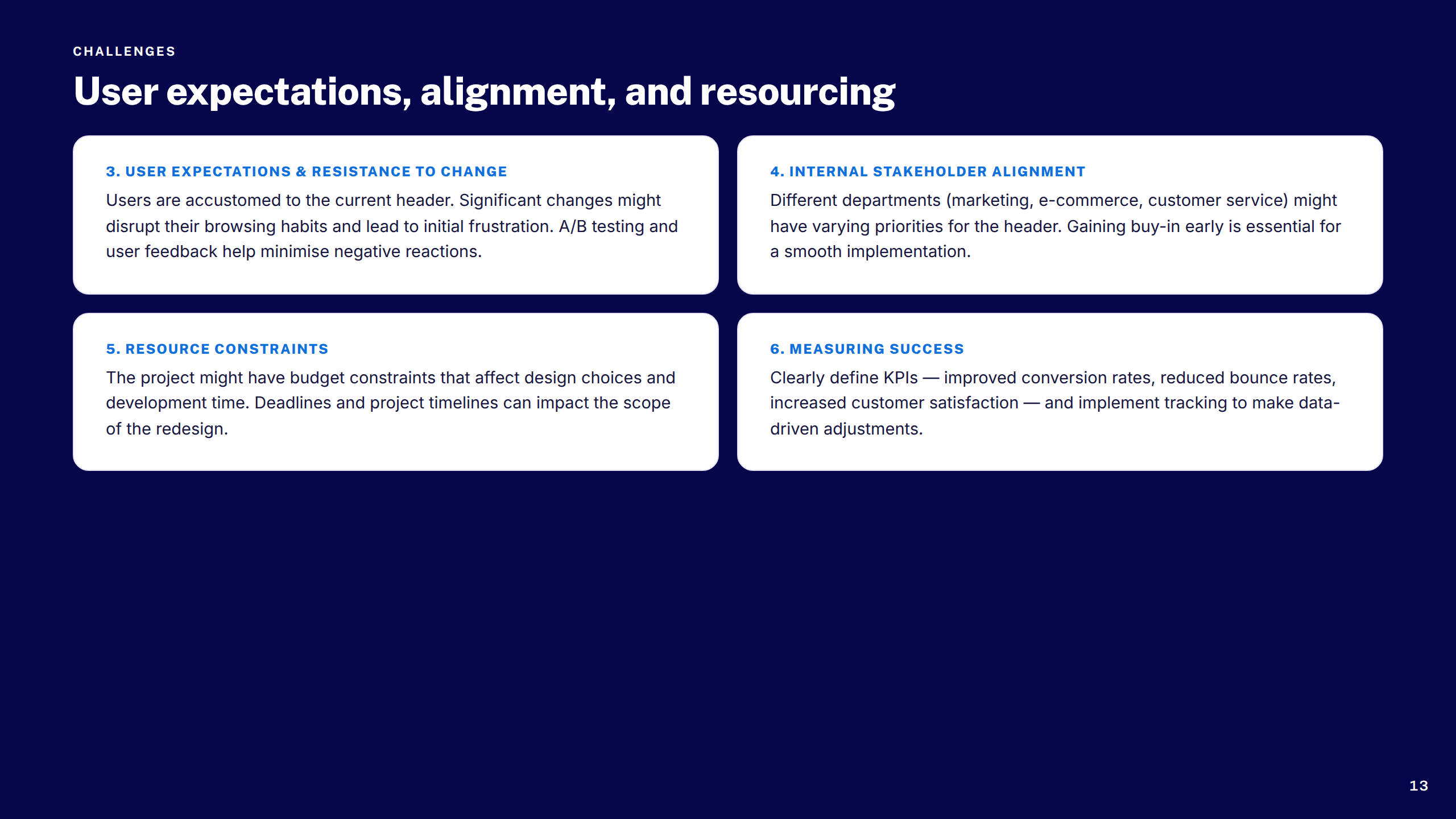
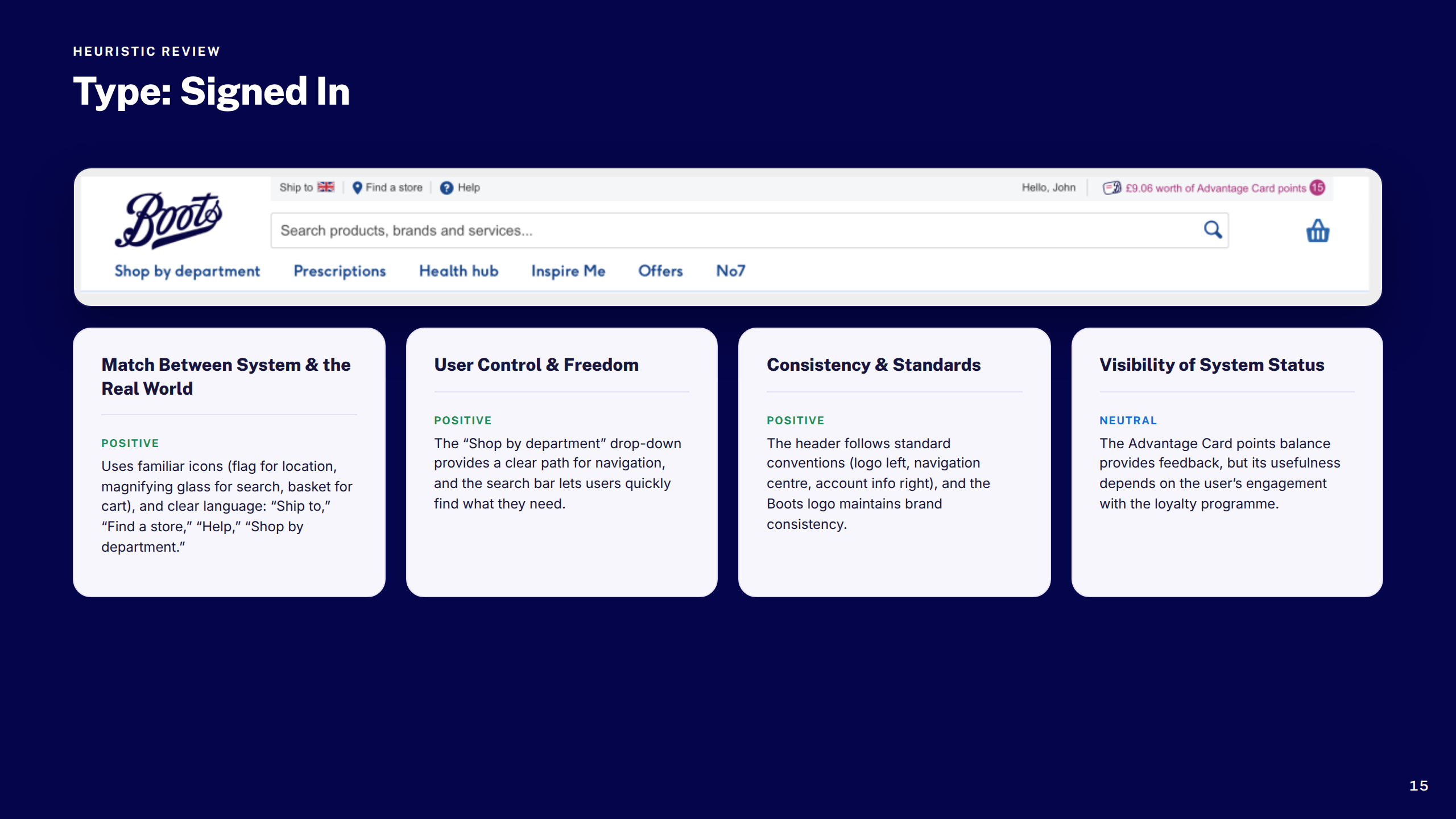
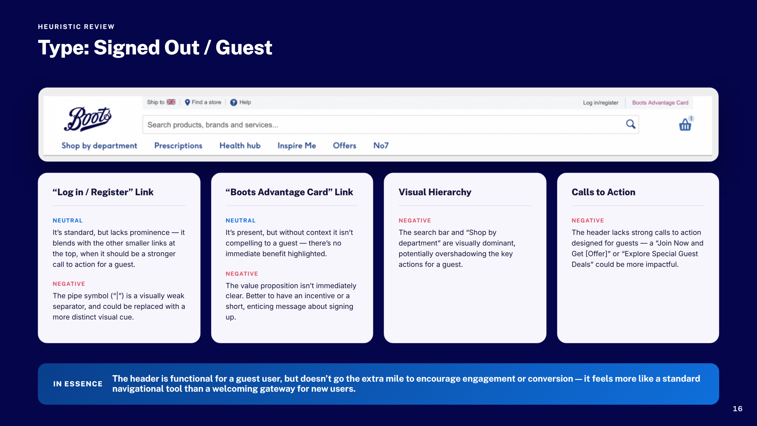
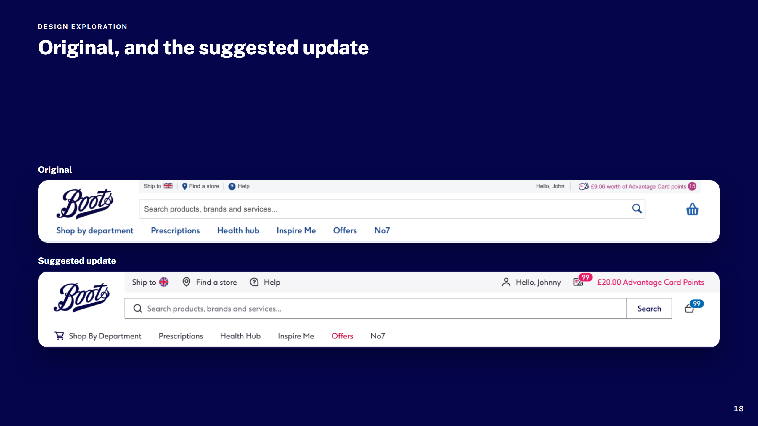
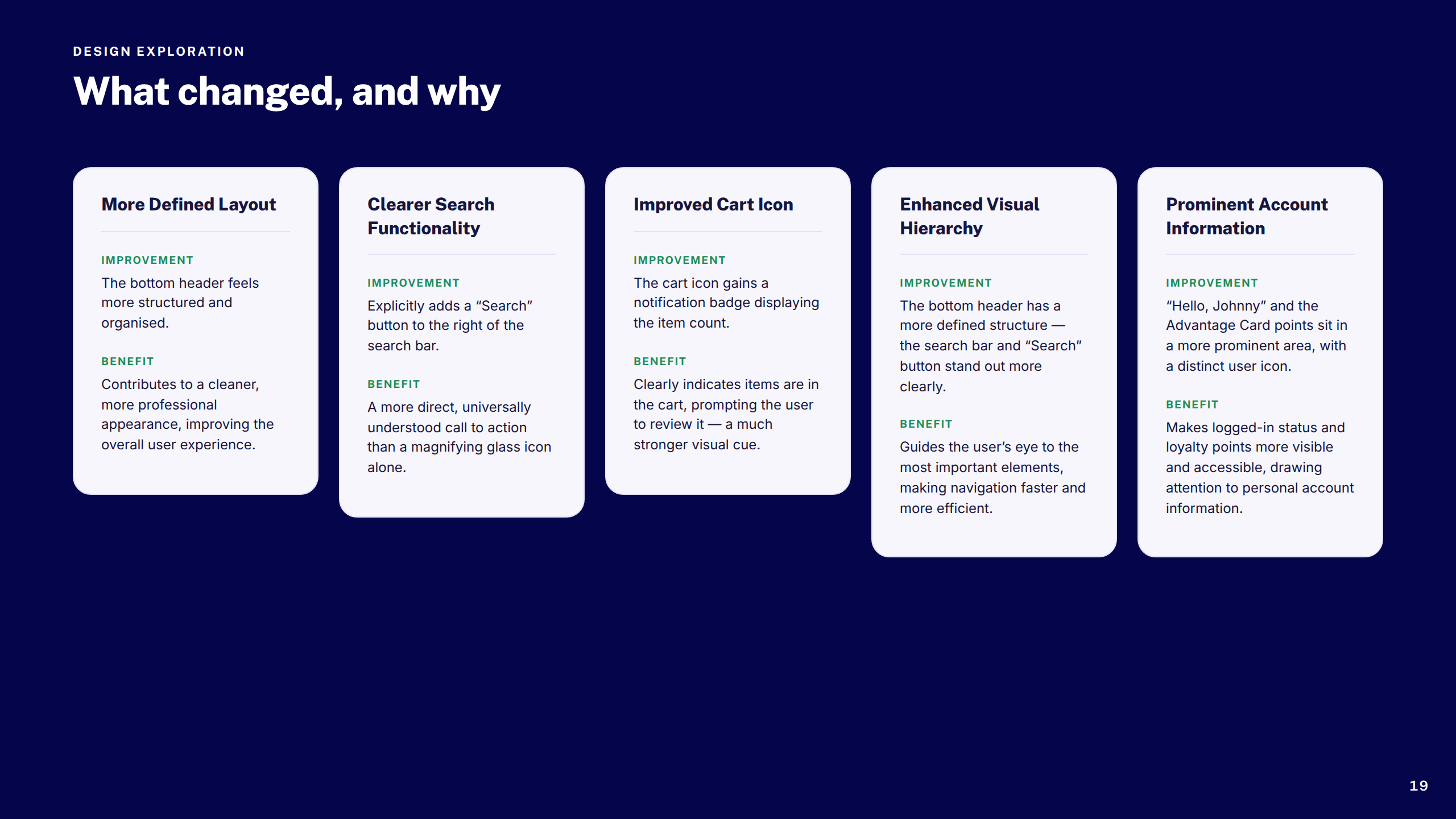
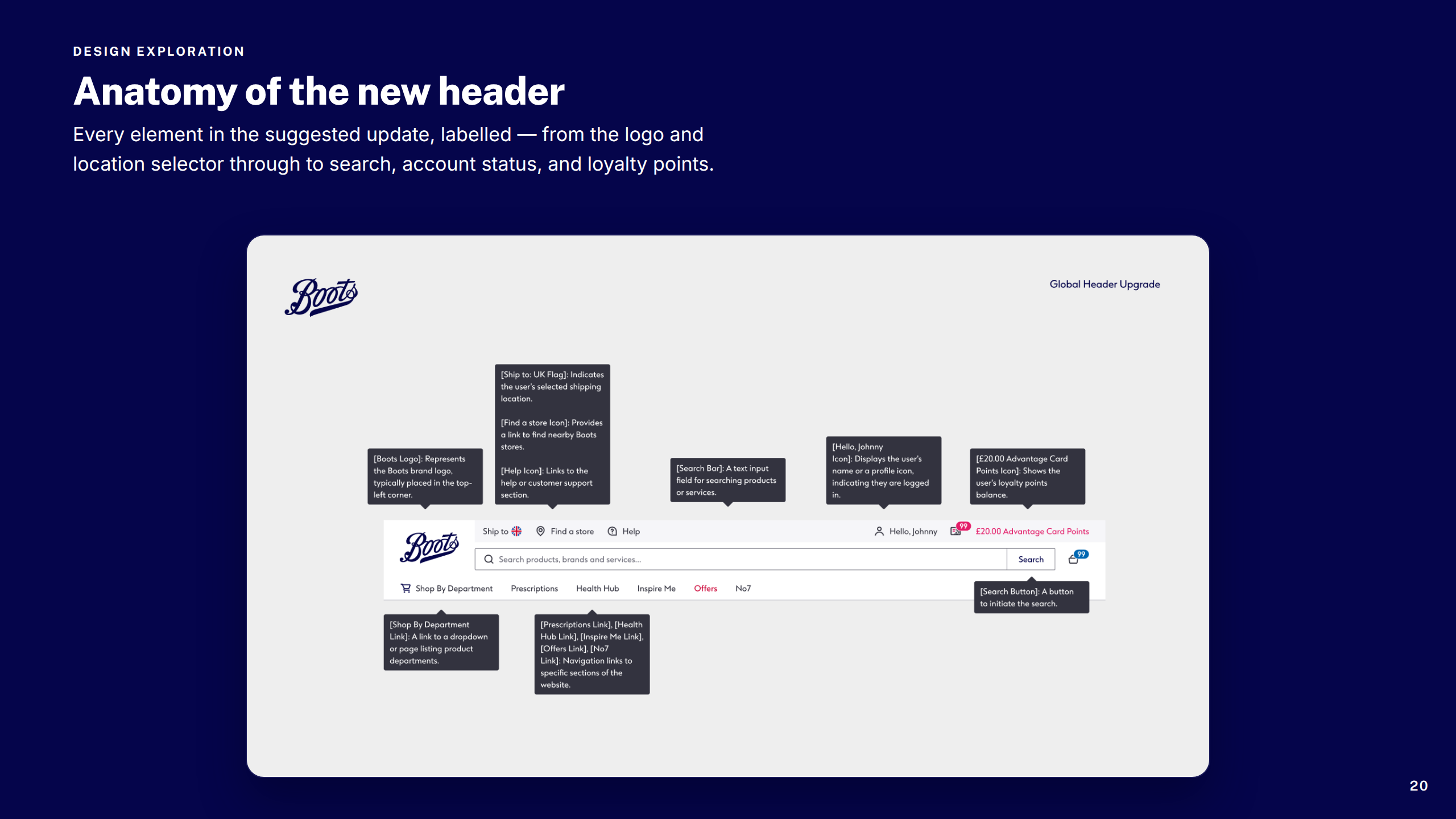
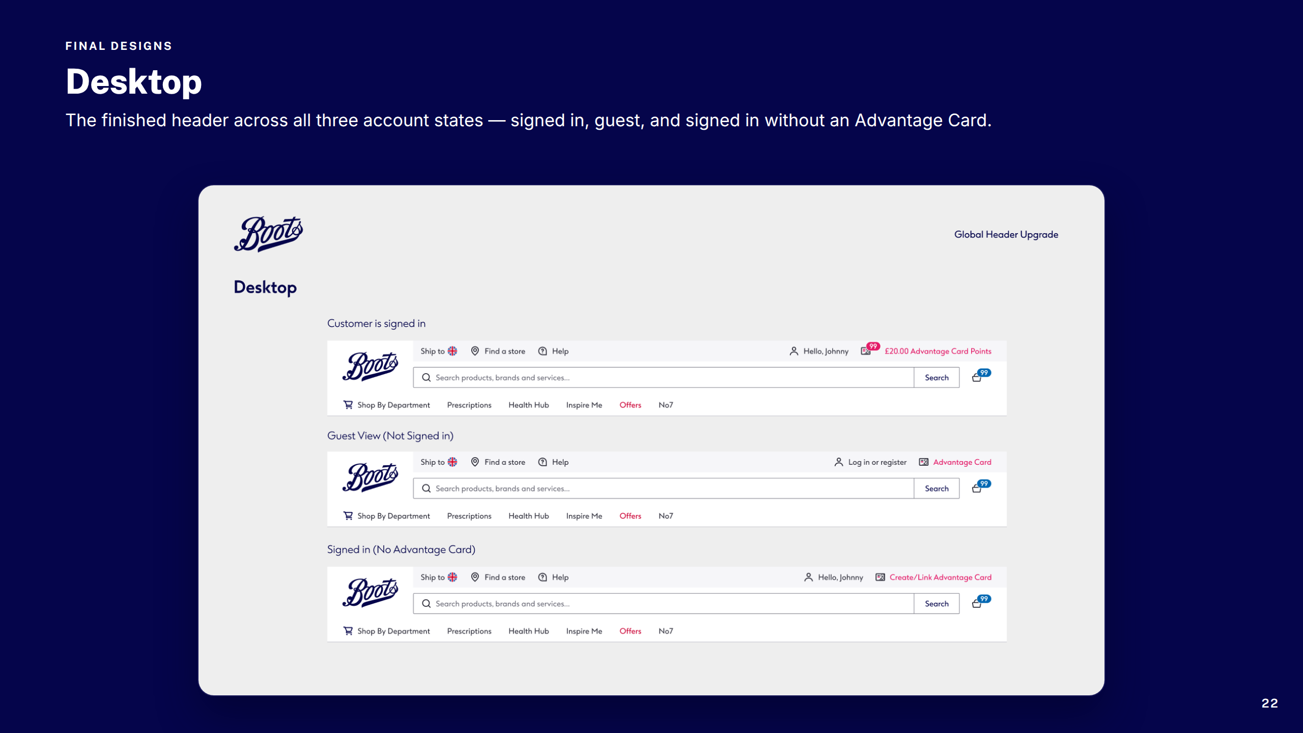
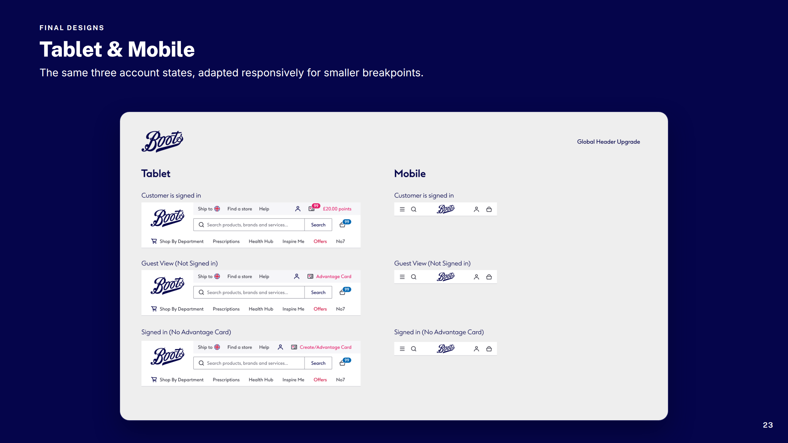
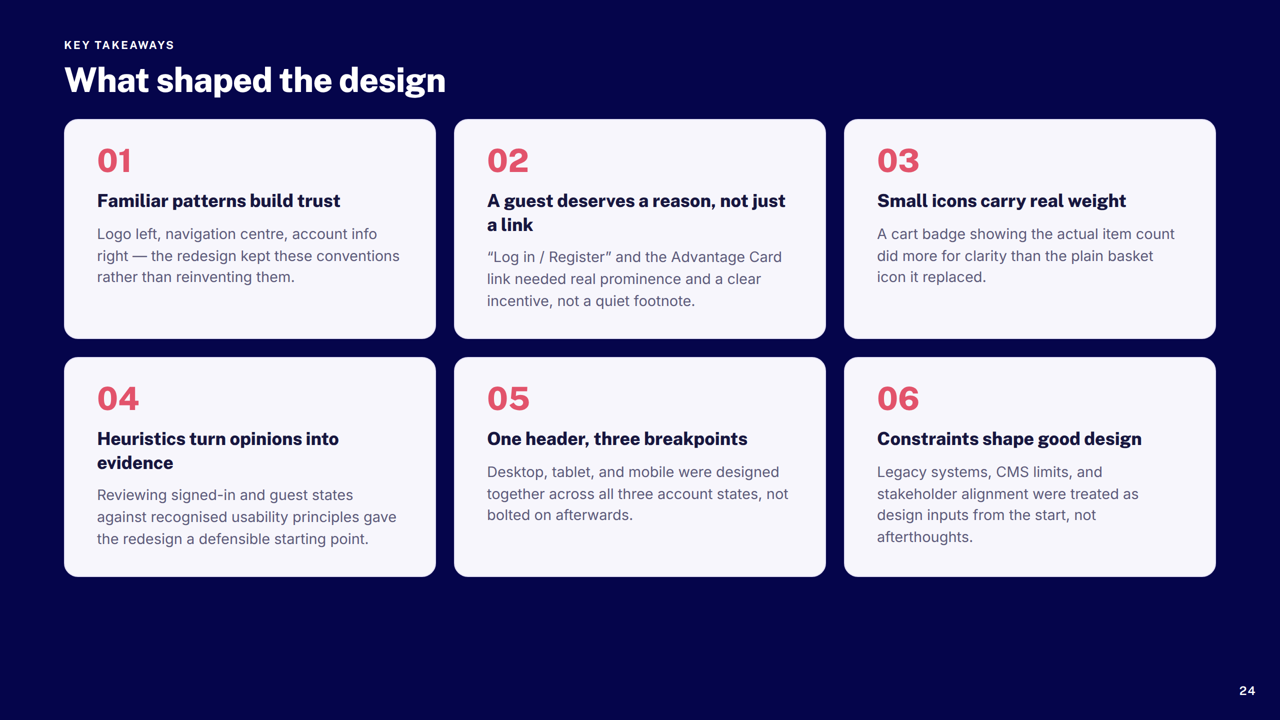
Resolved years of accumulated decisions in Boots.com's global navigation — icon ambiguity, inconsistent signed-in and guest states, and responsive gaps — with a cleaner, more accessible header across all breakpoints.
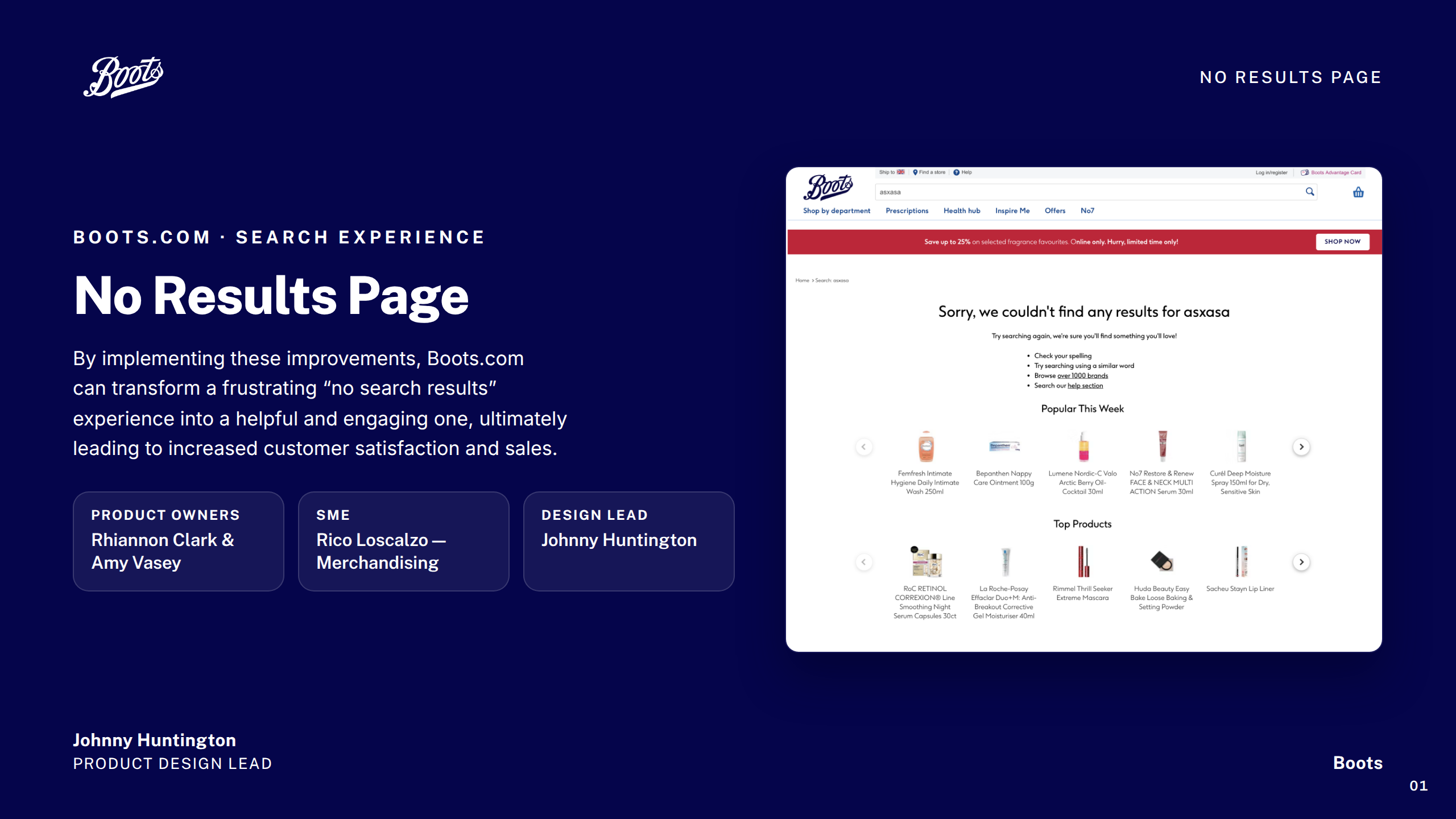
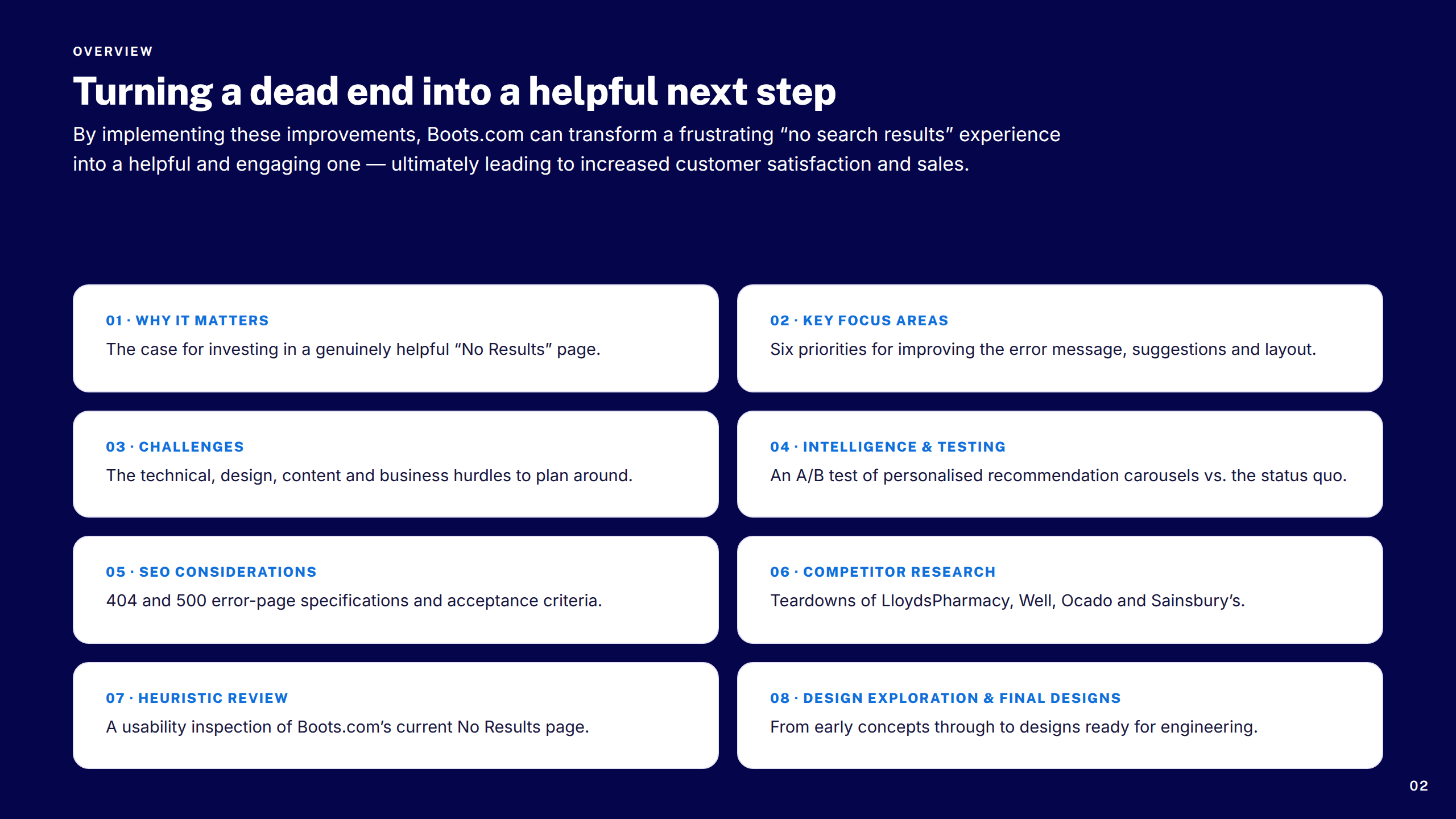
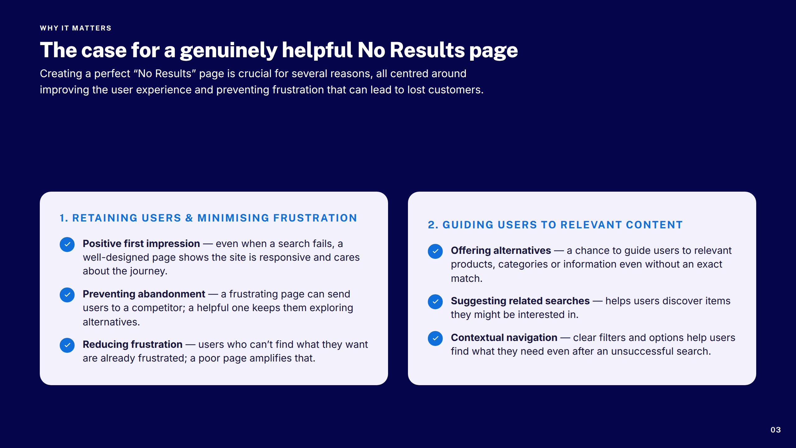
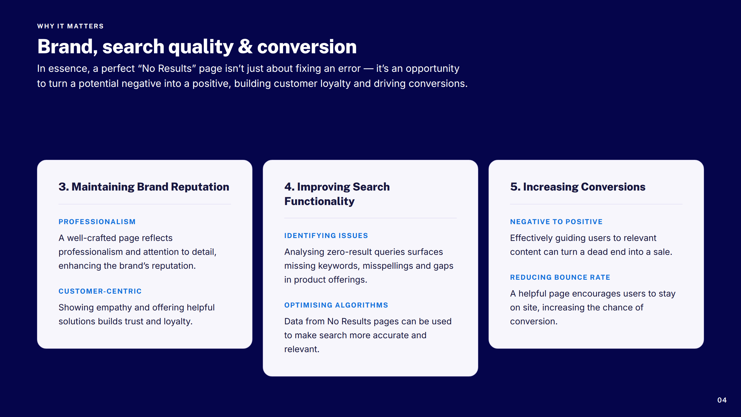
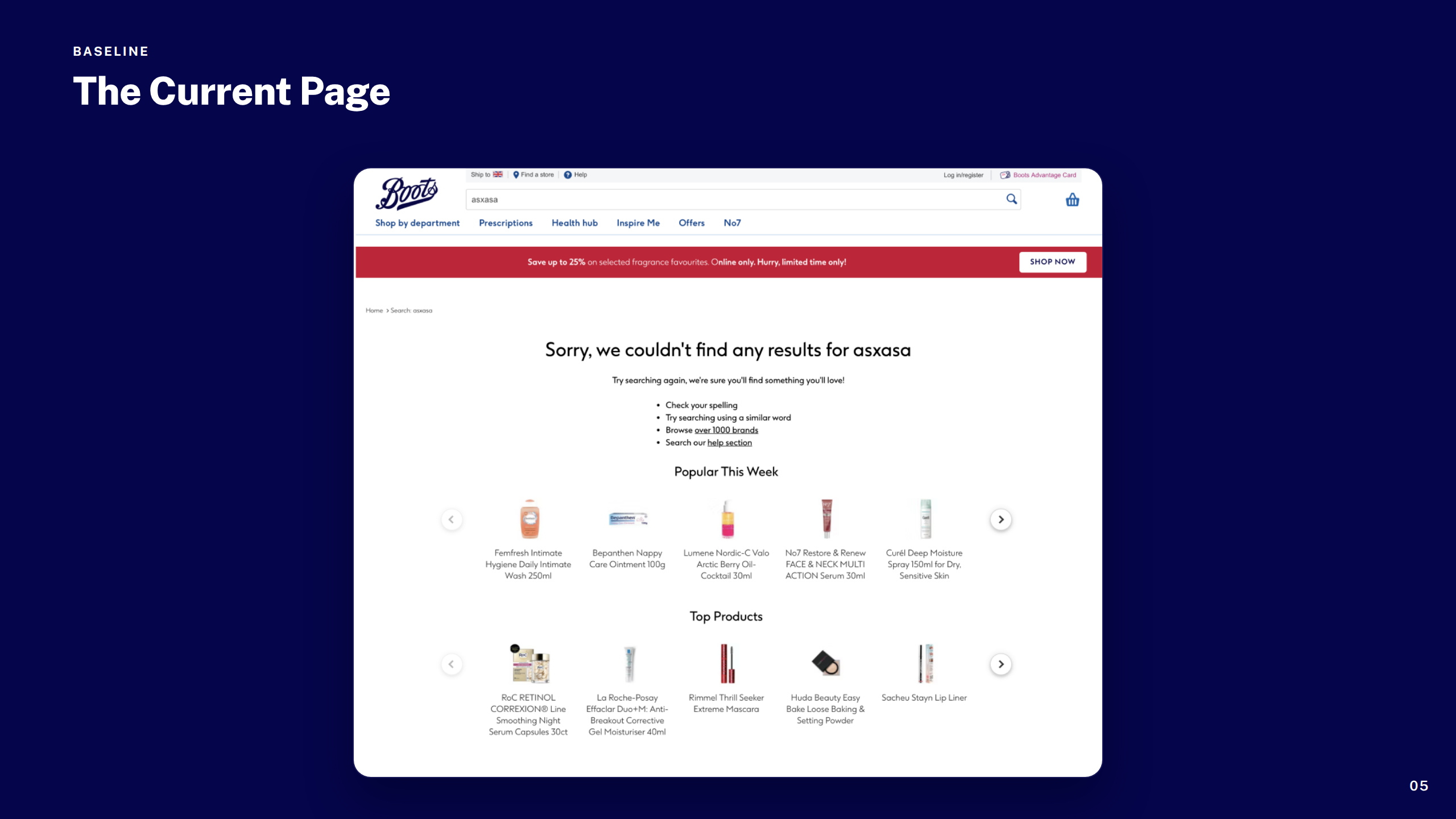
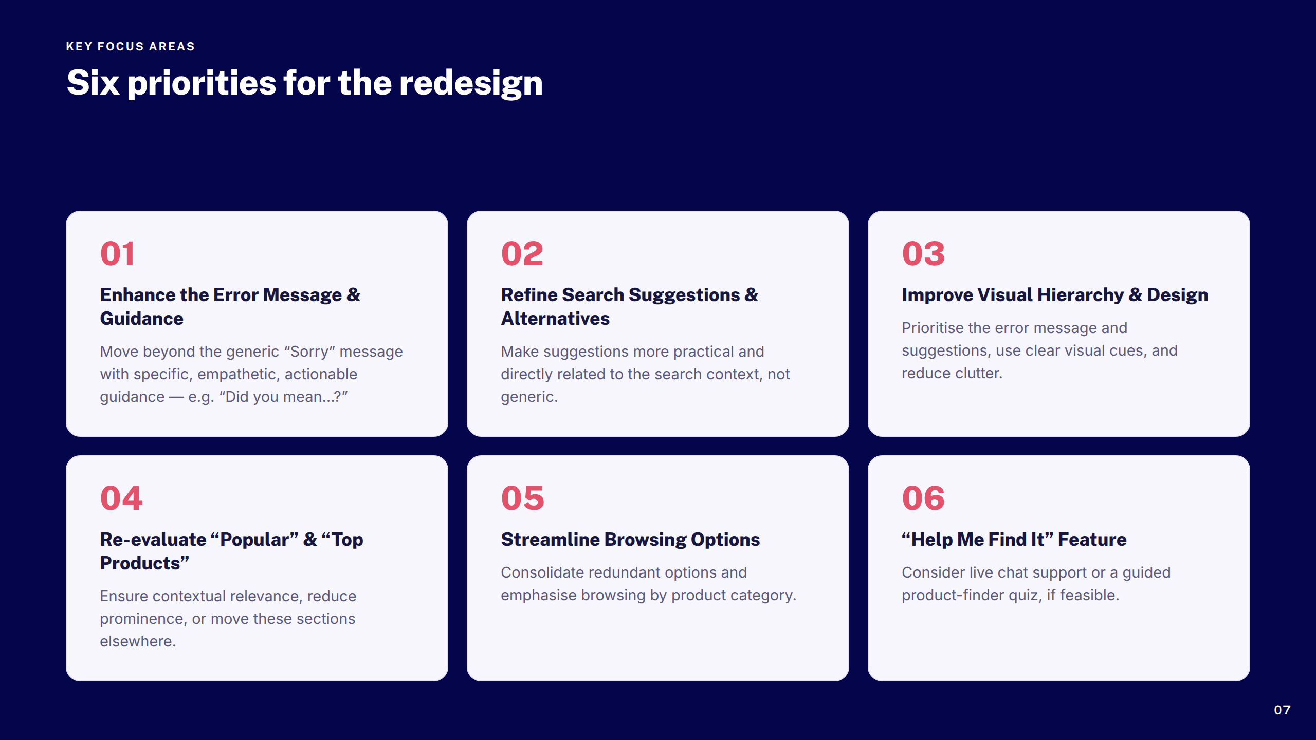
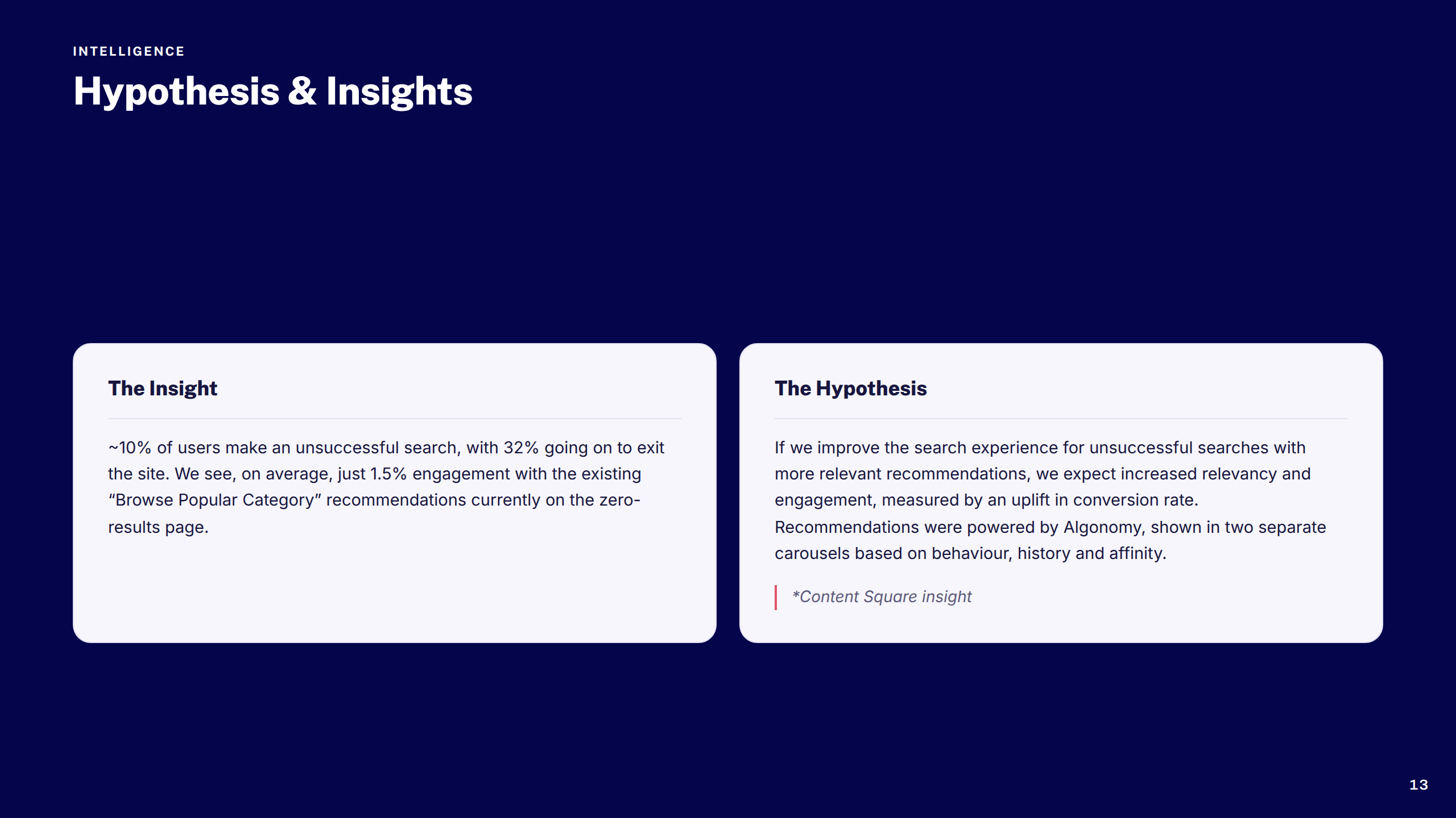
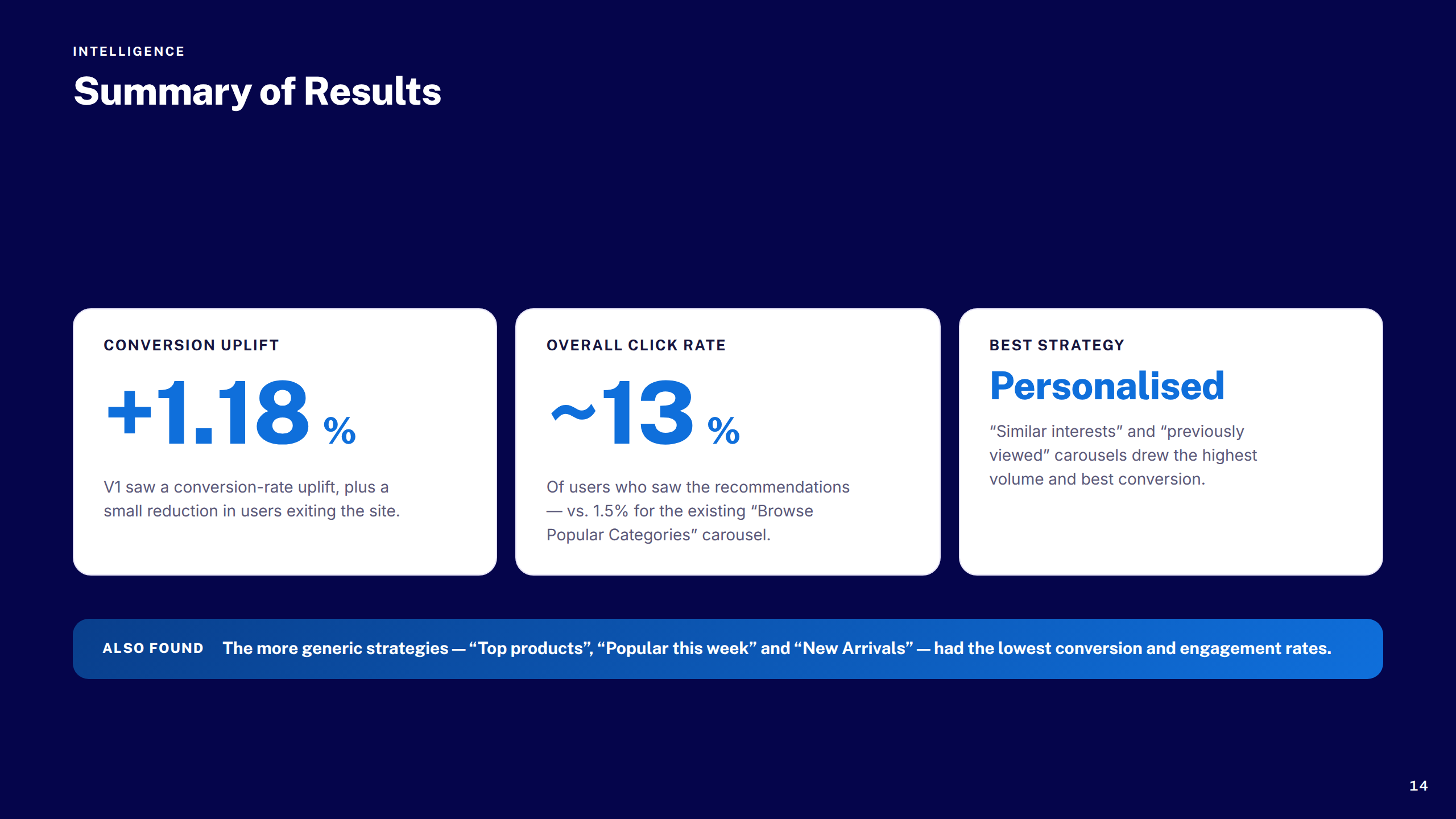
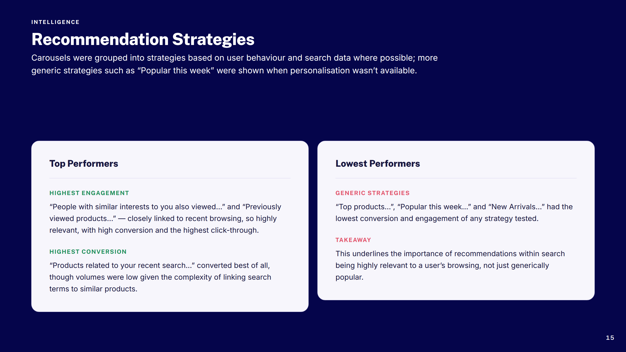
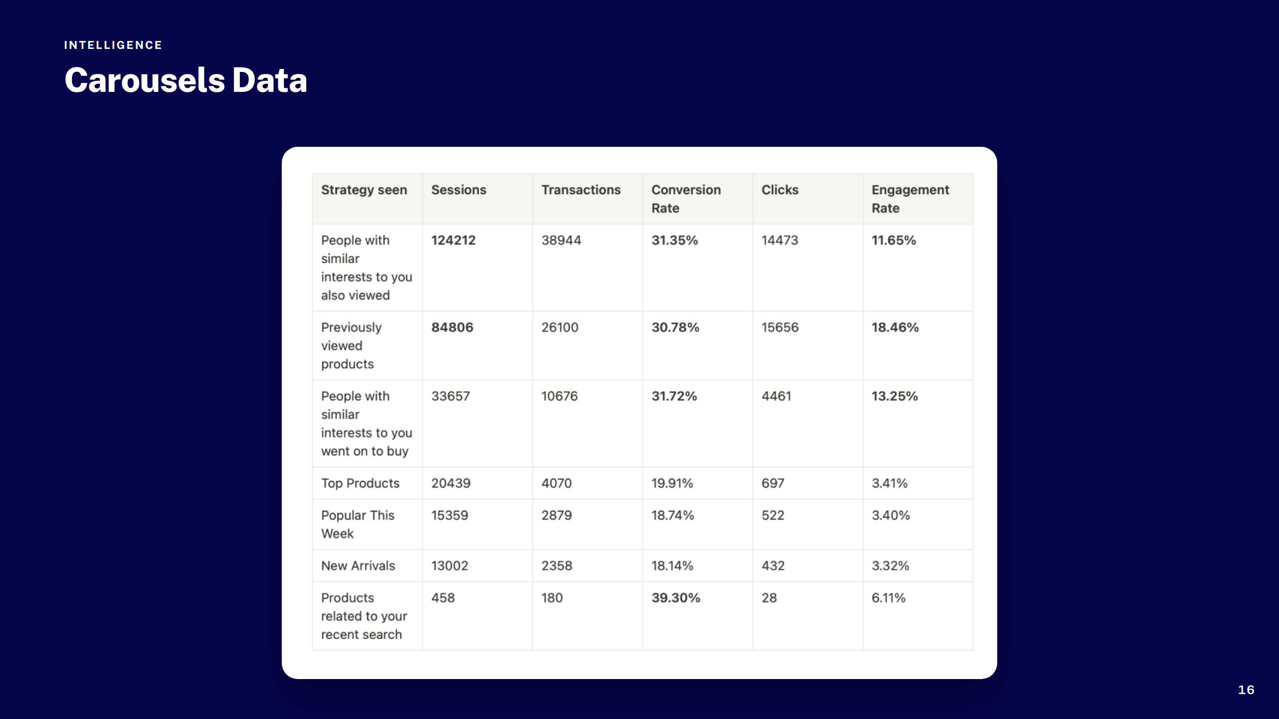
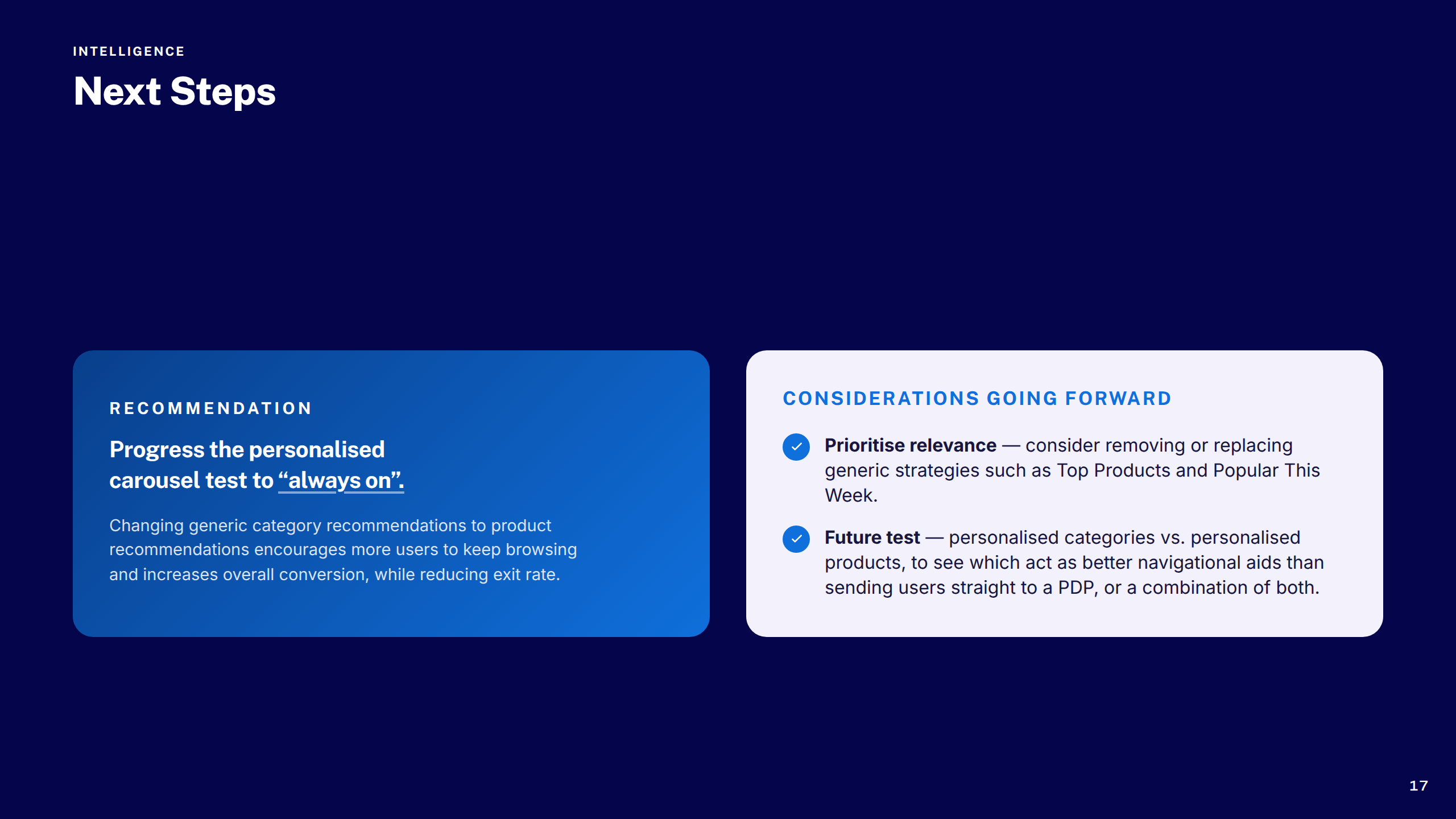
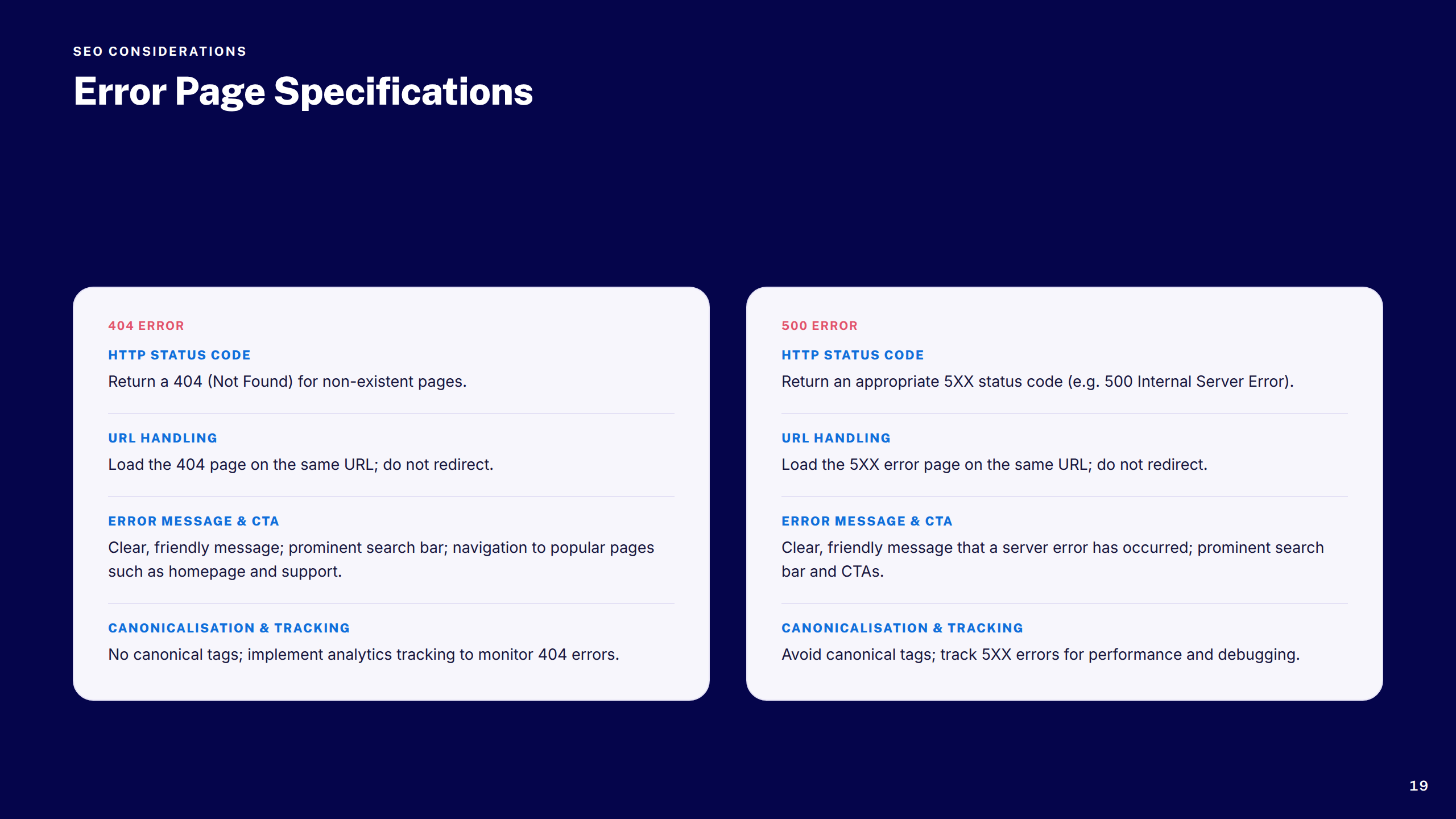
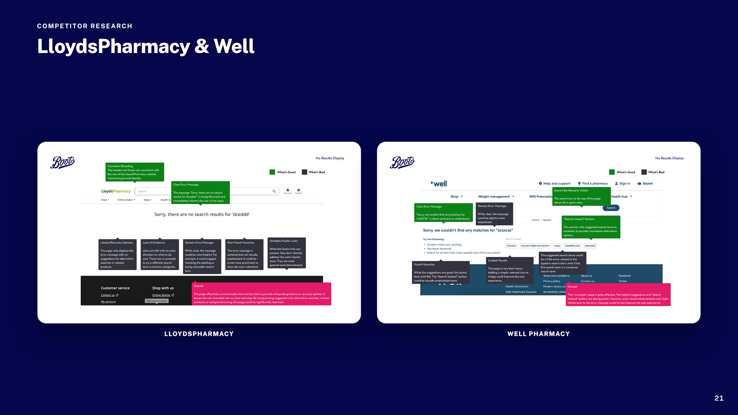
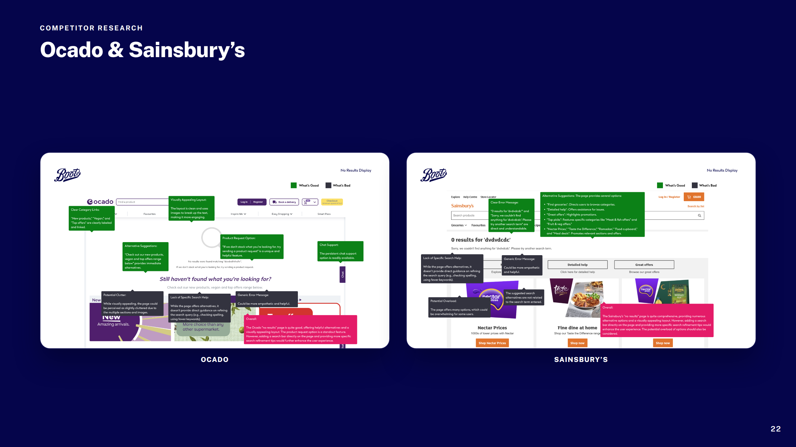
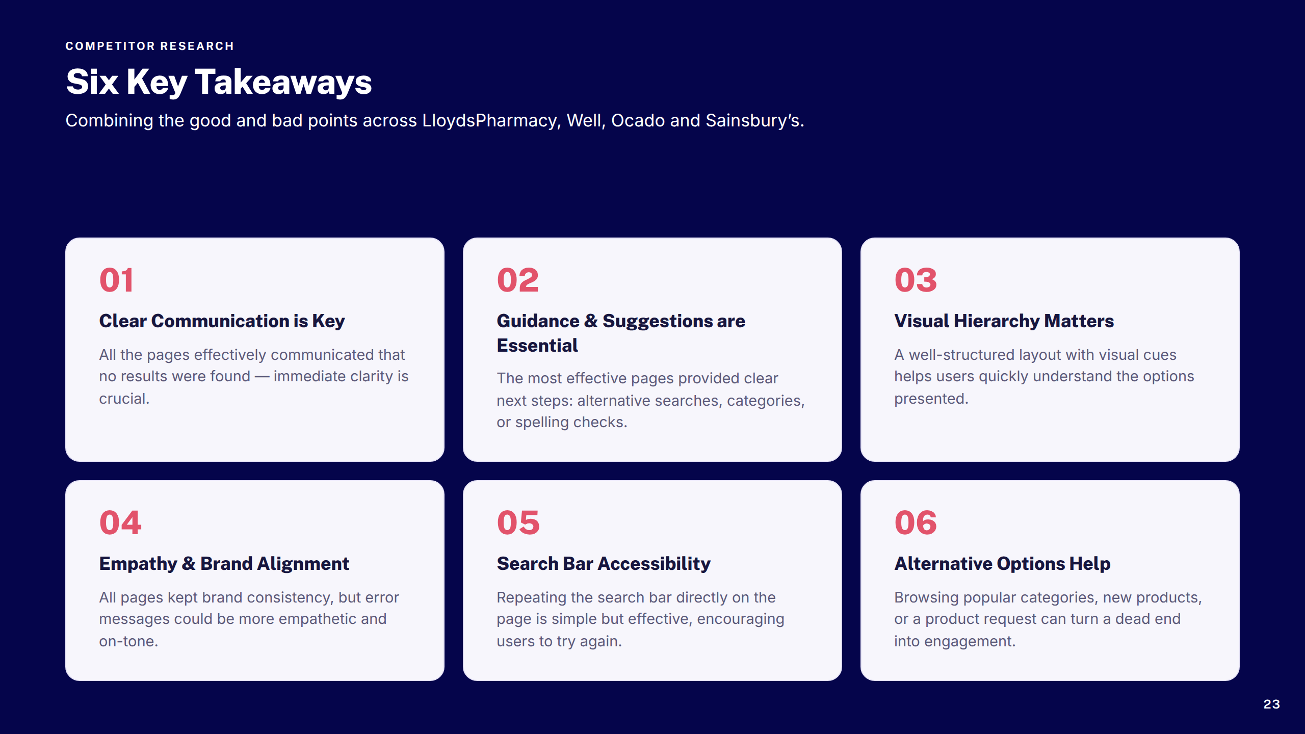
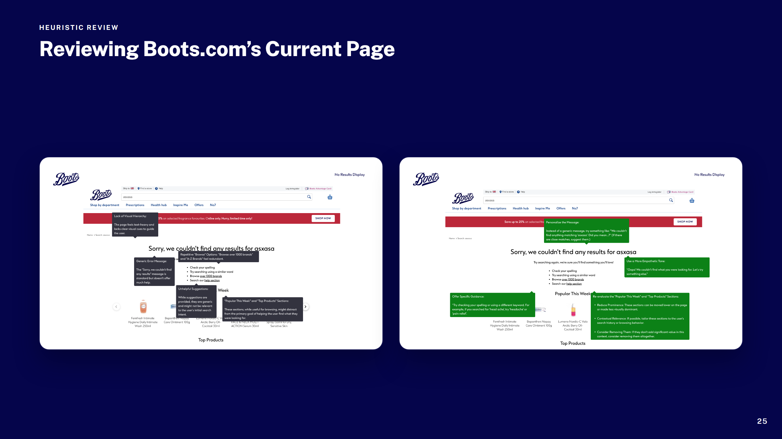
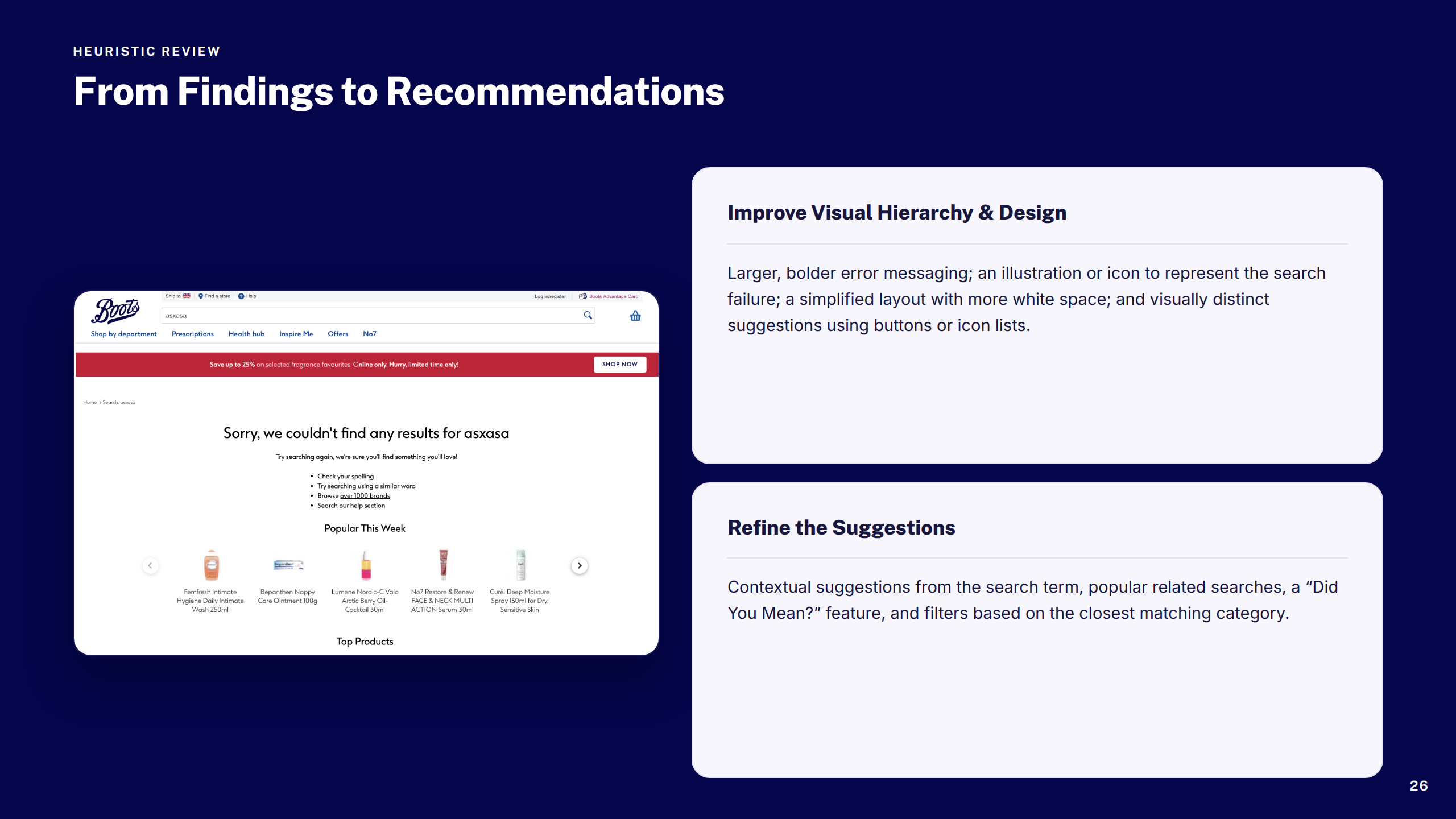
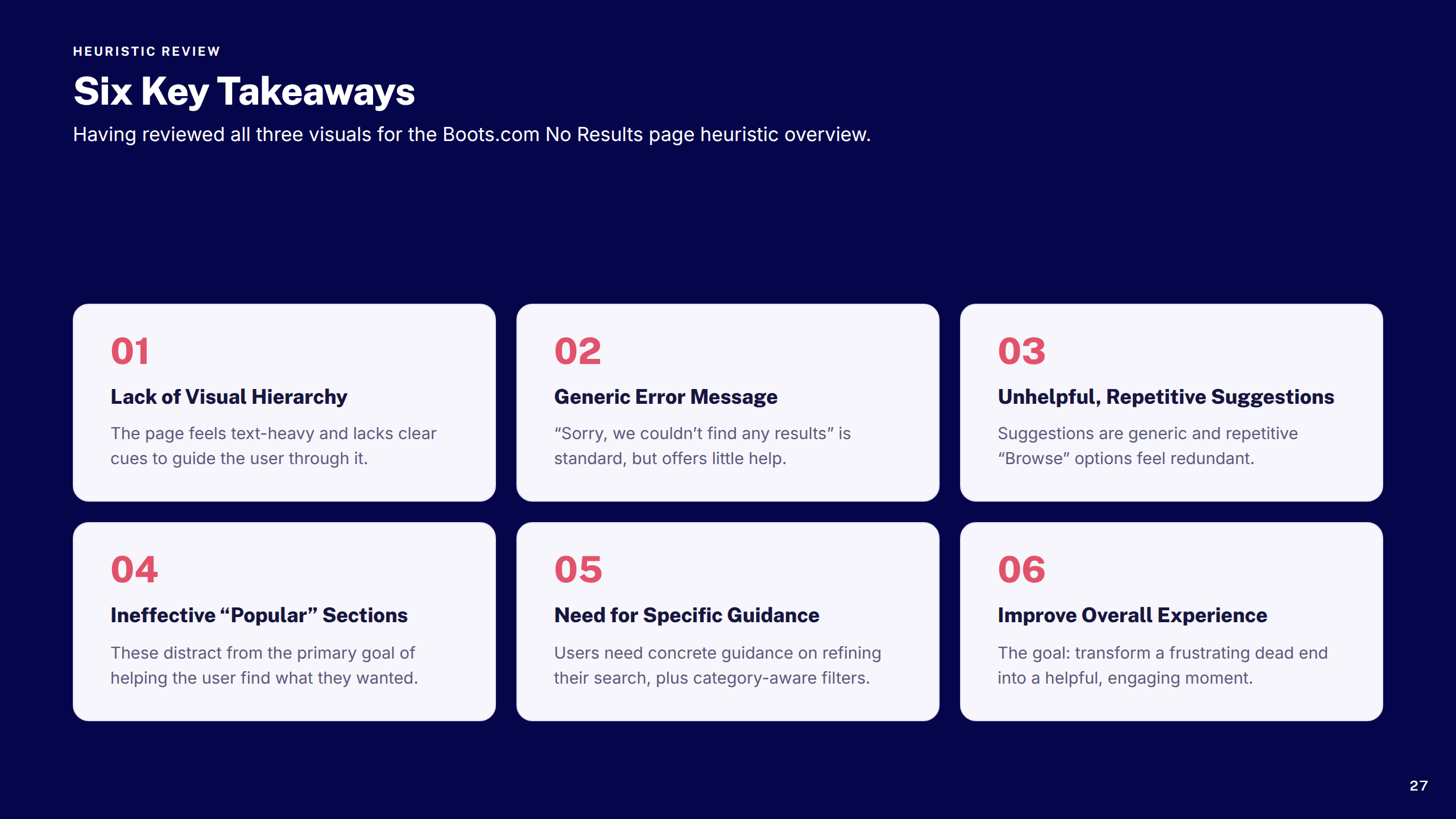
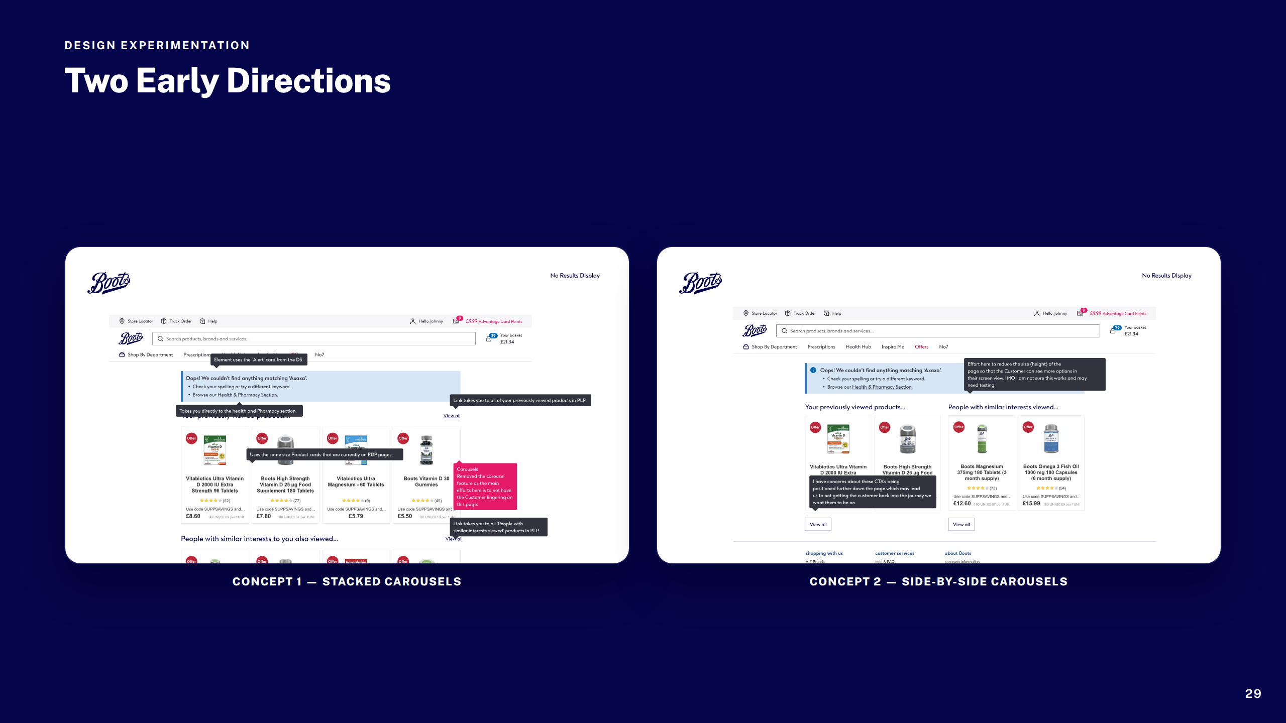
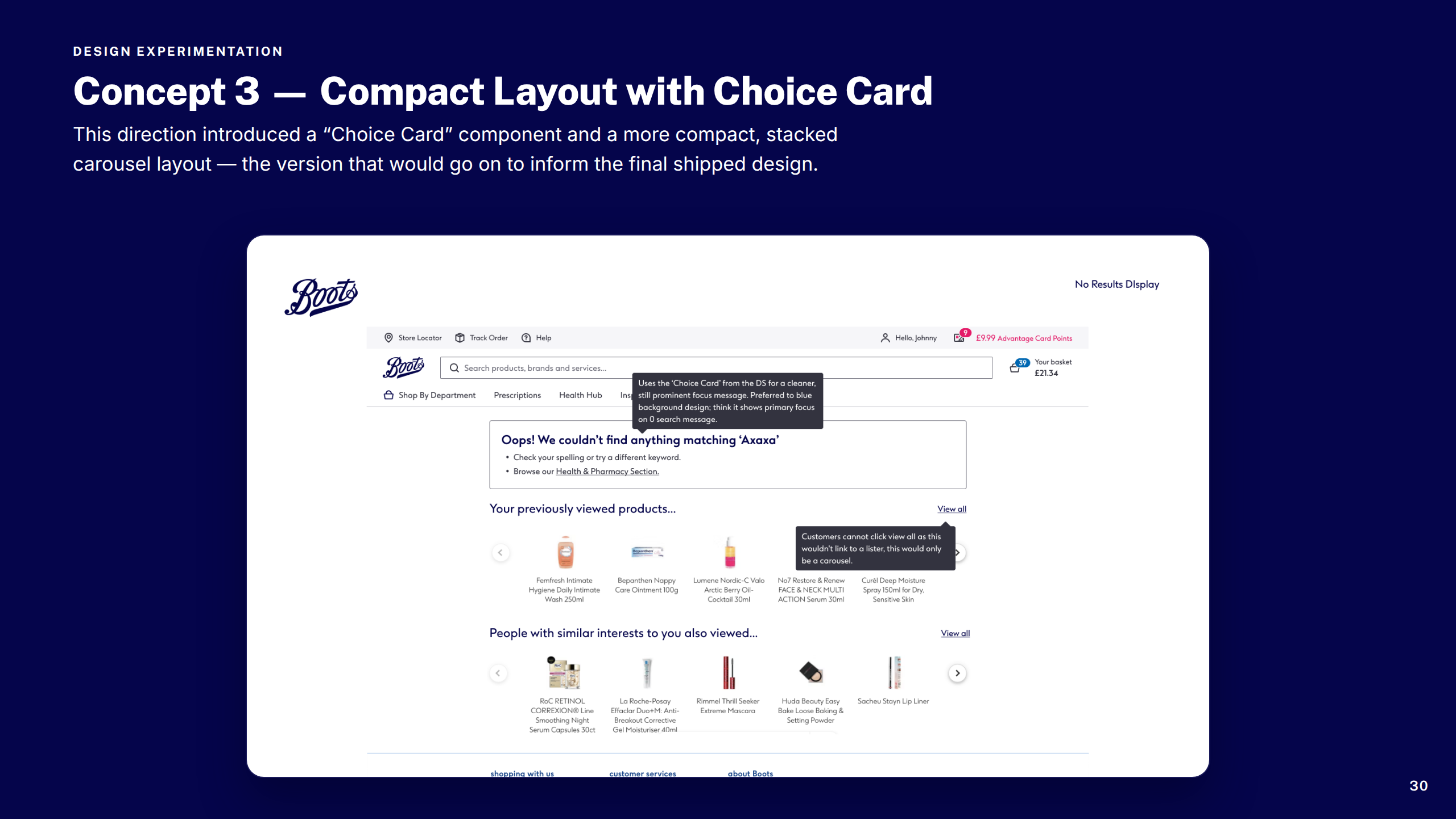
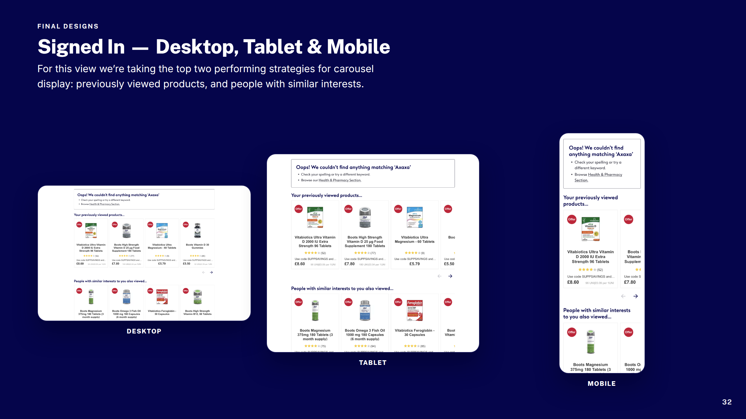
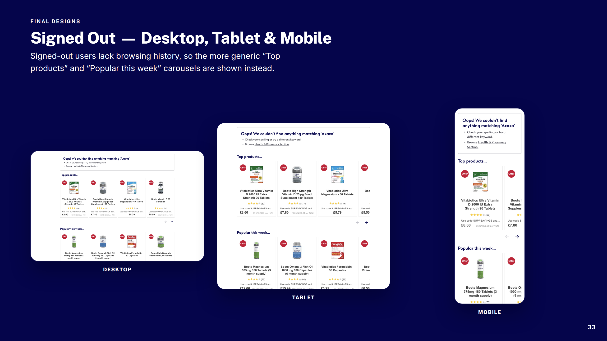
Redesigned the dead-end search experience into a useful recovery page — surfacing smart recommendations, spelling suggestions, and navigational pathways to keep customers moving toward purchase.
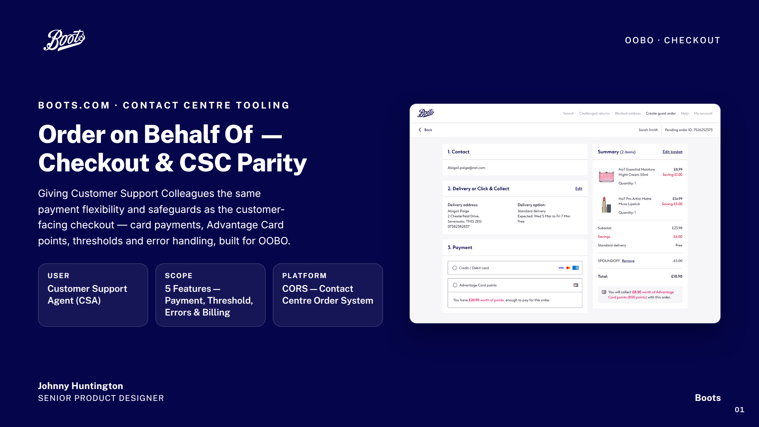
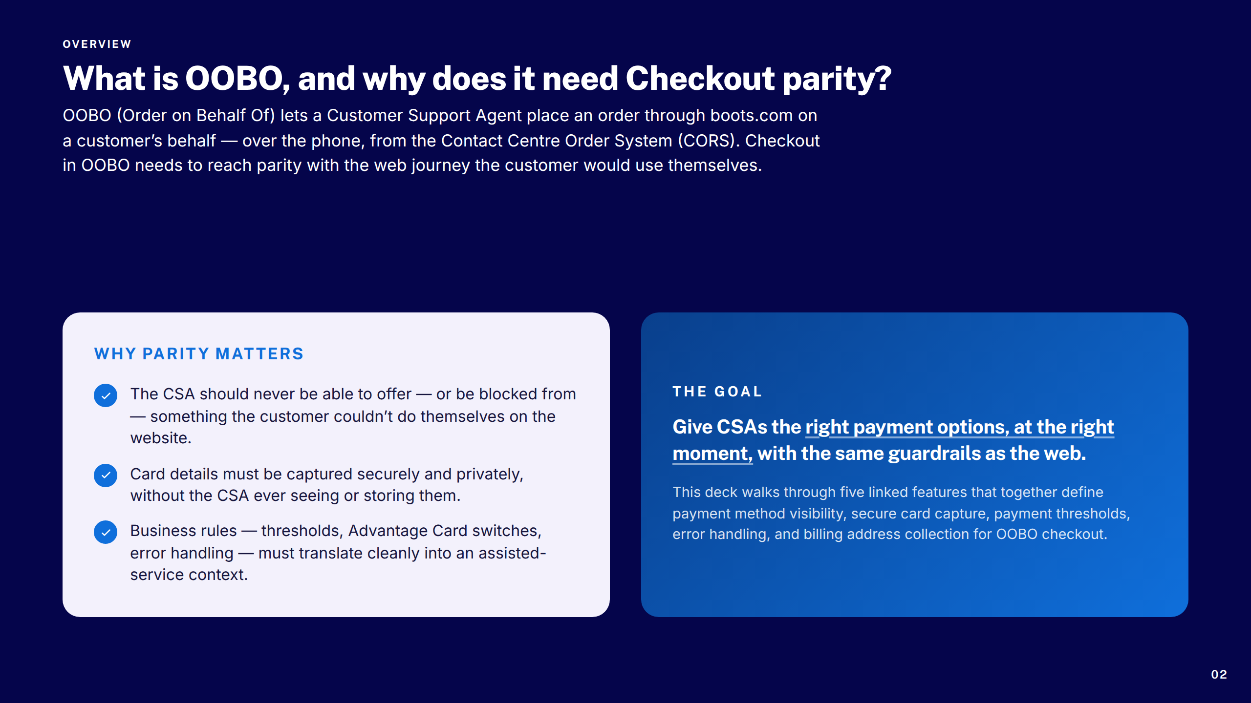
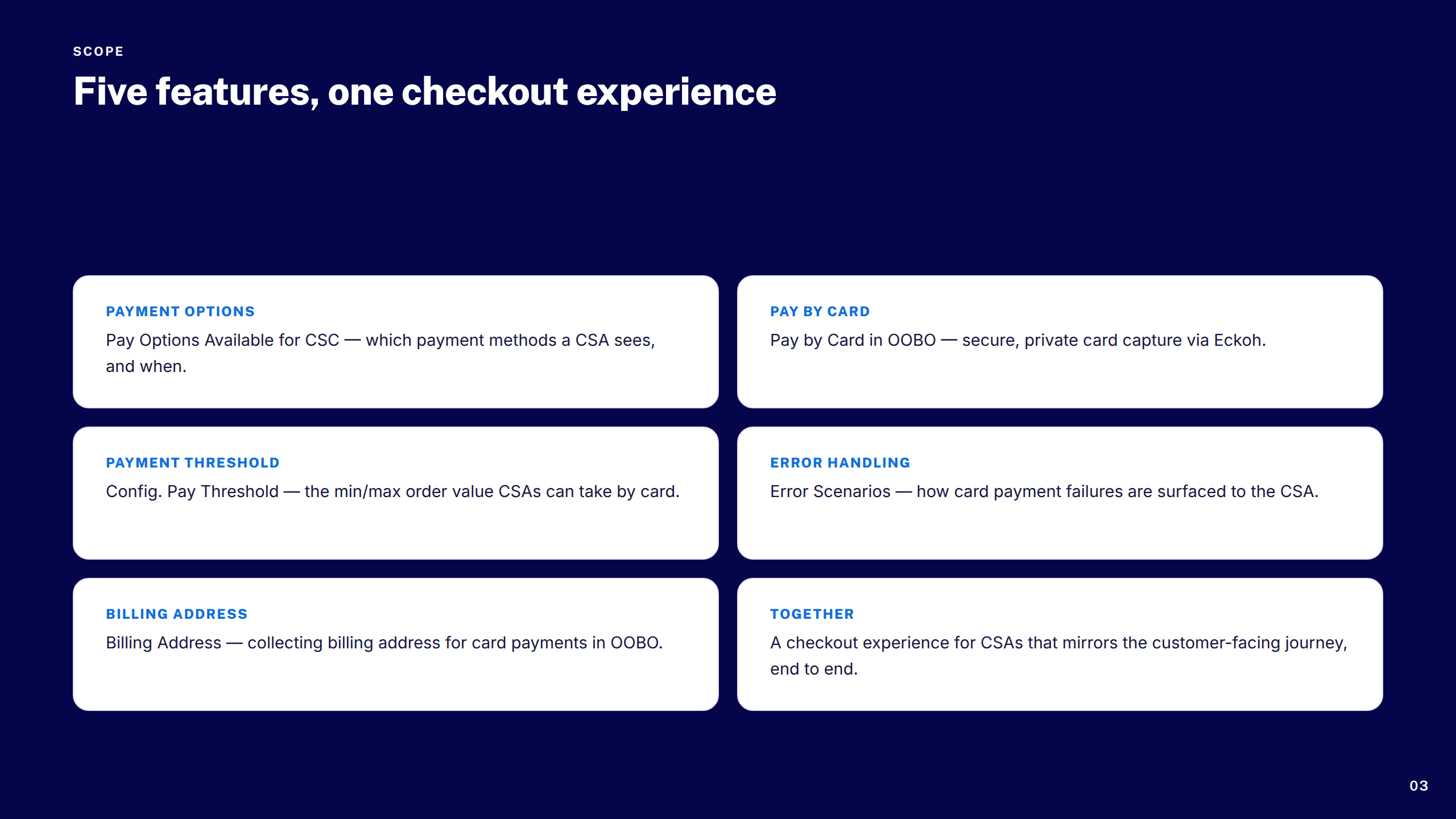
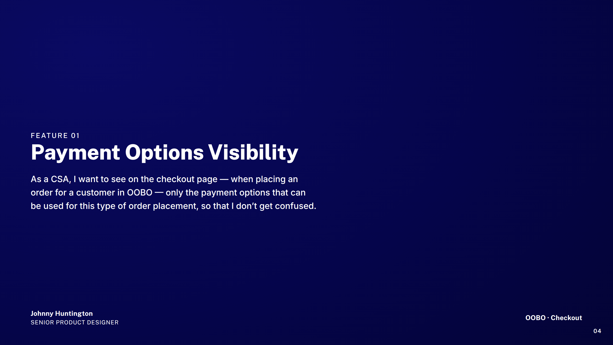
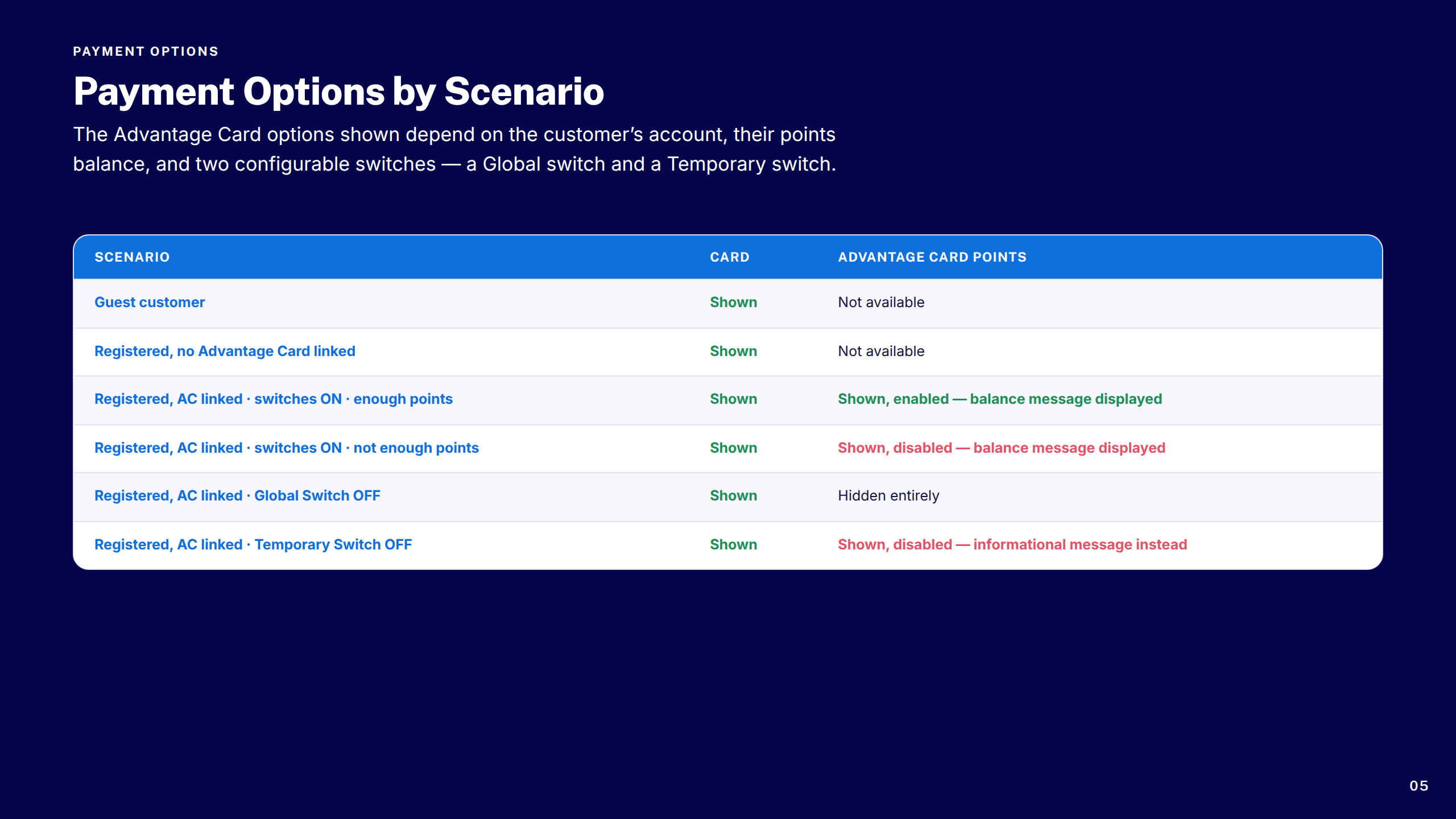
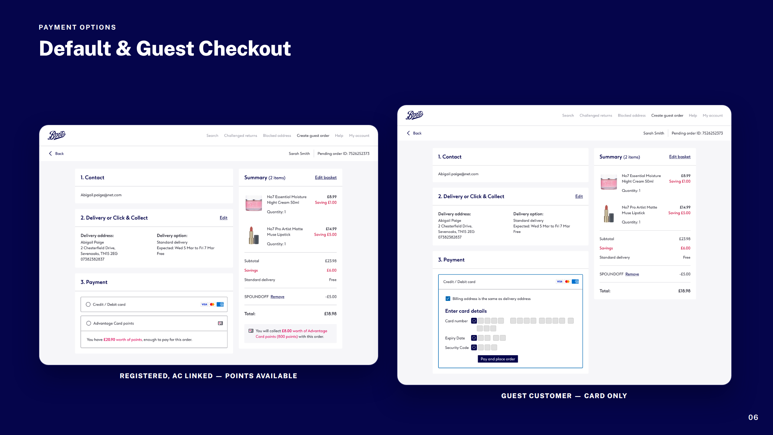
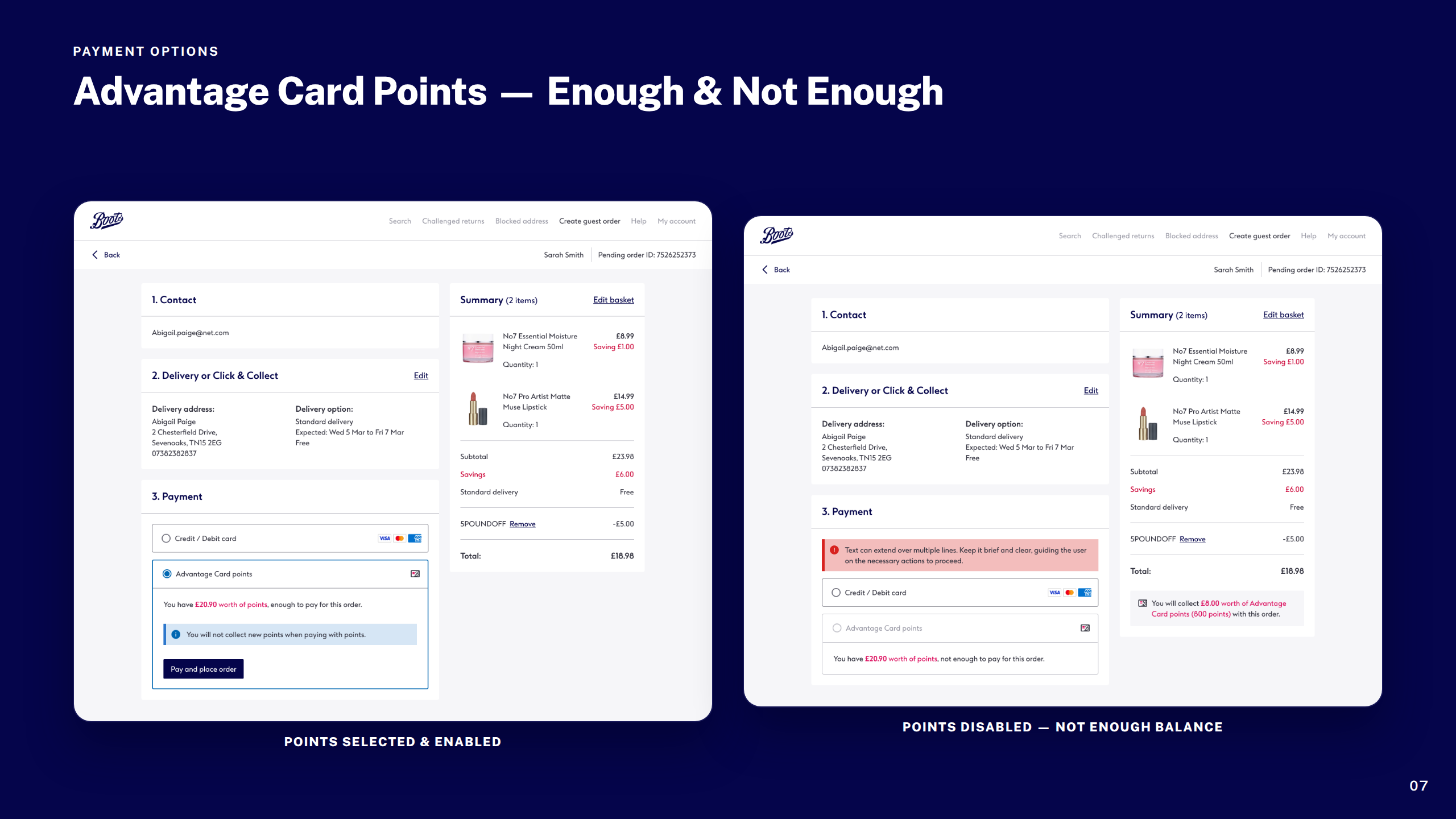
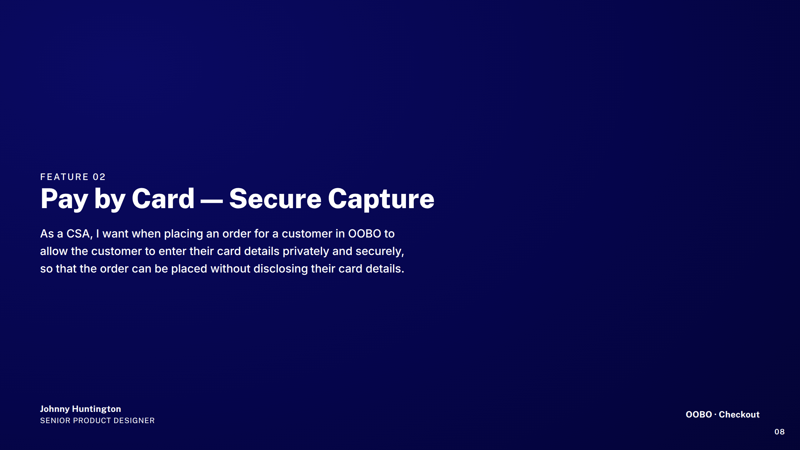
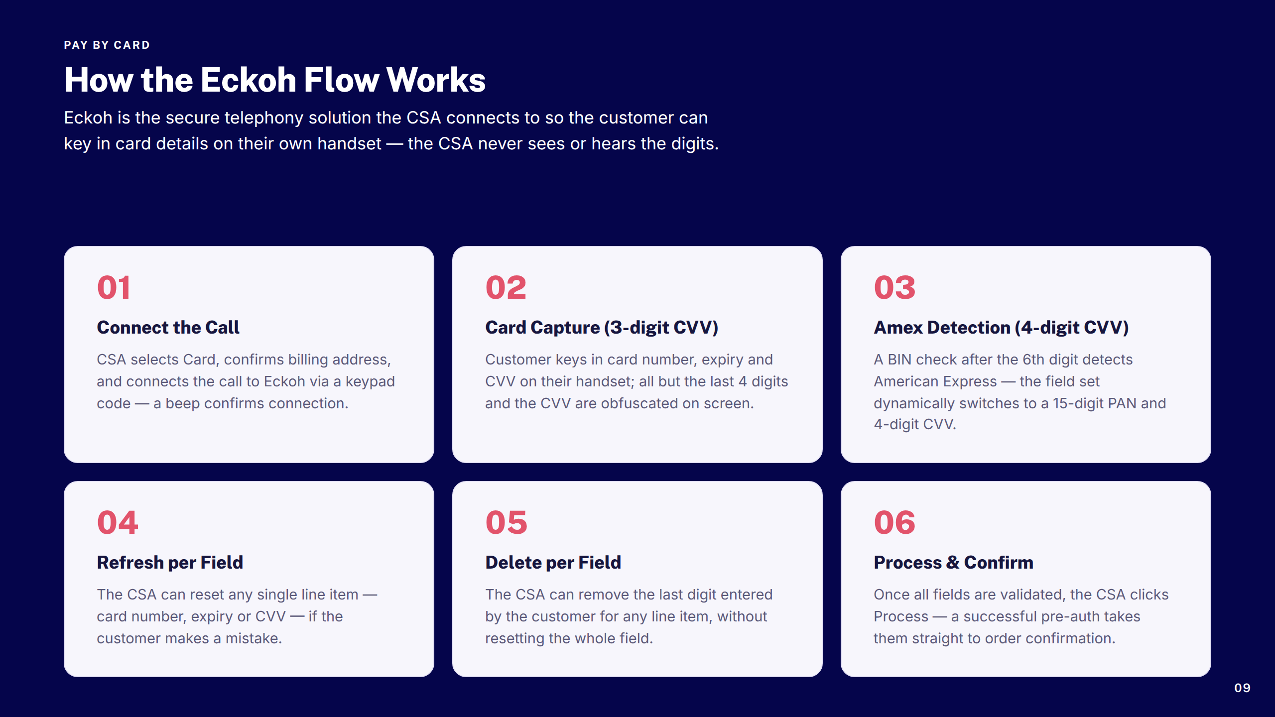
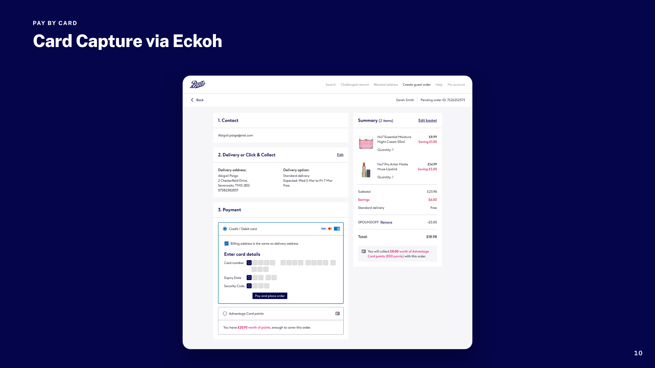
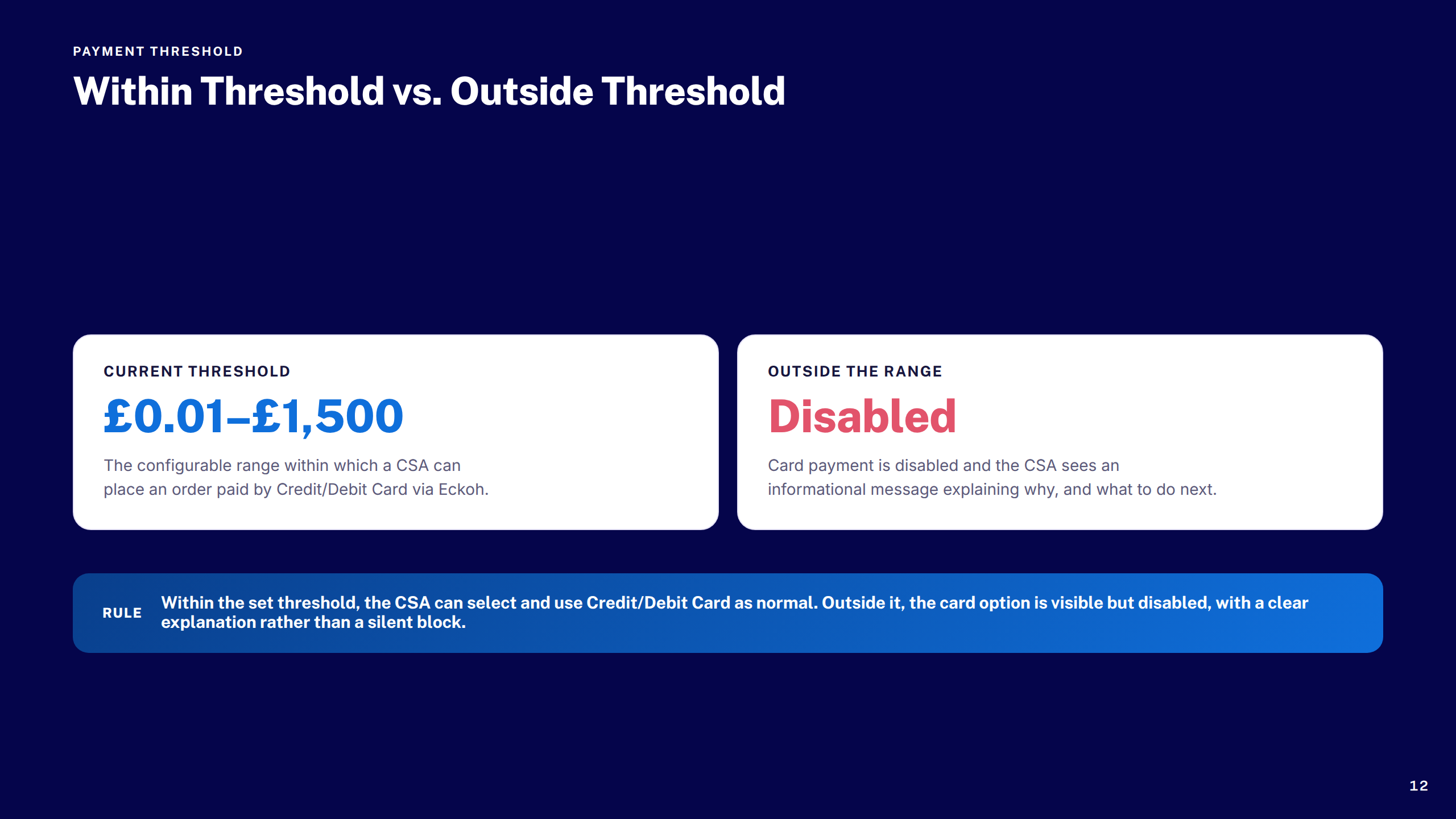
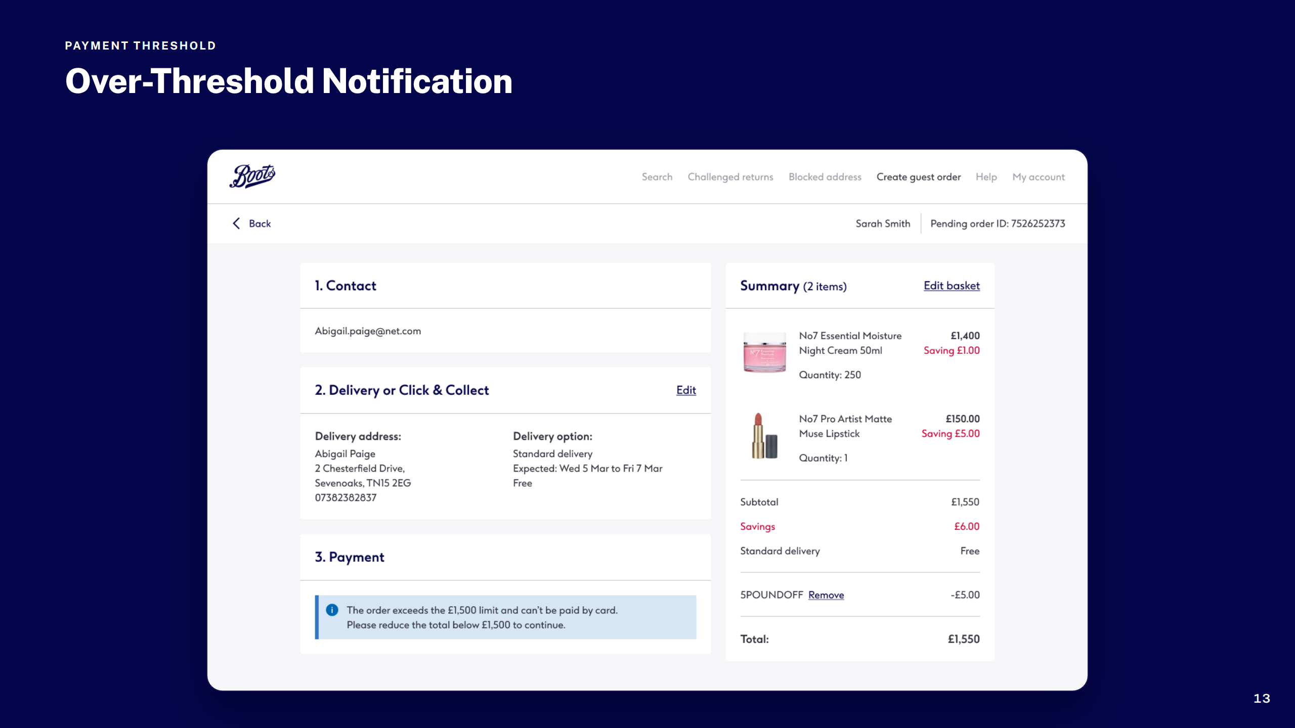
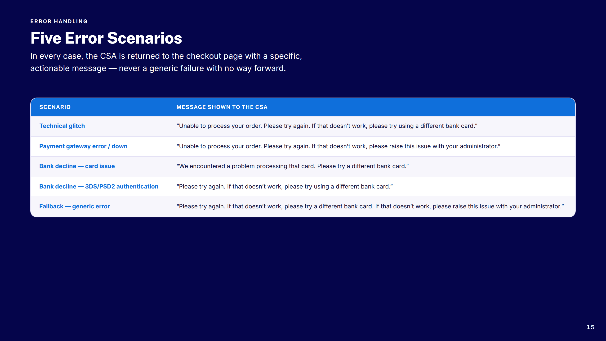
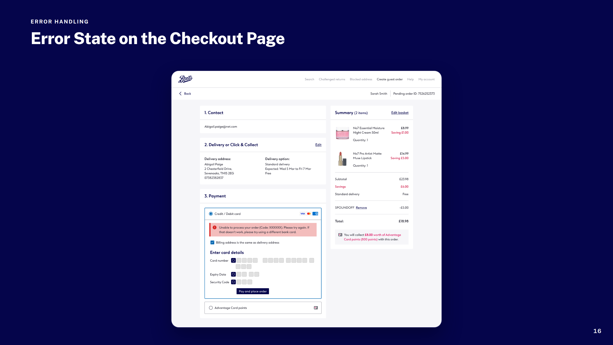
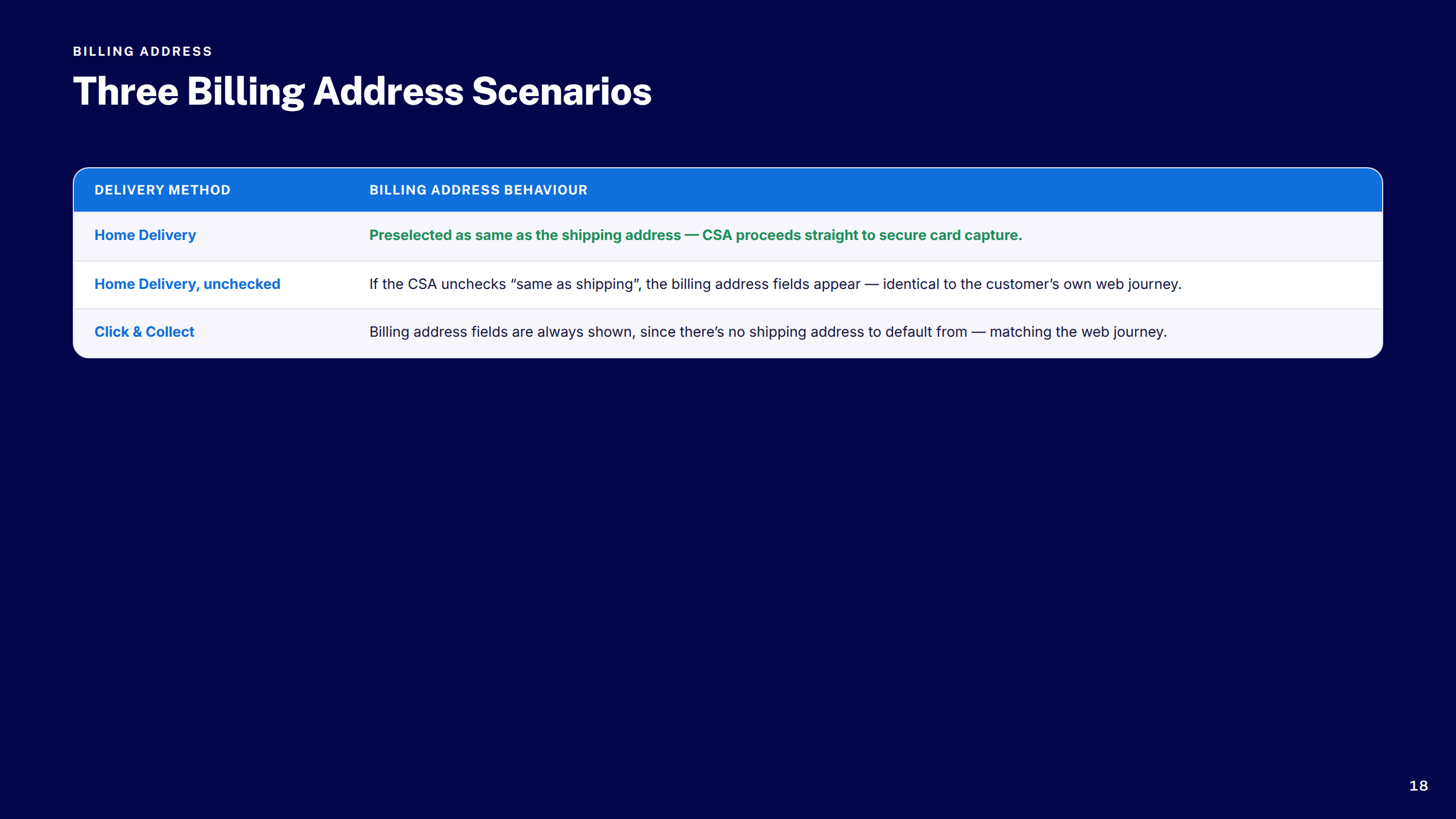
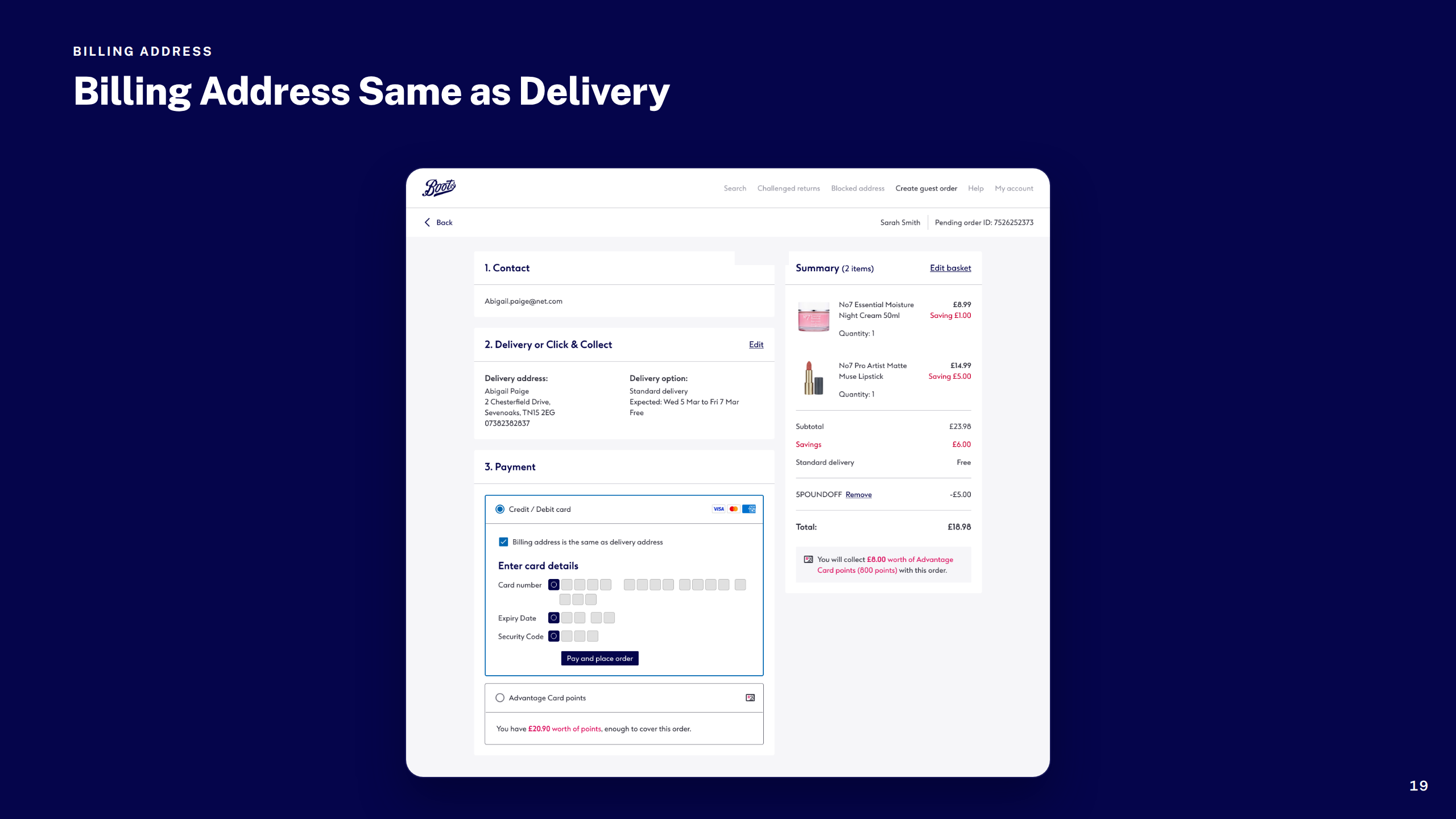
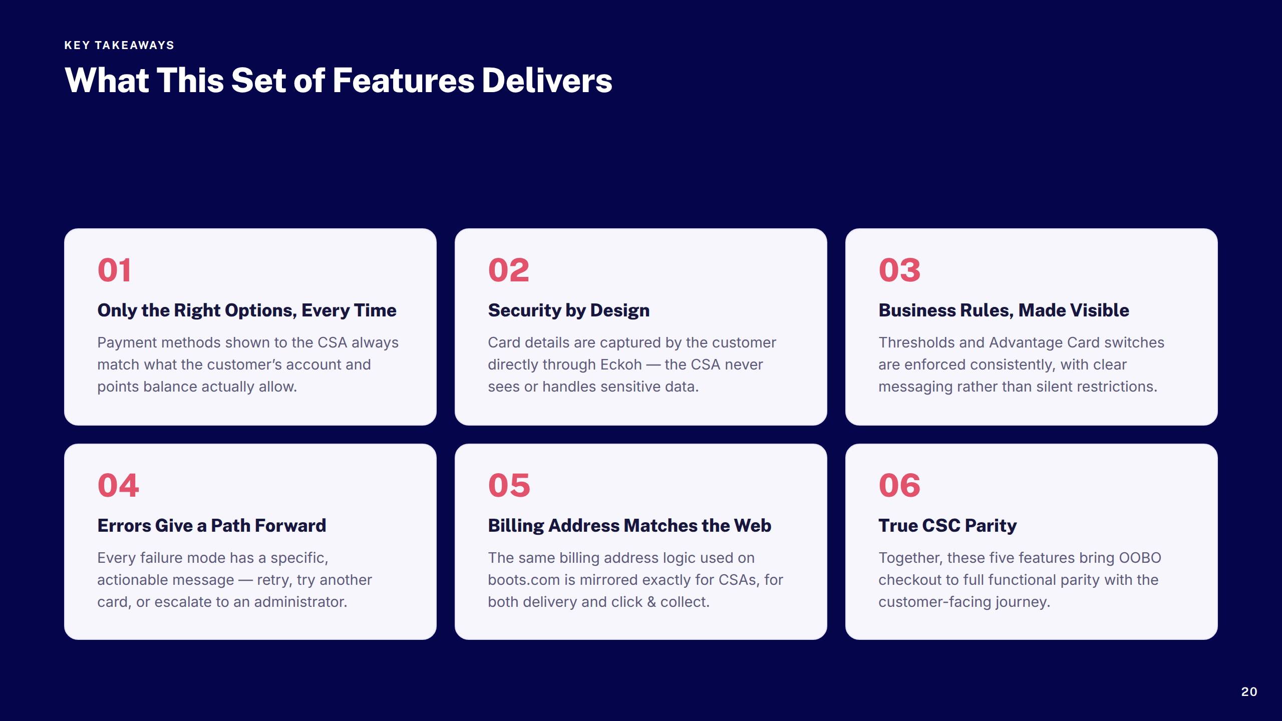
Designed the Order On Behalf Of checkout flow for Customer Service Centre agents — bringing parity with the customer-facing experience while handling edge cases around payment, thresholds, and error states.
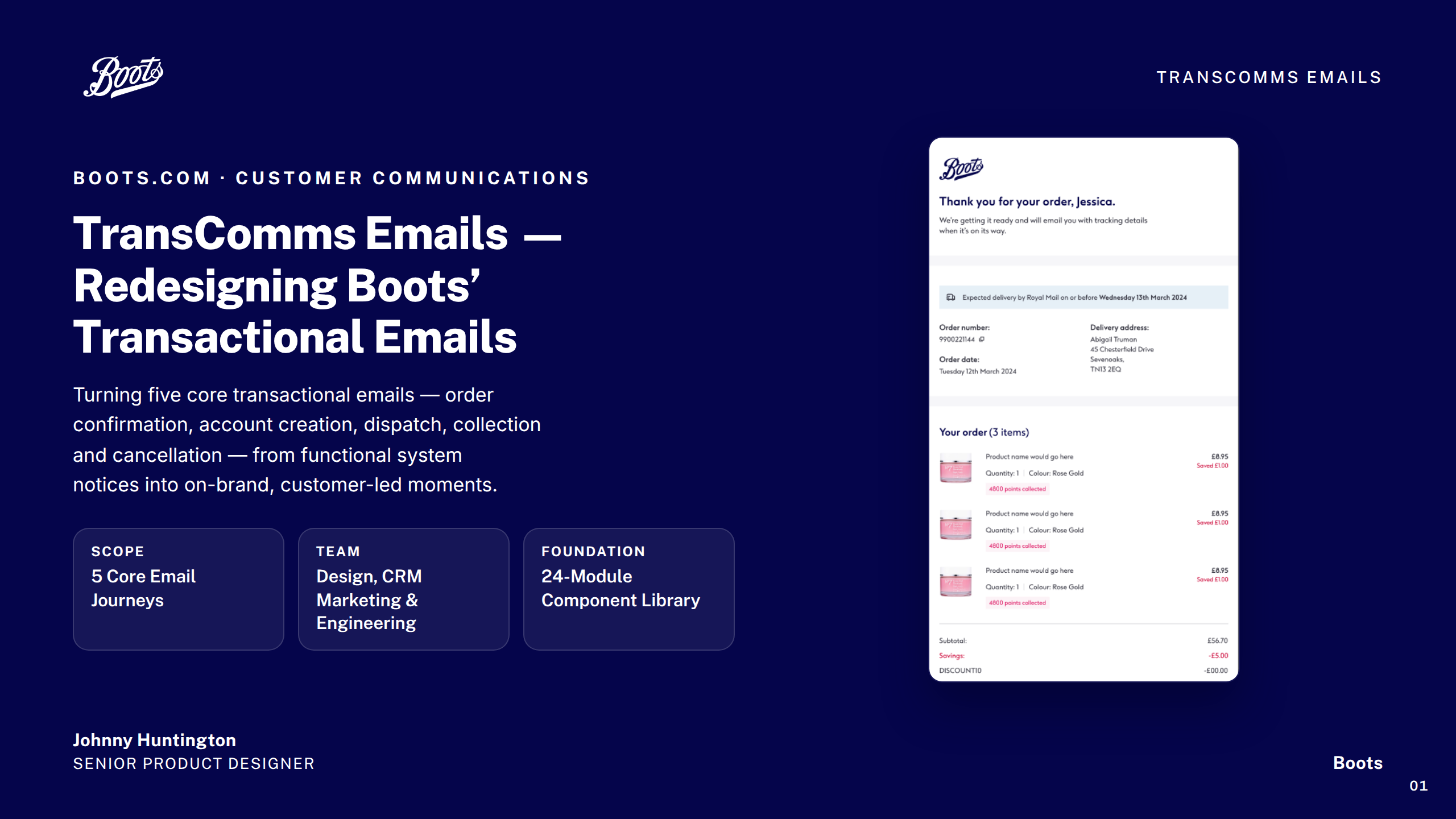
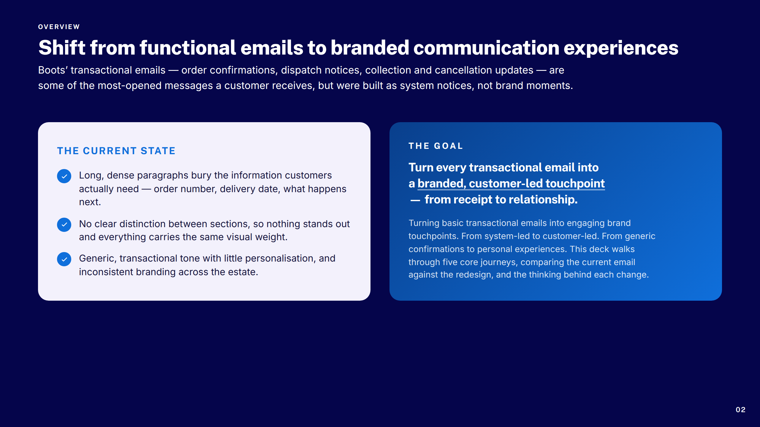
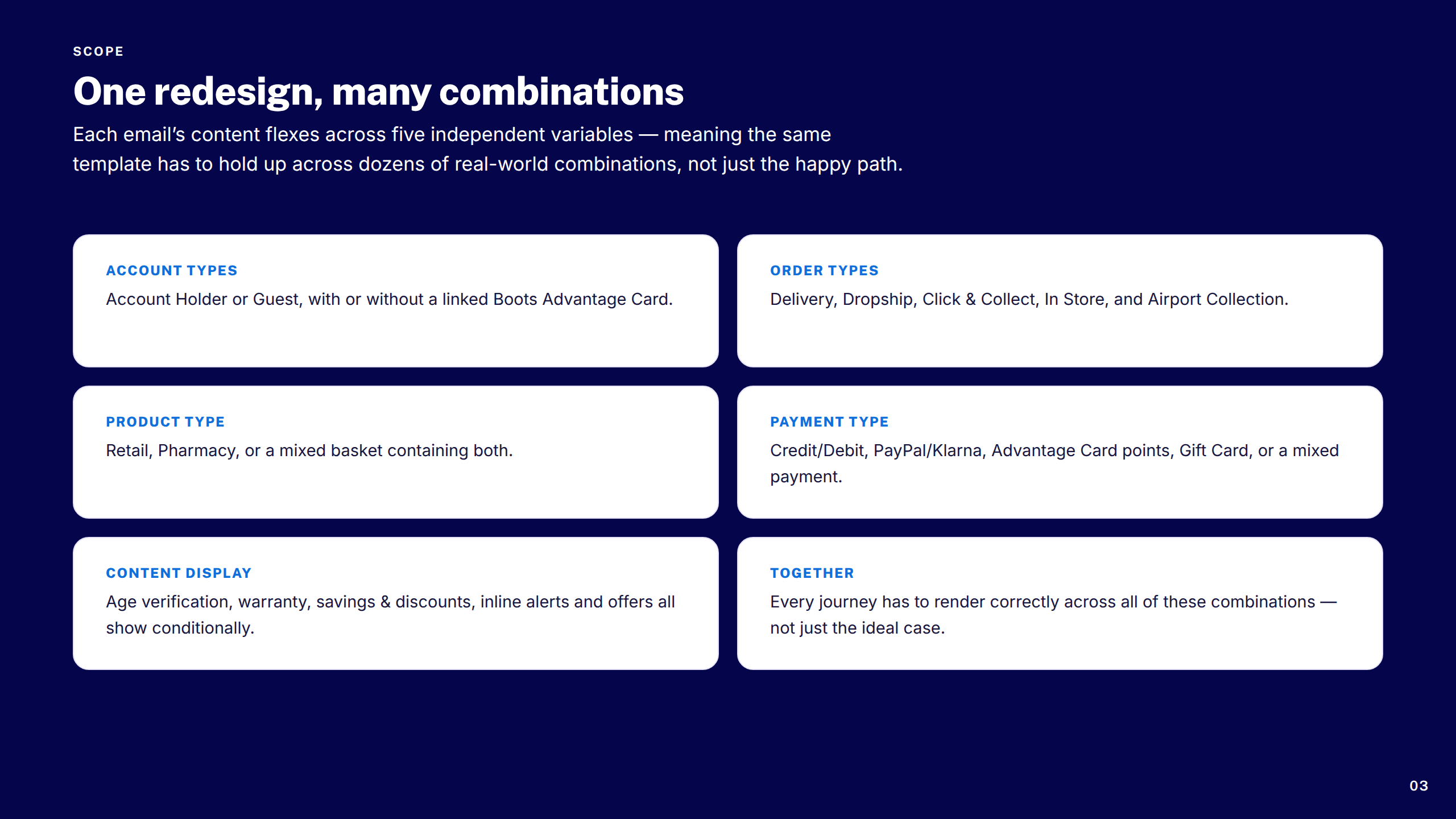
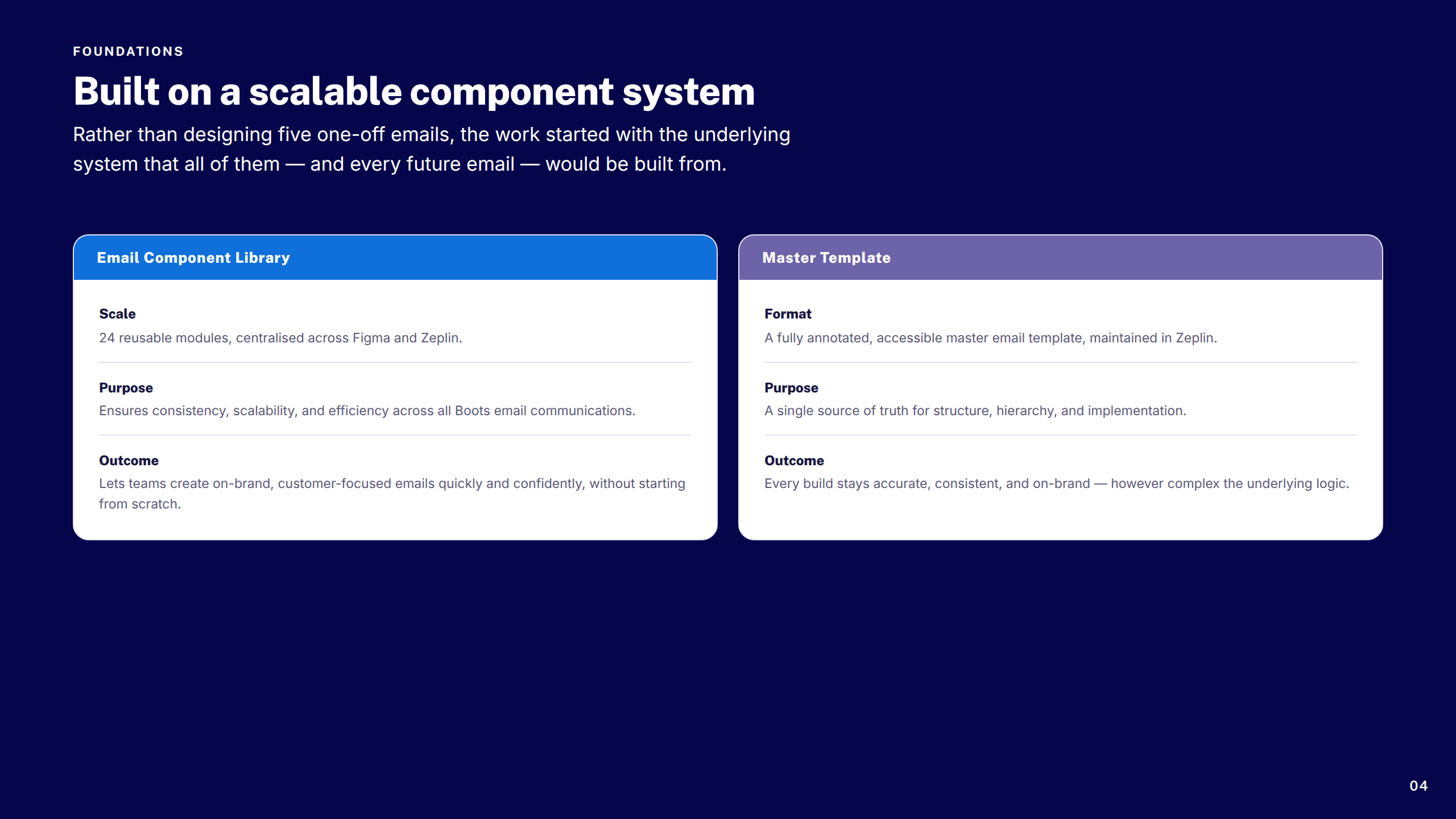
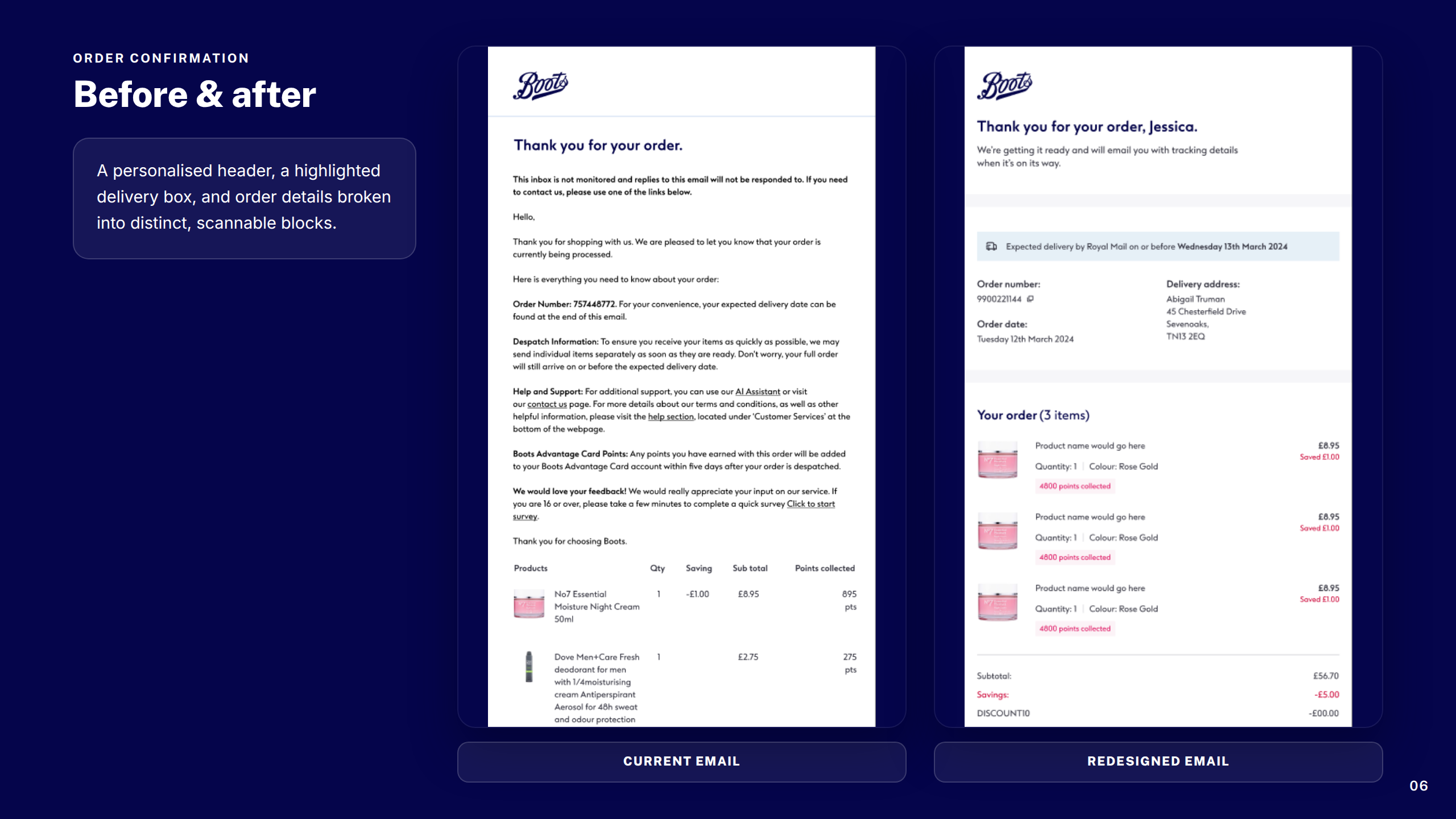
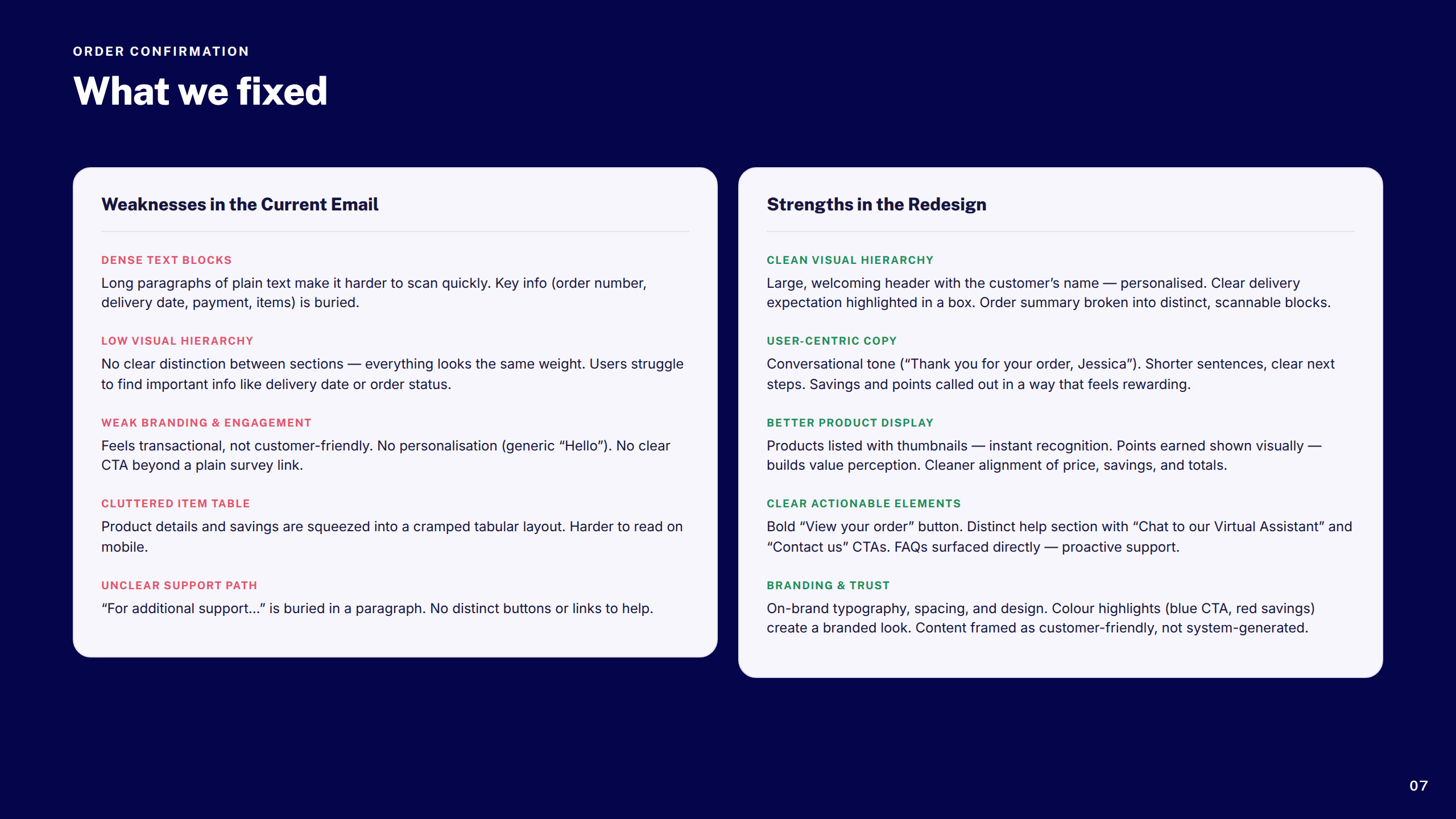
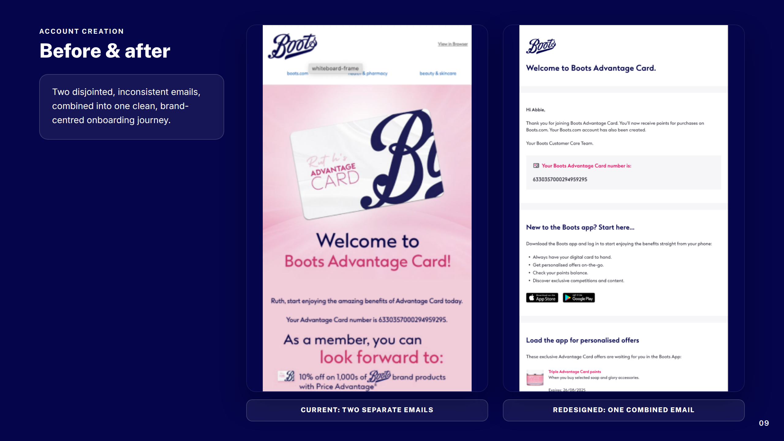
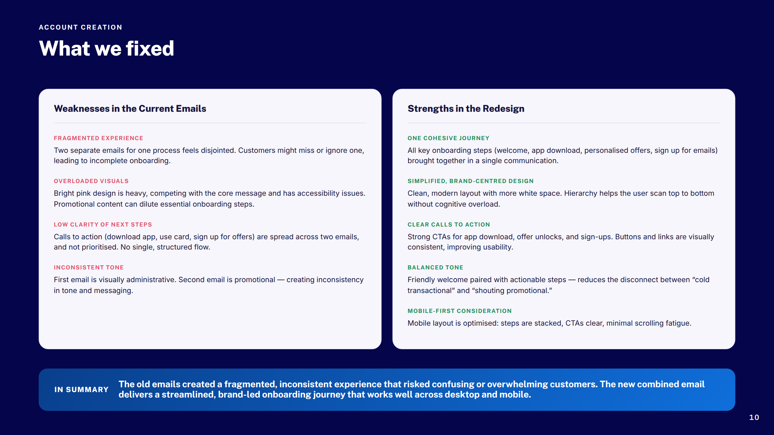
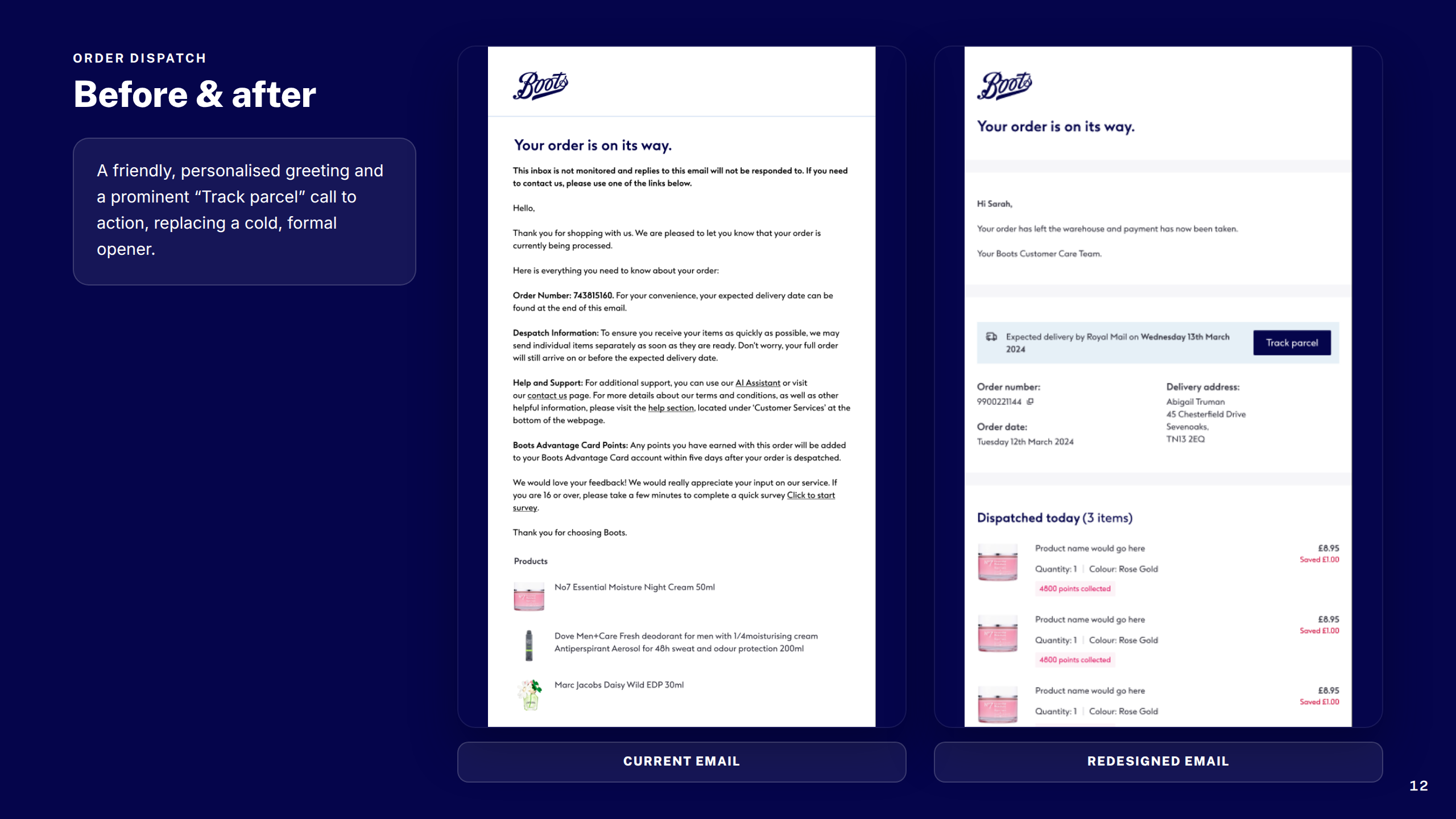
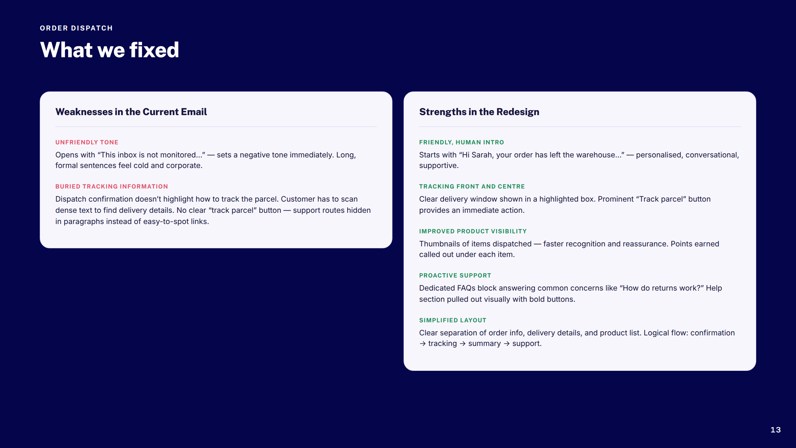
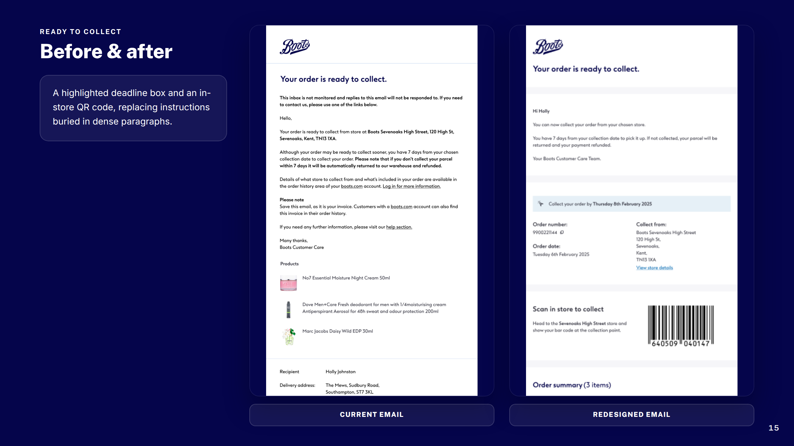
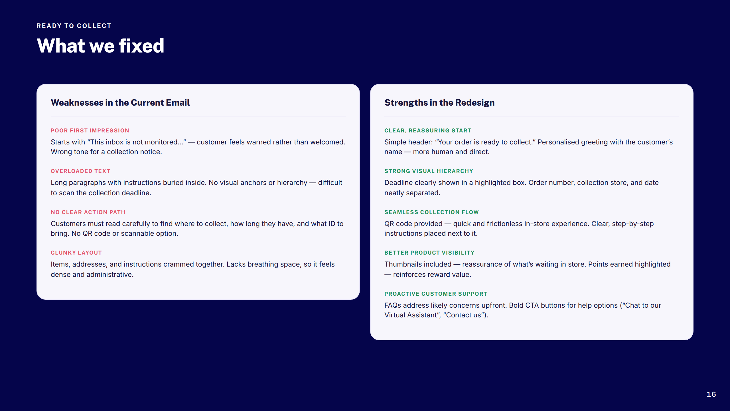
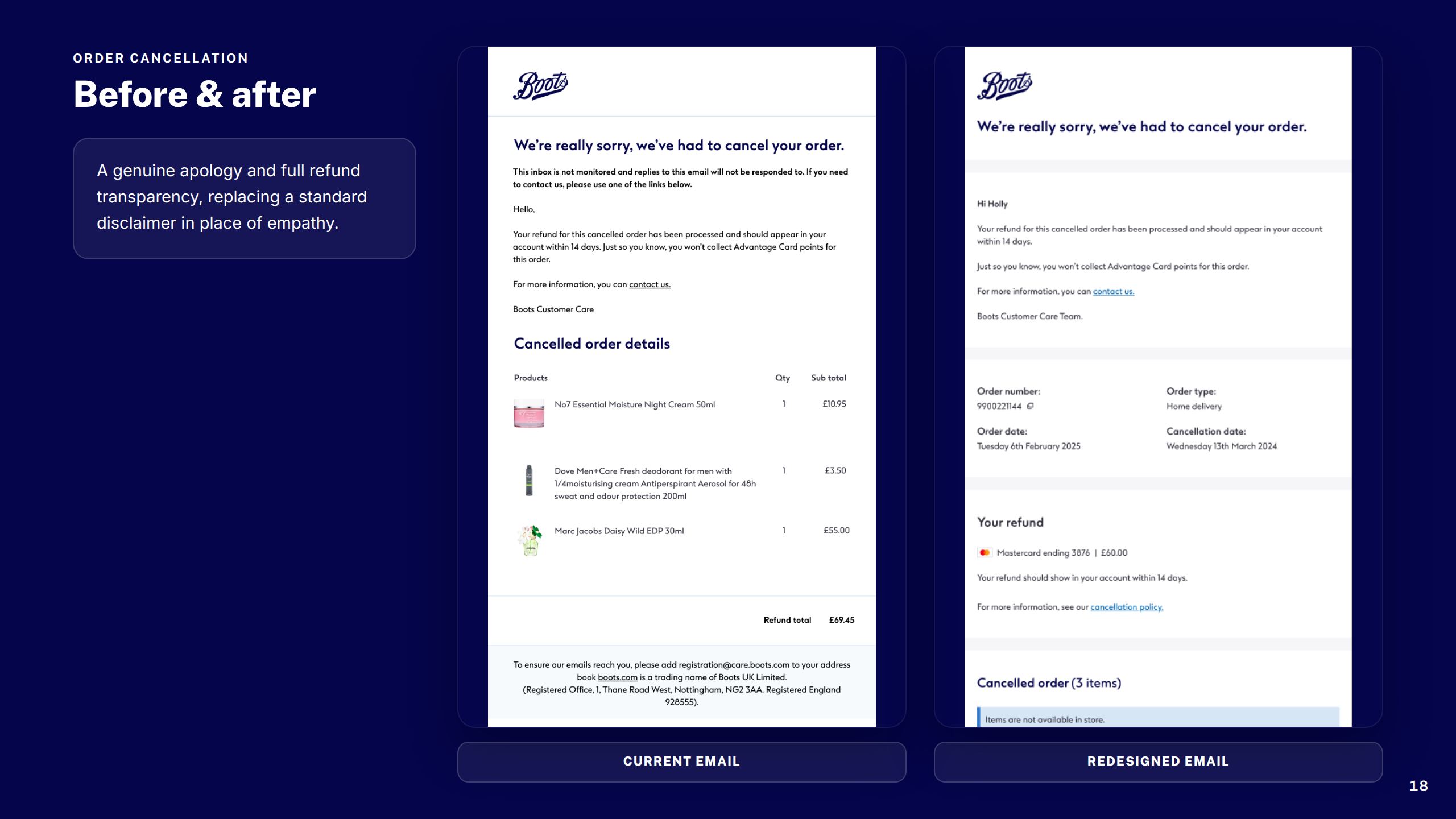
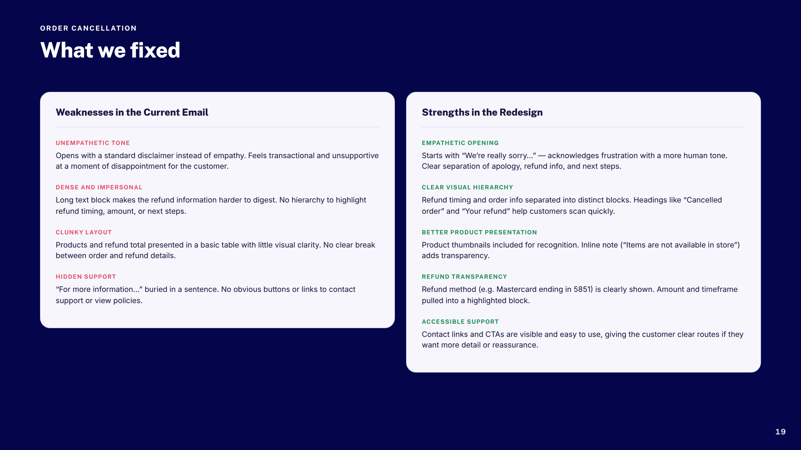
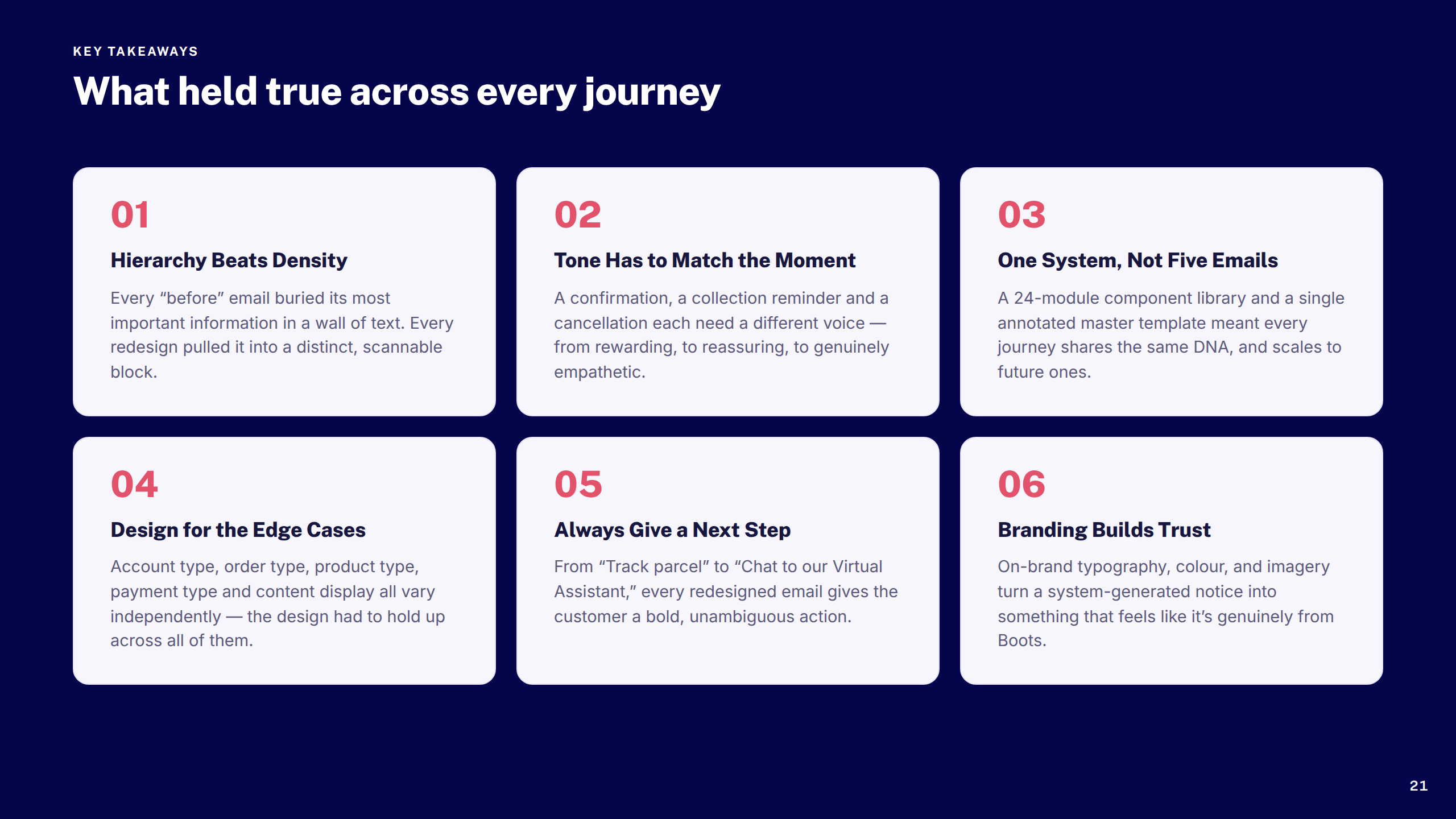
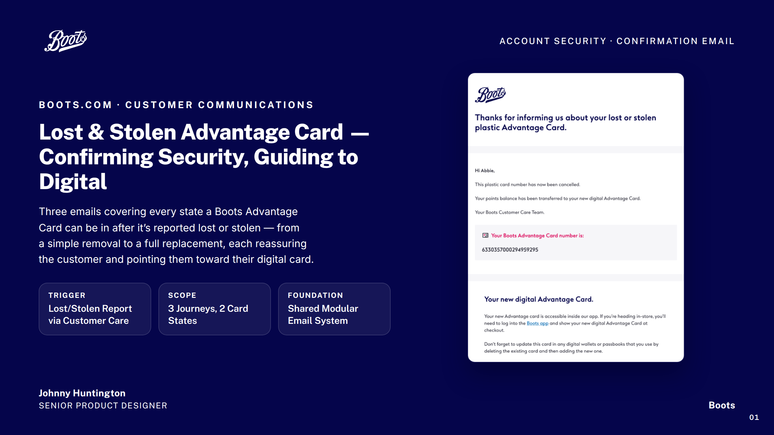
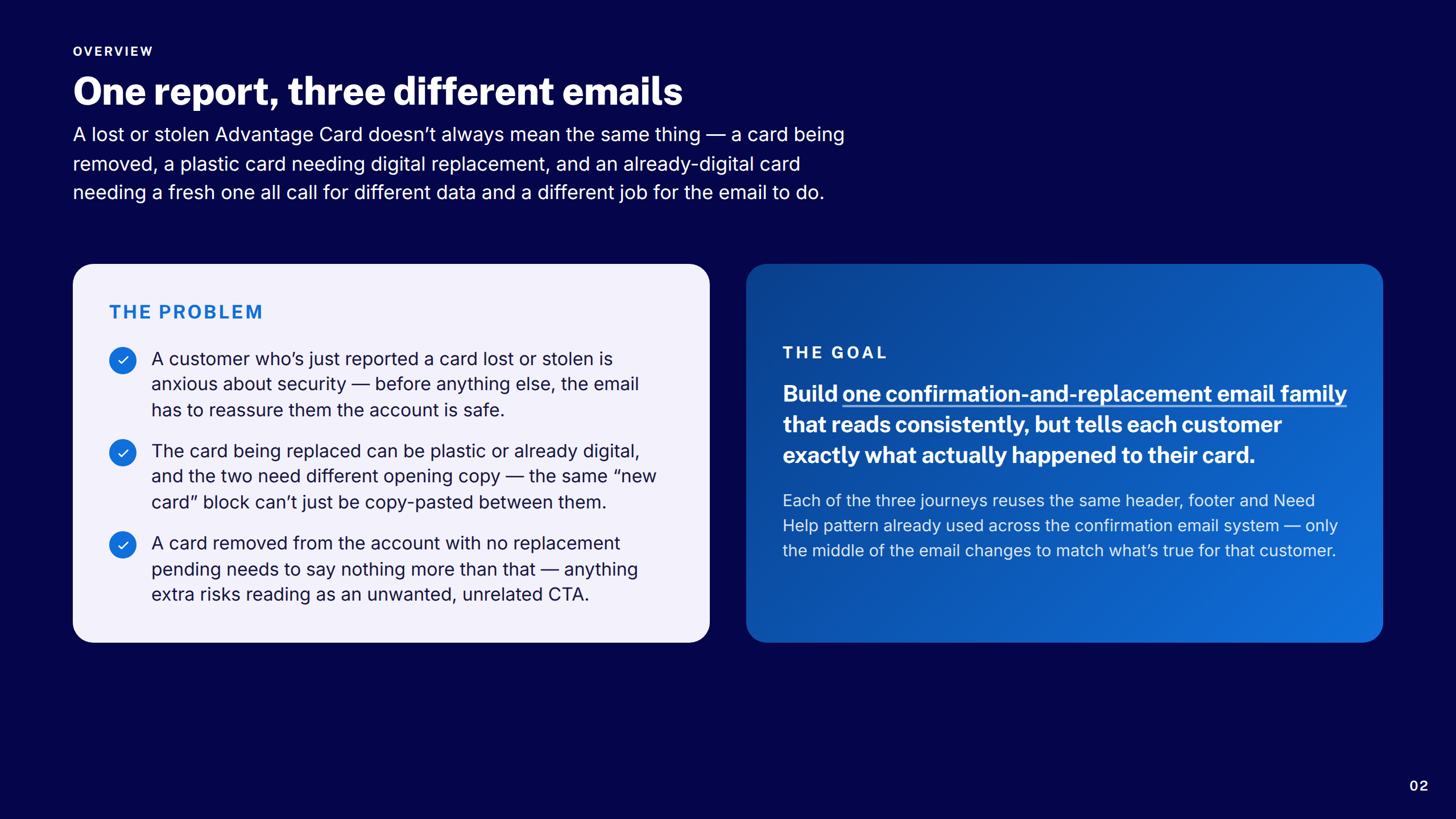
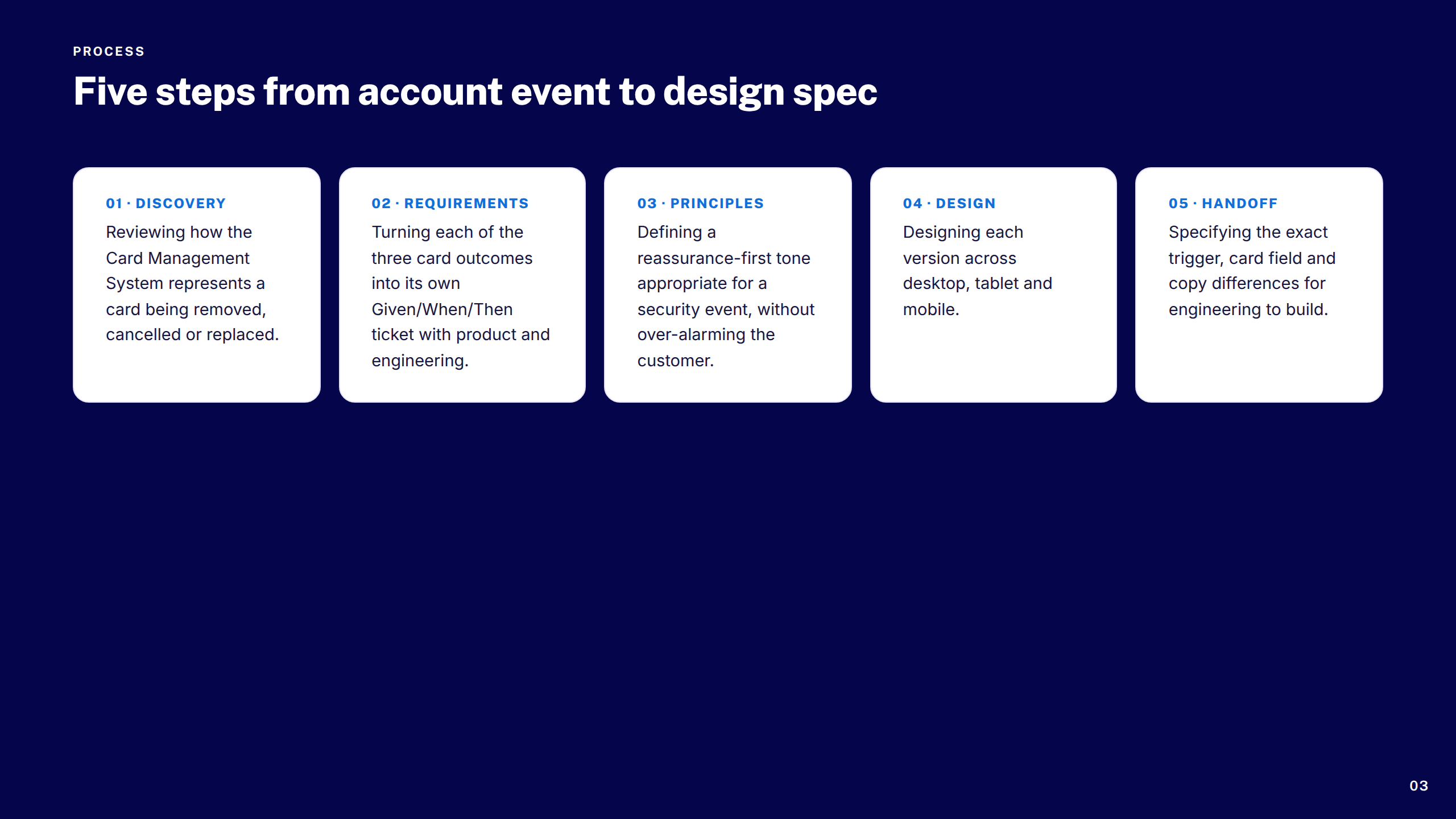
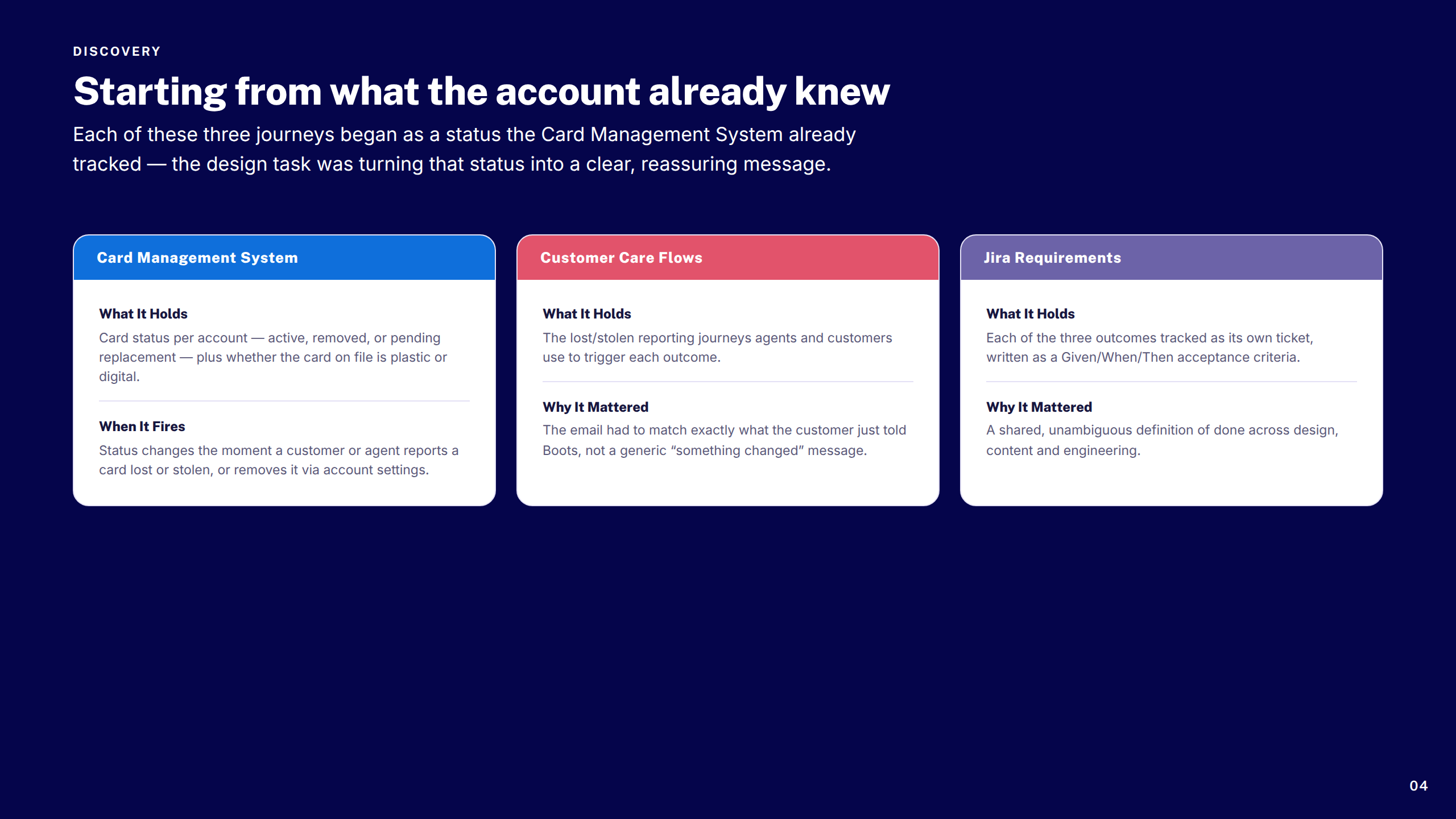
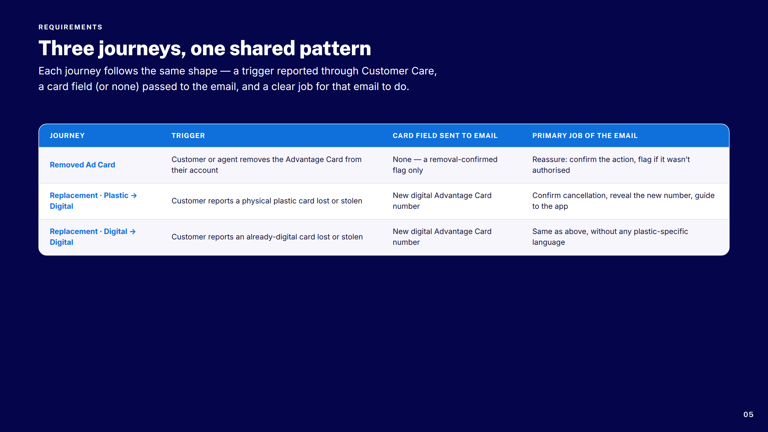
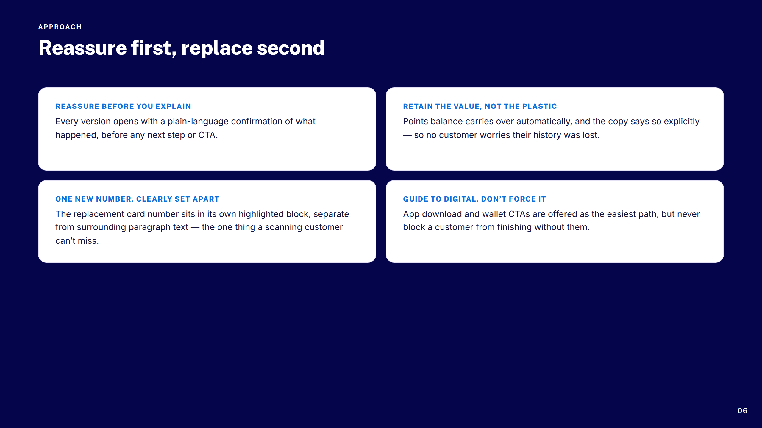
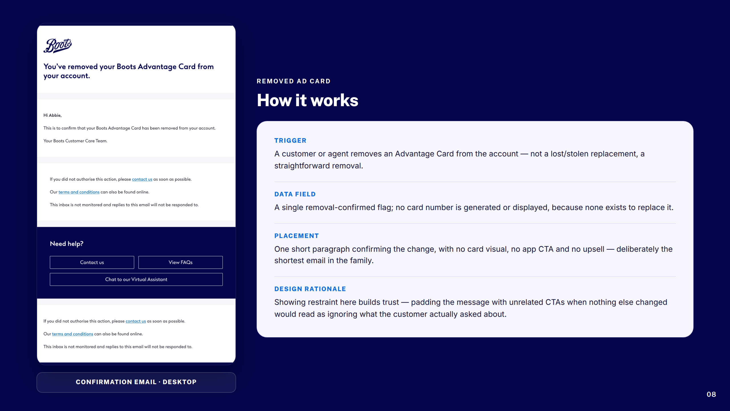
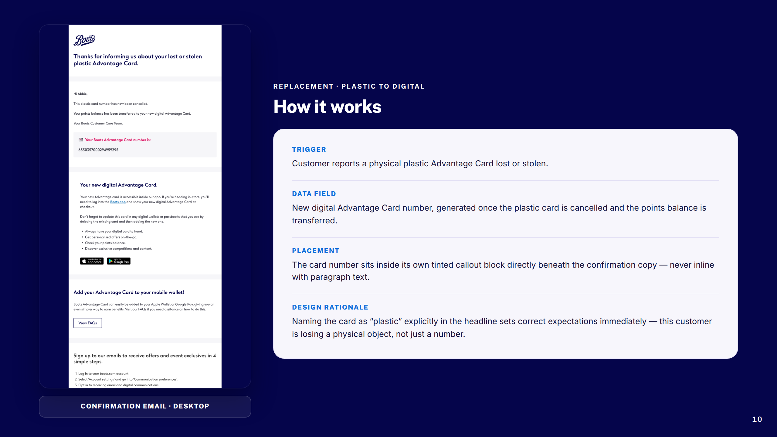
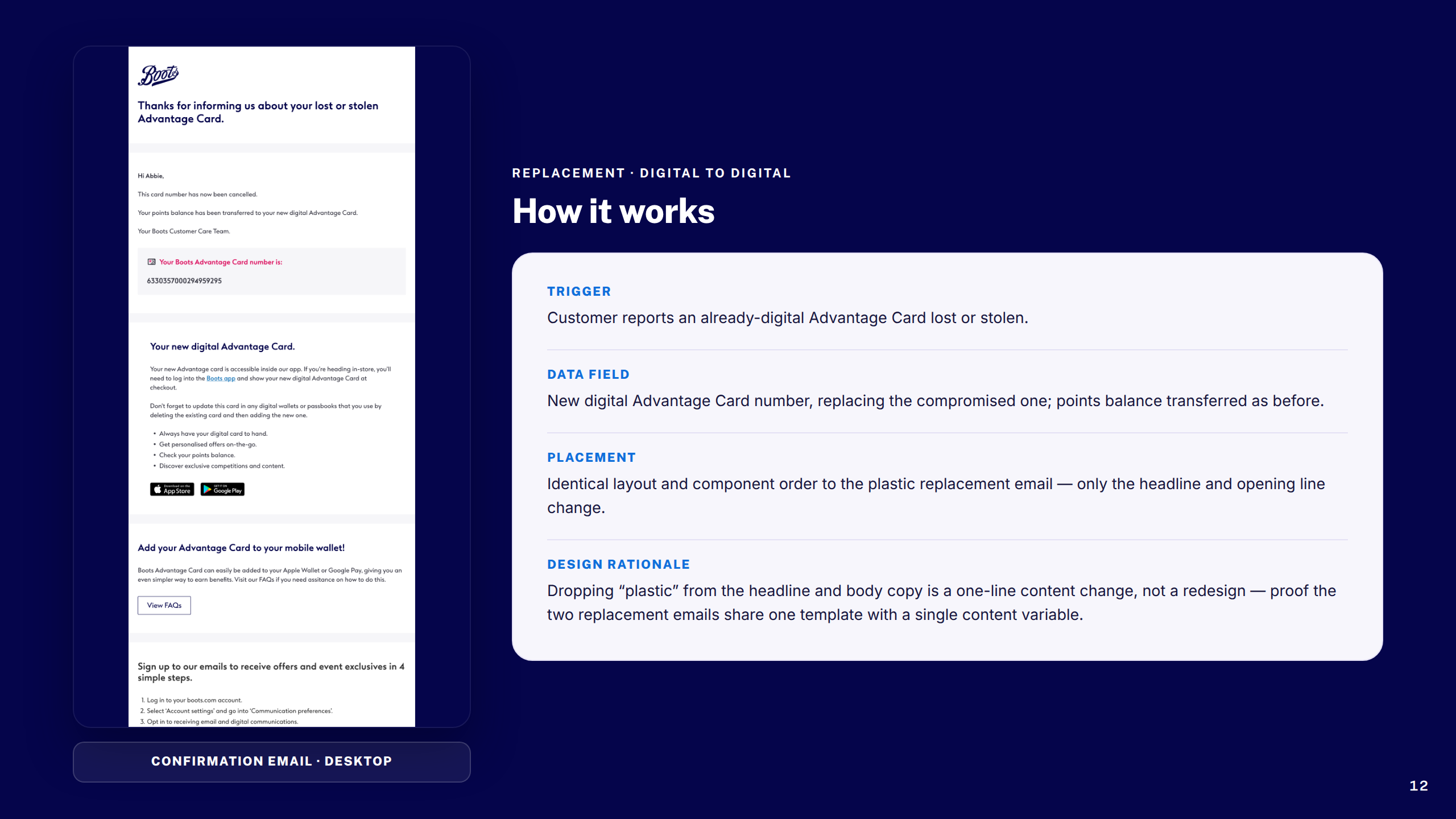
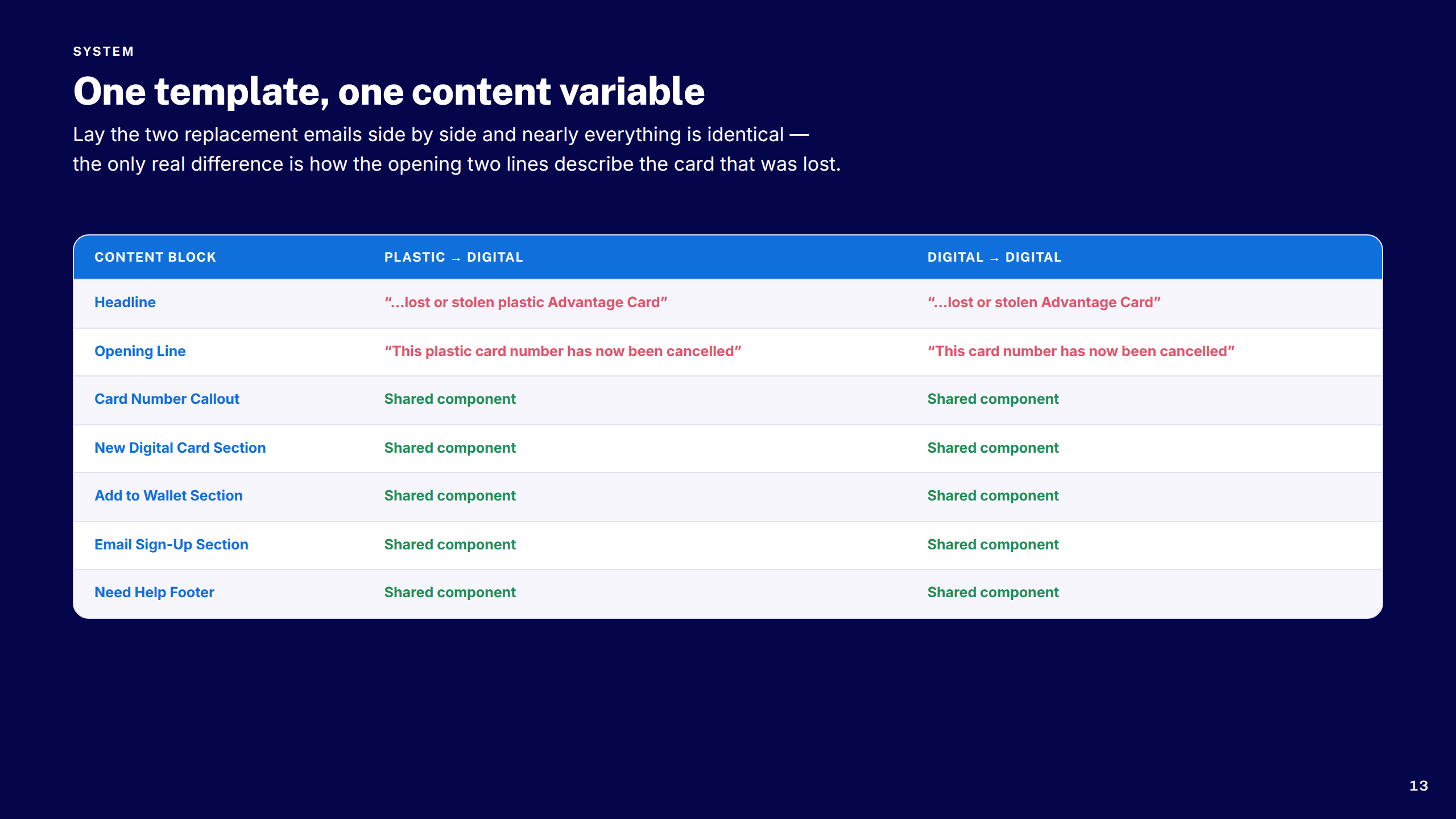
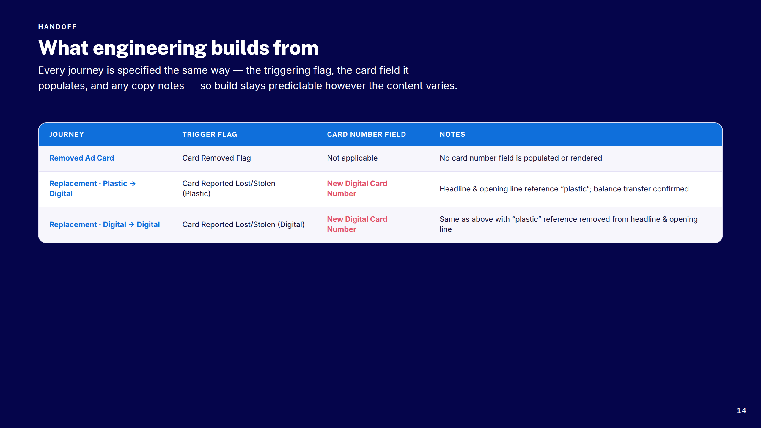
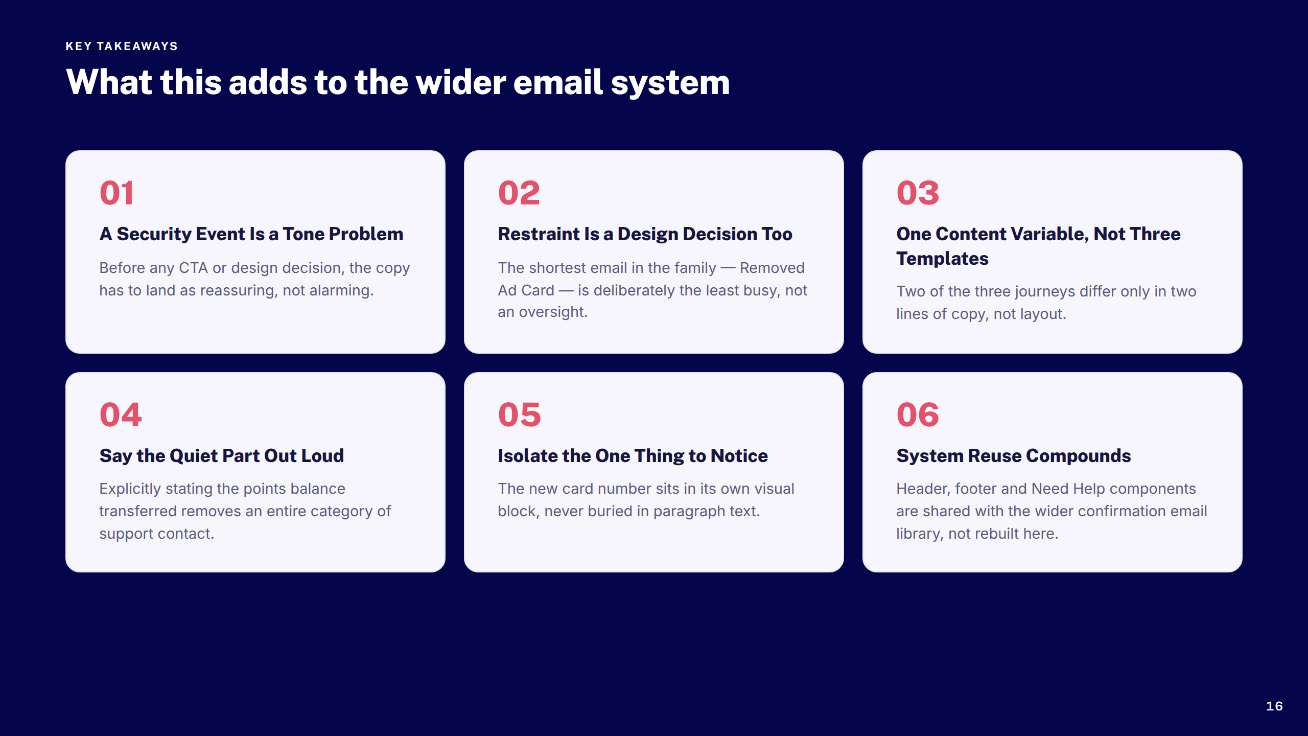
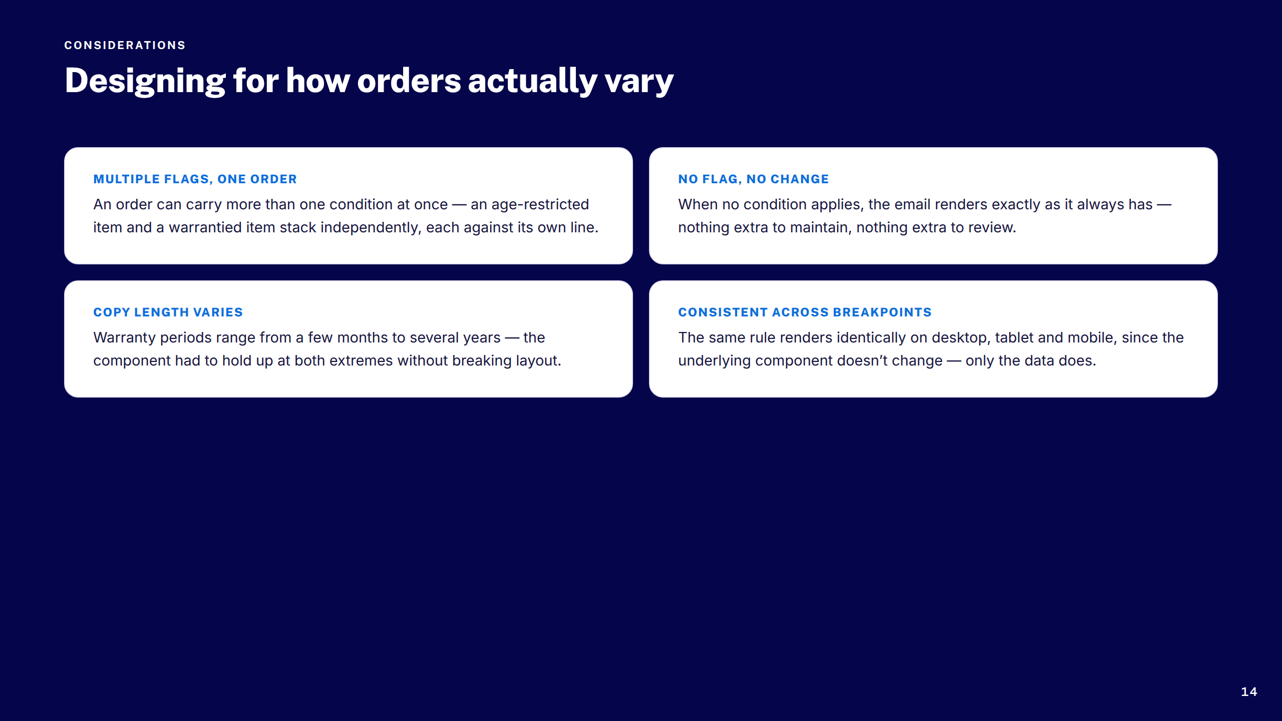
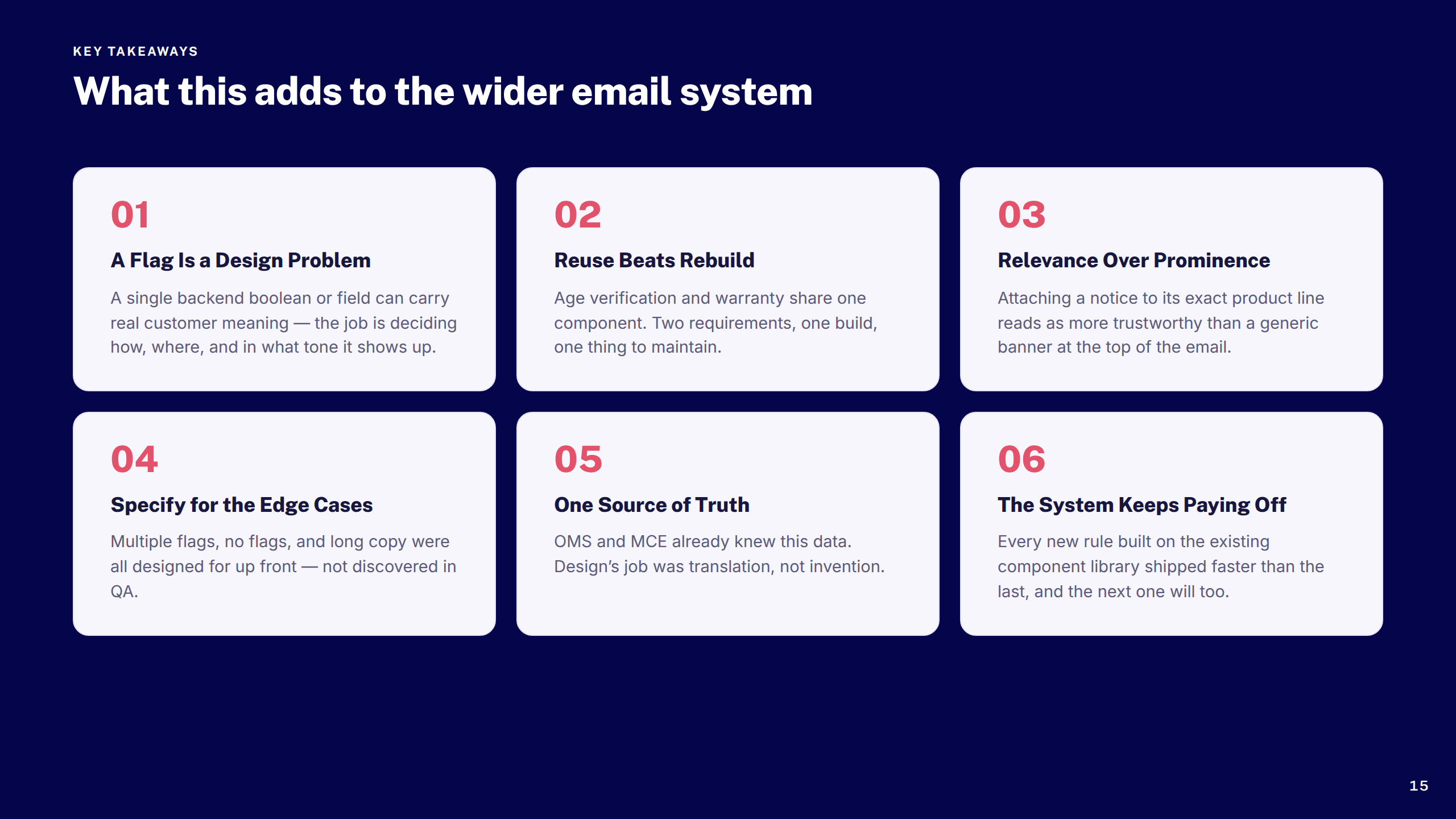
Audited and redesigned Boots's suite of transactional emails — order confirmation, dispatch, ready-to-collect, and cancellation — bringing visual consistency, accessibility, and design system alignment across every touchpoint.
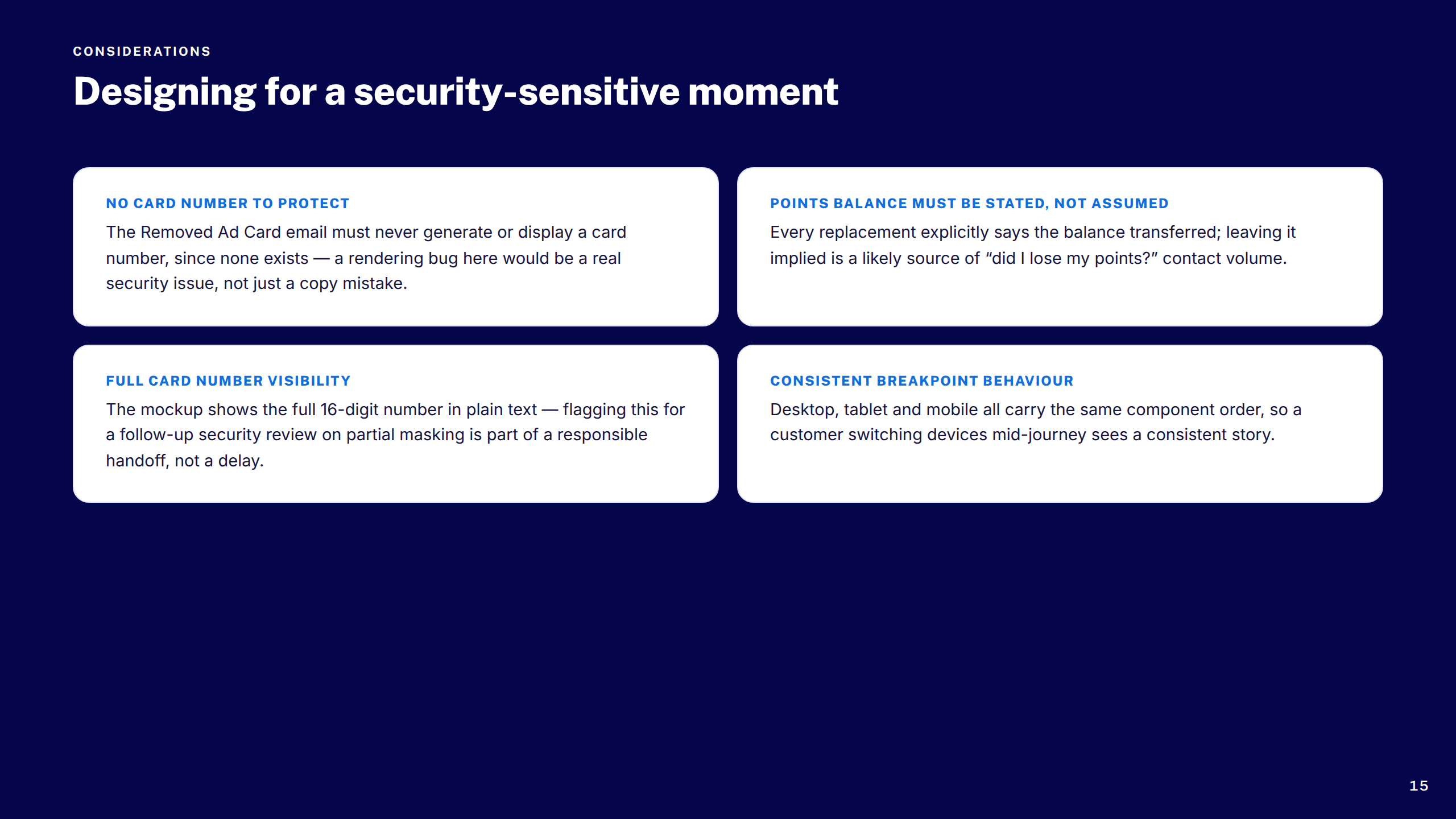
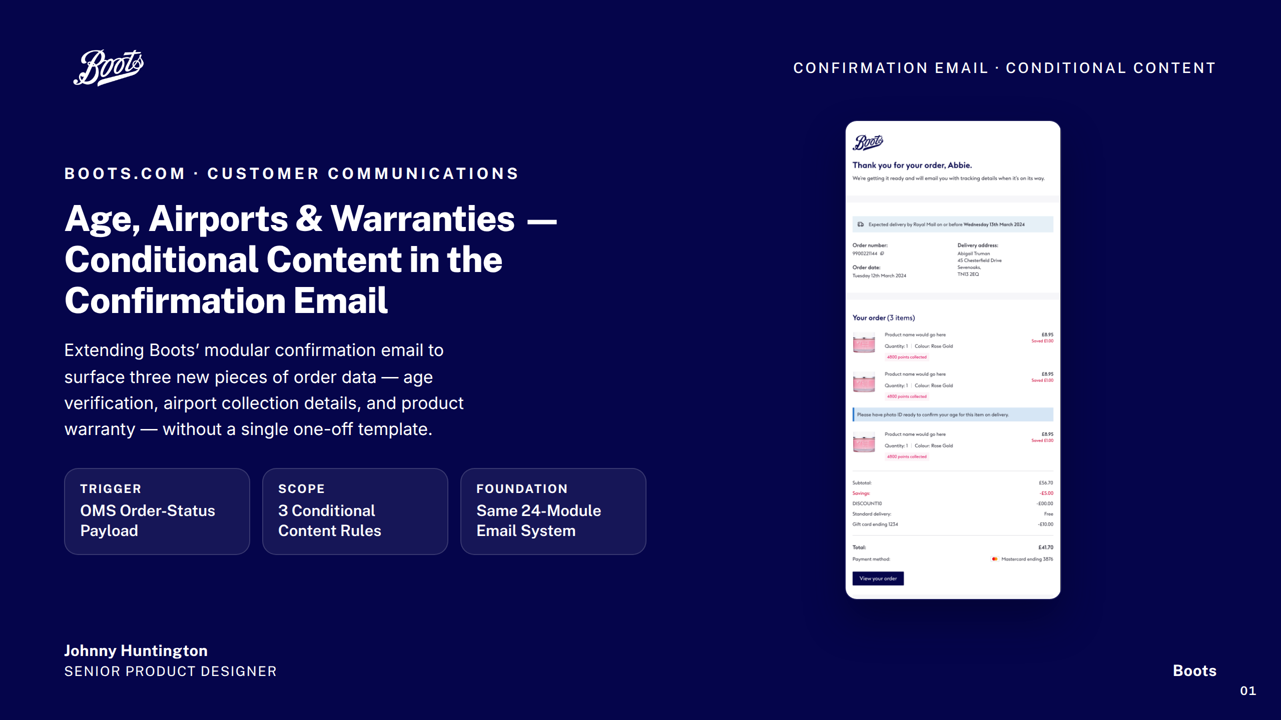
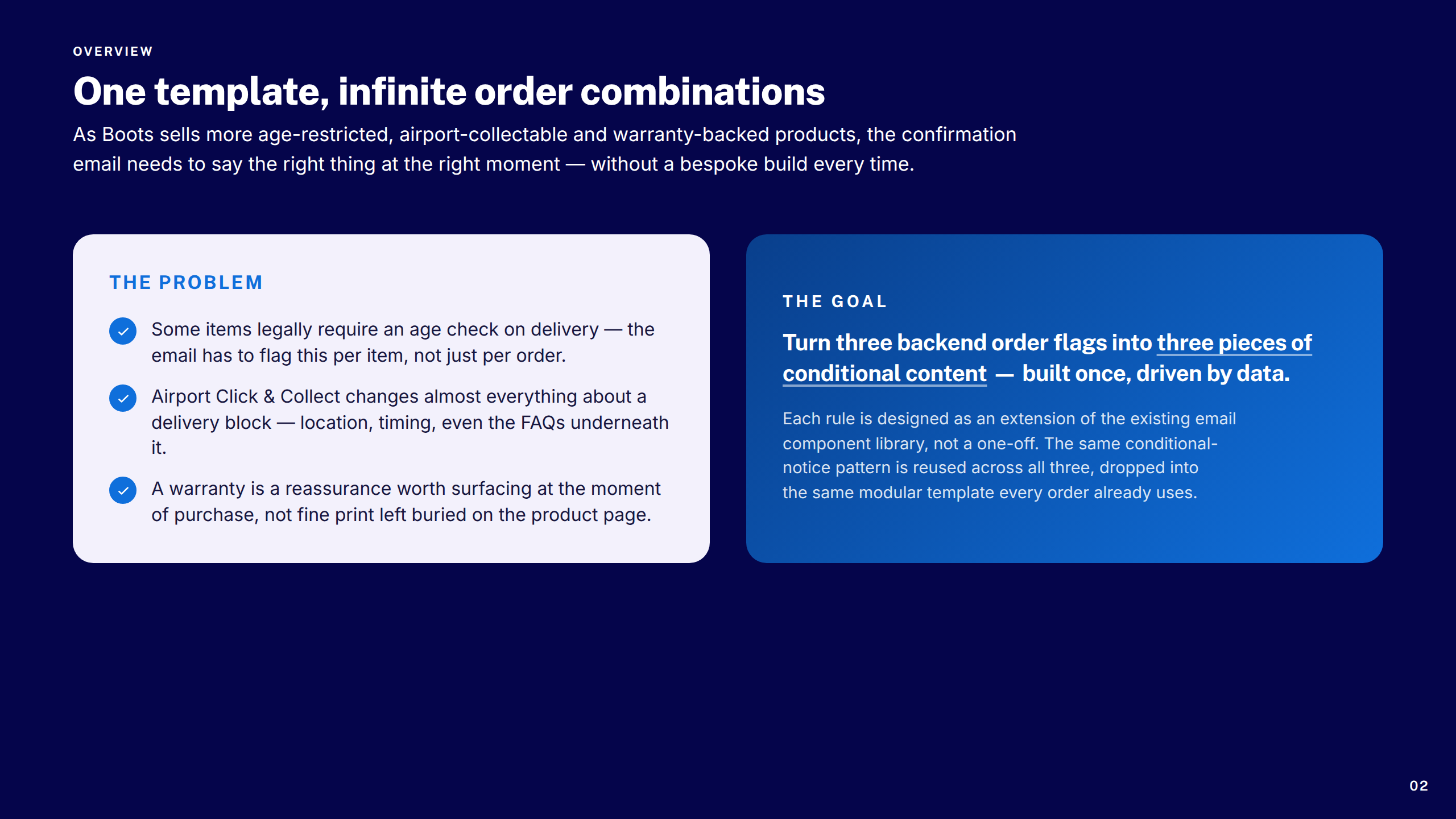
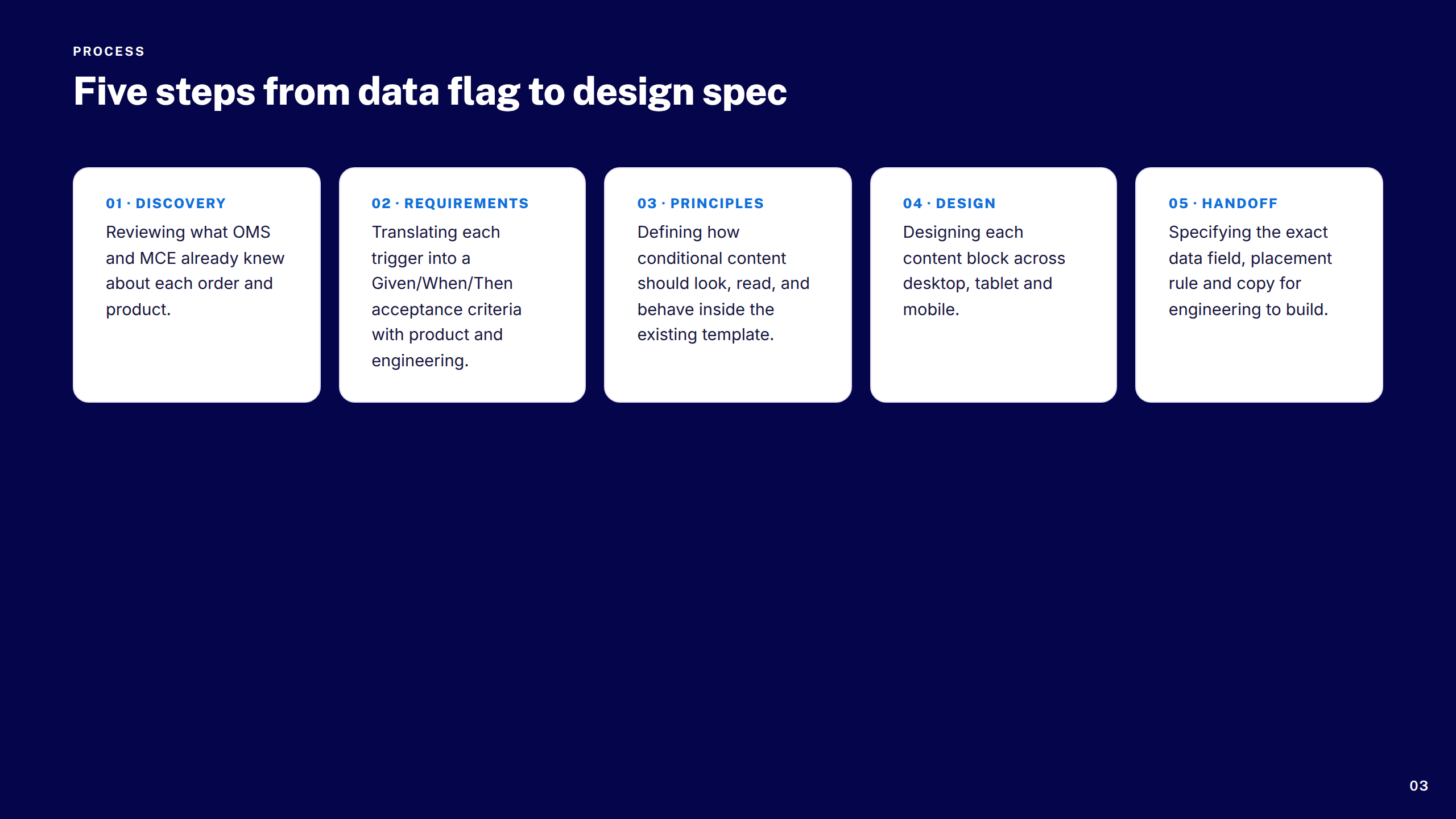
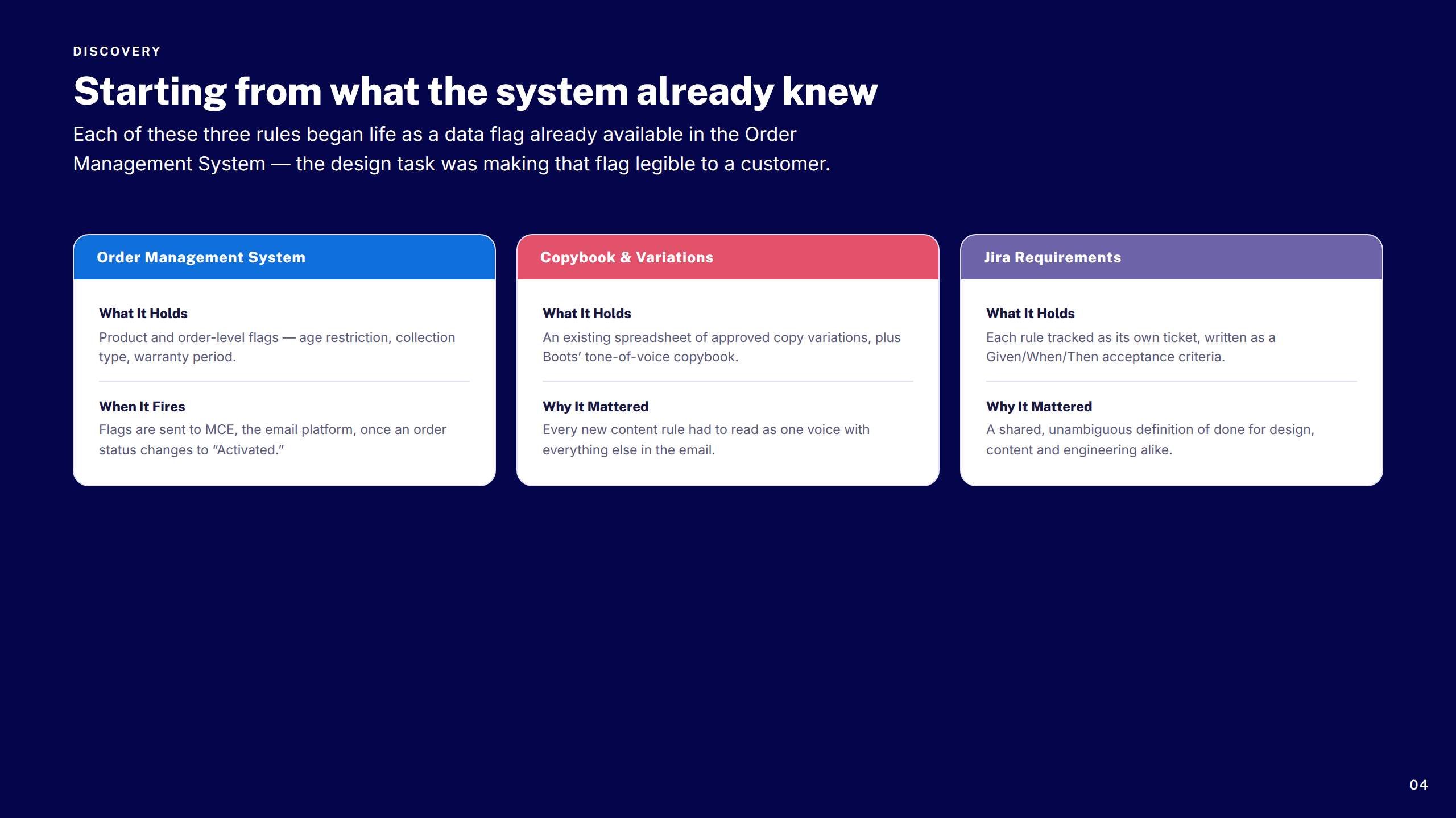
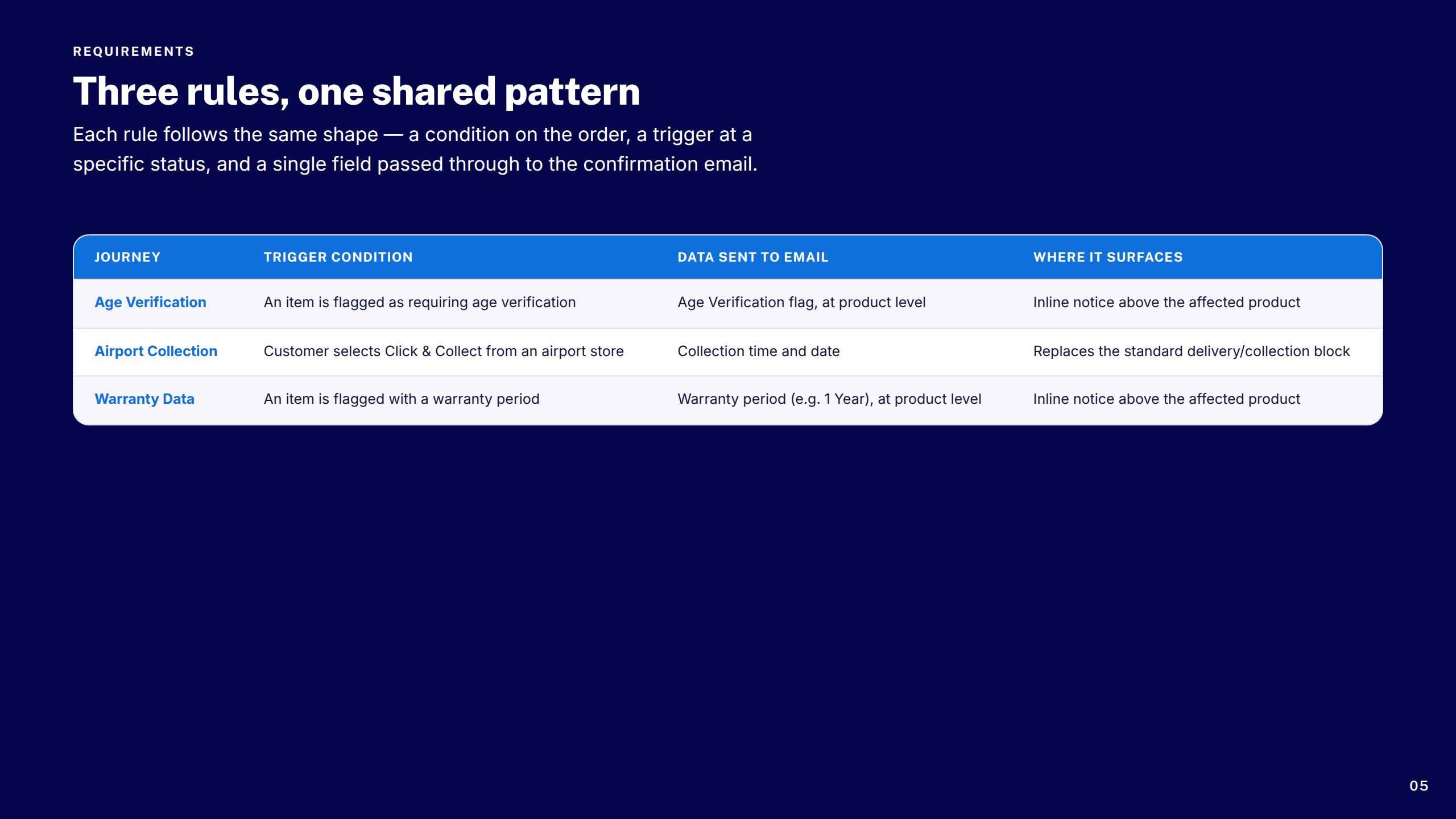
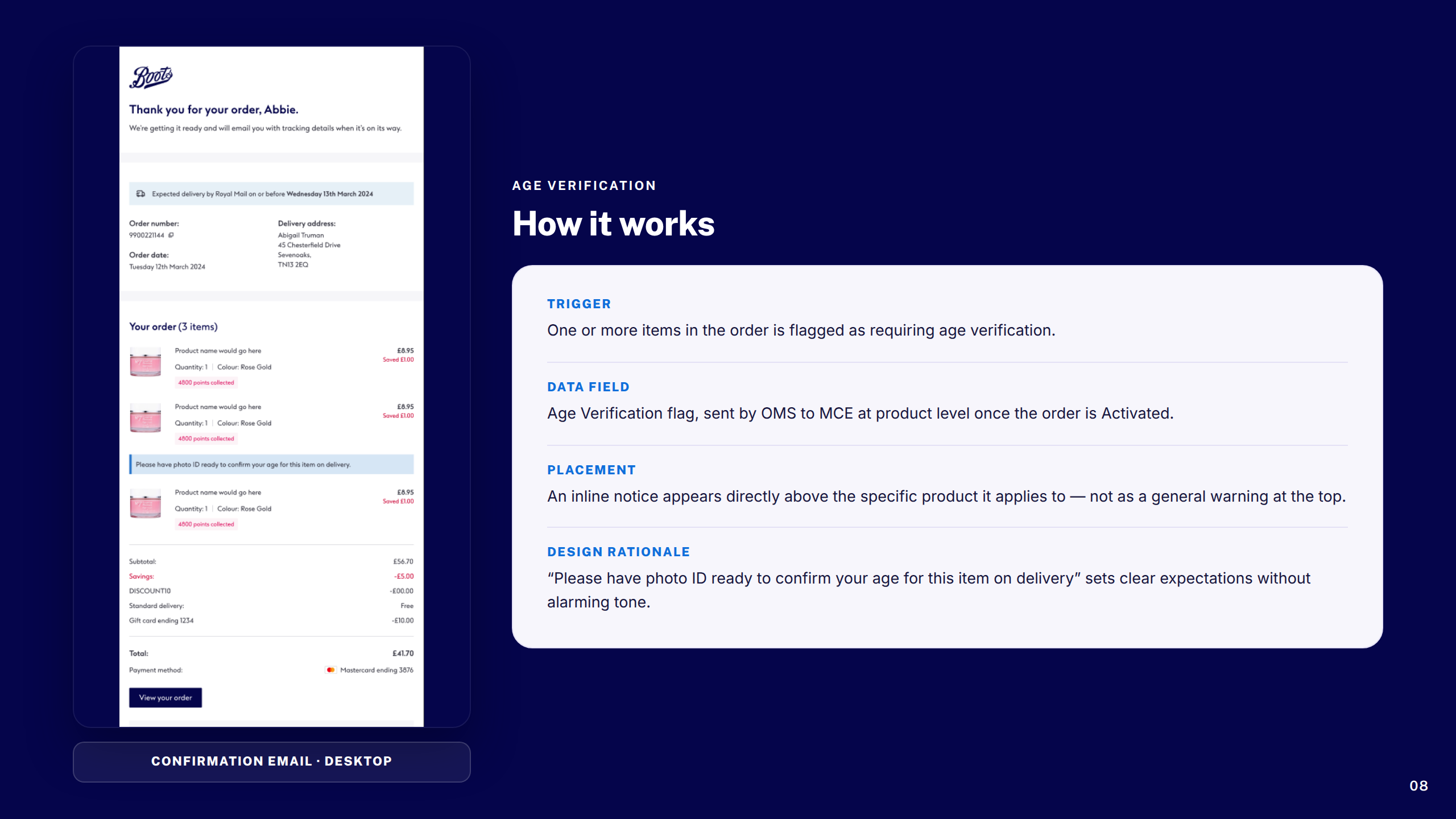
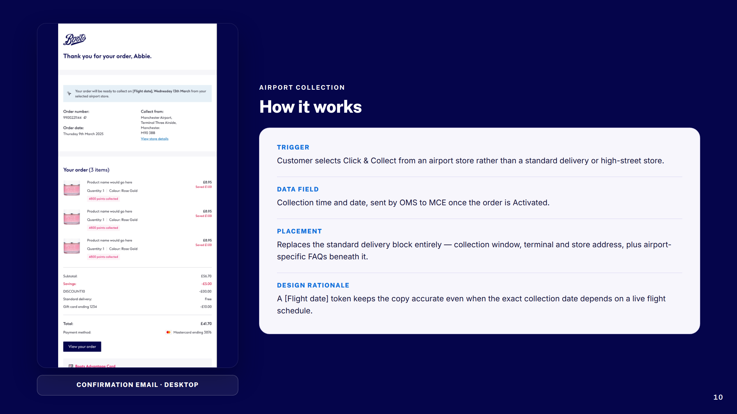
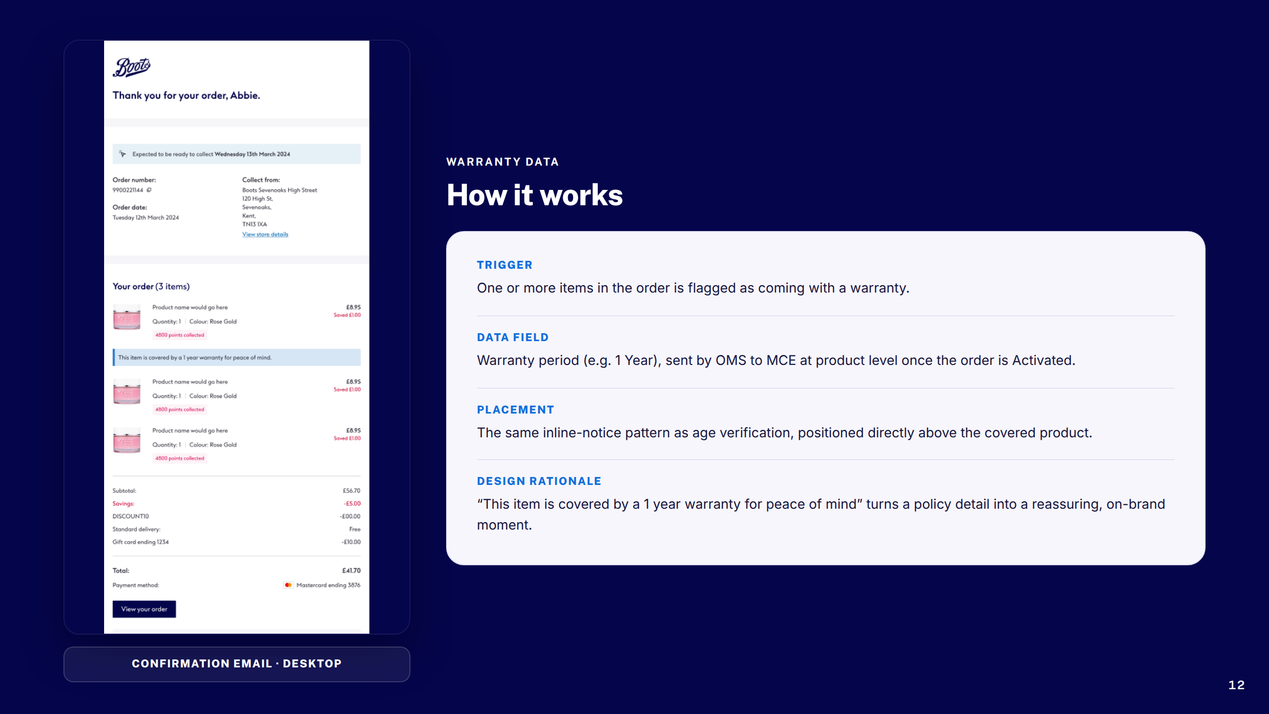
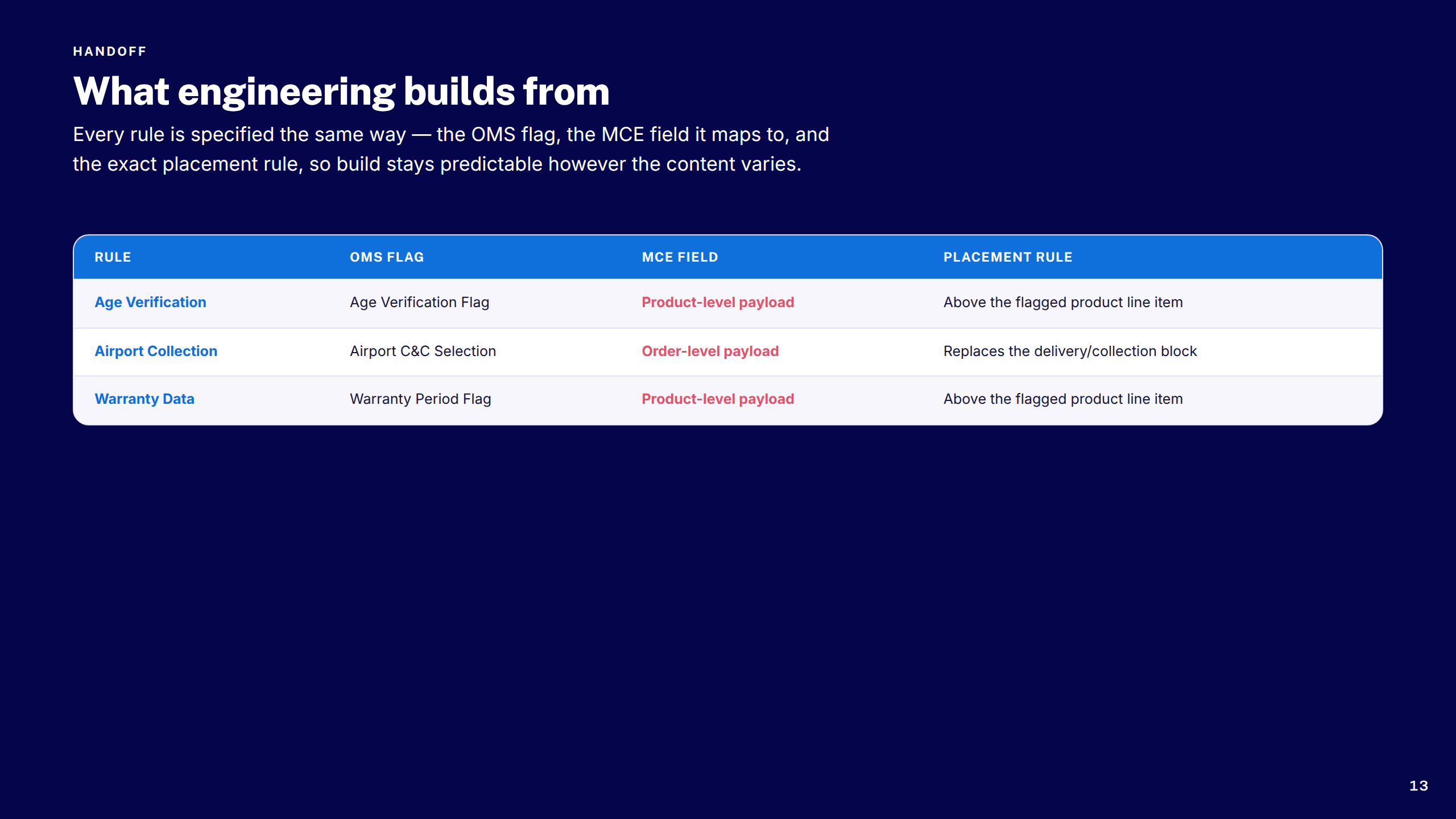
Three compliance-led feature streams — age verification at point of purchase, airport click-and-collect logic, and warranty data capture — each requiring close collaboration with engineering, legal, and operations teams.
Tools & process
Analytics deep-dive, heuristic review, competitor analysis, customer journey mapping
Problem framing, friction mapping, success metrics, accessibility requirements
Mobile-first wireframes, component design, high-fidelity prototypes, design system contributions
Usability testing, analytics review, accessibility audit, iteration
Dev handoff, QA support, design system documentation, post-launch review
A set of focused improvements across search, navigation, and guided product discovery.
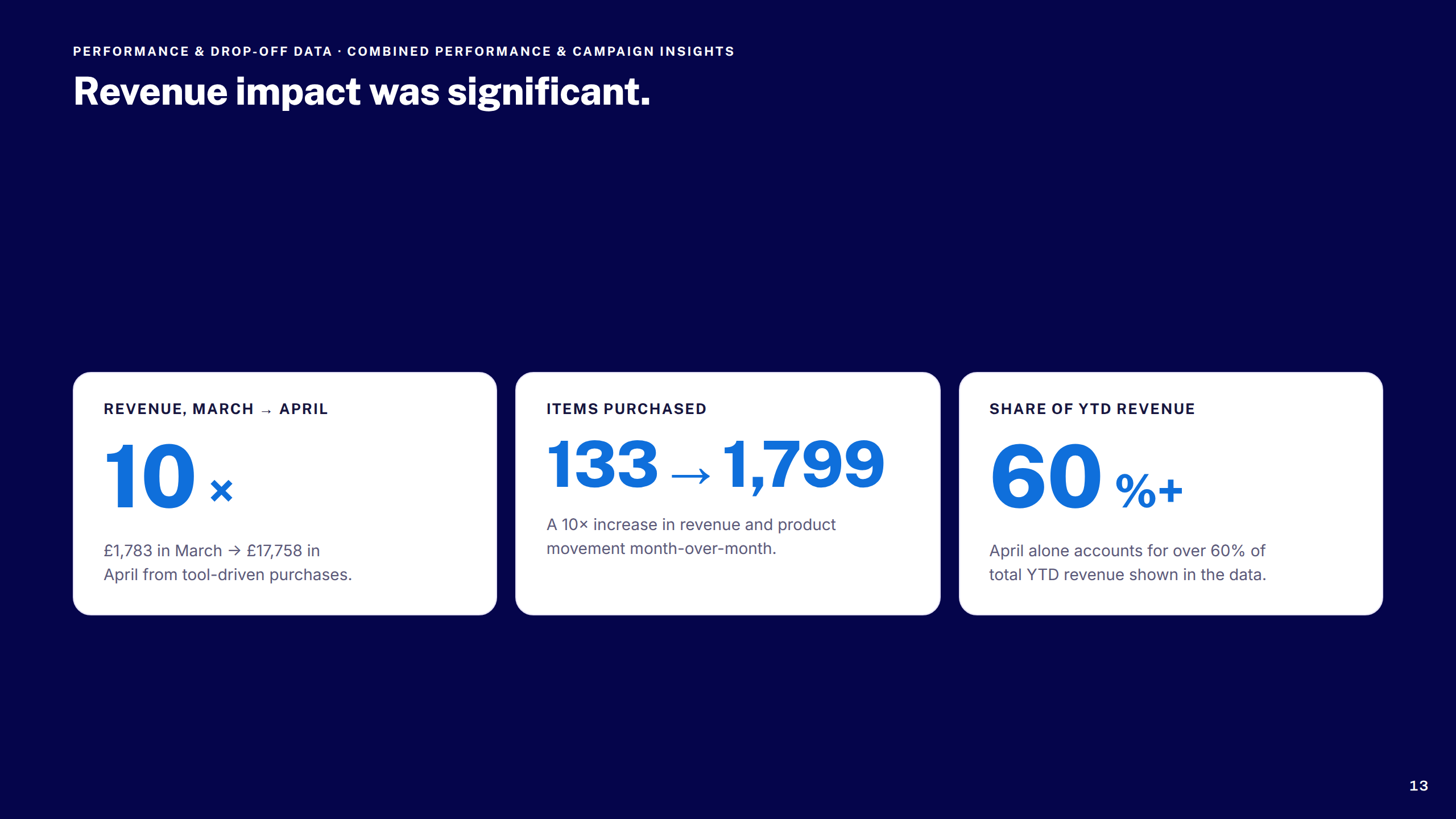
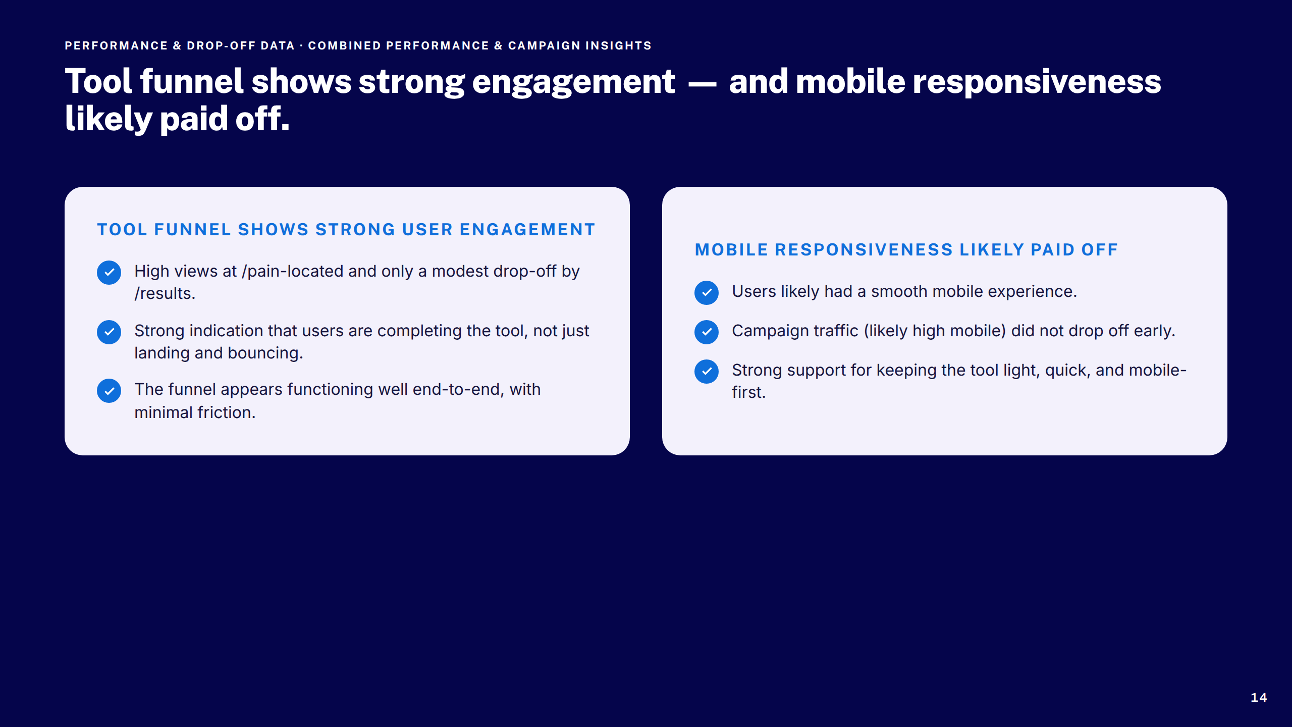
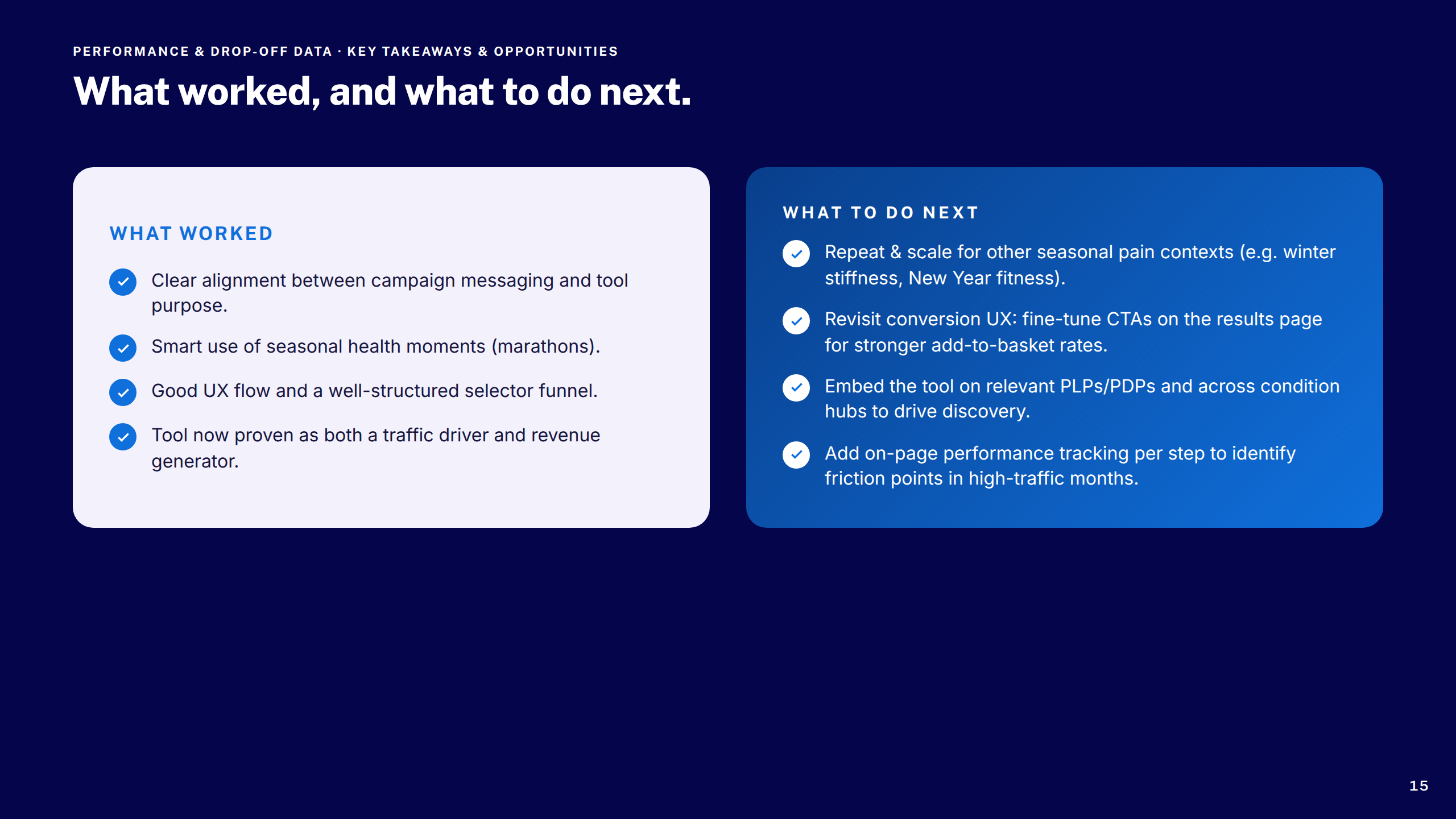
Six workstreams across discovery, navigation, search, checkout, communications, and compliance: a Pain Selector Tool to guide customers from symptom to product, a No Results page that rescued dead-end searches, a Global Header upgrade that clarified navigation and branding, an OOBO checkout flow for Customer Service agents, a full transactional email redesign, and three compliance-driven features covering age verification, airport collection, and warranty data capture.
Each was designed mobile-first, validated through research, and built to contribute back to the Boots design system — raising the bar on accessibility and commercial performance across the platform.