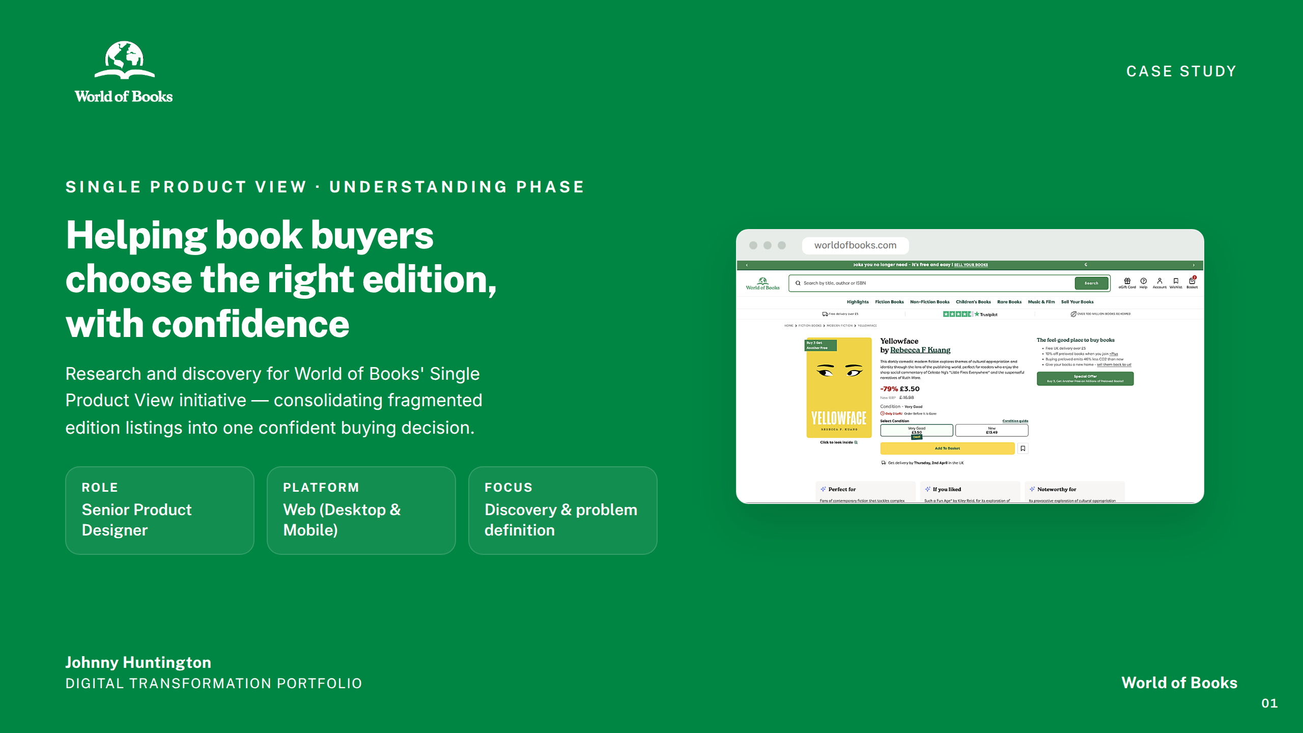
Case Study
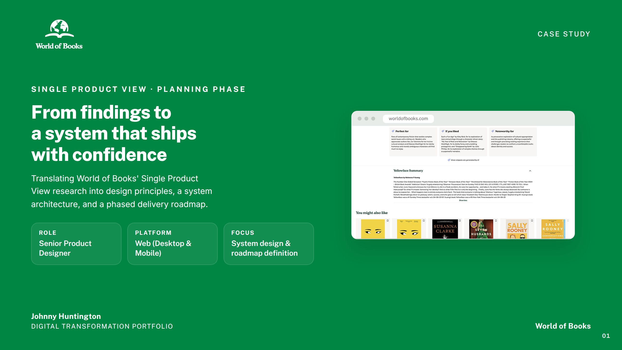
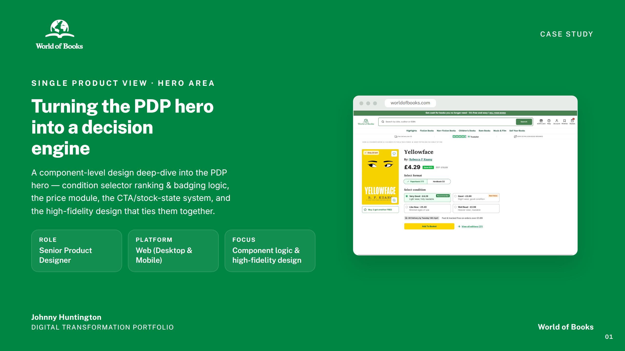
A nine-workstream design programme to redesign the Single Product View — from research and architecture through to component-level specifications across web and mobile.
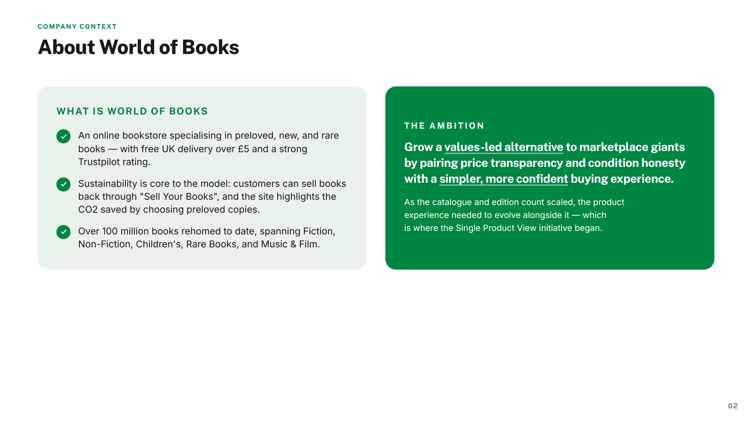
World of Books — known as Wob — is one of the UK's largest online retailers of secondhand books, founded in 2002 after its founders rescued a bag of books from a charity shop bin bound for landfill. That instinct to give books a second life became a business model: Wob buys pre-loved books back from customers and purchases bulk excess stock from charities, then resells them at affordable prices. The result is a circular economy that keeps millions of books out of landfill every year.
Operating across the UK and internationally, Wob lists millions of titles and processes thousands of orders daily. The platform spans web and mobile, serving a wide audience from casual bargain hunters to dedicated collectors.
A certified B Corp since 2019 and officially carbon neutral, Wob holds two Queen's Awards for Enterprise — for Sustainable Development and International Trade. Sustainability isn't a marketing line; it's embedded in every part of the operation.
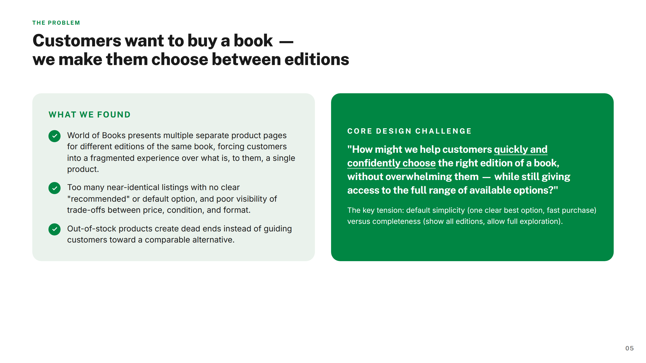
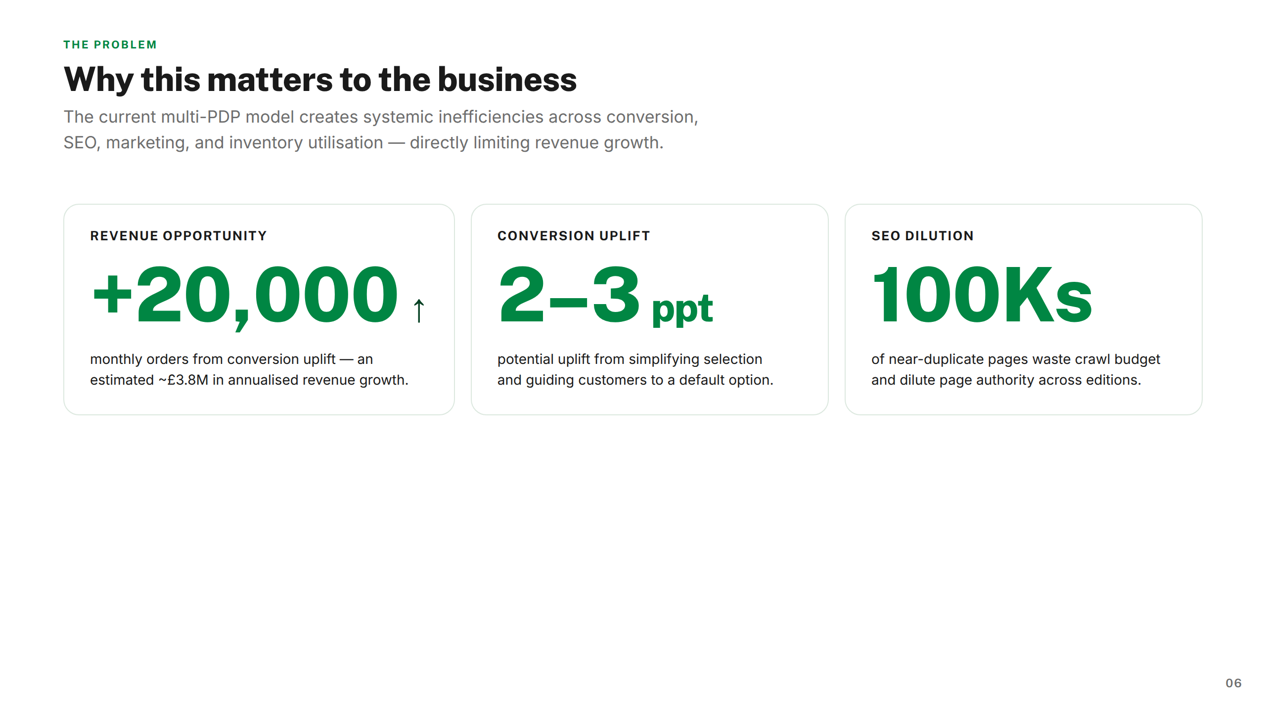
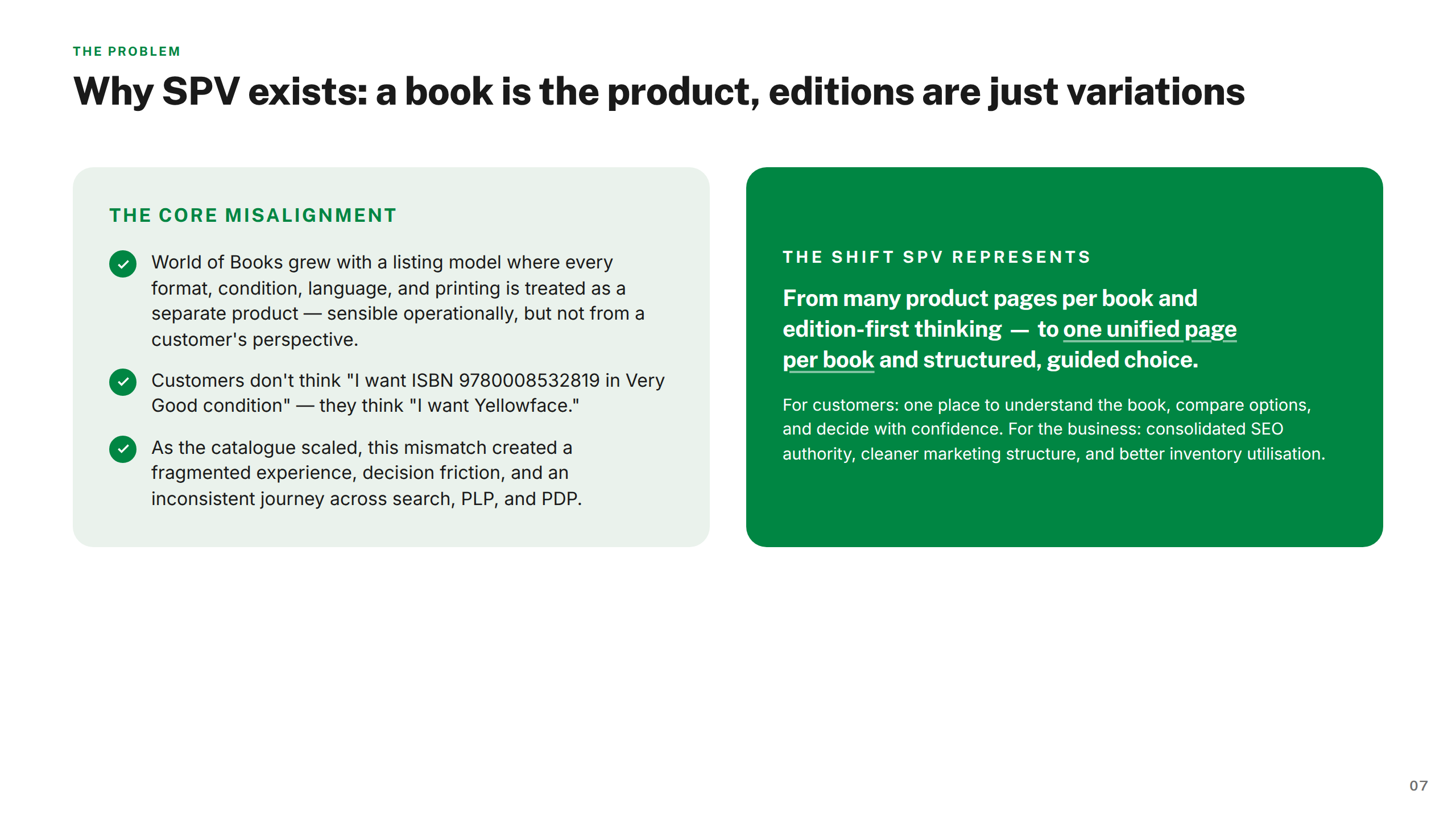
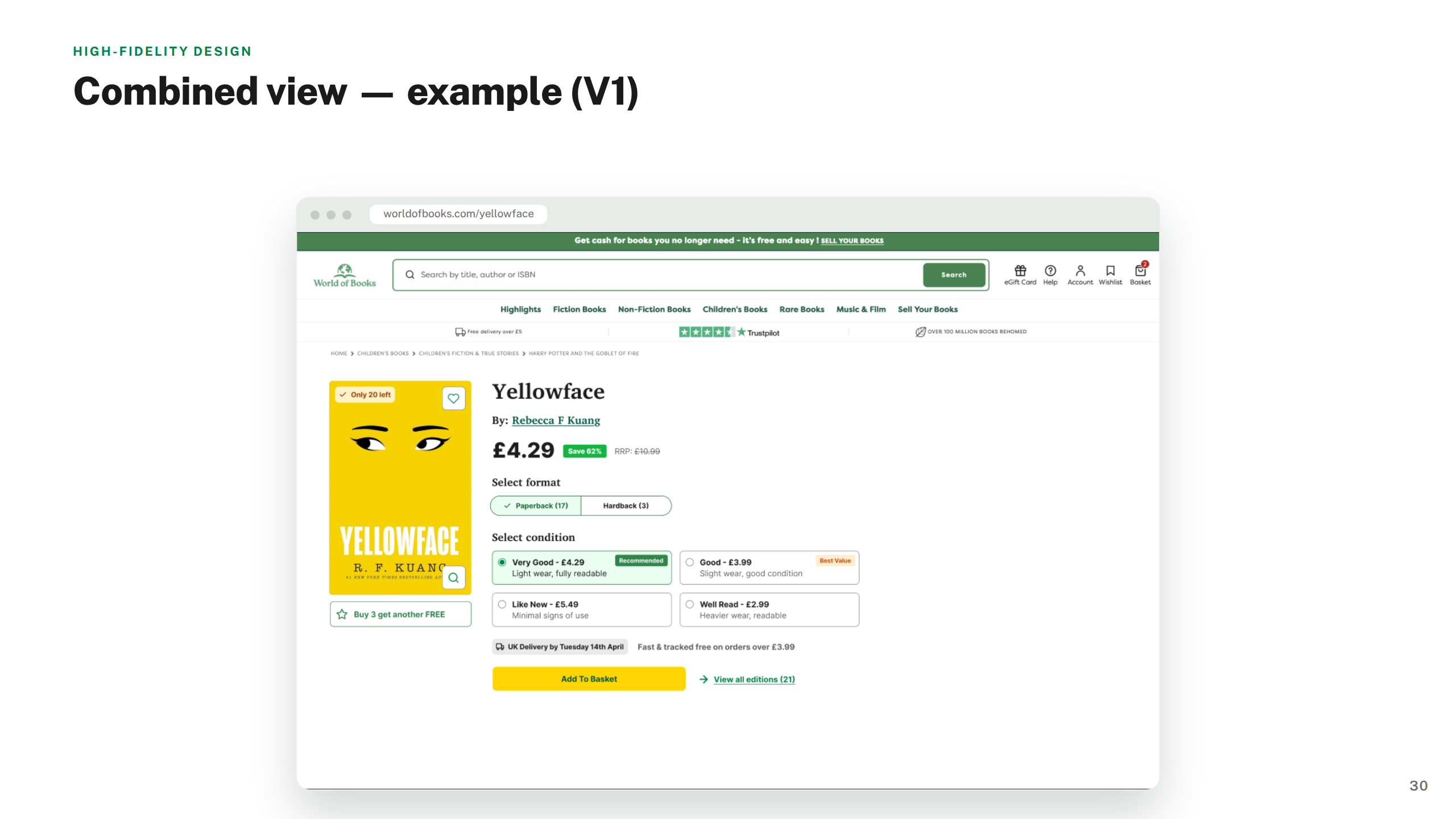
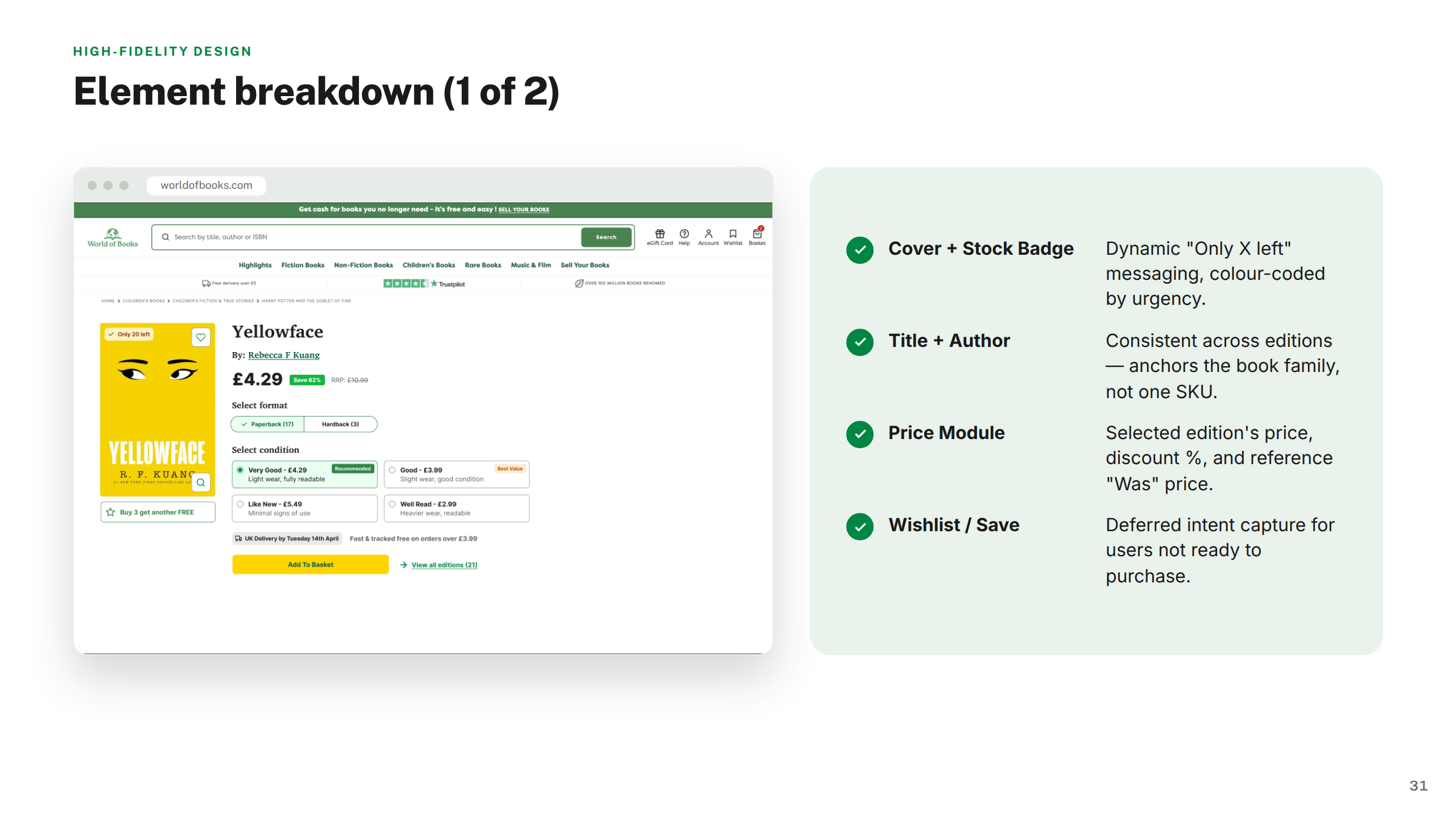
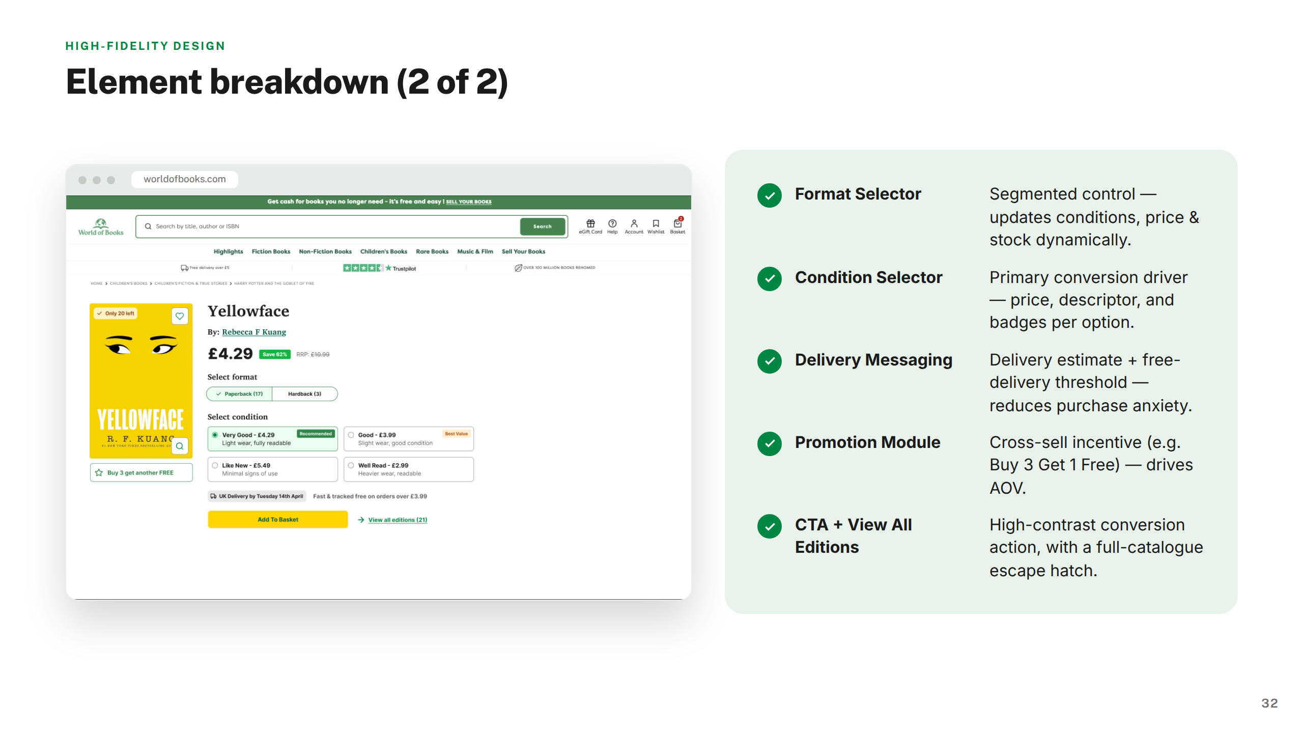
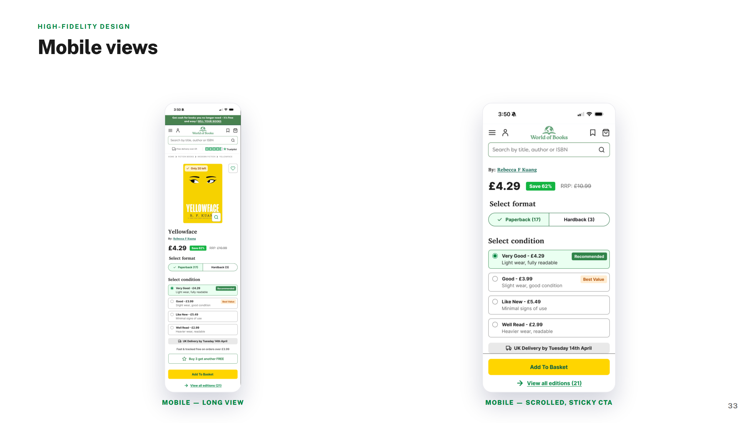
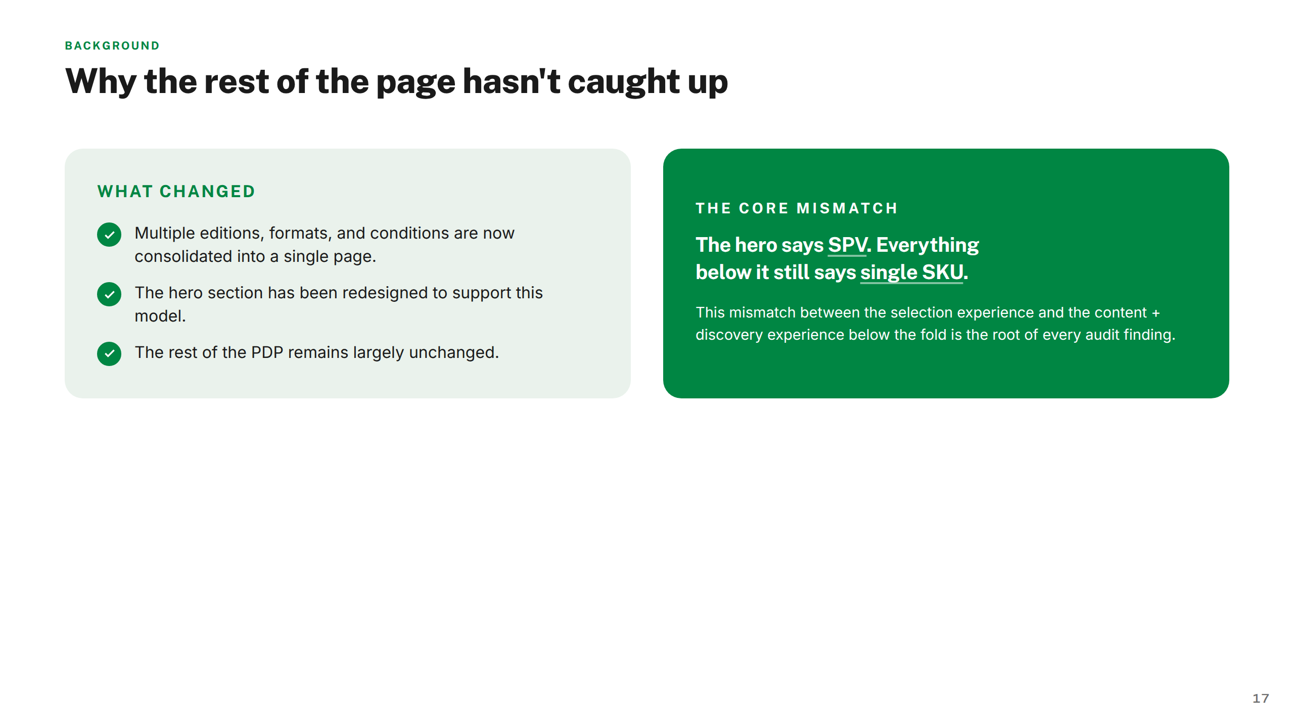
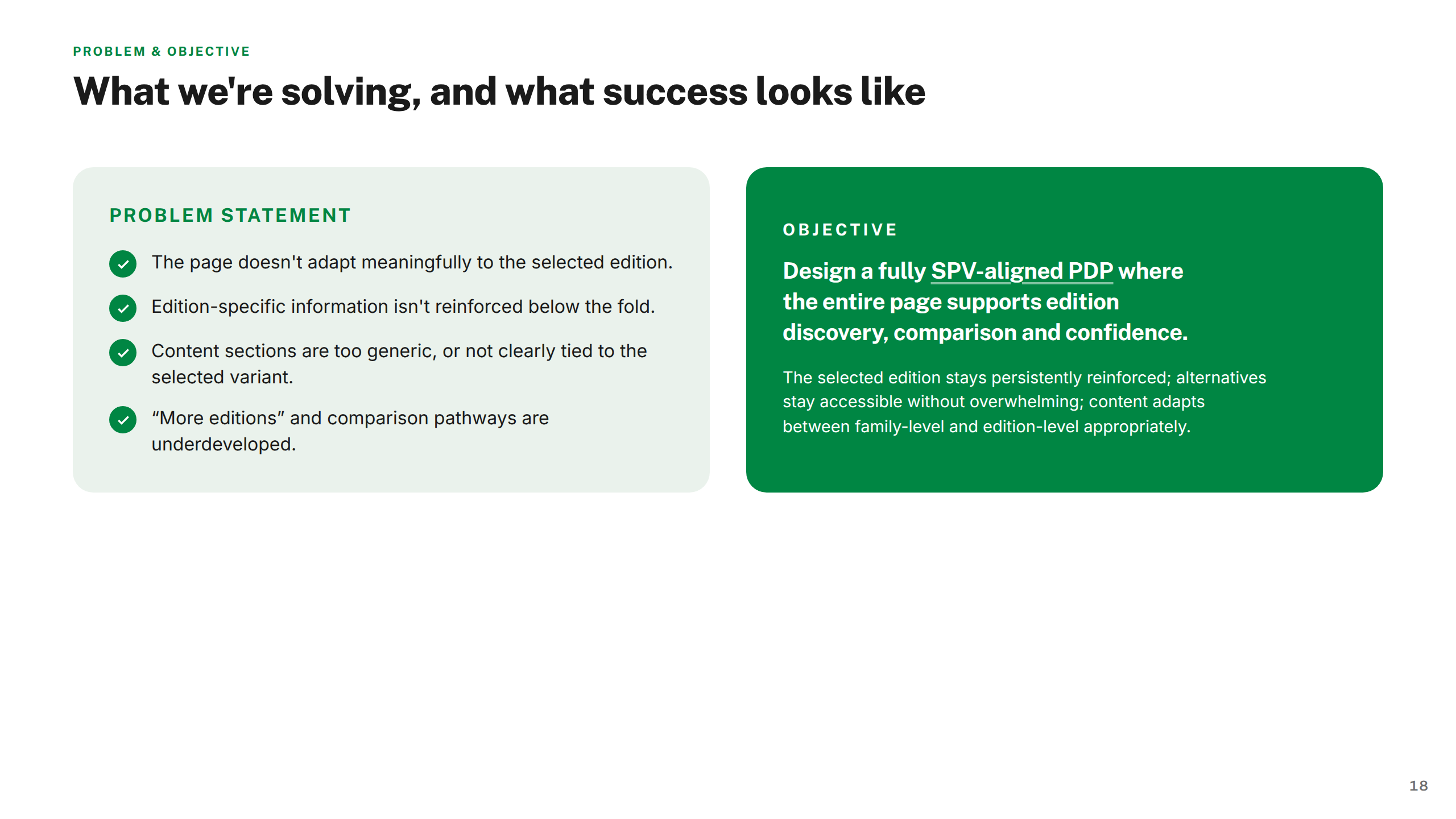
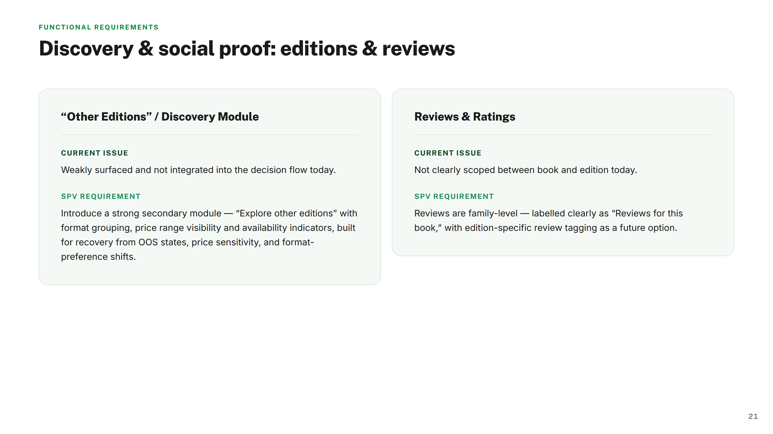
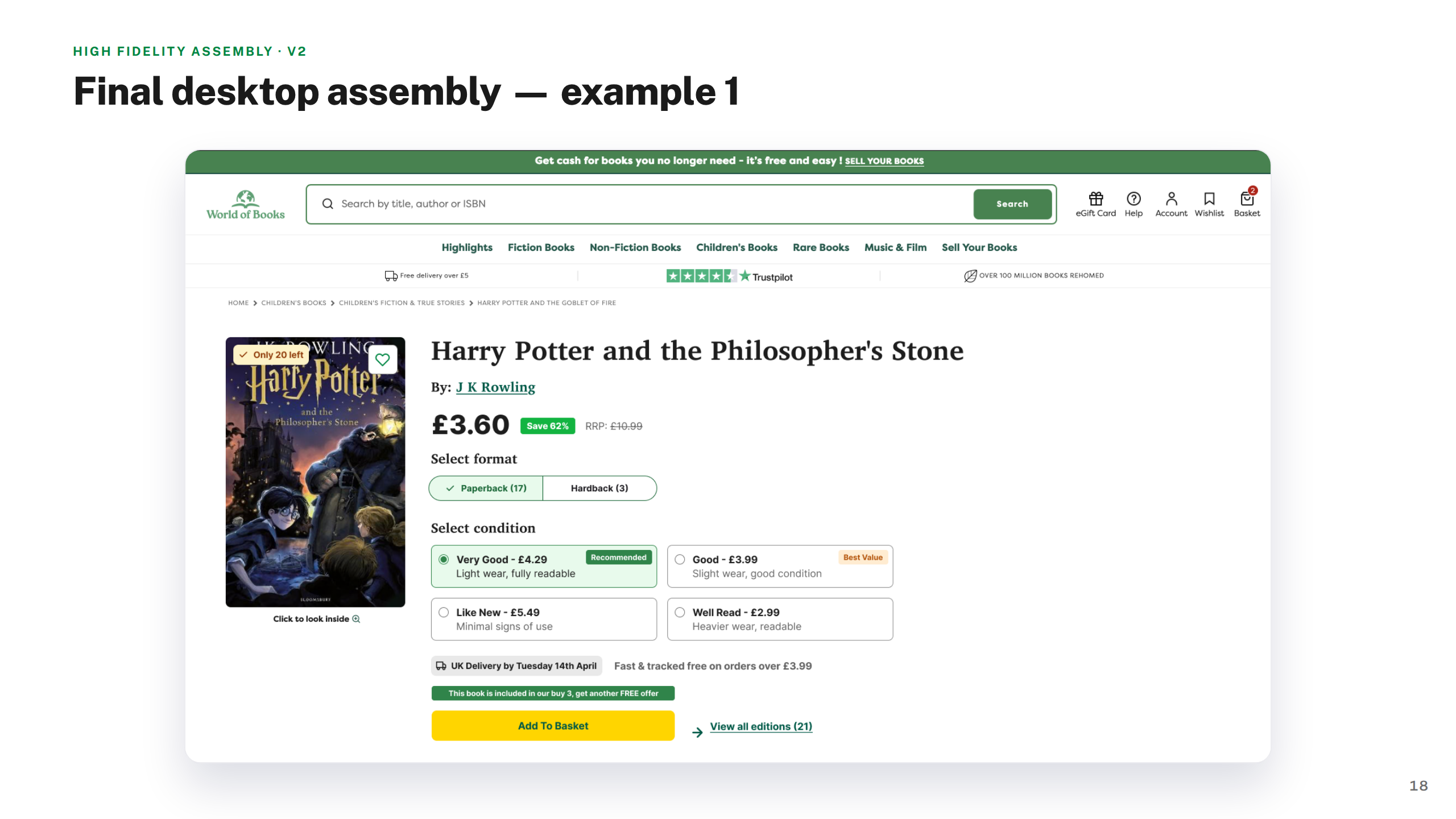
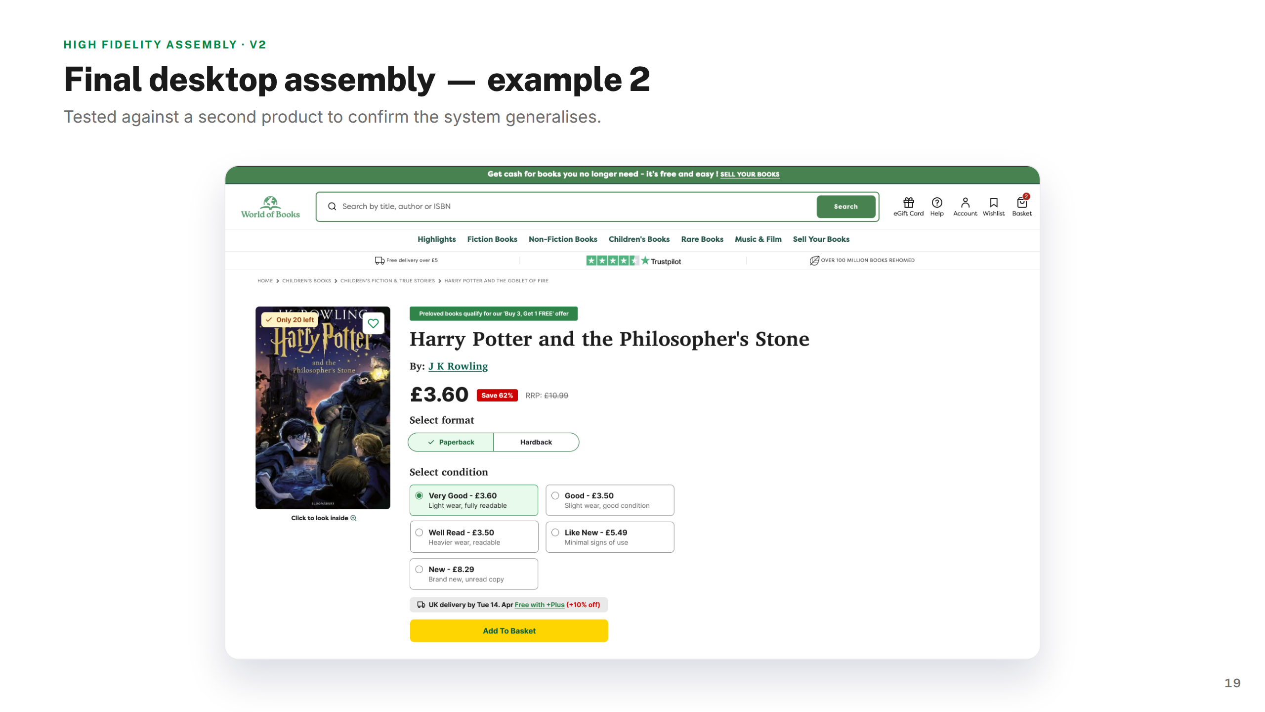
World of Books lists millions of secondhand book editions, but customers frequently struggled to understand which edition they were looking at — leading to abandoned purchases and avoidable returns. The Single Product View (SPV) initiative set out to fix this by consolidating fragmented edition listings into one clear, confident buying decision.
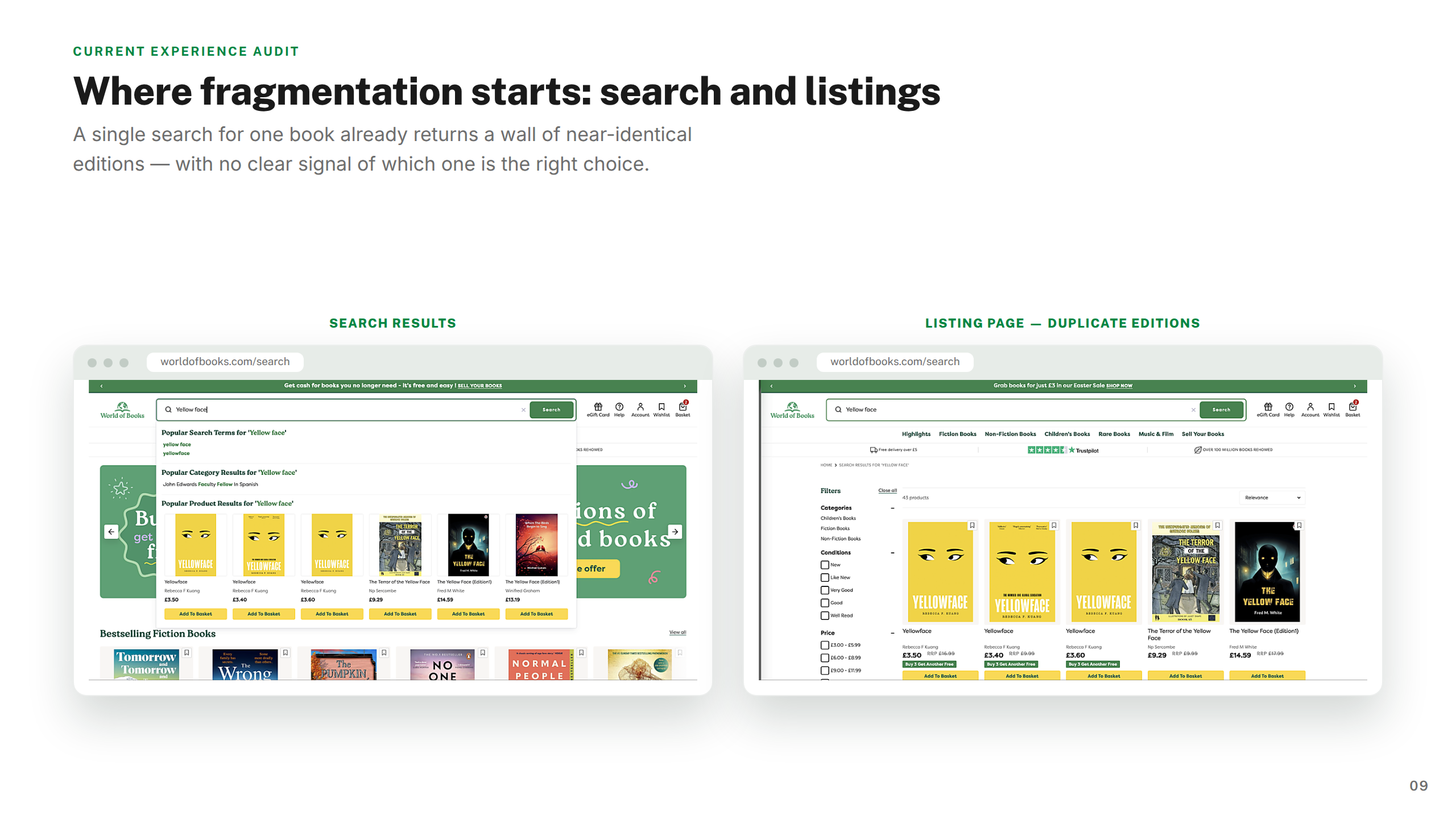
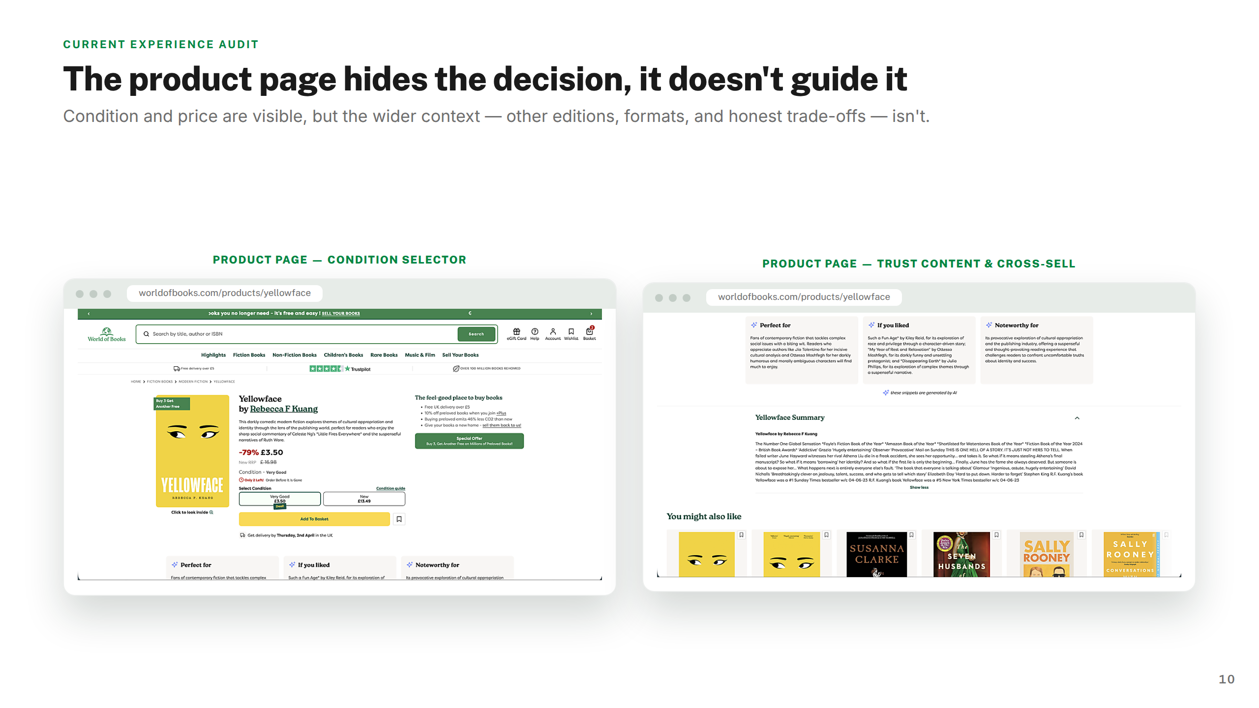
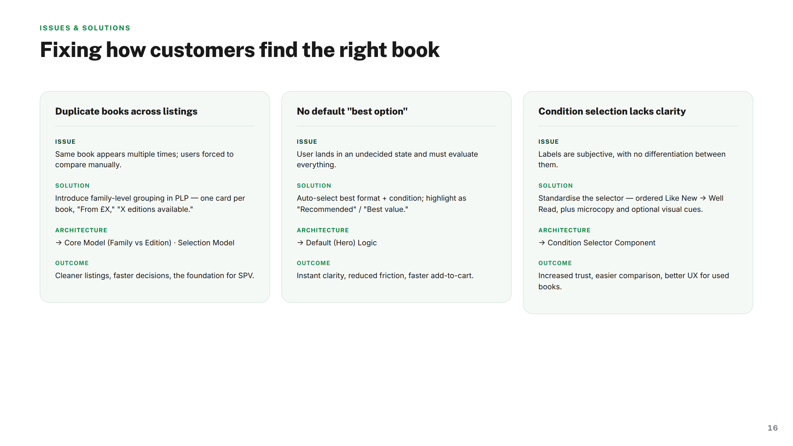
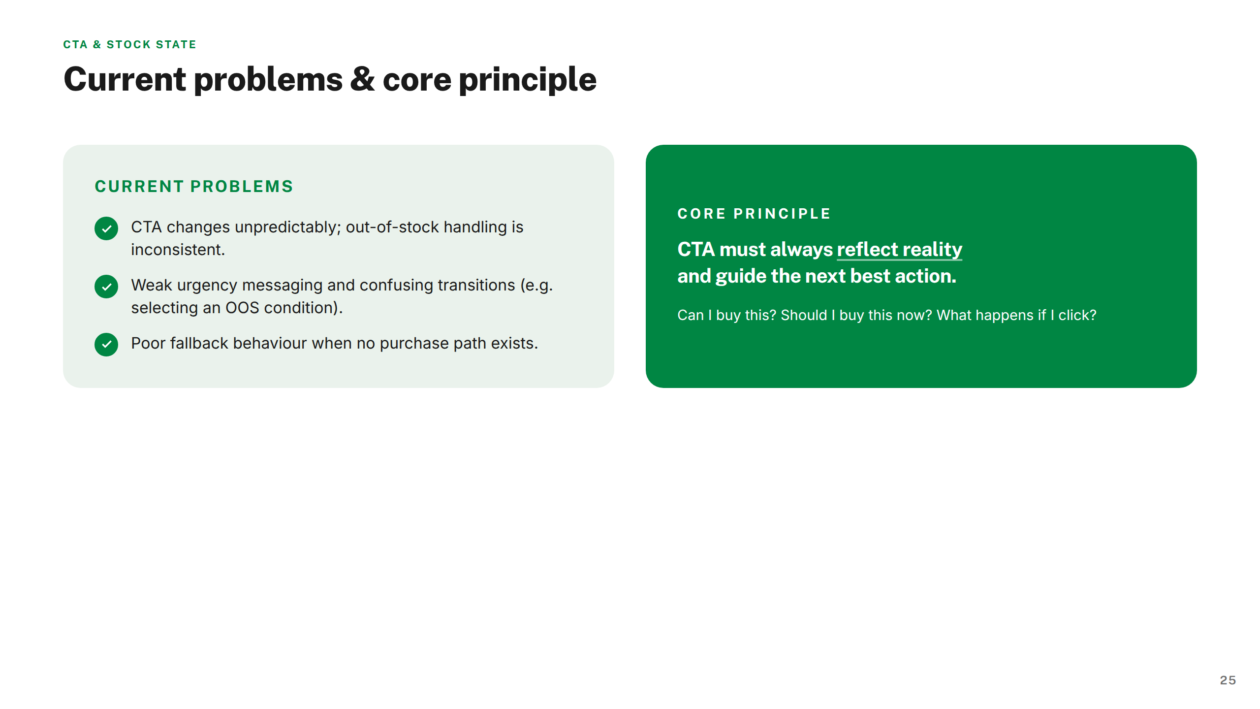
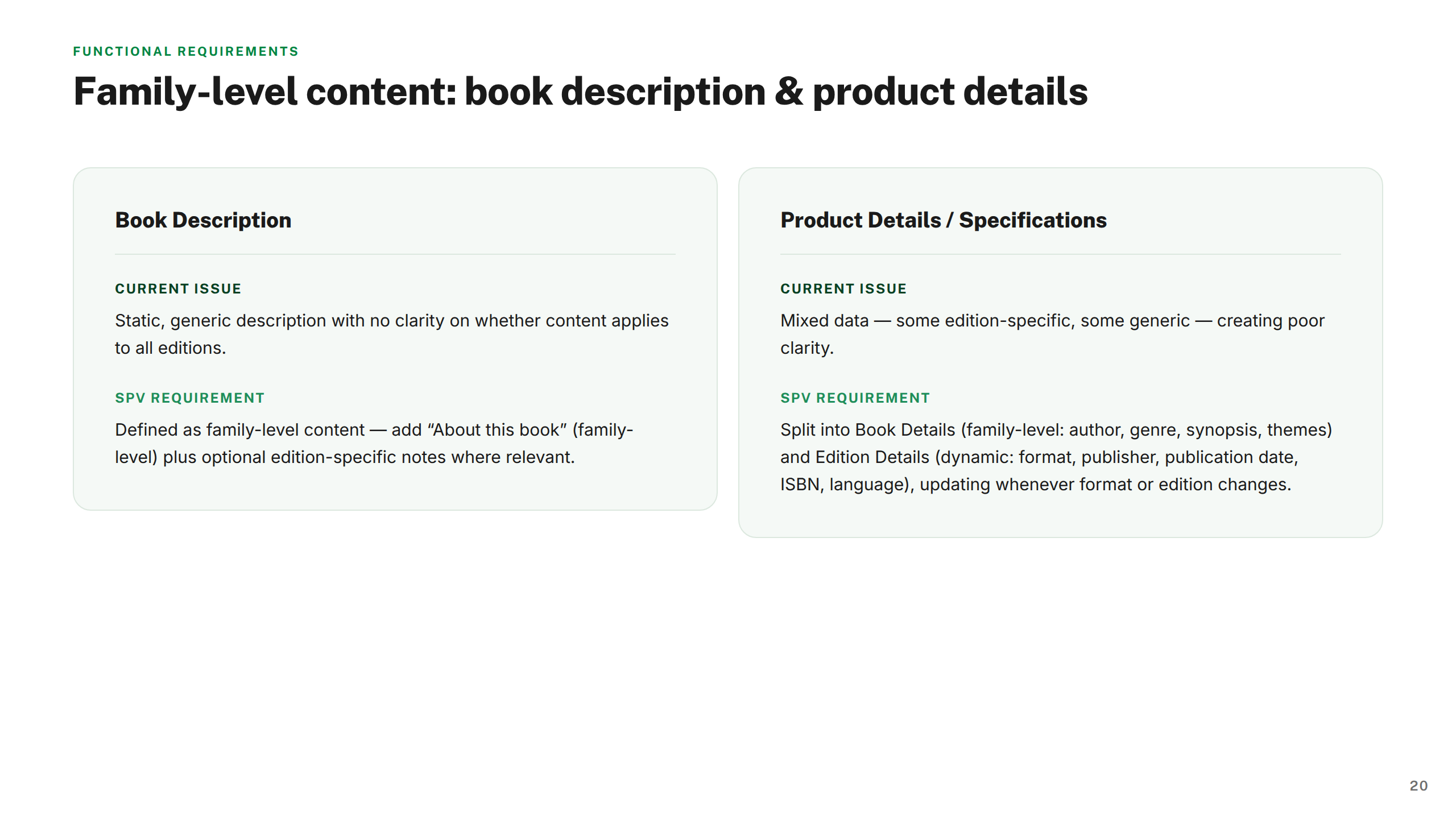
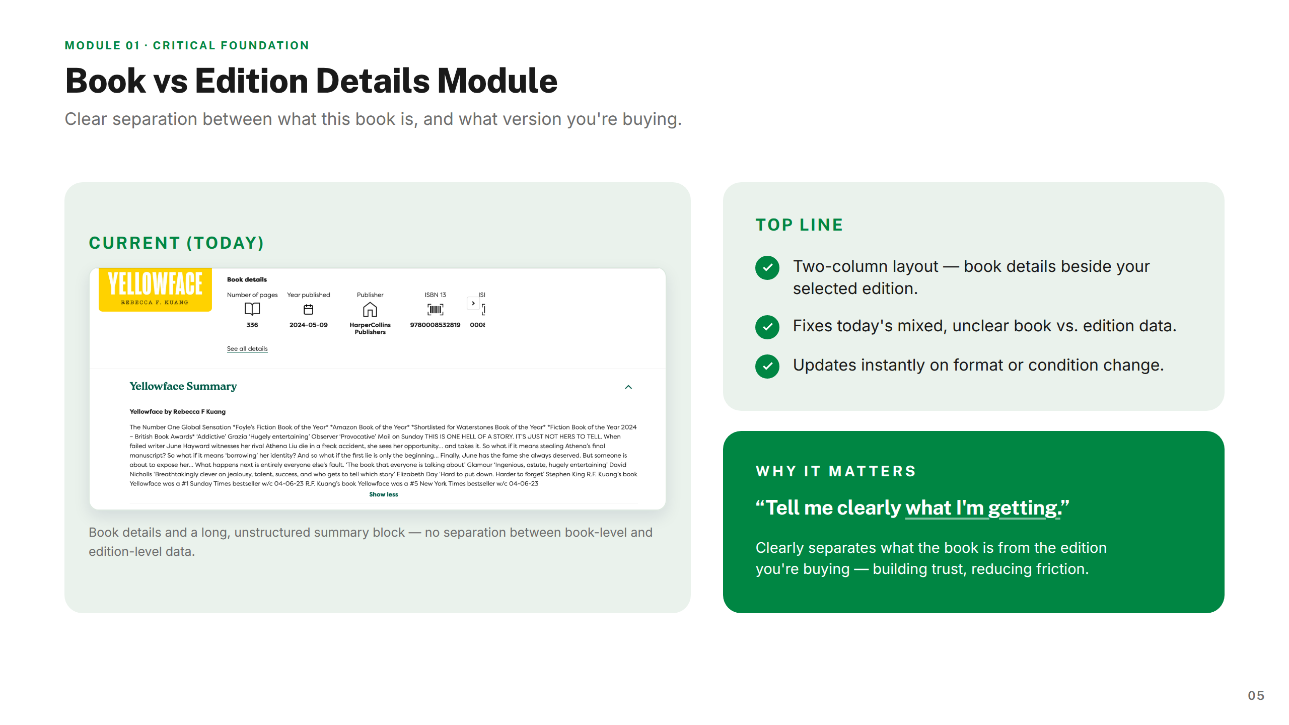
The core tension was structural: Wob's catalogue is built around individual editions rather than a single canonical title, meaning the same book could appear dozens of times with no clear hierarchy. Customers couldn't reliably distinguish format, condition, or price — and the product page gave them little help.
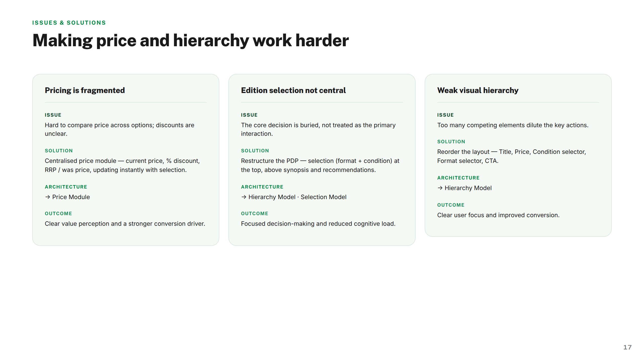
Internally, there was no shared design language across the page, no consistent component architecture, and no framework for how editions should be presented or selected. The challenge wasn't just a UX problem — it was a product, content, and systems problem that needed solving from first principles.
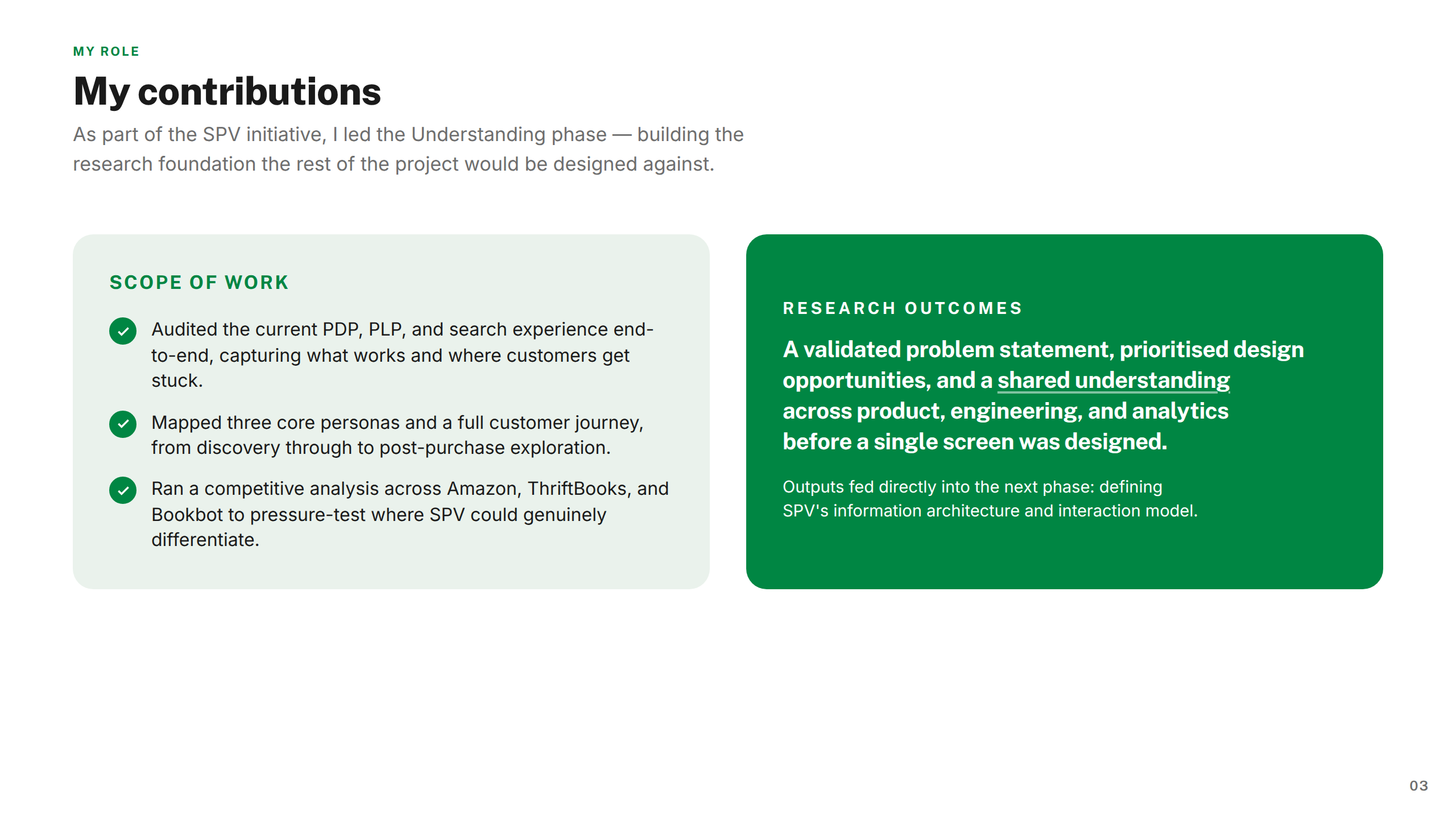
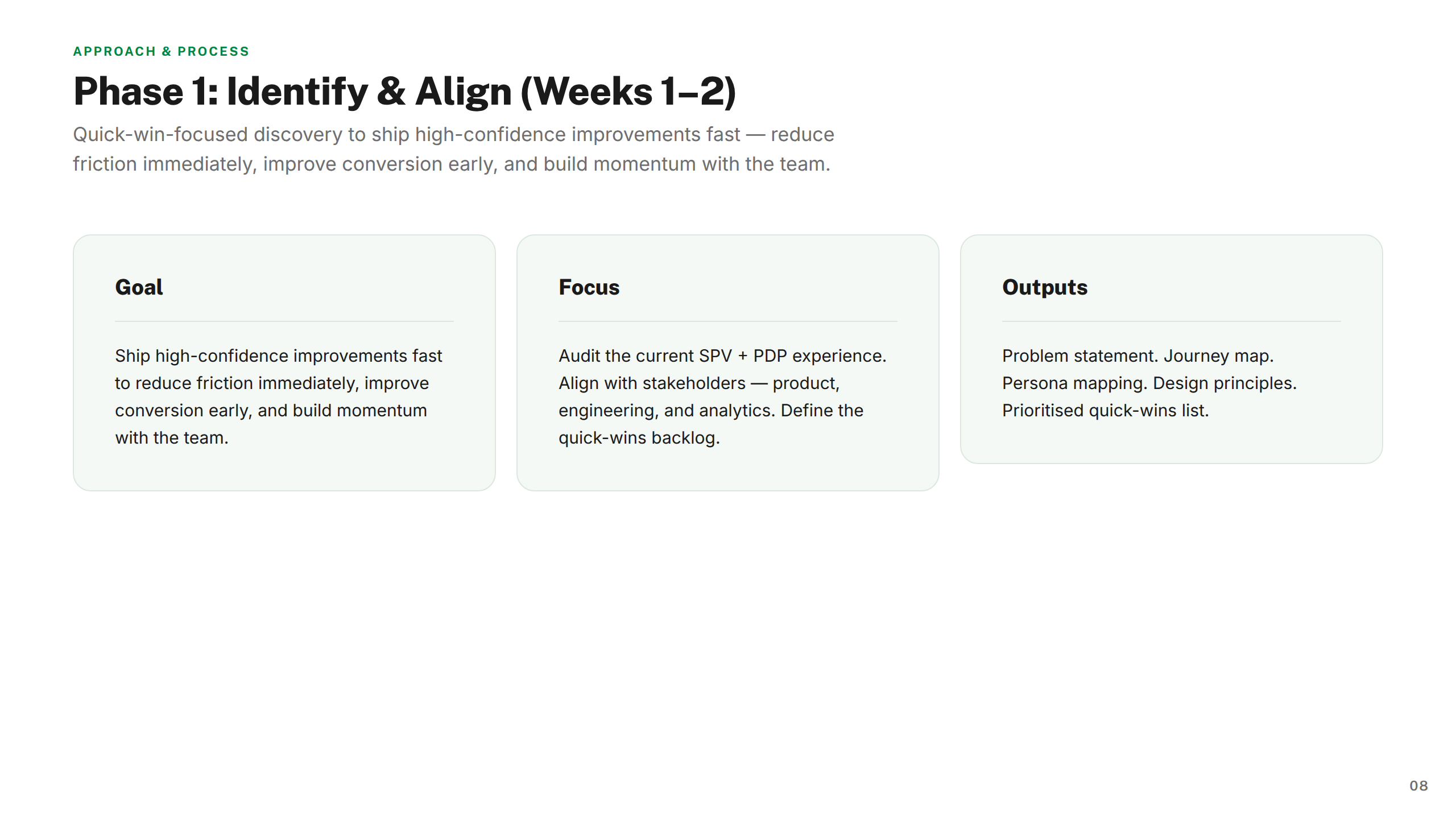
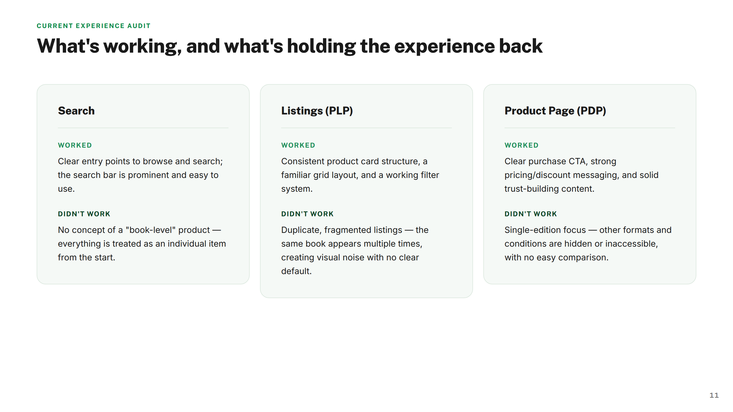
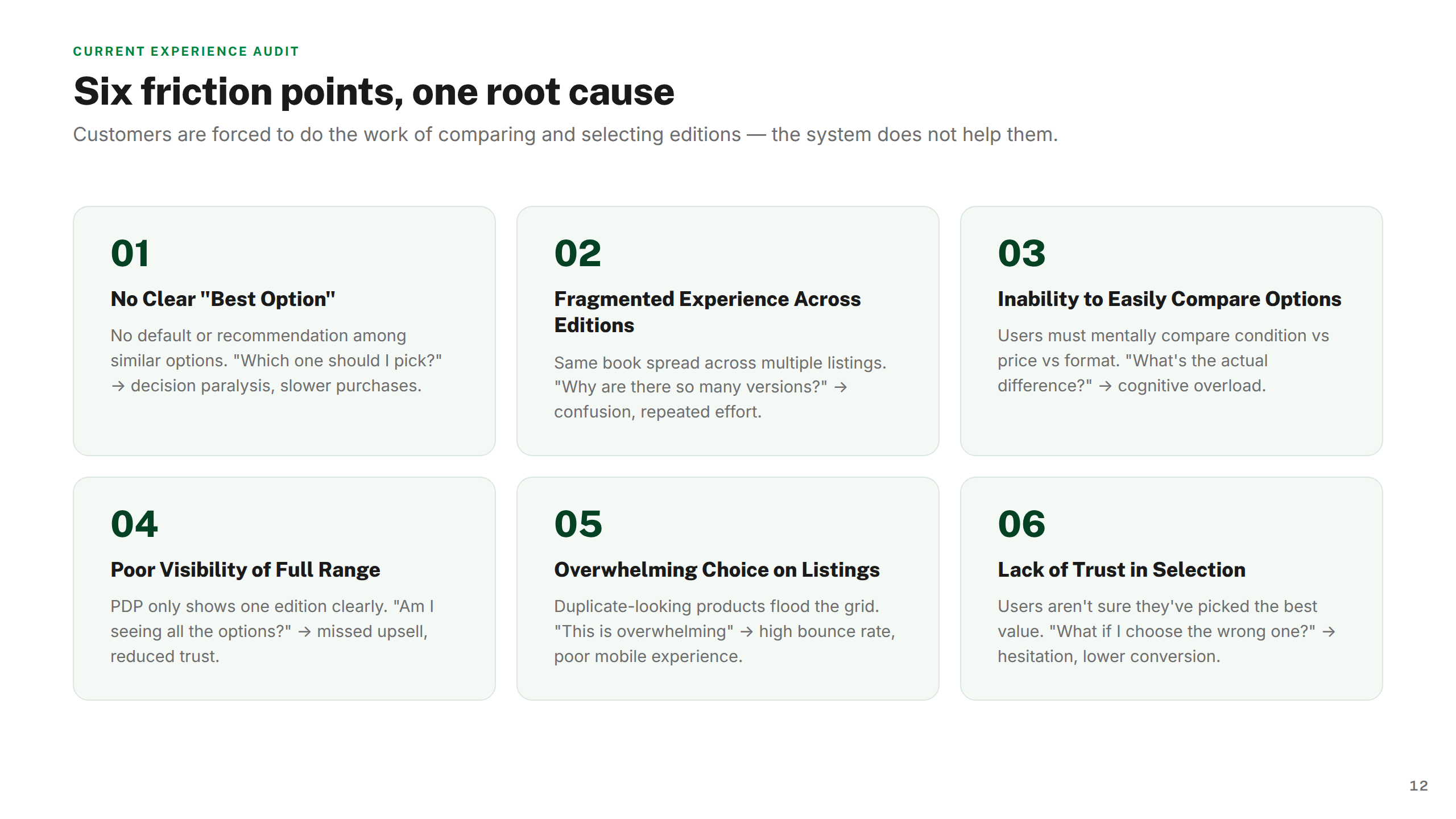
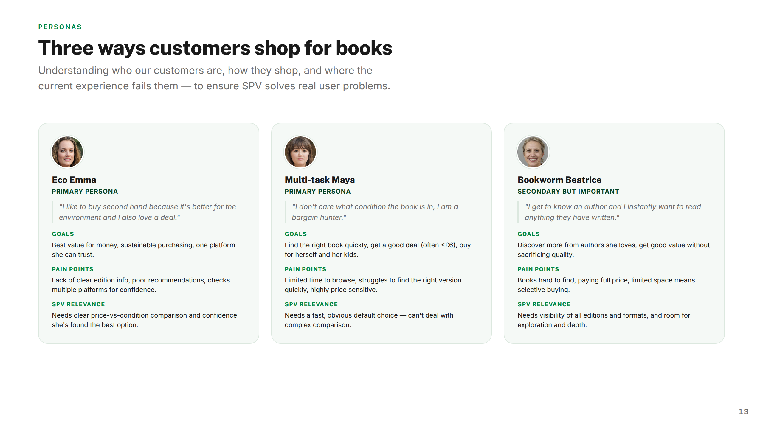
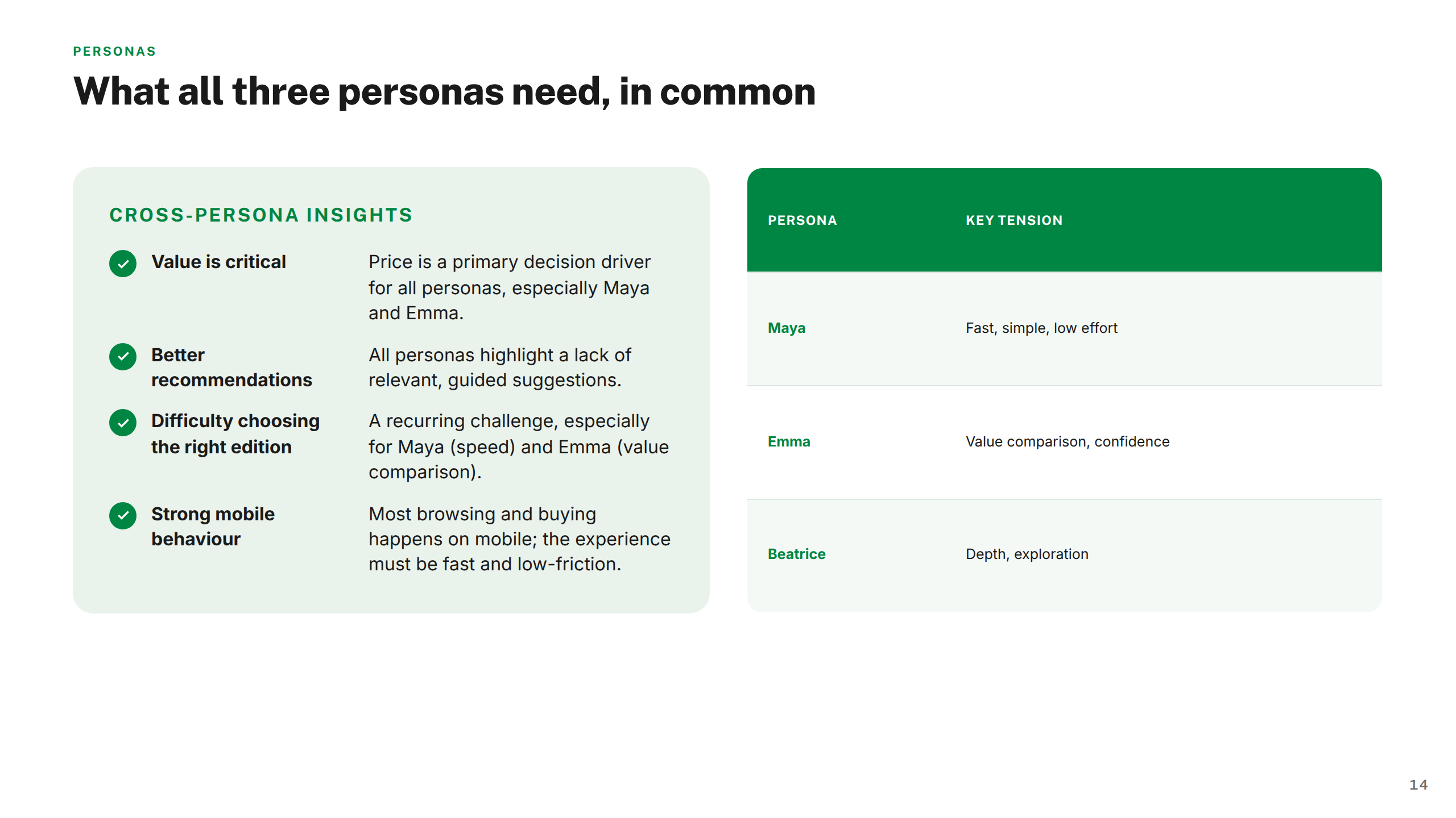
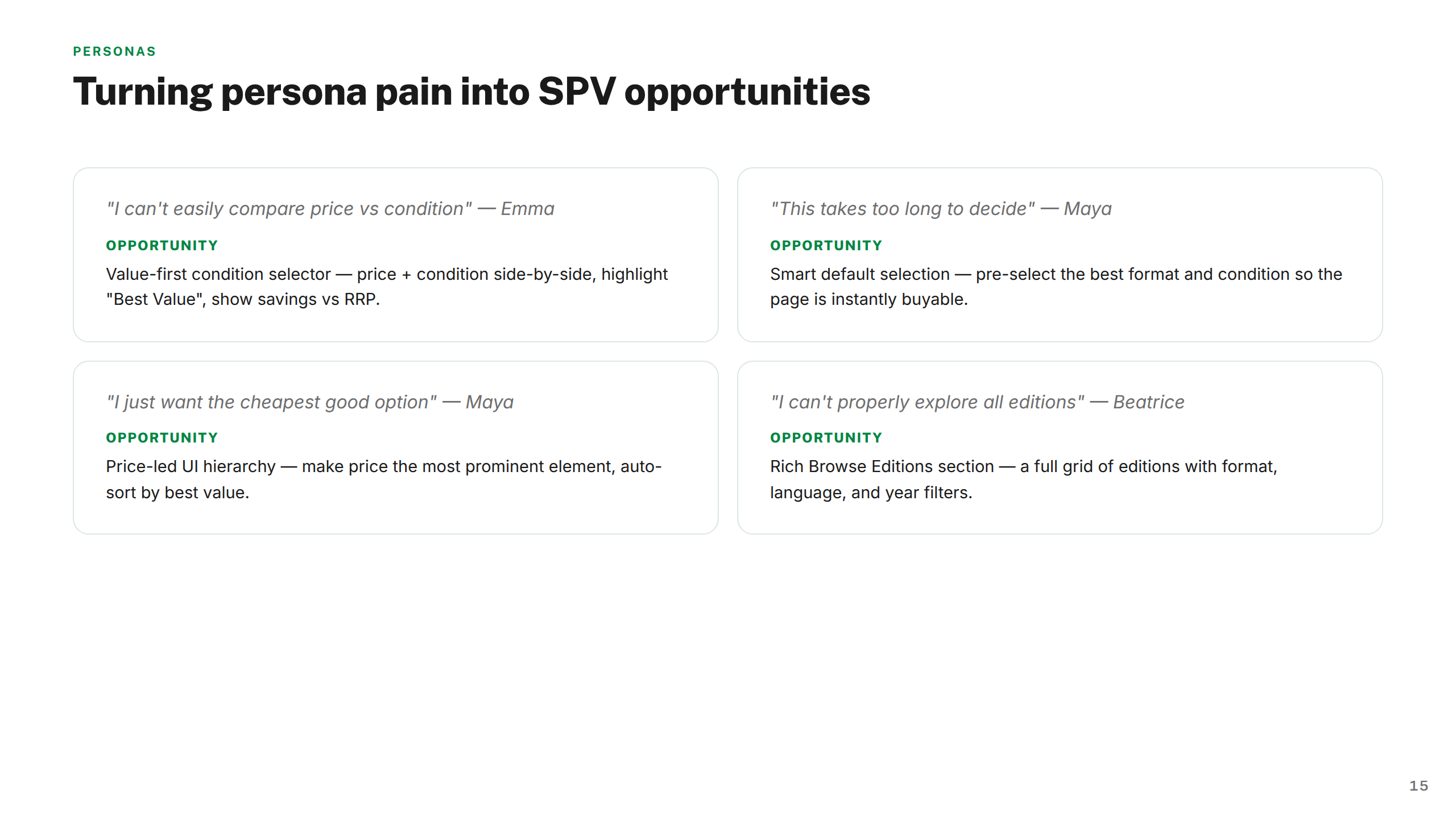
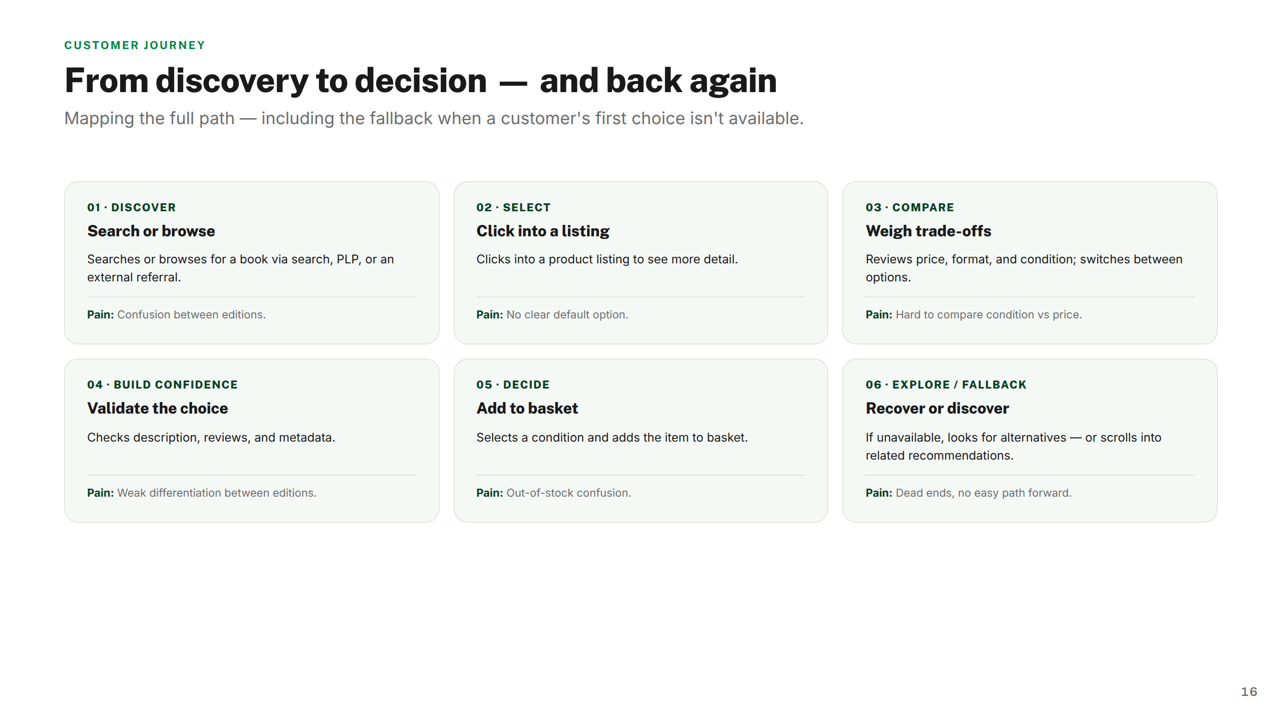
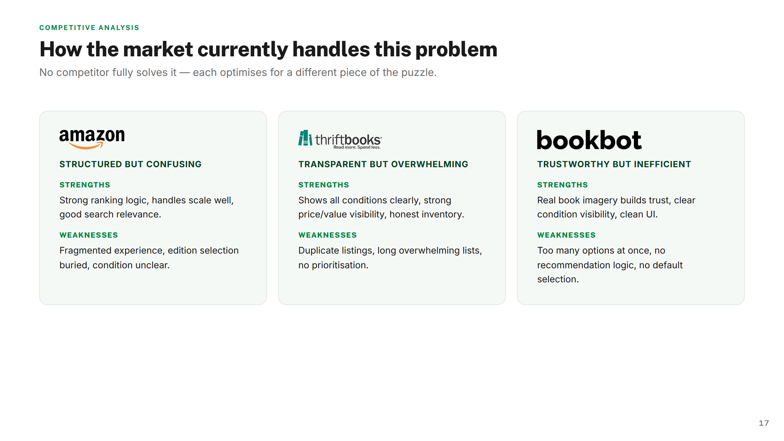
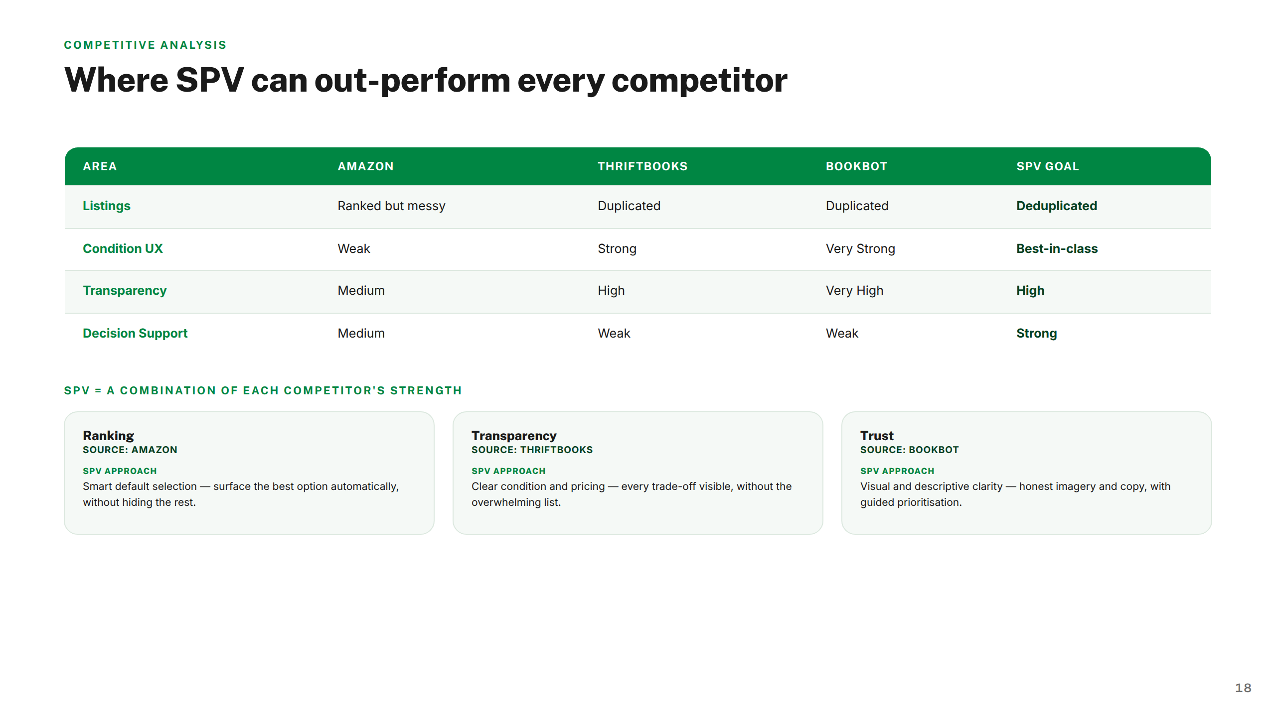
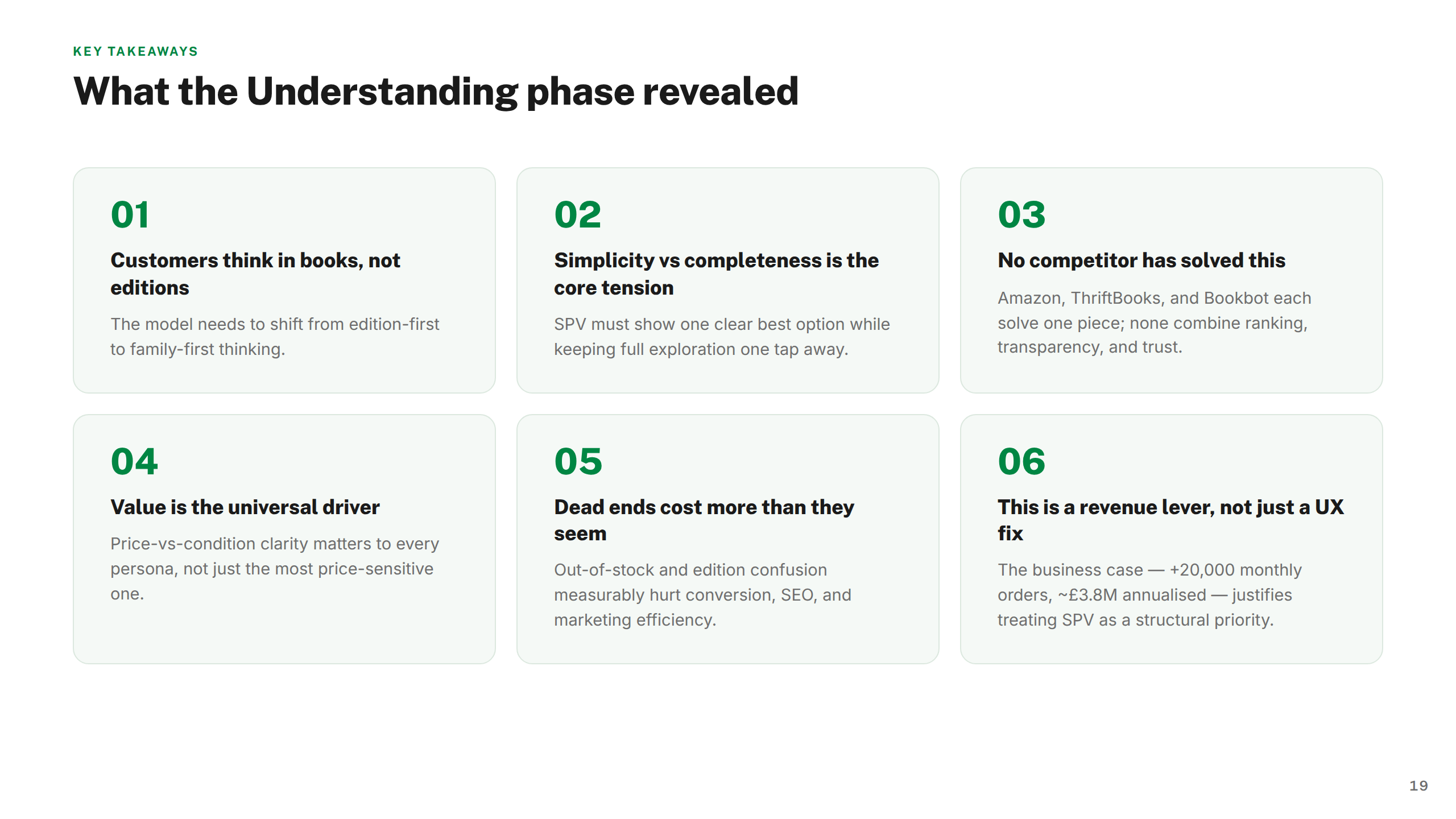
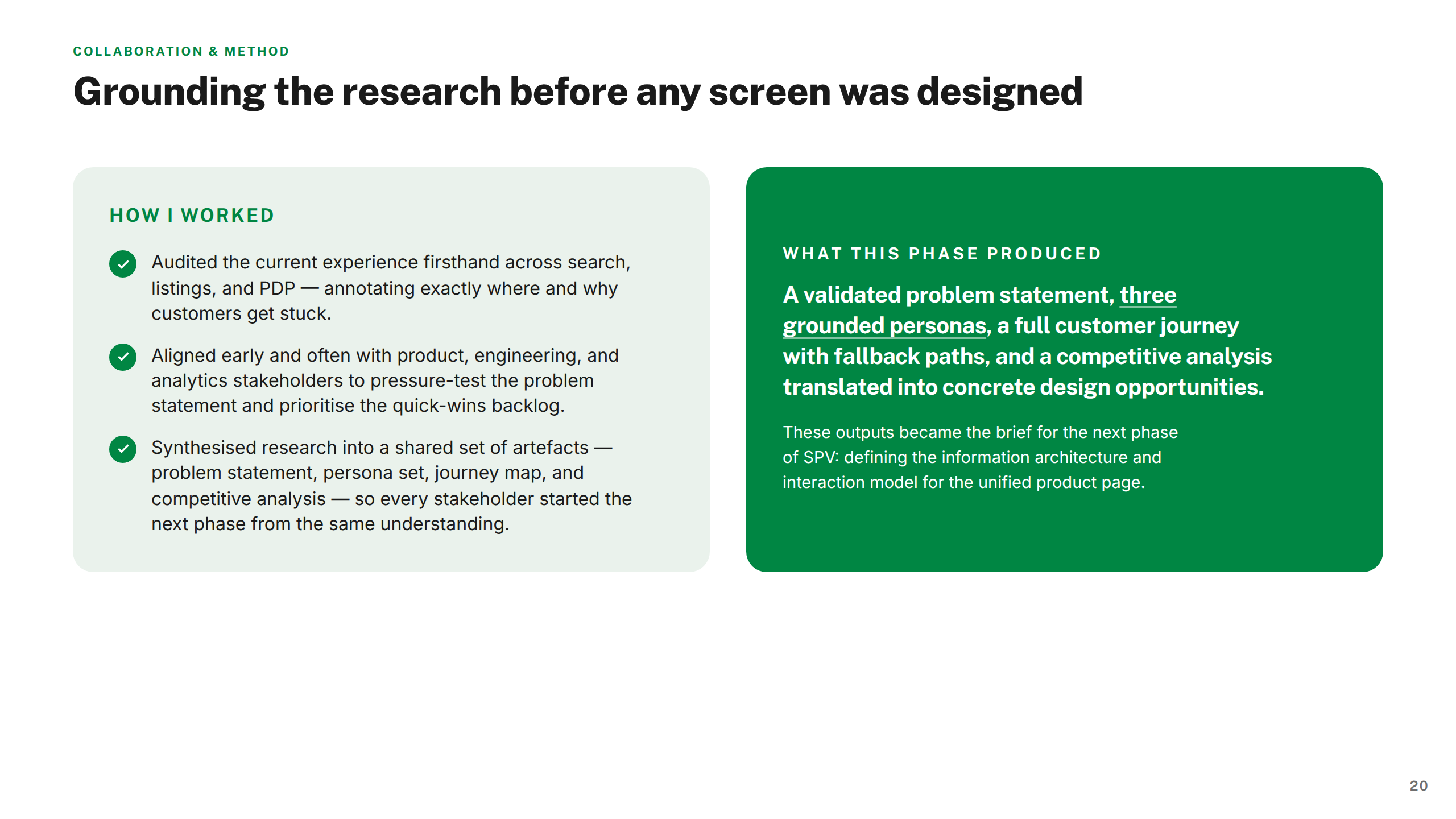
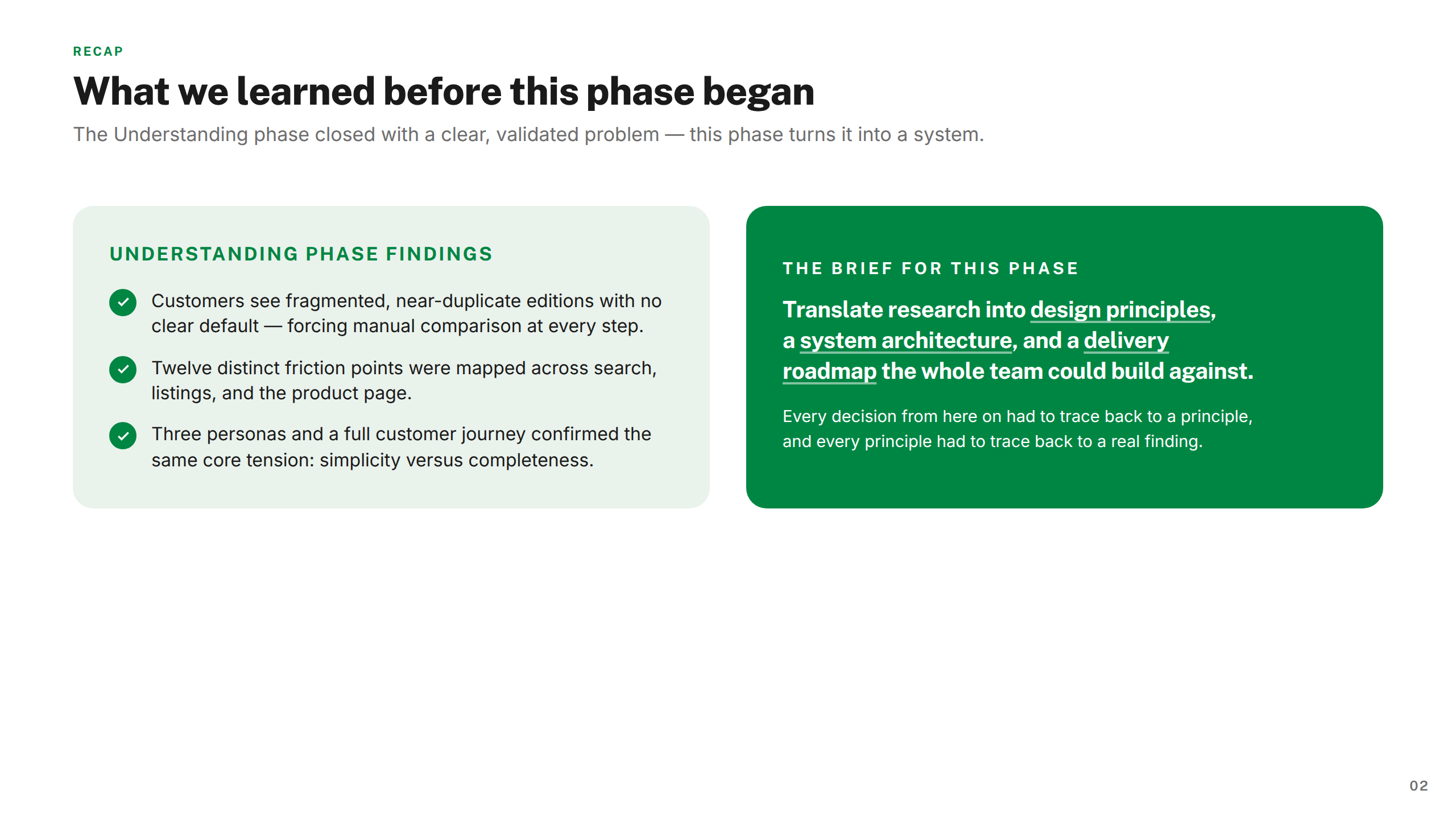
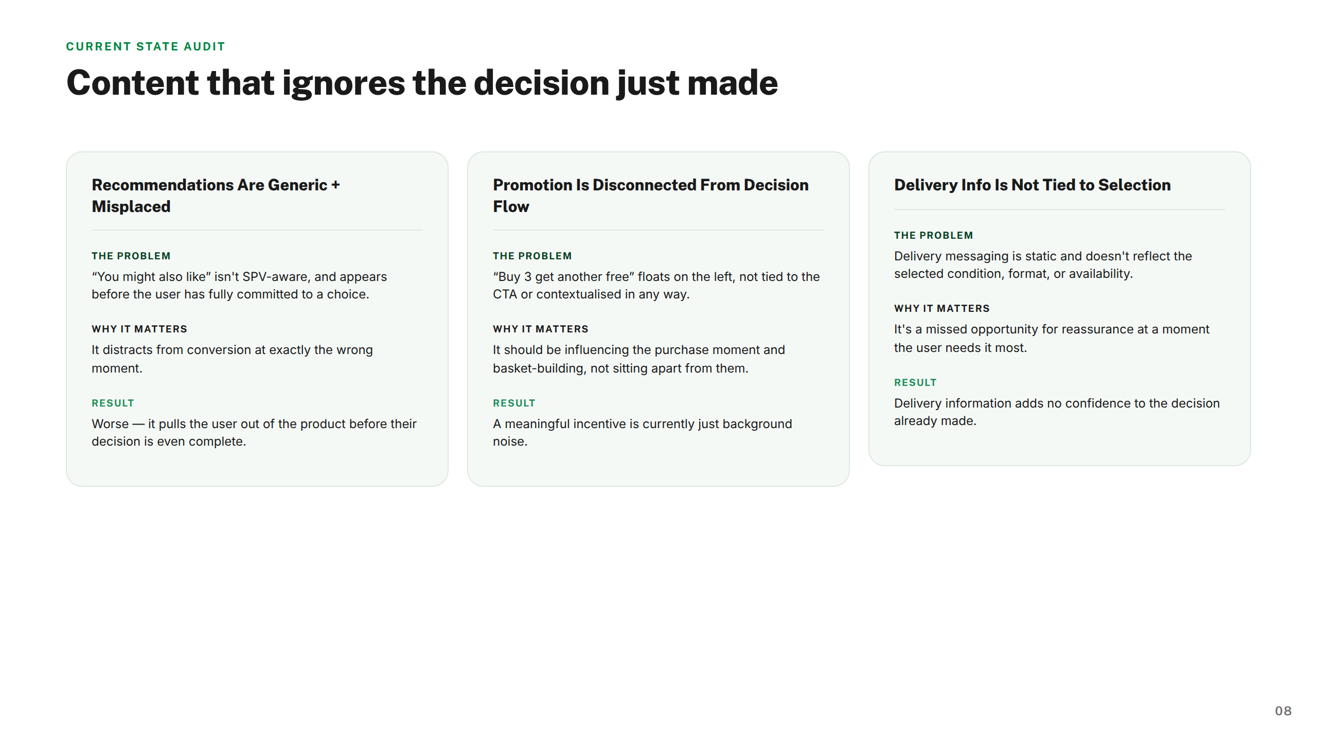
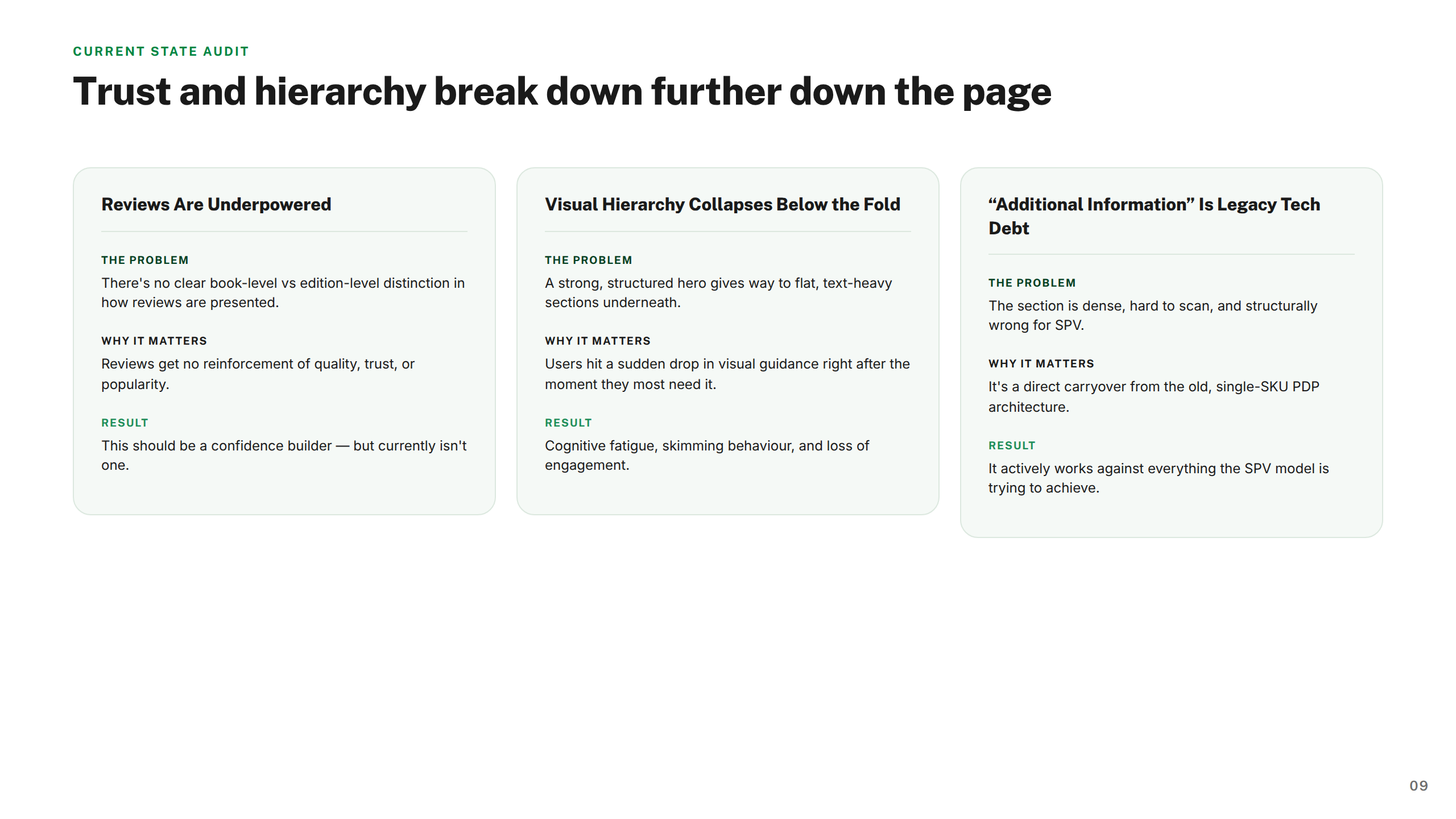
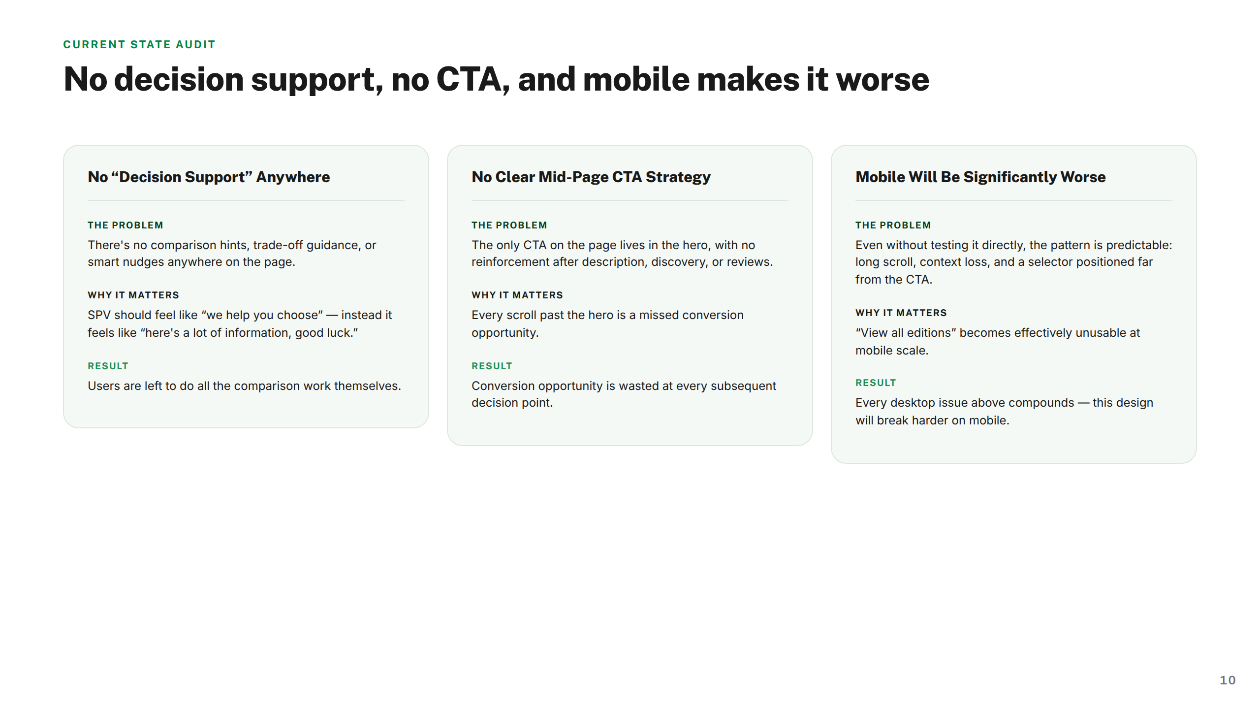
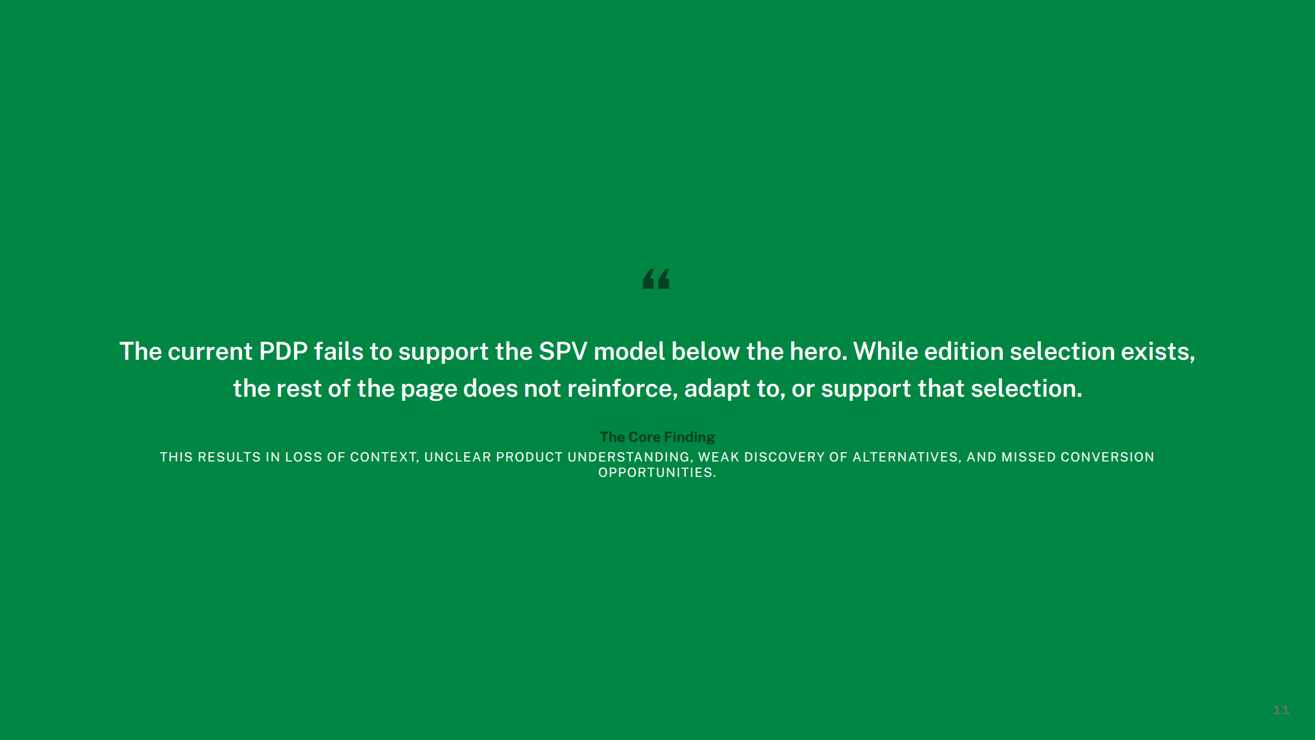
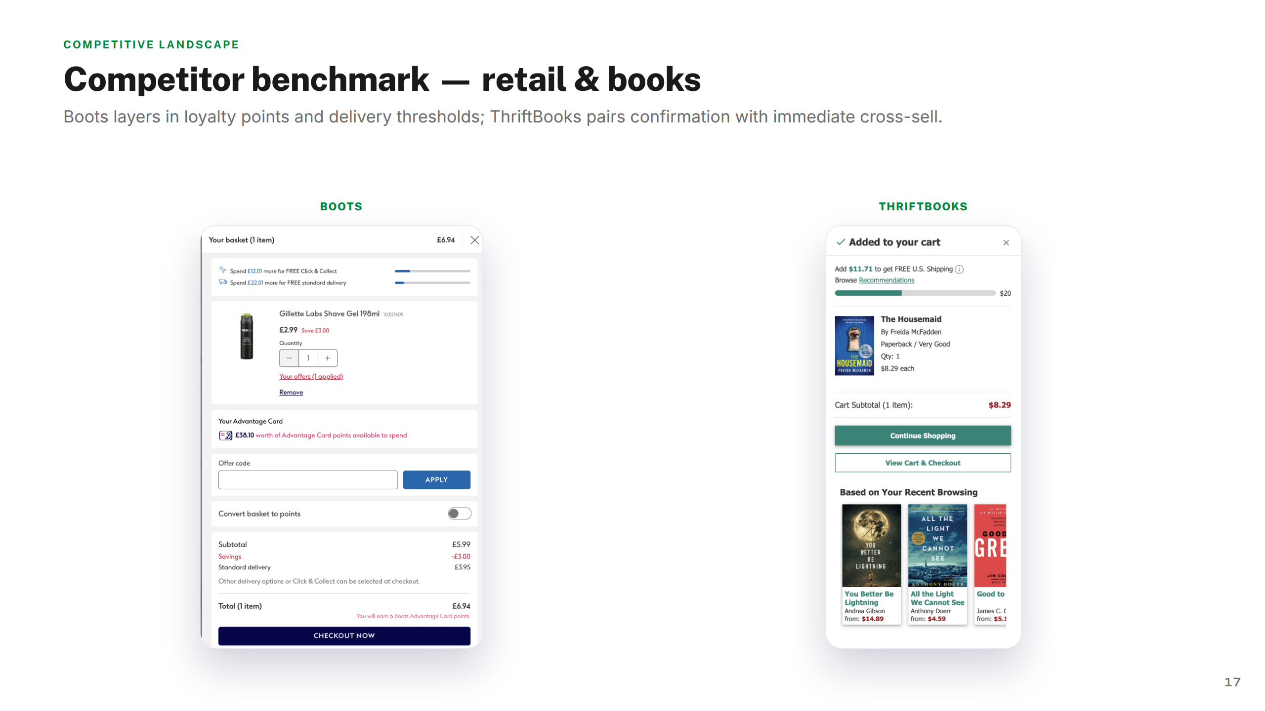
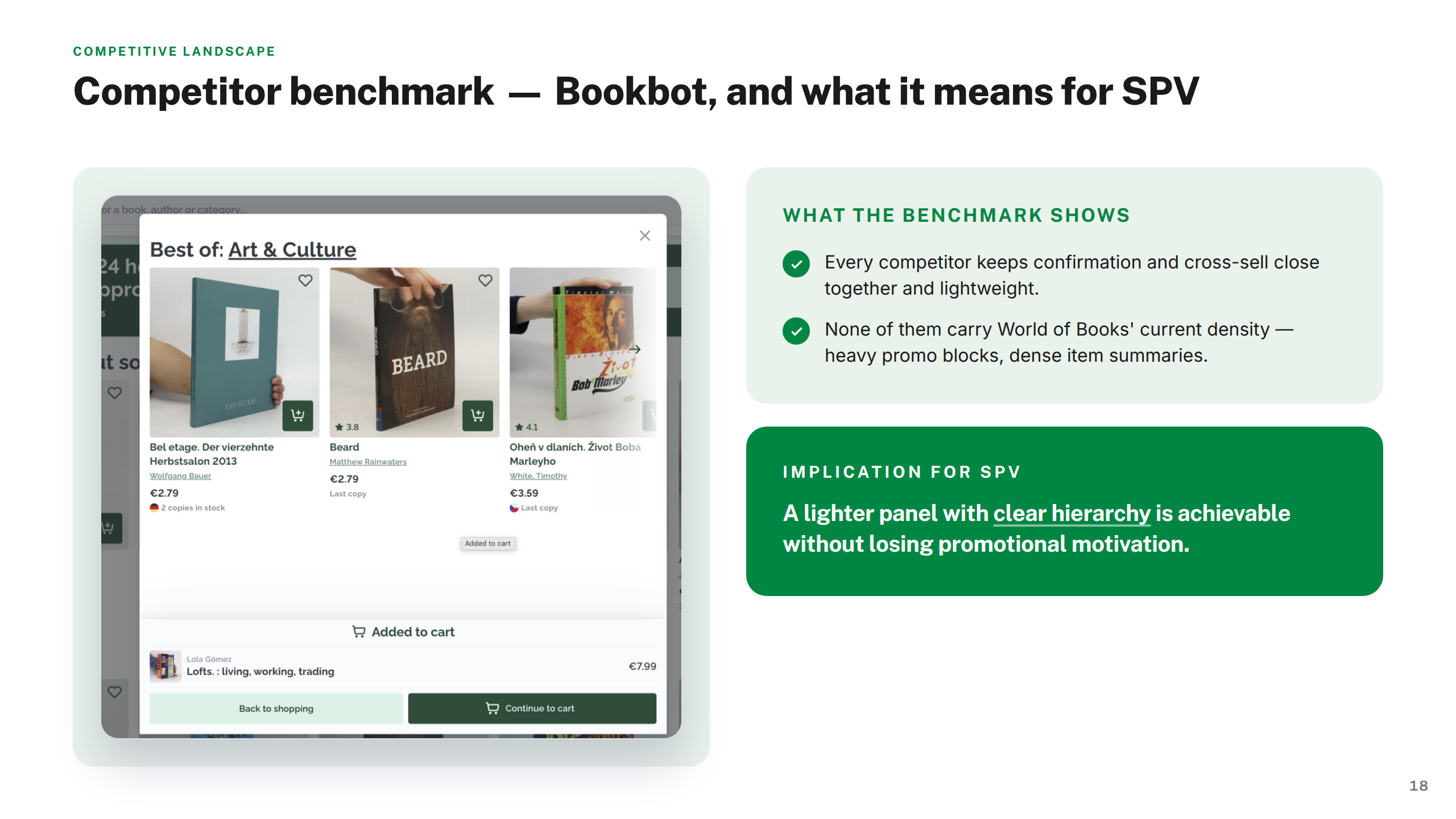
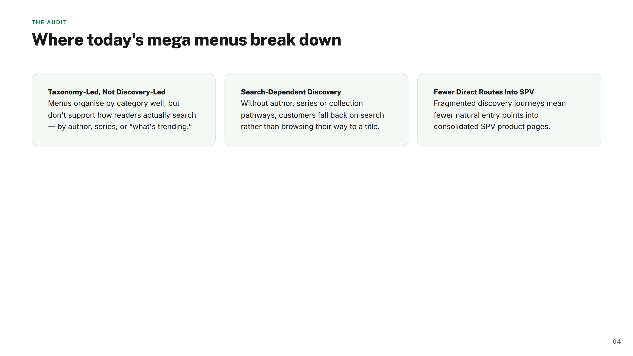
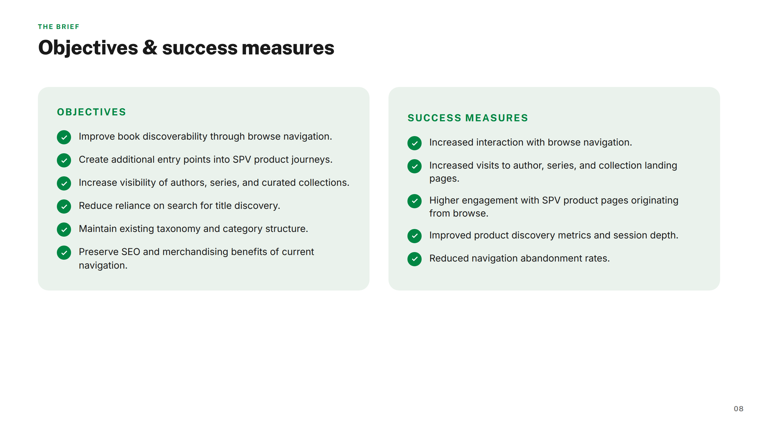
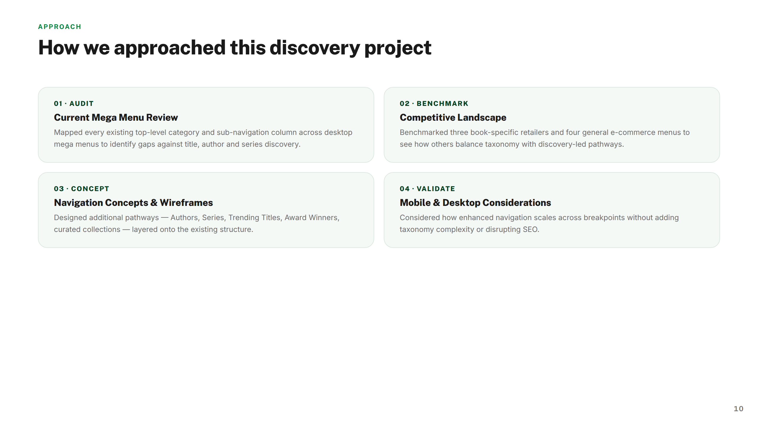
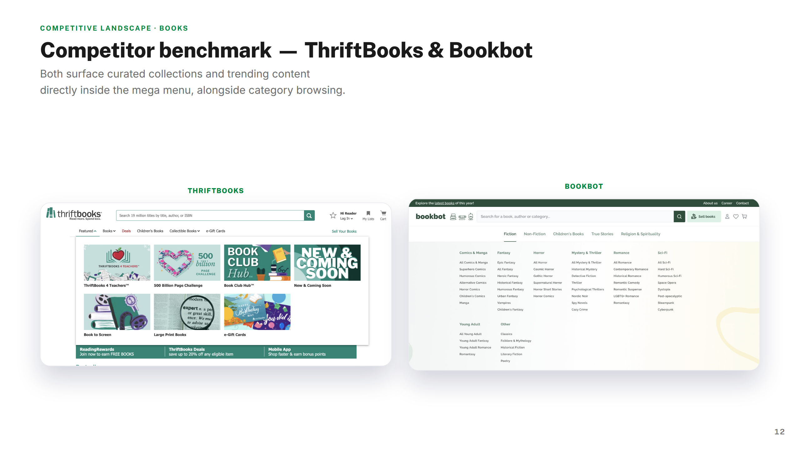
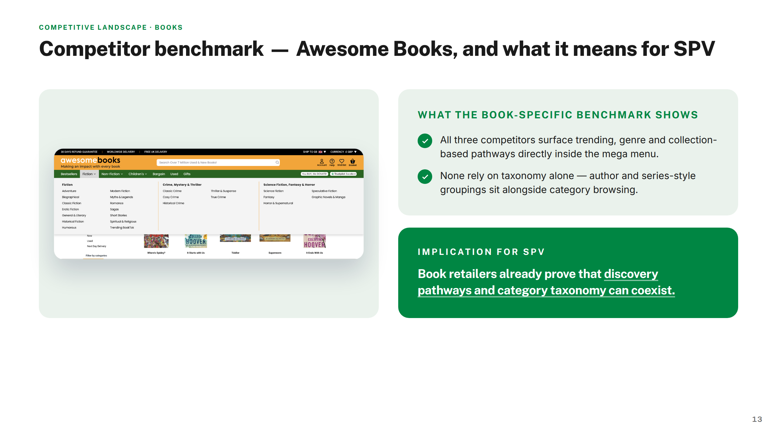
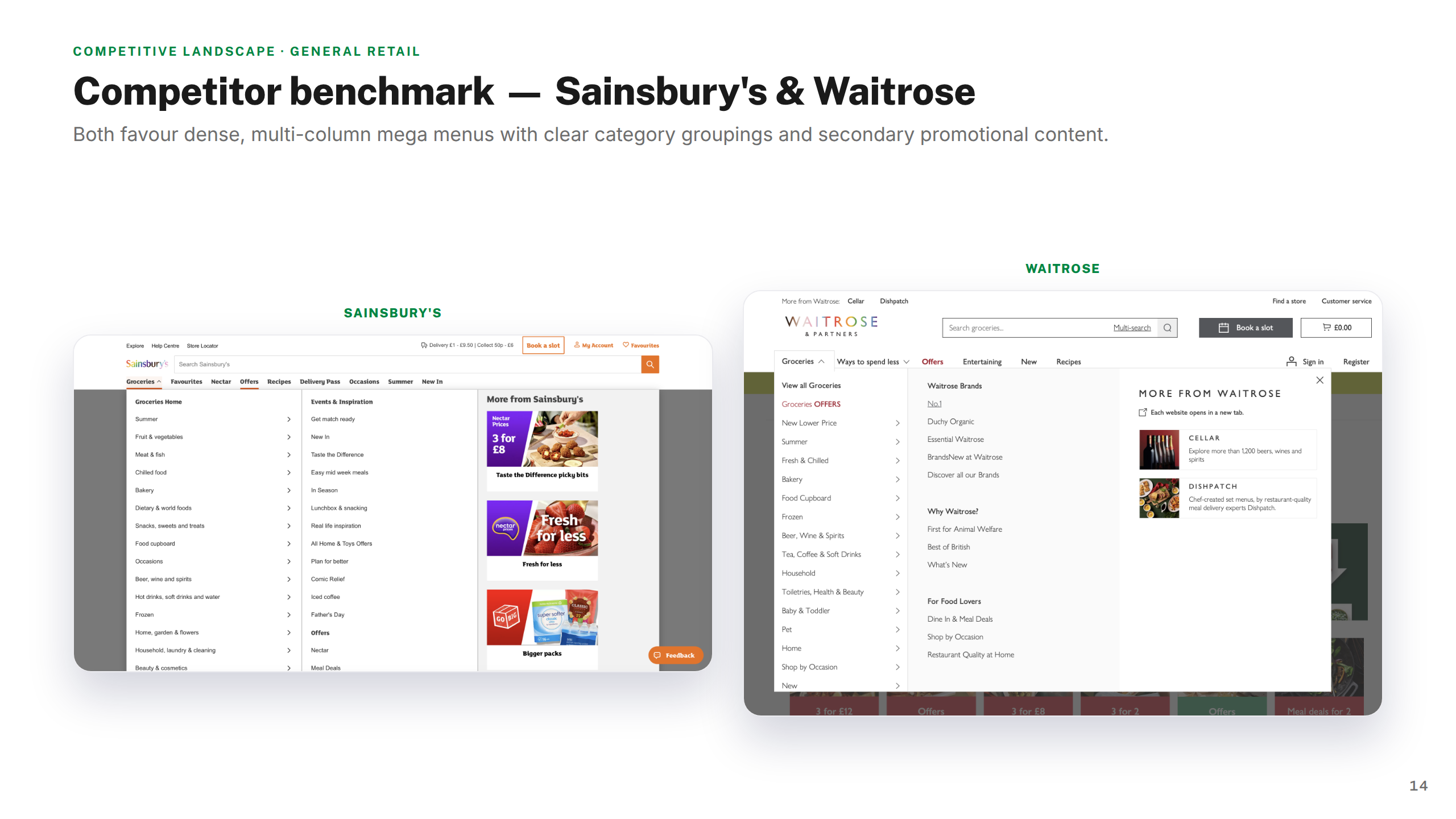
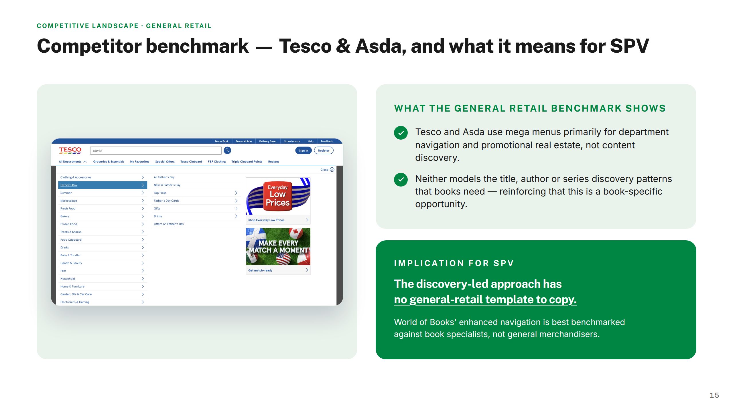
I started with an understanding phase — auditing the current experience, mapping friction points, and building three personas to capture meaningfully different buying intents: the Bargain Hunter, the Gift Buyer, and the Collector. A competitive landscape review across secondhand and mainstream retailers identified where SPV could win.
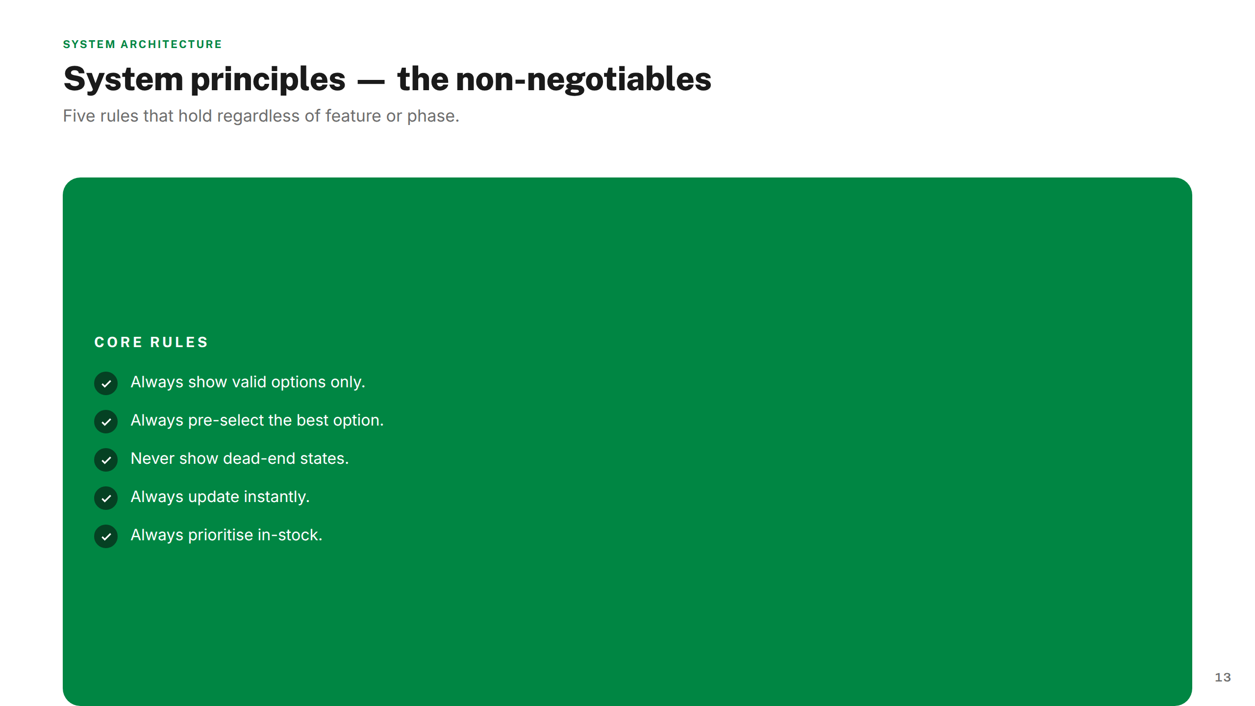
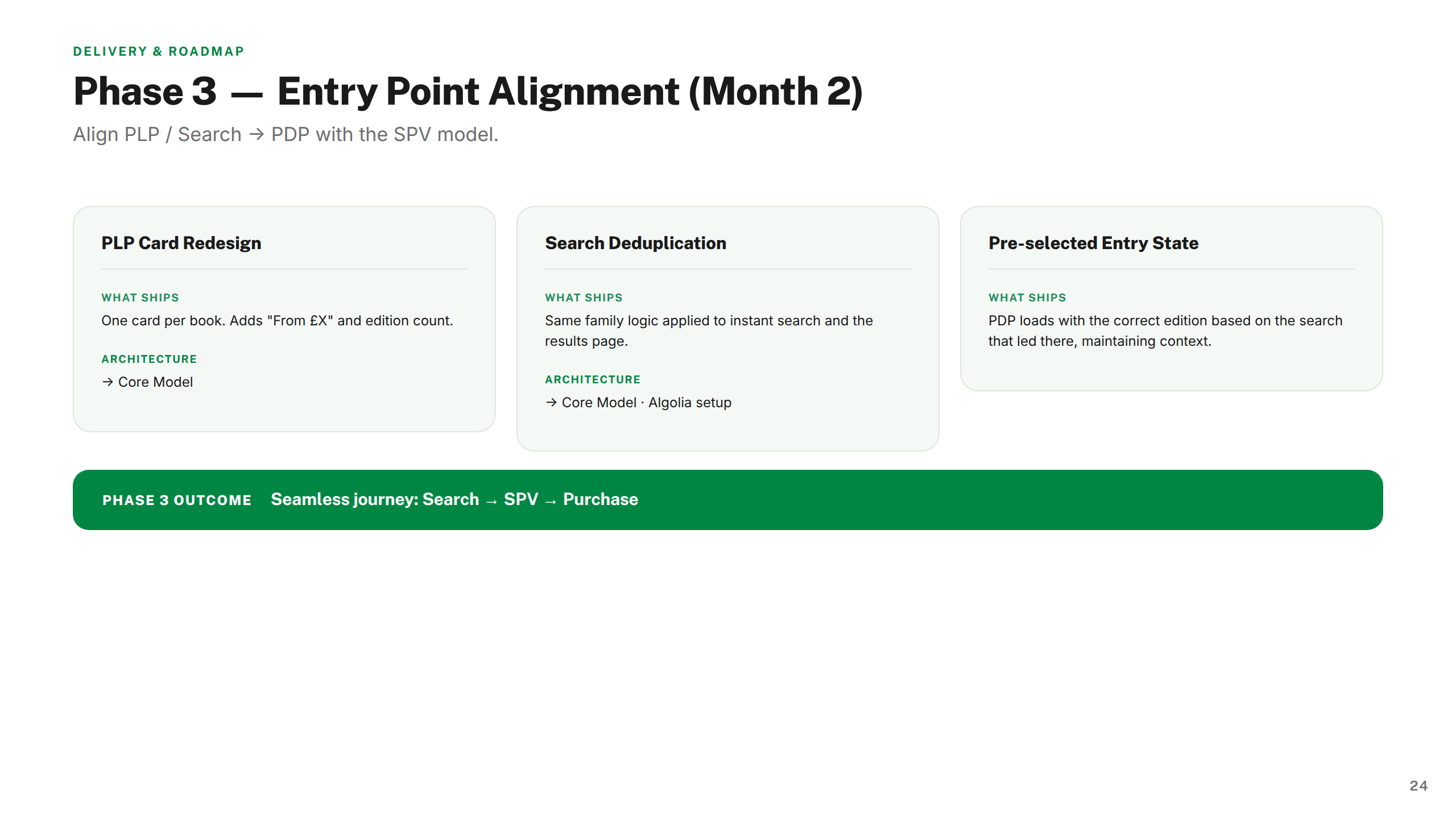
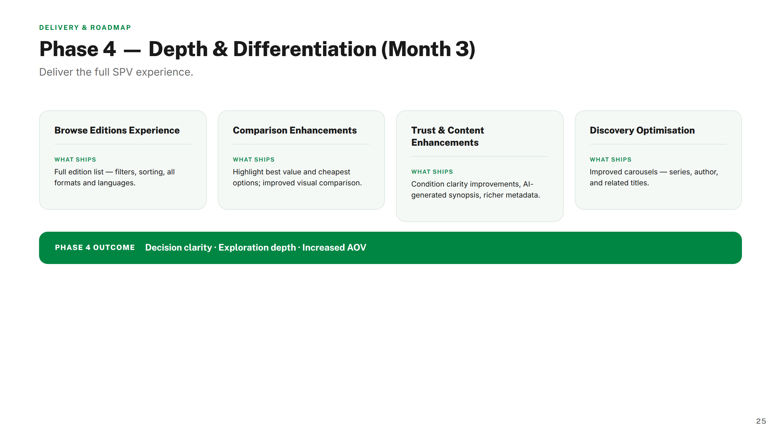
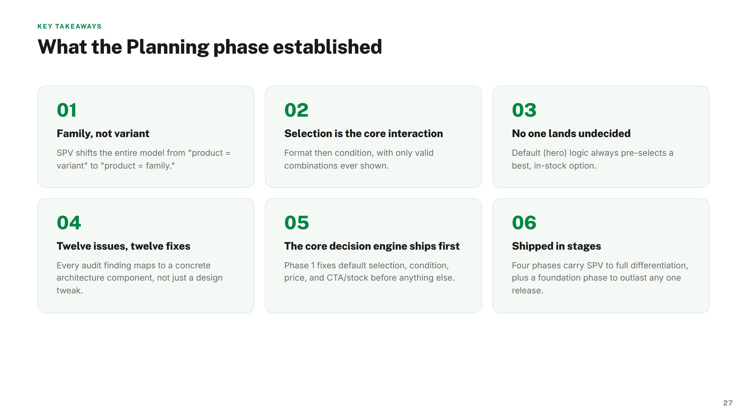
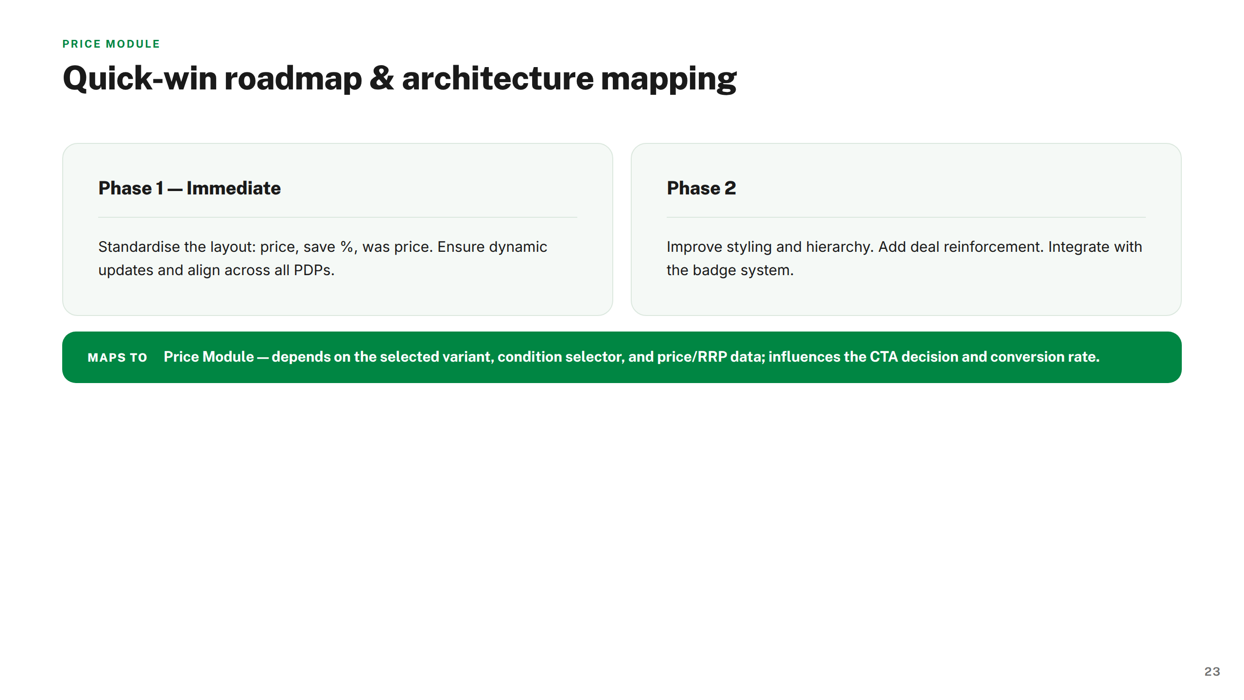
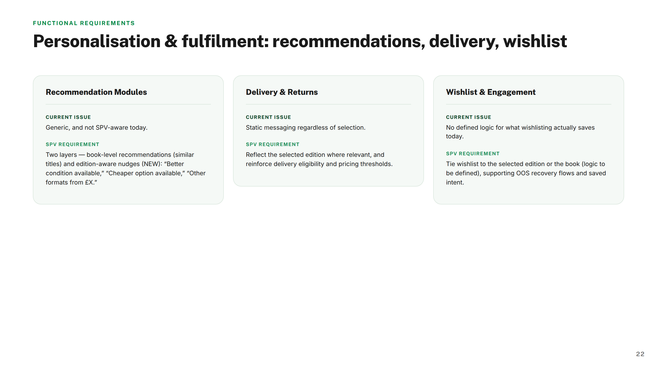
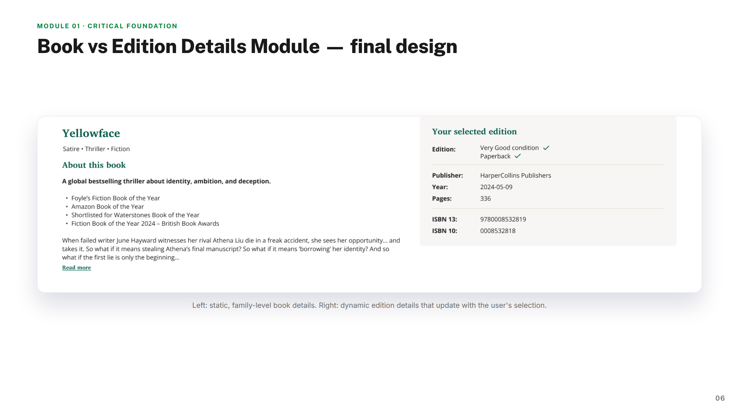
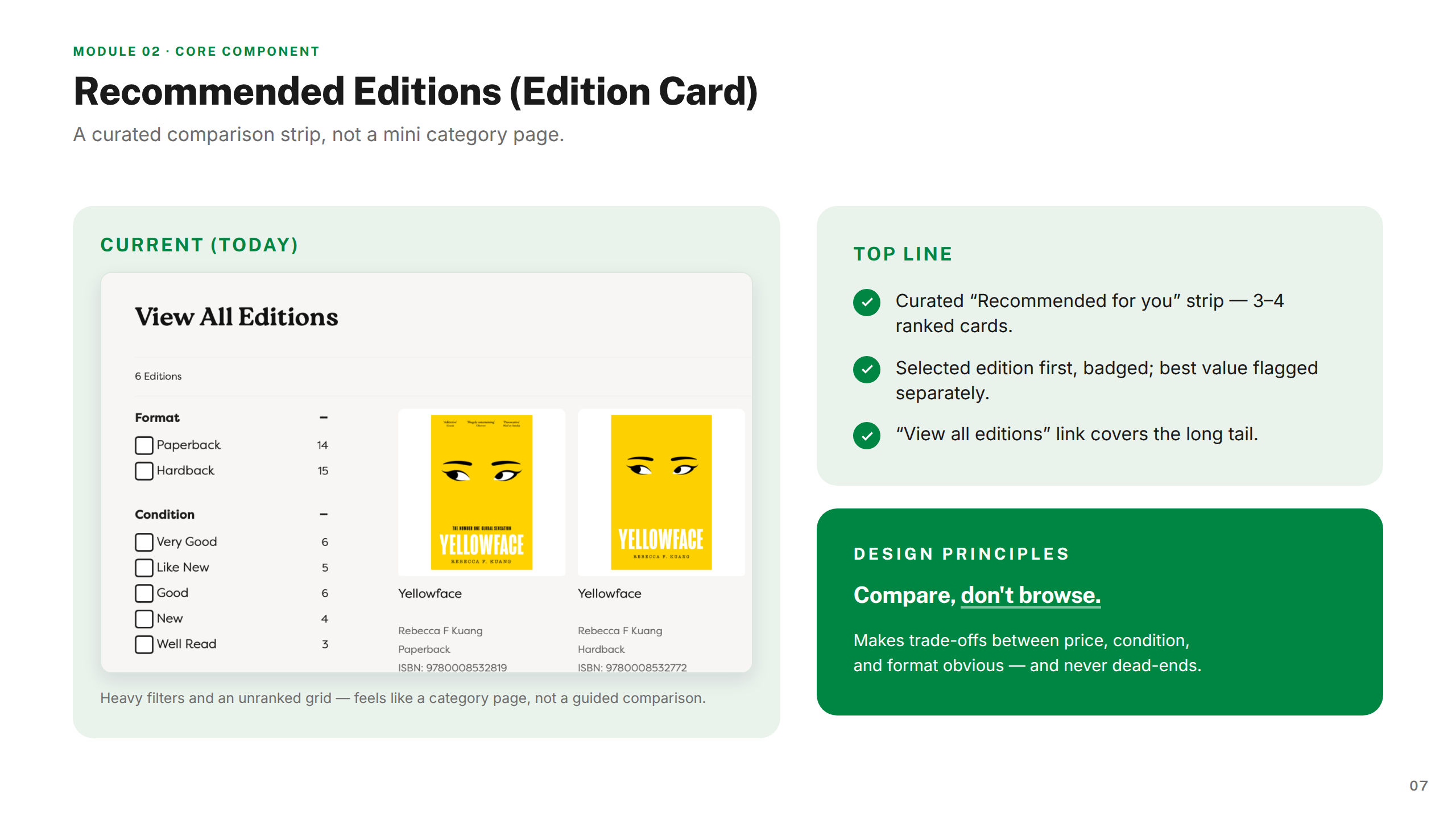
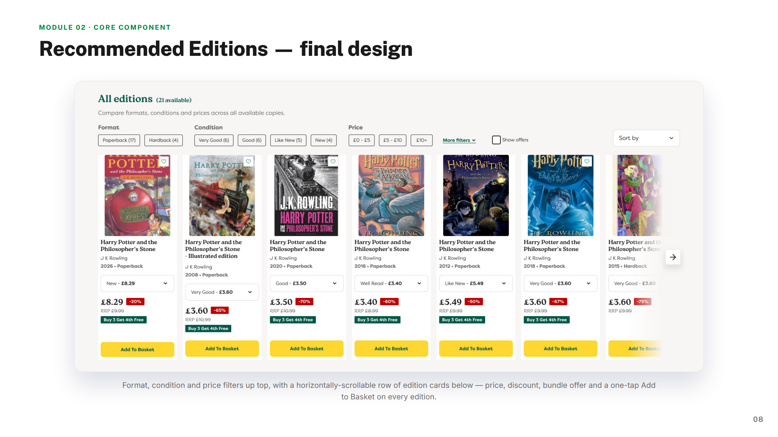
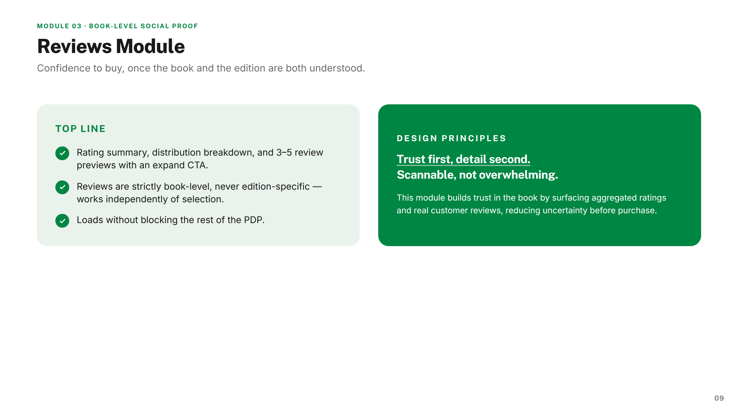
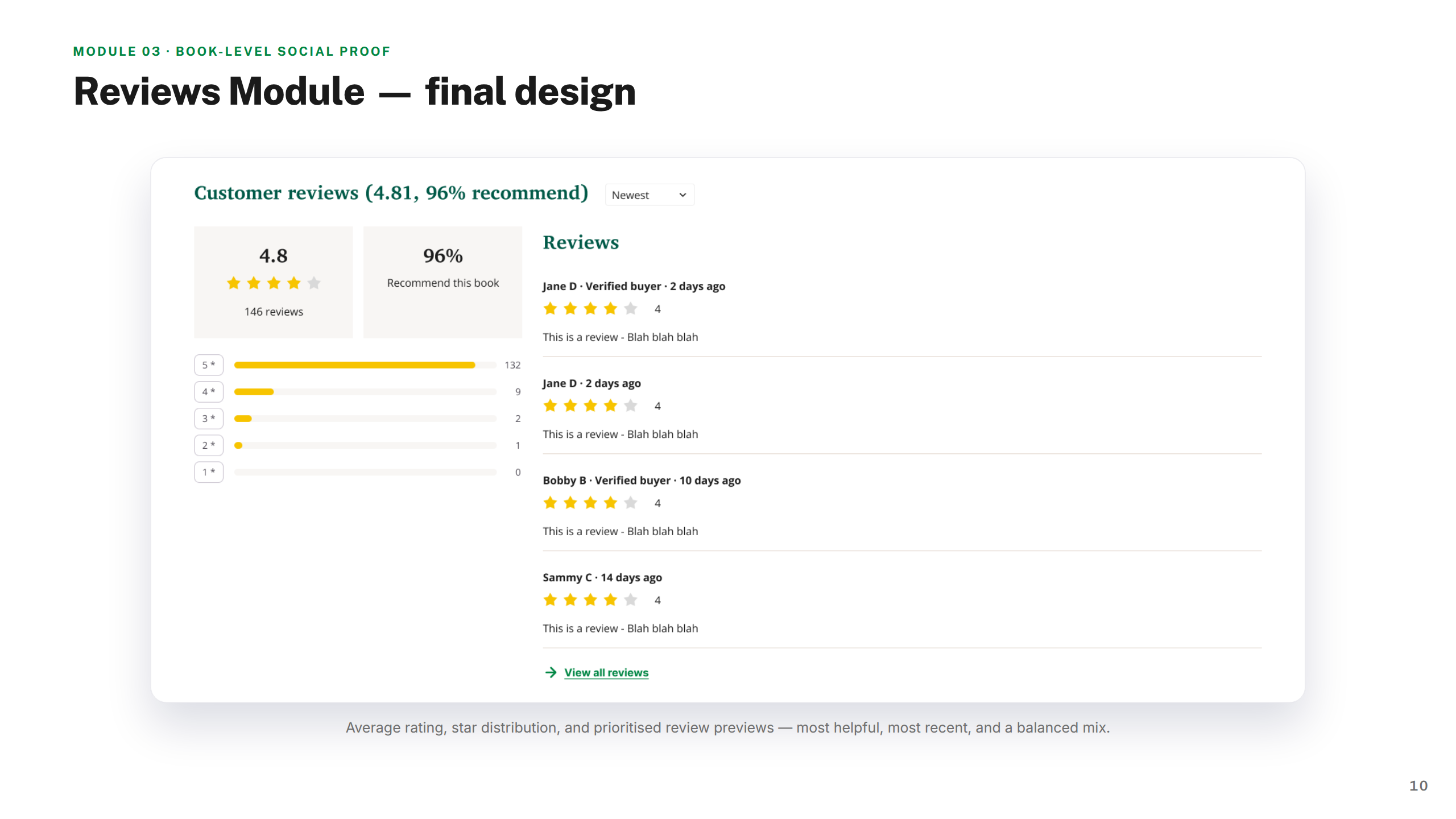
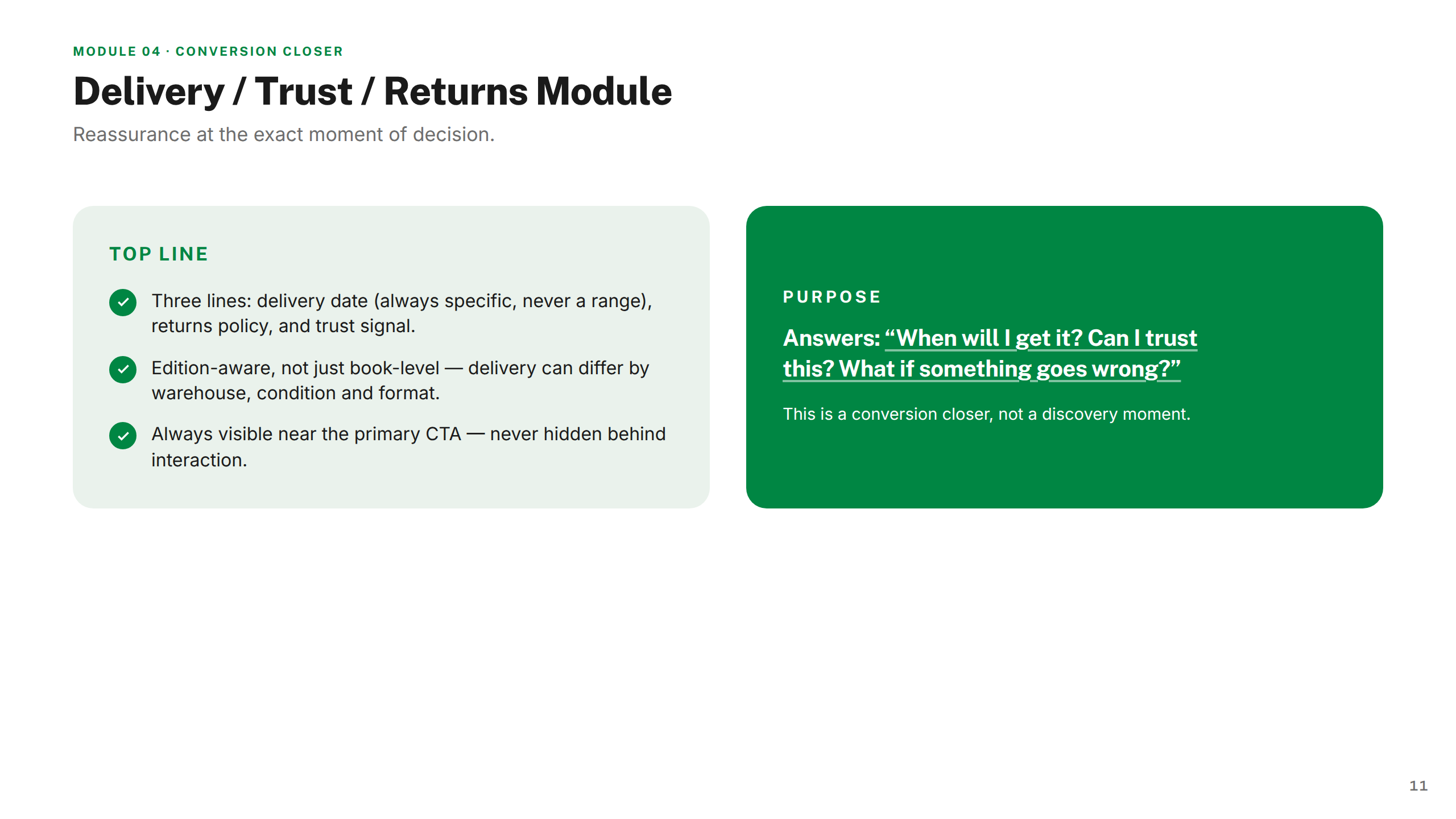
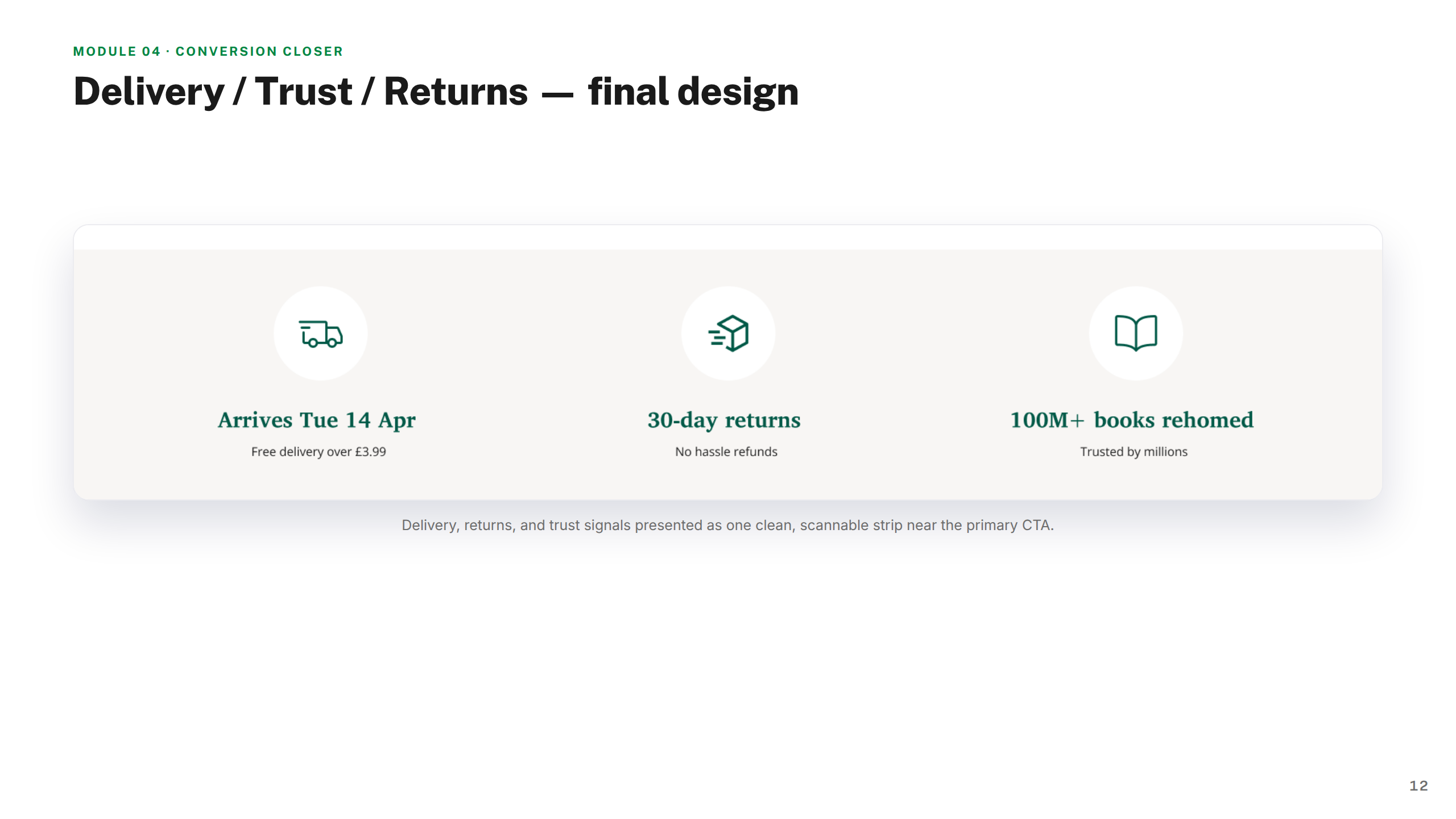
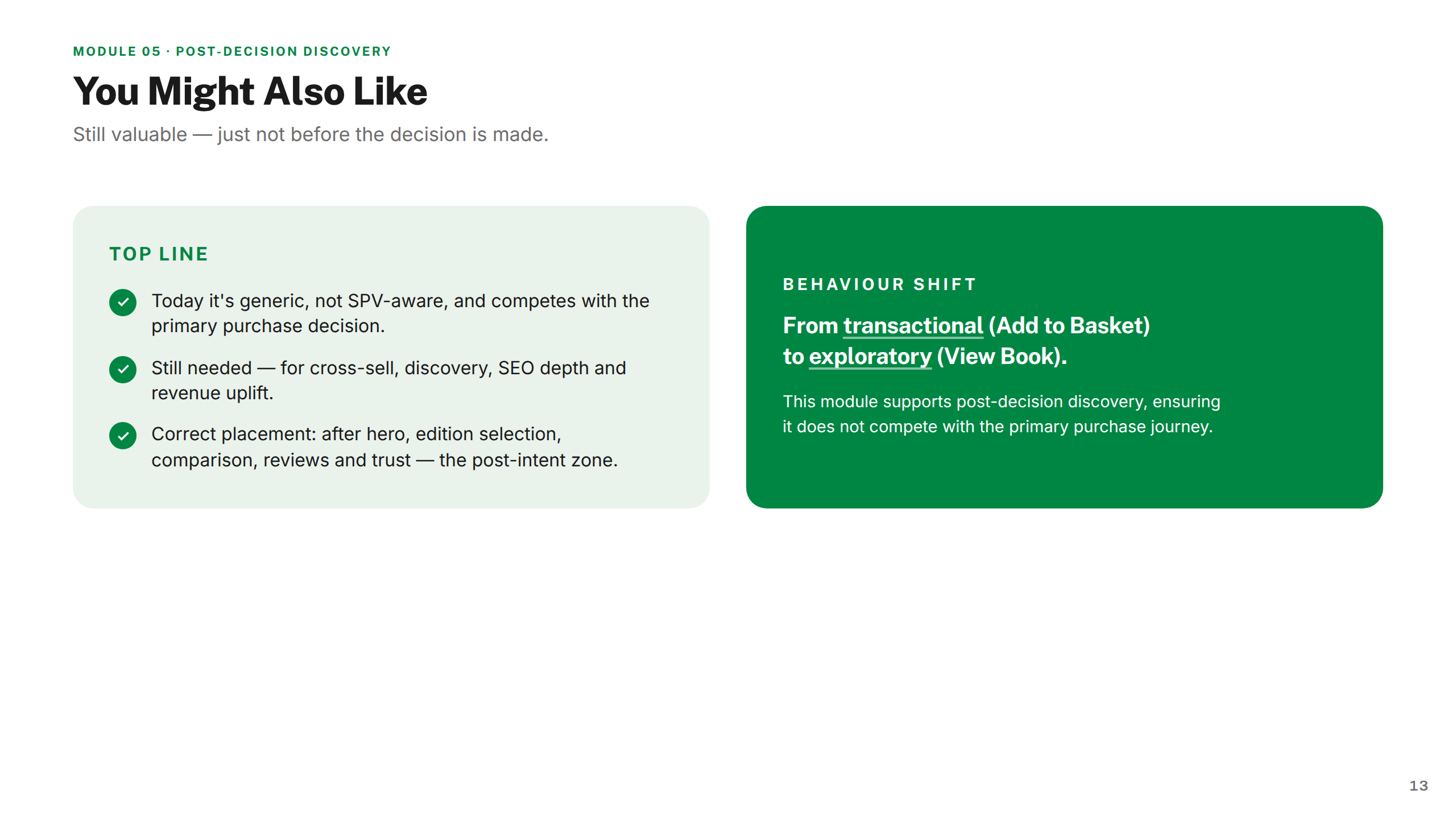
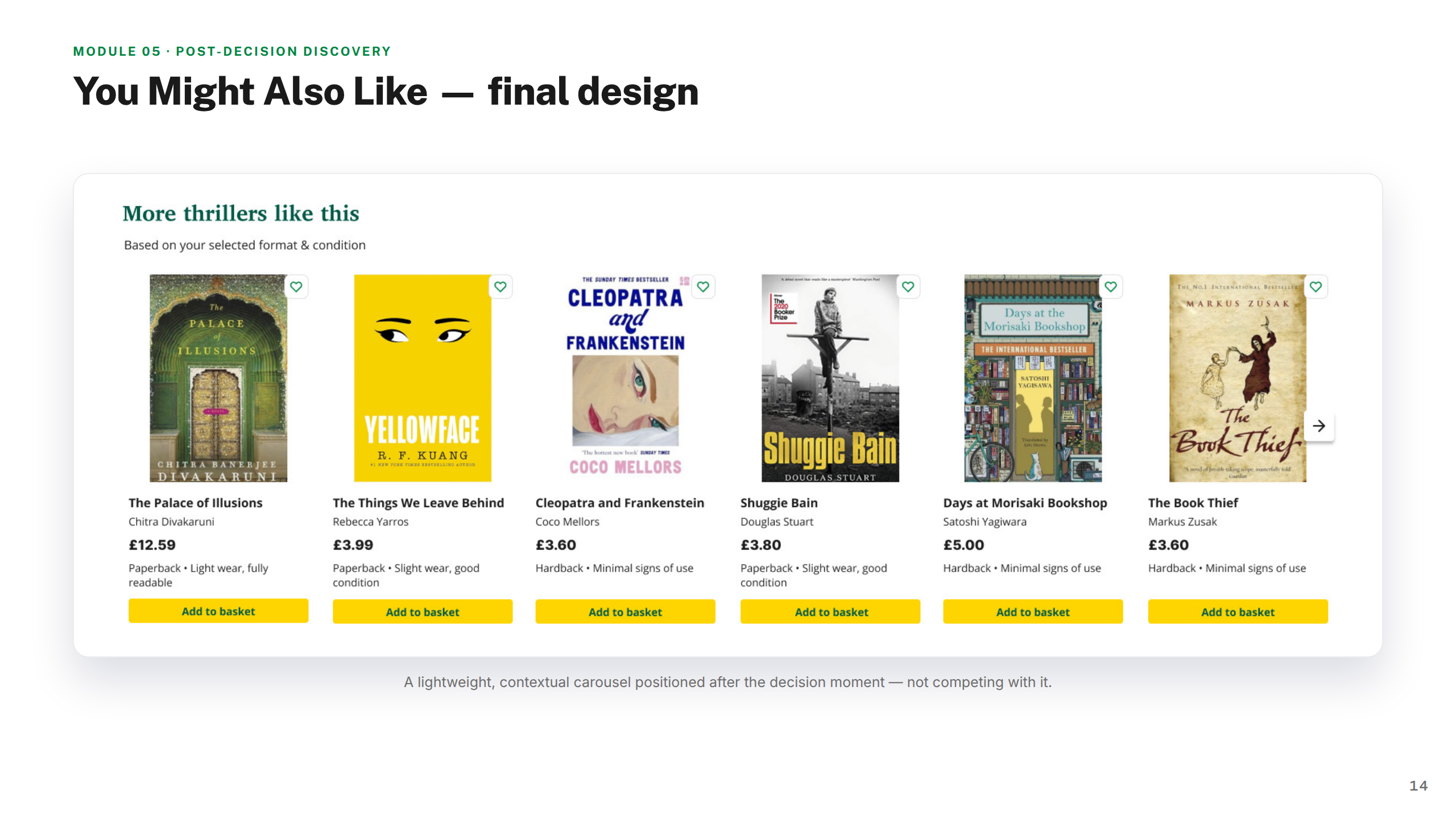
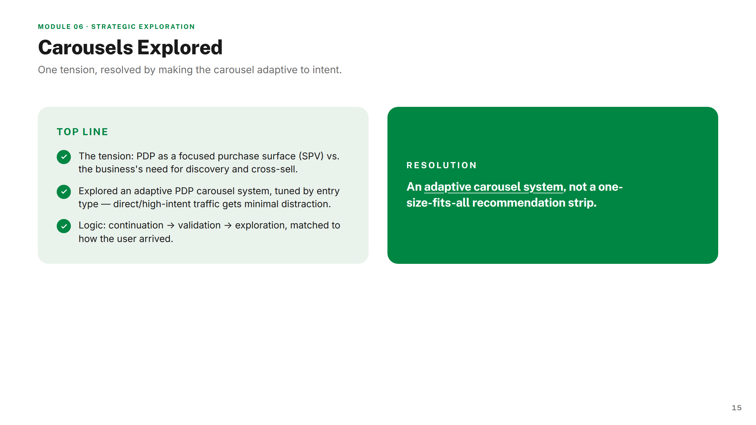
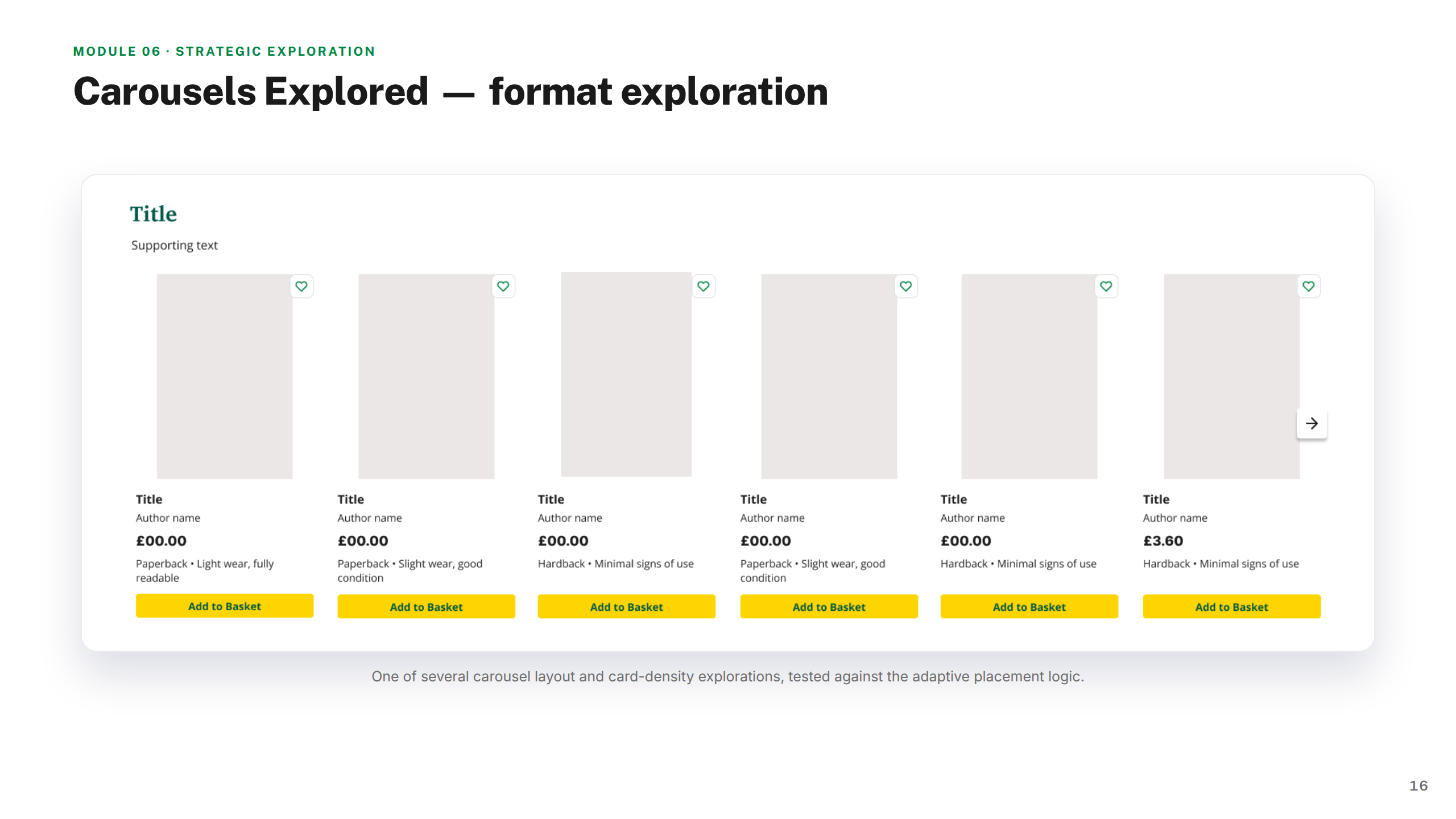
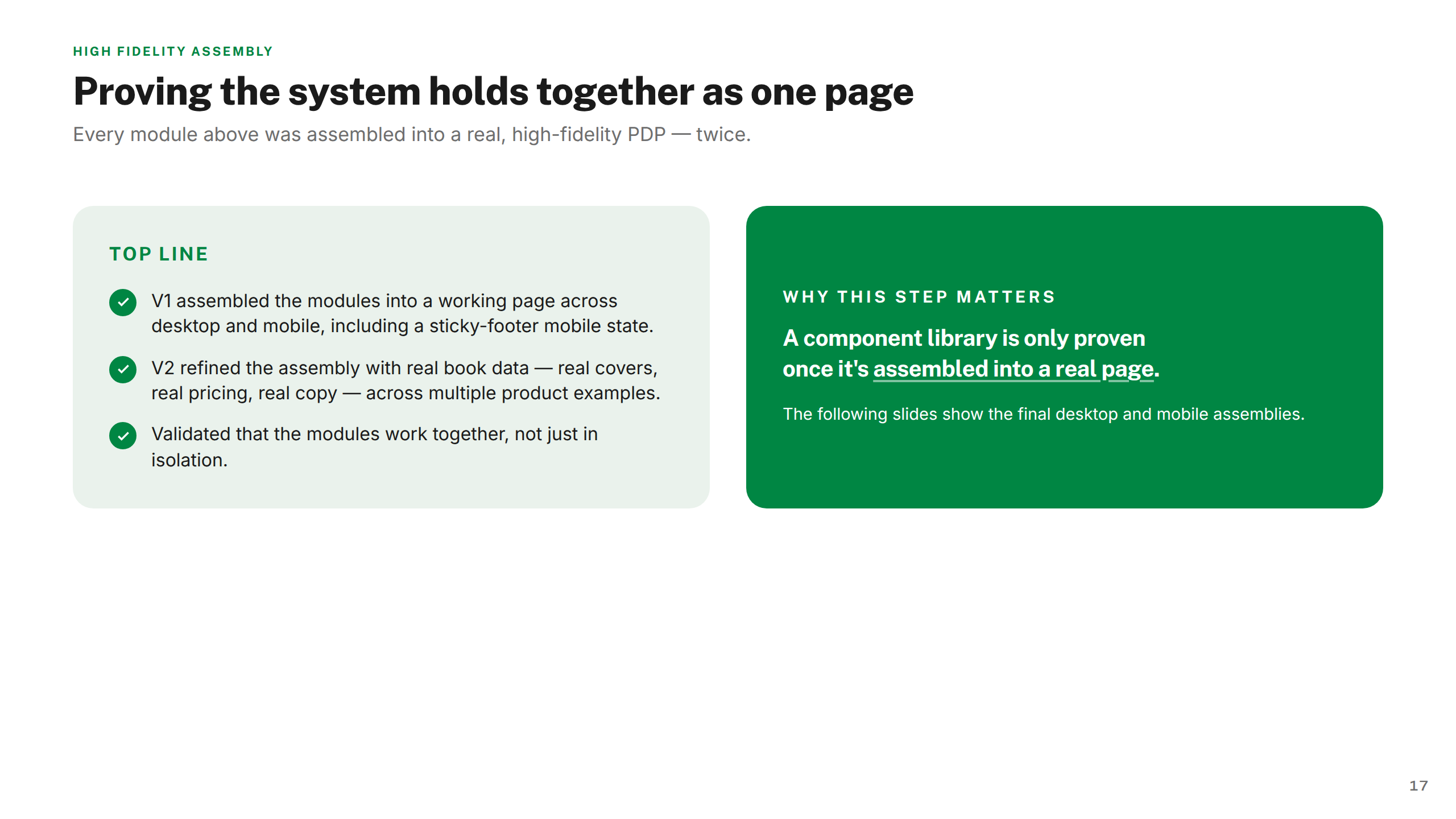
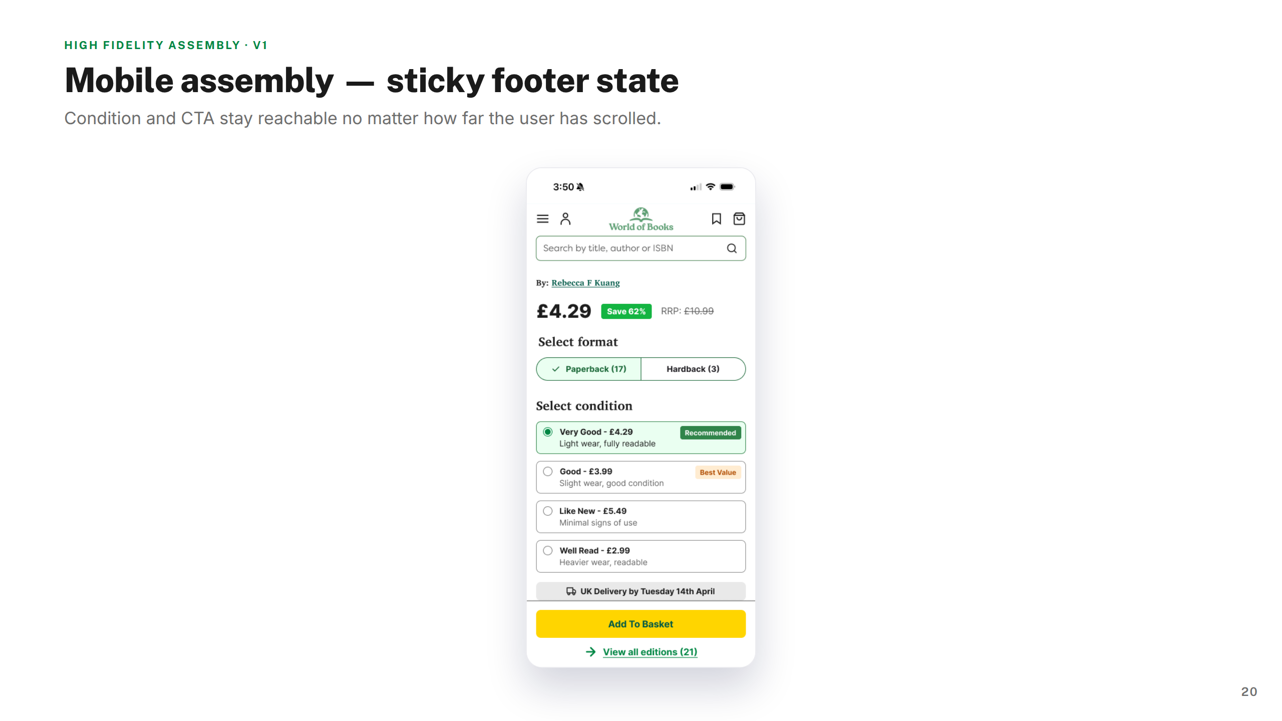
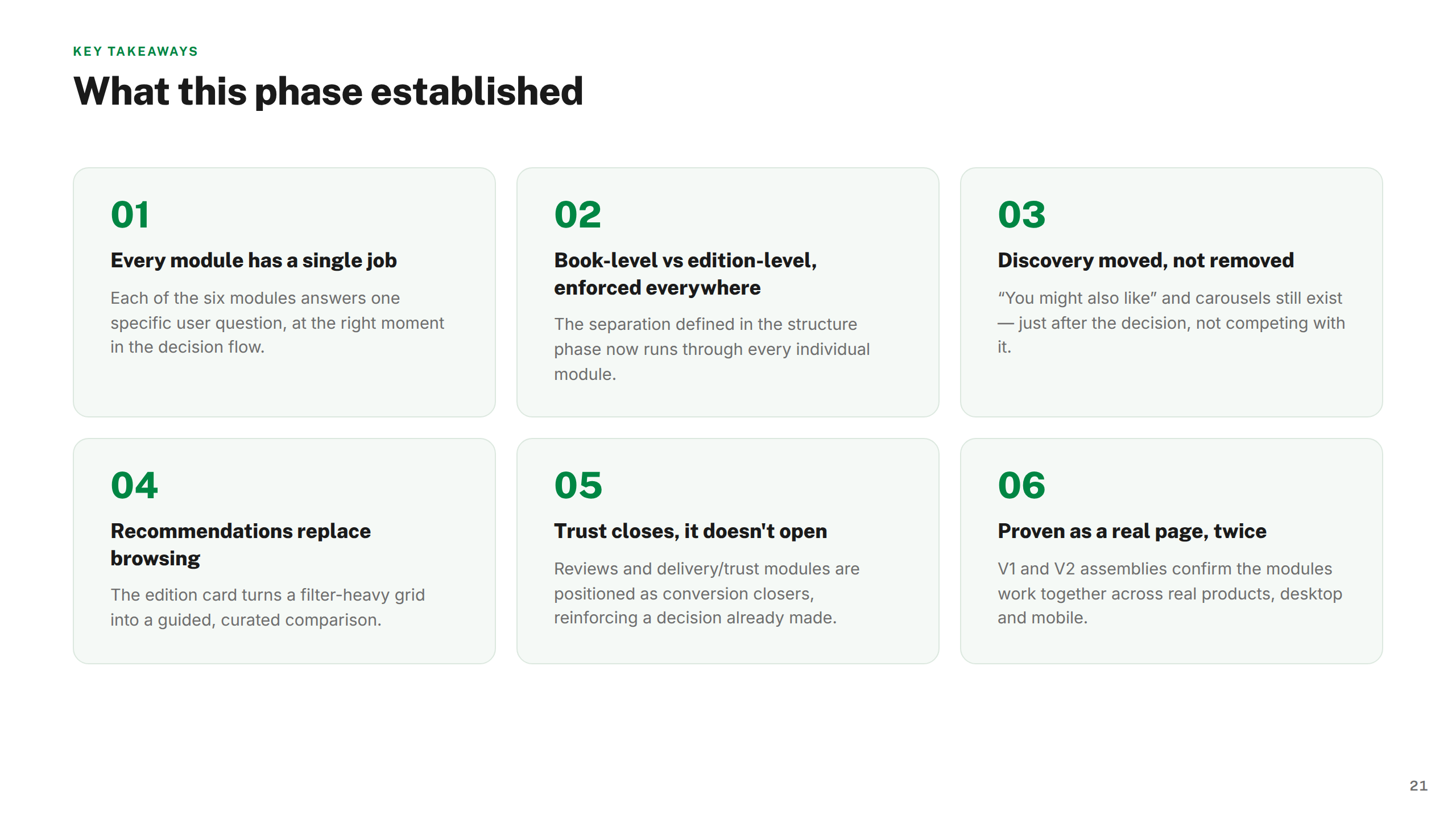
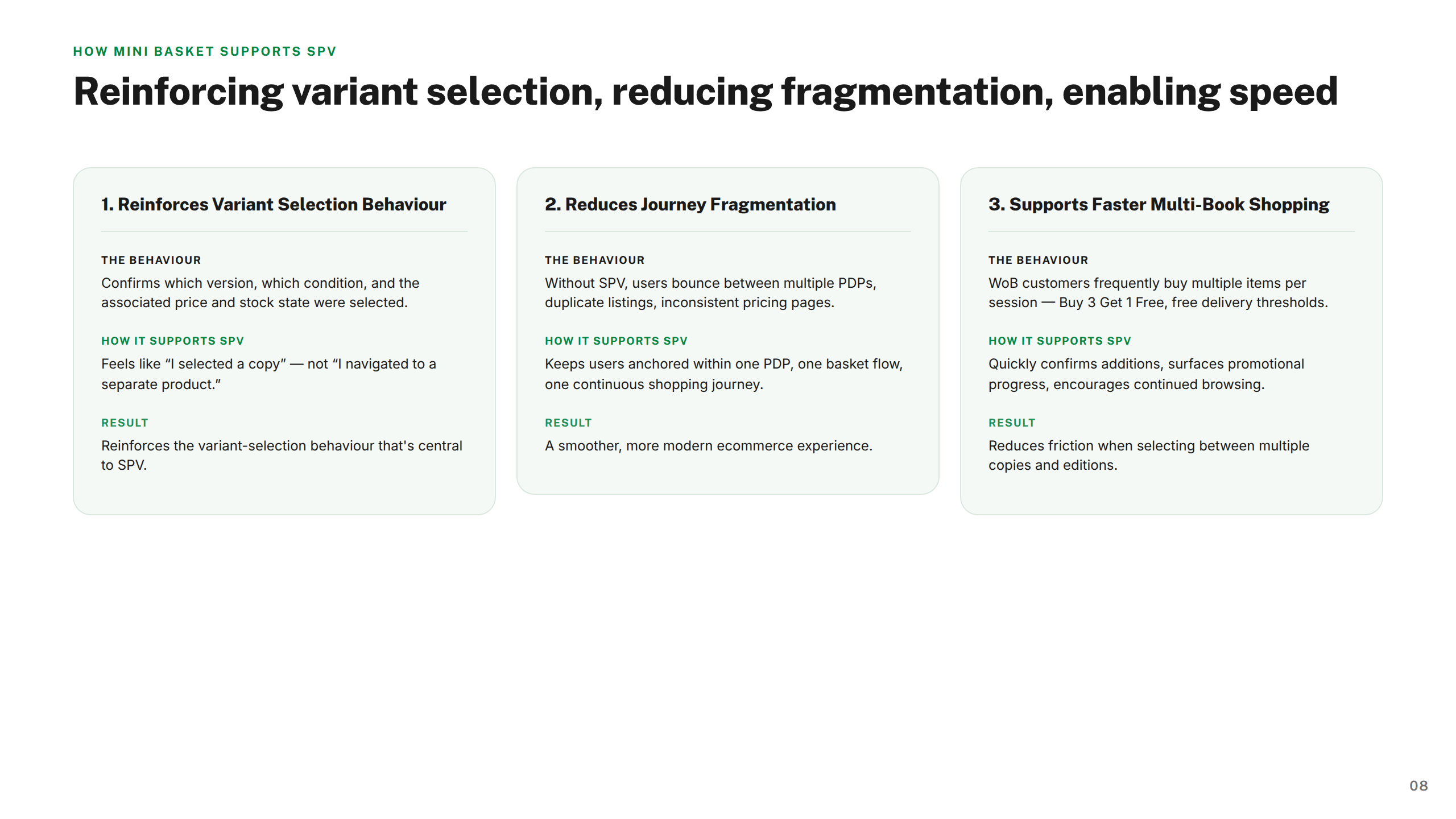
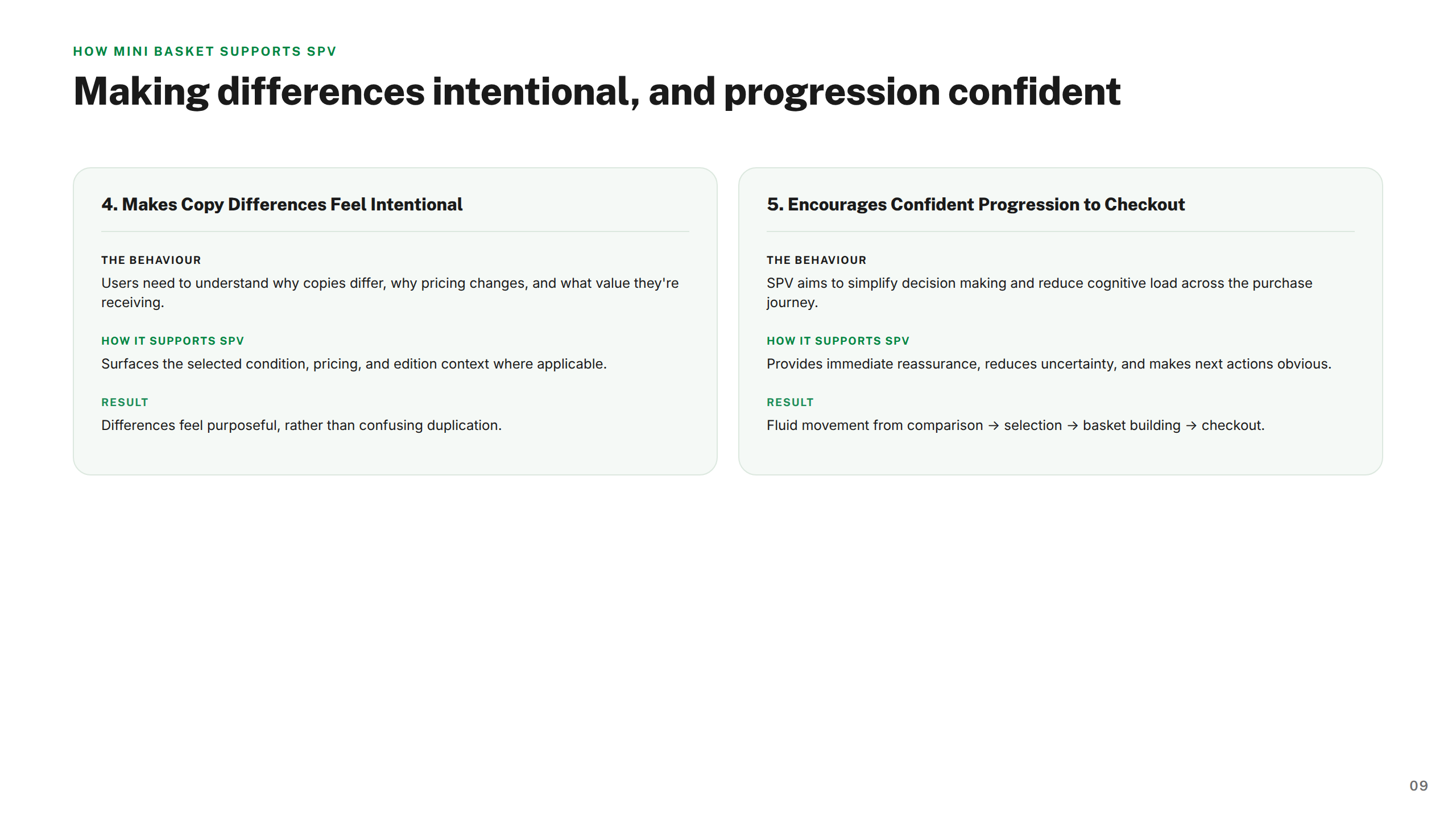
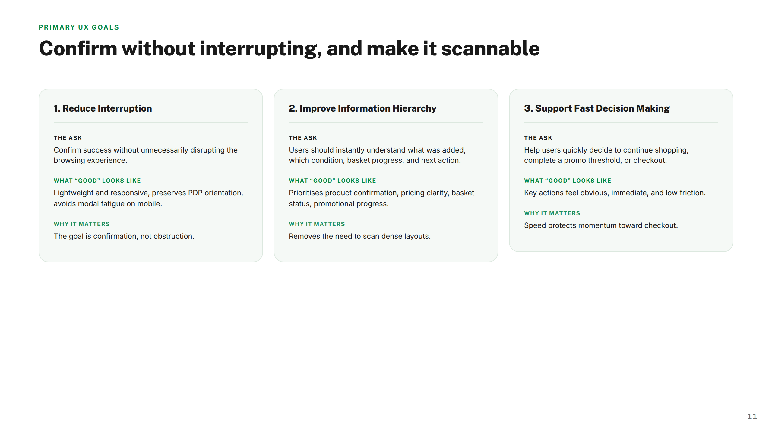
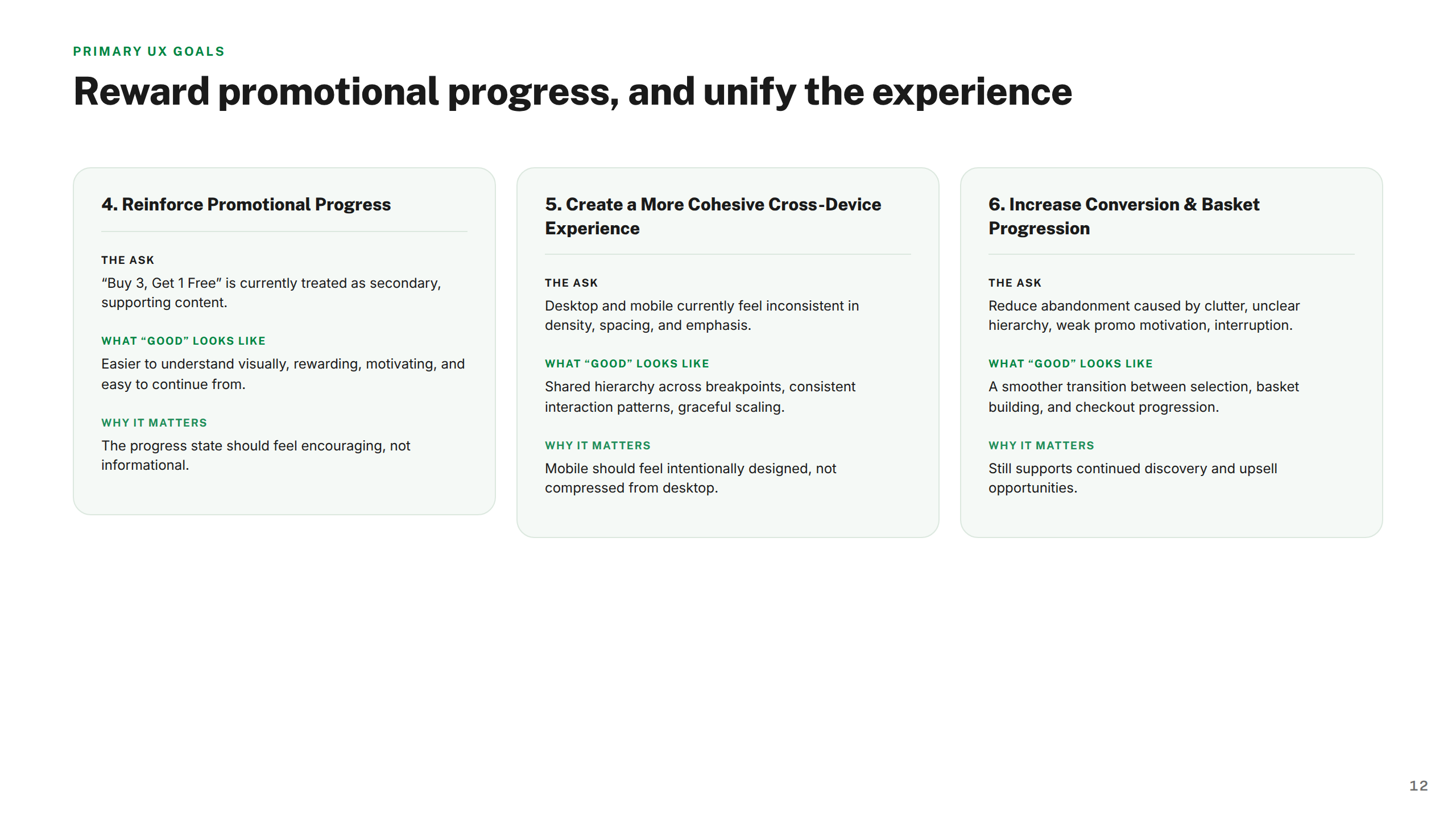
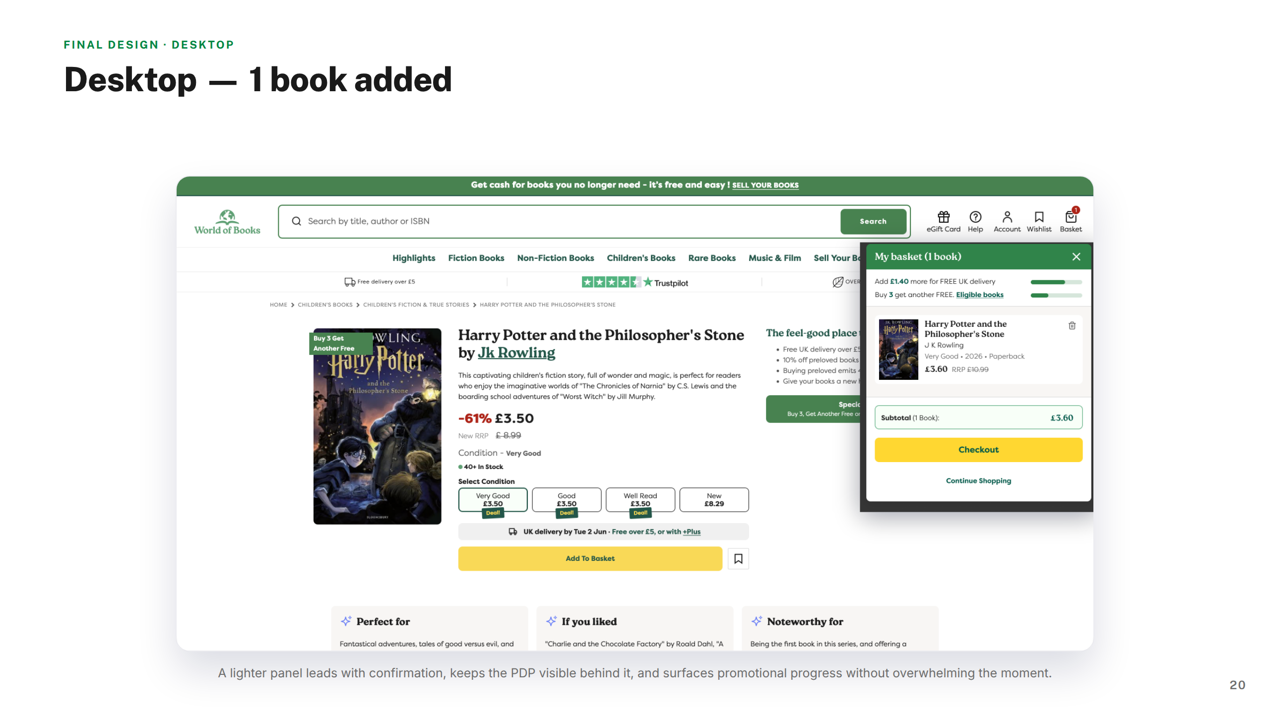
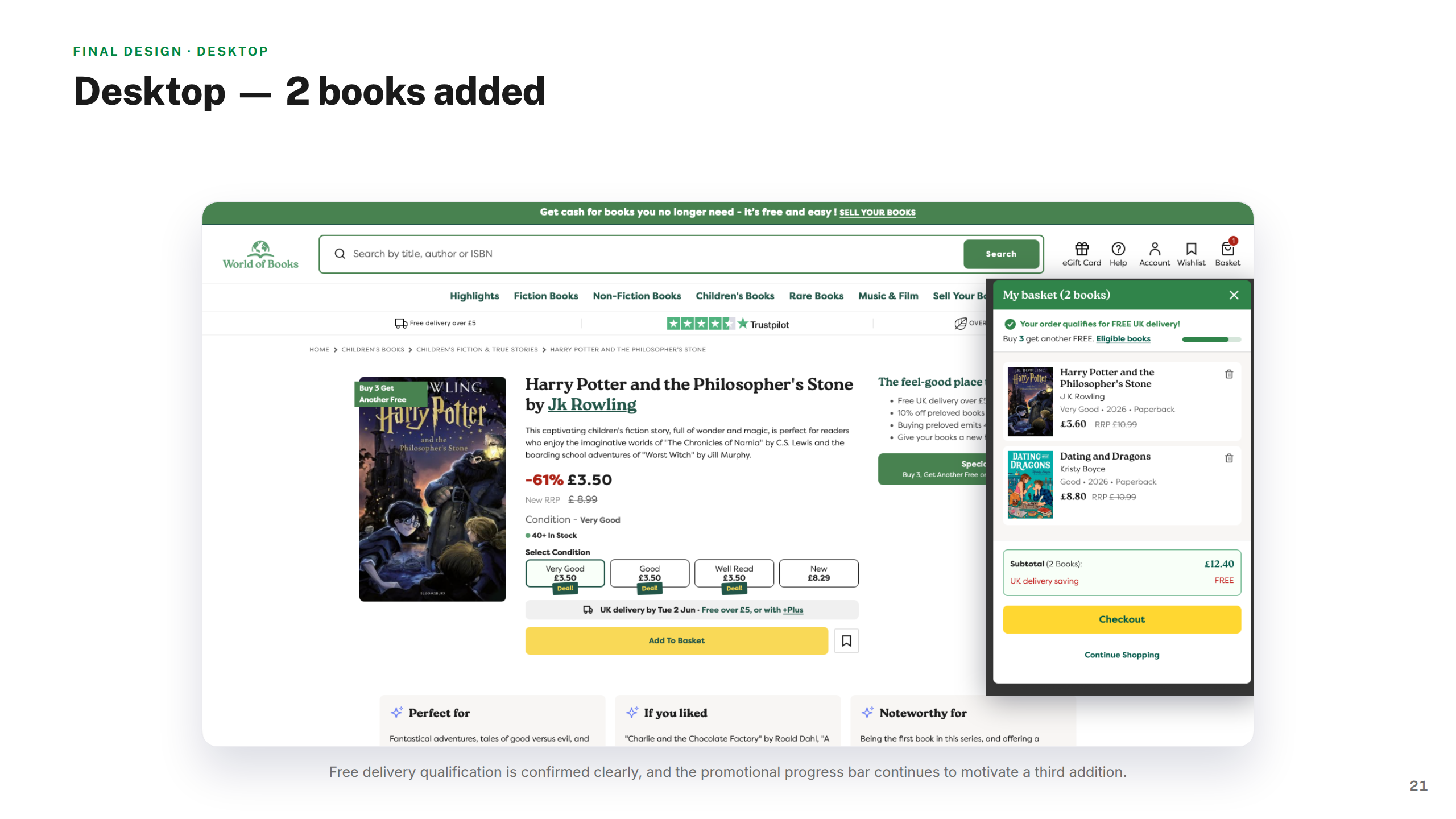
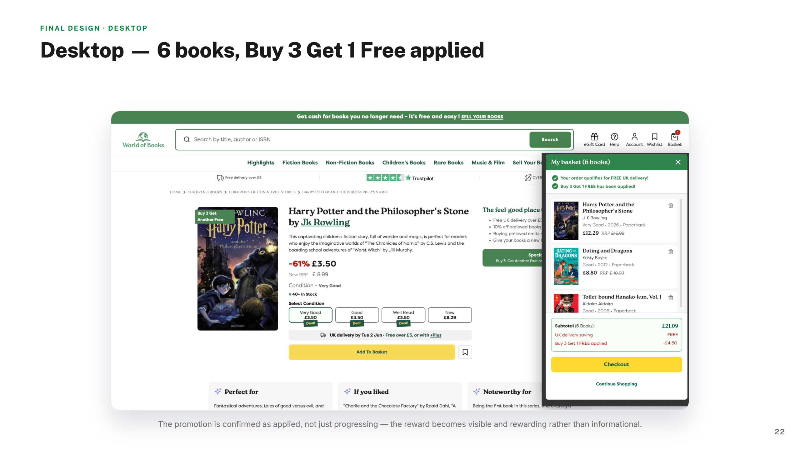
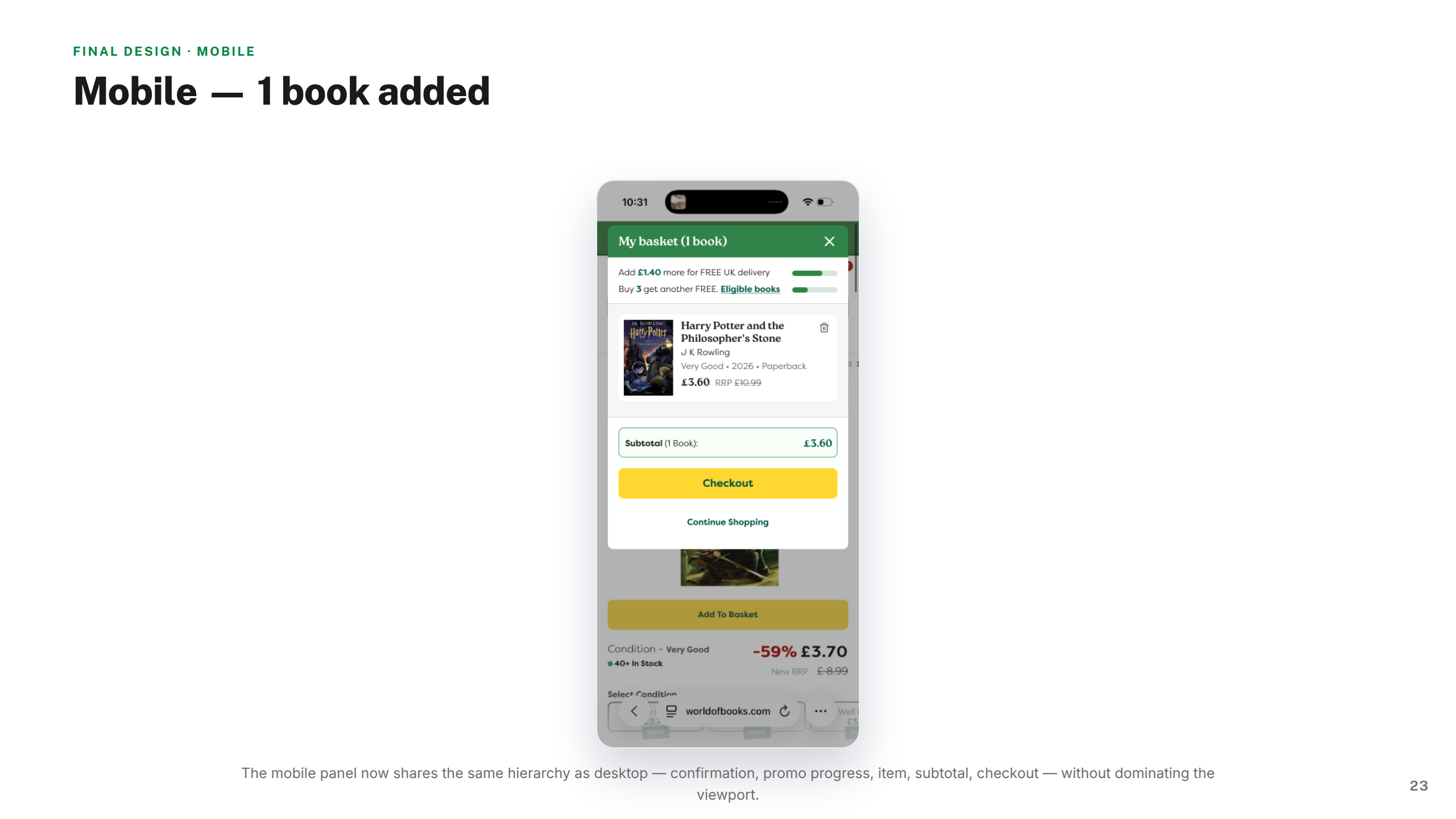
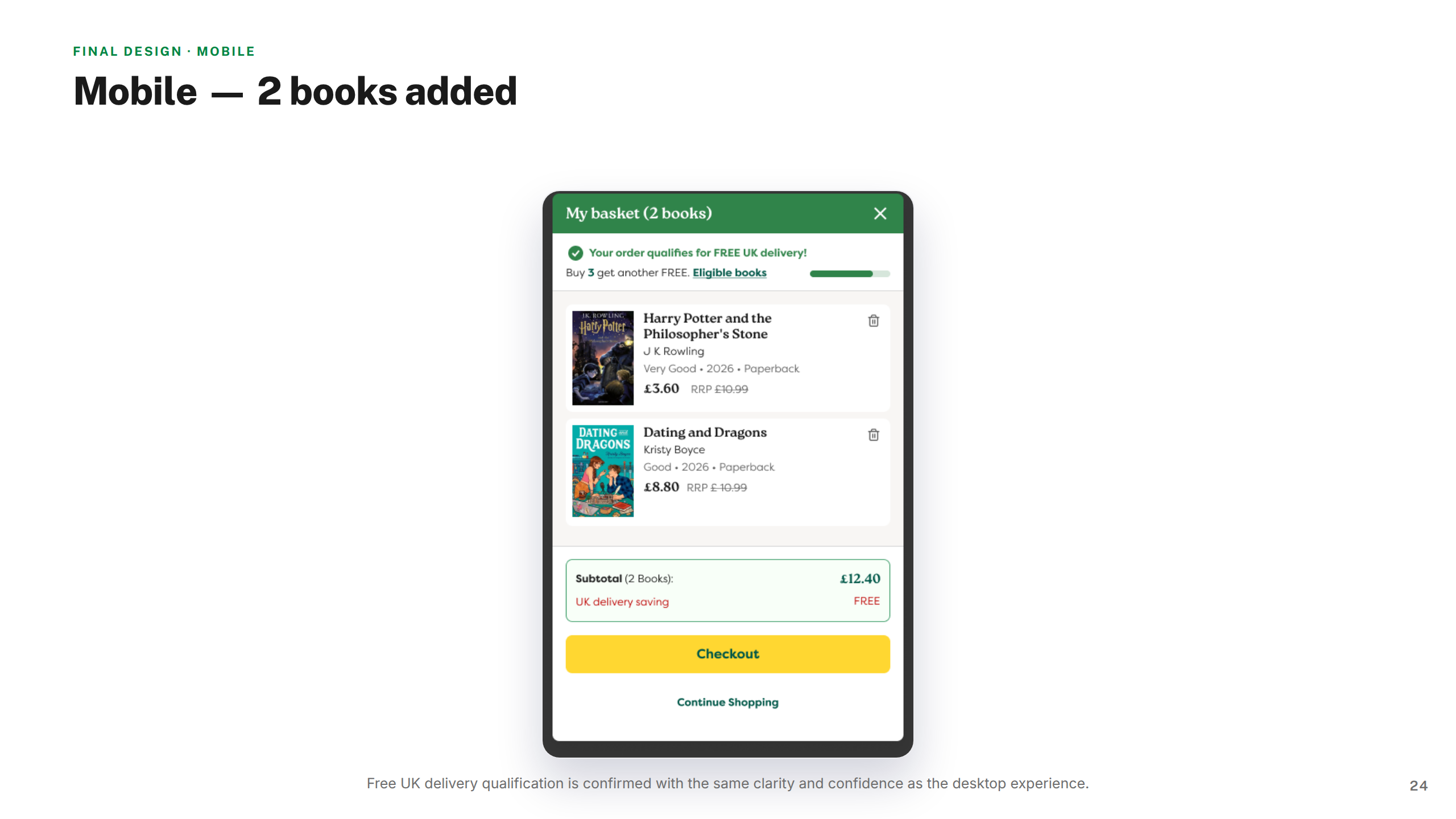
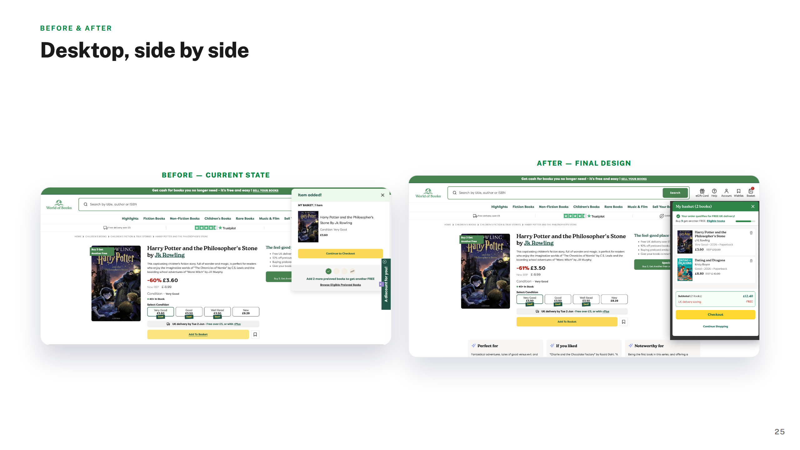
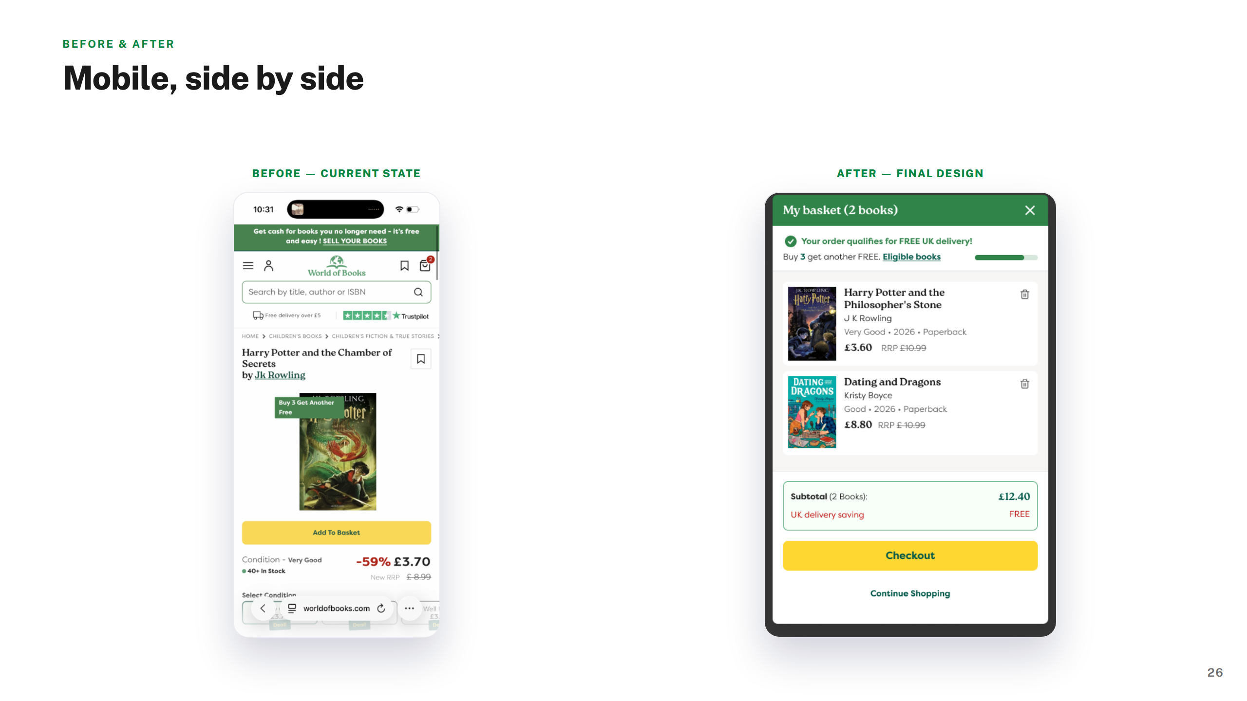
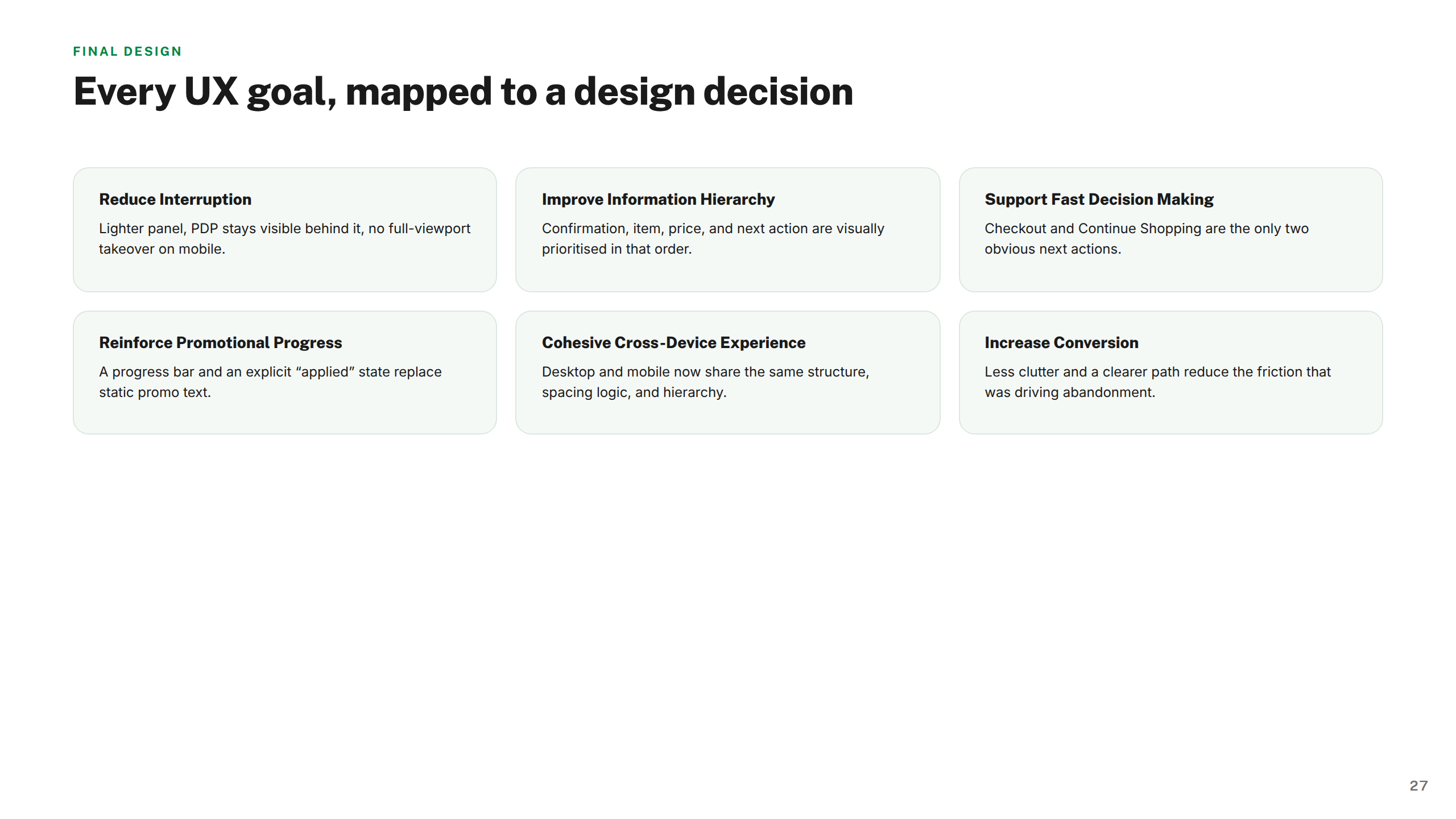
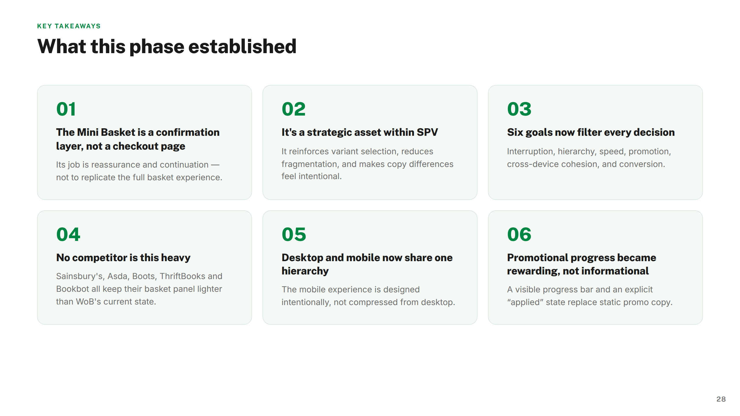
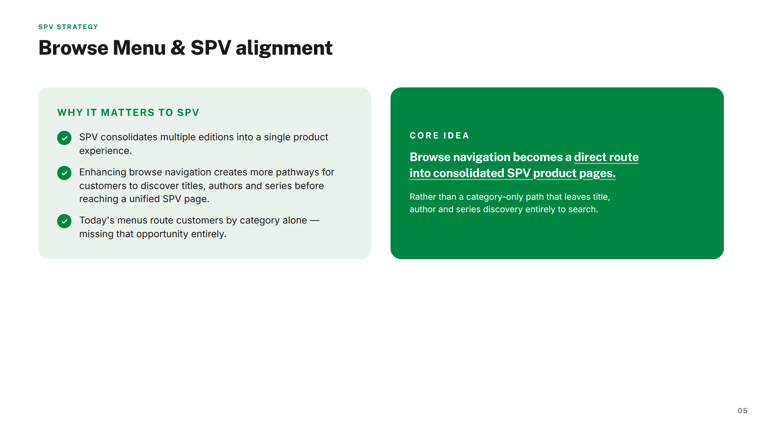
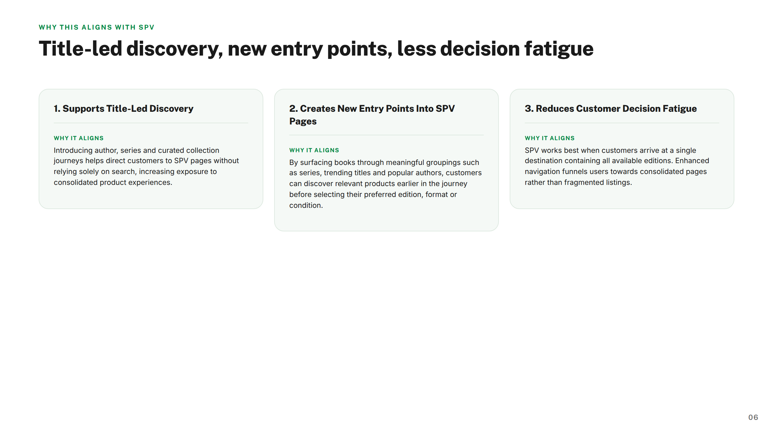
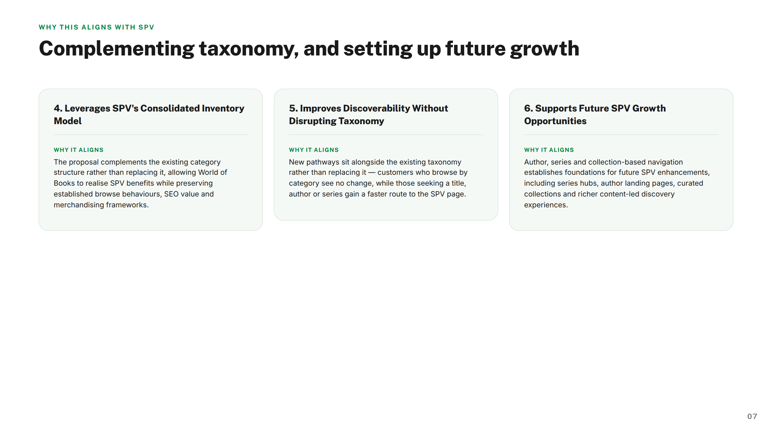
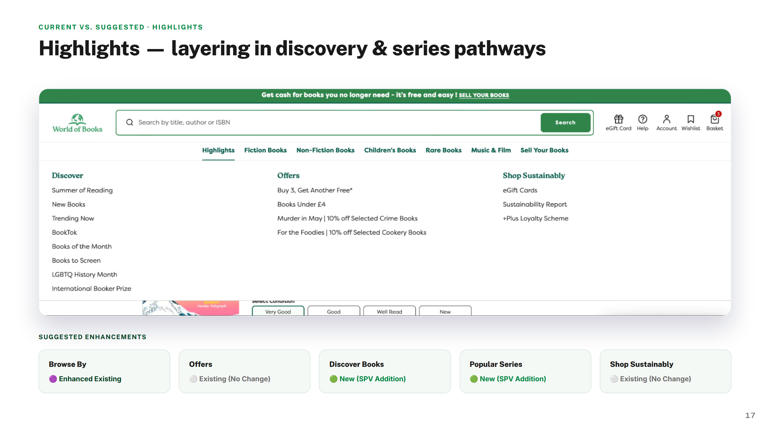
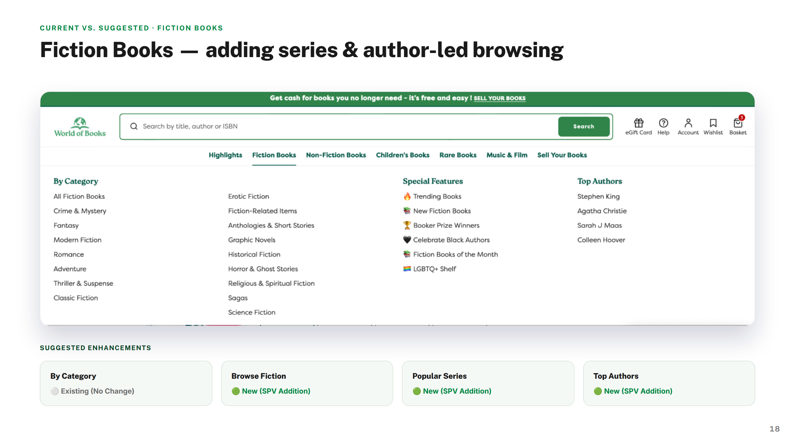
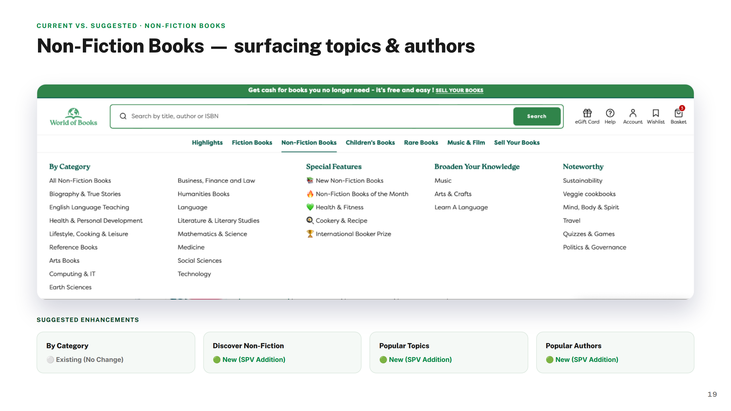
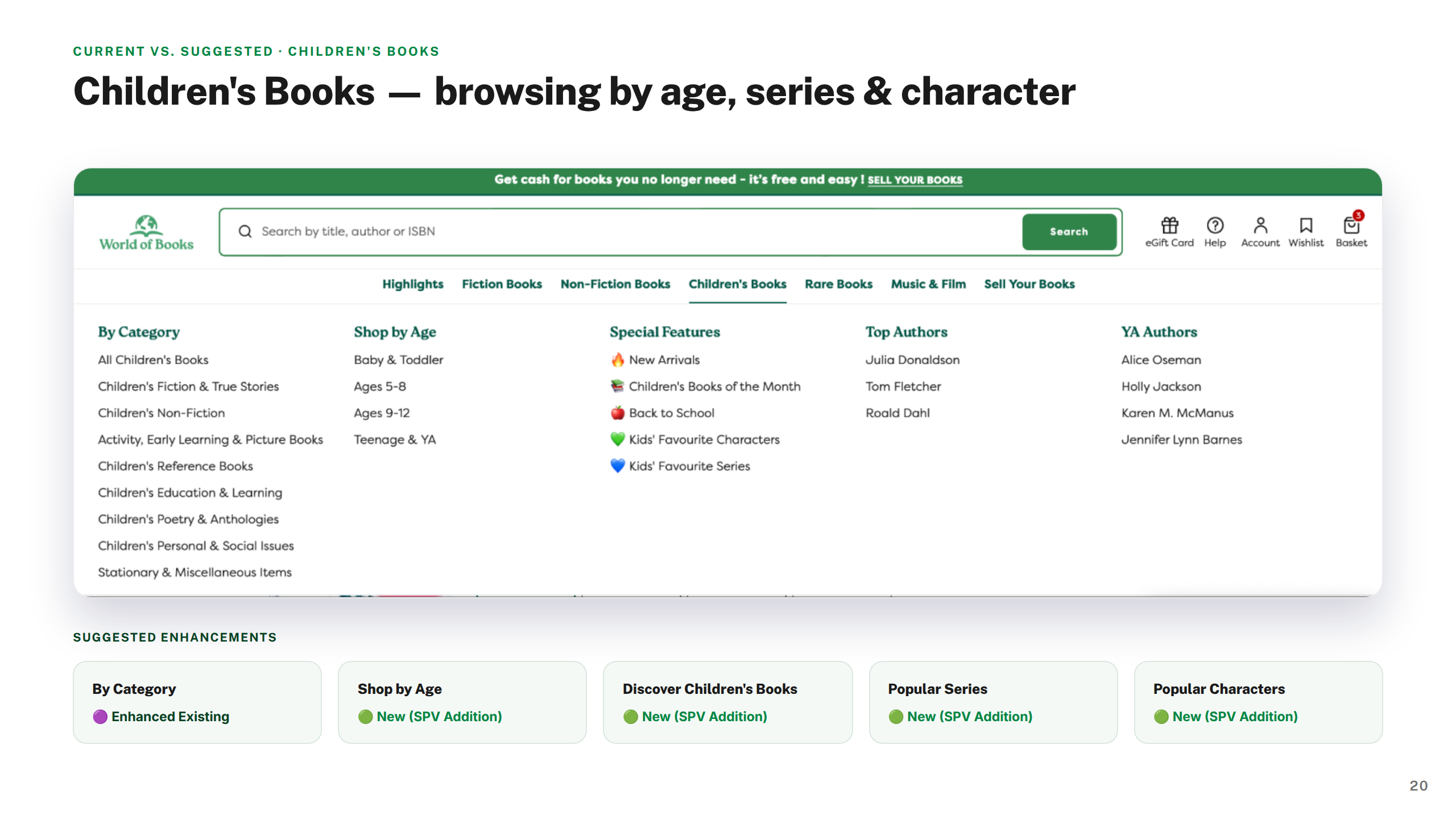
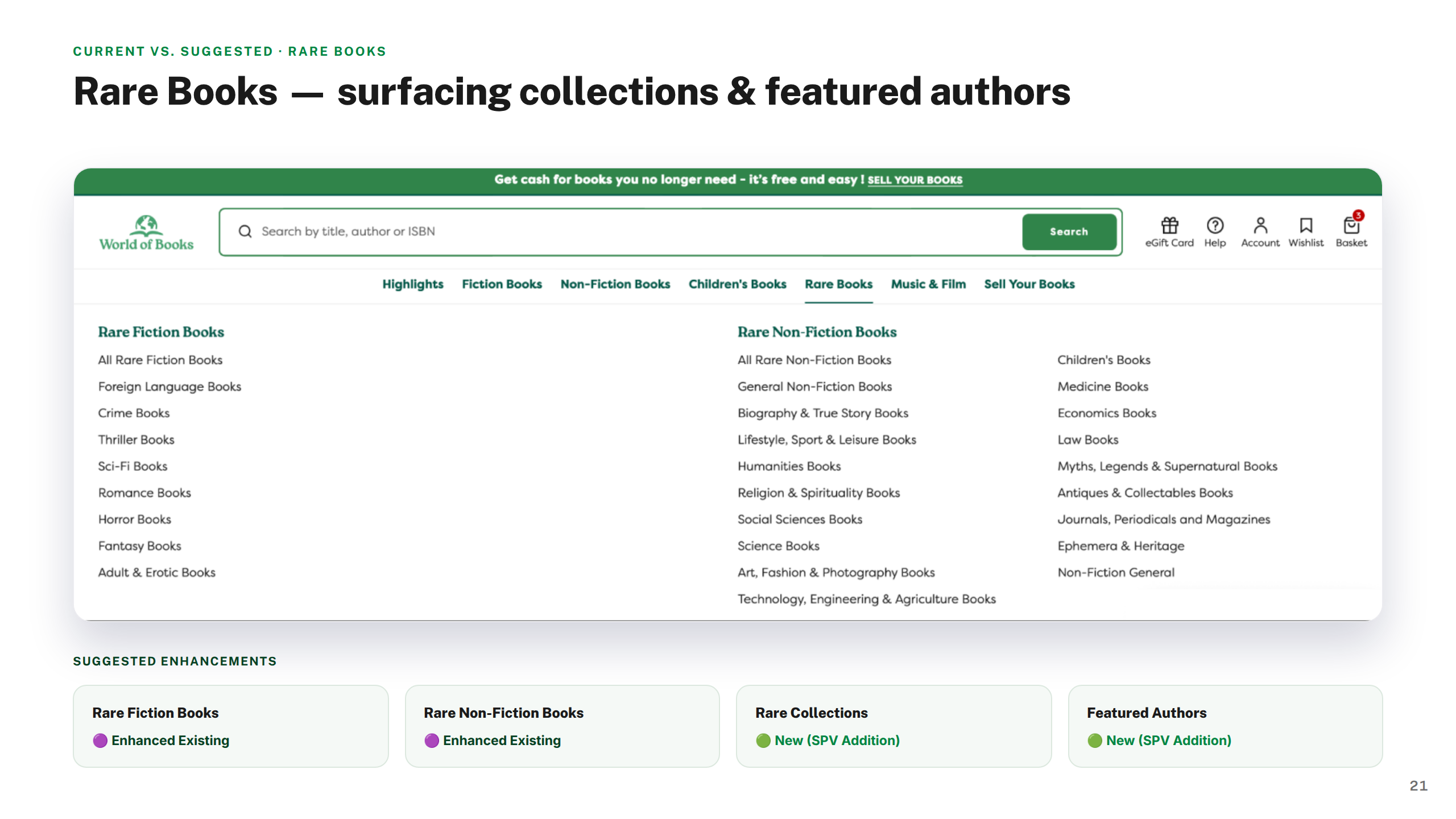
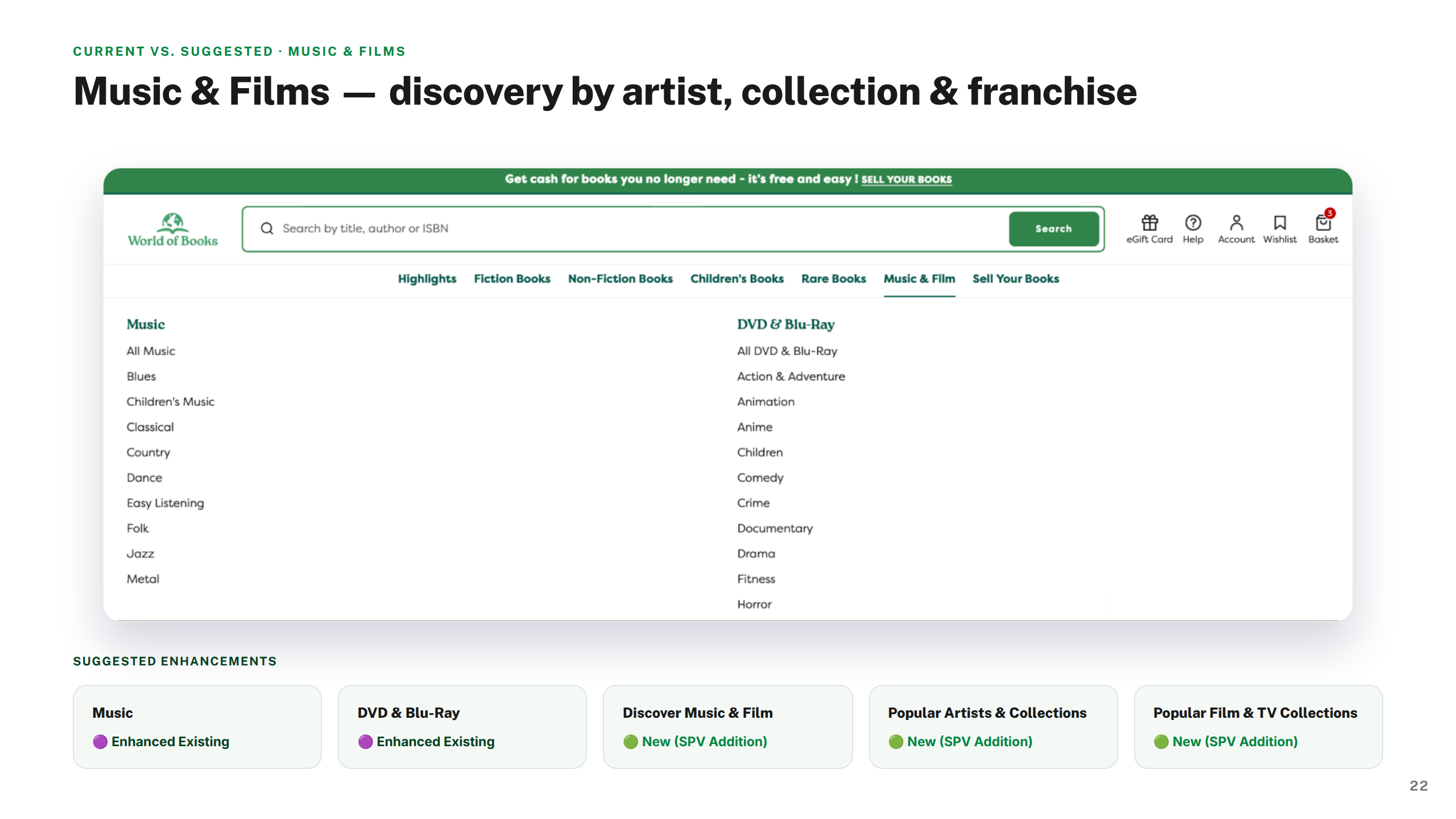
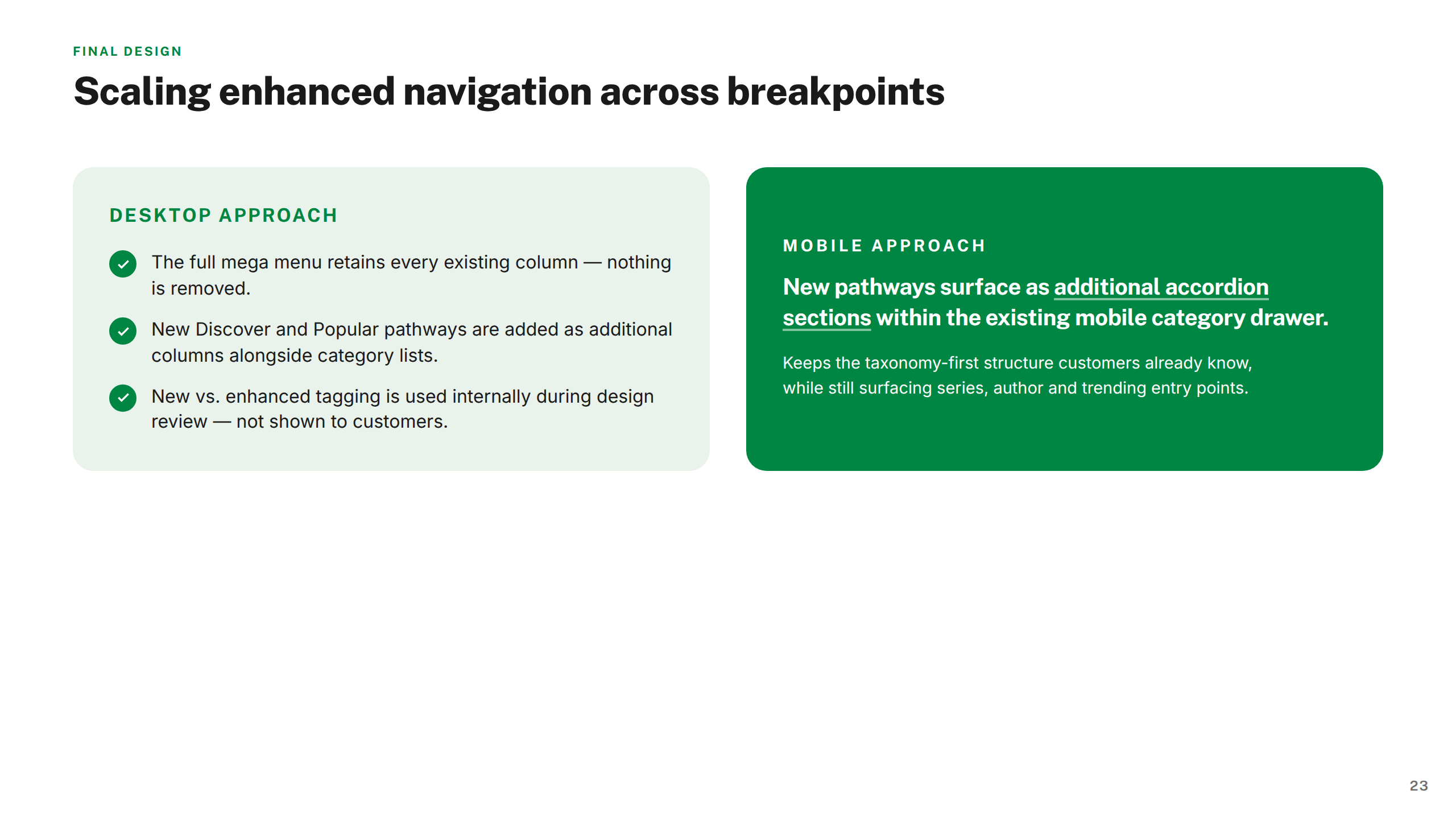
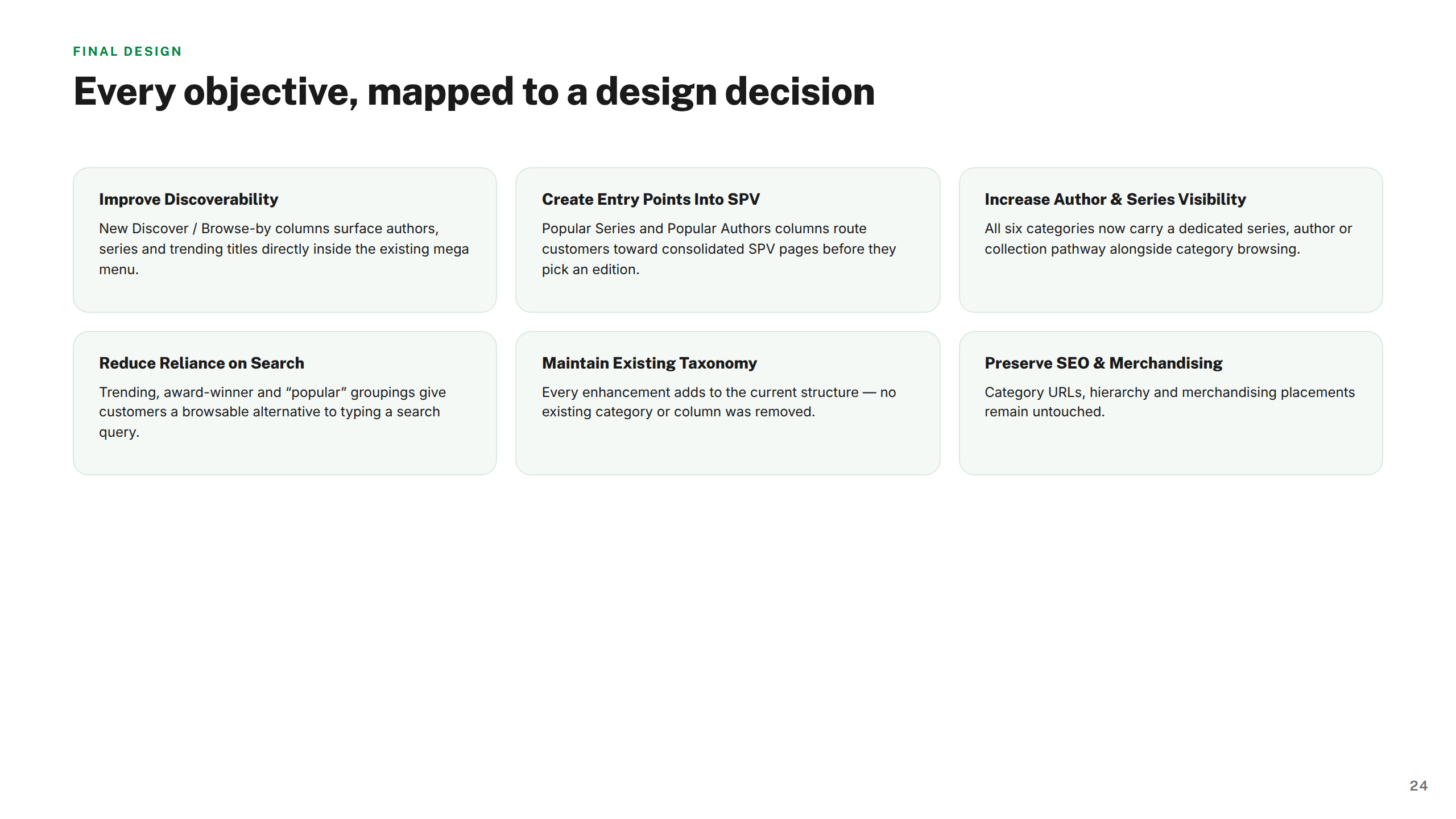
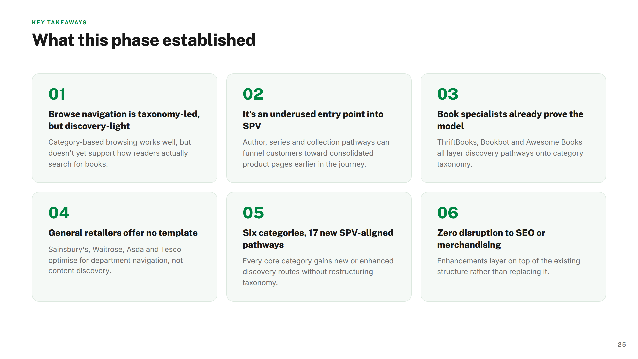
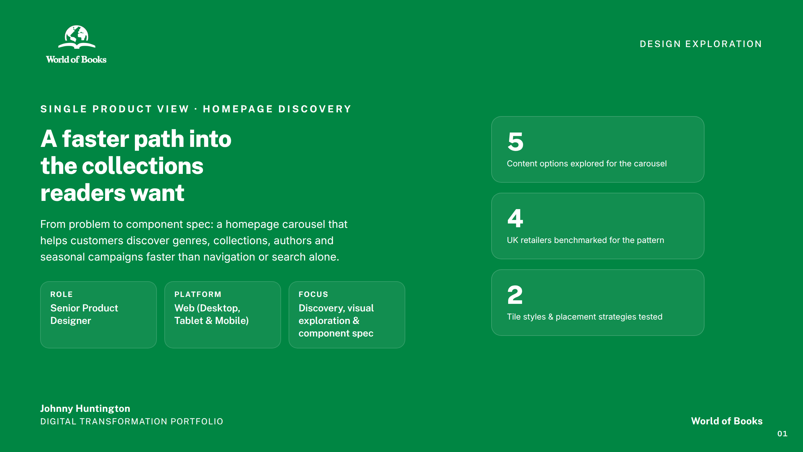
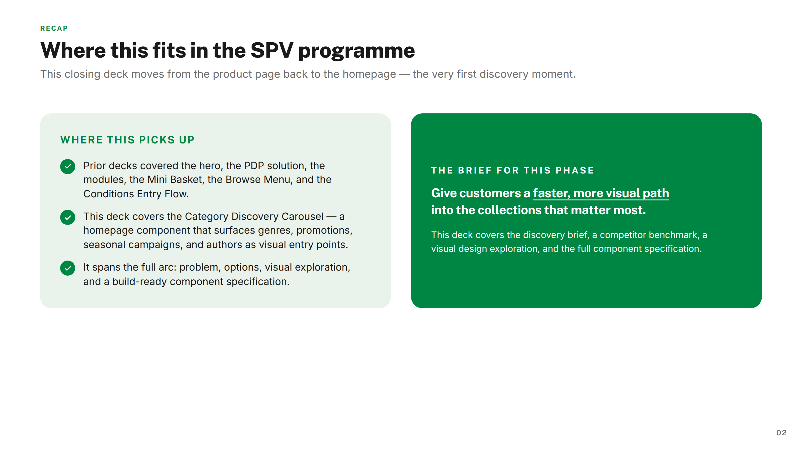
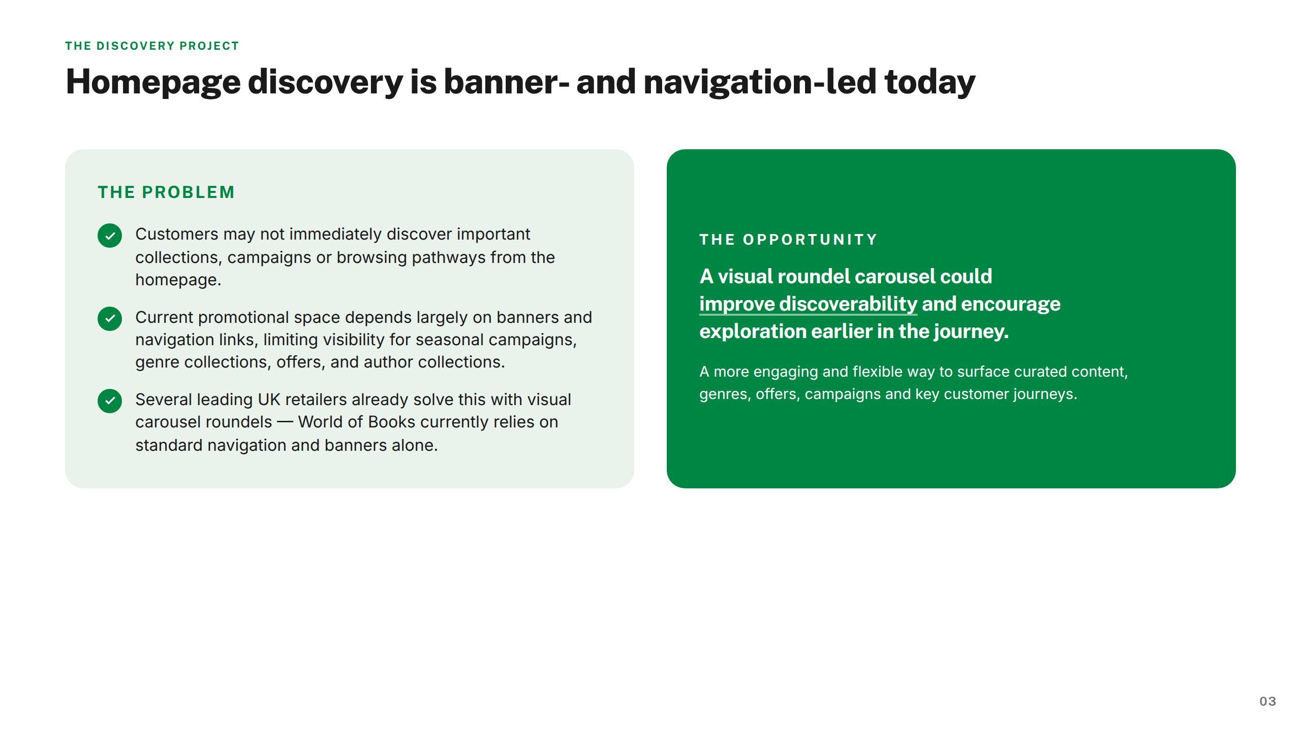
The research fed into a design framework: a set of principles, an architecture model covering selection logic, product states, and user flow, and a phased delivery roadmap. Each subsequent workstream — the PDP audit and module system, the hero area redesign, mini basket, browse menu, conditions entry, and category discovery carousel — was executed against that framework to ensure everything composed coherently.
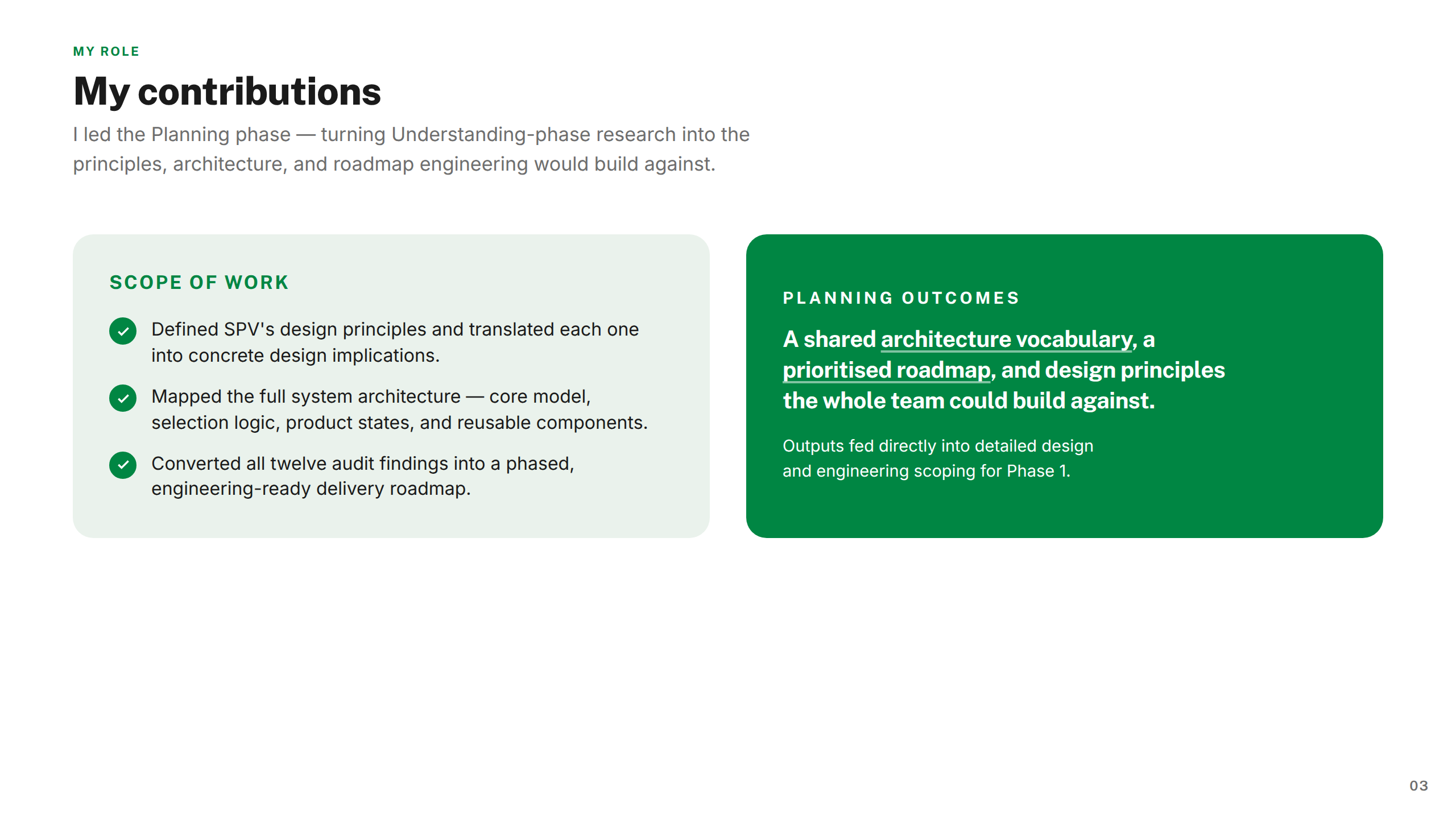
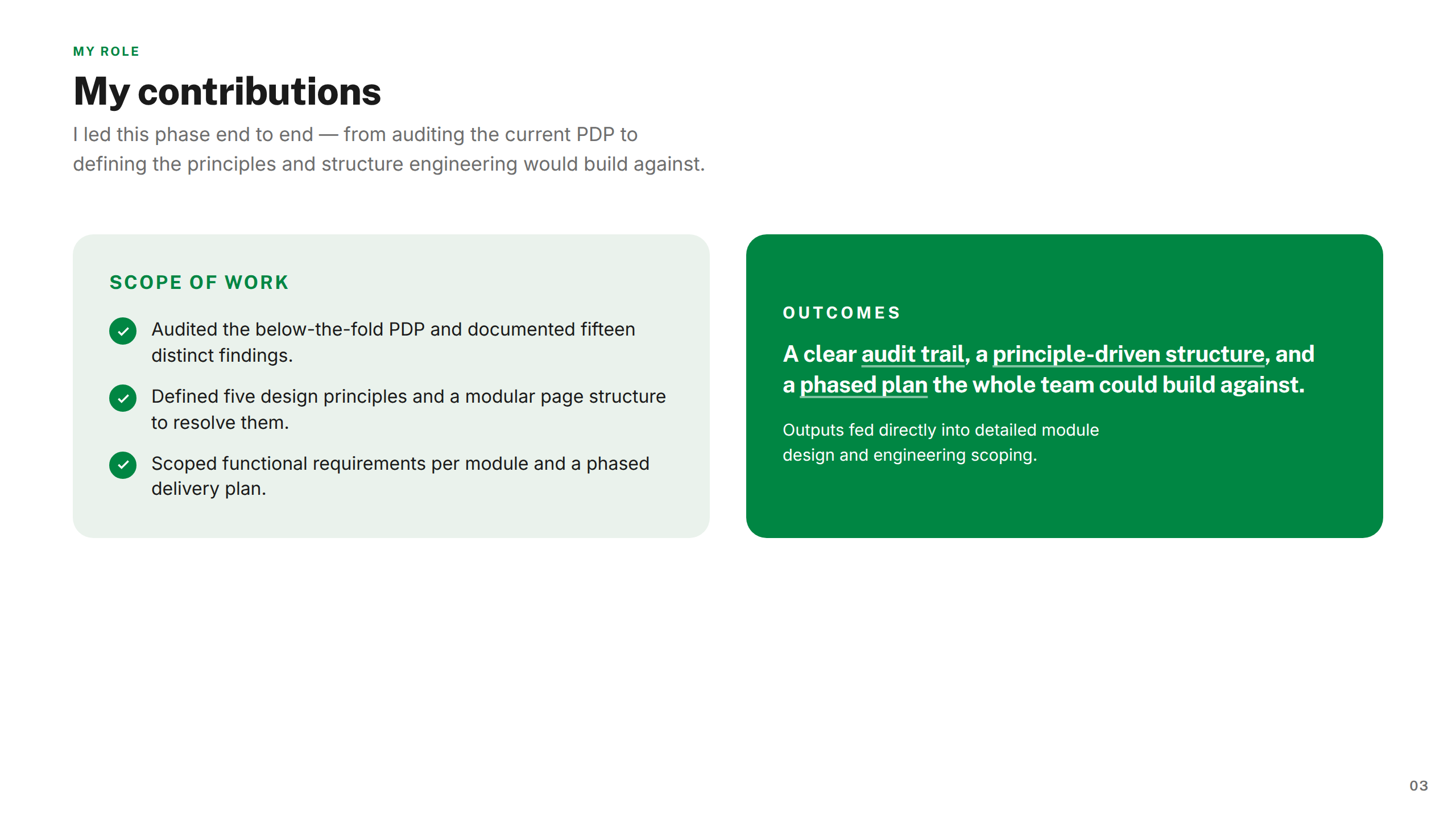
I owned the full design process — from discovery and research synthesis through to component specifications and handoff. This covered the design framework, PDP page structure, hero module redesign, component library, and five additional SPV workstreams — each scoped, researched, and delivered end-to-end.
Worked alongside product managers, engineering leads, content designers, and senior stakeholders. Operated within Wob's existing design system while proposing structural extensions for SPV-specific components, ensuring new work integrated coherently across the platform.
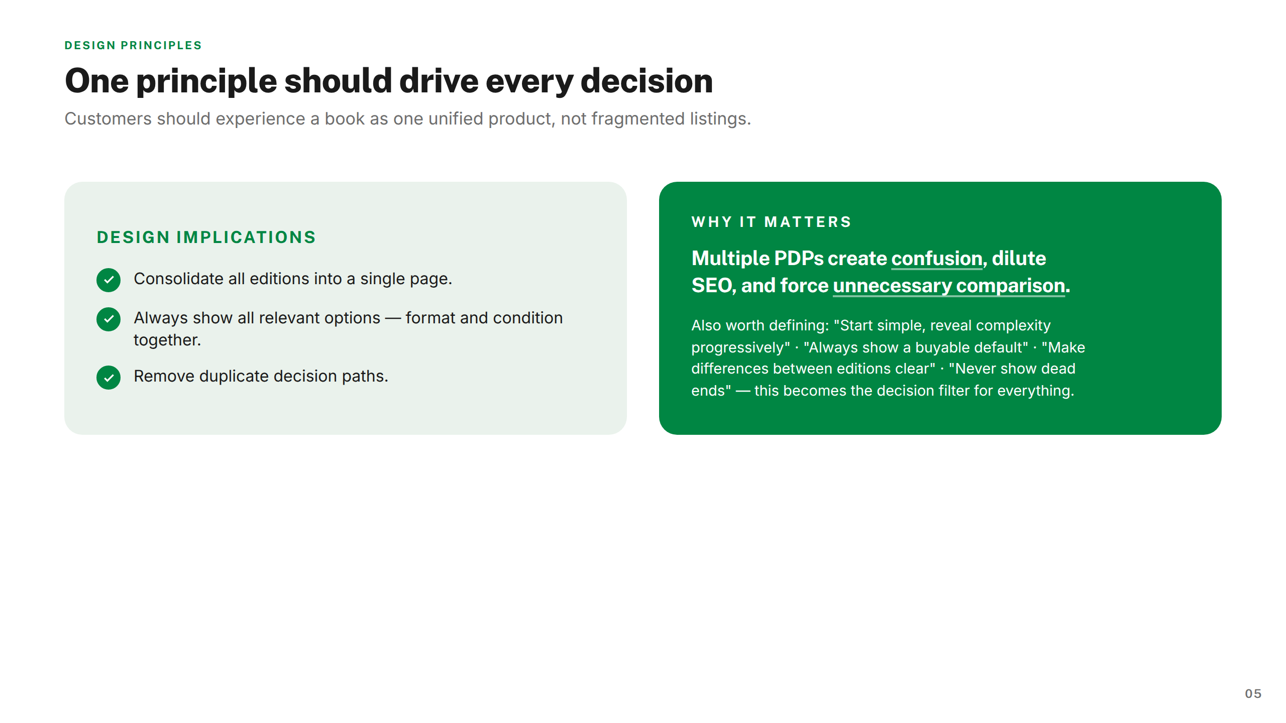
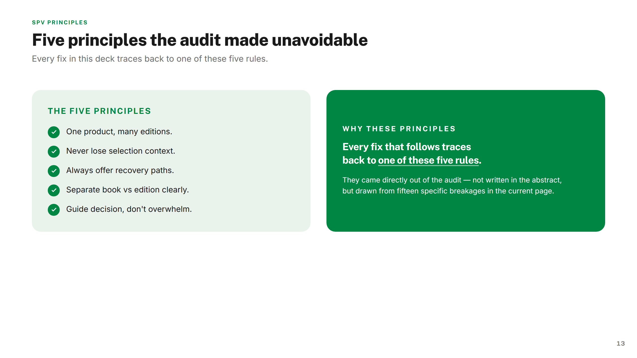
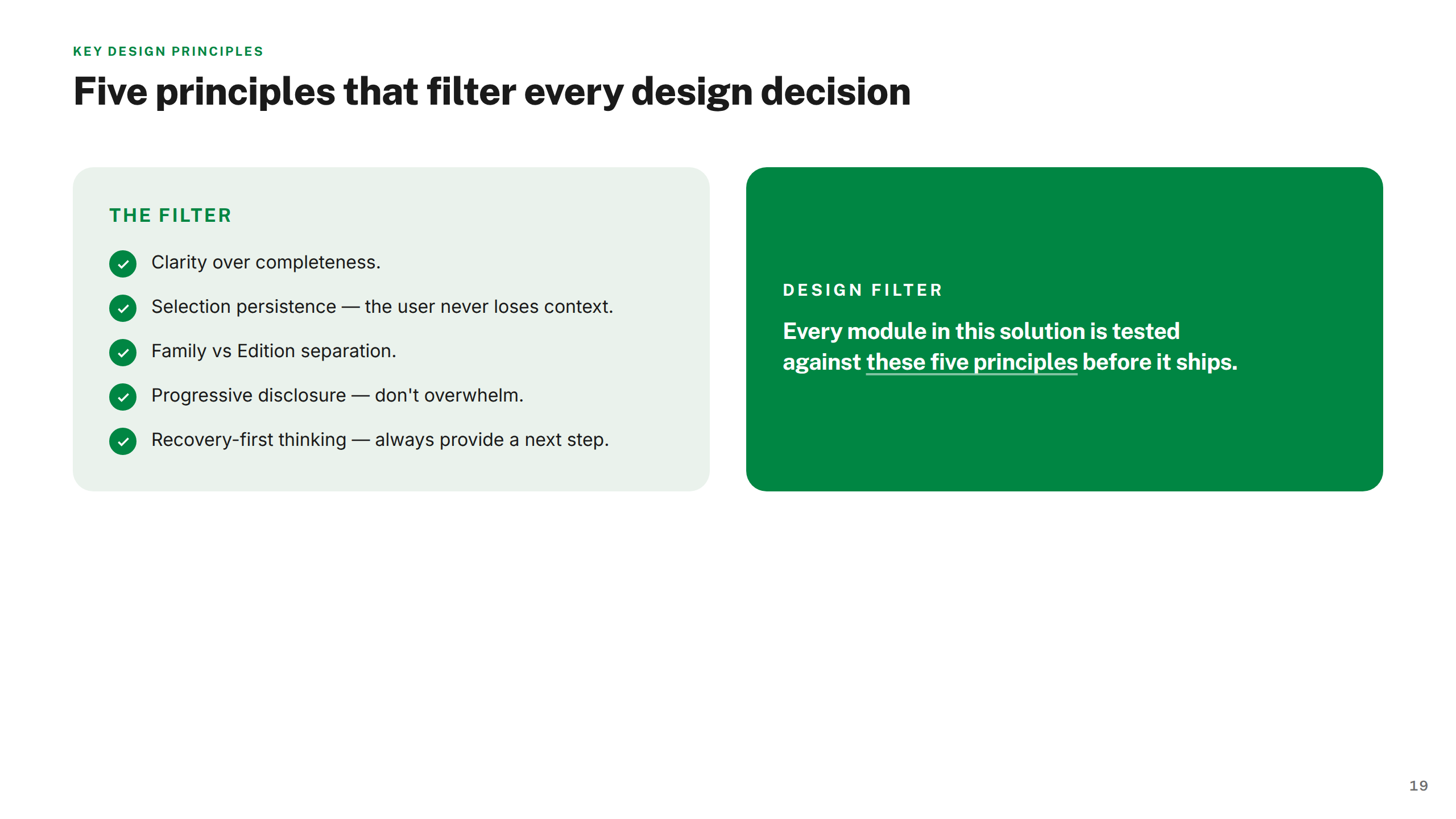
Four principles that ran through the entire programme.
Every decision starts with helping customers identify the right edition with confidence. Ambiguity at this moment costs conversions and causes returns.
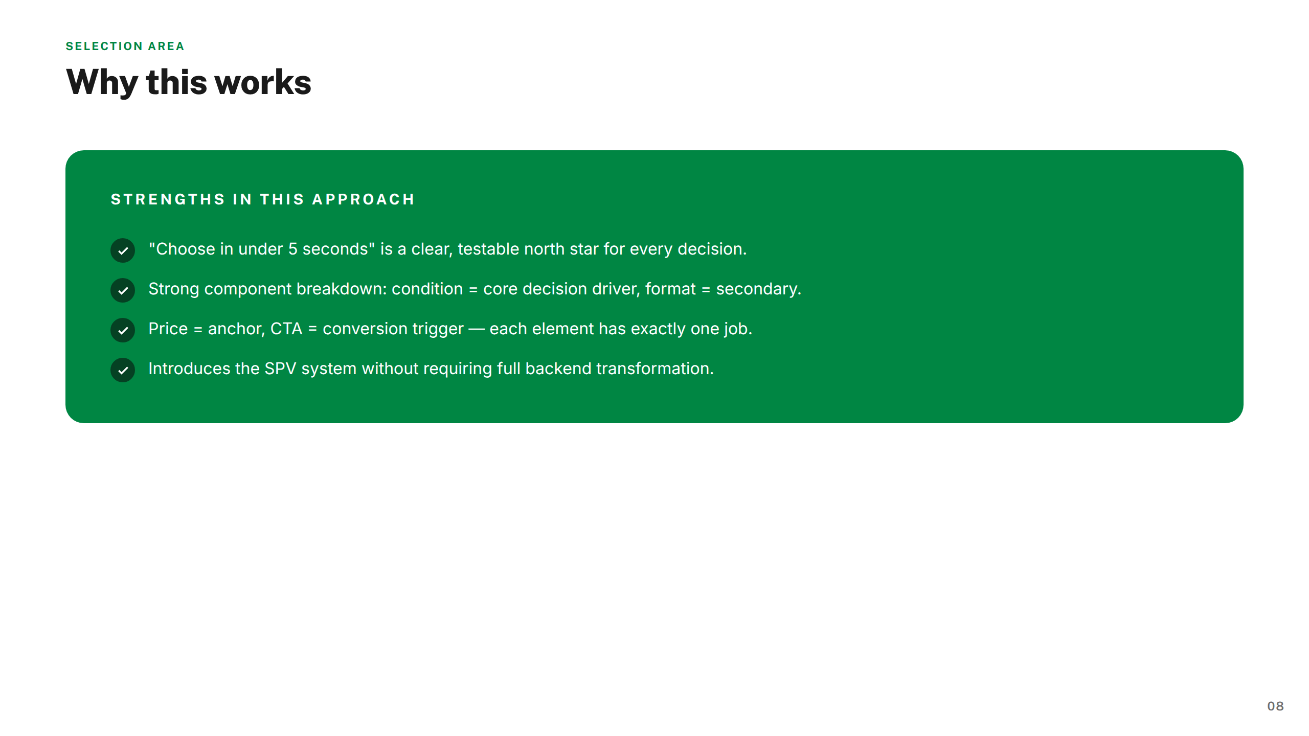
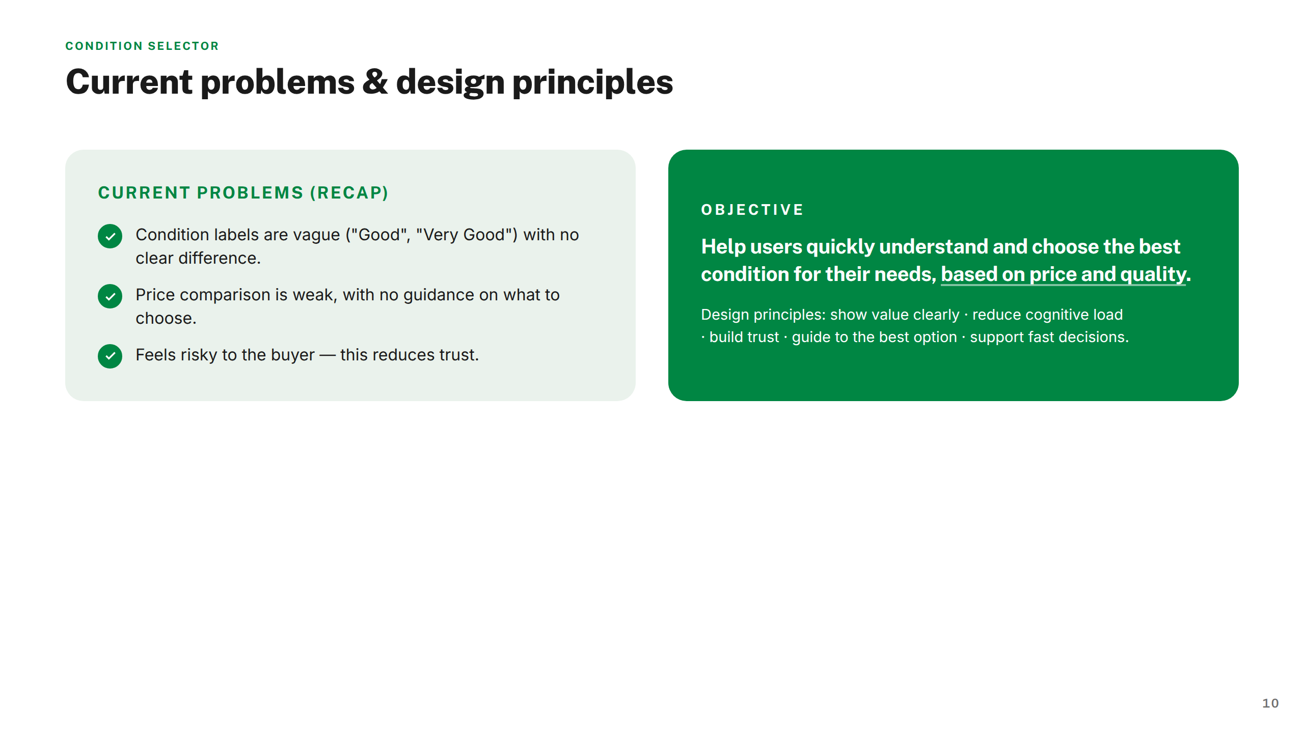
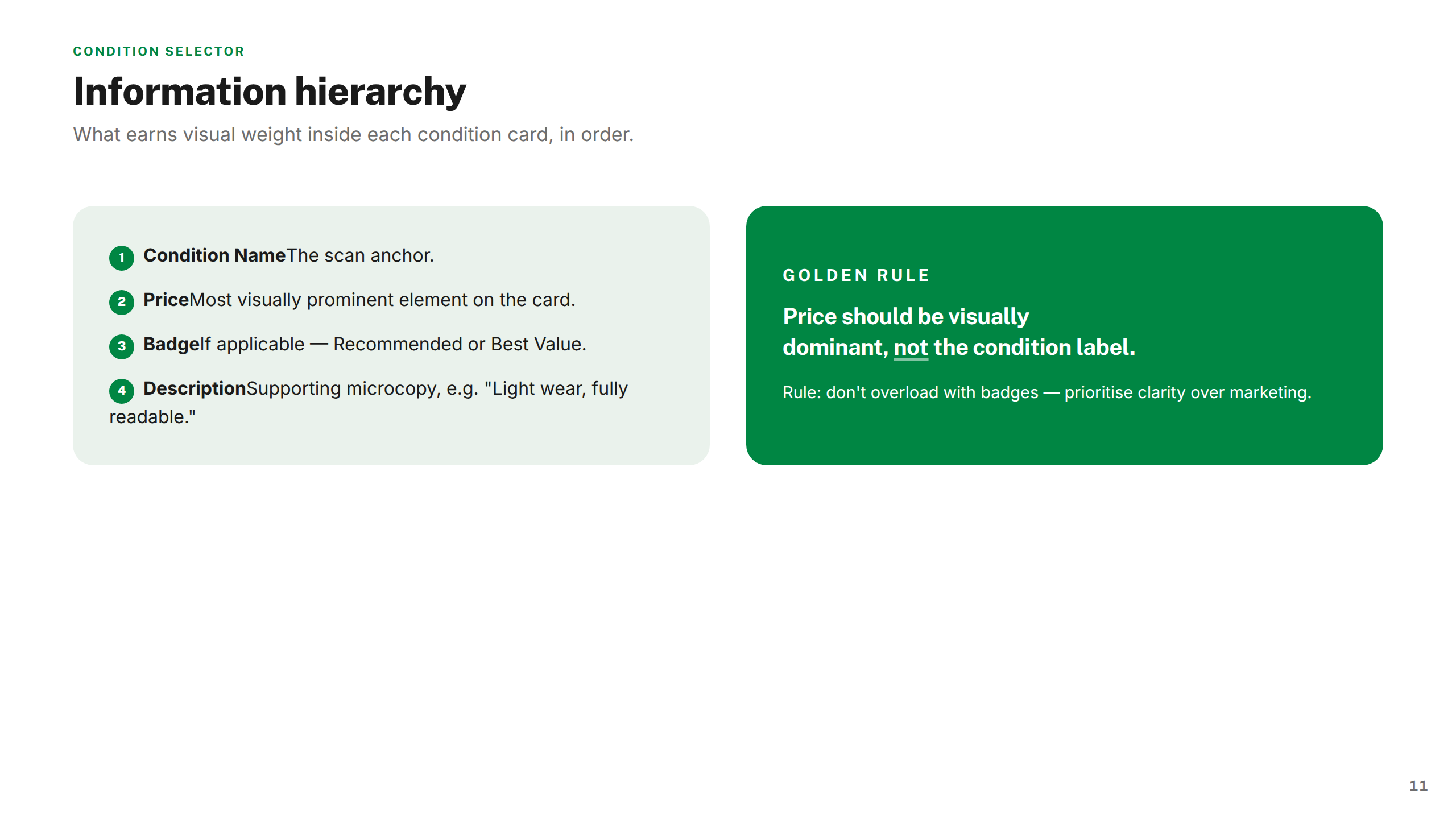
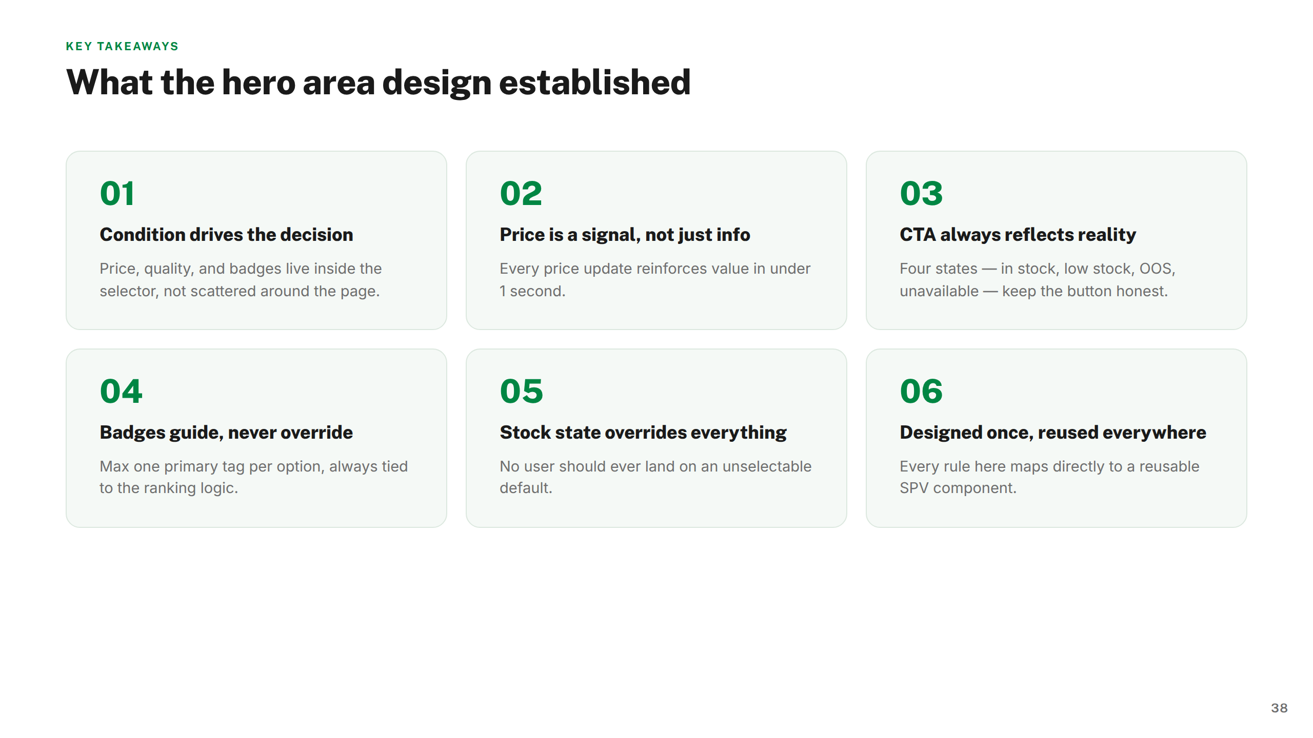
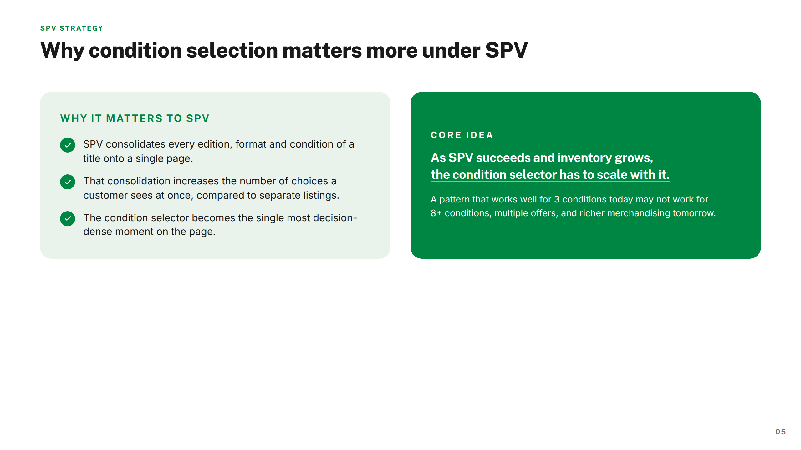
Condition isn't a filter — it's the primary organising logic for price, availability, and trust. The design reflects that order throughout.
Surface what's essential at a glance; detail is available on demand. Complexity is managed, never hidden — and never absent.
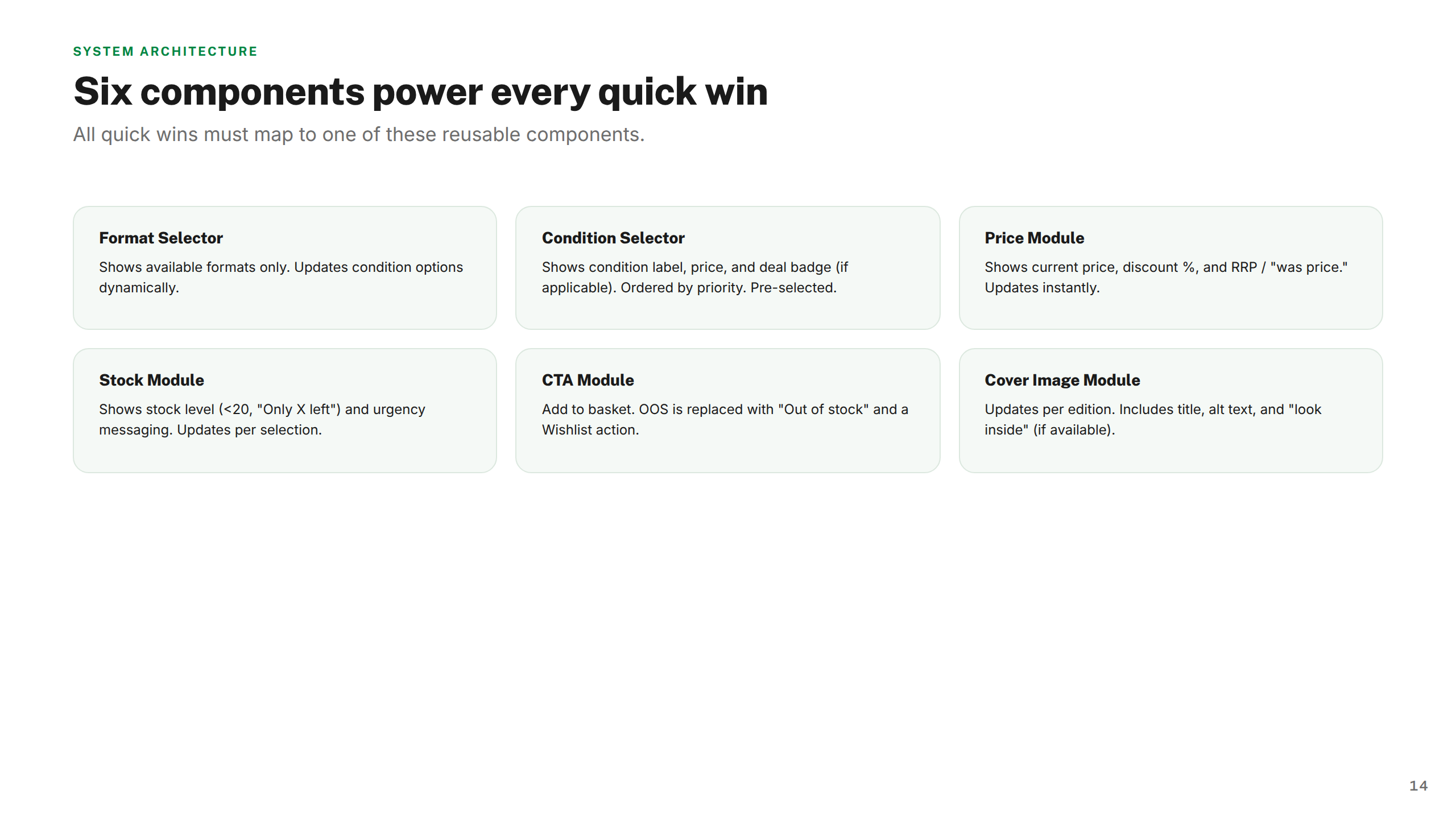
Every component is specified to work standalone and as part of the full SPV page system. Scale and coherence are built in from the start.
Nine workstreams. One coherent programme.
Three choices that shaped the programme.
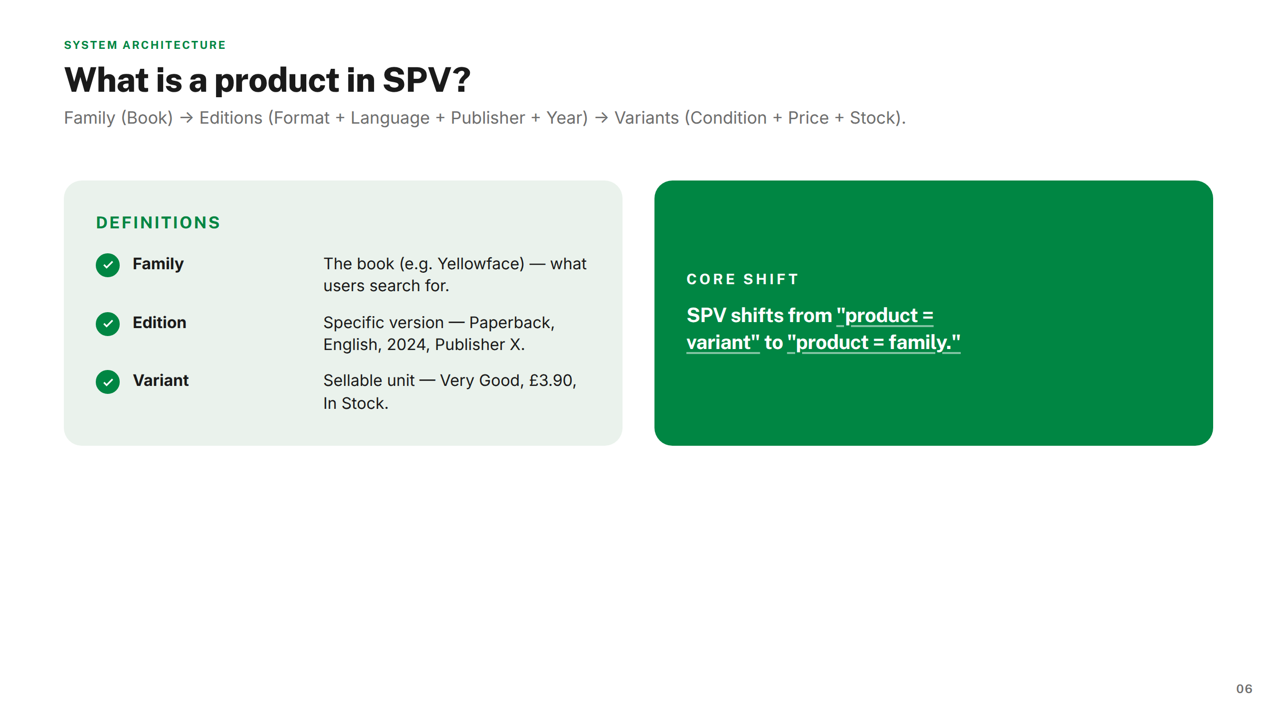
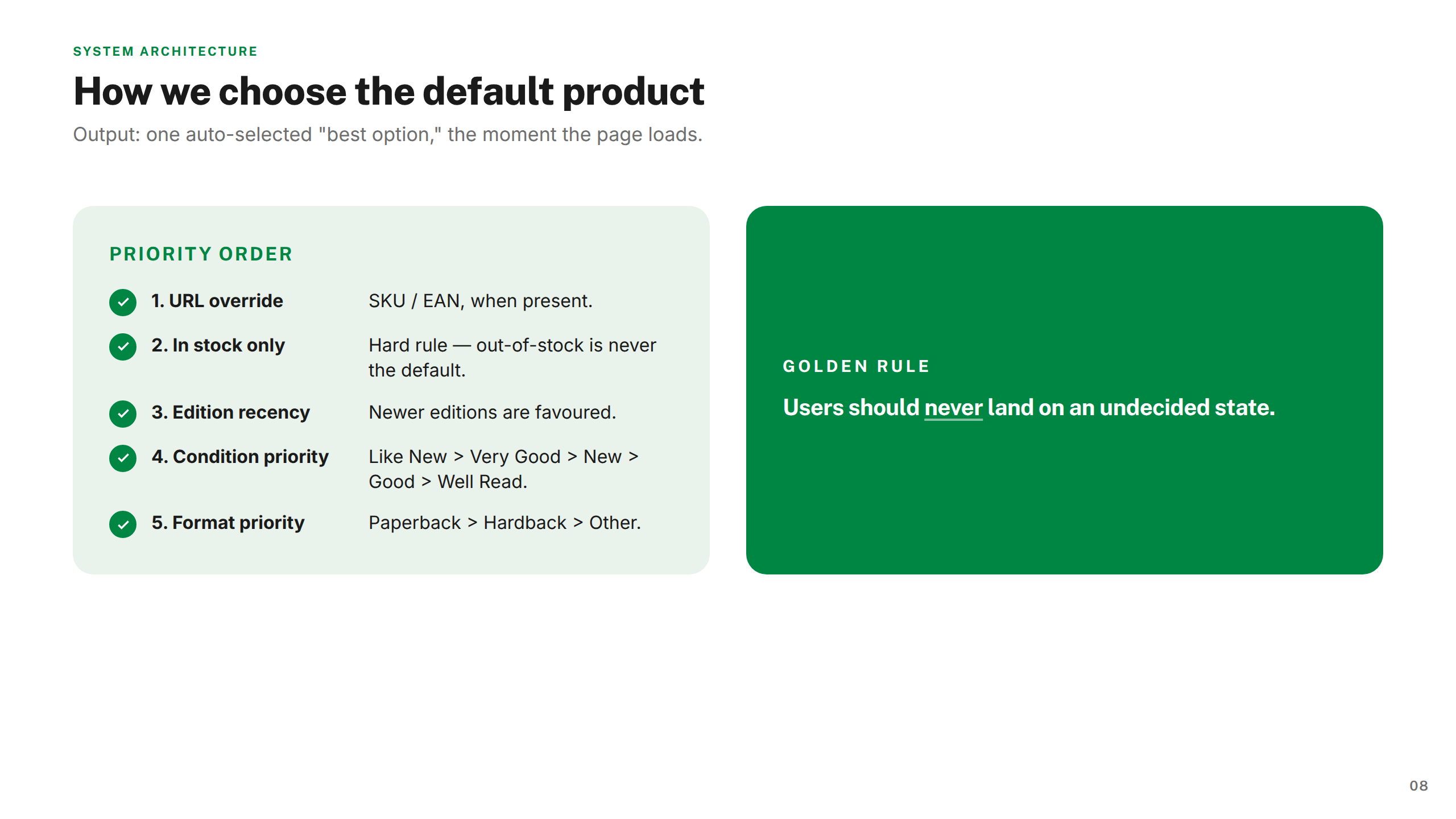
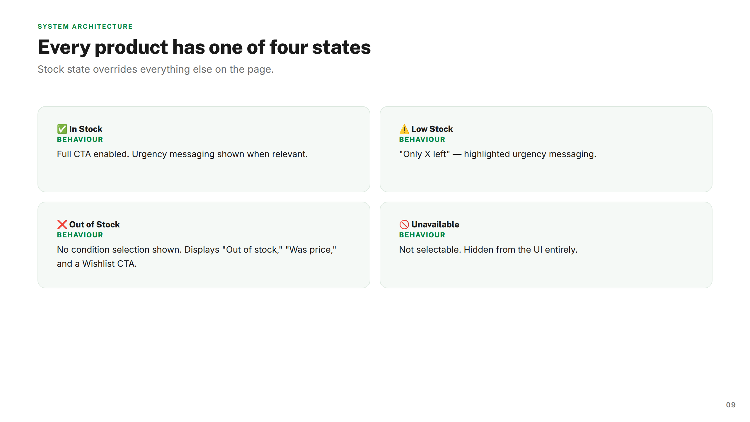
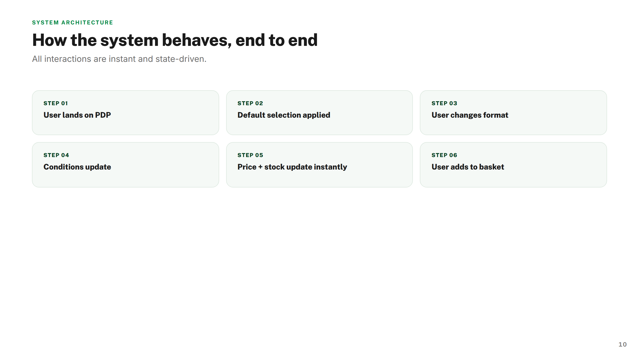
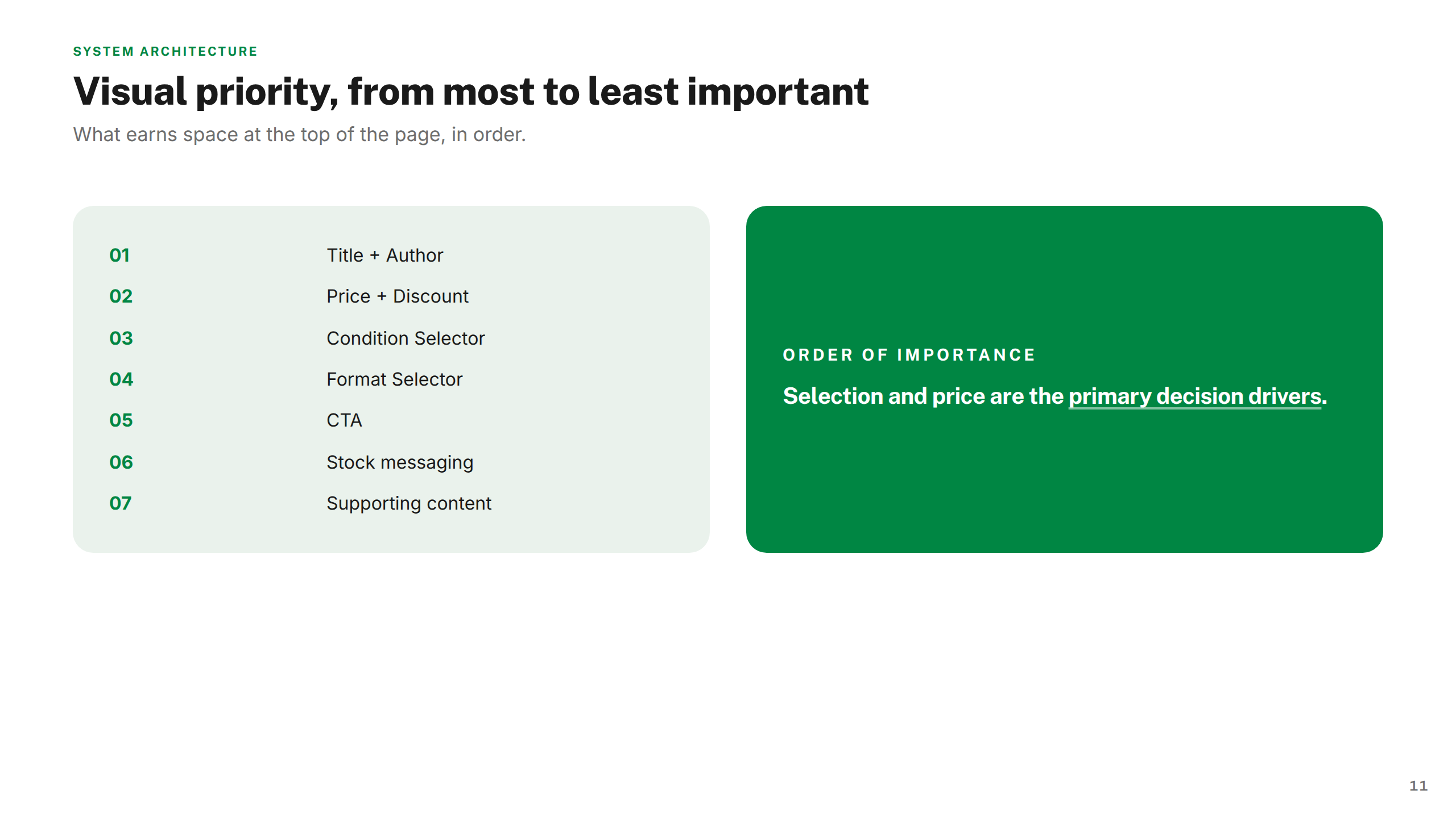
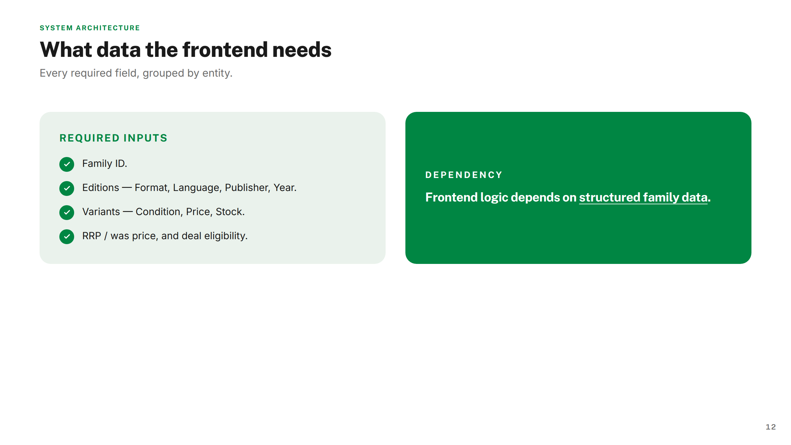
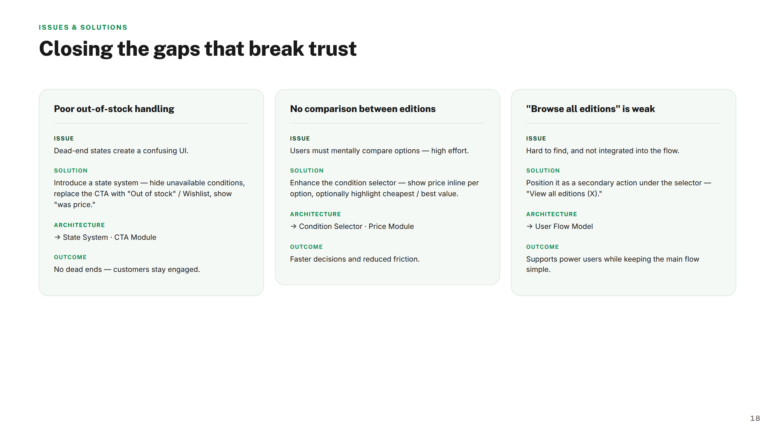
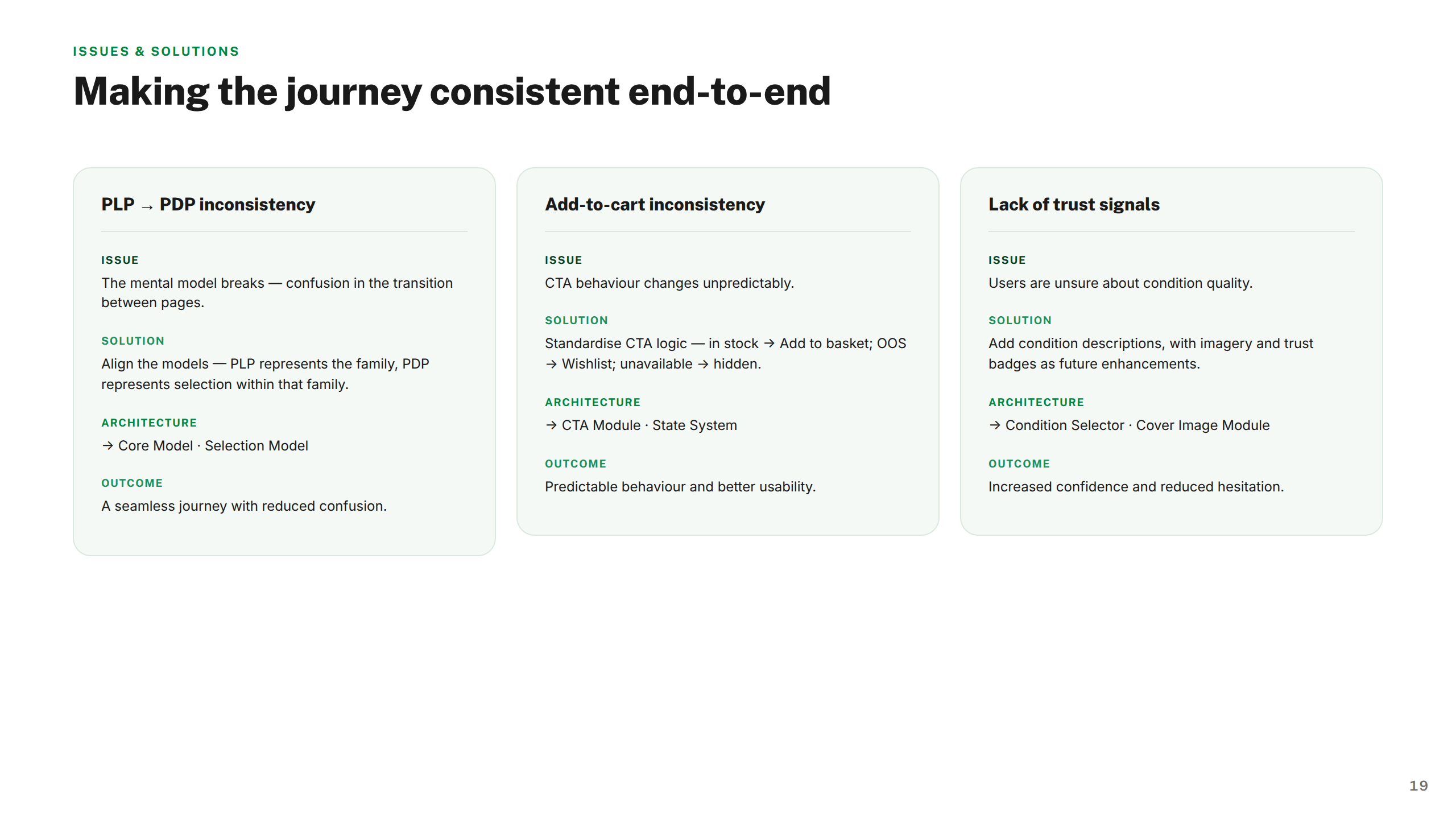
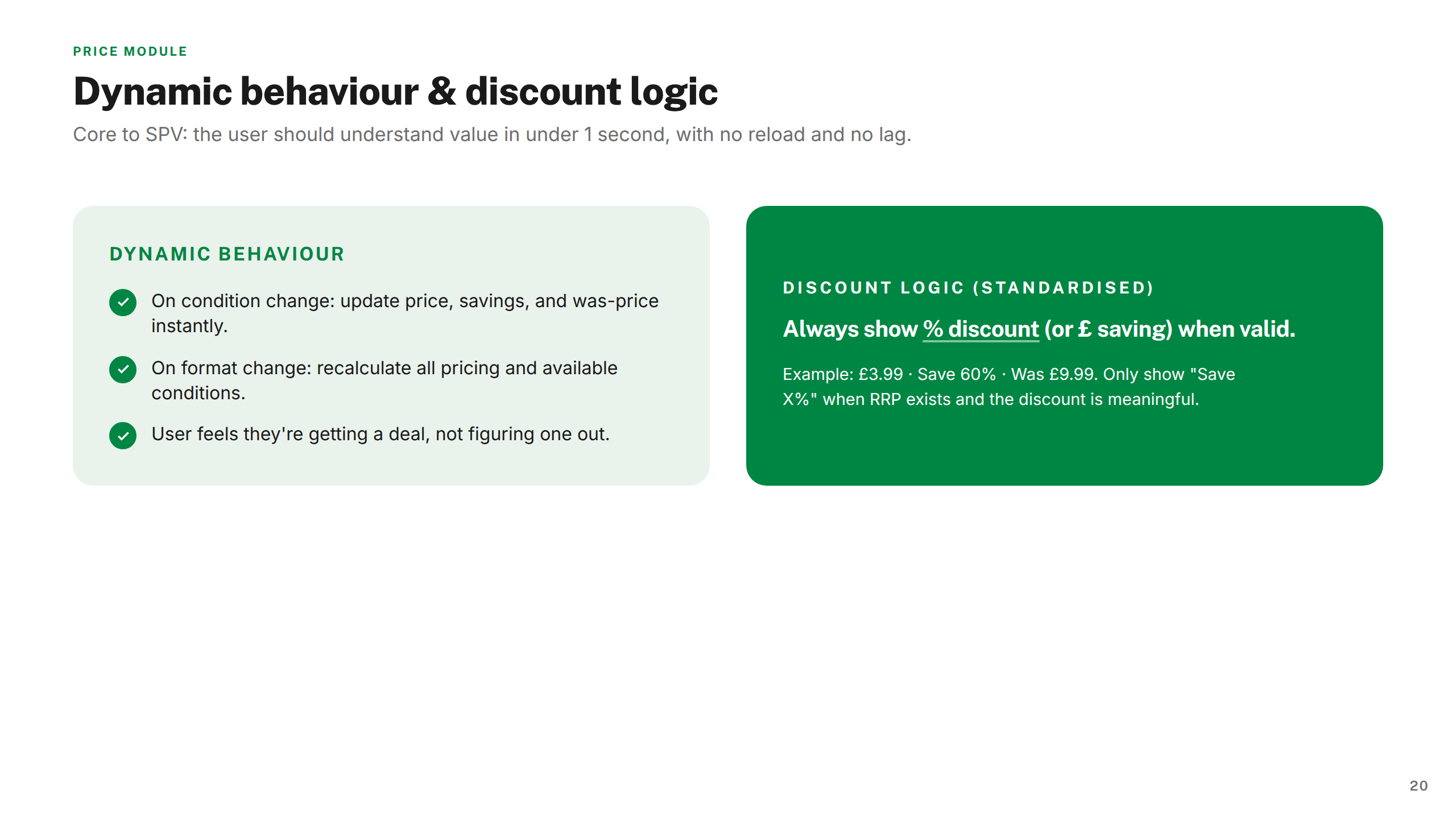
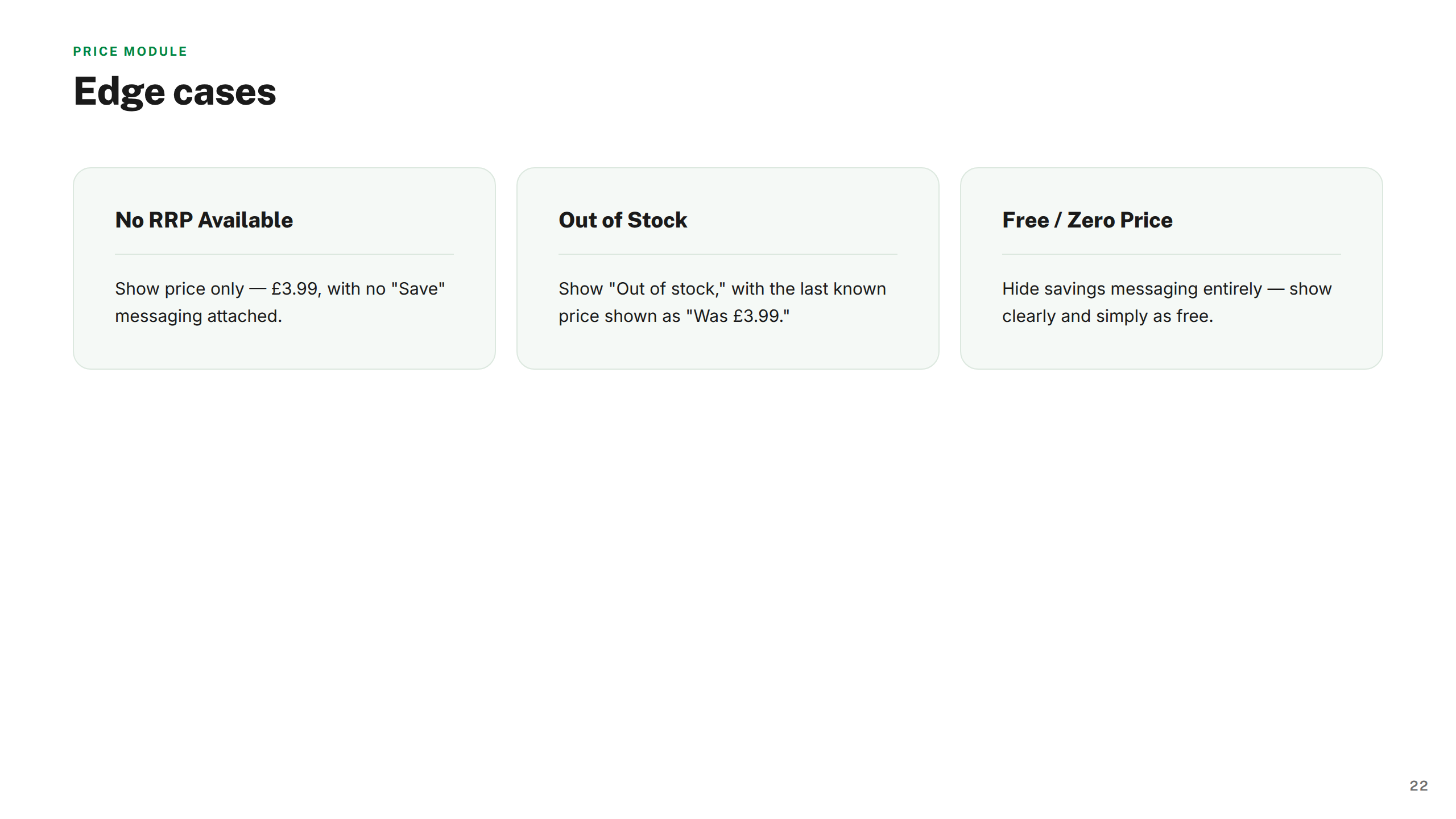
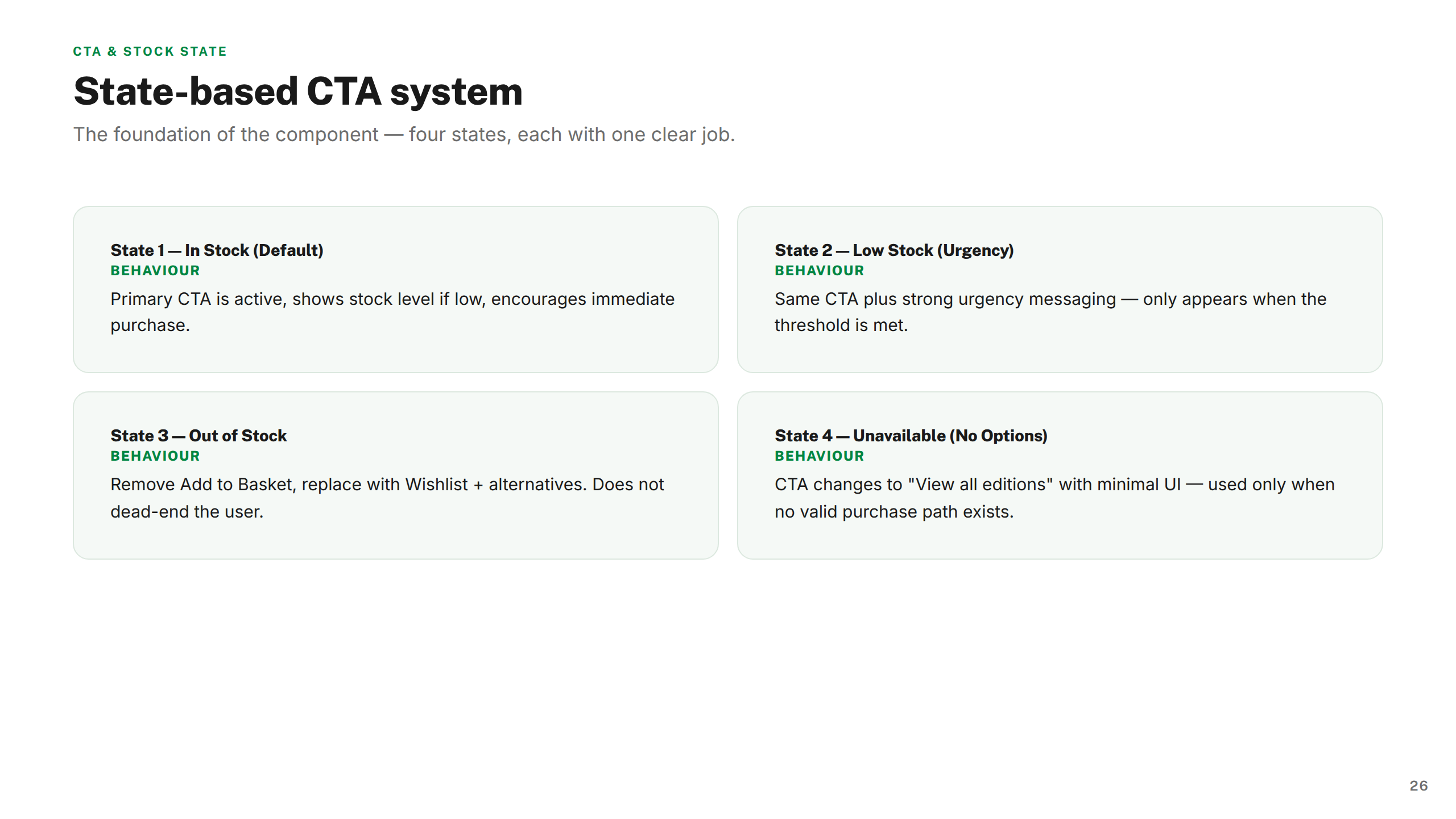
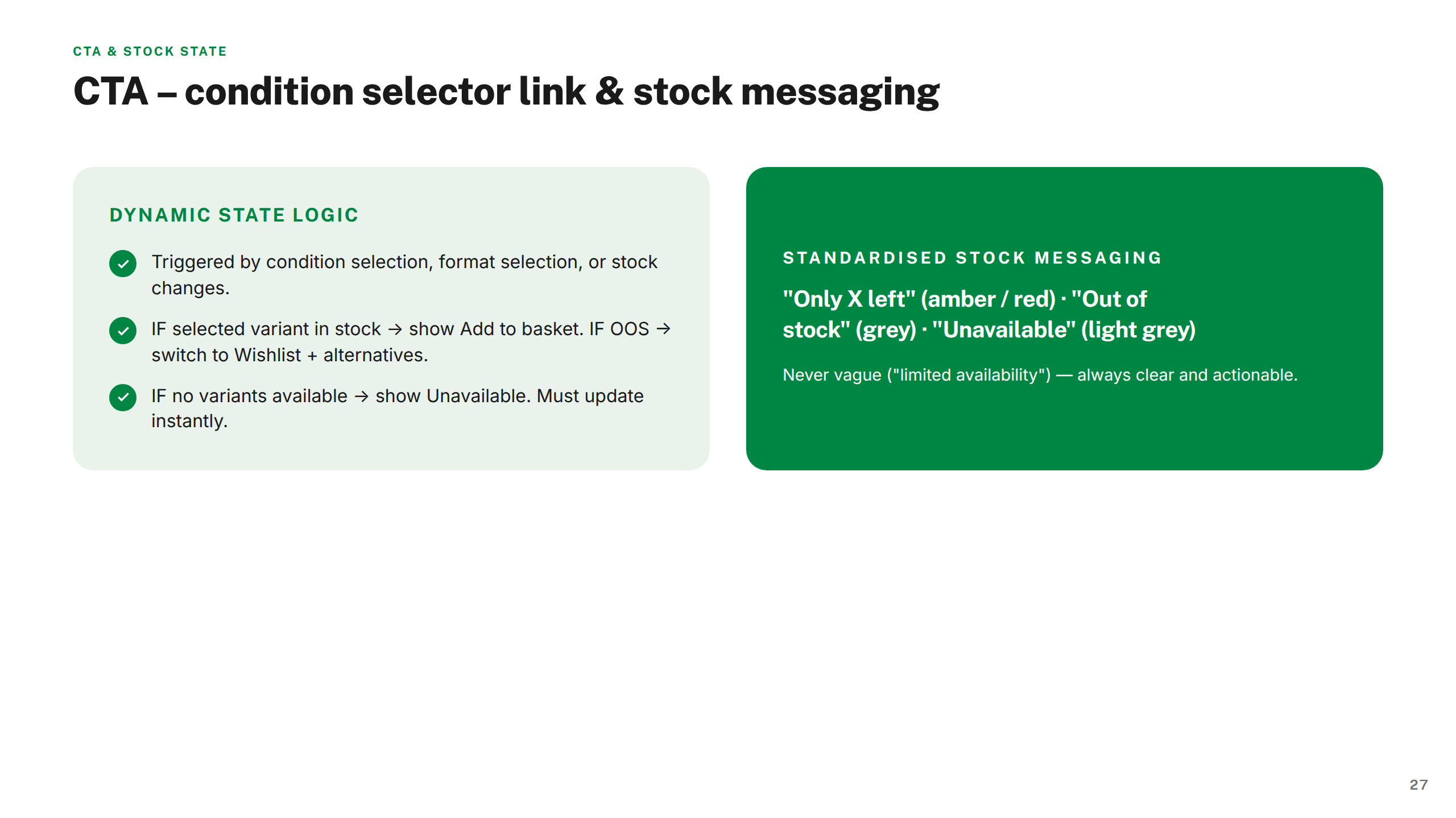
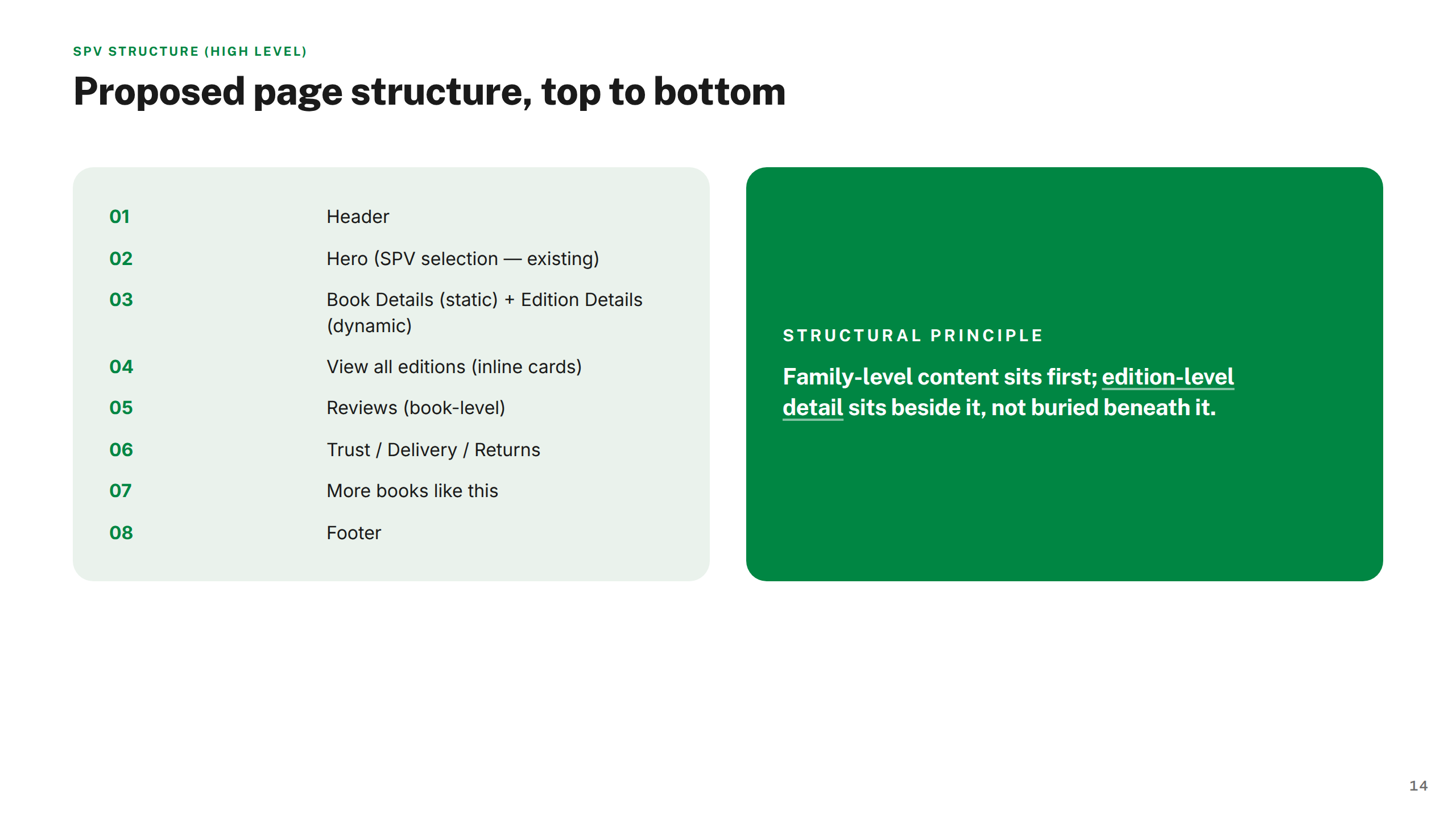
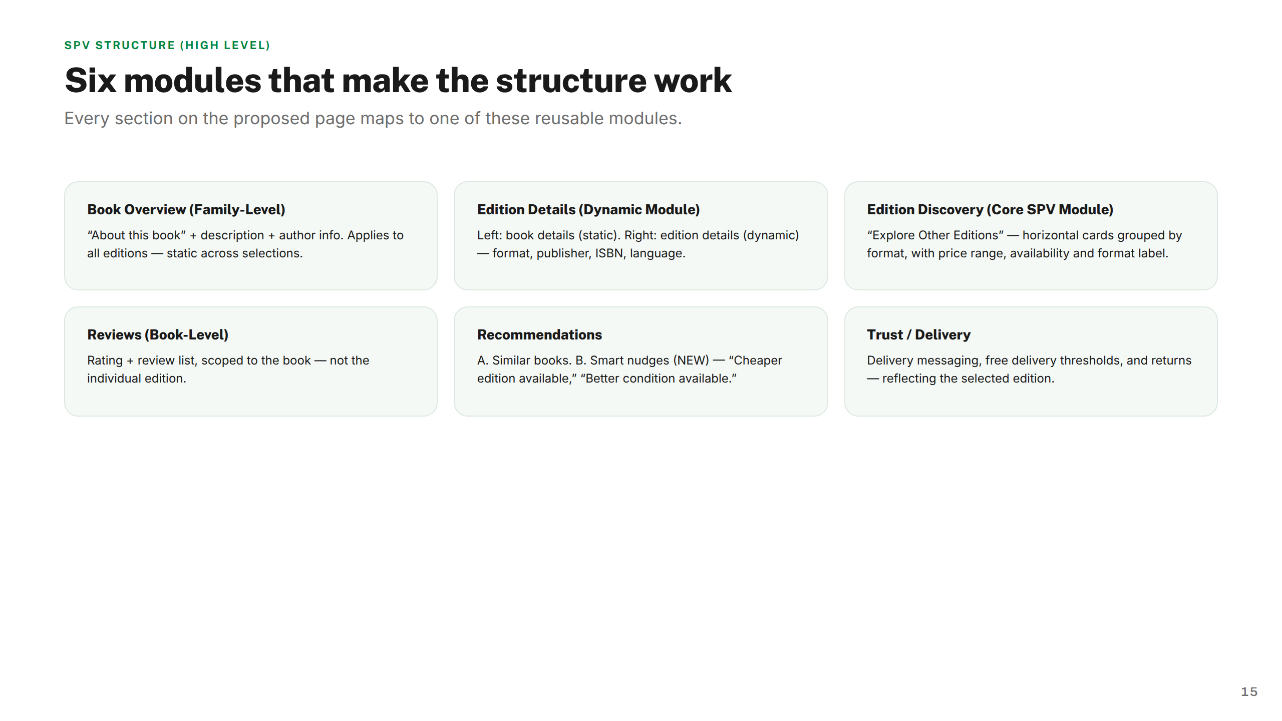
Rather than jumping to visual explorations, I built a full architecture model first — covering selection logic, product states, user flow, and data dependencies. This gave engineering and product a clear mental model to design against, and ensured components composed coherently across all SPV touchpoints from the start.
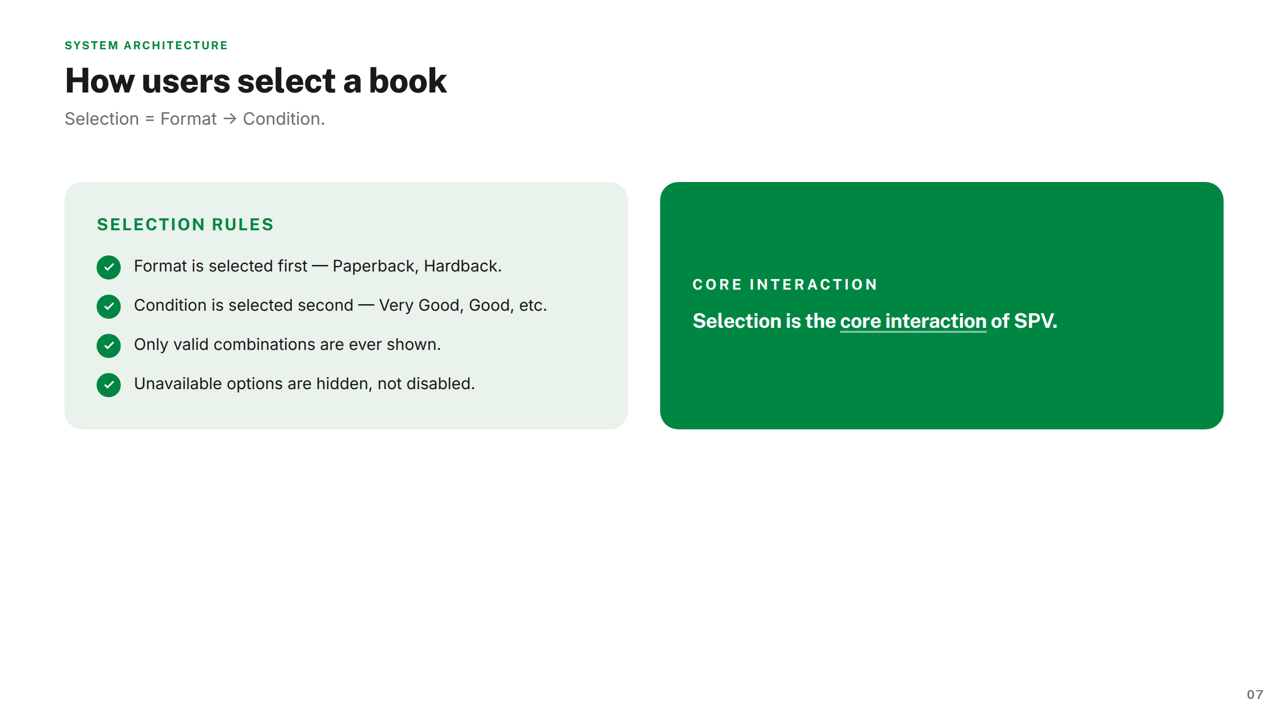
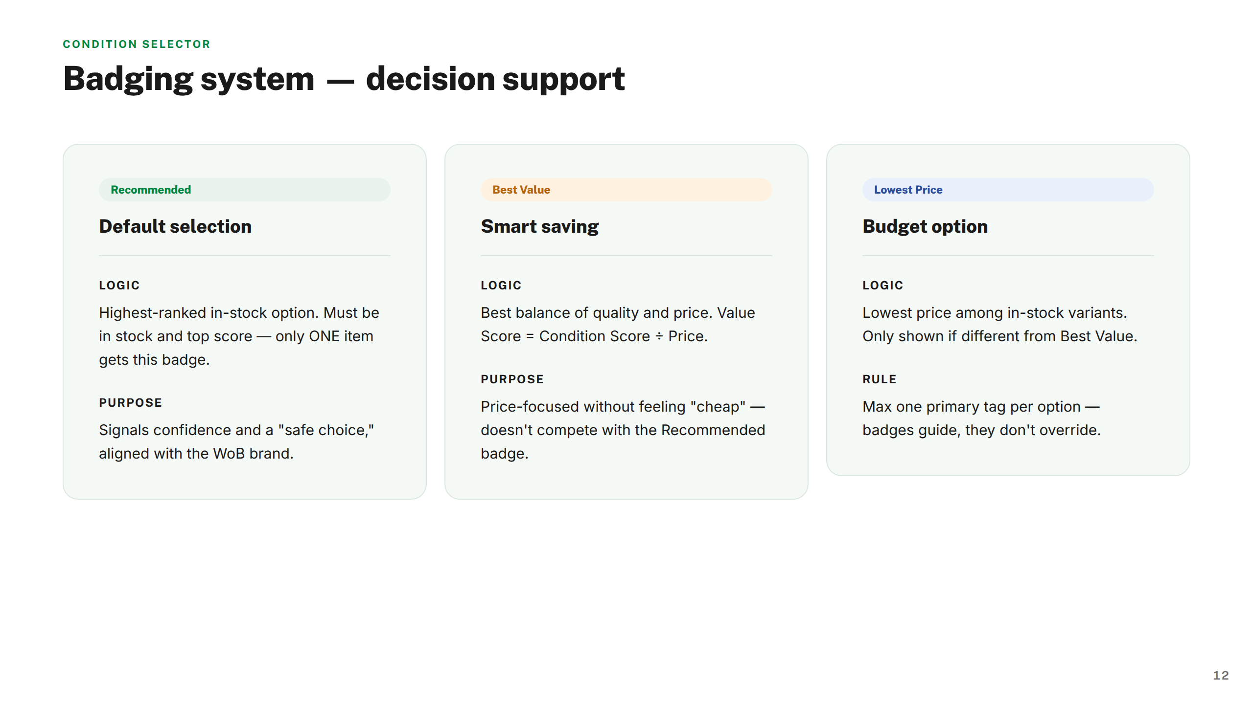
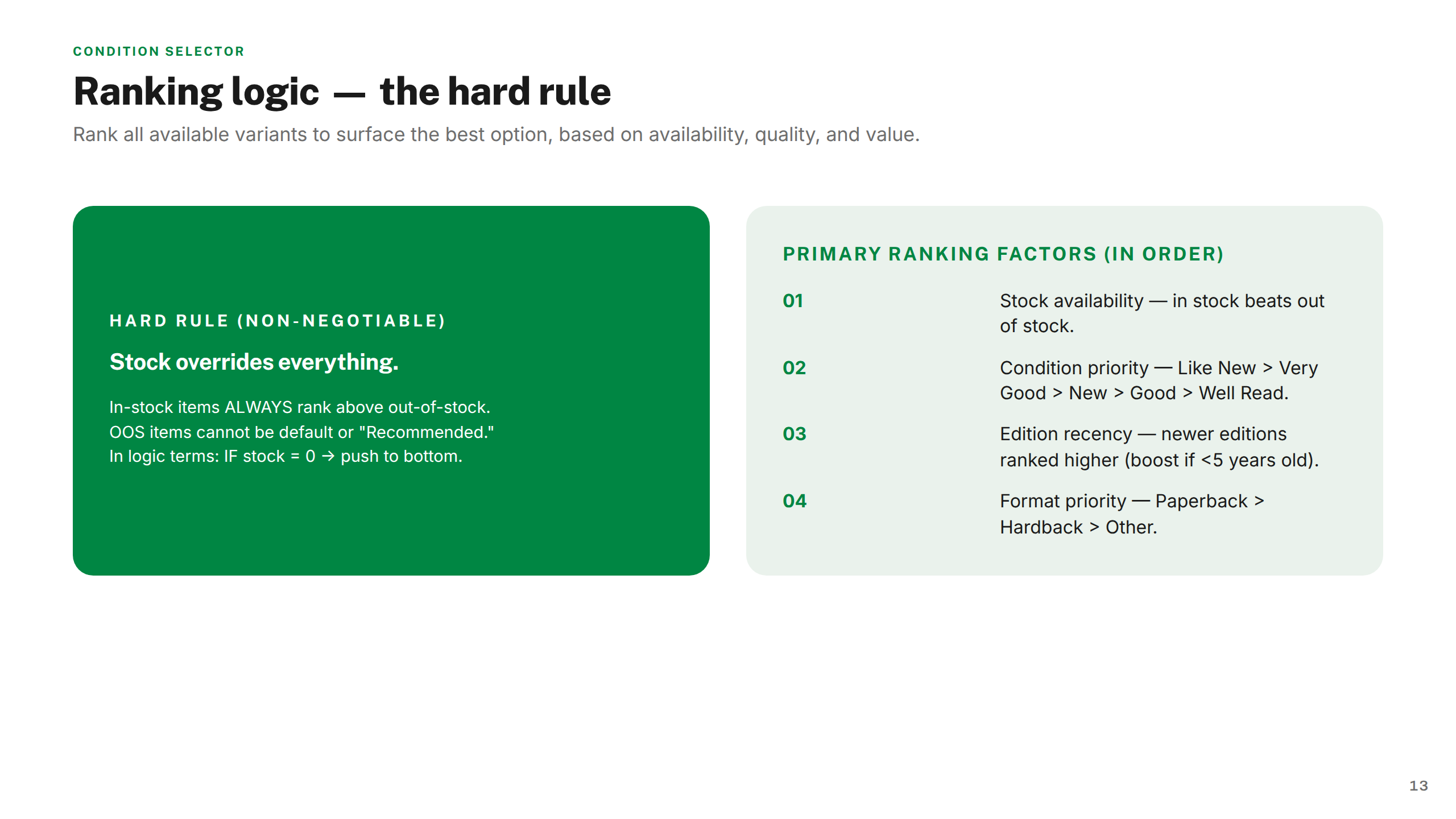
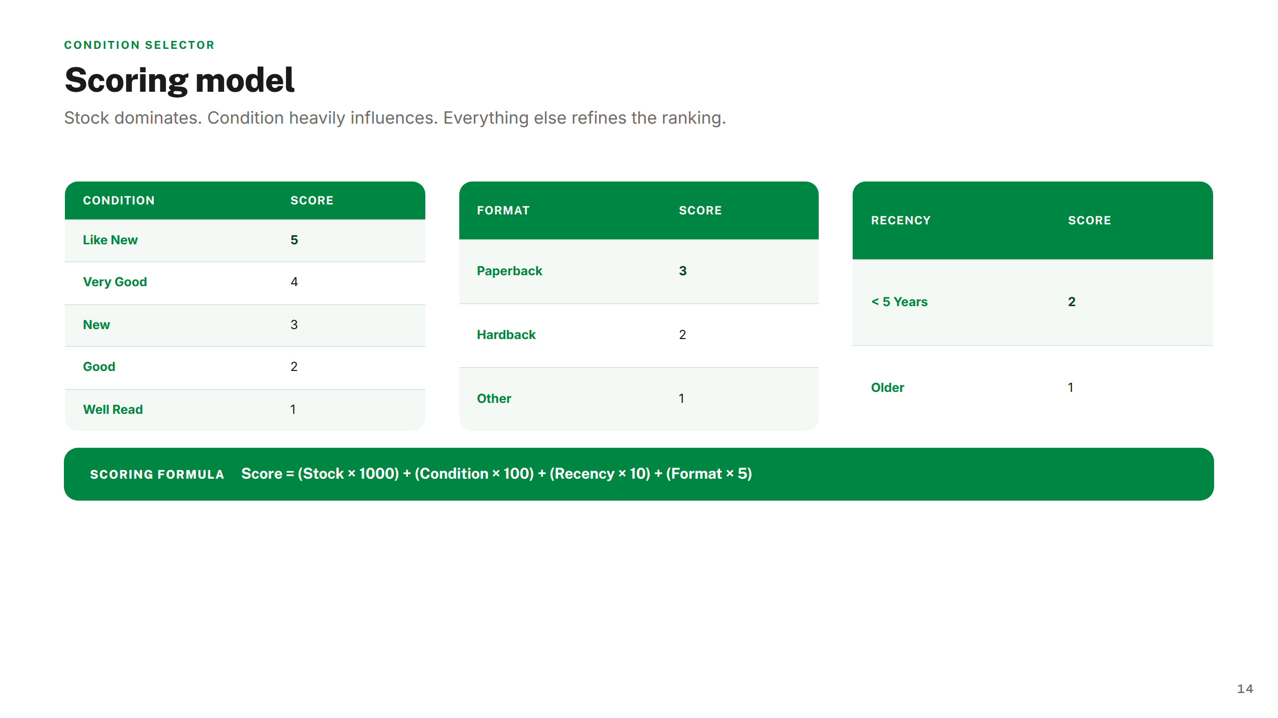
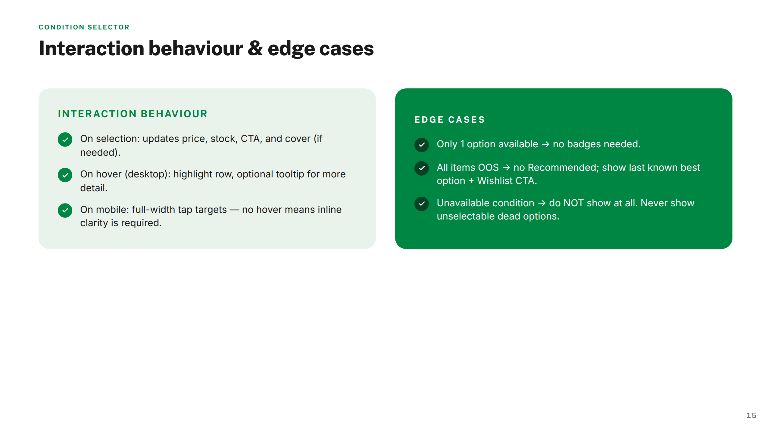
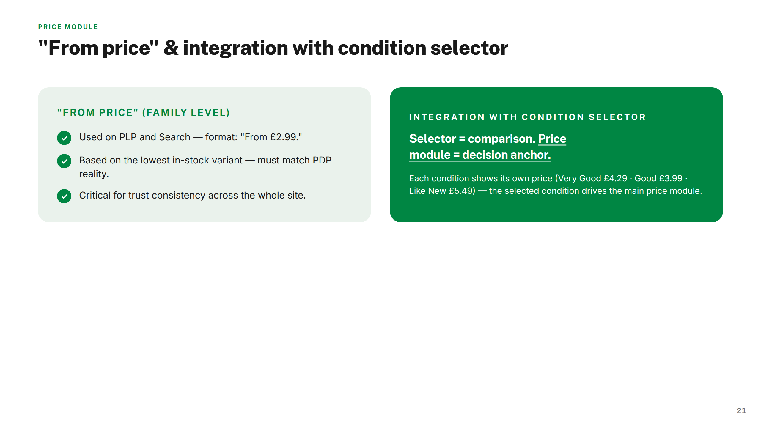
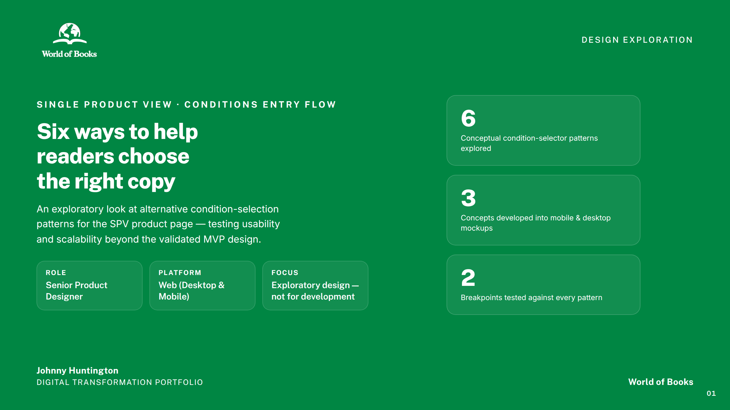
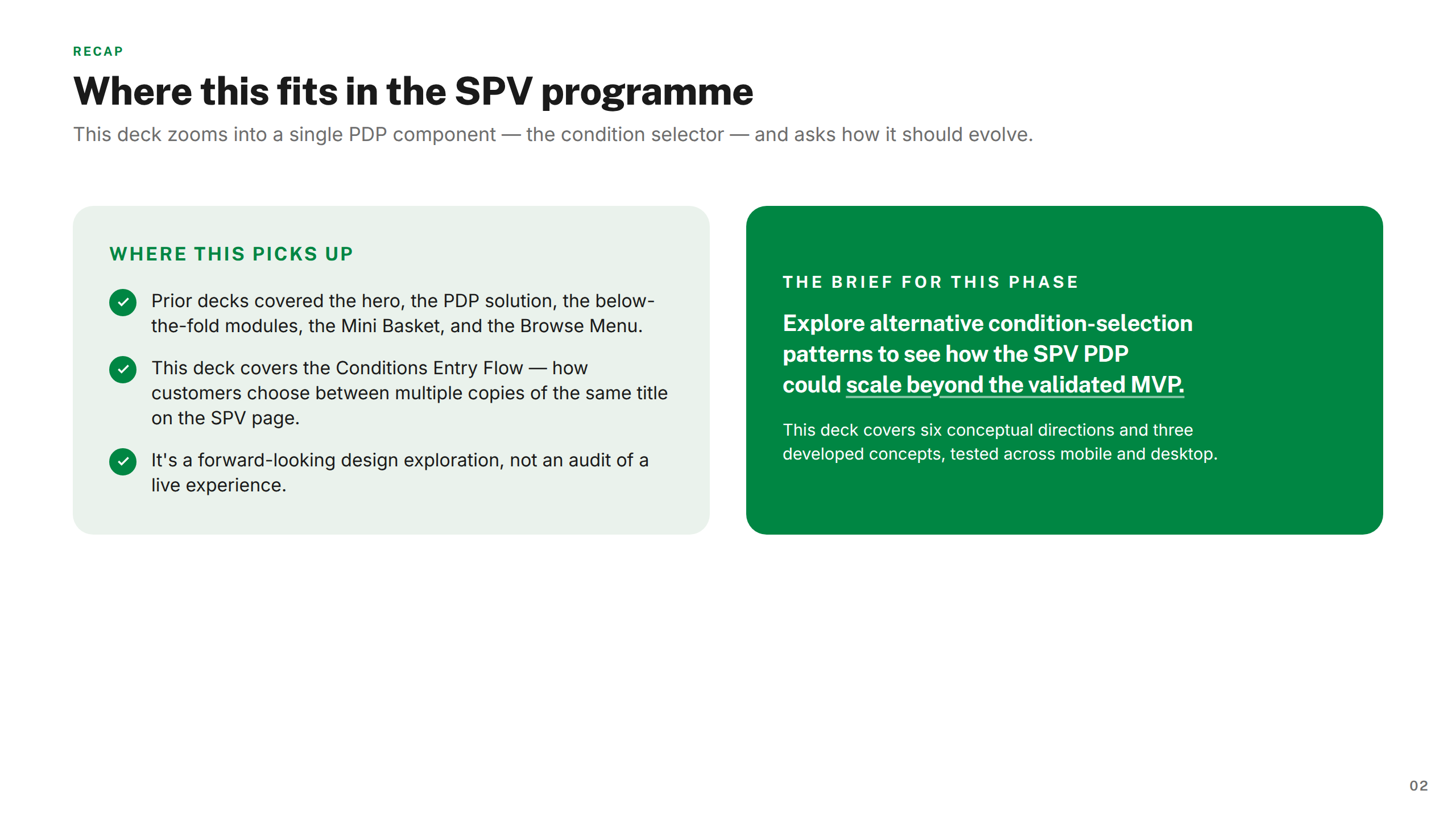
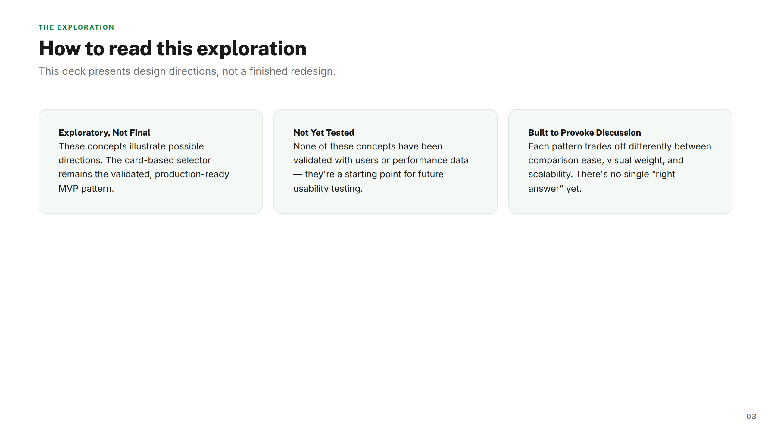
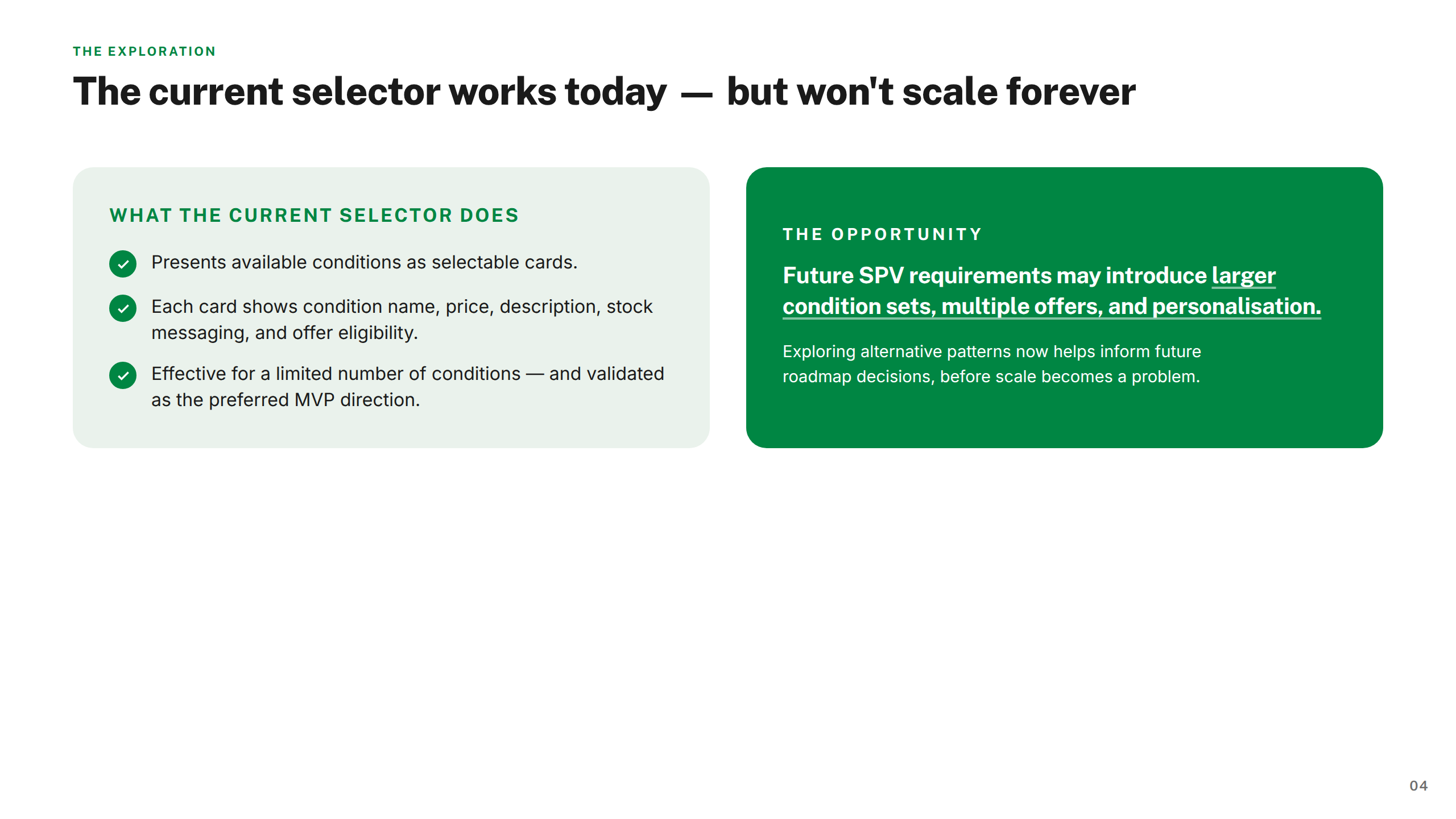
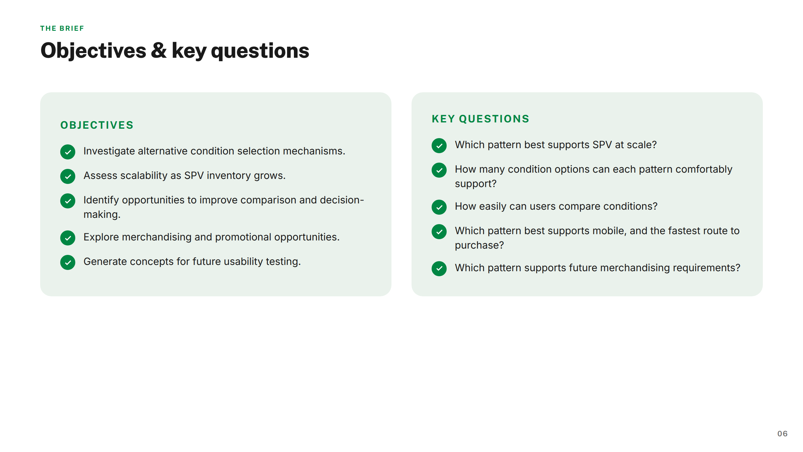
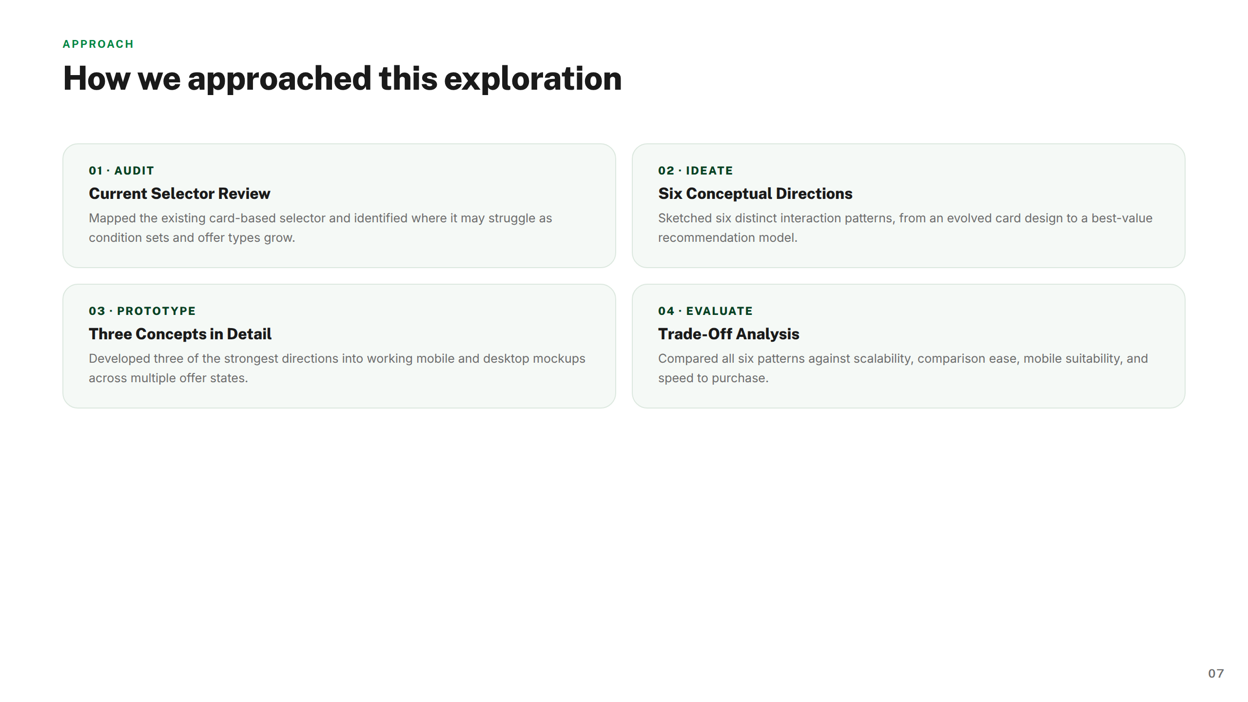
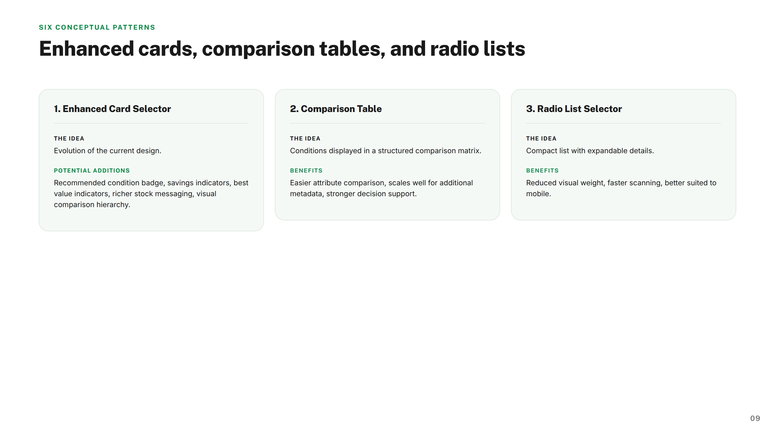
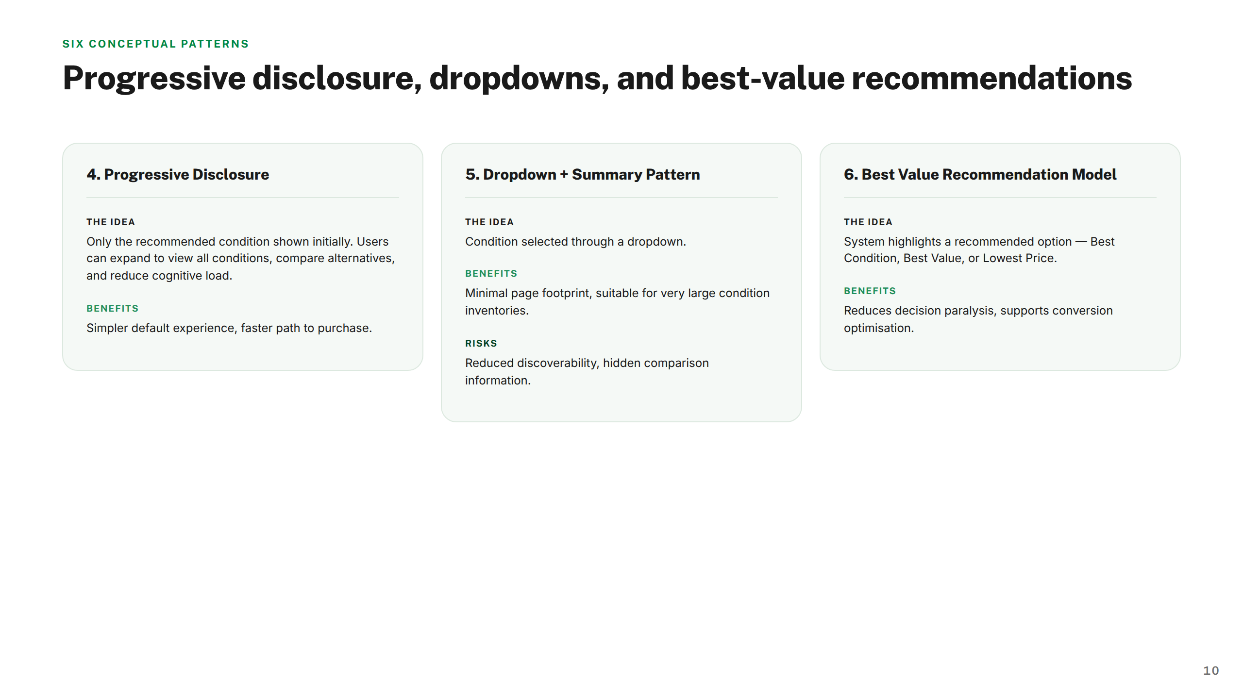
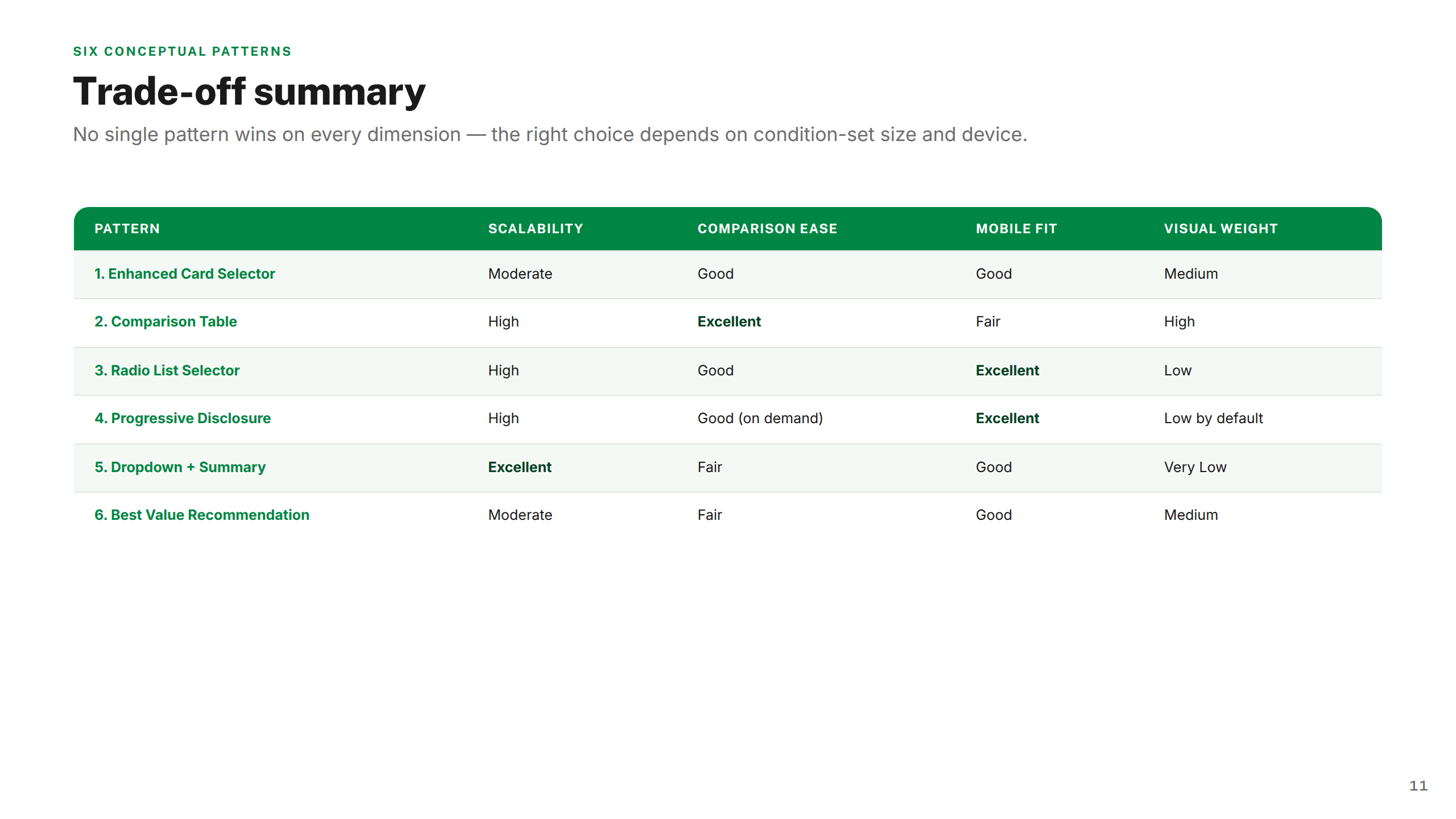
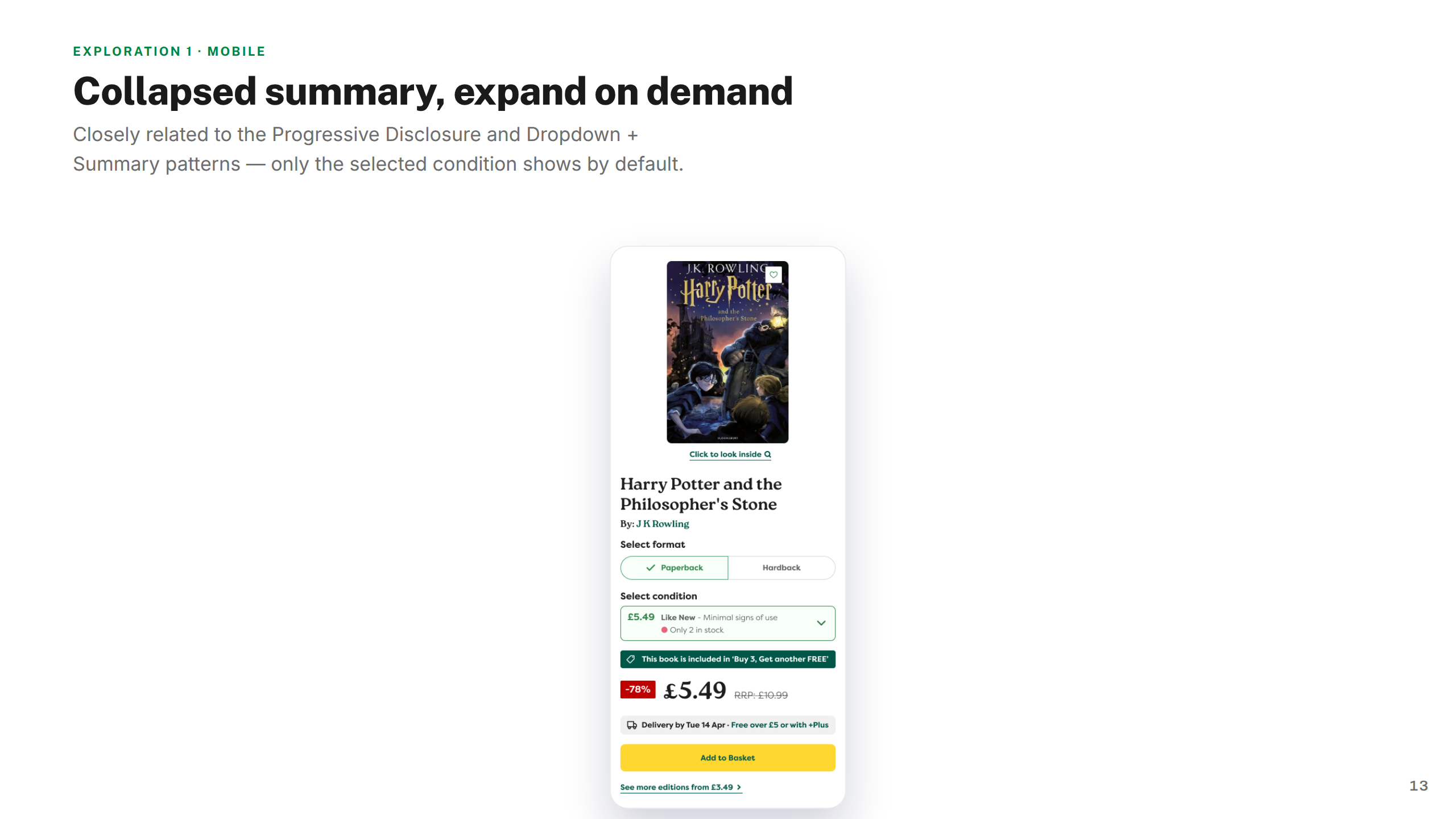
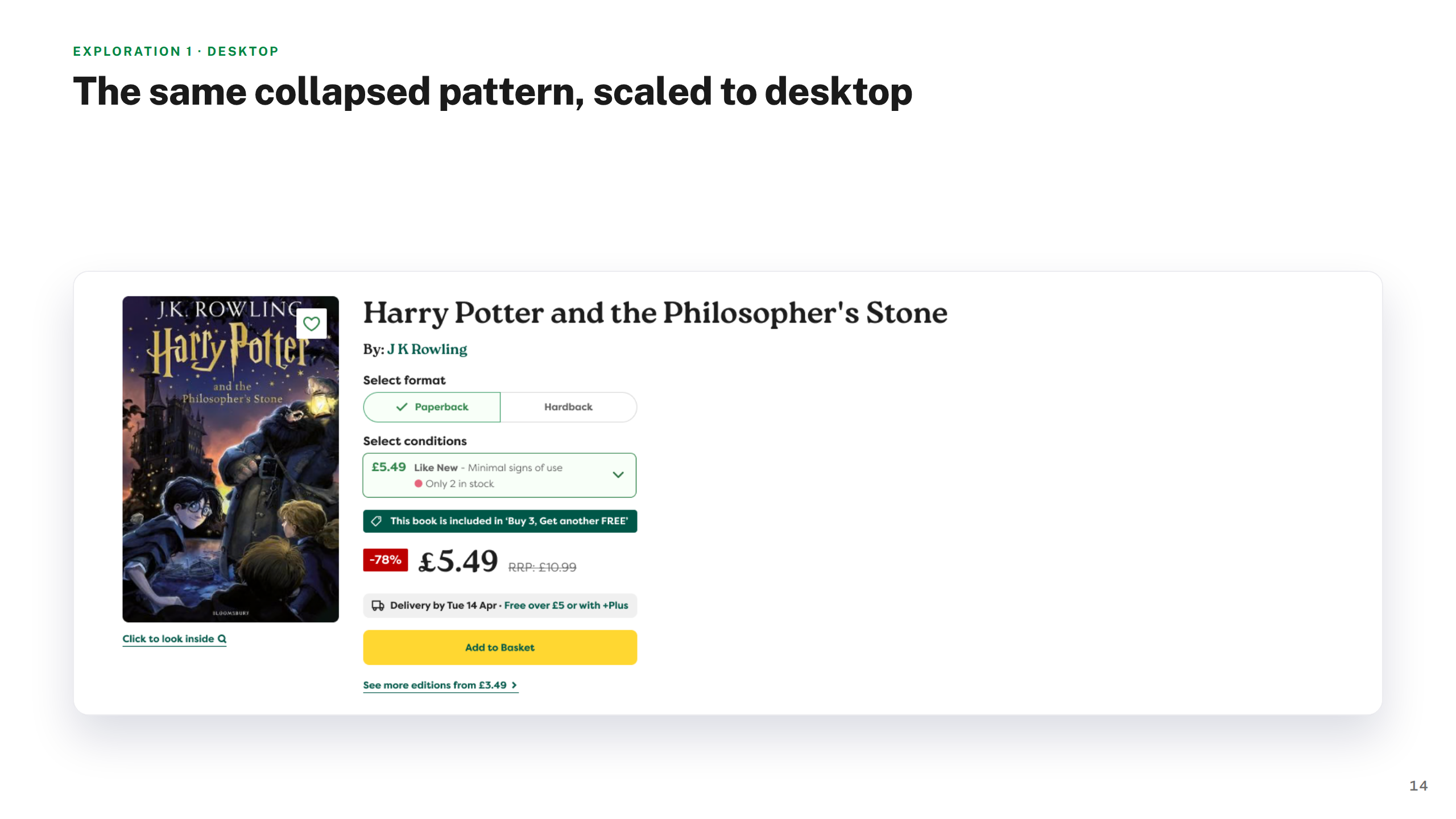
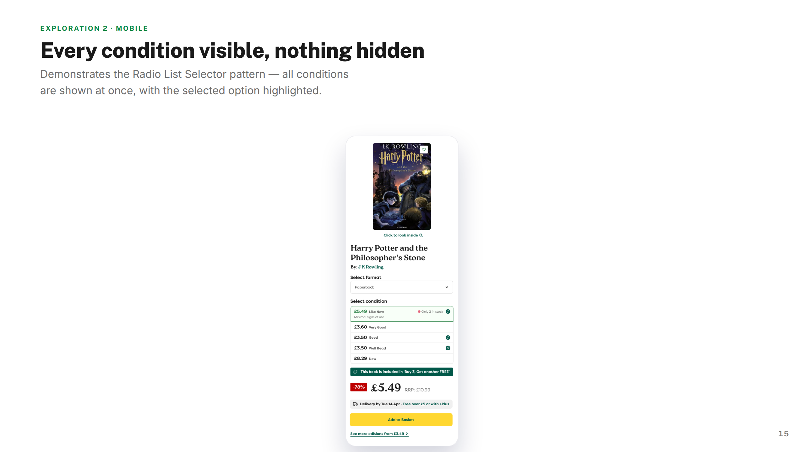
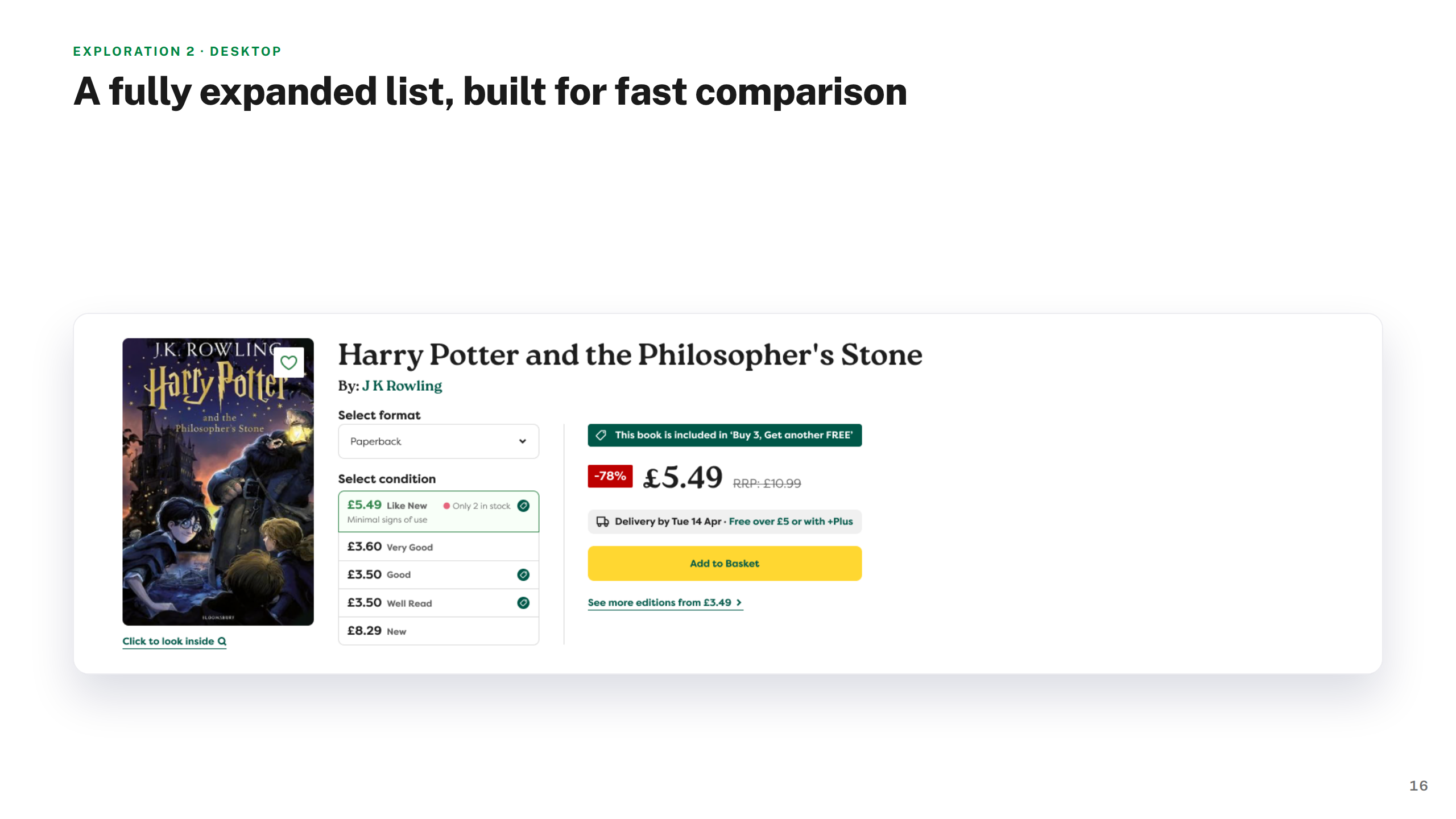
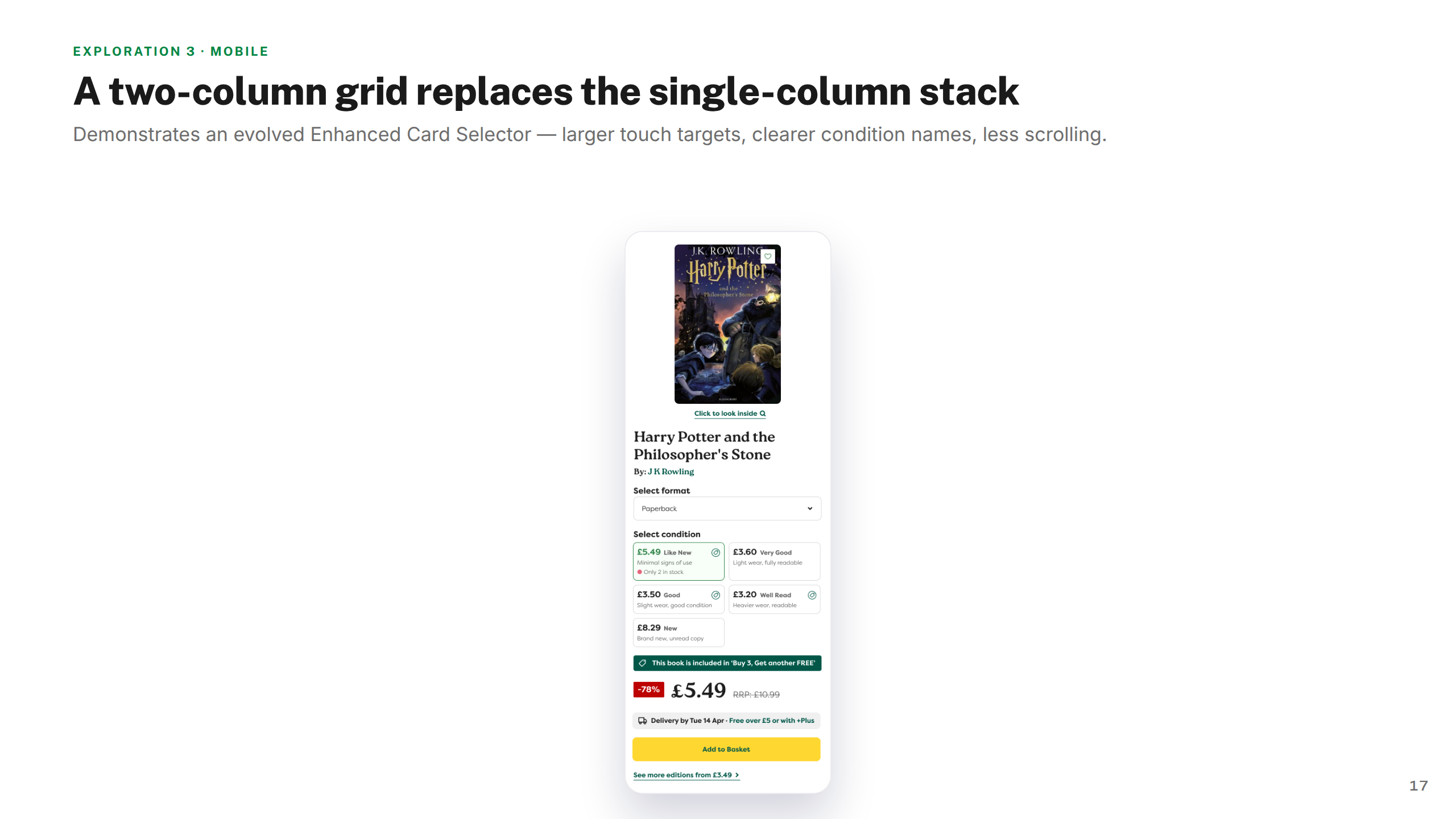
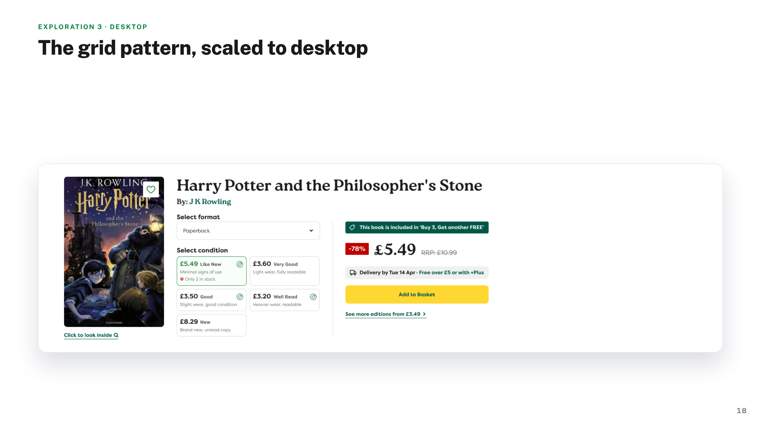
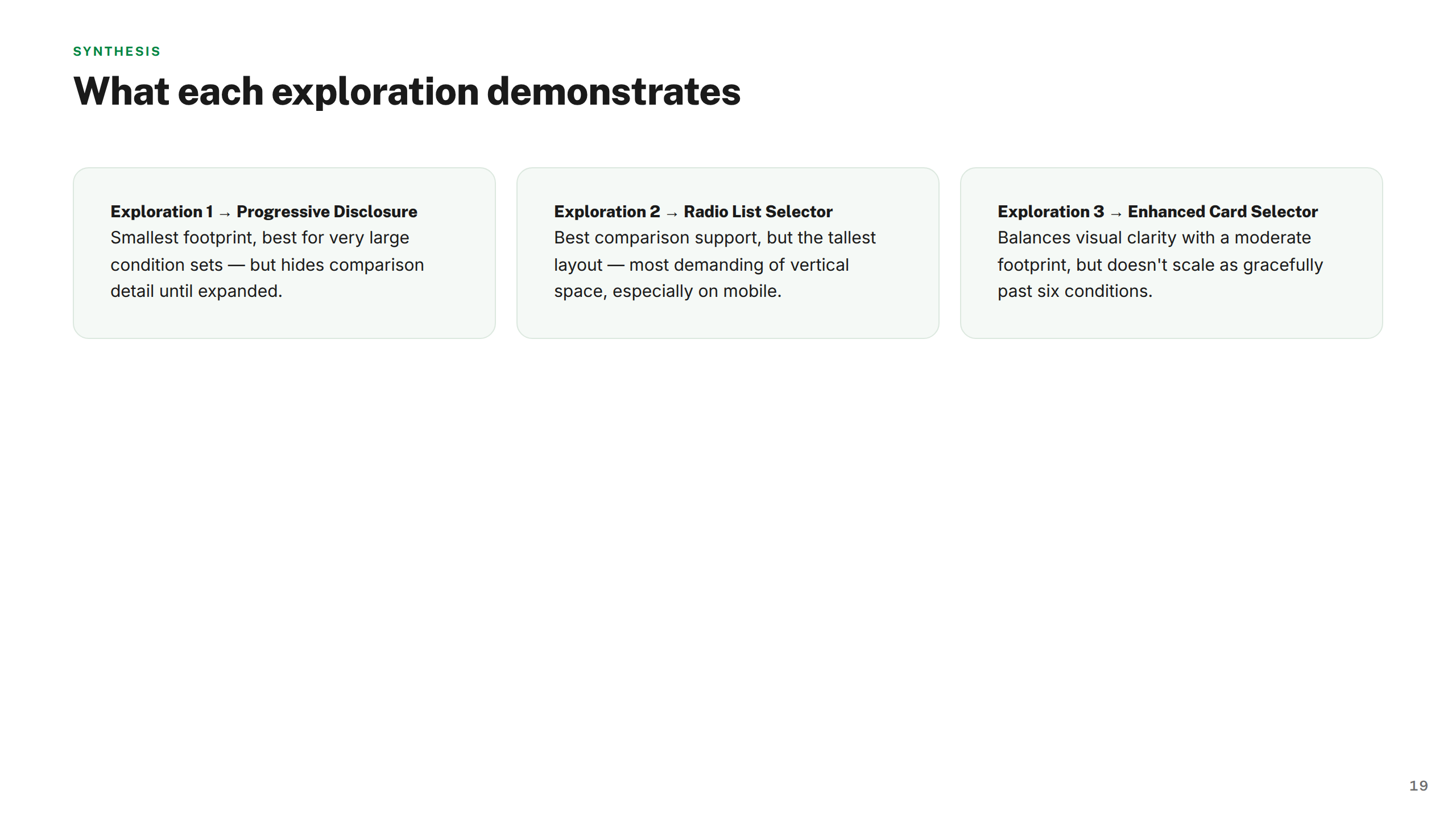
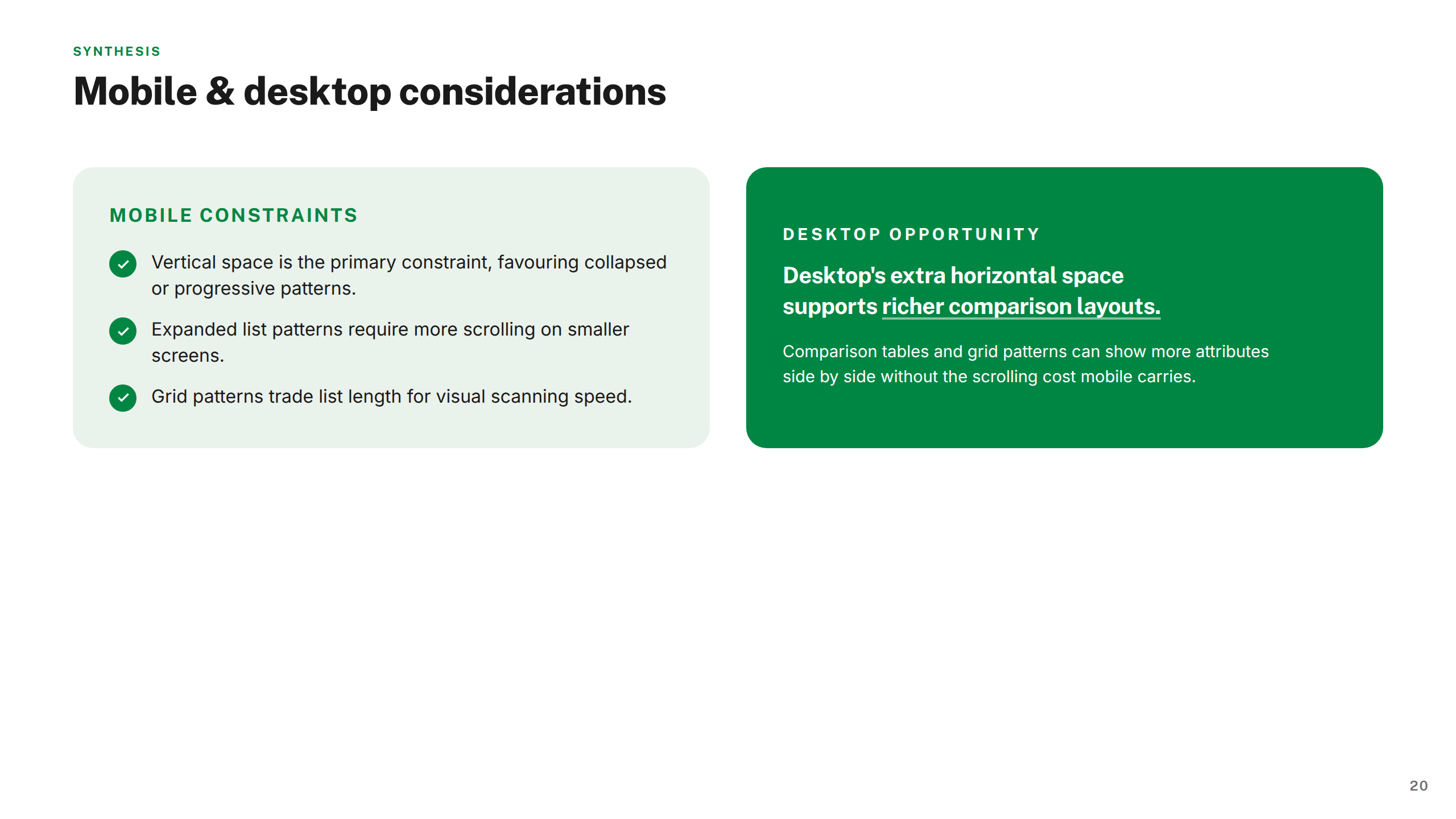
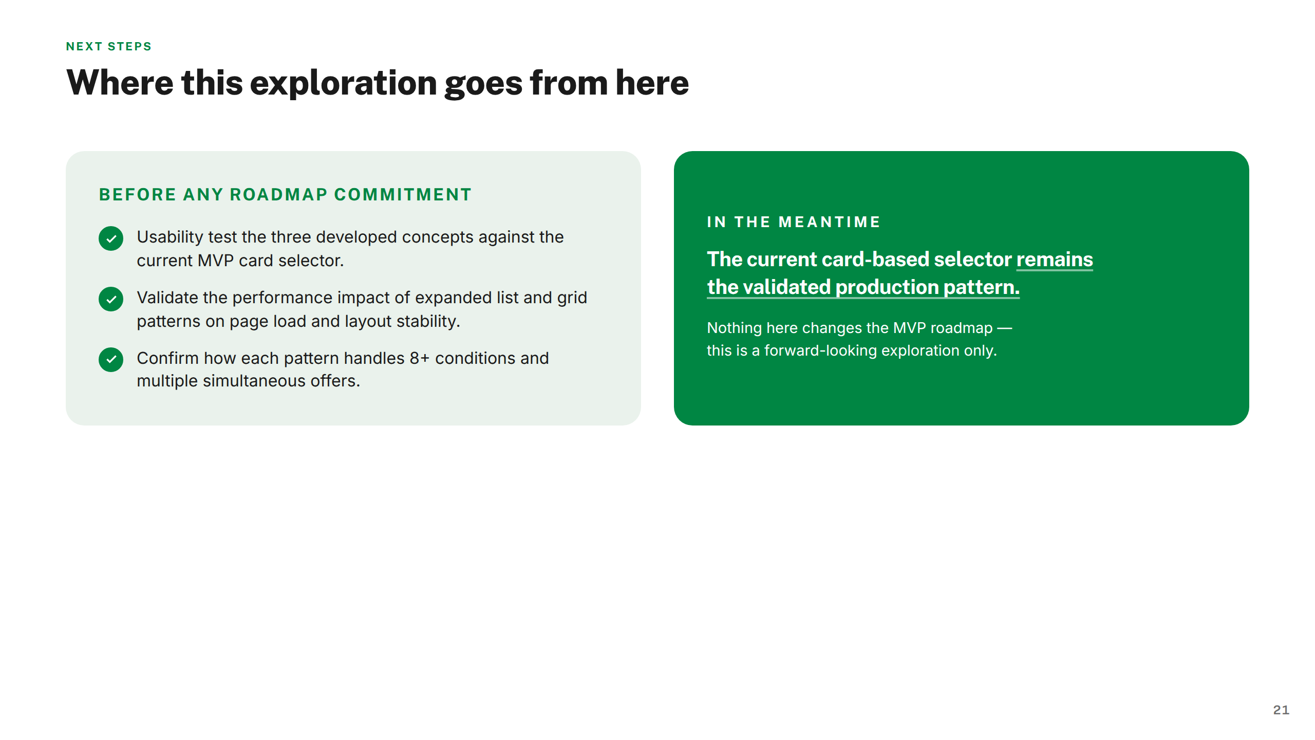
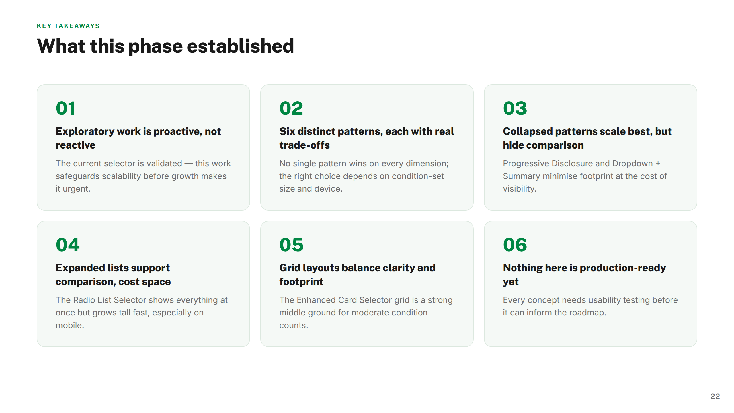
Rather than defaulting to one interaction model for how customers select a book condition, I mapped six distinct patterns and evaluated tradeoffs before making a recommendation. The goal was to make the decision transparent and defensible — not just deliver a solution that looked right.
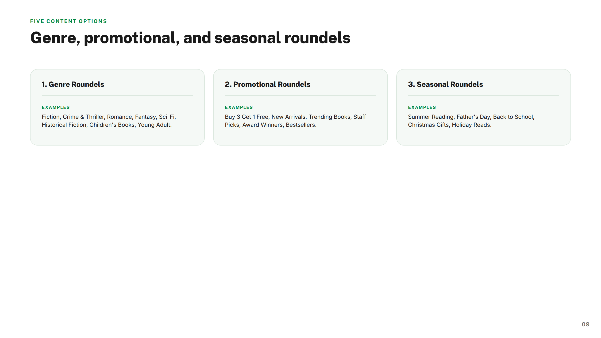
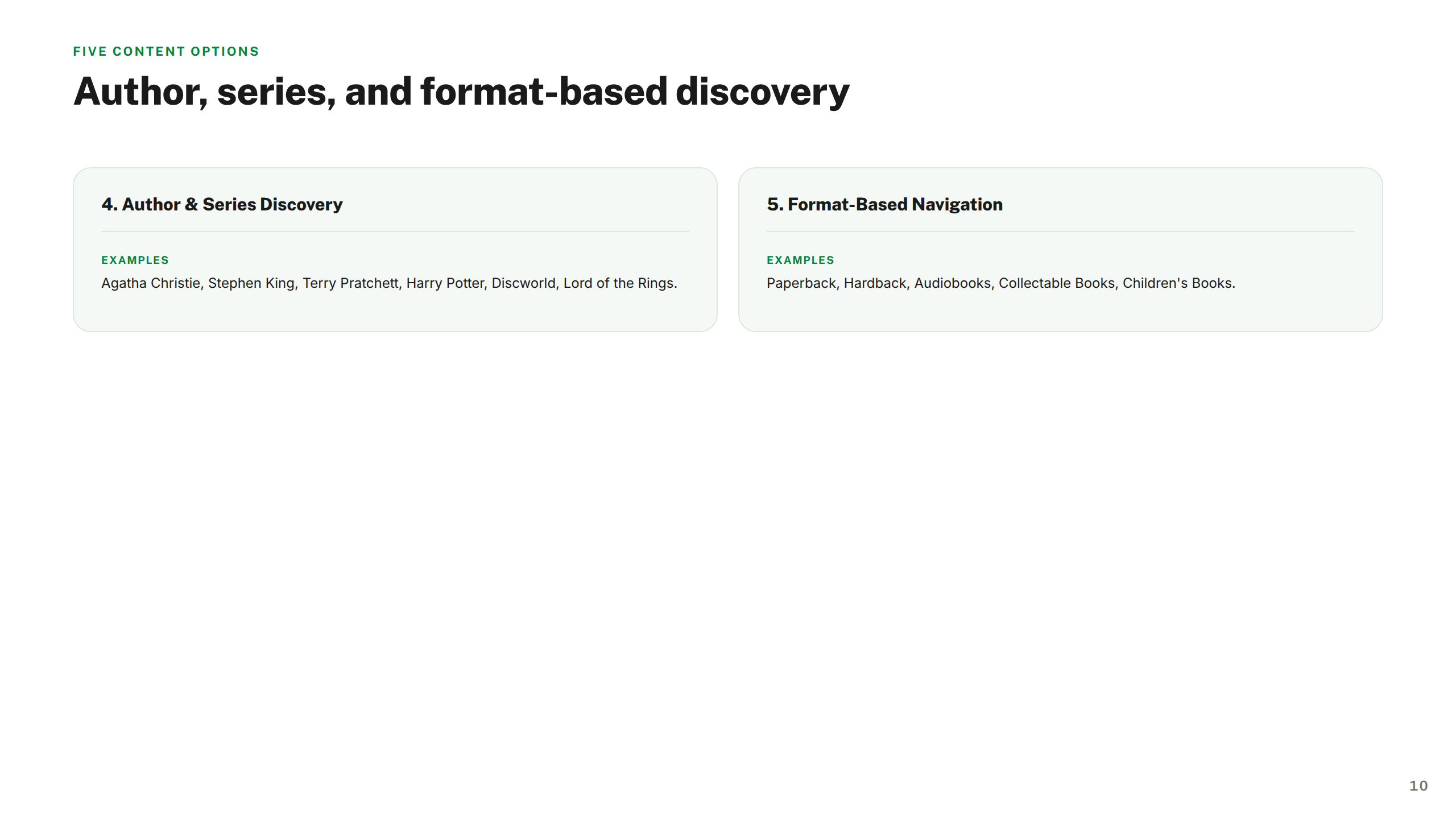
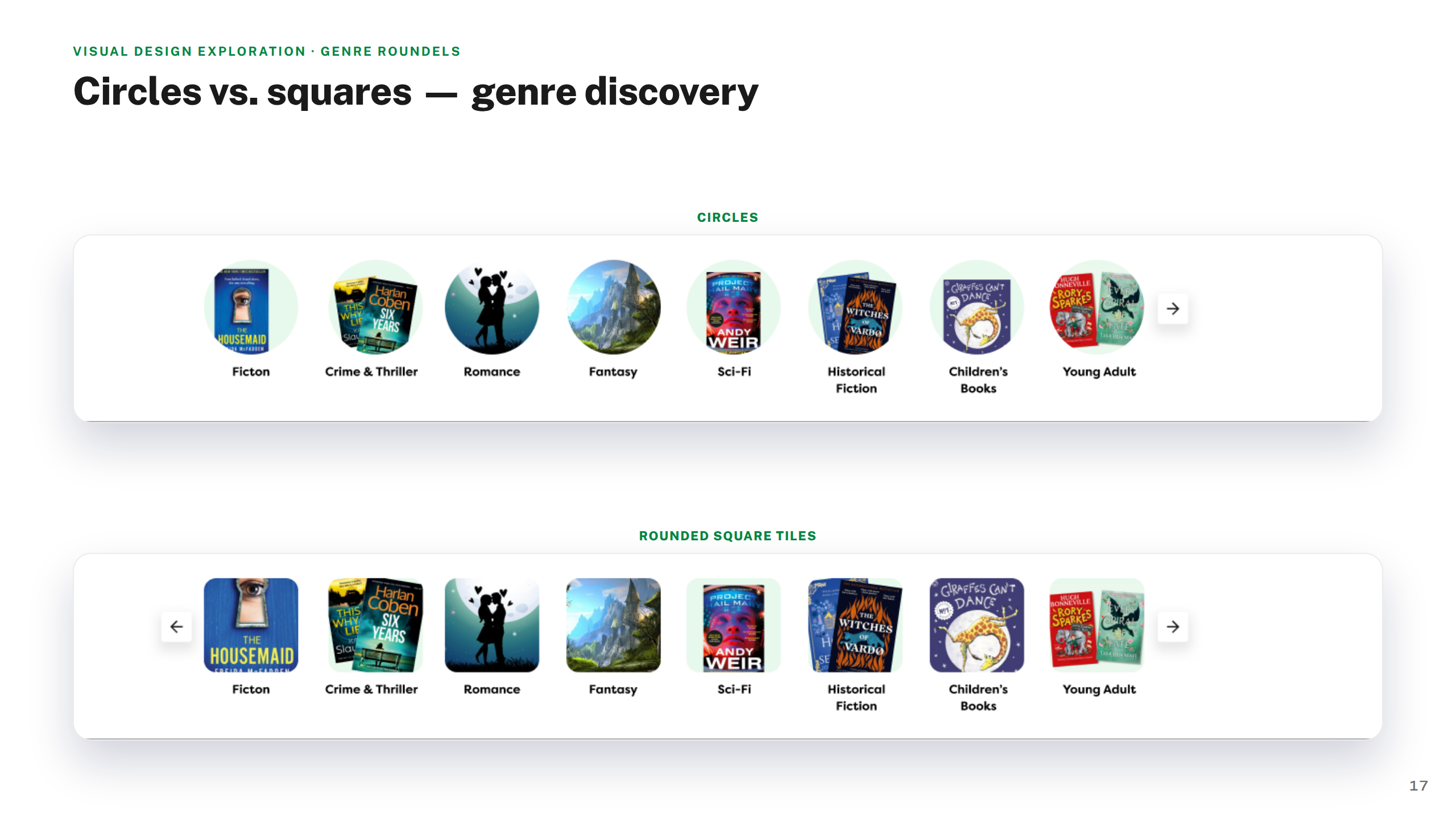
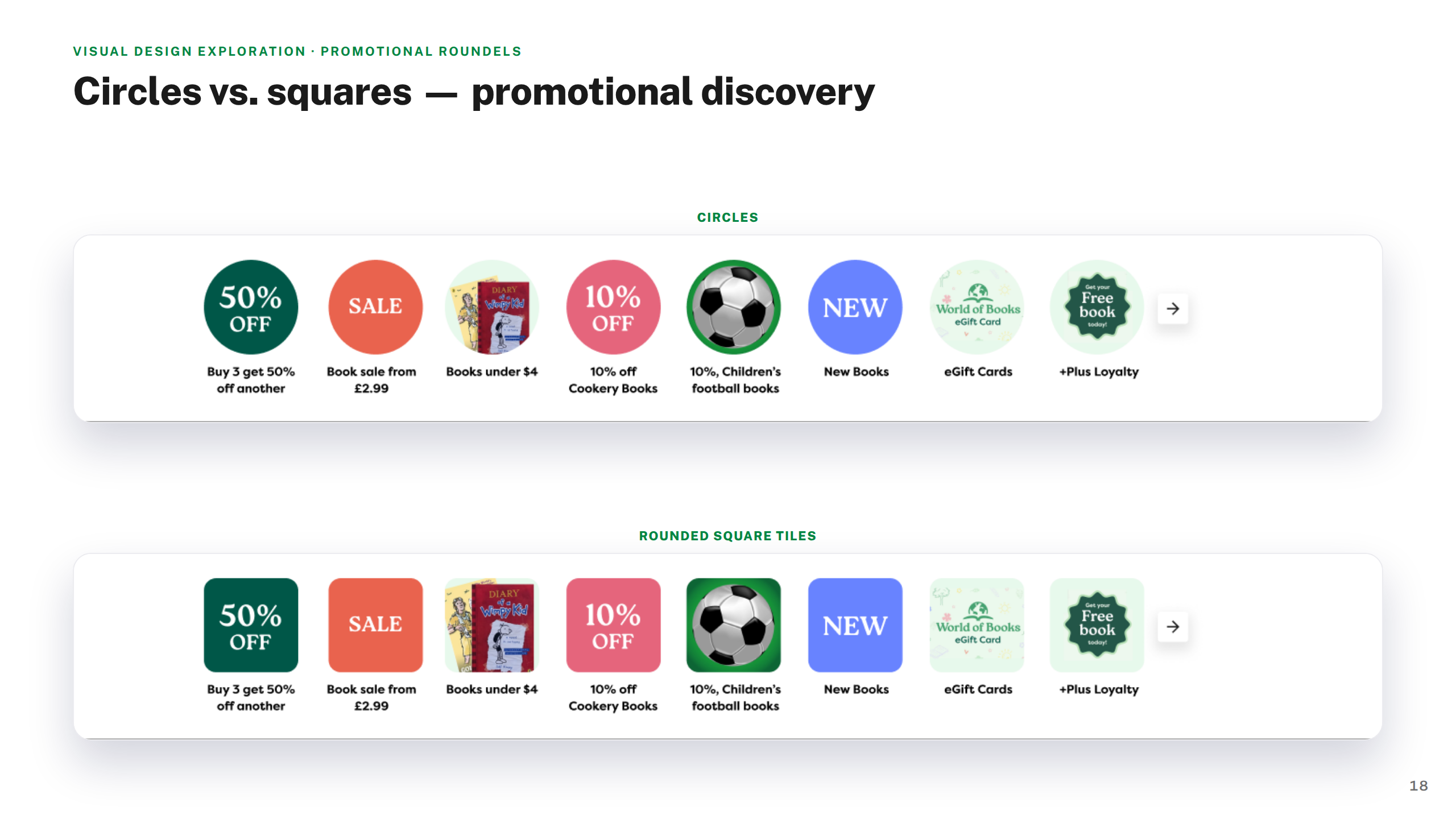
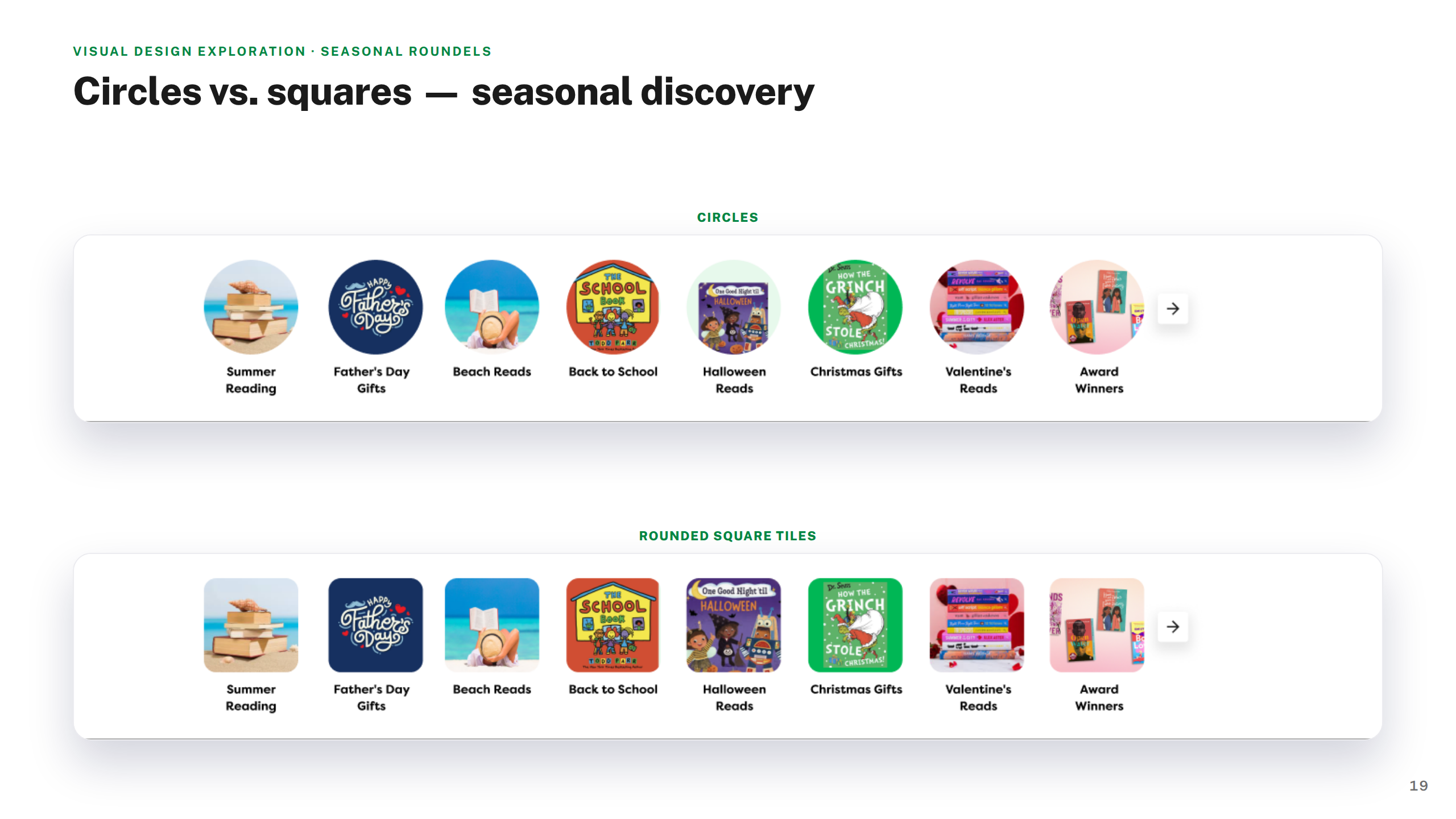
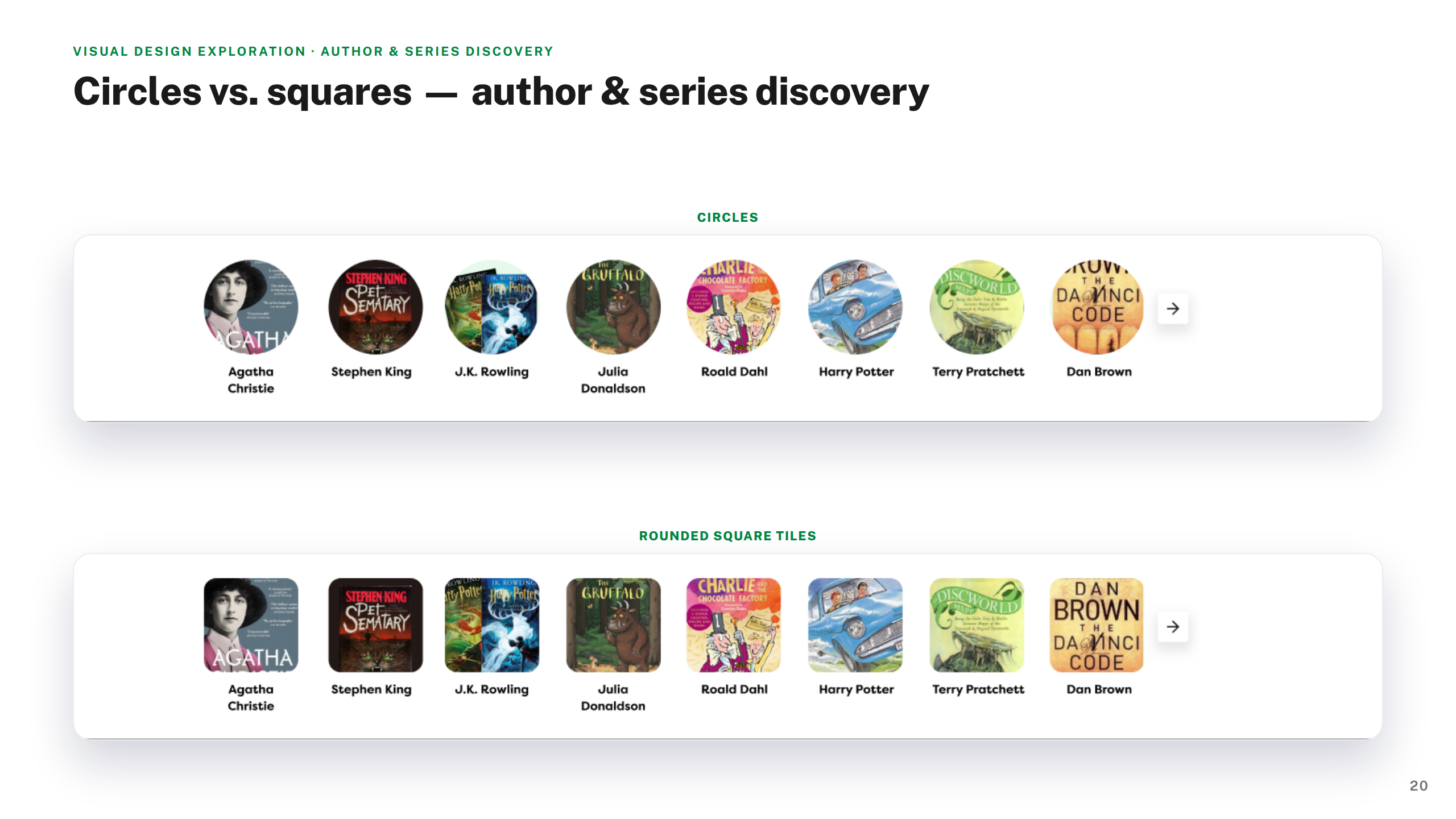
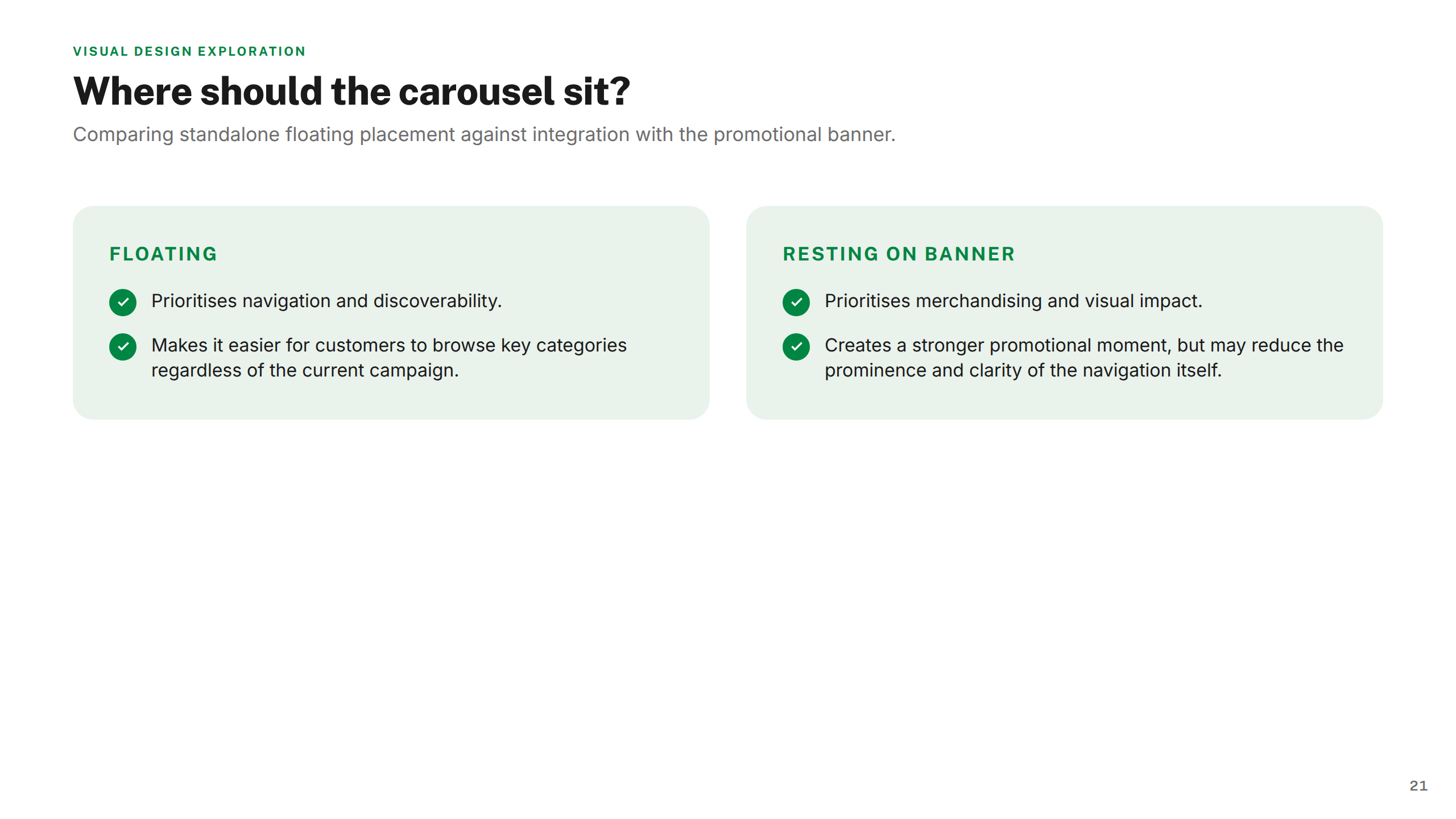
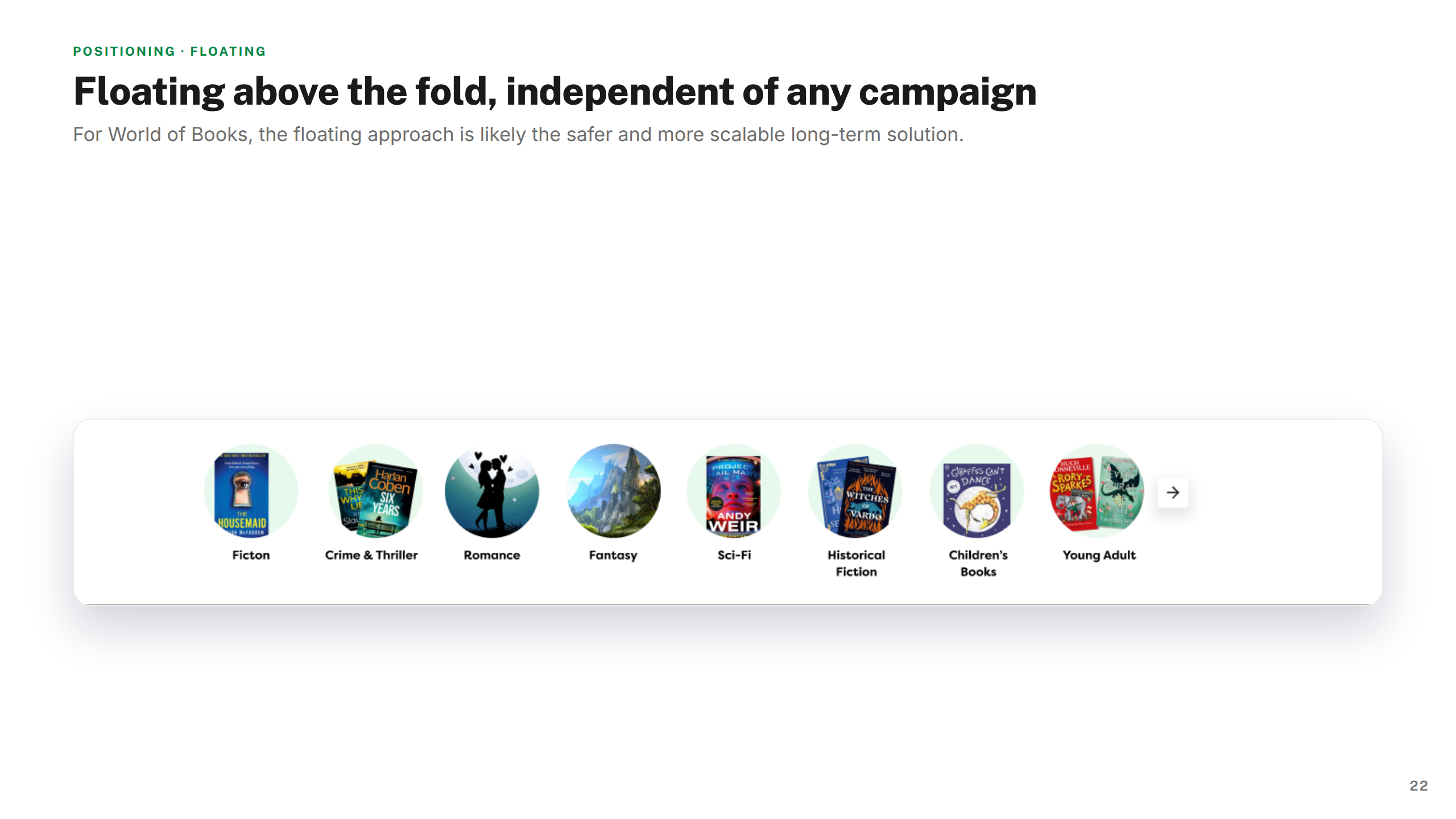
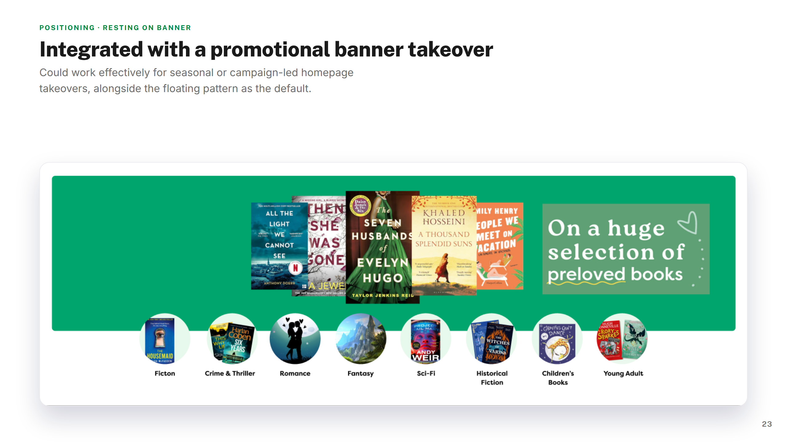
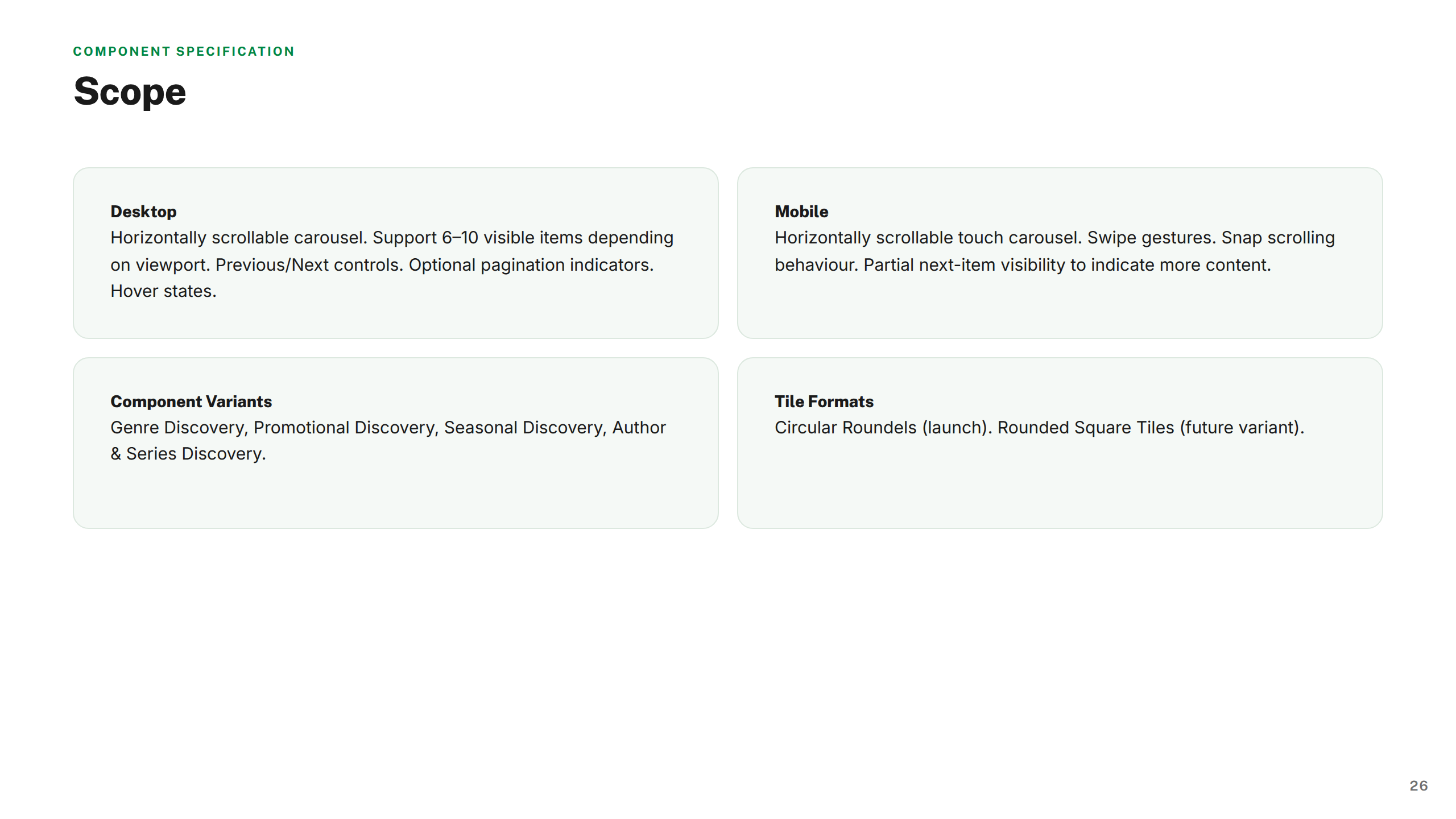
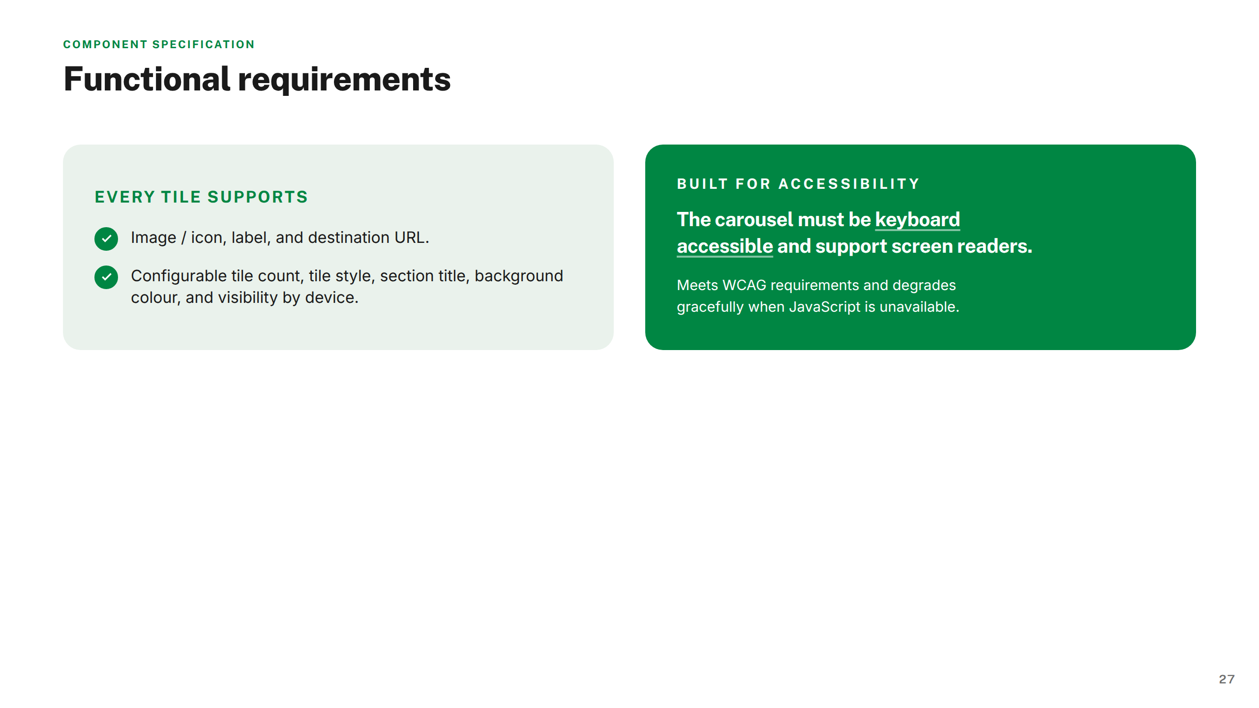
Circles vs squares is not just an aesthetic question — shape determines how genre is perceived. Squares read as editorial and considered; circles as casual and browsable. I tested both across fiction, promotional, seasonal, and author/series contexts before landing on a direction, and documented the rationale in the handoff.
A programme with a clear shape.
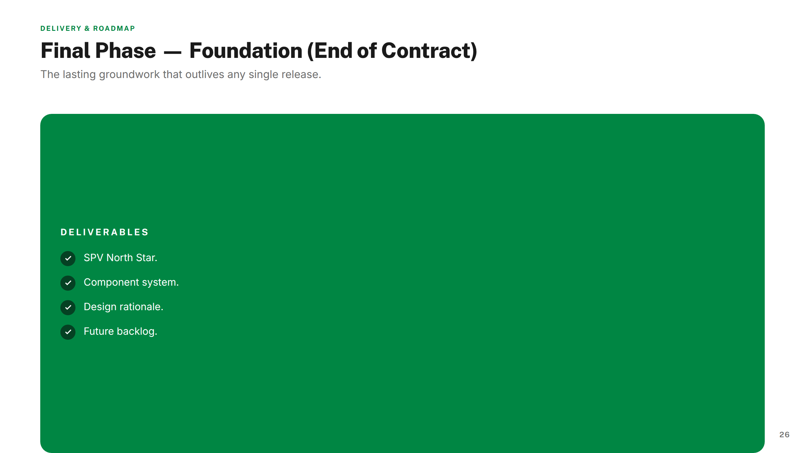
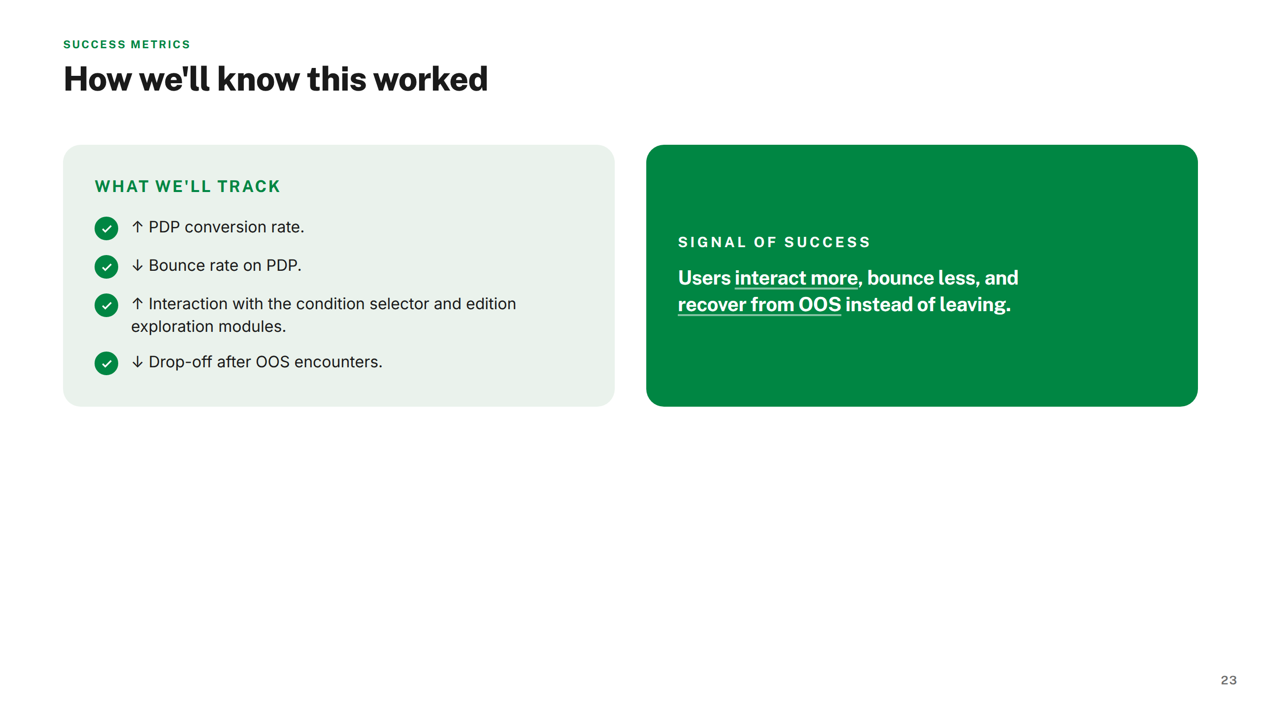
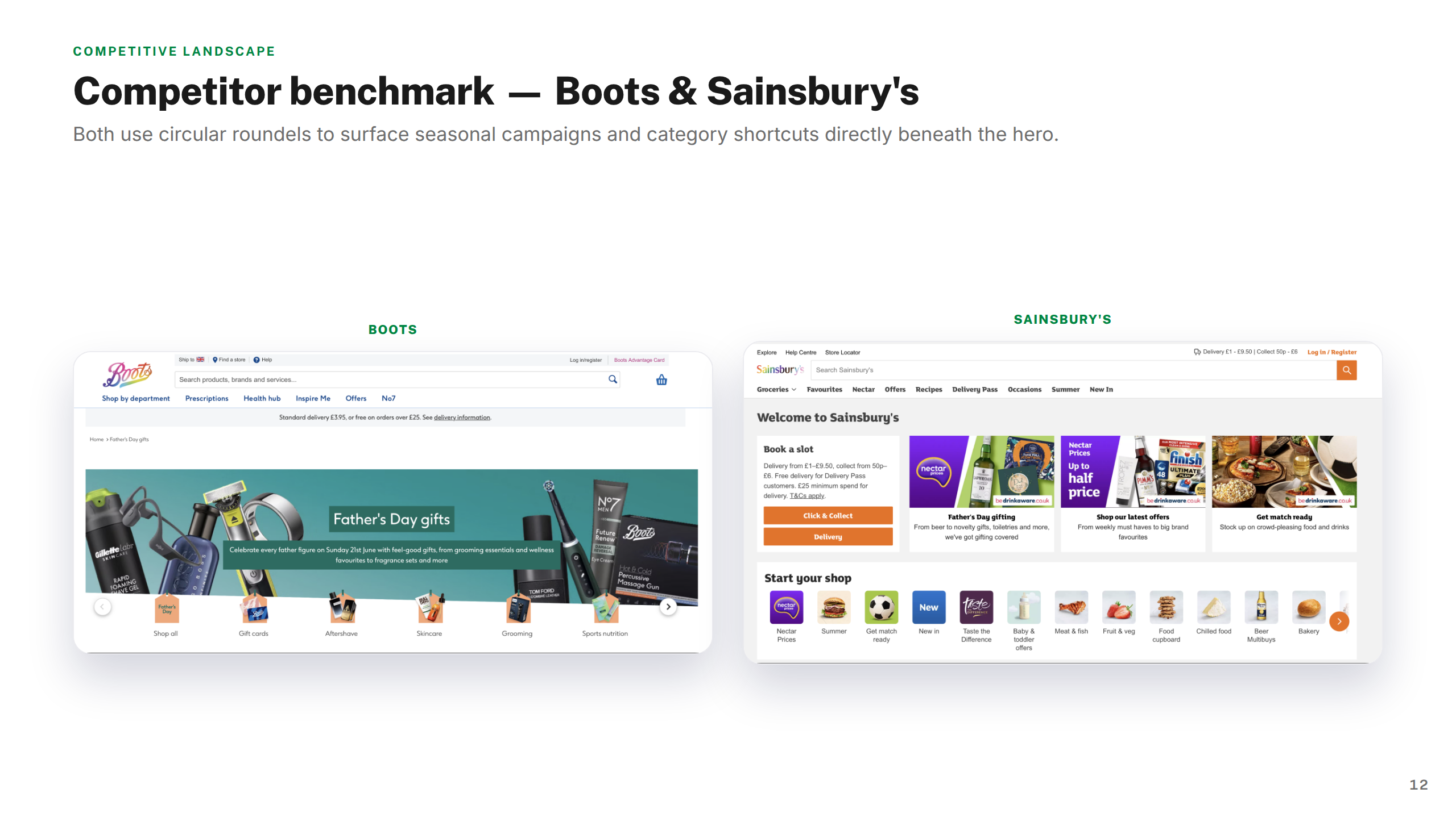
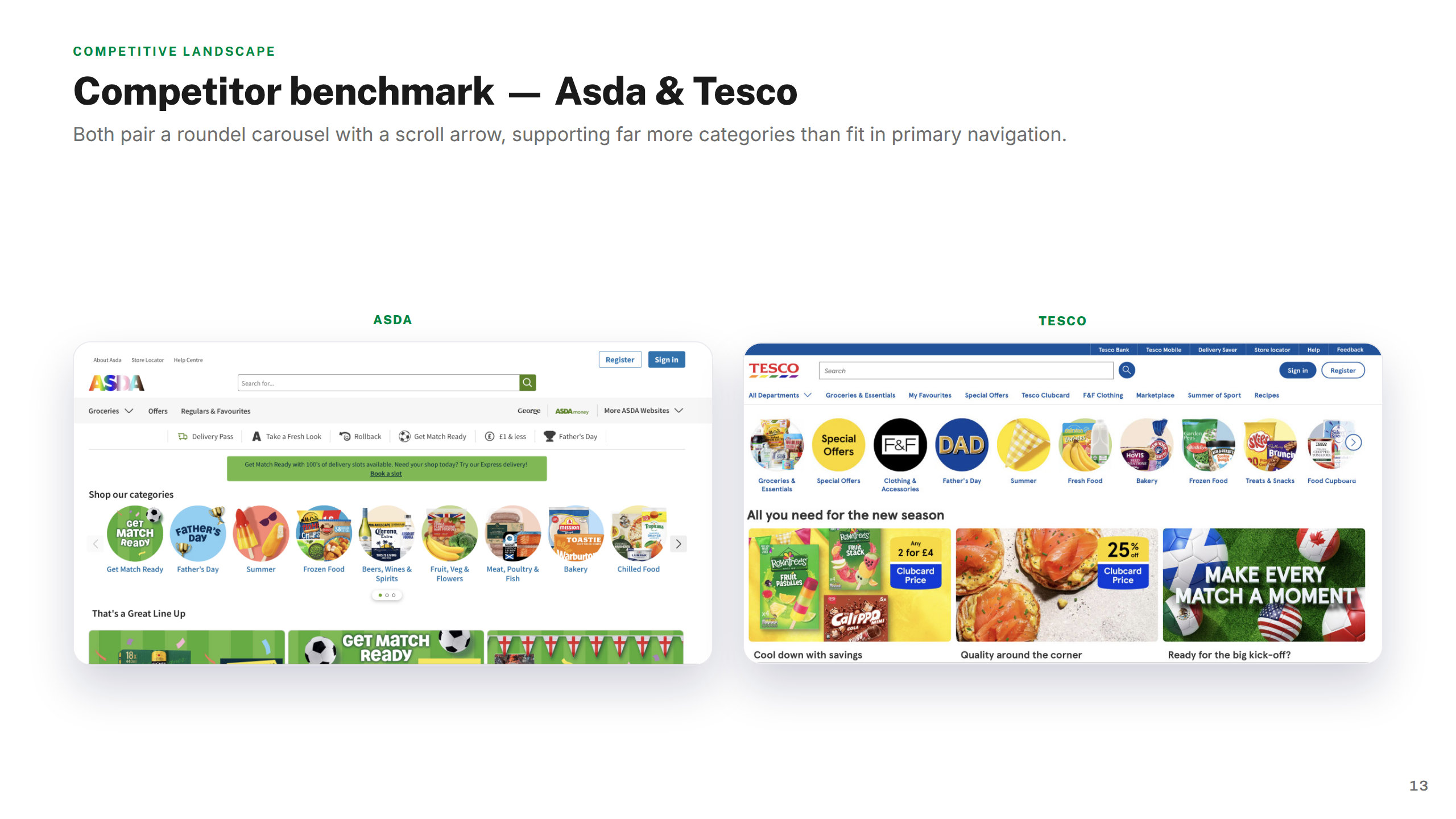
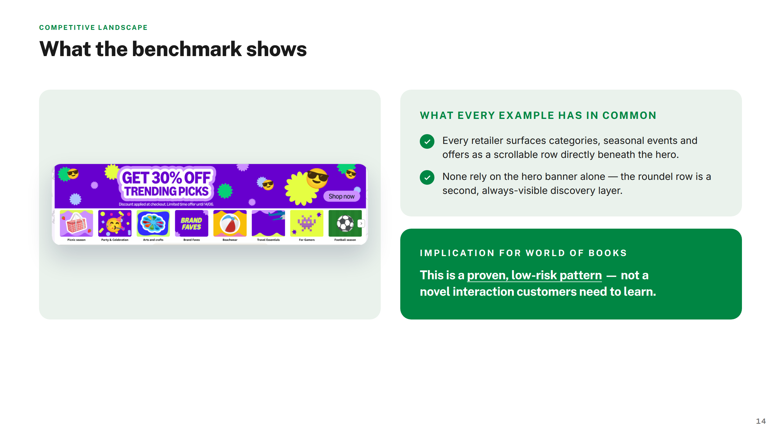
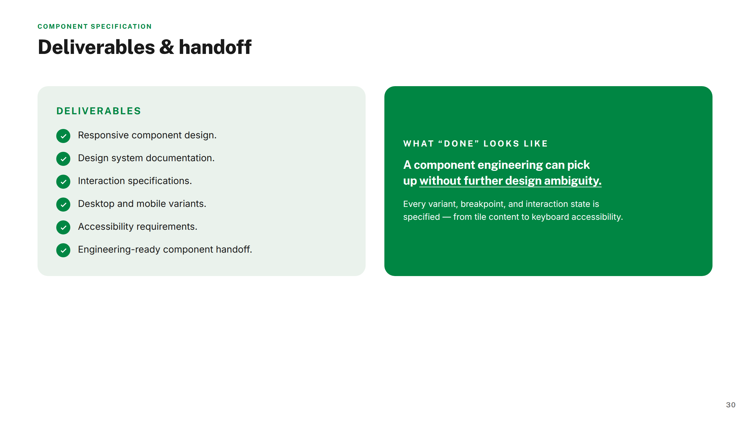
Nine workstreams delivered across an extended engagement. The output spans a full research foundation, a composable design system for SPV, redesigned core modules, and six targeted feature workstreams — each with a competitive benchmark, design rationale, and handoff-ready specifications.
Projects shown include live work, pitch deliverables, and design produced as part of embedded or collaborative engagements. Some work was completed as part of a wider team. Deliverables reflect the scope and direction at the time of engagement — the live experience may have since changed, launched in a different form, or not proceeded to production. All brand assets and trademarks shown remain the property of their respective owners and are displayed here for portfolio reference only.
Available for new engagements
Senior product design available for engagements across enterprise ecommerce, fintech, and regulated systems.
Get in touch →