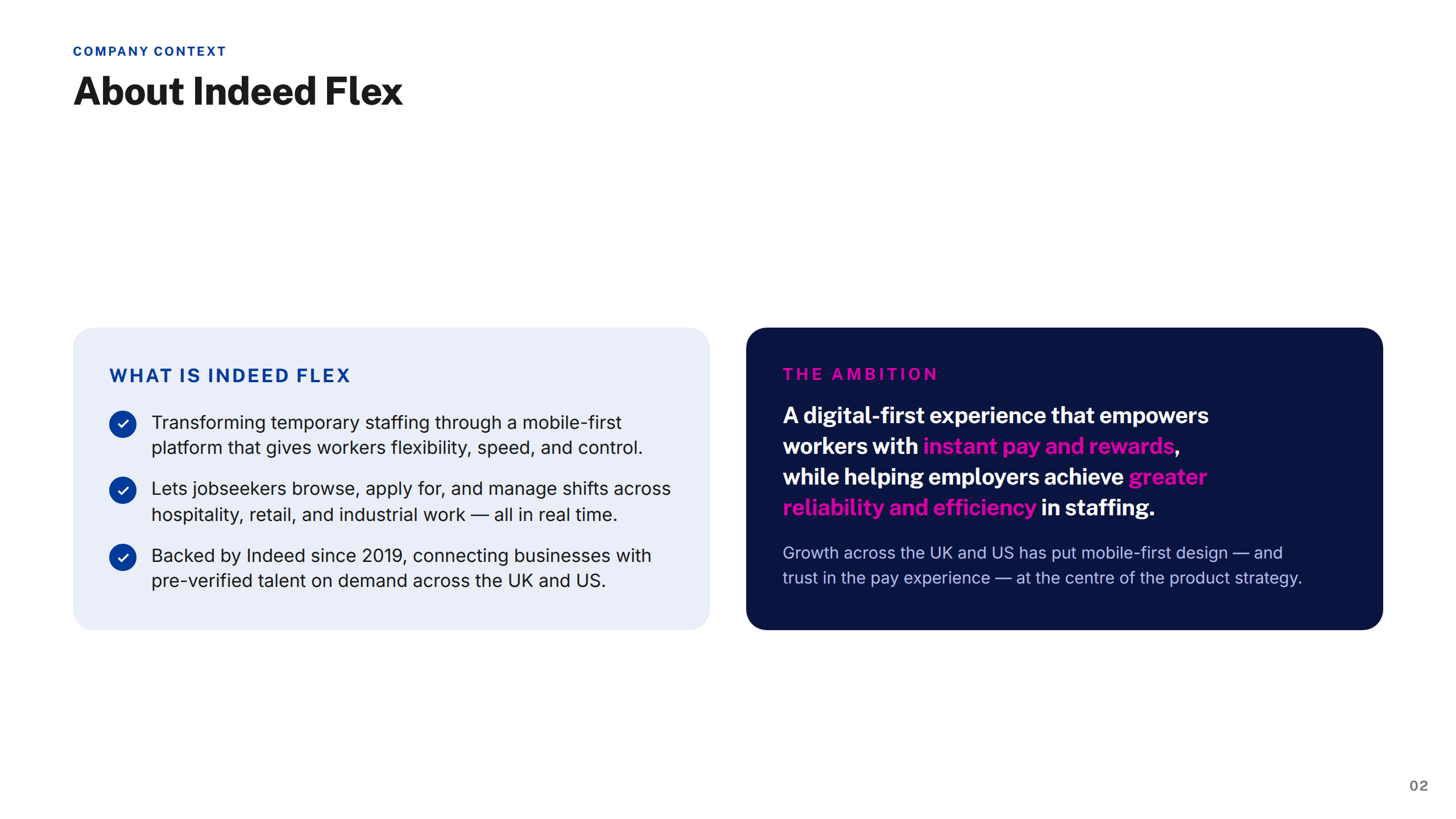
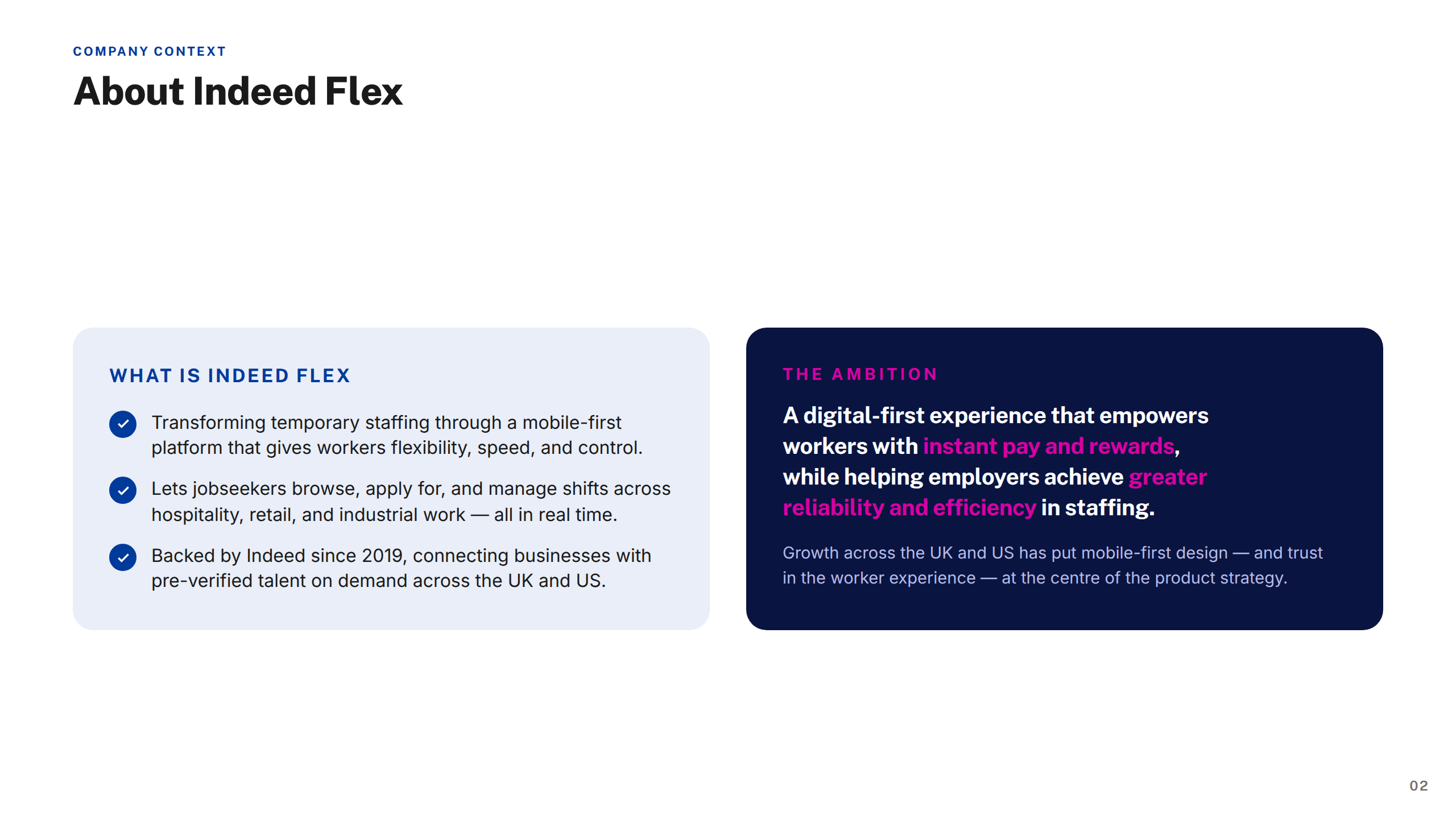
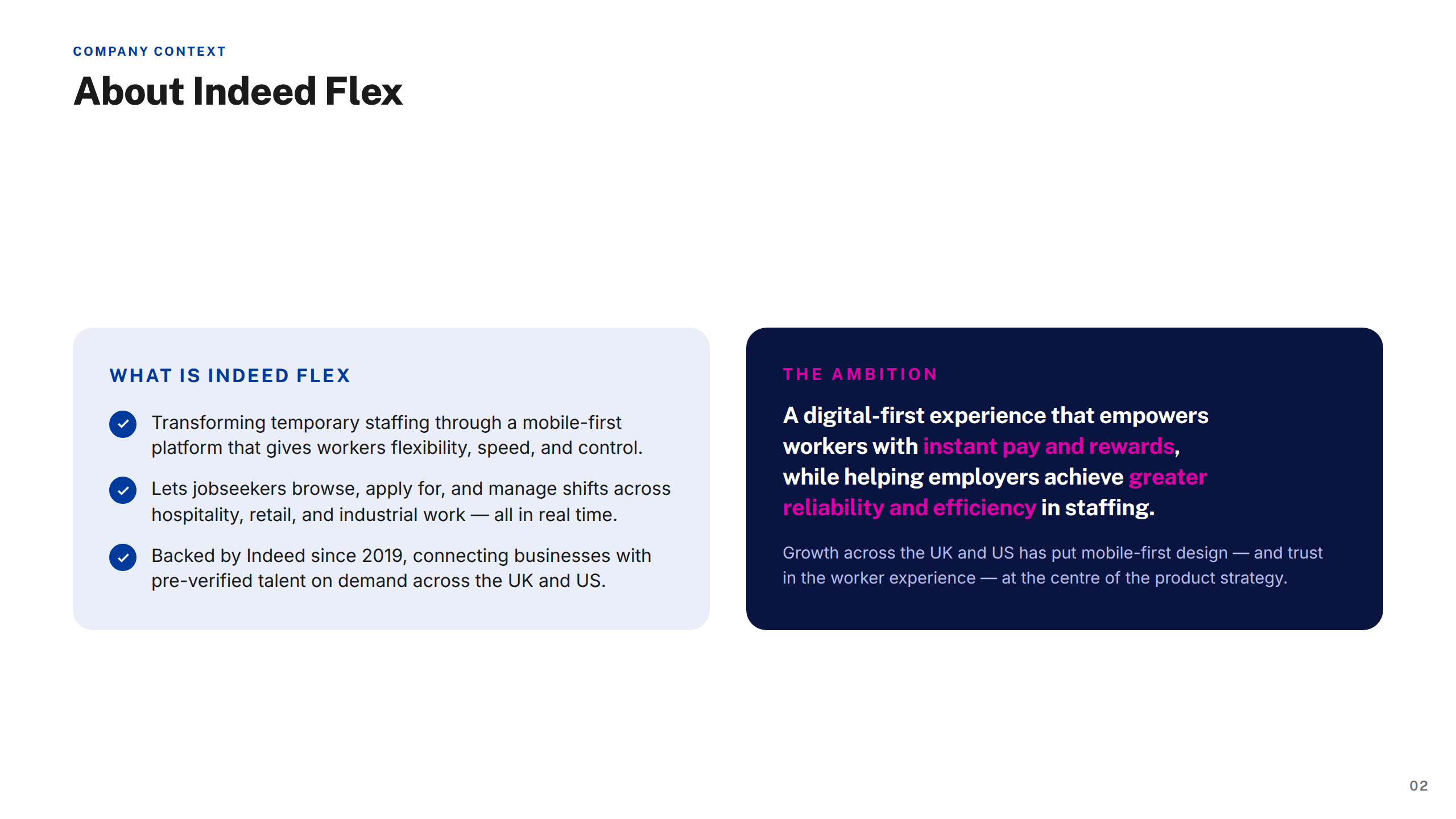
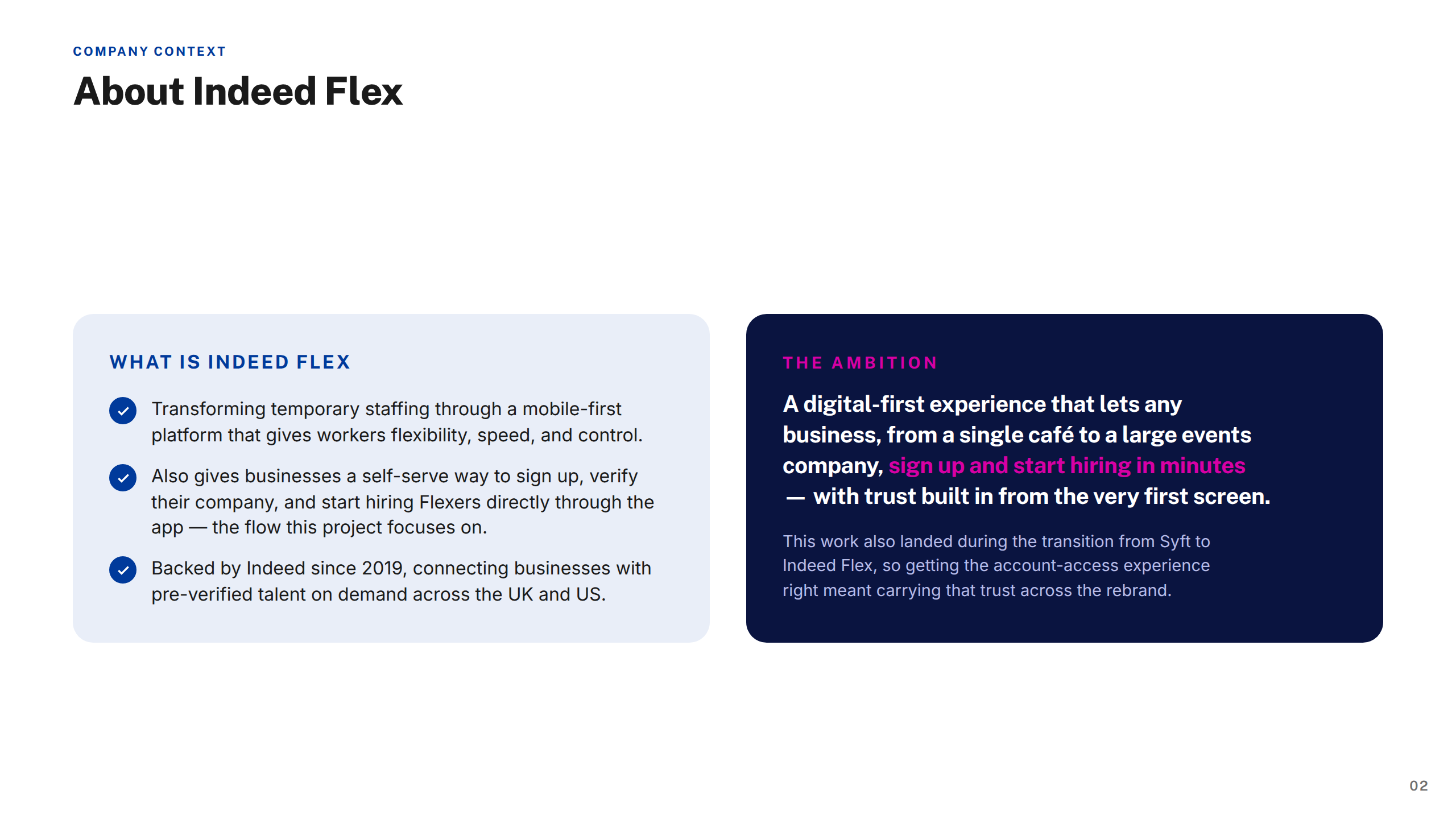
Indeed Flex is a flexible staffing marketplace — part of the Indeed group, one of the world's largest job platforms — connecting workers with temporary and flexible shift opportunities across hospitality, retail, industrial, driving, and healthcare sectors. Workers can find, book, and manage shifts directly through the app, while employers post roles and access a pool of pre-verified, rated talent on demand.
Operating primarily in the UK and US, Indeed Flex had grown rapidly since its acquisition by Indeed, scaling its platform to hundreds of thousands of active workers and thousands of employer accounts. As the product grew in scale and complexity, the native app needed to keep pace — handling increasingly sophisticated flows around pay, compliance, workforce management, and shift logistics. I was embedded as a Product Designer across a two-year engagement, owning end-to-end design across multiple workstreams on both the worker and employer sides of the platform.
Indeed Flex transforms temporary staffing, connecting jobseekers with flexible shift opportunities across hospitality, retail, and industrial sectors. As the platform scaled, the app needed to handle increasingly complex jobs — pay visibility, timesheet approvals, strikes-and-bans policy, and worker profiles — without overwhelming workers or managers.
Inconsistent patterns across the product were slowing teams down and eroding trust at key moments like understanding pay or policy status.
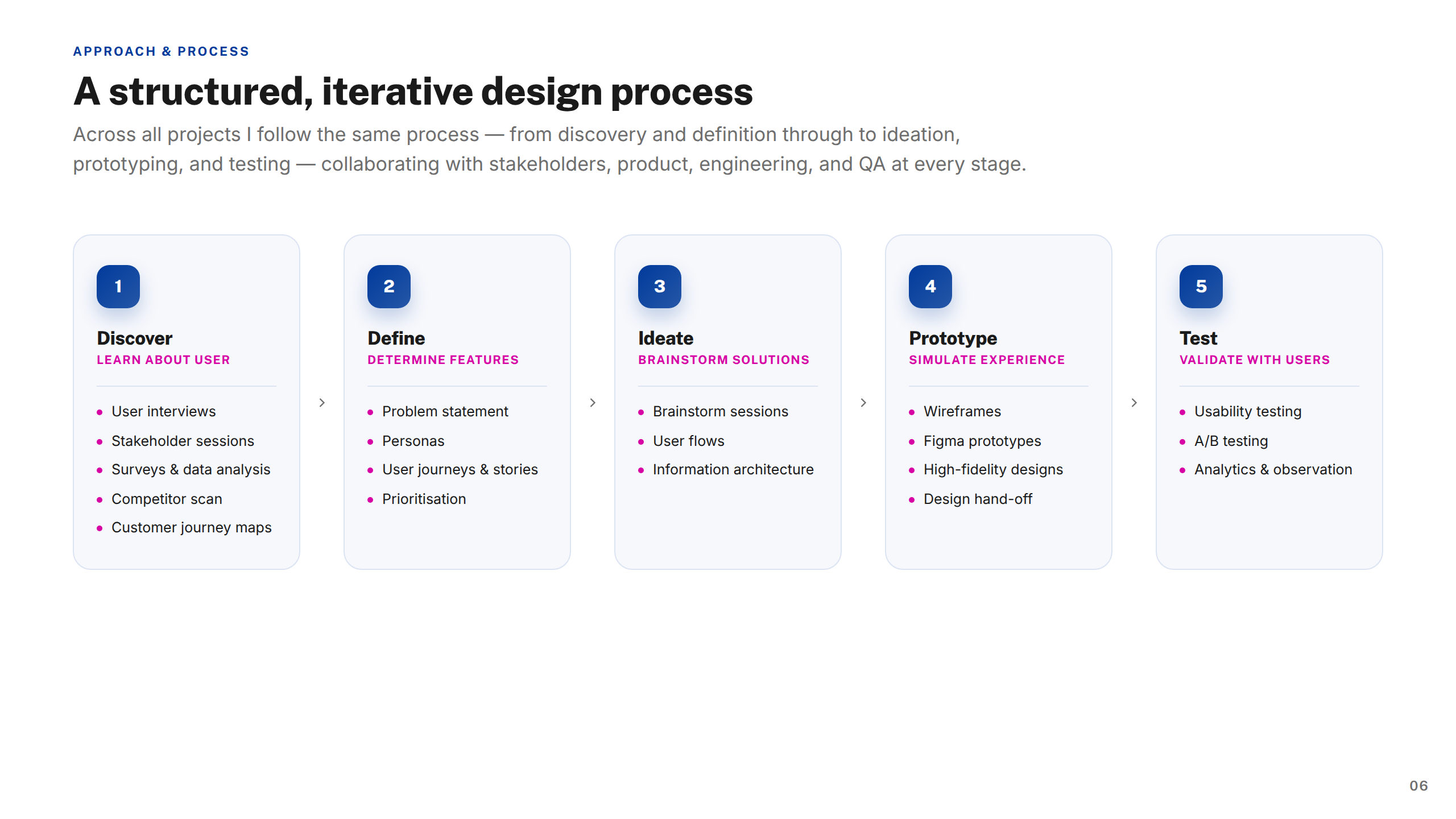
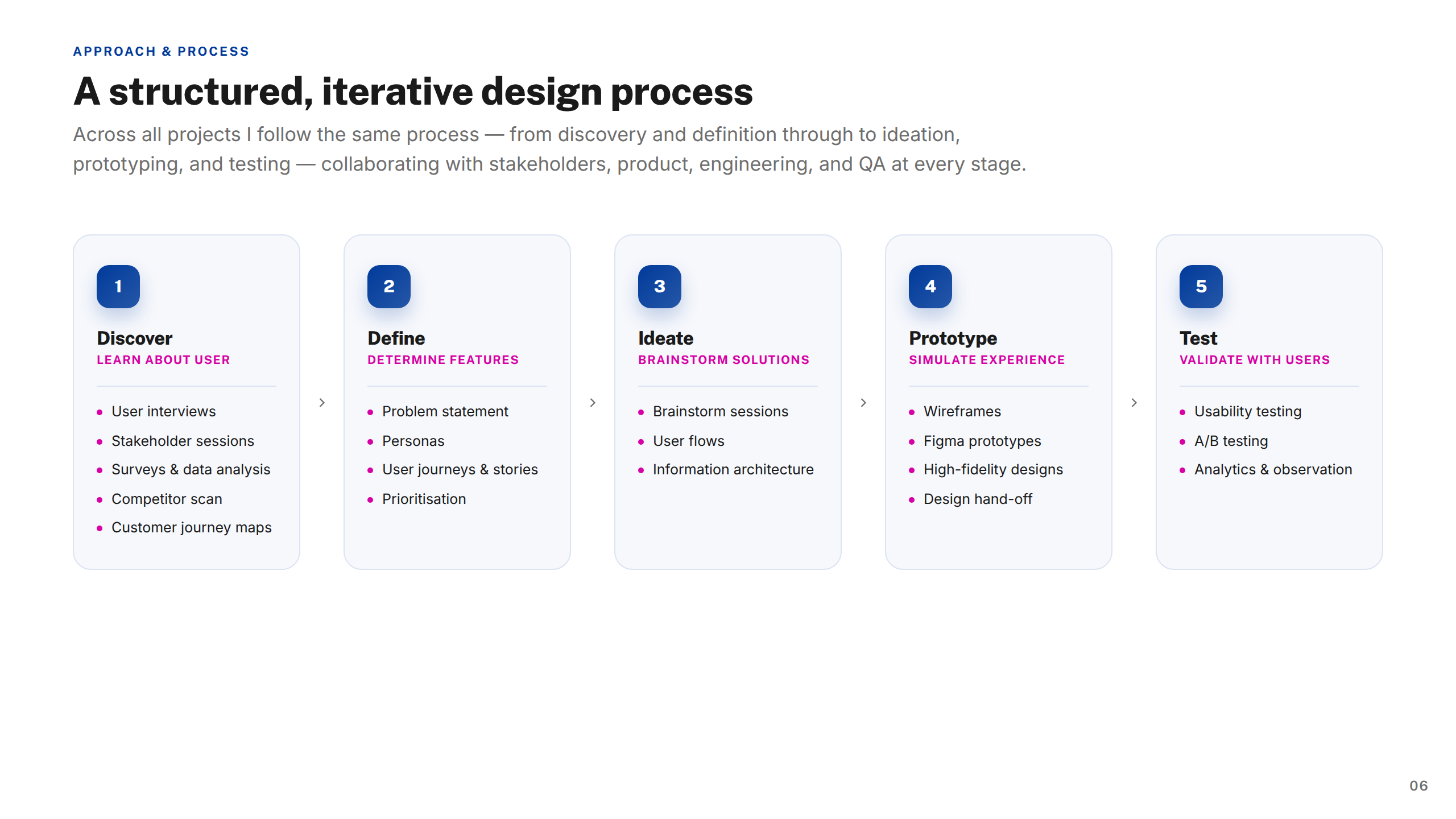
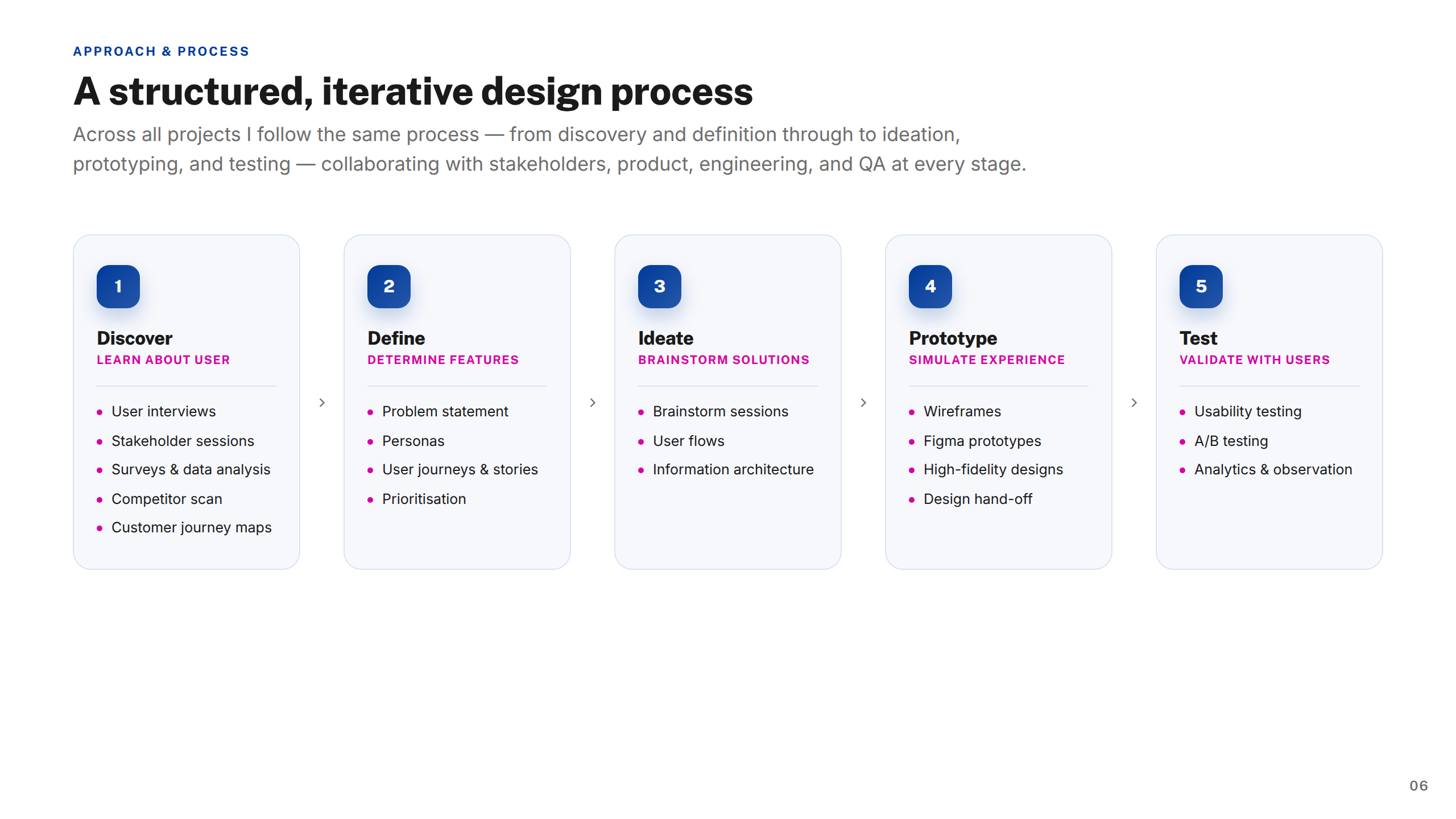
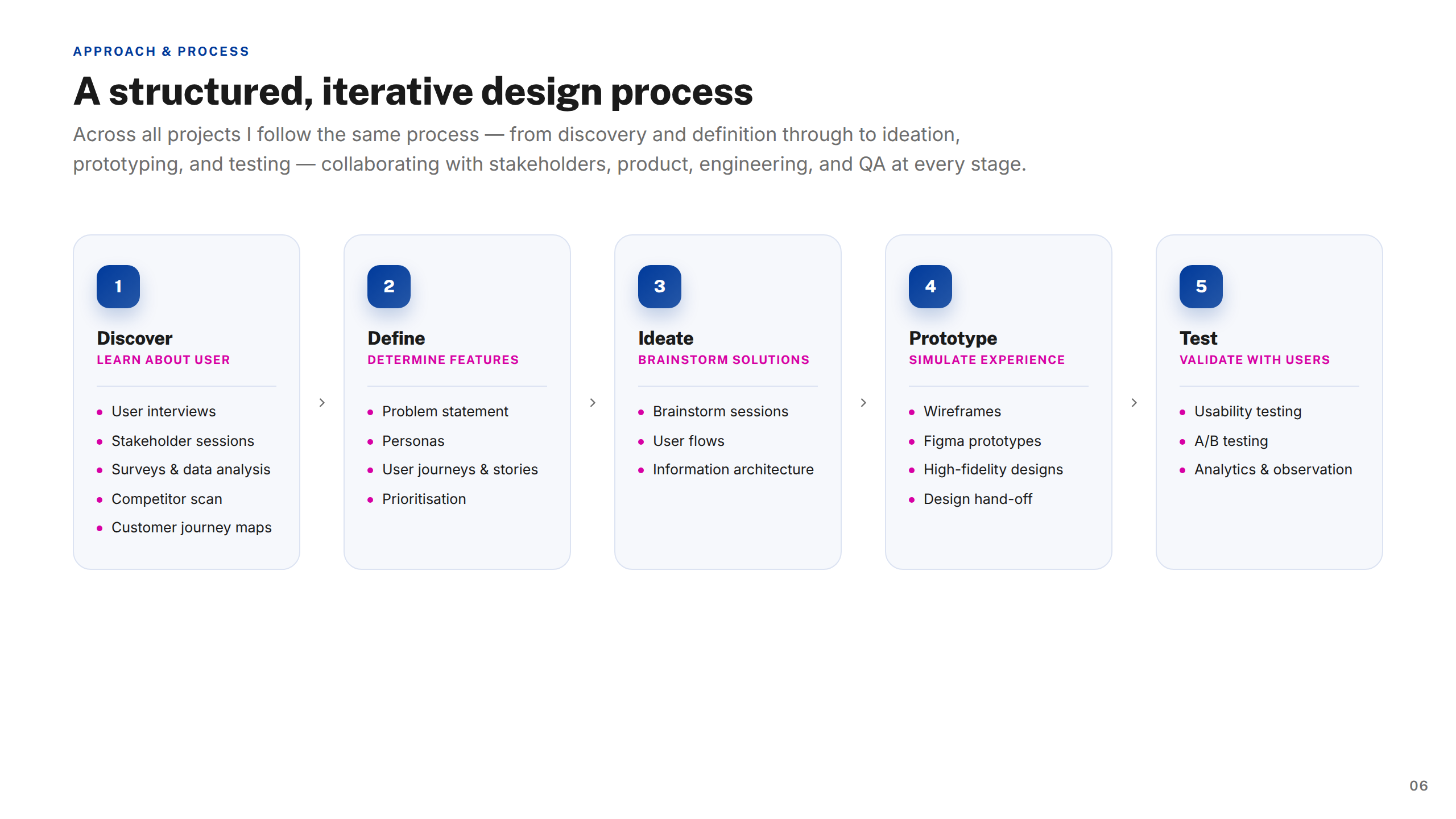
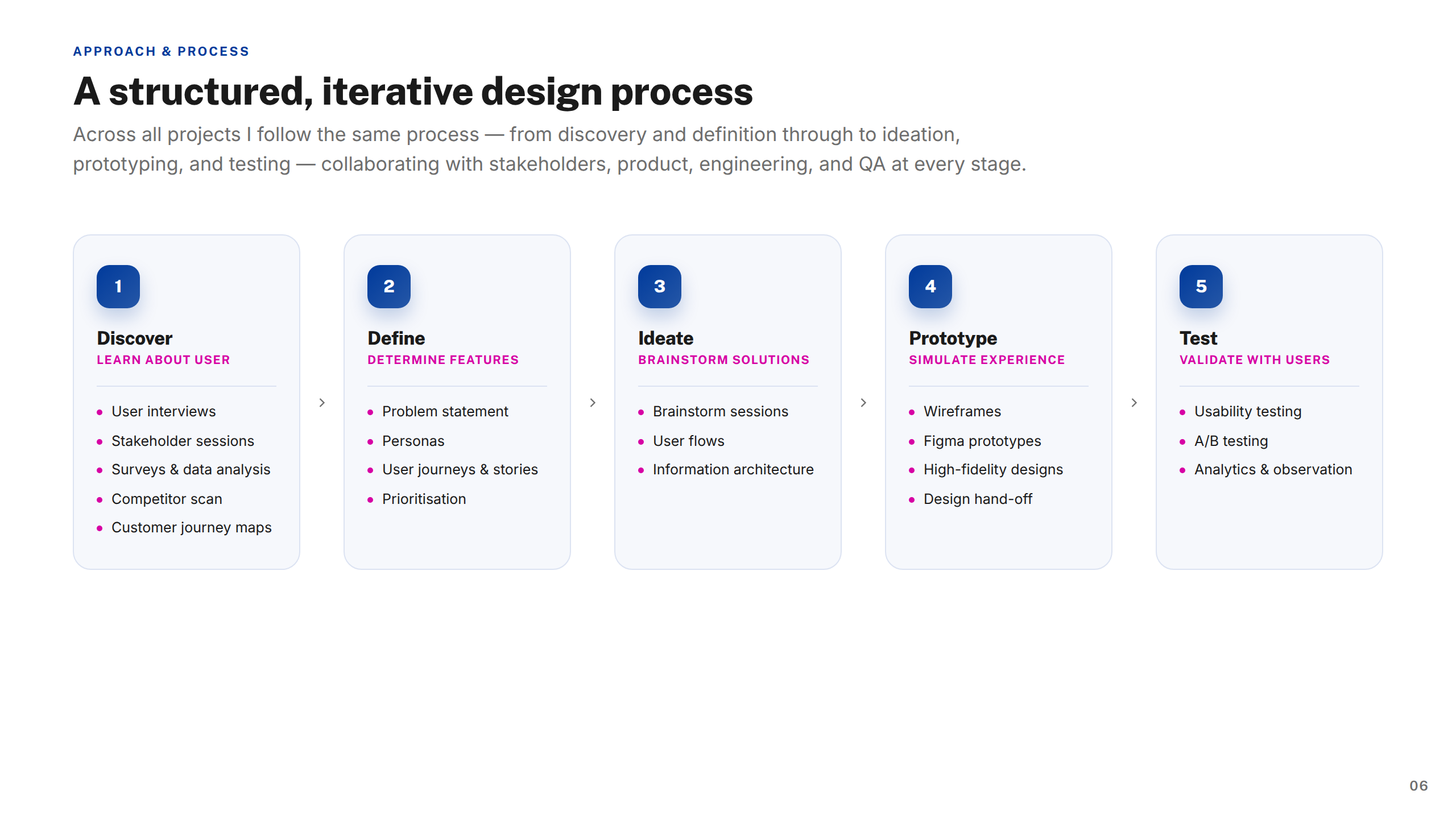
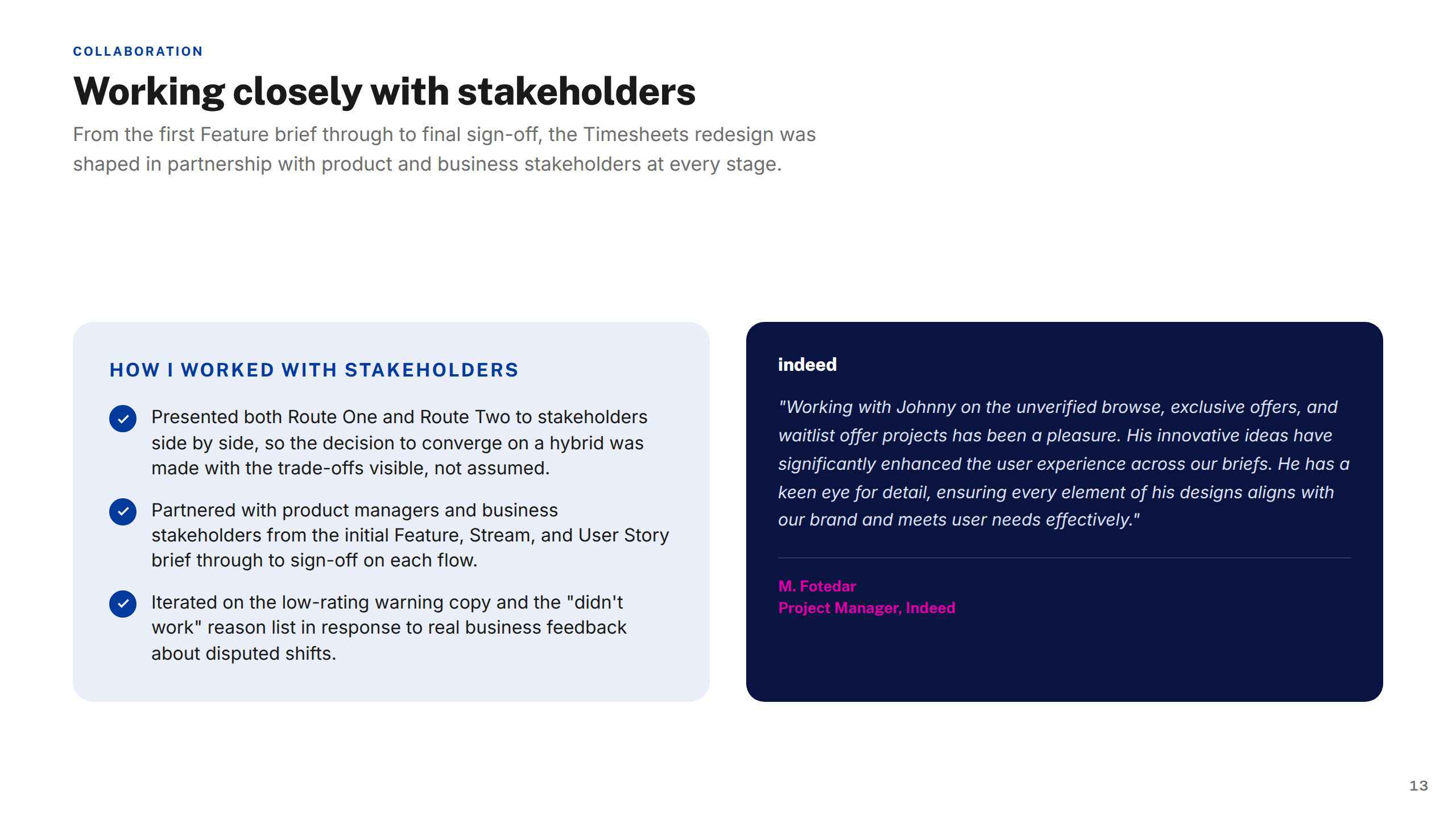
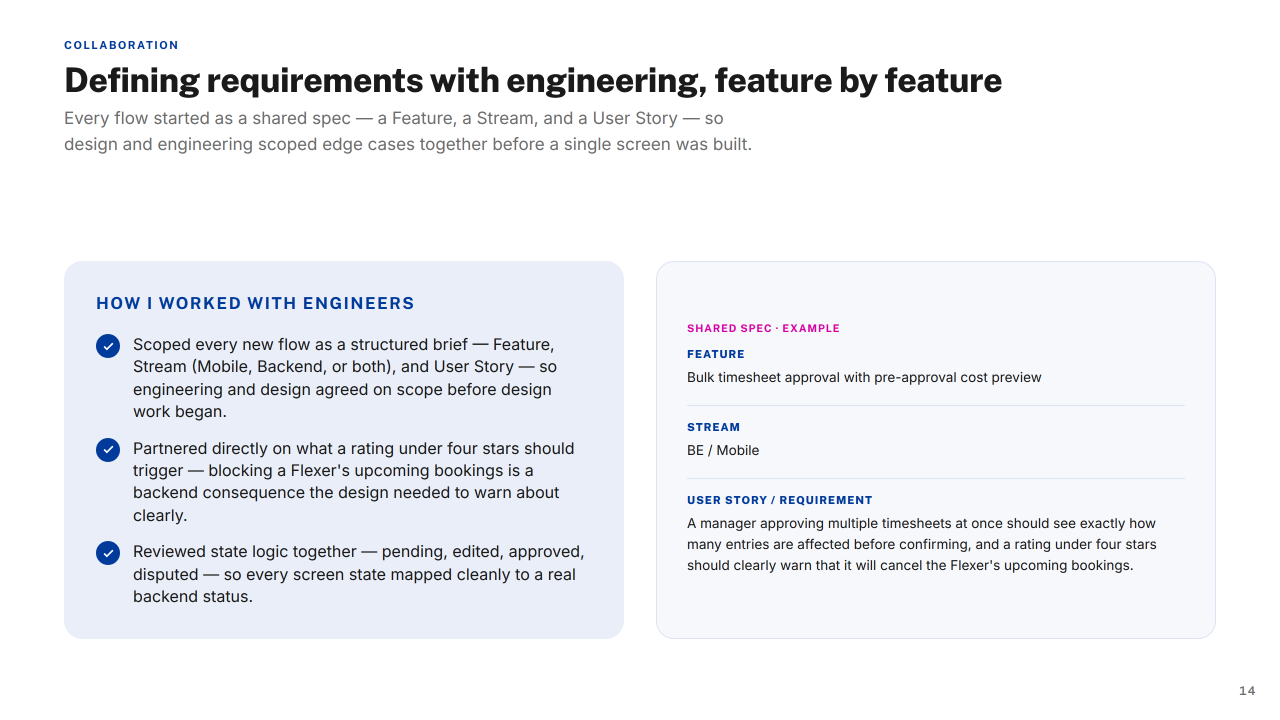
As part of an eight-person UXD team, I worked through a structured, iterative process — discovery, definition, ideation, prototyping, and testing — in close collaboration with product, engineering, QA, and research.
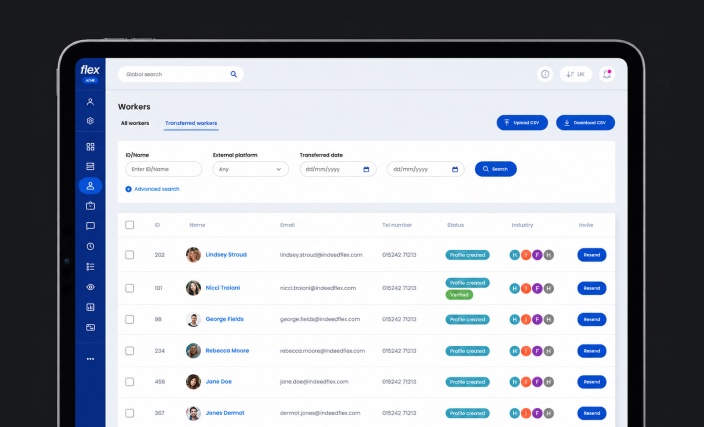
I built reusable framework templates for menus, navigation, and data-heavy screens, standardised components and interaction states for accessibility, and a 30+ icon system representing job roles across five industries.
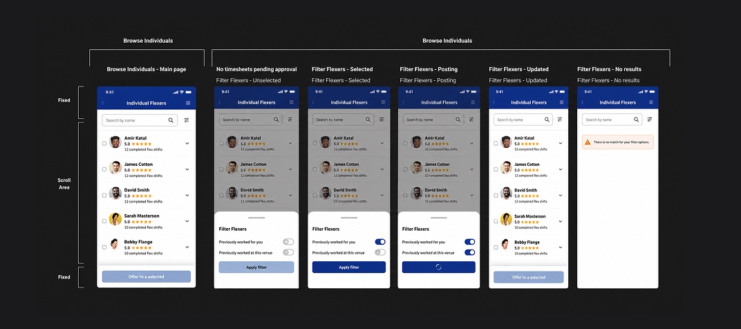
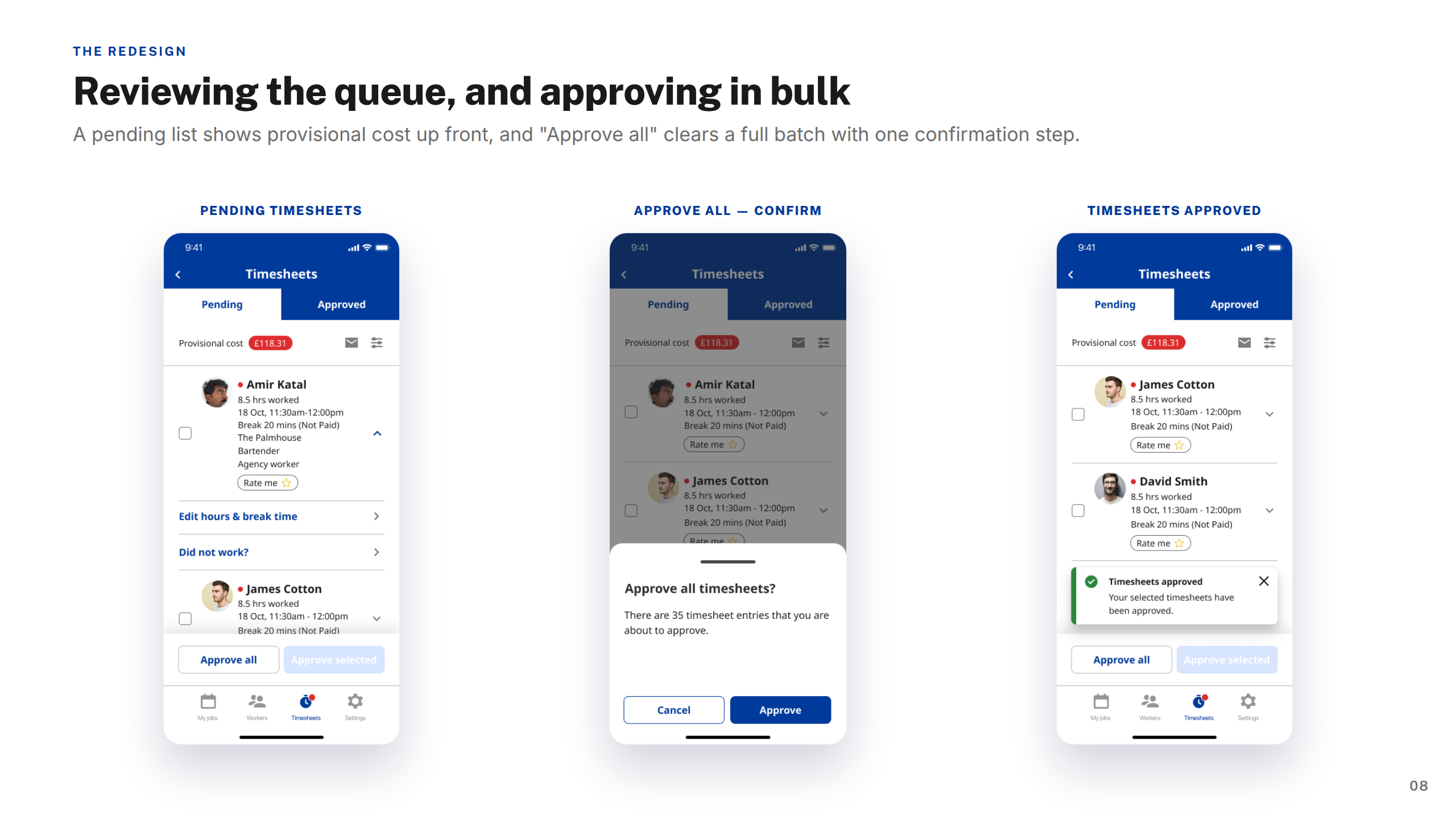
A clearer, more scalable native experience — from a redesigned pay section and timesheet approvals to a complete job-posting journey and worker profiles.
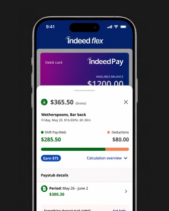
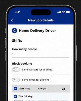
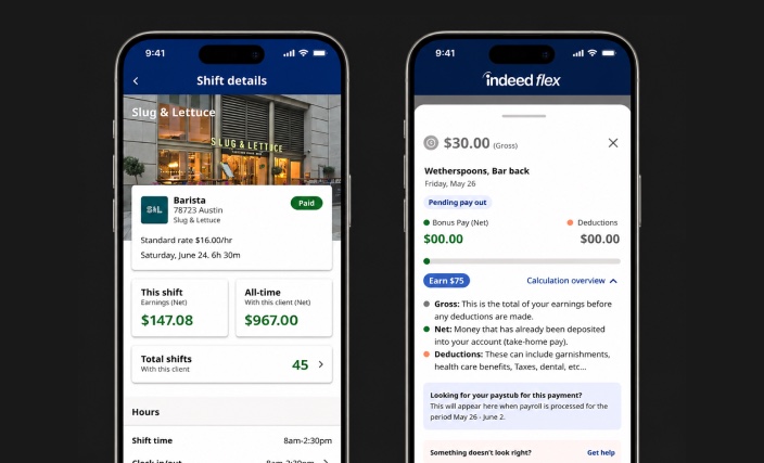
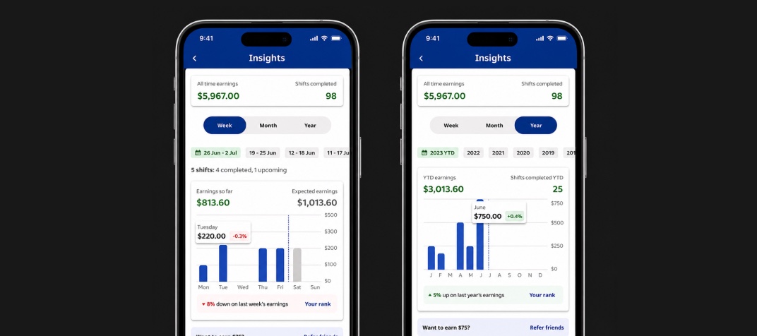
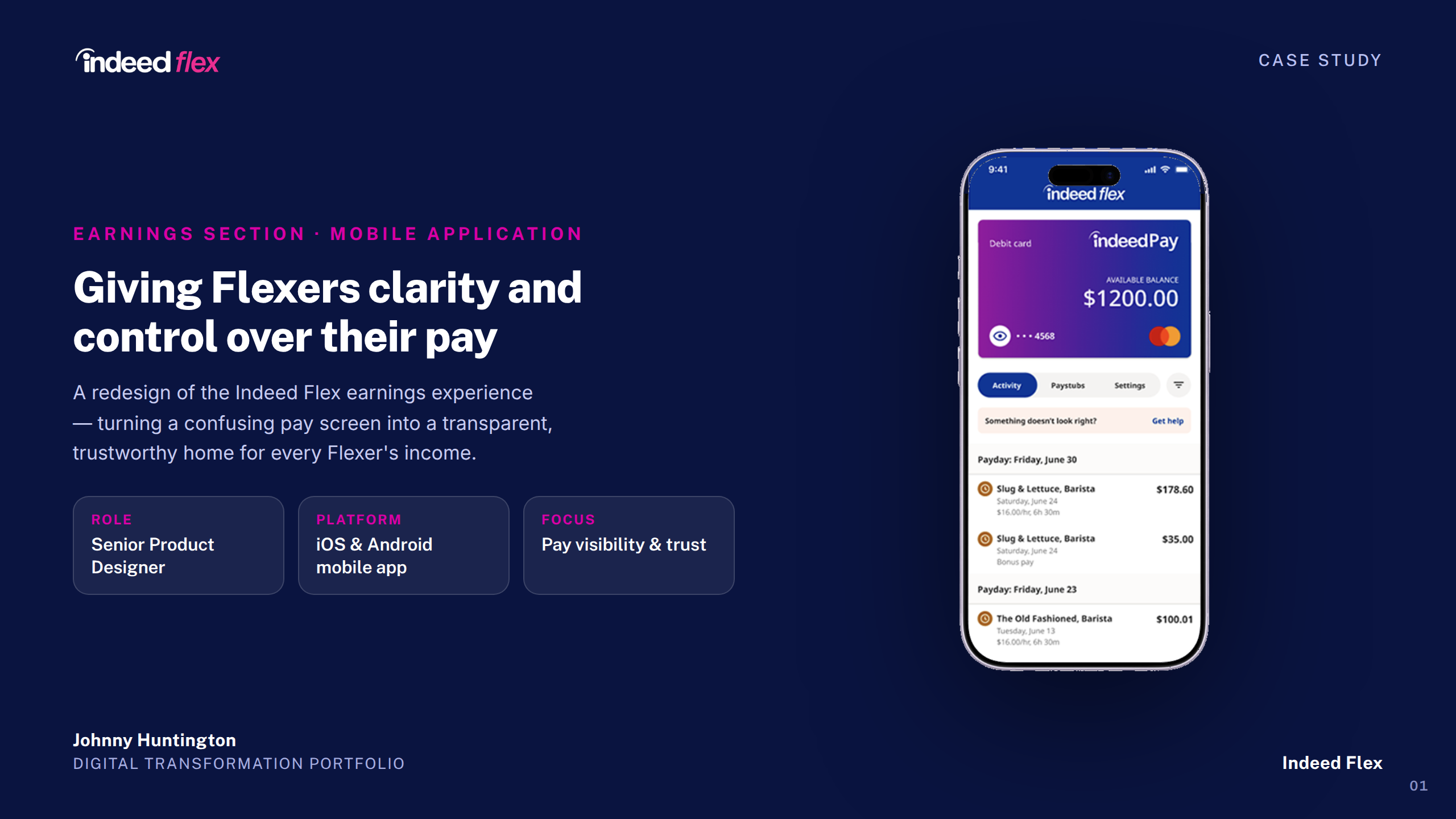
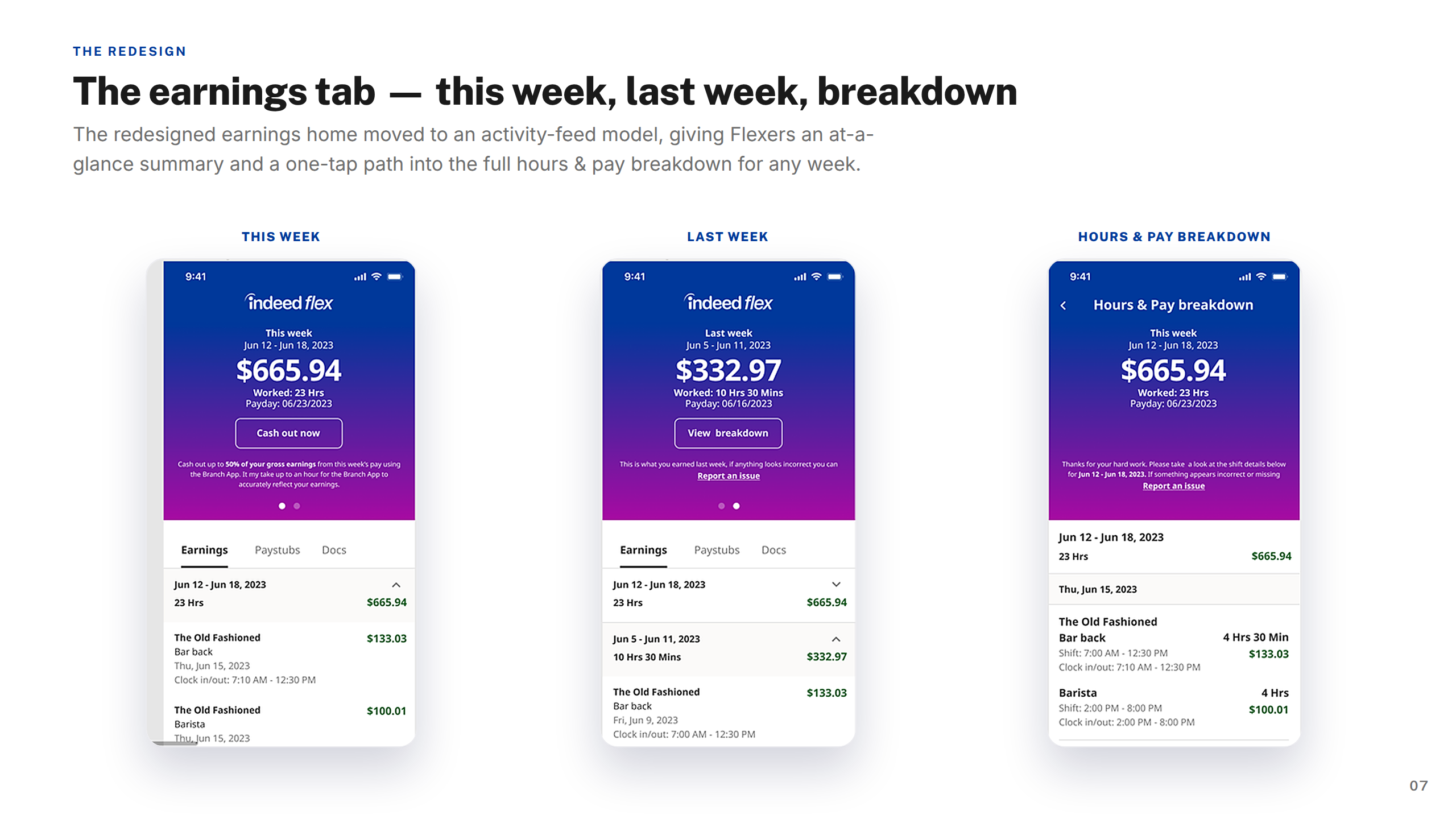
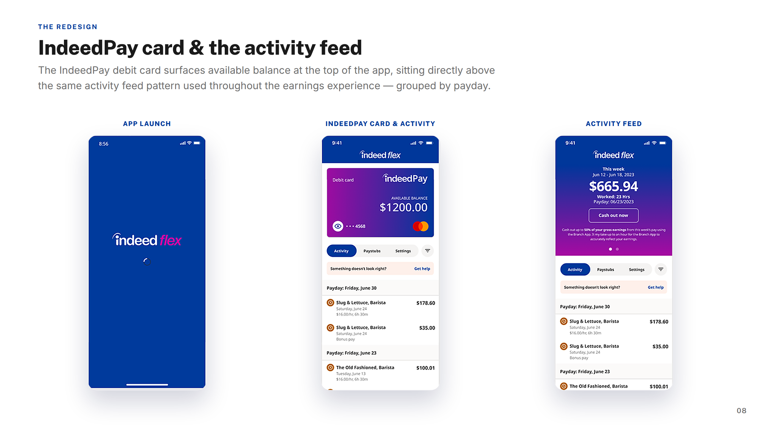
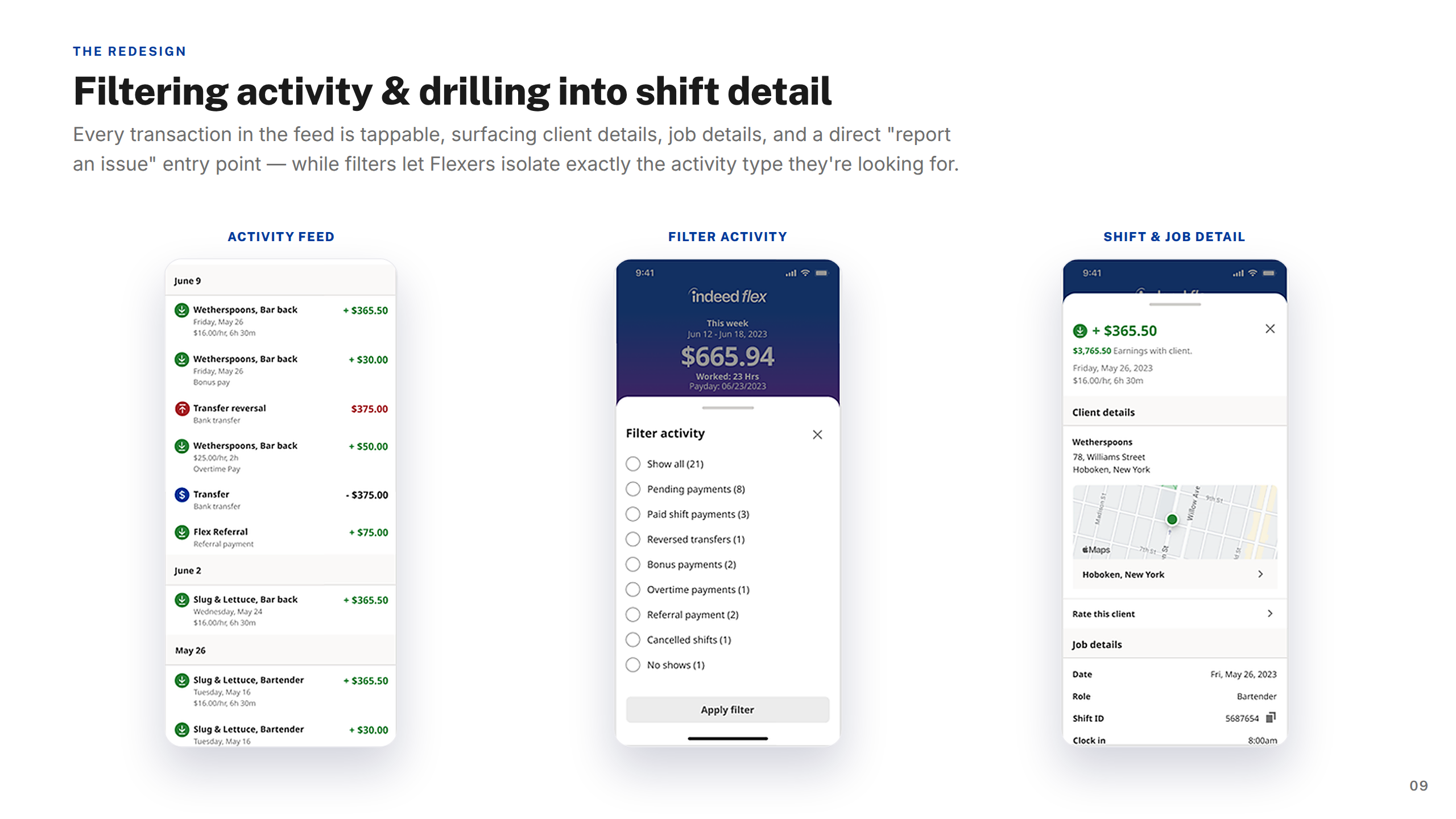
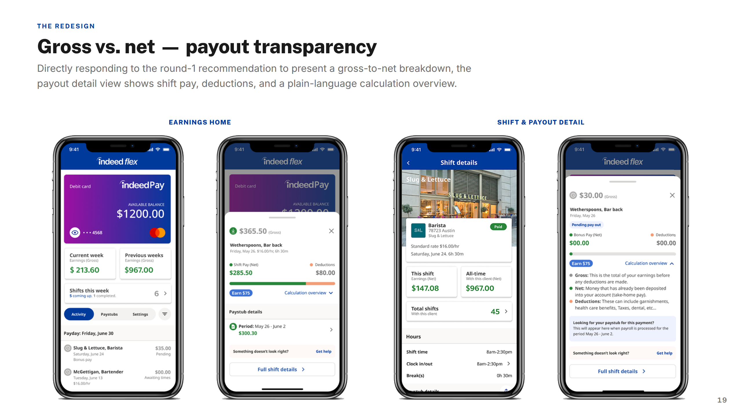
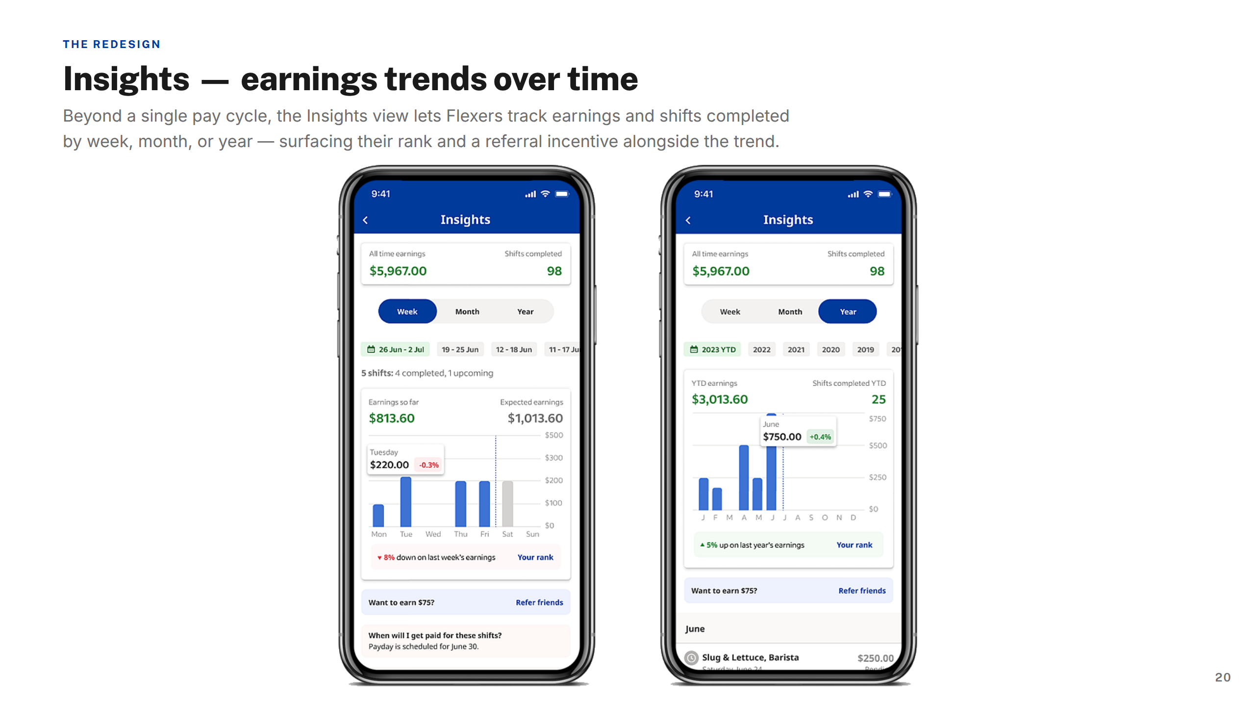
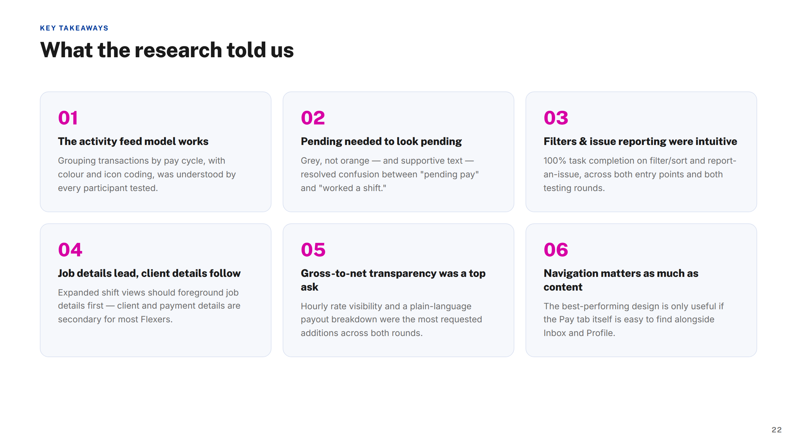
Key flows were rebuilt around clarity and trust. The Strikes and Bans redesign gave workers clearer policy communication and status tracking. The Earnings section introduced weekly summaries, detailed breakdowns, and historical views so workers always understood their pay. The job-posting journey let busy managers create and publish shifts entirely on mobile.
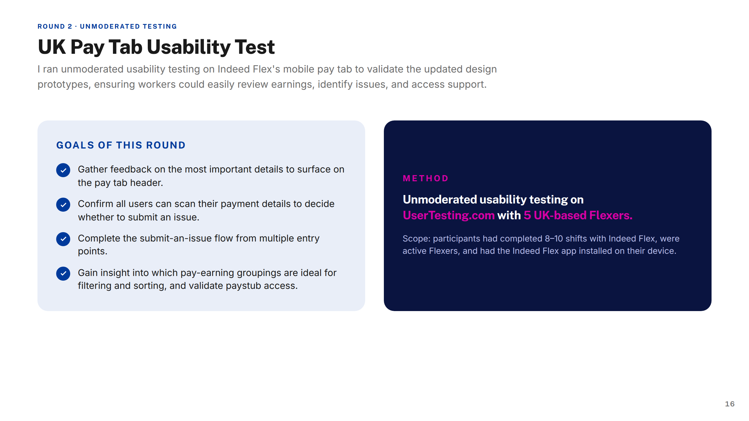
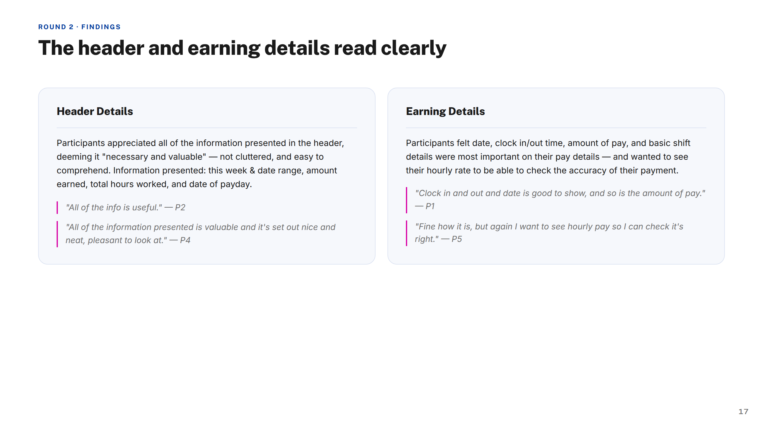
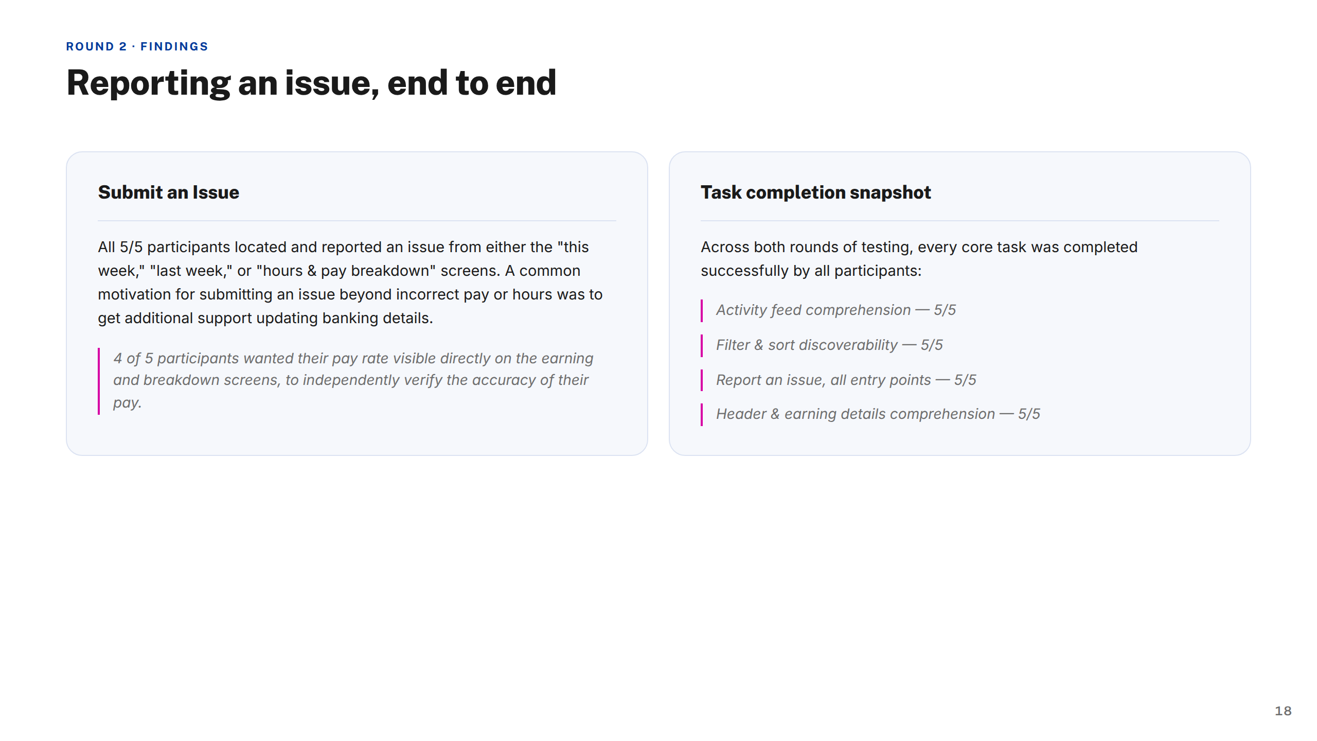
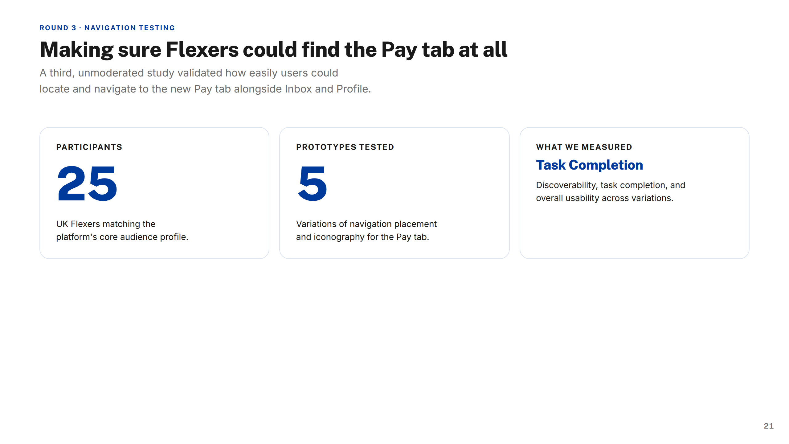
Every change was validated through usability testing — including a 25-participant study across five prototypes on the pay tab alone — ensuring the patterns held up before they shipped.
The end-to-end case study covering research, design evolution, usability testing, and key decisions made along the way.
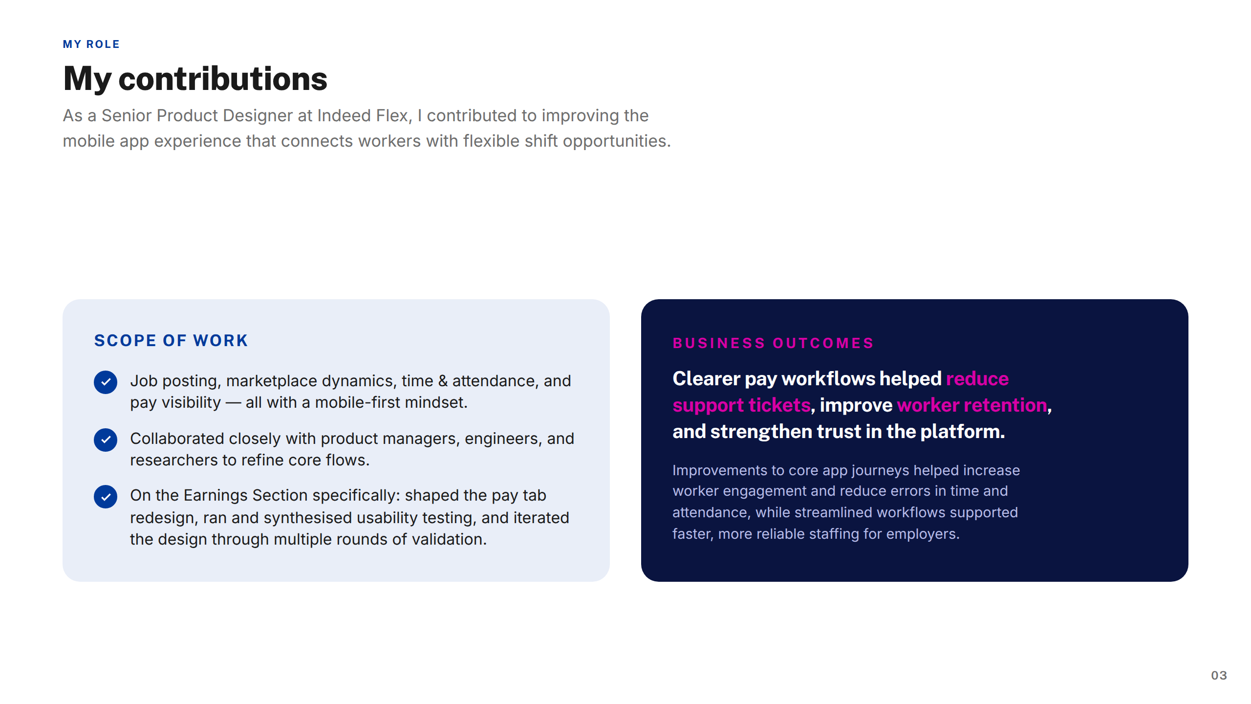
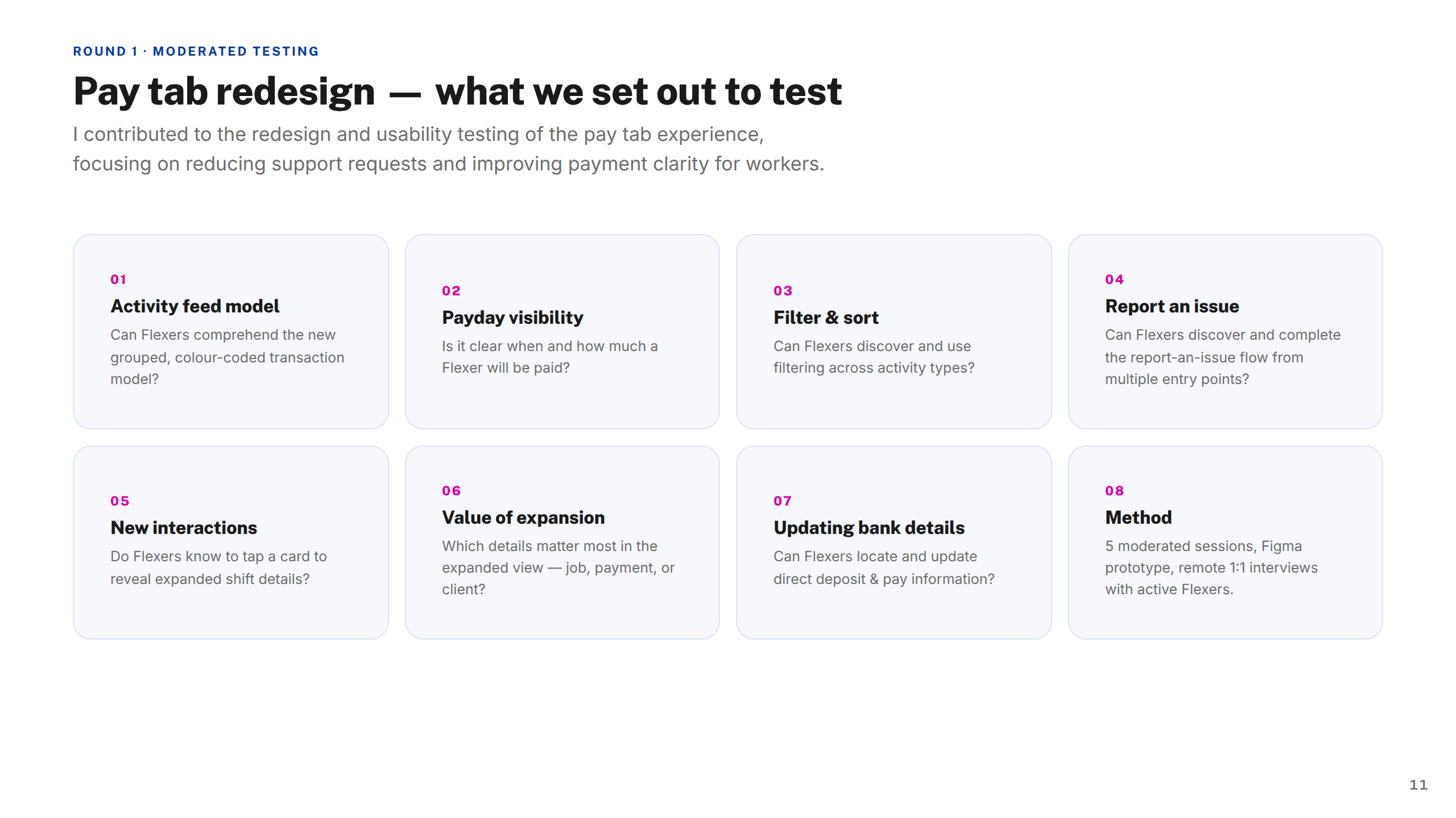
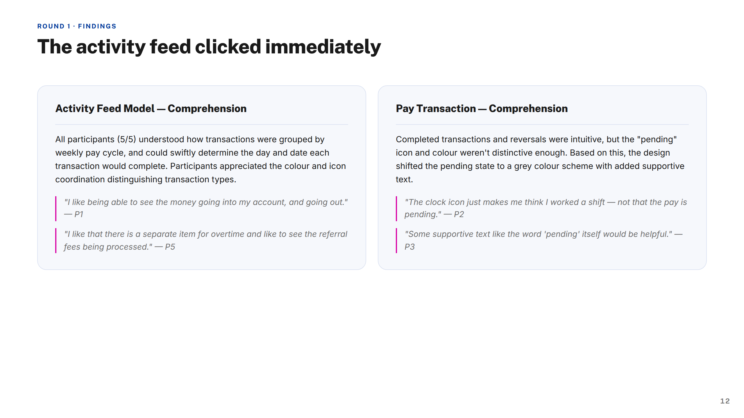
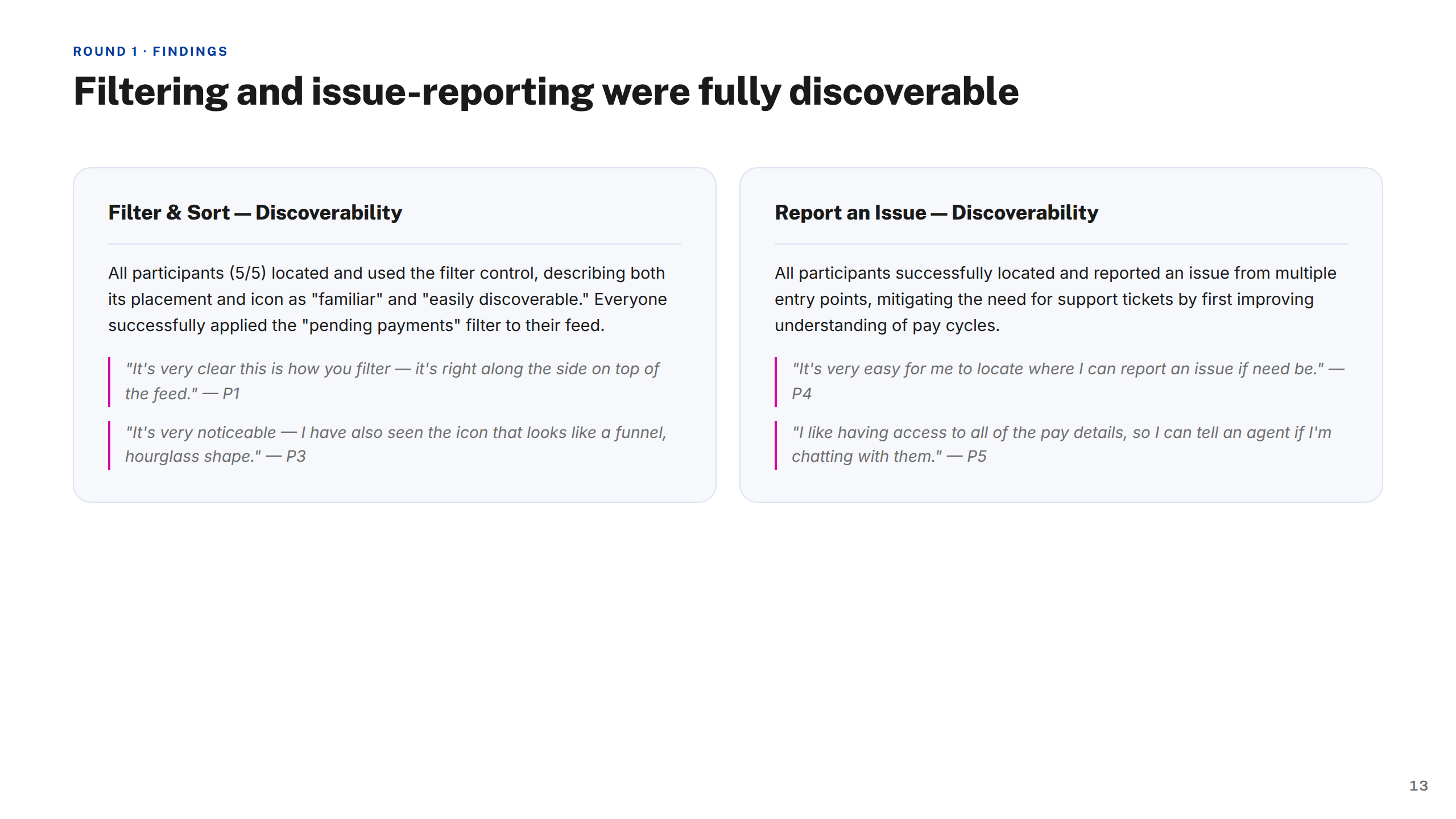

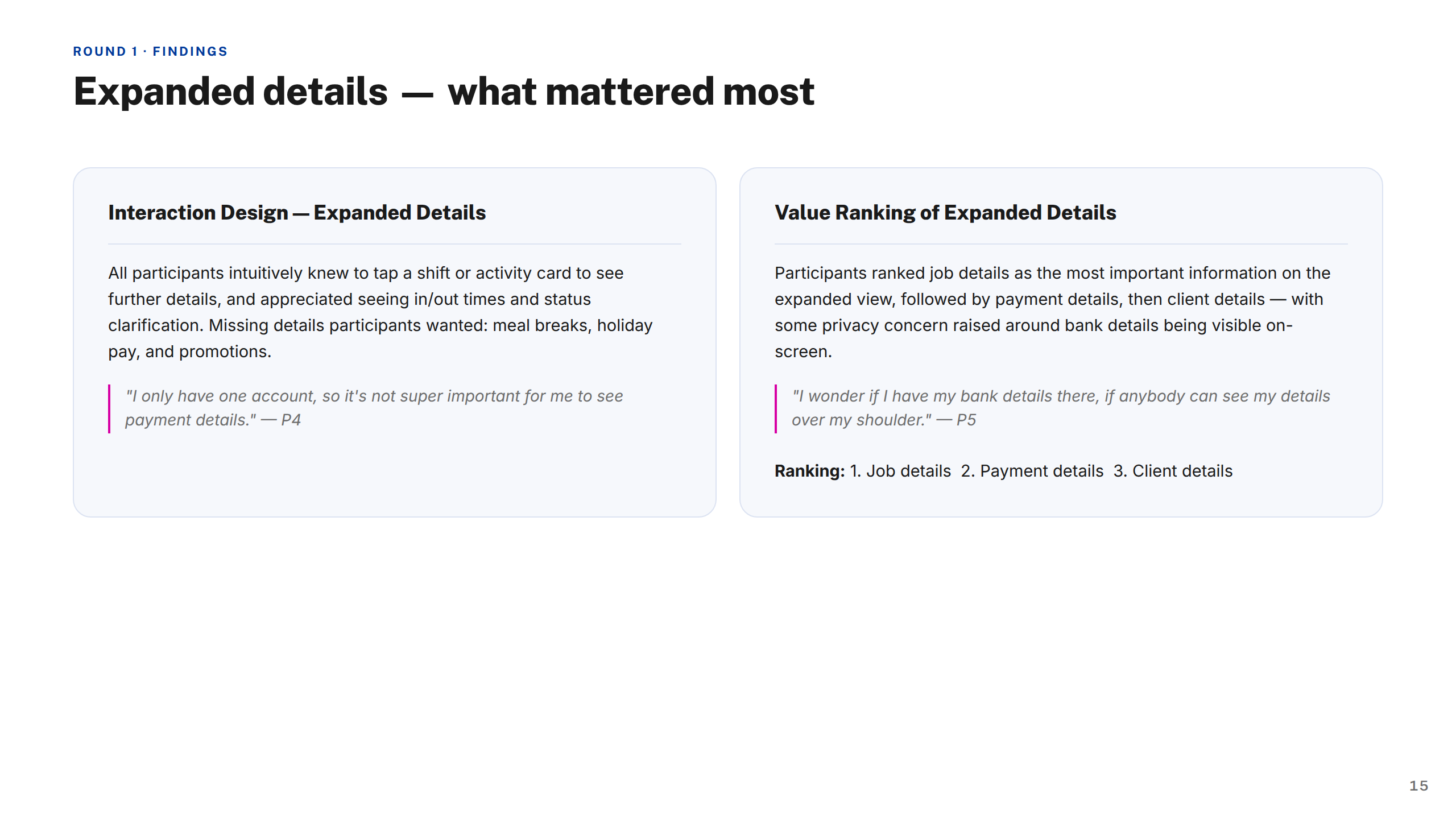
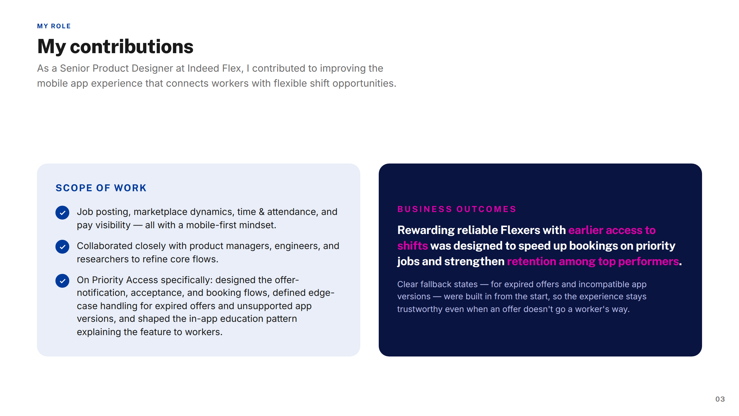

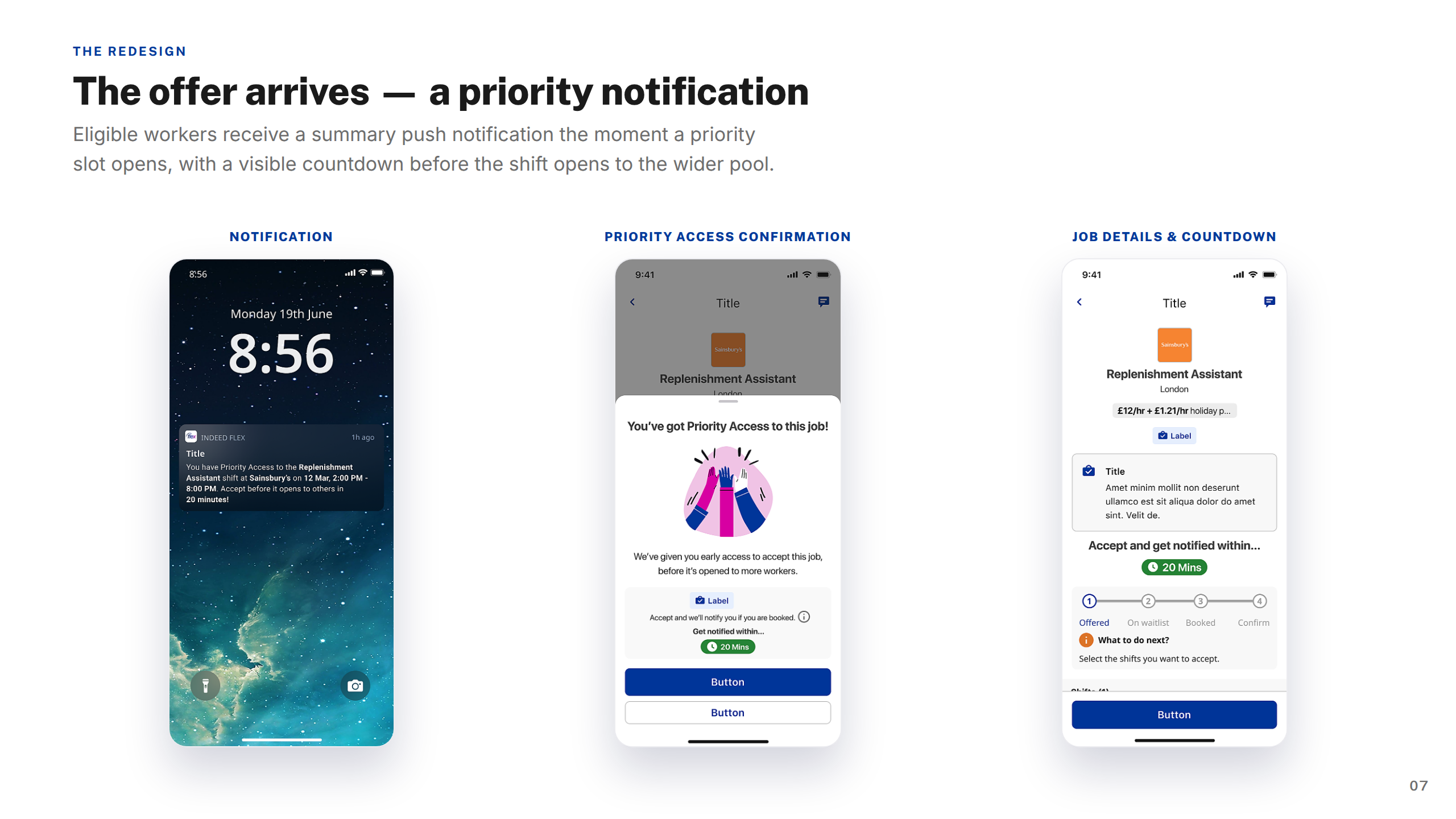
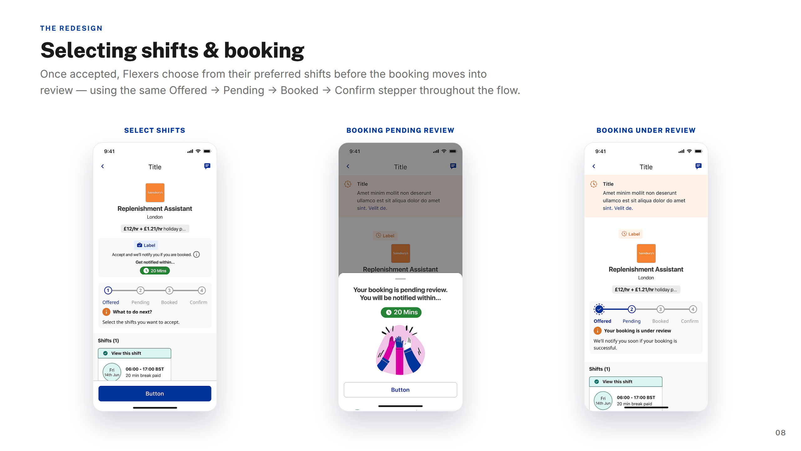
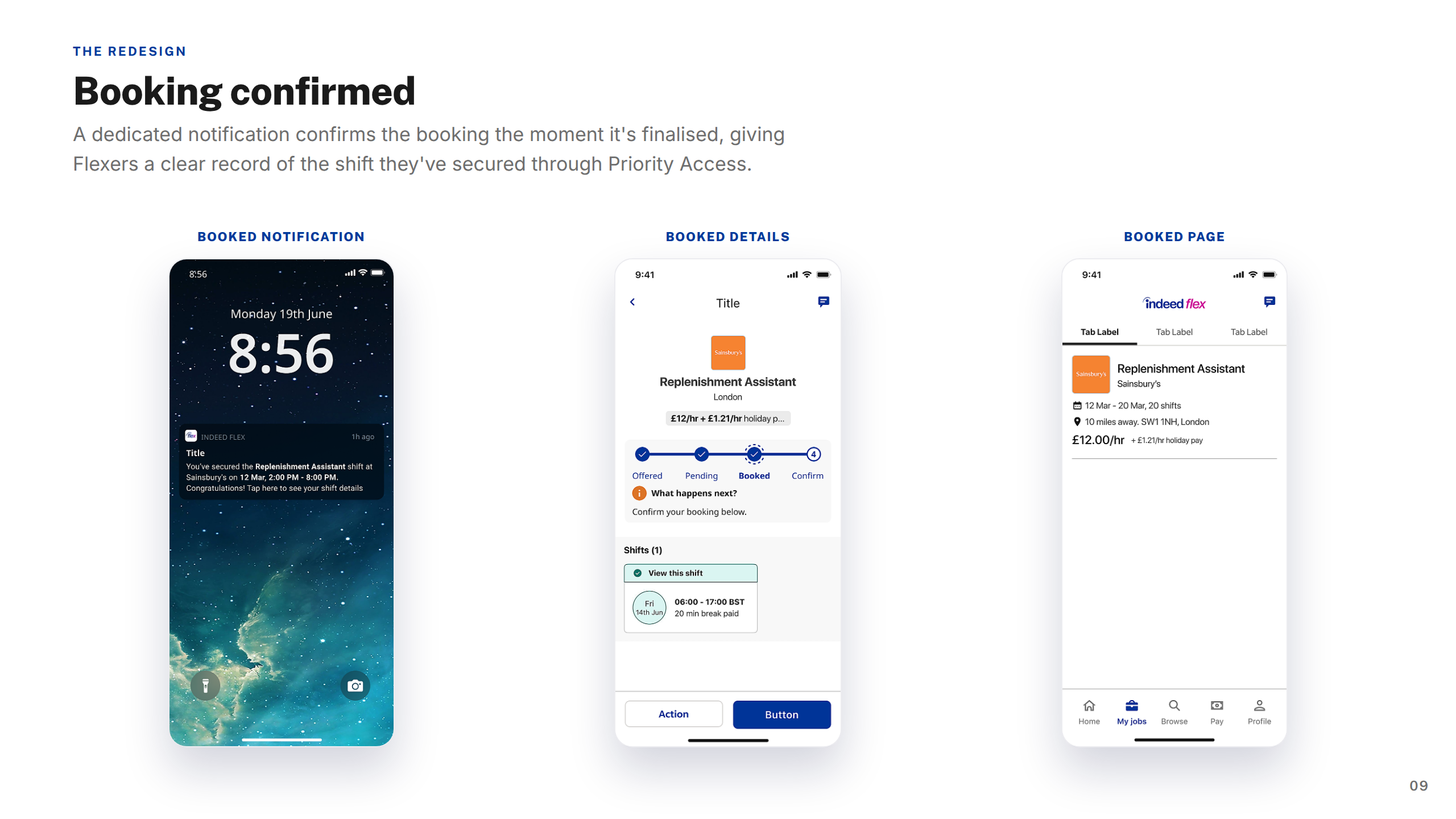
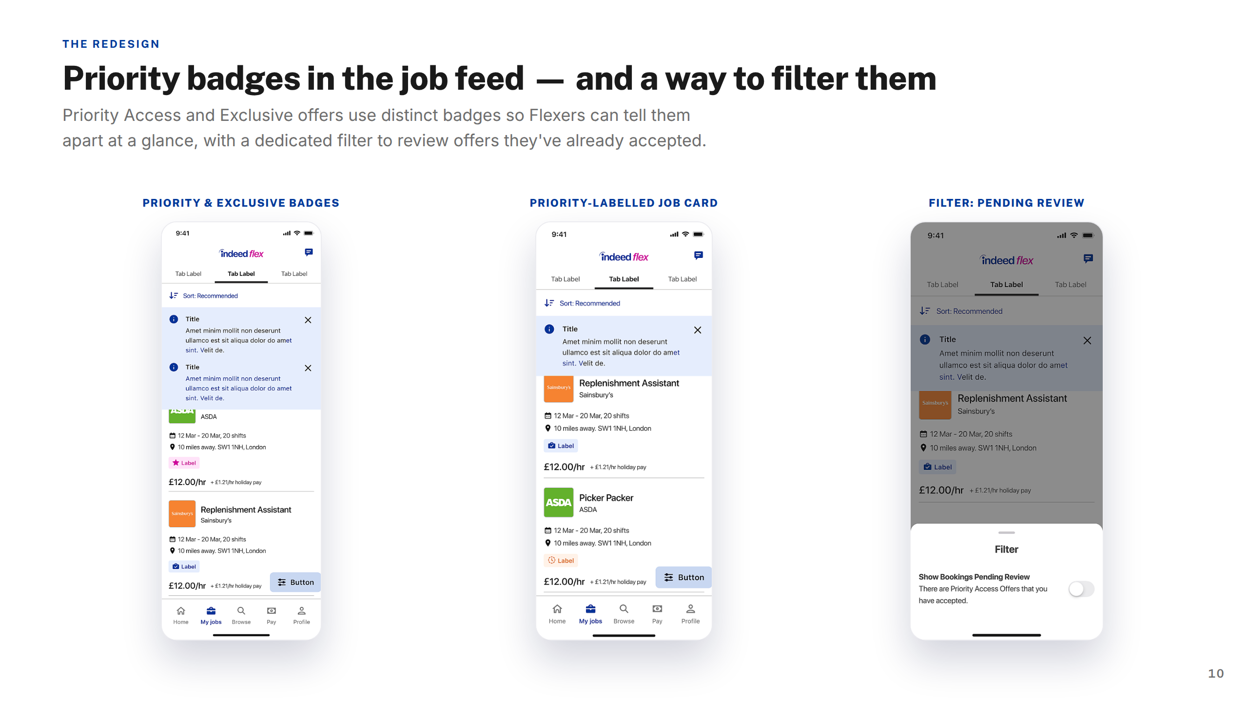
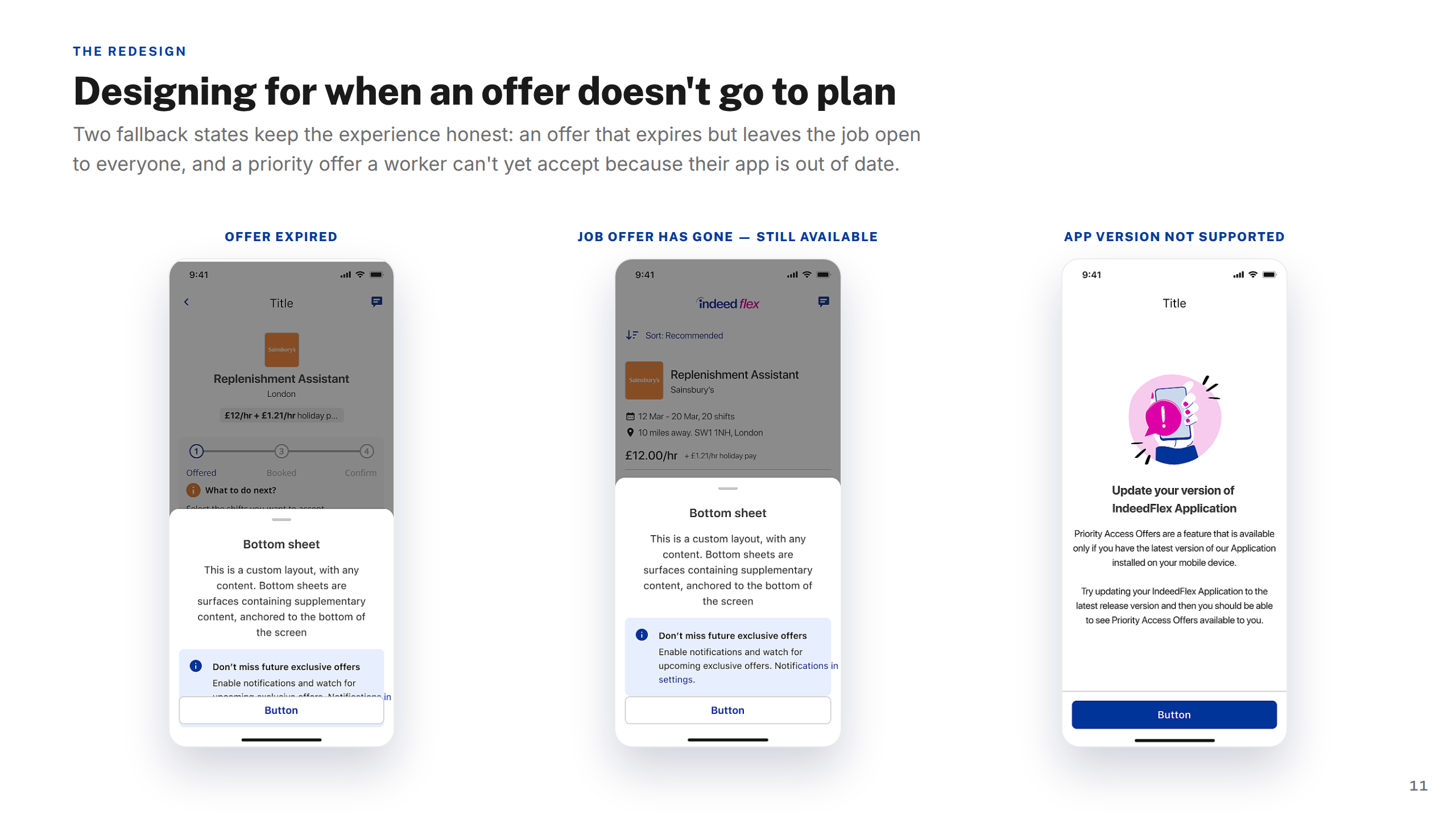
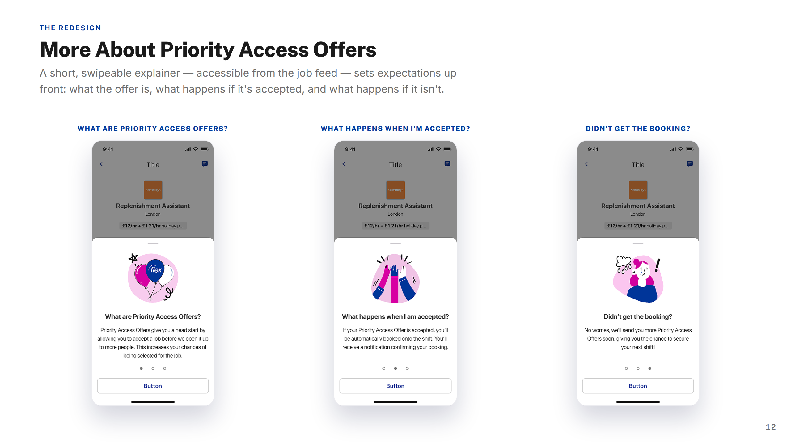
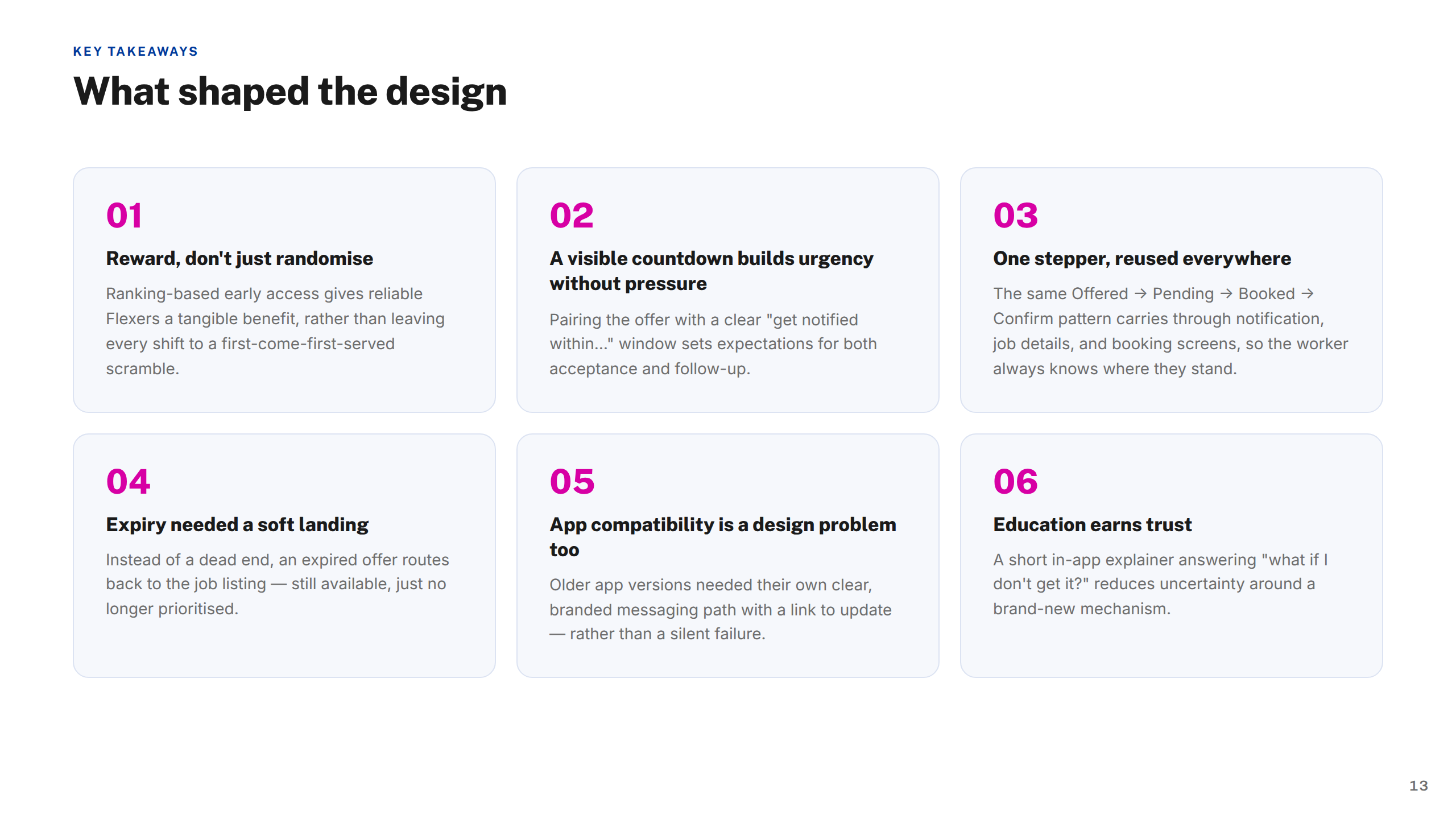
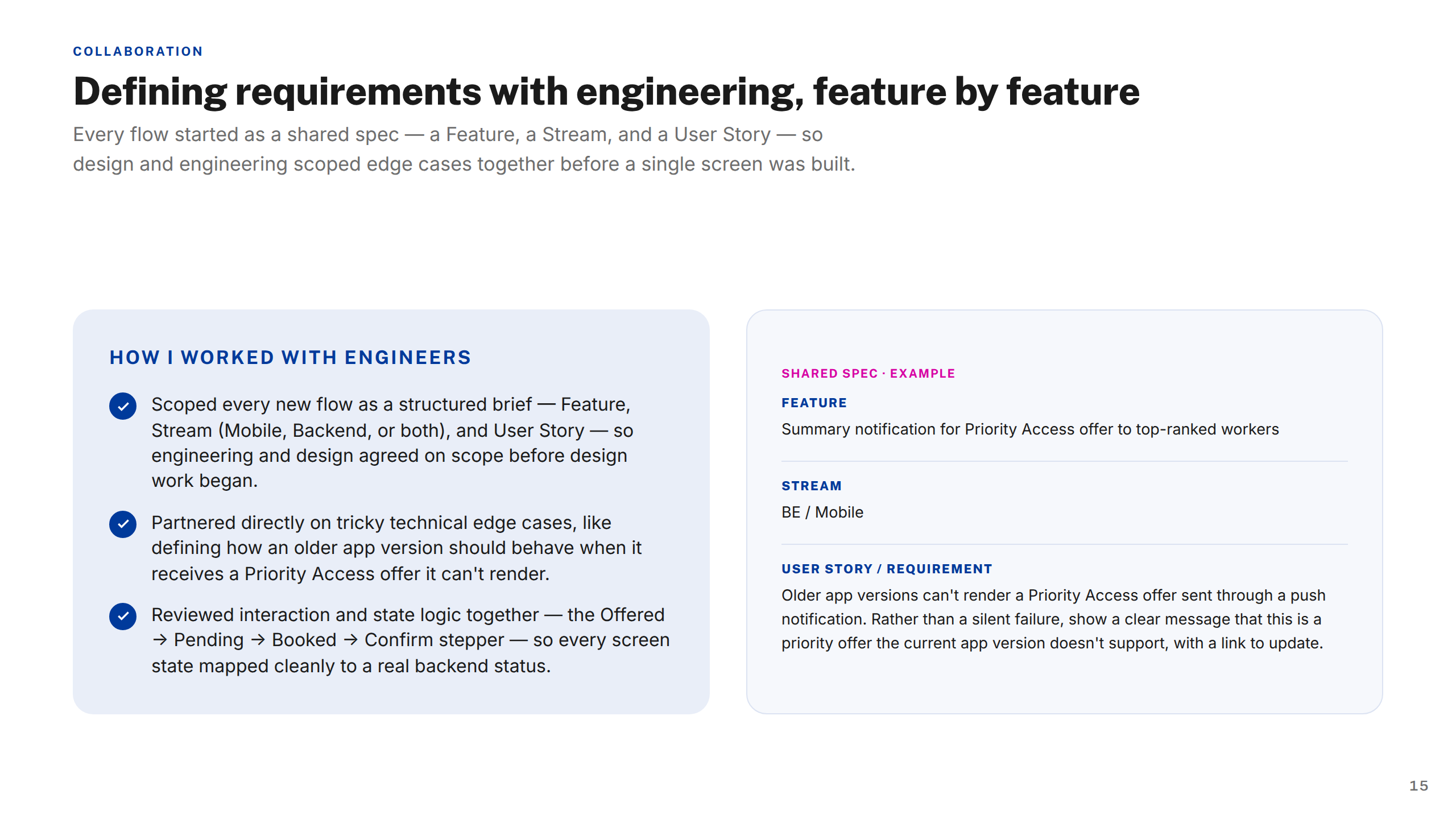
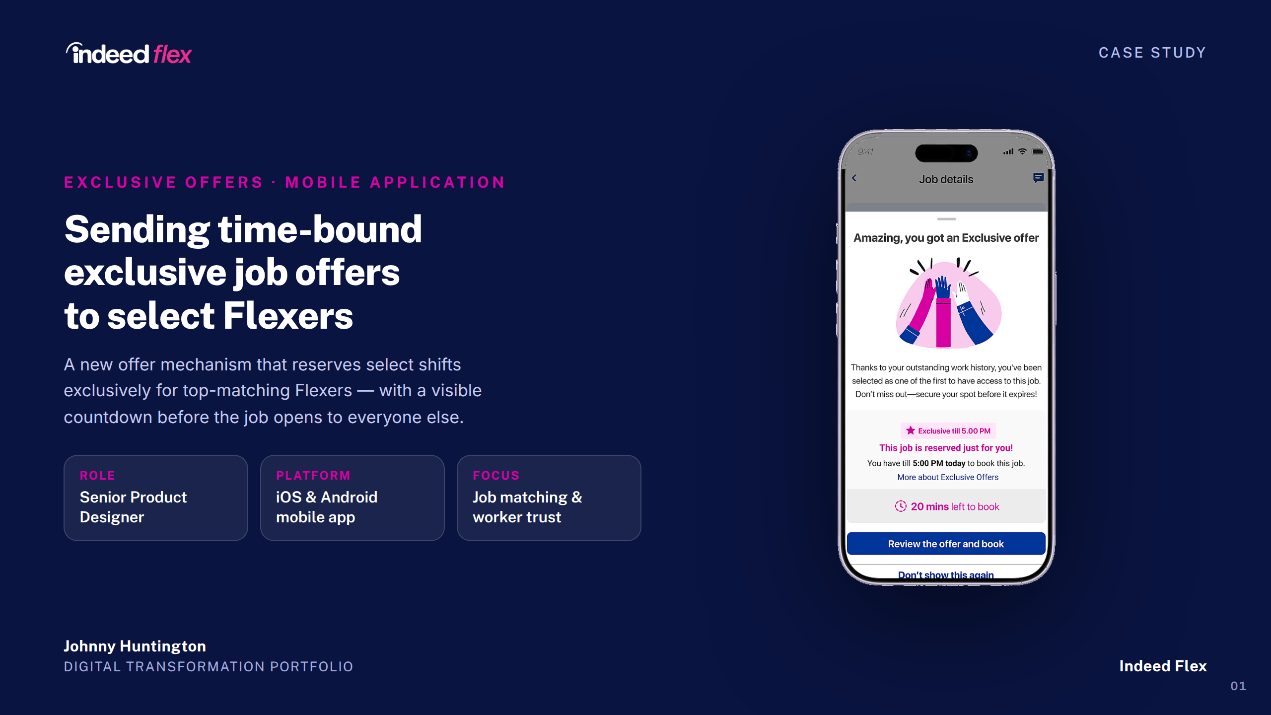
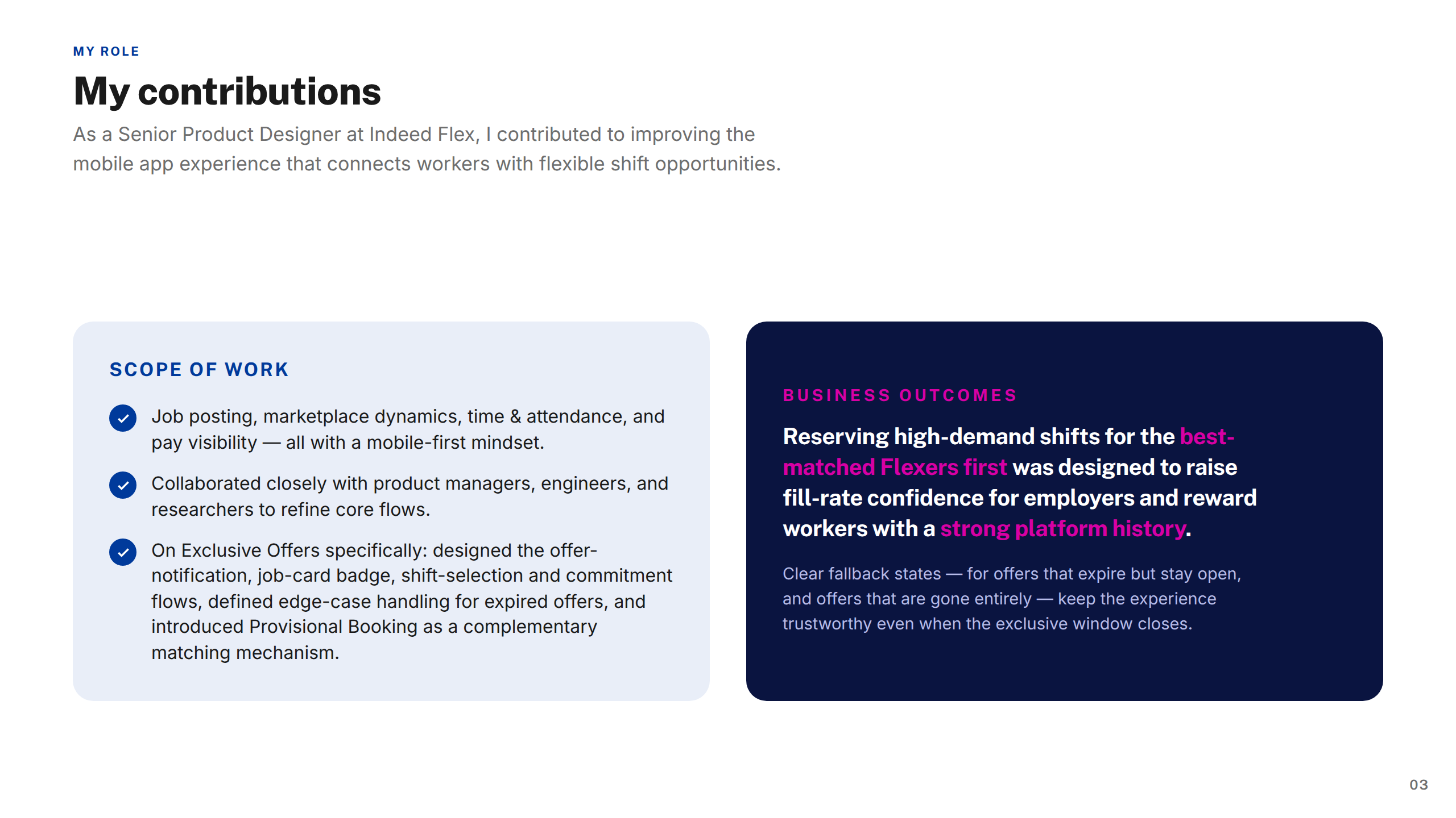
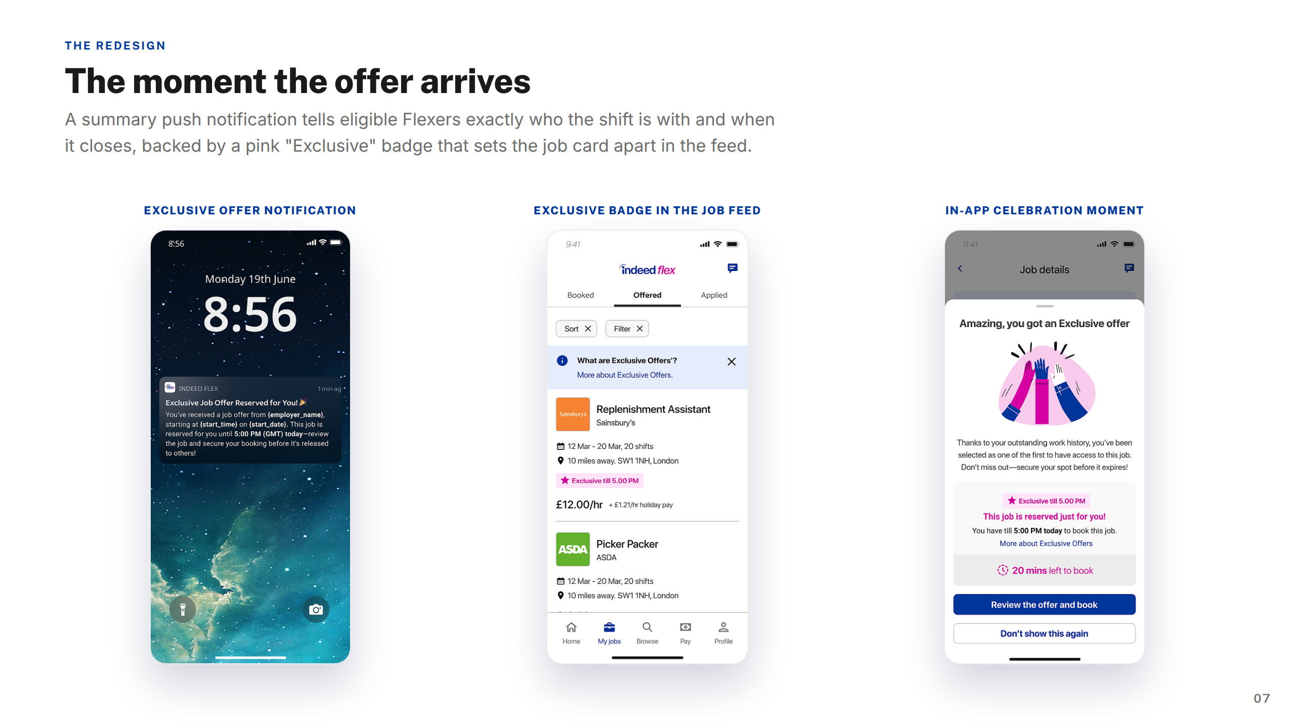
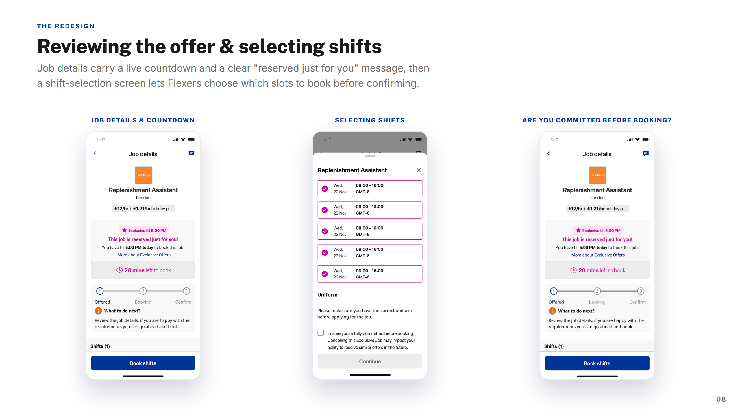
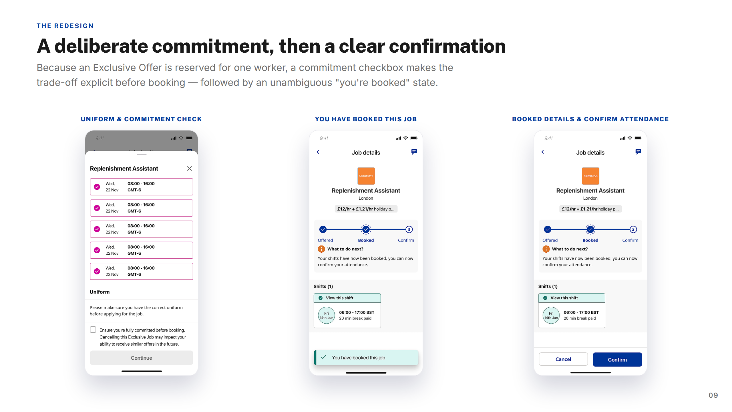
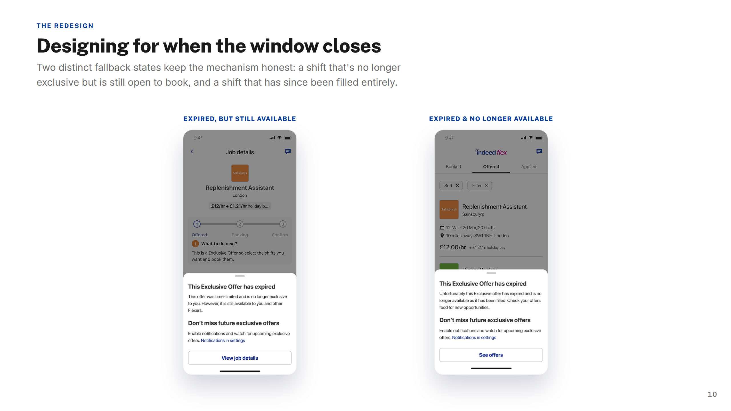
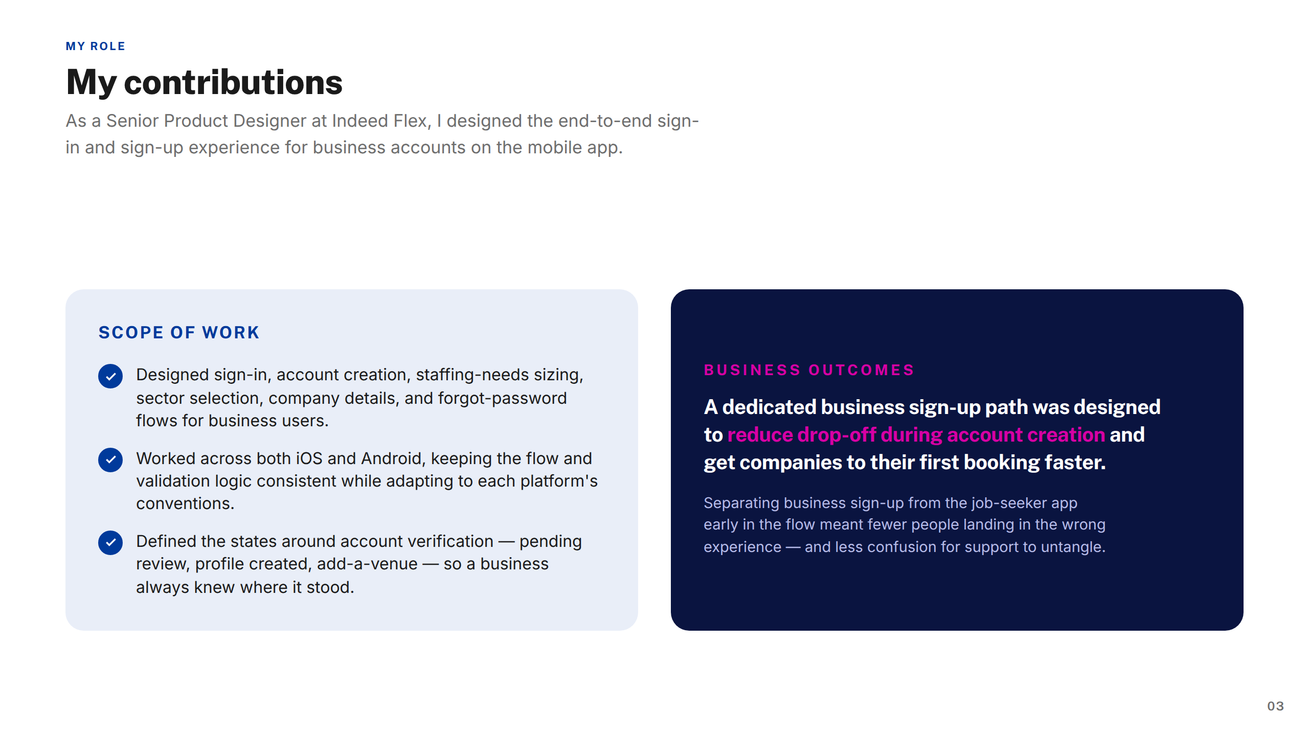
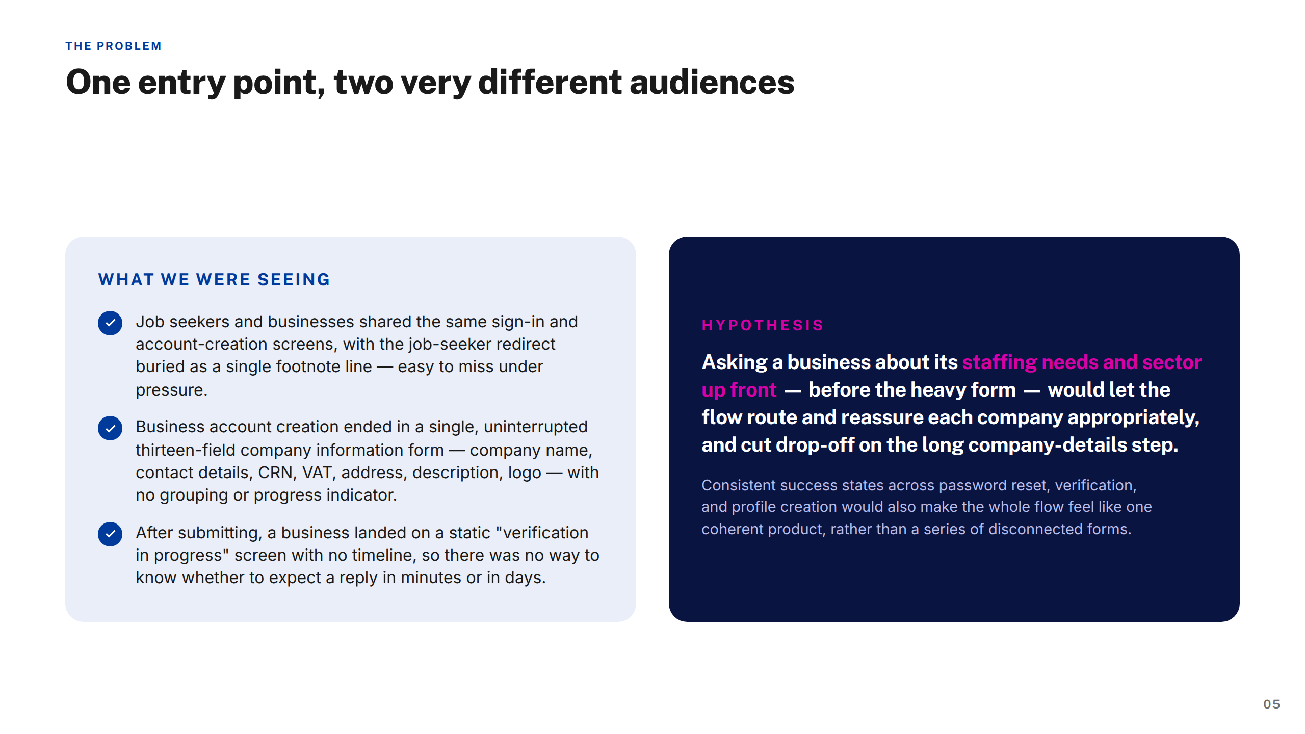
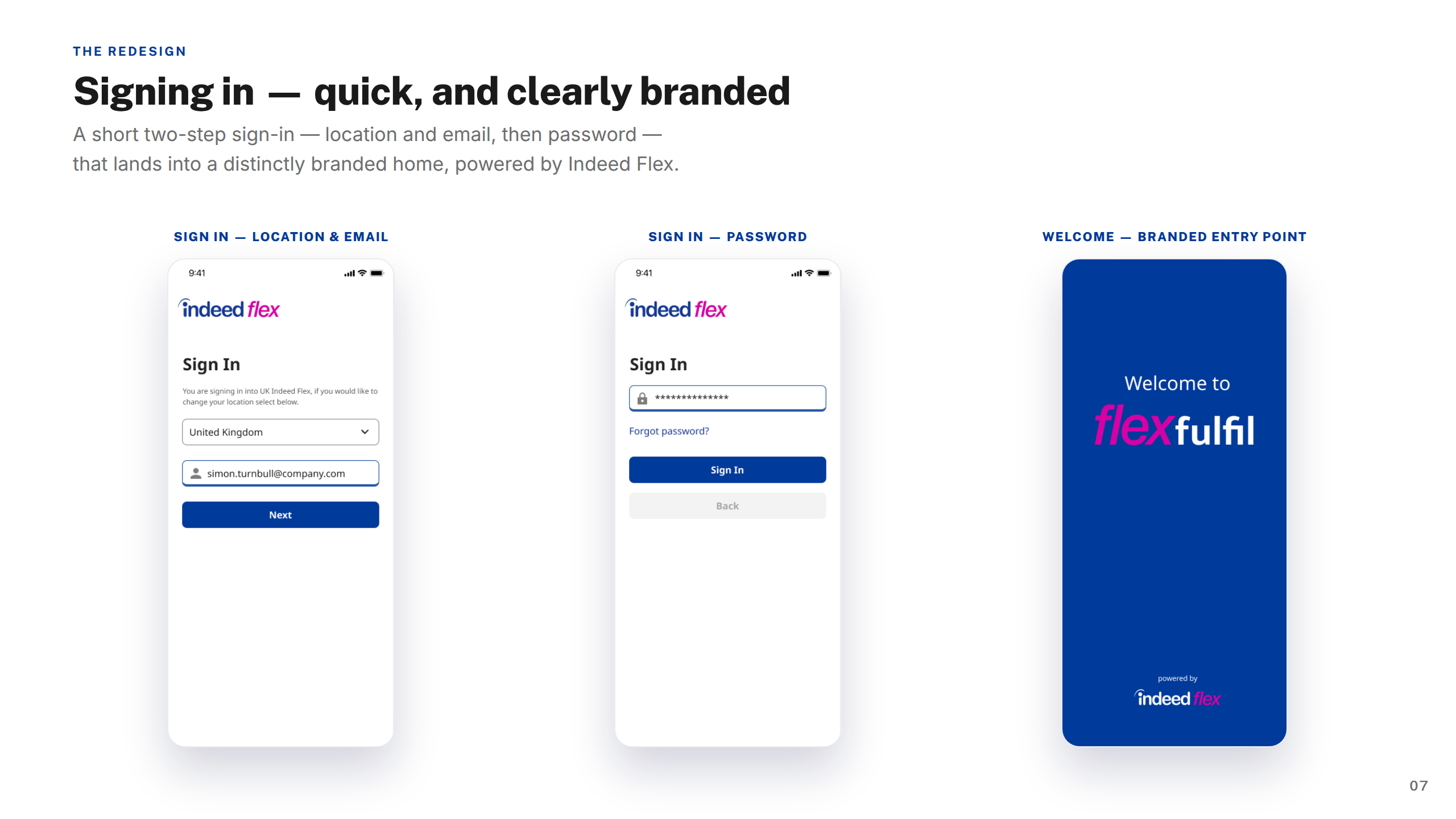
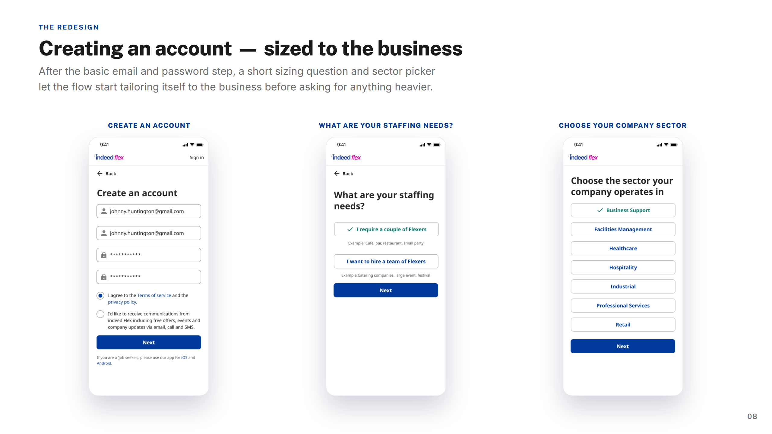
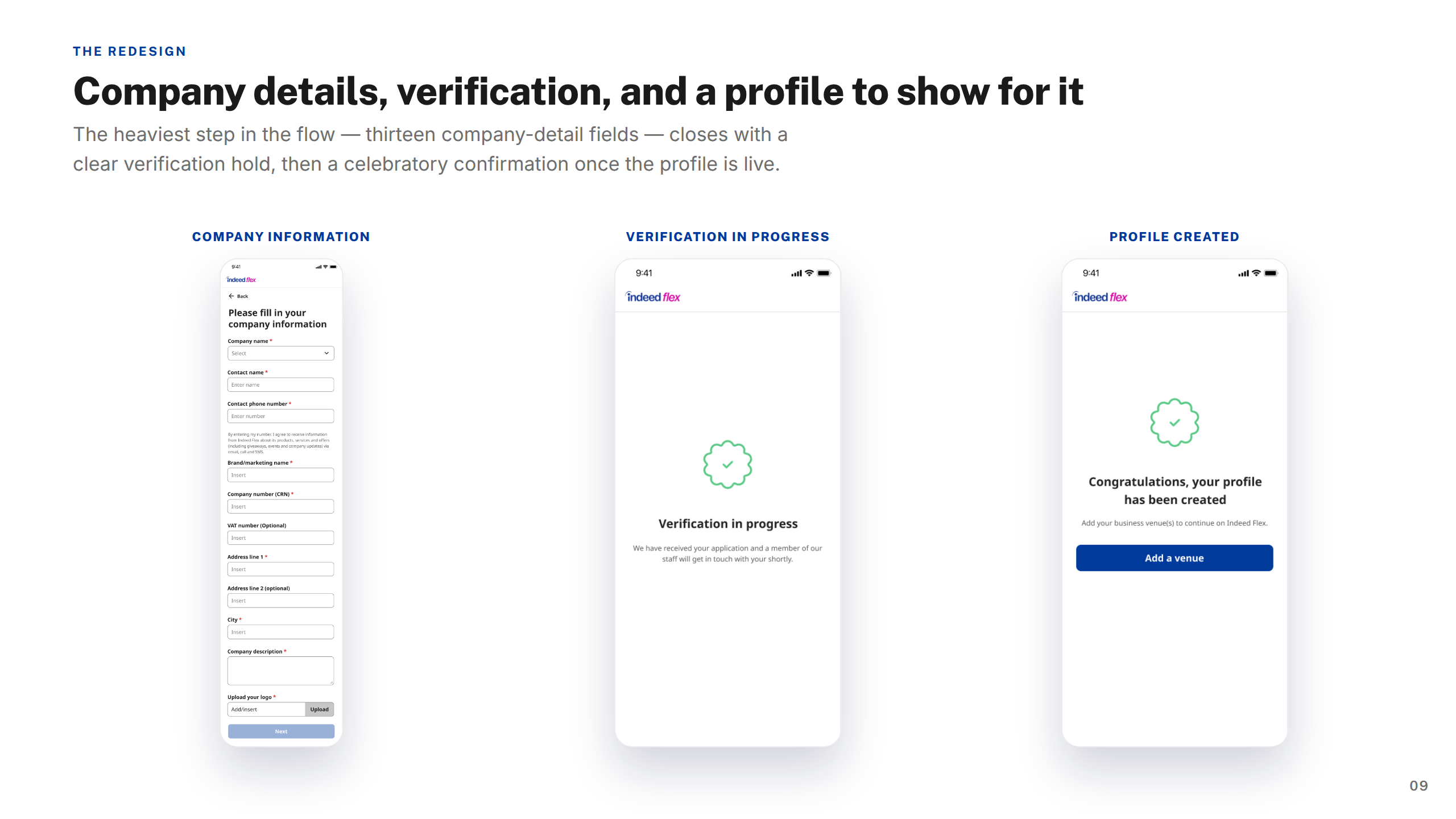
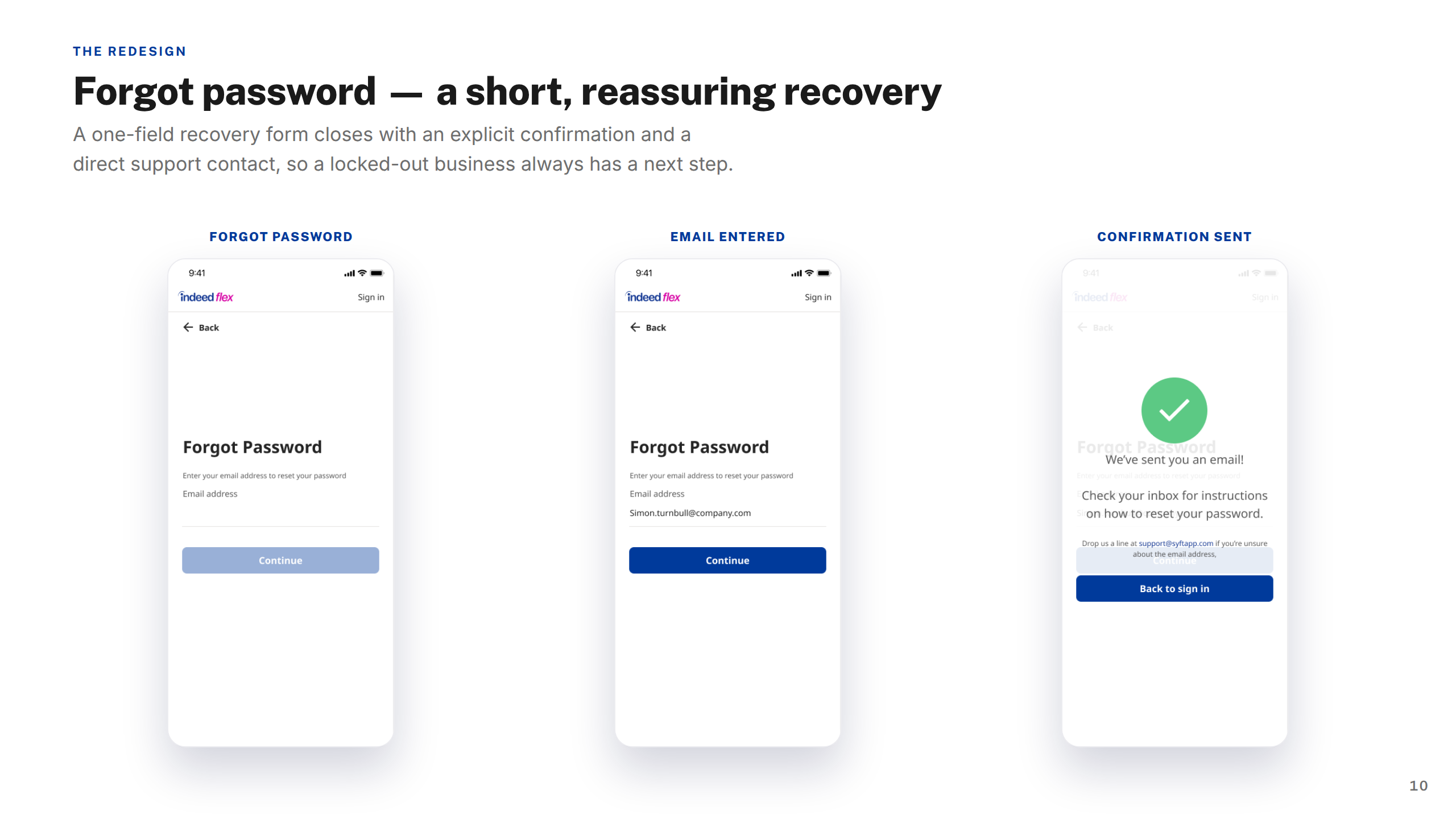
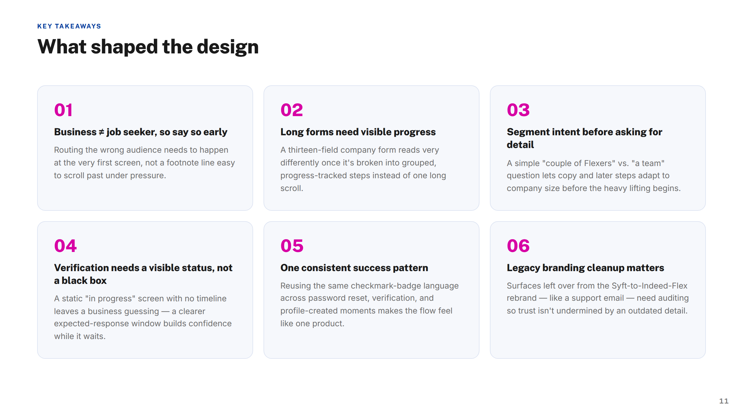
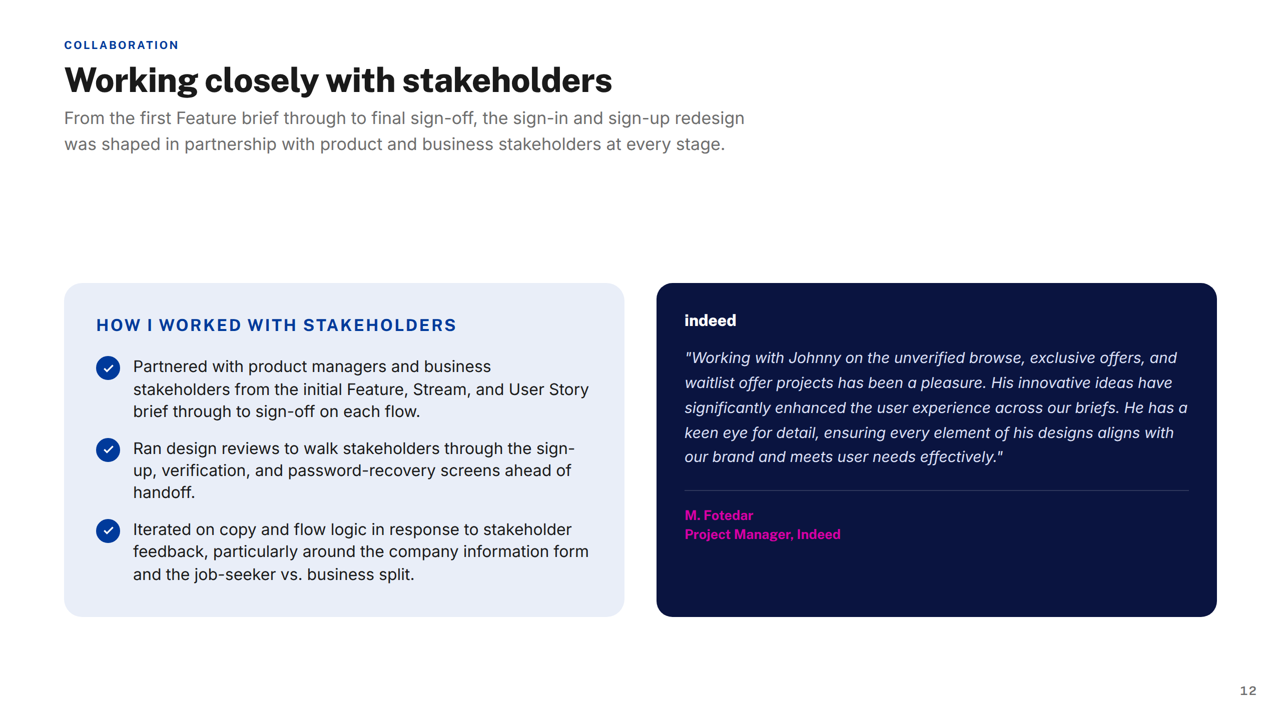
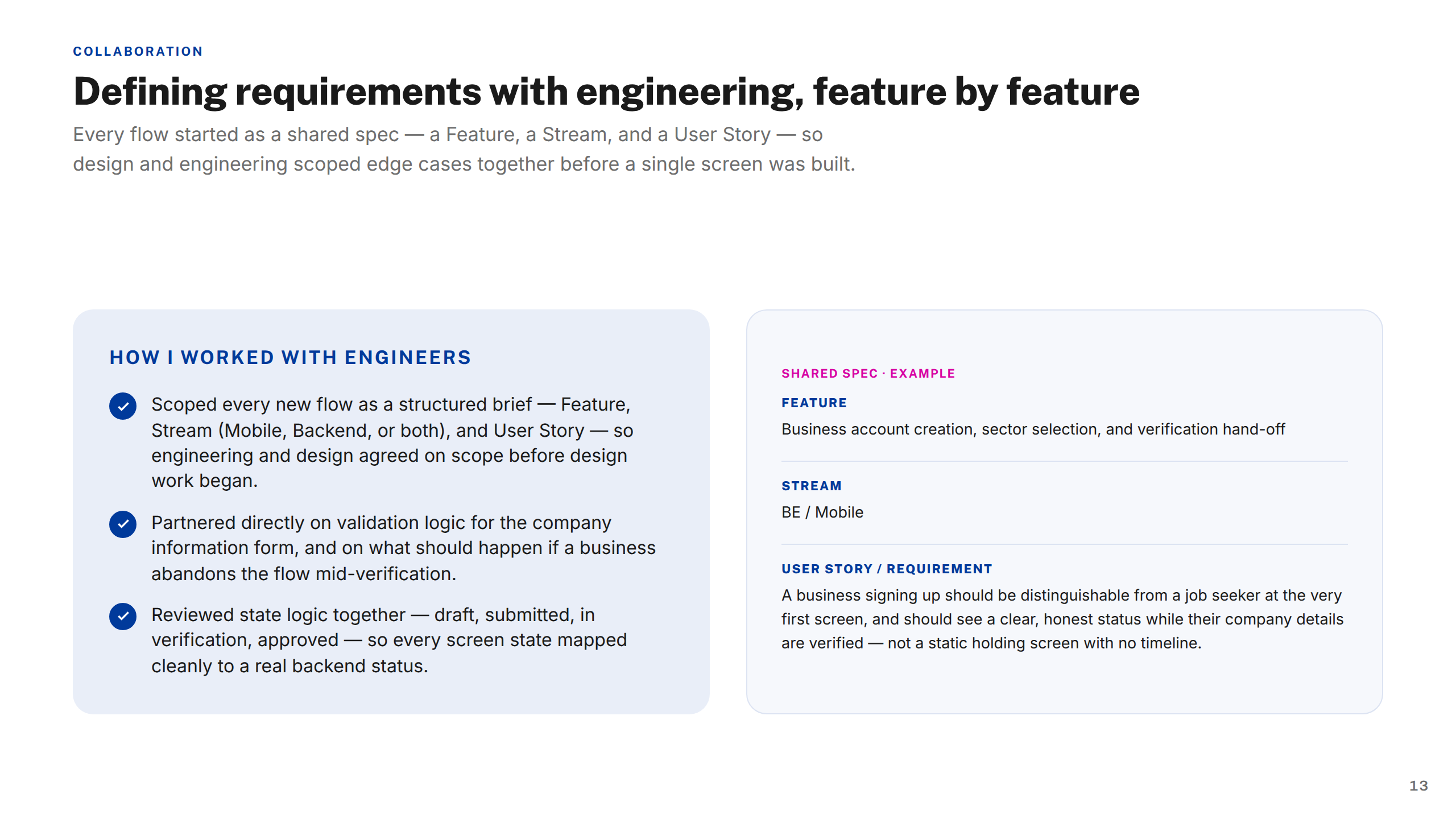
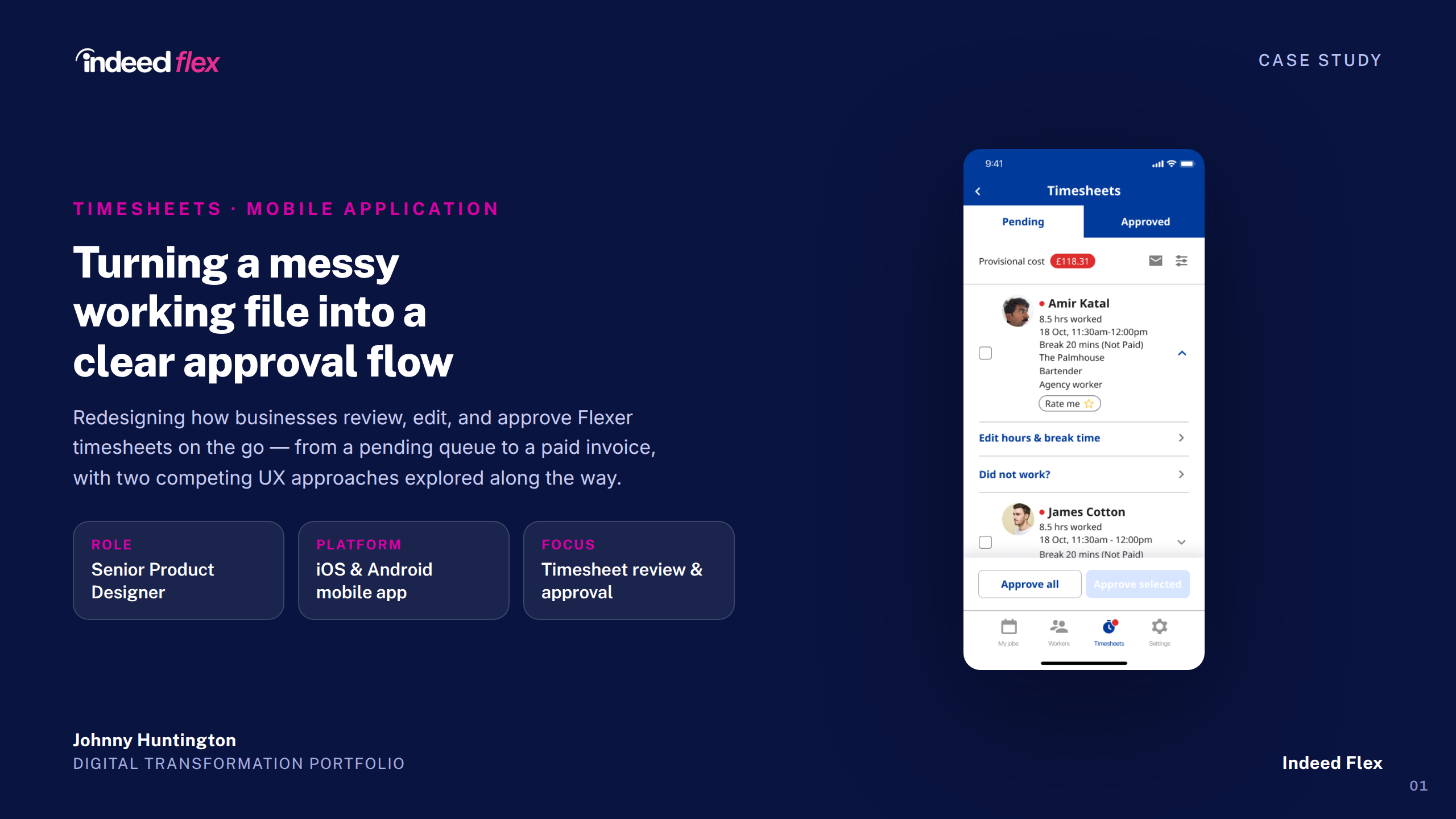
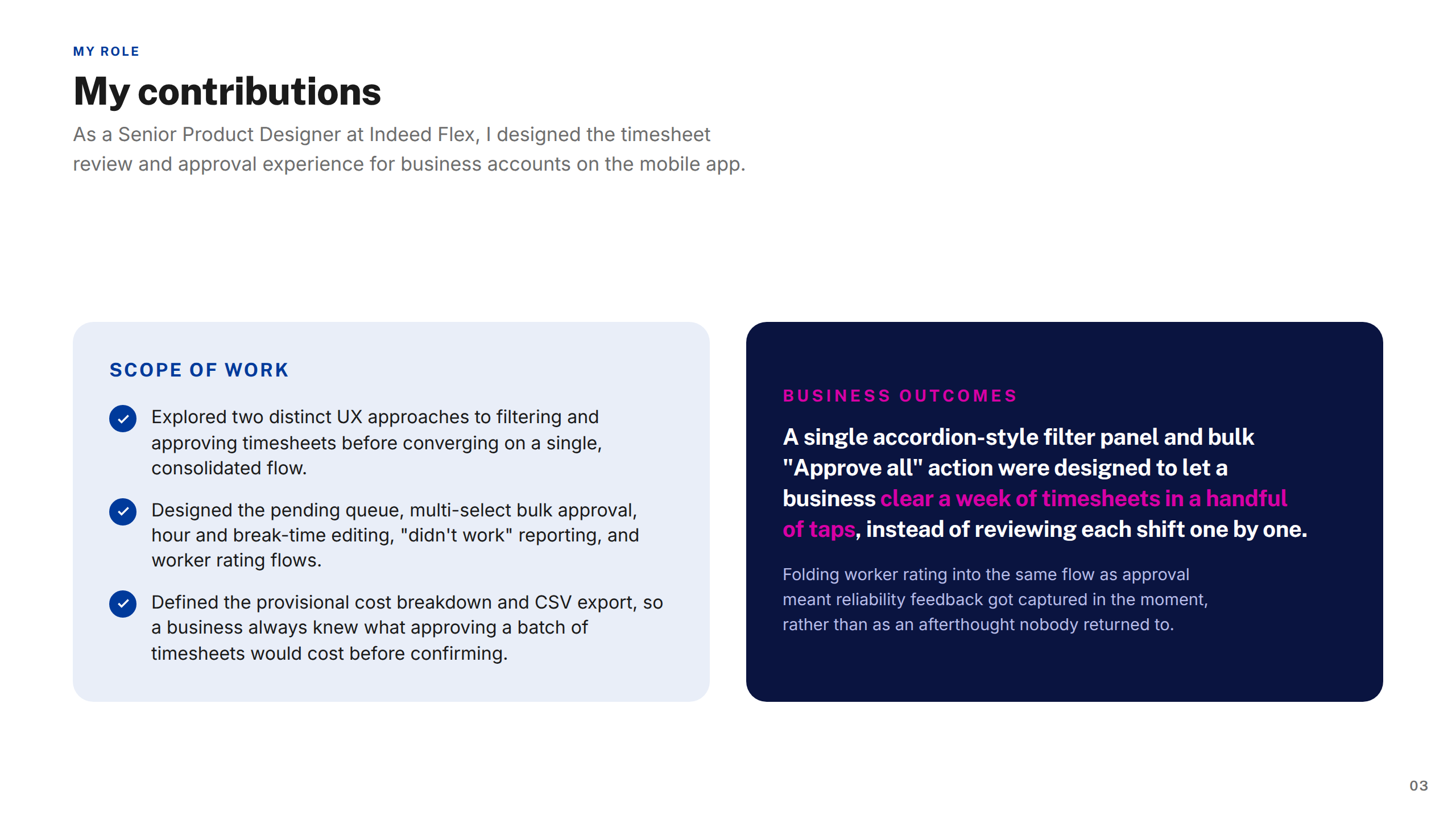
Product Designer (UX/UI), embedded in the core product team across a two-year engagement. End-to-end ownership of the Earnings section, Timesheets, Job Posting journey, Sign In & Sign Up, and the Strikes & Bans redesign.
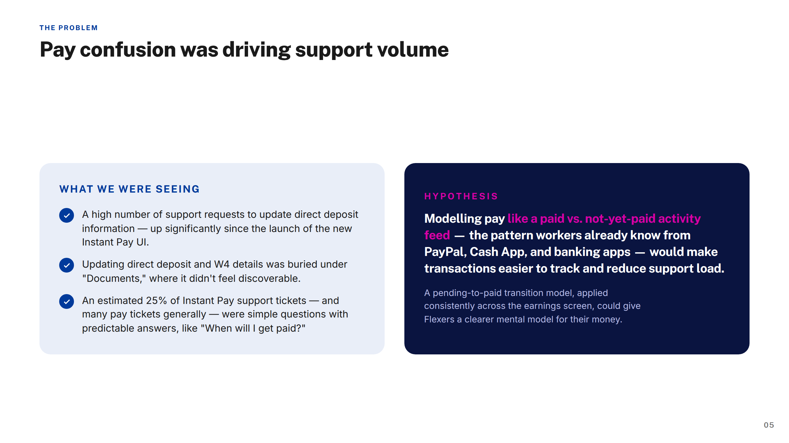
Stakeholder interviews, competitor analysis, analytics review, existing flow audits
Problem framing, user stories, success metrics, design principles per workstream
Low-fi exploration, component design, high-fidelity prototypes, annotation for engineering
Moderated & unmoderated usability testing, synthesis, design iteration
Dev handoff, QA support, post-launch monitoring, retrospectives
The biggest lesson from this engagement was the cost of inconsistency at scale. Pattern divergence across the product that might seem harmless in isolation compounds quickly in a team of eight designers — we spent meaningful time re-aligning instead of moving forward. A more rigorous design system governance process from day one would have paid for itself multiple times over.
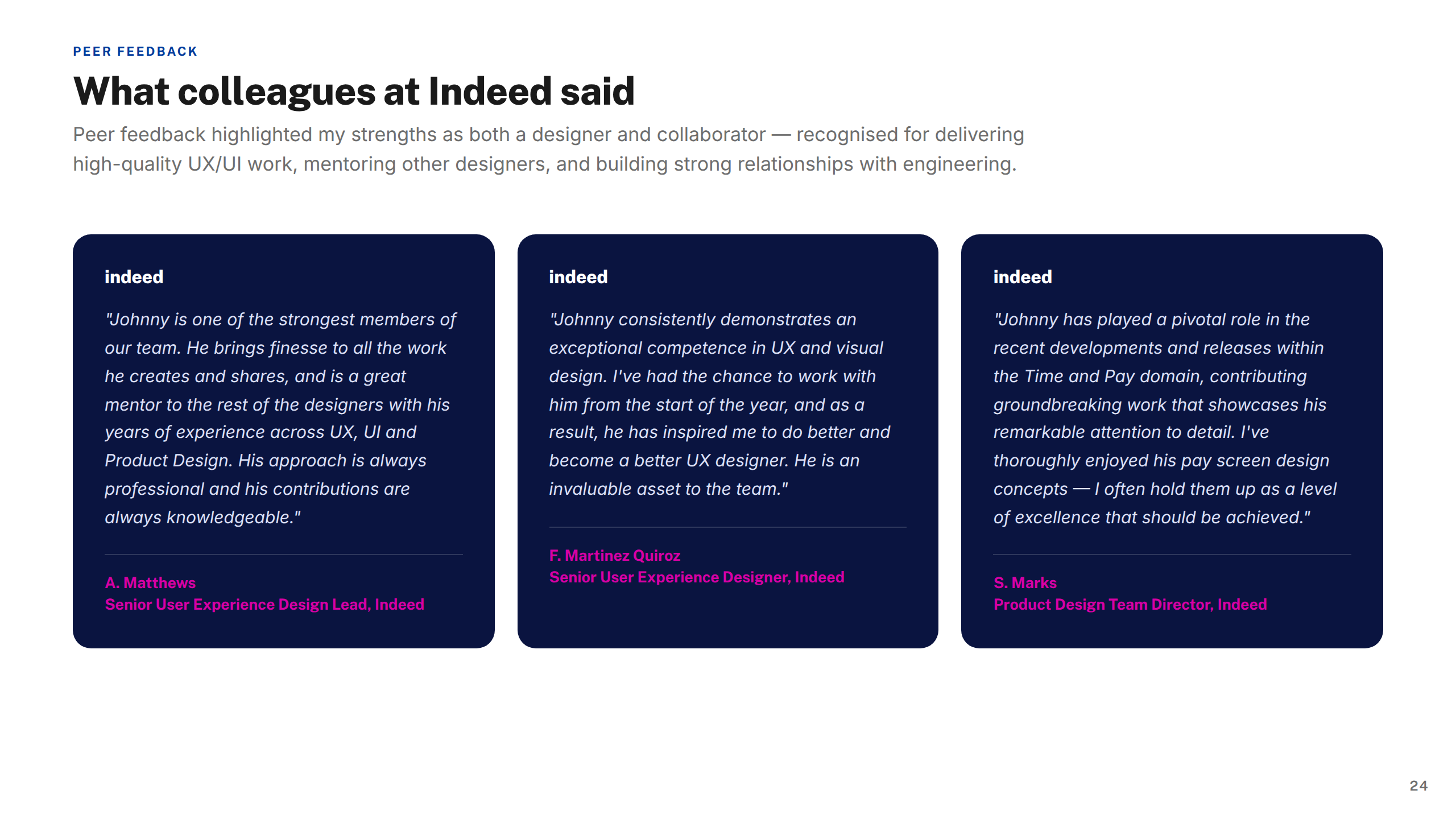
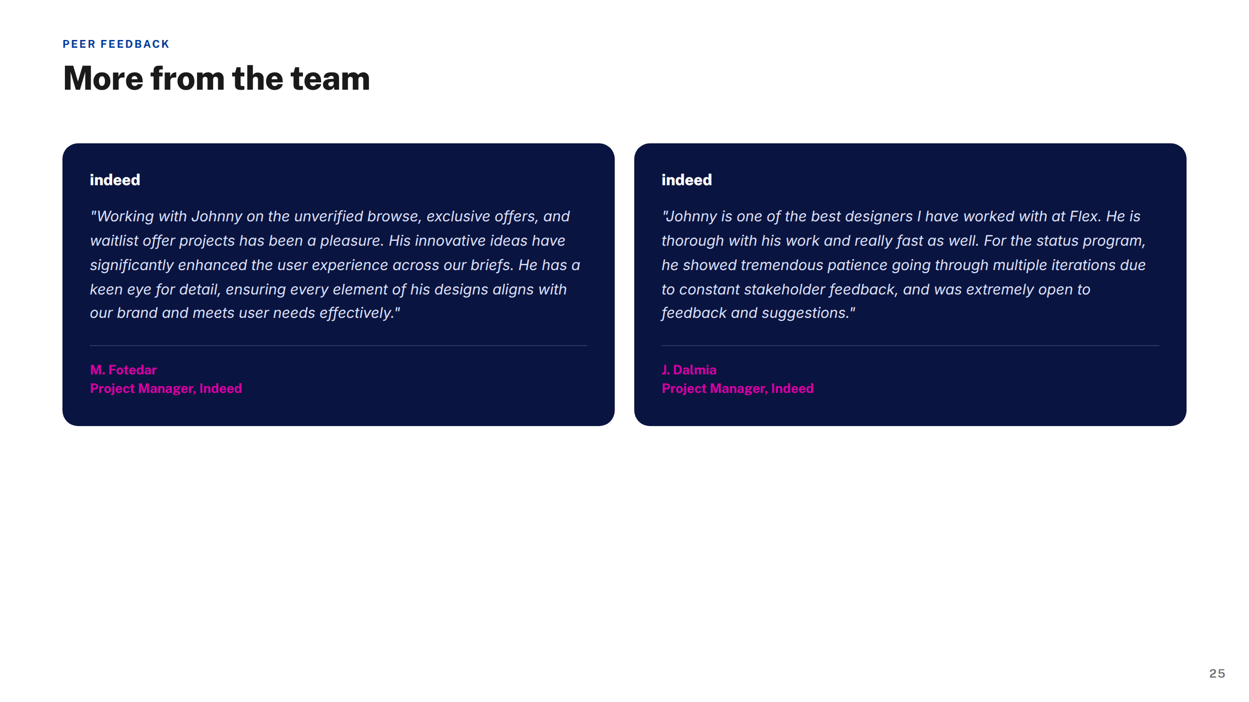
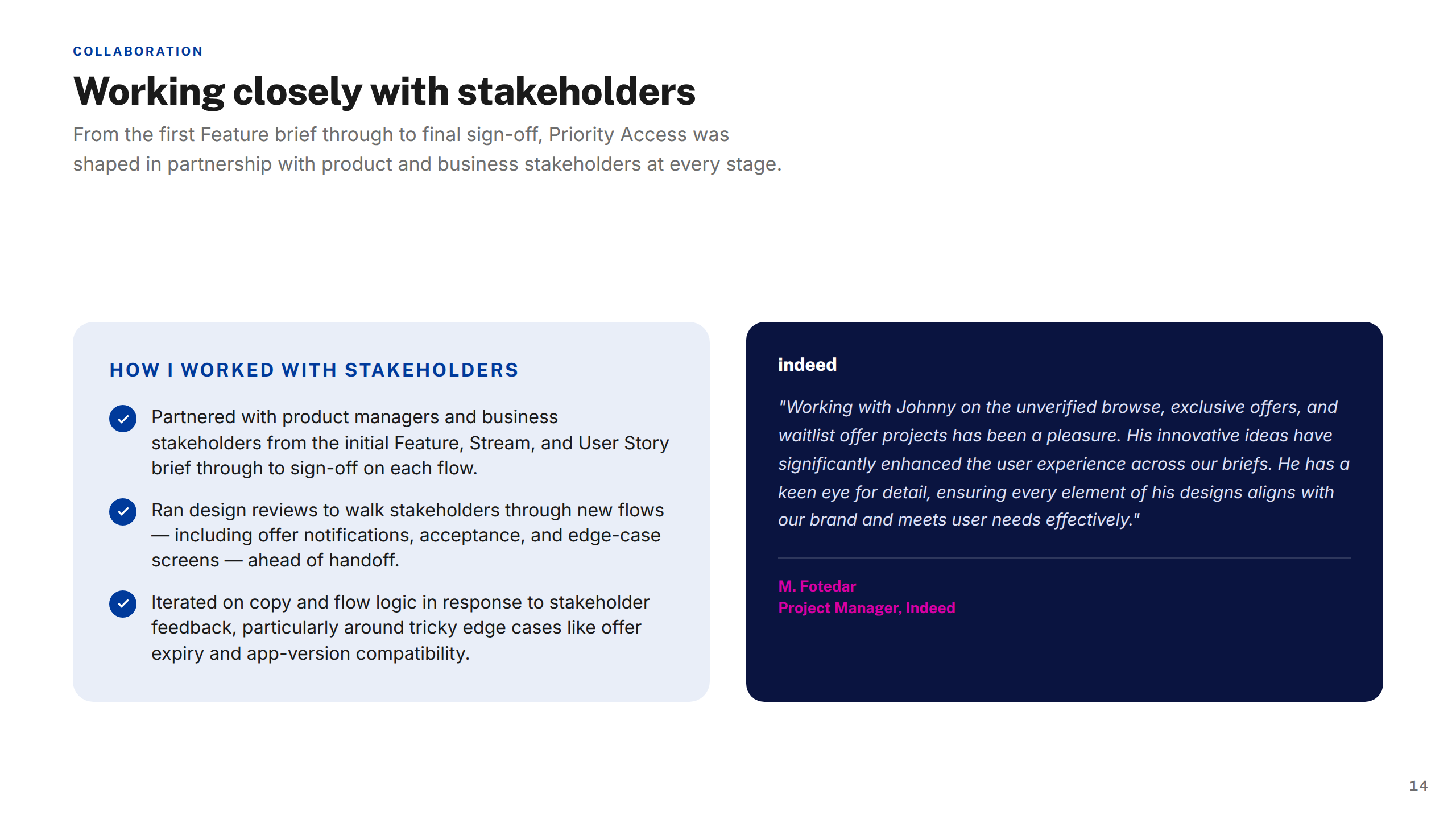
"Johnny brought a level of craft and rigour to the earnings experience that genuinely changed how we thought about the problem. He was always asking the right questions — and backing them up with evidence from testing."
Projects shown include live work, pitch deliverables, and design produced as part of embedded or collaborative engagements. Some work was completed as part of a wider team. Deliverables reflect the scope and direction at the time of engagement — the live experience may have since changed, launched in a different form, or not proceeded to production. All brand assets and trademarks shown remain the property of their respective owners and are displayed here for portfolio reference only.