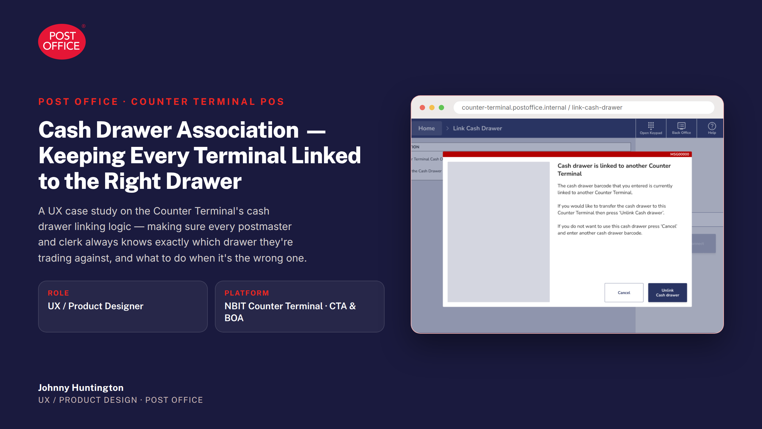
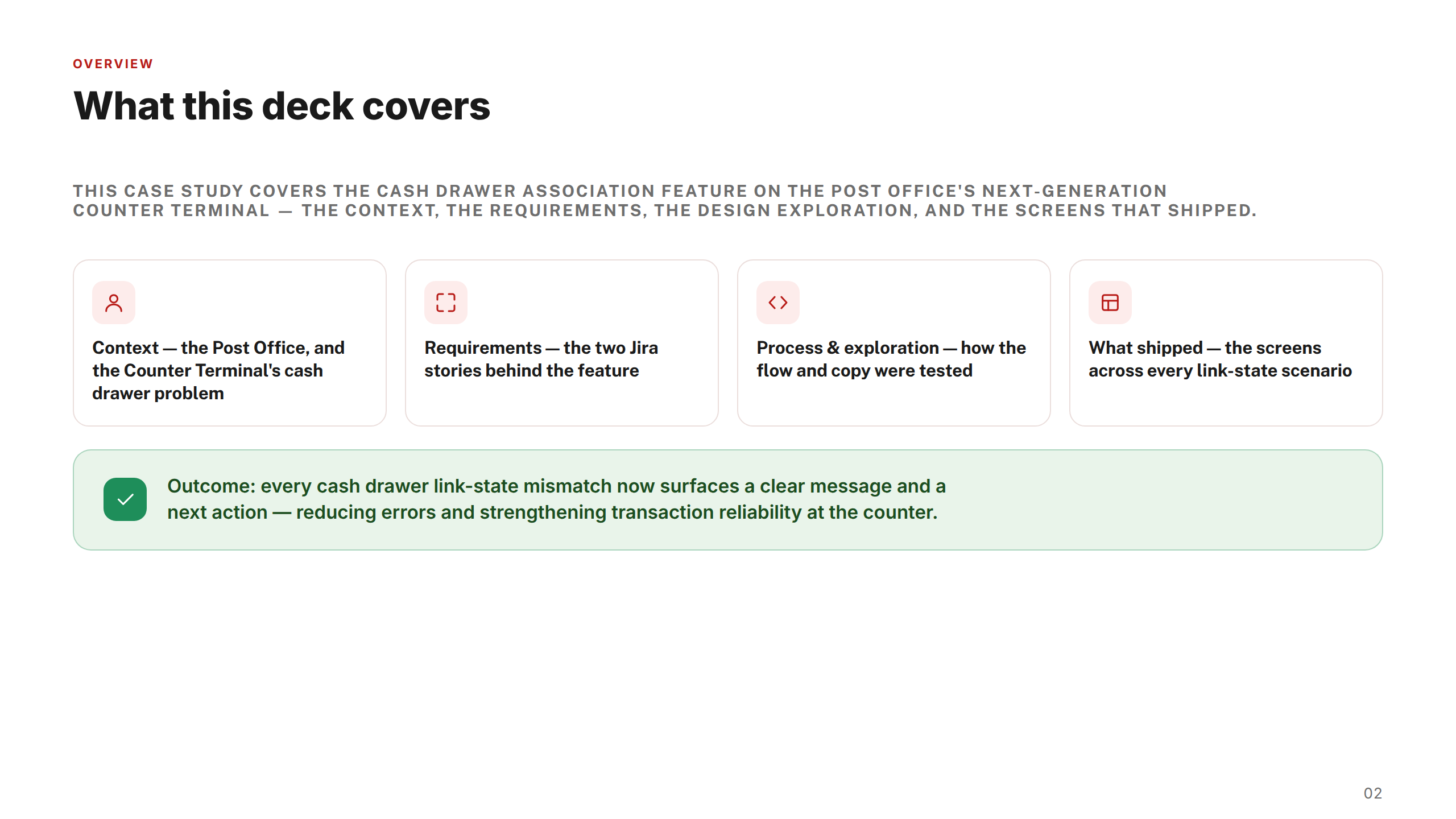
Designing the next-generation Counter Terminal POS to replace Post Office's legacy Horizon platform — covering Cash Drawer Association, Closed Basket Reversals, and Pouch Acceptance across a network of 11,500 branches.
One of the UK's most trusted brands — and one of its most complex digital transformation challenges.
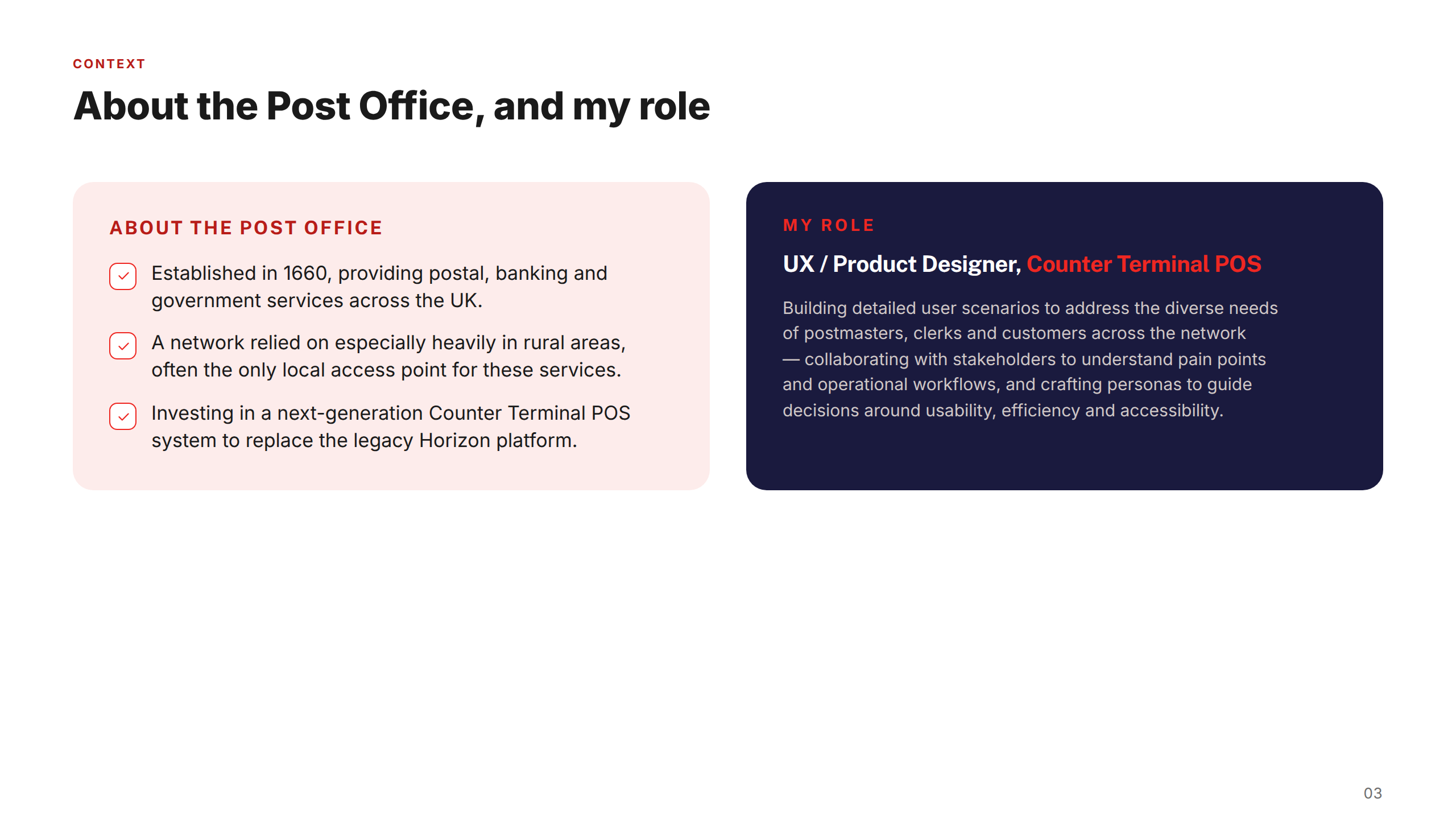
Post Office Ltd is the UK's largest retail network, with over 11,500 branches serving more than 11 million customers every week. Operating across financial services, telecoms, travel, and government services, it occupies a unique position as both a commercial enterprise and a critical piece of national infrastructure — particularly in rural and underserved communities where it is often the only accessible provider of essential services.
Amid a major modernisation programme, Post Office was investing in digital products to reduce postmaster workload, streamline in-branch transactions, and improve the end-to-end experience for both customers and the network of postmasters who run branches. With legacy systems, a highly distributed operational model, and strict regulatory constraints, it represented a genuinely complex design environment — where every decision had to balance commercial goals with accessibility, compliance, and the realities of front-line branch use.
The challenge
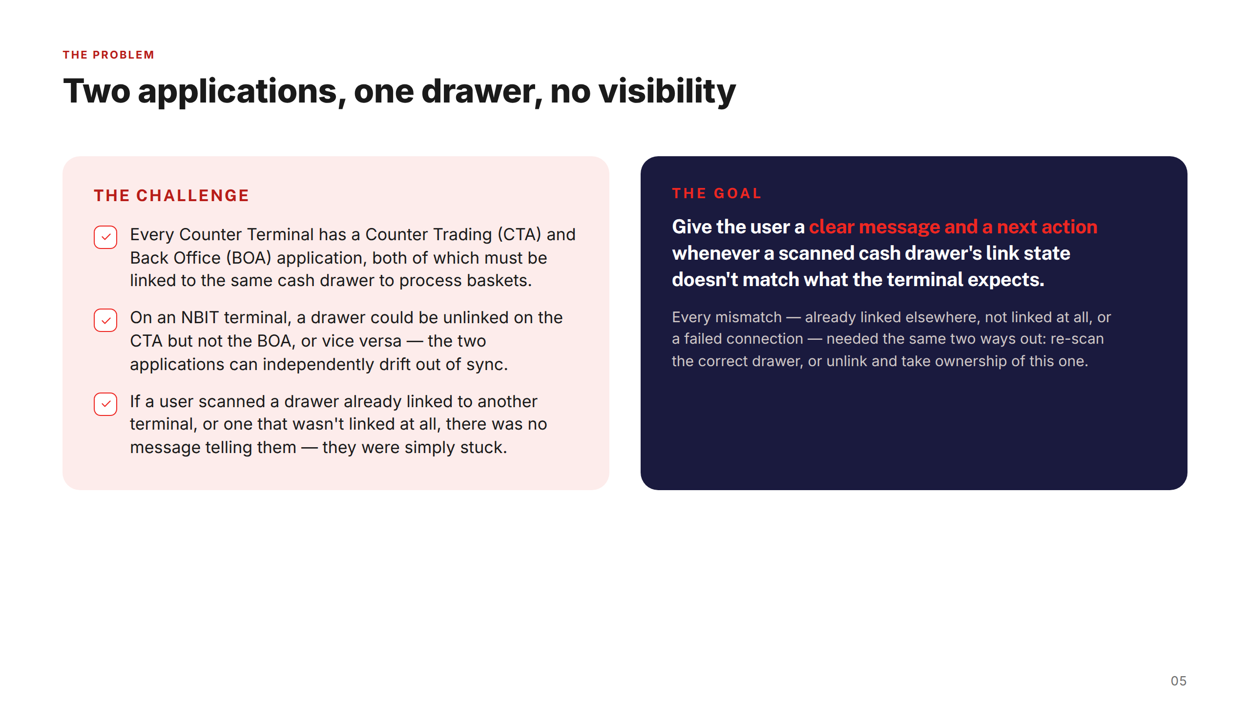
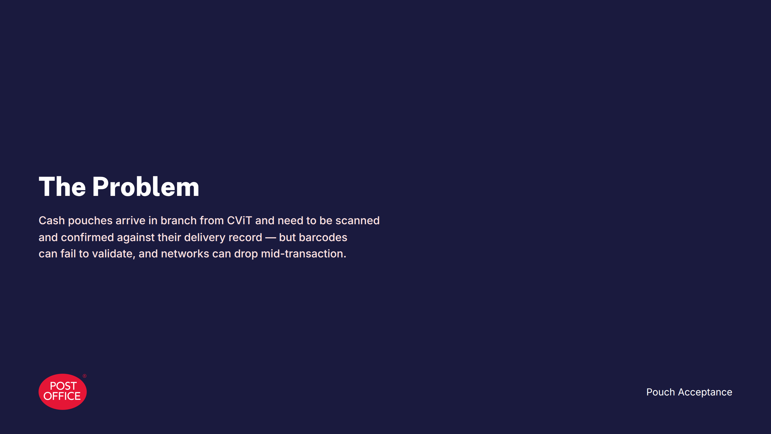
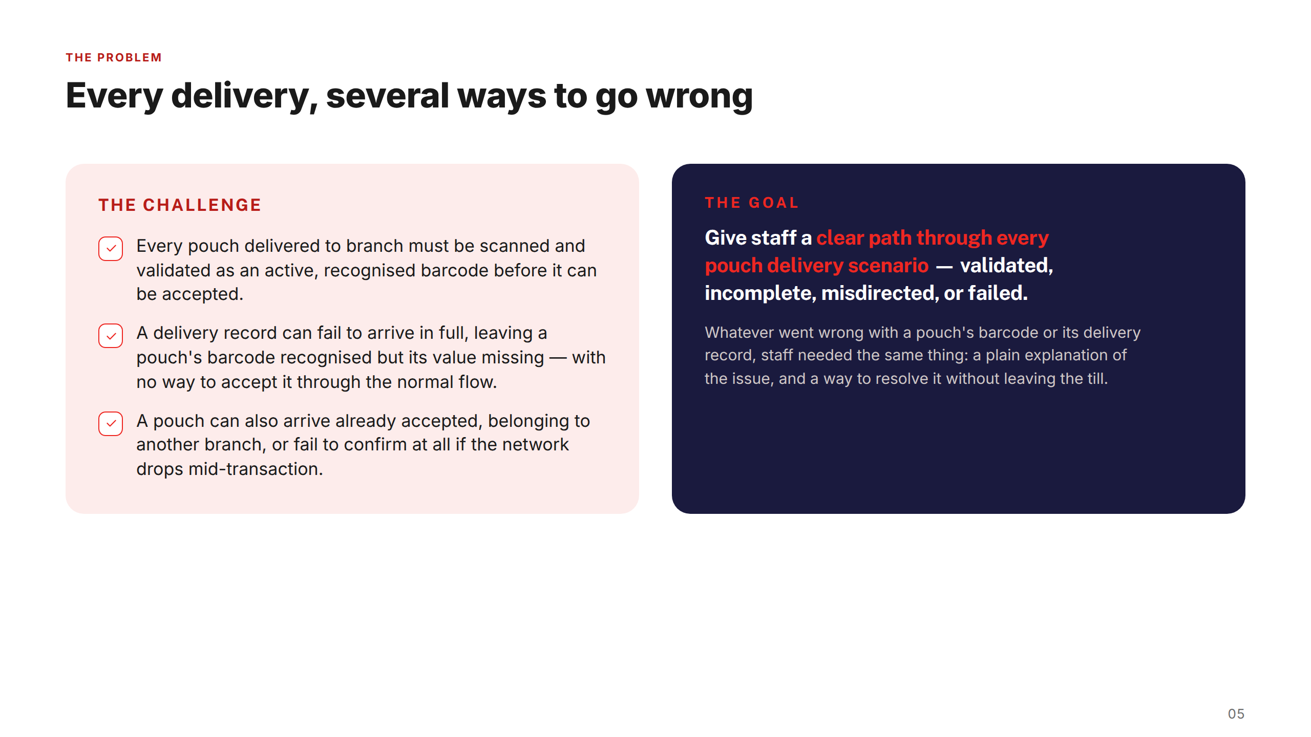
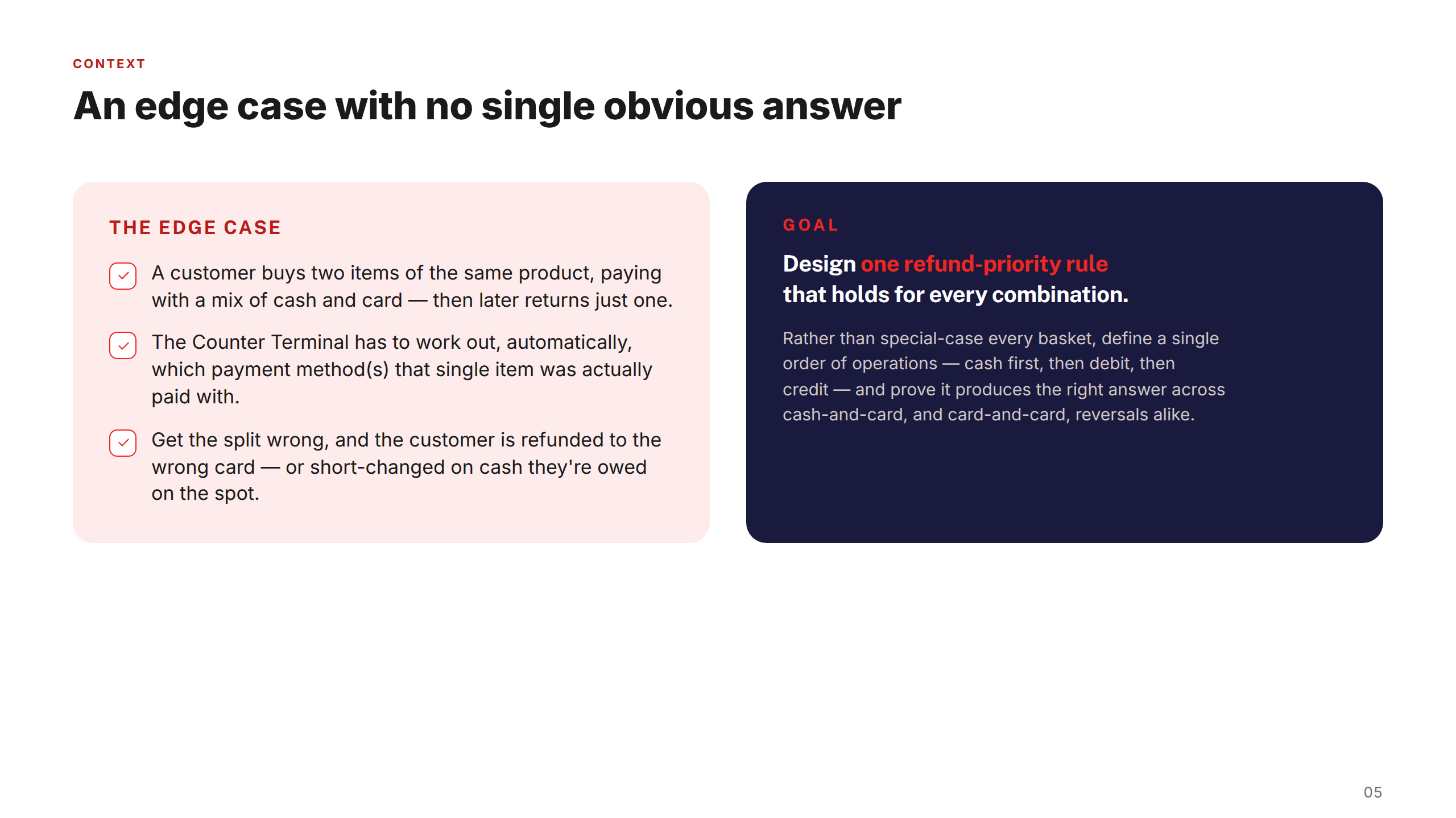
Post Office was building a next-generation Counter Terminal POS to replace the legacy Horizon platform — and across every feature, the same underlying problem kept surfacing: front-line staff had no clear guidance when transactions entered an unexpected state.
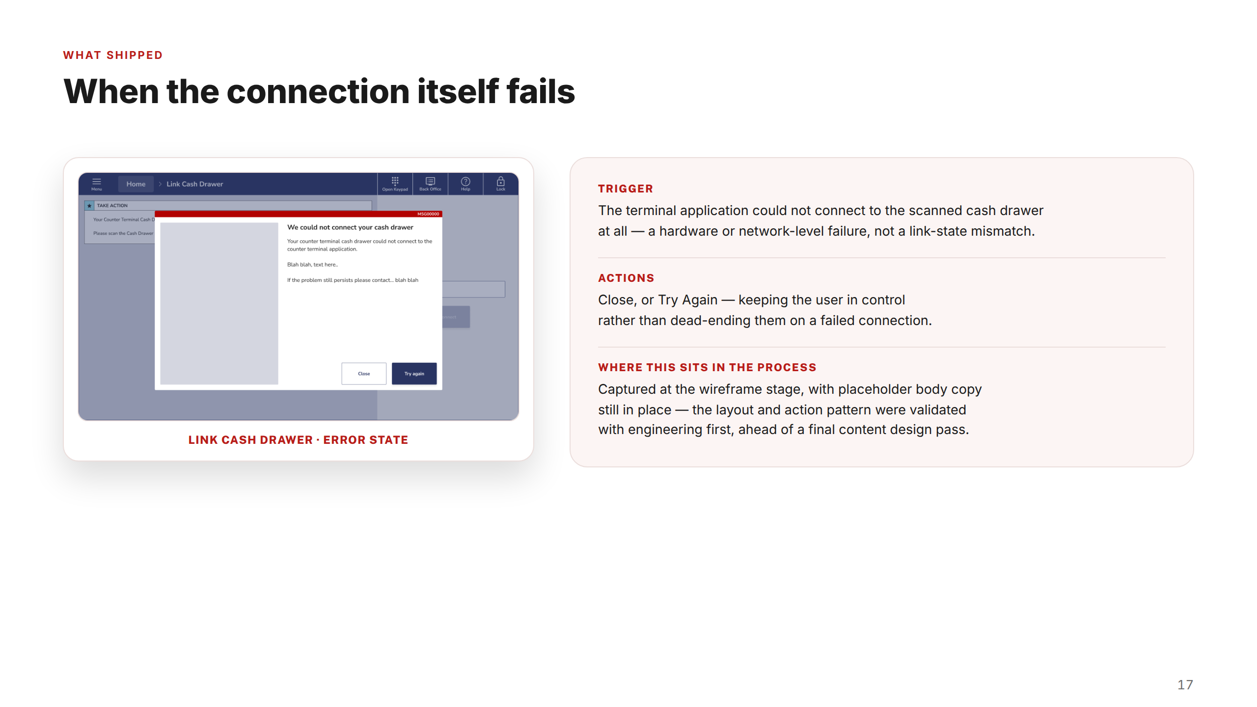
Whether a cash drawer was linked to the wrong terminal, a basket couldn't be reversed across multiple payment methods, or a pouch barcode failed to scan — users were simply stuck, with no message and no next action.
My approach
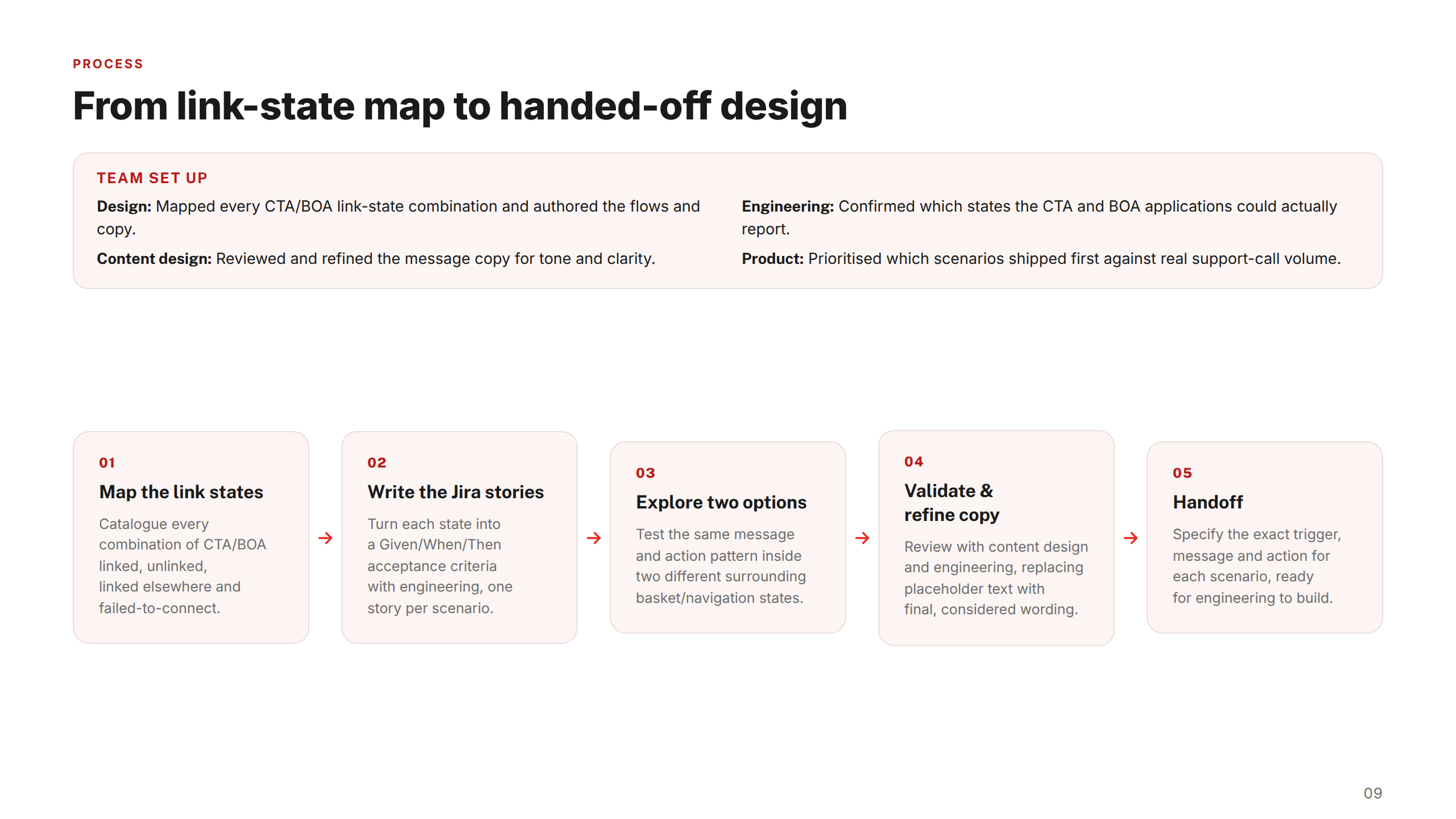
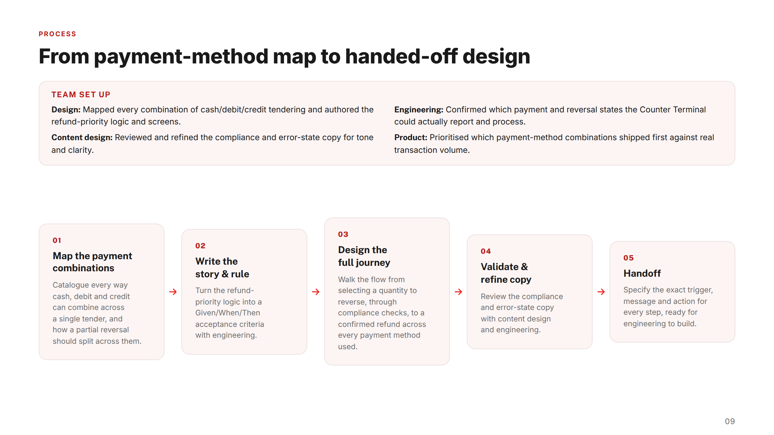
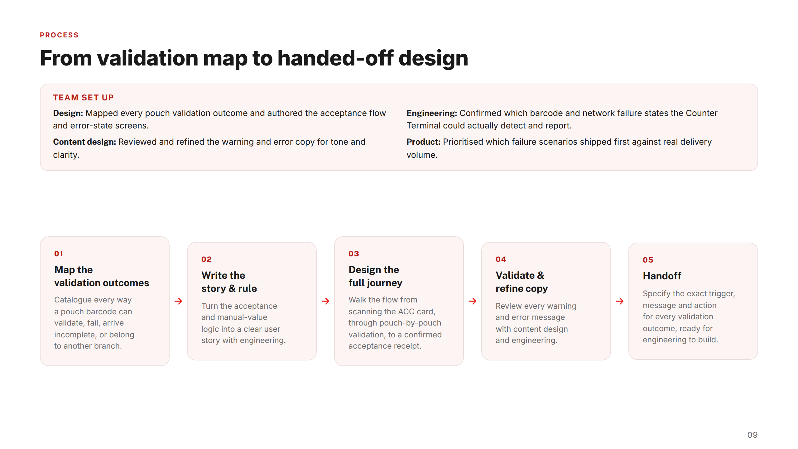
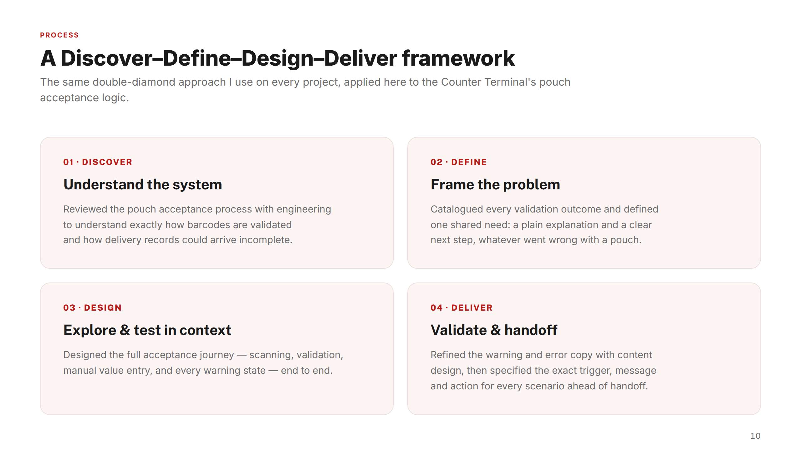
I applied a Discover–Define–Design–Deliver framework to each feature. For each one, I started by mapping every edge case and system state with engineering, then defined a single shared goal, explored two design options in Figma, and refined copy with content design before handoff.
Prioritisation was always grounded in real data — product used actual support-call volume to sequence which scenarios shipped first, ensuring the highest-impact states were resolved earliest.
My role
UX / Product Designer — Counter Terminal POS
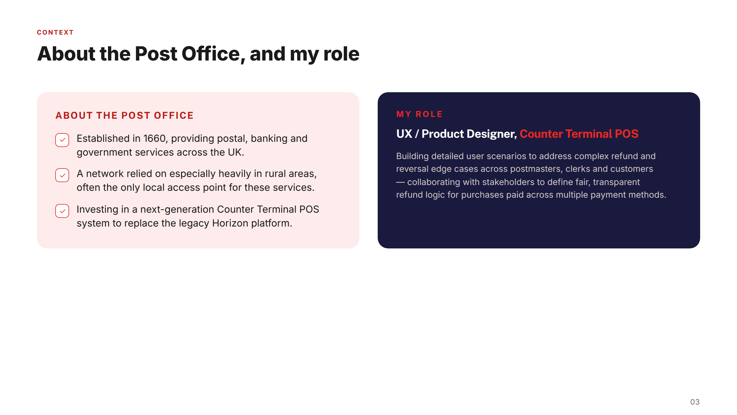
I was embedded as UX/Product Designer on the Counter Terminal programme, responsible for designing feature flows across the next-generation POS system replacing Post Office's legacy Horizon platform.
My work centred on building detailed user scenarios to address the diverse needs of postmasters, clerks, and customers — collaborating with stakeholders to understand pain points and operational workflows, and crafting flows that balanced usability, efficiency, and accessibility within a highly constrained enterprise environment.
Collaborators
I worked within a cross-functional team across three feature deliveries. Engineering confirmed which system states the CTA and BOA applications could actually report, and validated technical feasibility of each design option. Content design reviewed and refined all in-product messaging for tone and clarity.
Product management prioritised which scenarios shipped first, using real support-call volume to sequence the work — ensuring the most-impactful error states were addressed earliest.
Design process
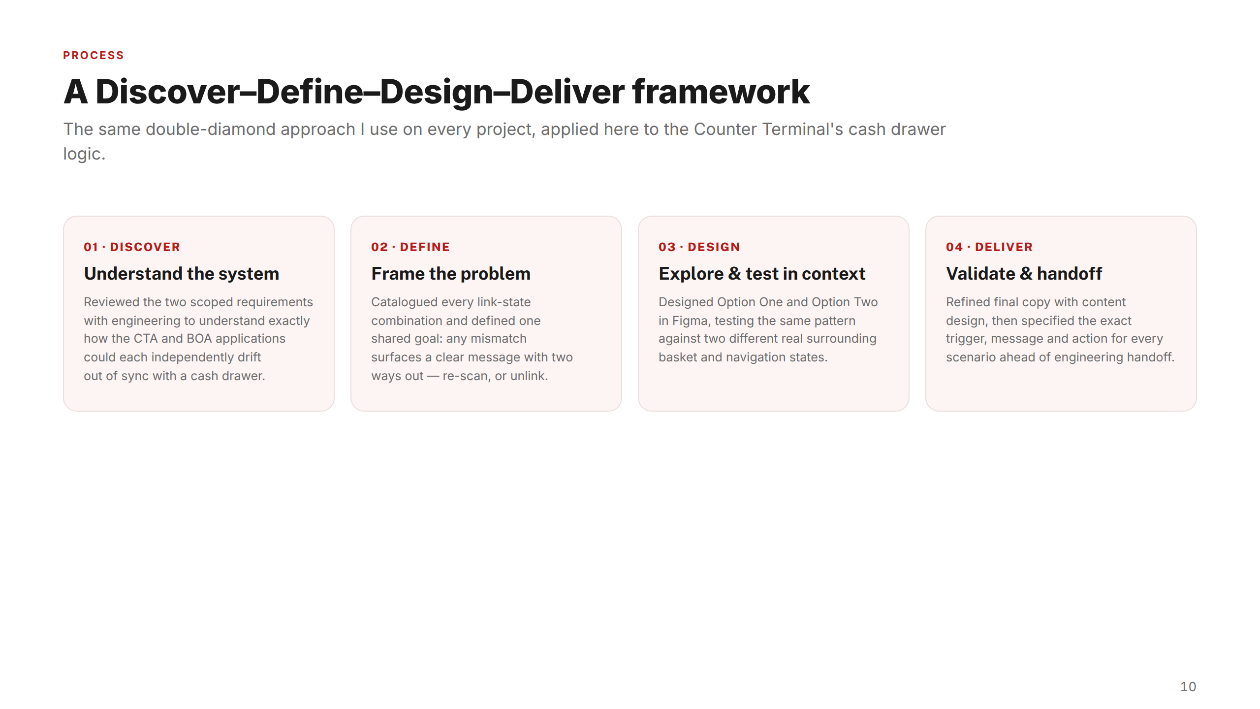
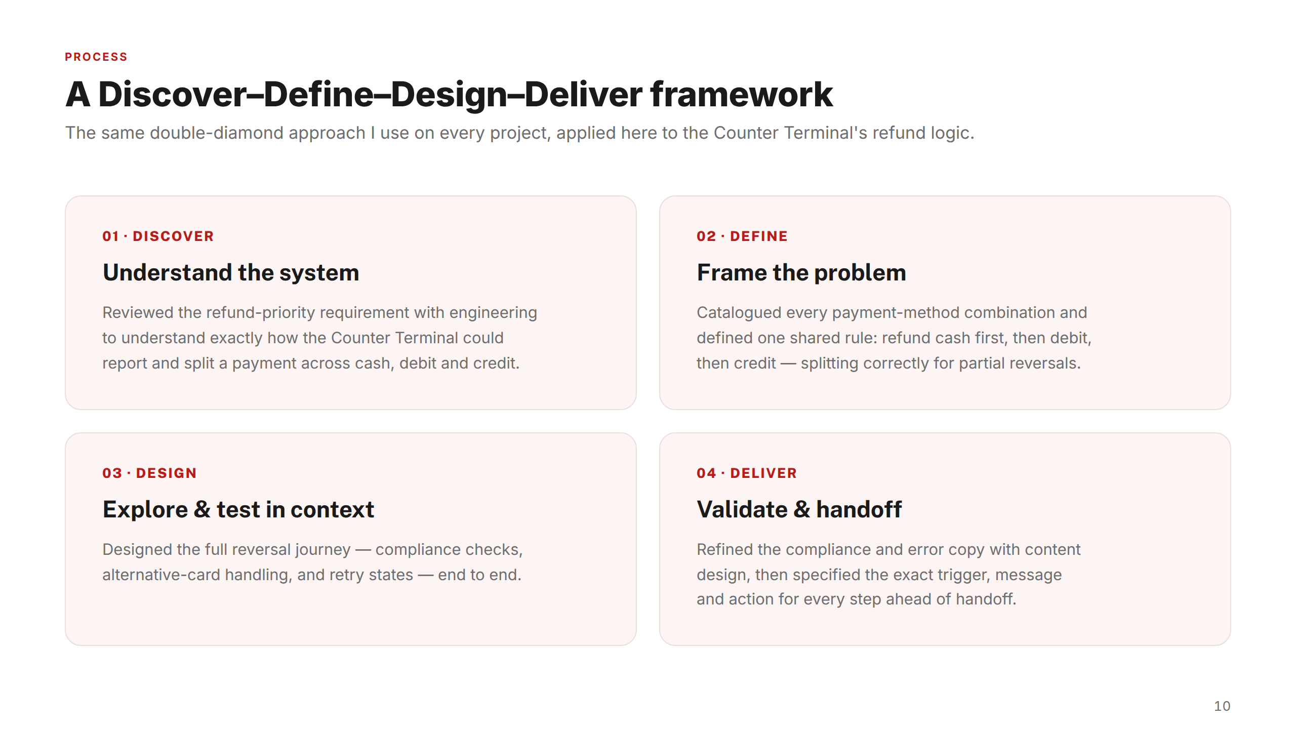
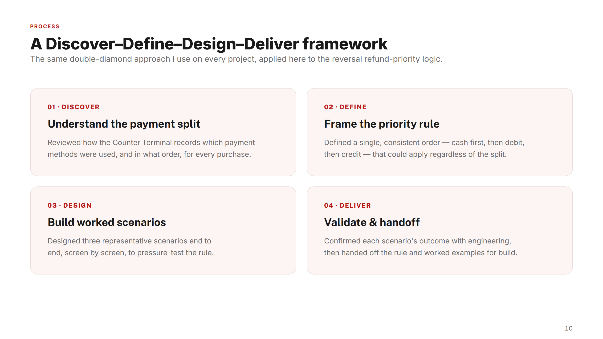
A Discover–Define–Design–Deliver framework, applied consistently across all three Counter Terminal features.
01 — Discover
Understand the system
Reviewed scoped requirements with engineering to understand exactly how the CTA and BOA applications could each independently drift out of sync — cataloguing every possible state combination before any design work began.
02 — Define
Frame the problem
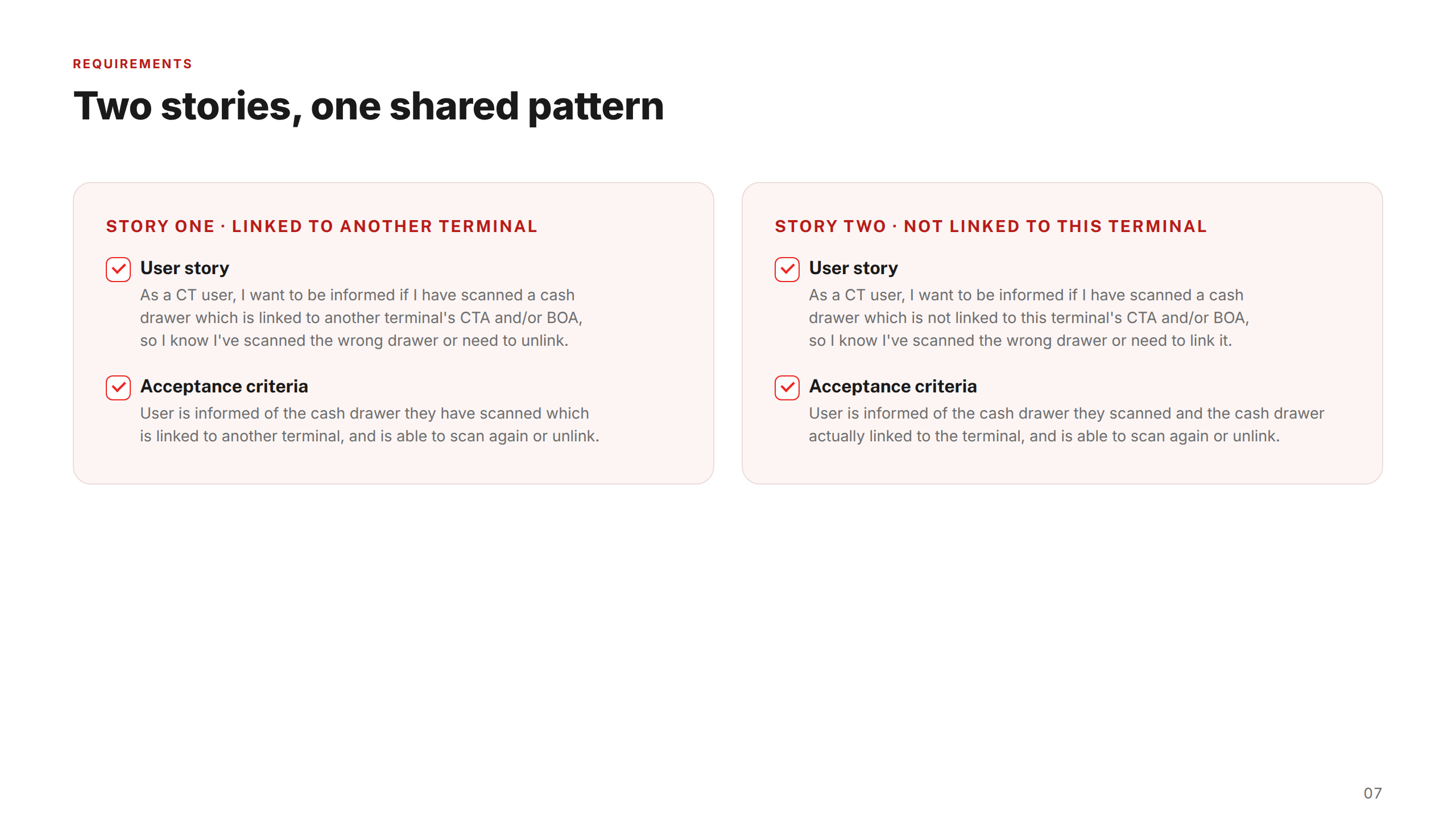
Turned each system state into a Jira user story with Given/When/Then acceptance criteria, agreed with engineering. Defined one shared goal per feature: every mismatch or error surfaces a clear message and a concrete next action.
03 — Design
Explore & test in context
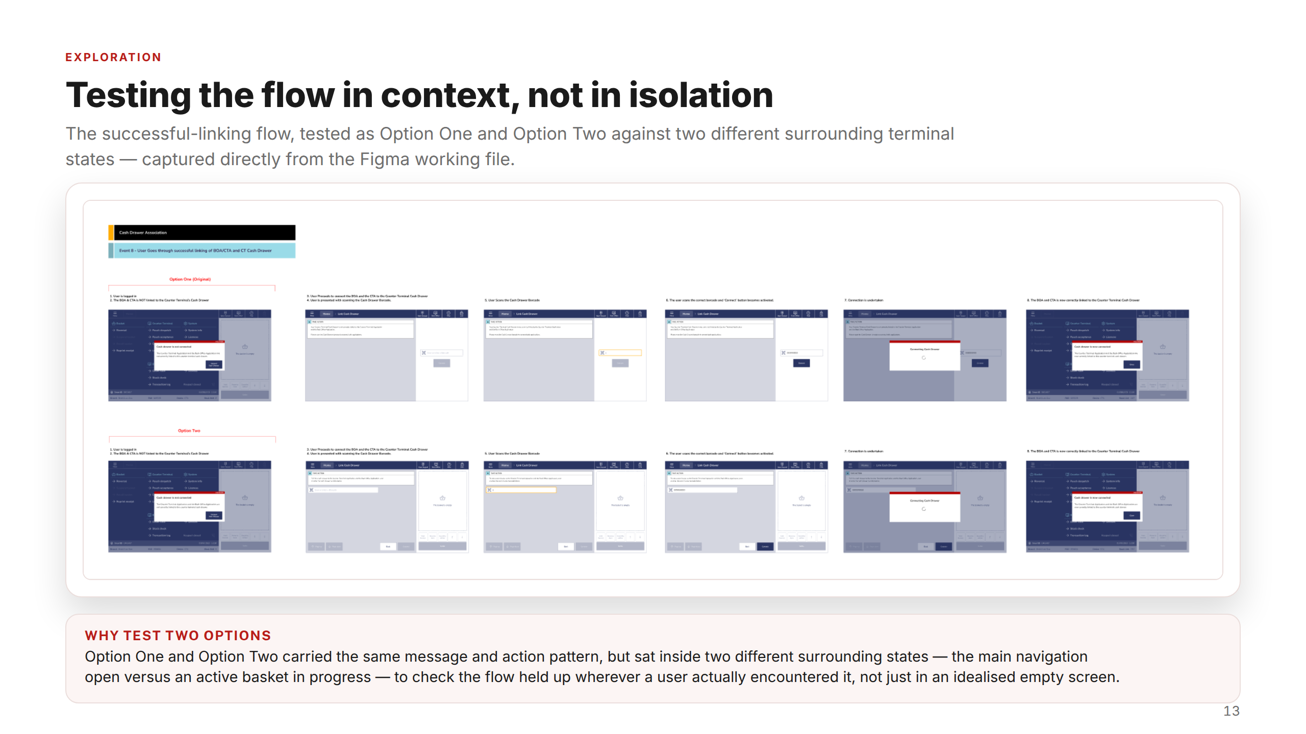
Designed two options per scenario in Figma, testing the same message and action pattern against different real surrounding basket and navigation states. Copy was reviewed and refined with content design for tone and clarity.
04 — Deliver
Validate & handoff
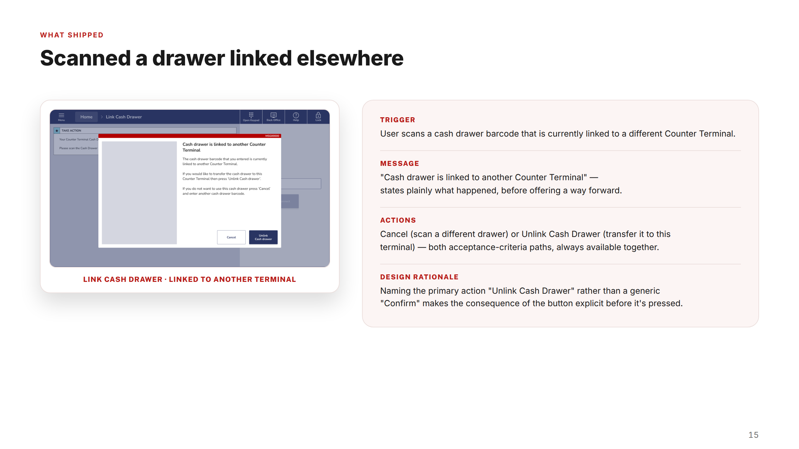
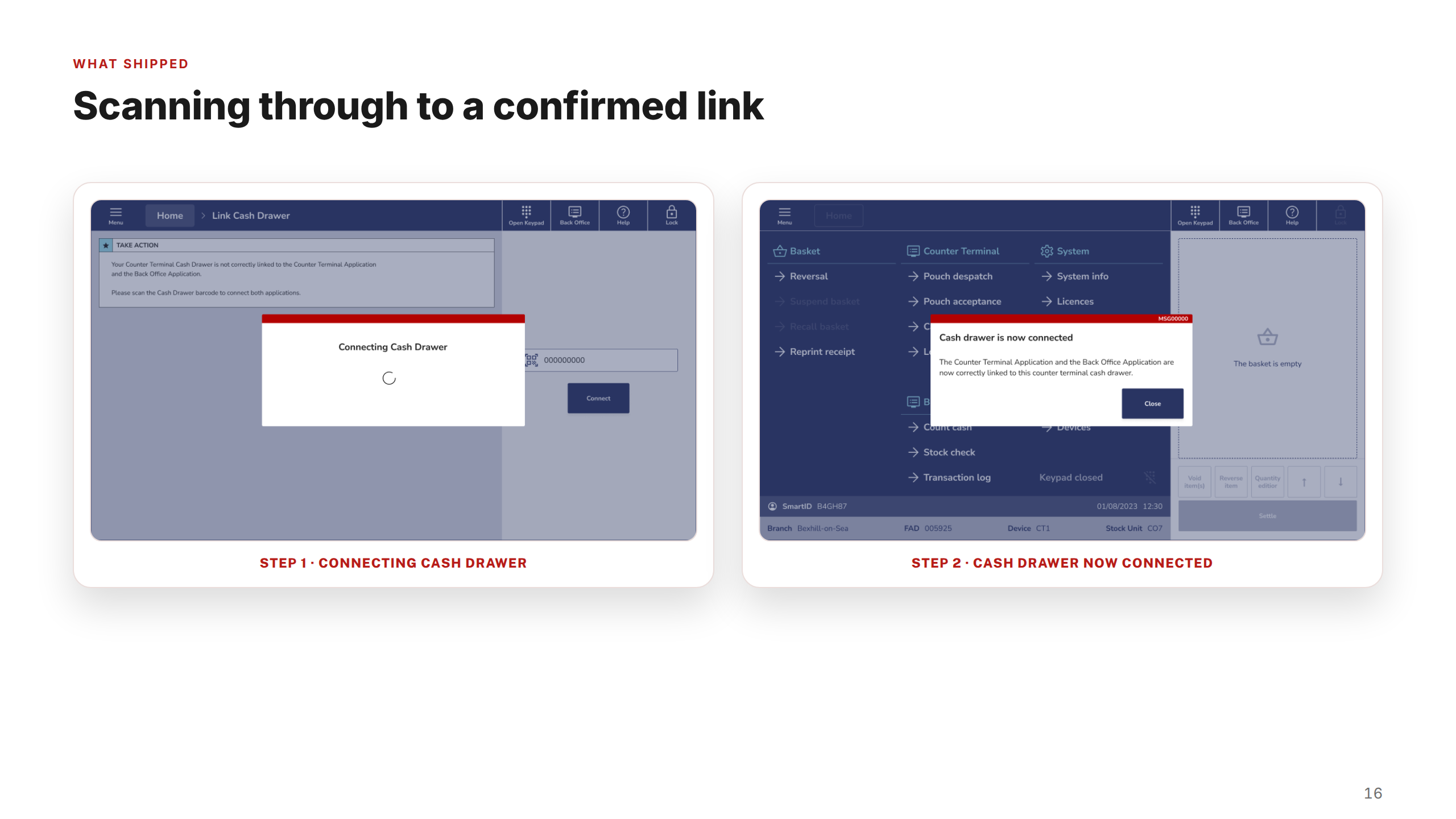
Specified the exact trigger, message, and action for every scenario in a format engineering could build directly from. Prioritisation was sequenced against real support-call volume to maximise early impact.
Key decisions
Three choices that shaped how every feature was designed and delivered.
01
Always two options
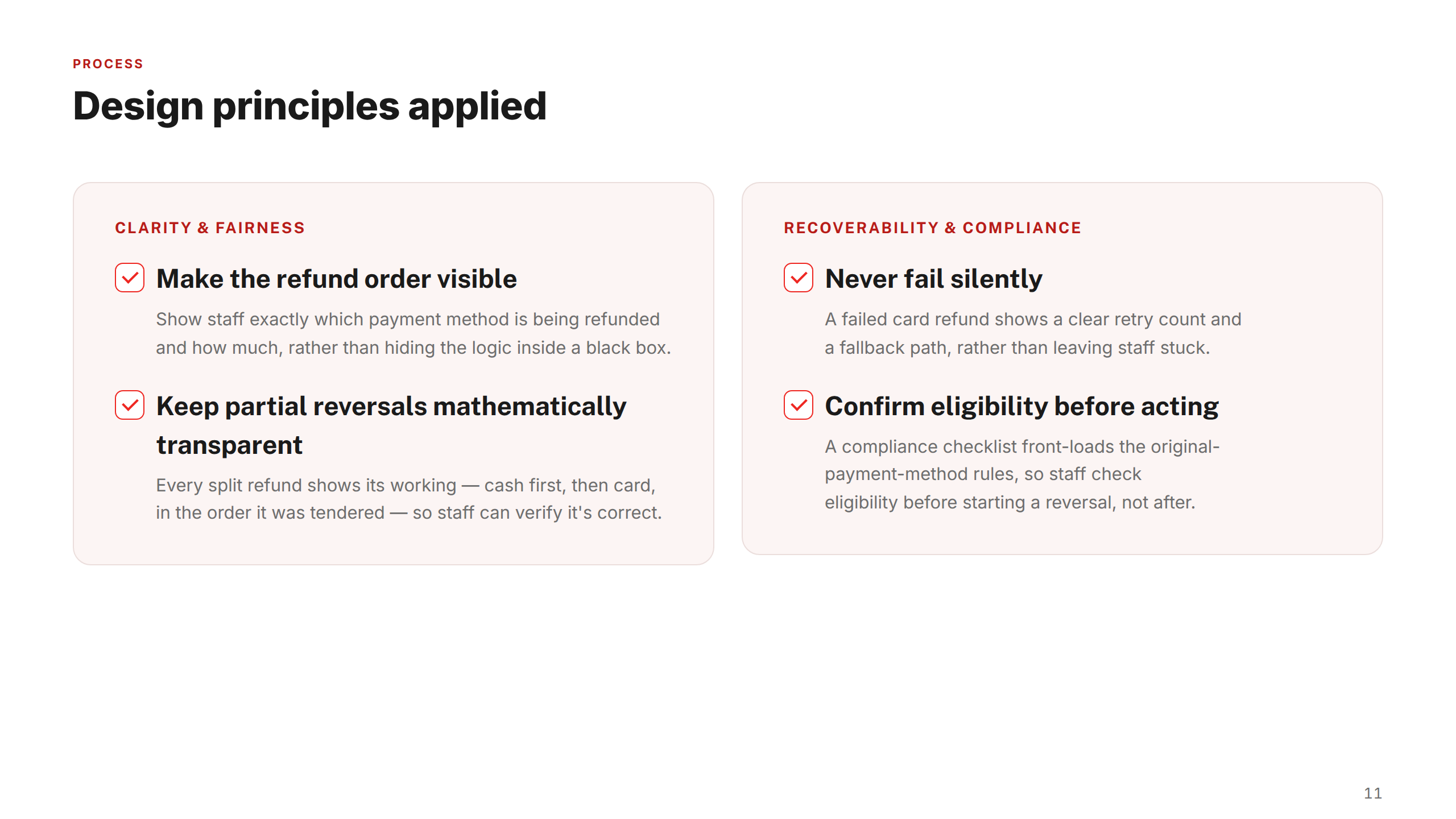
Two distinct design directions were explored for every scenario before any direction was chosen — giving stakeholders a genuine decision rather than a rubber-stamp, and forcing sharper thinking about trade-offs between UI complexity and postmaster comprehension.
02
Sequence by support-call volume
Scenarios weren't prioritised by design complexity — they were sequenced by actual support-call volume. The highest-frequency failure states shipped first. This kept the work grounded in operational impact rather than design preference or build convenience.
03
Every error needs an exit
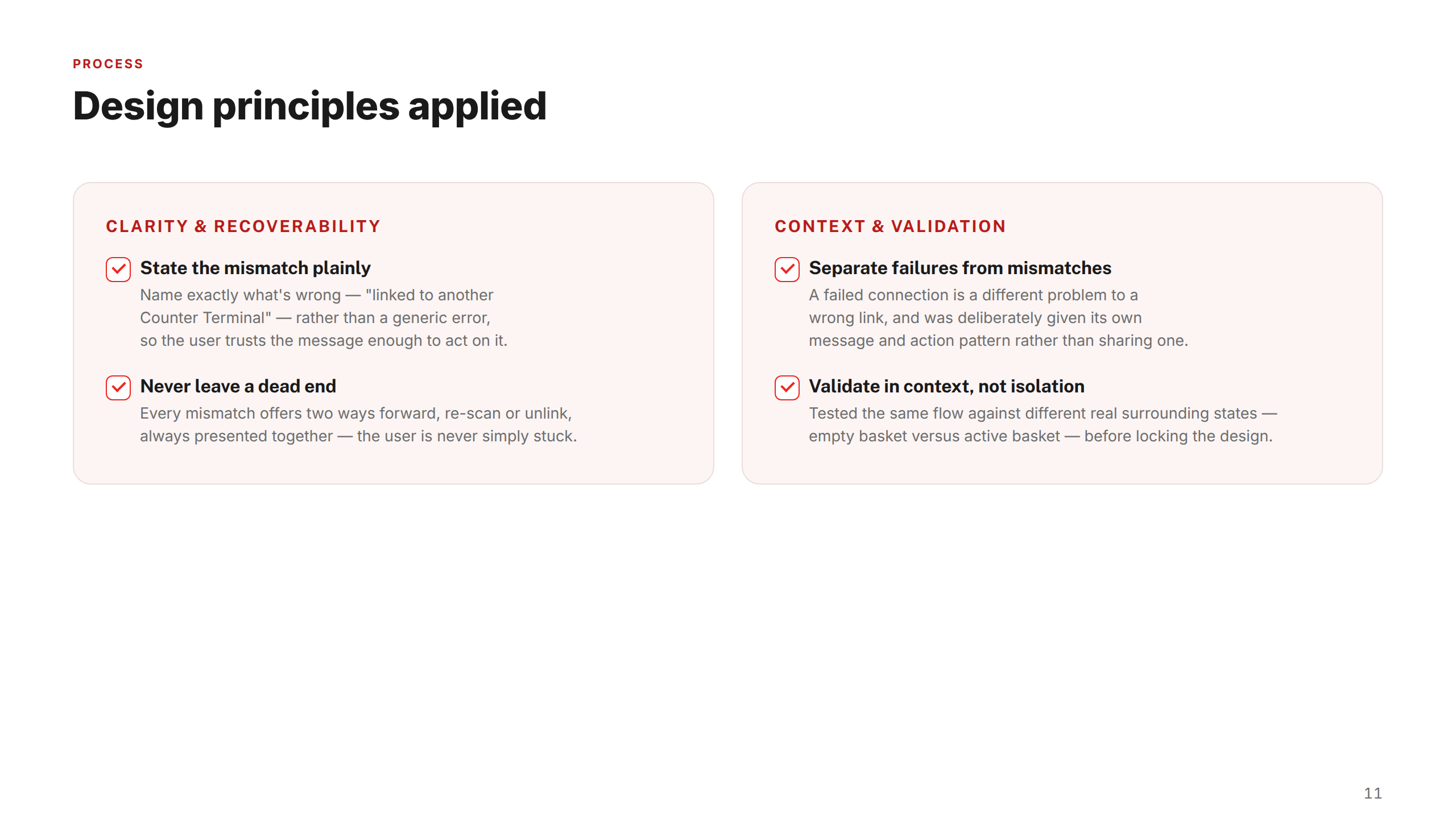
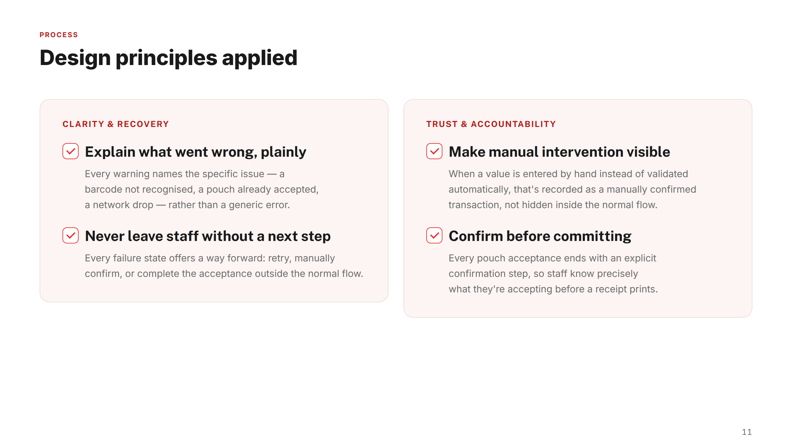
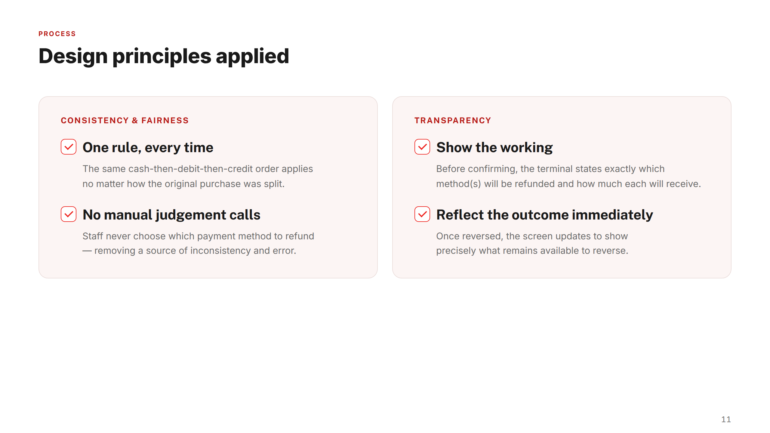
No error state was considered complete unless it surfaced a clear message and a concrete next action. The consistent principle across all three features: a postmaster should never be left wondering what to do next — every dead end became a decision point.
The work
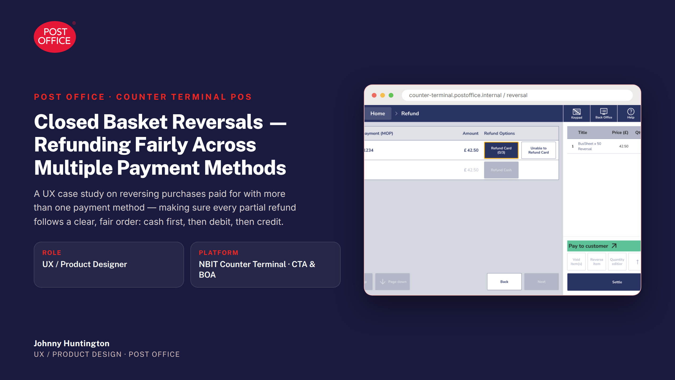
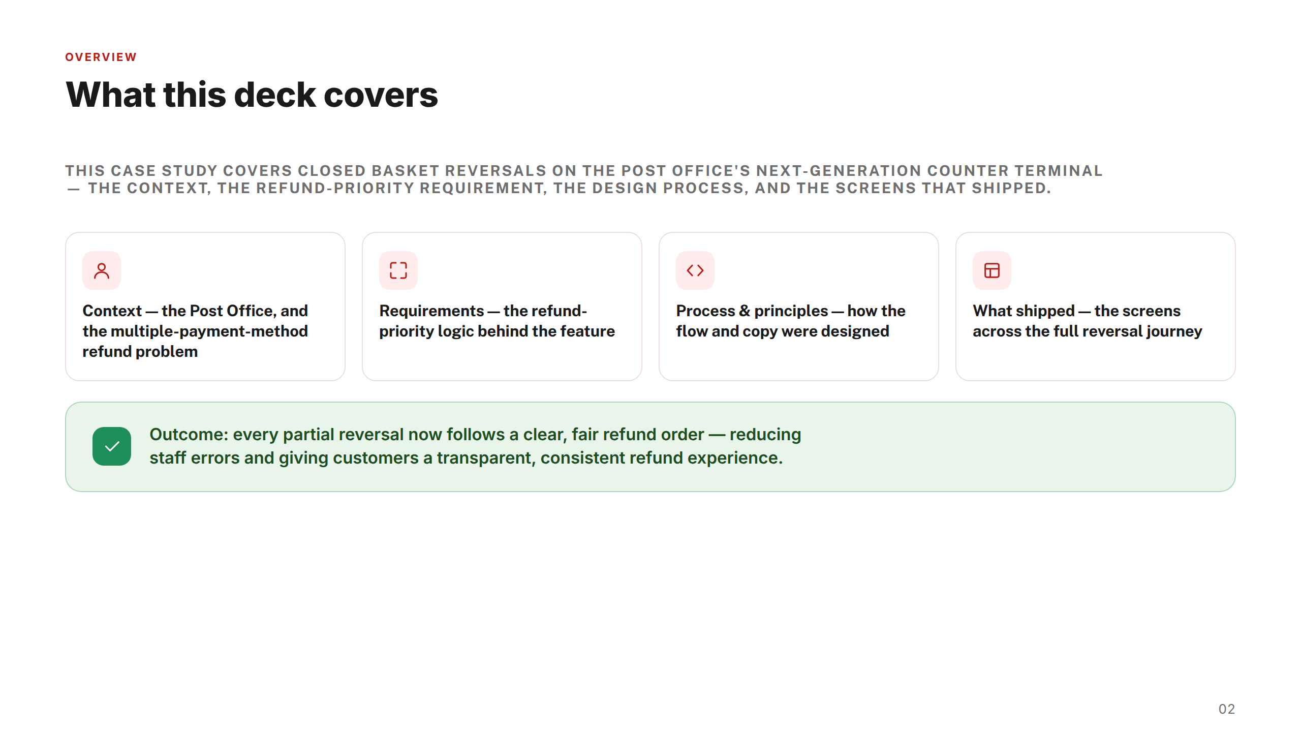
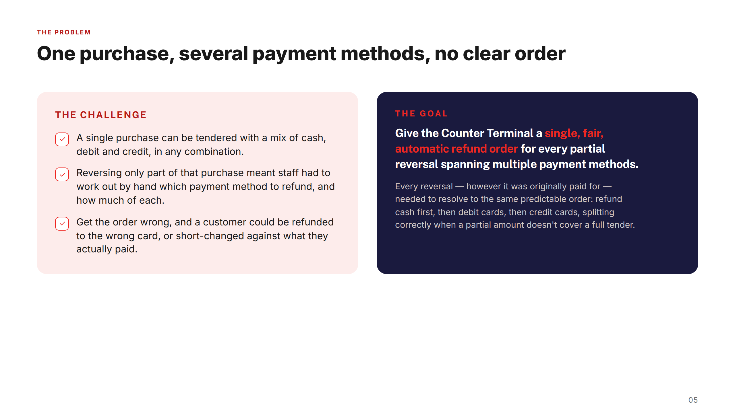
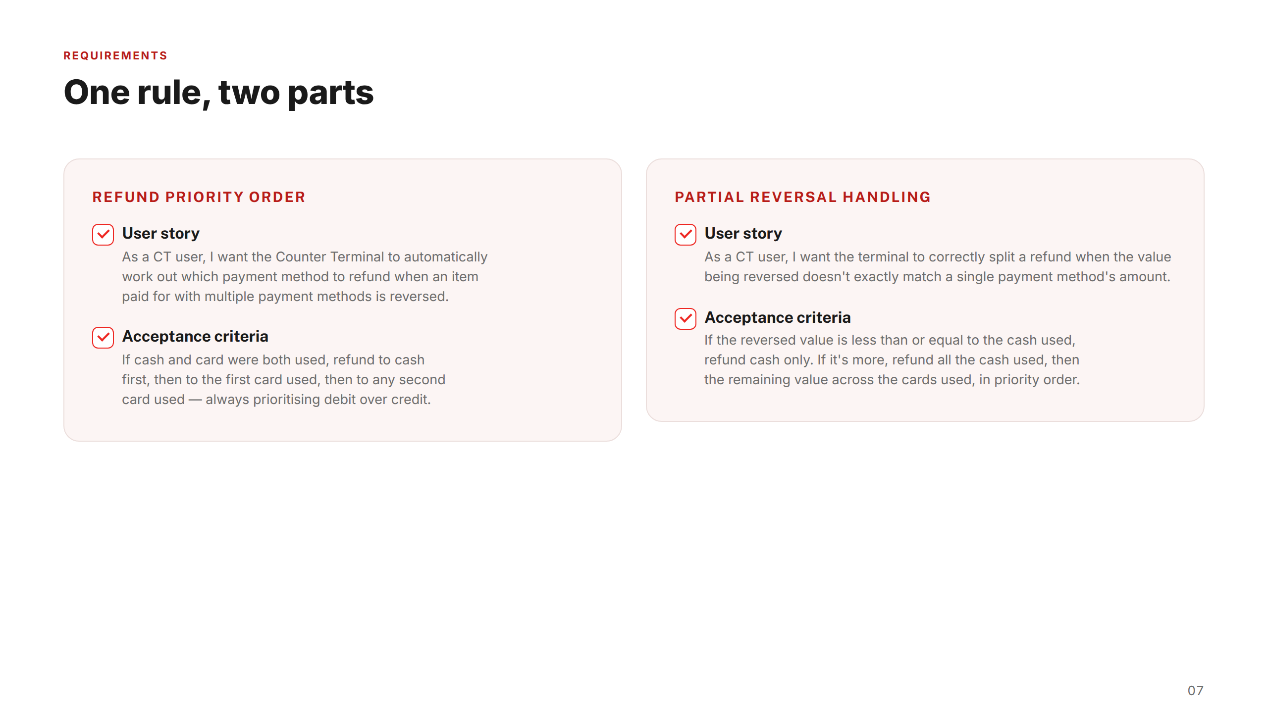
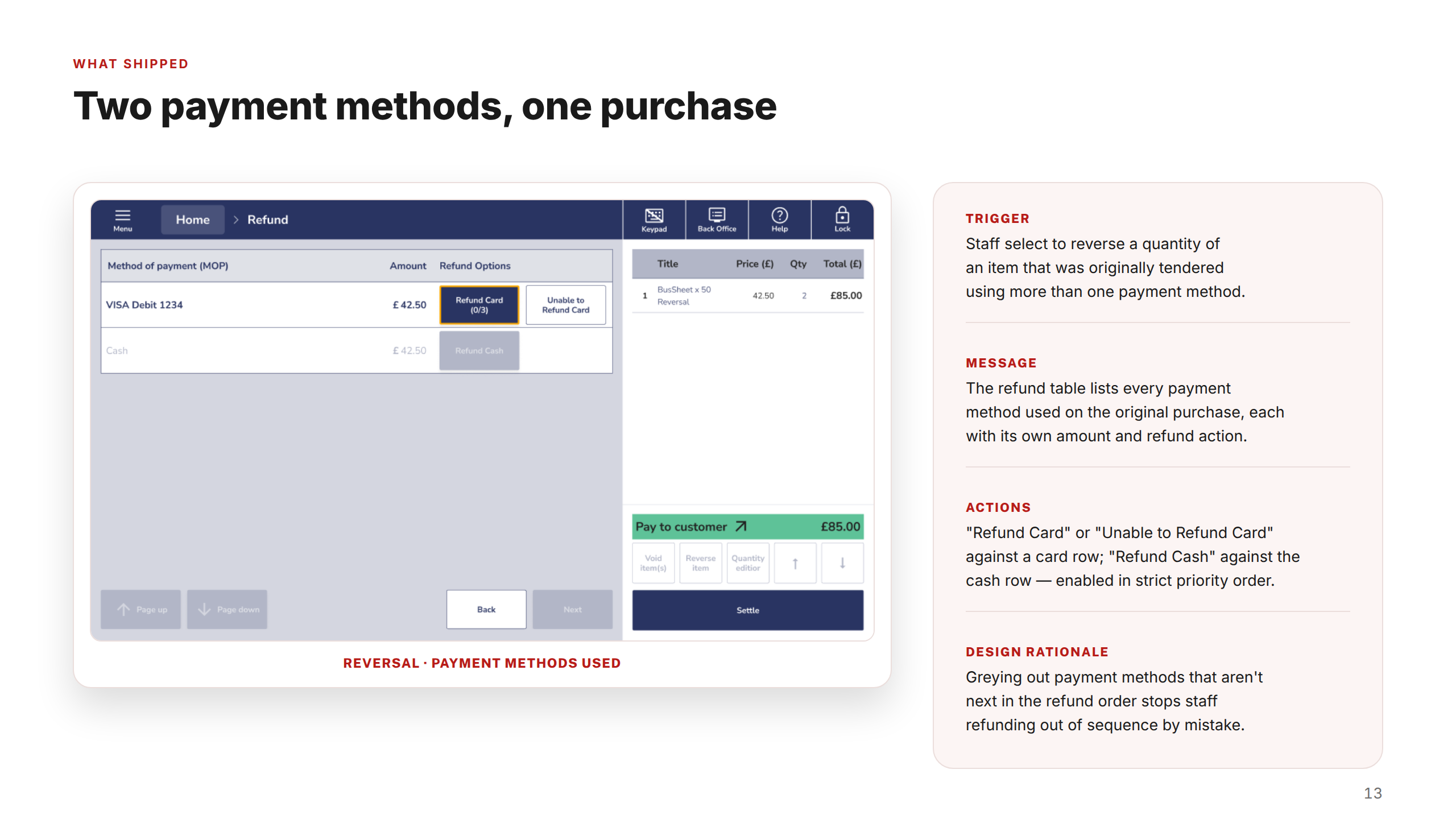
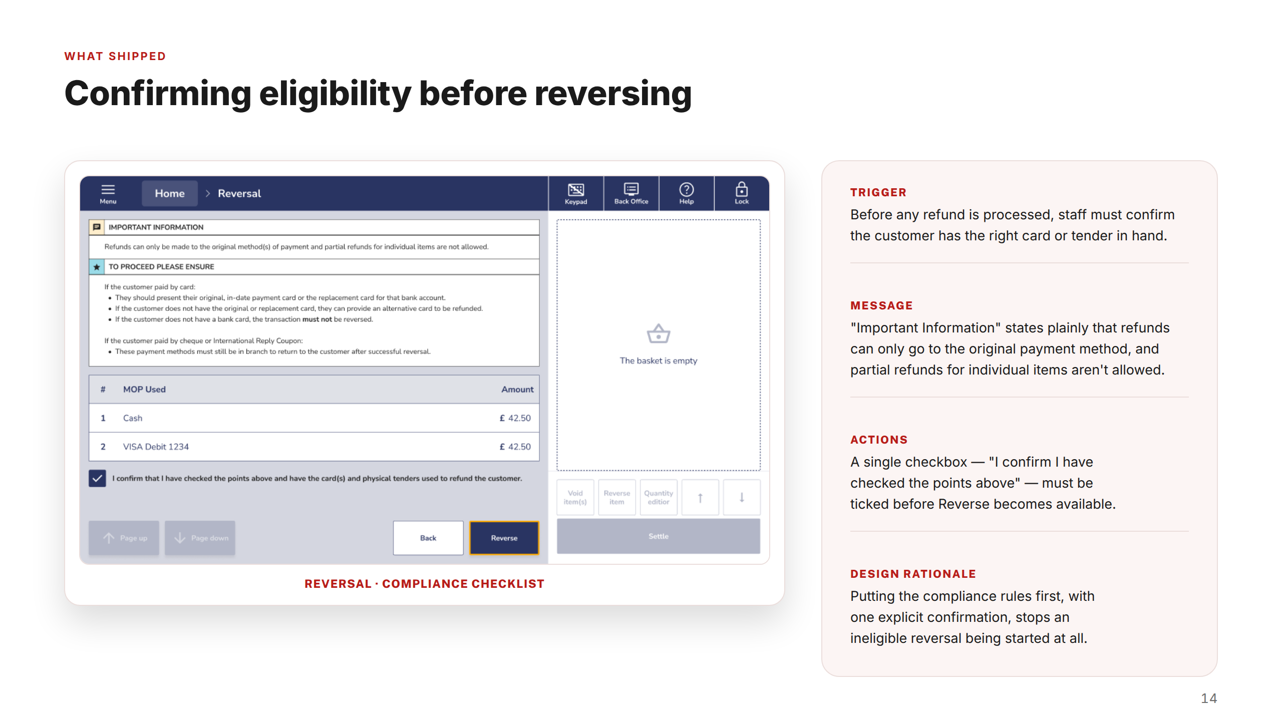
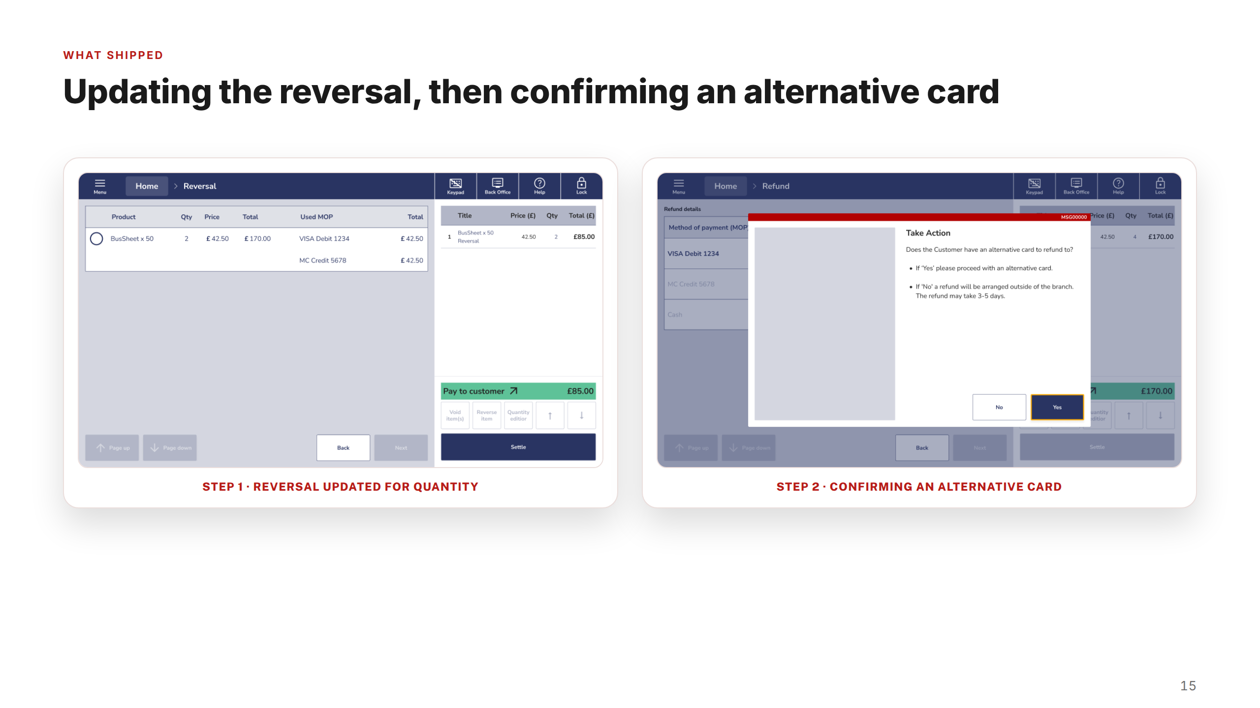
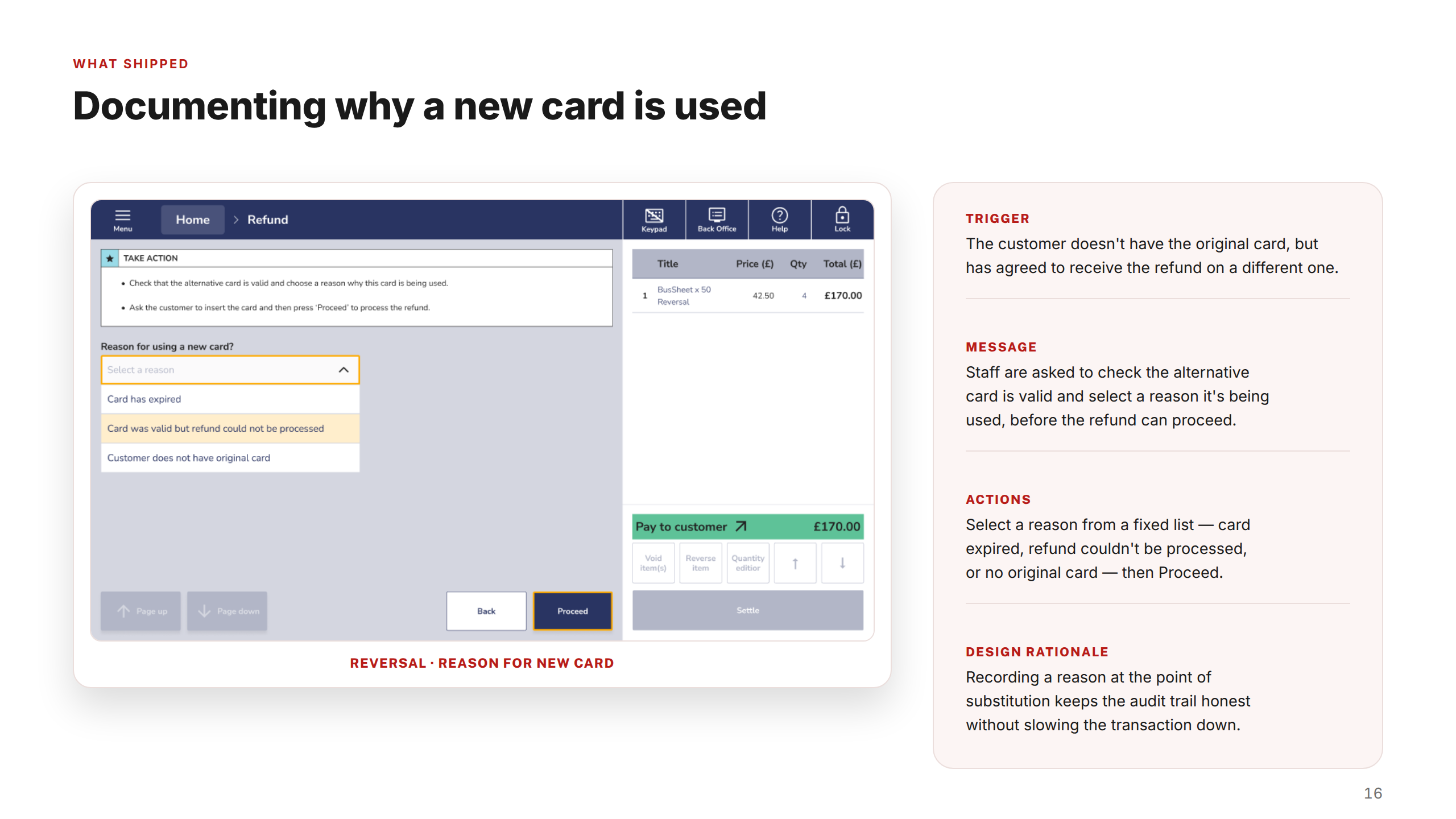
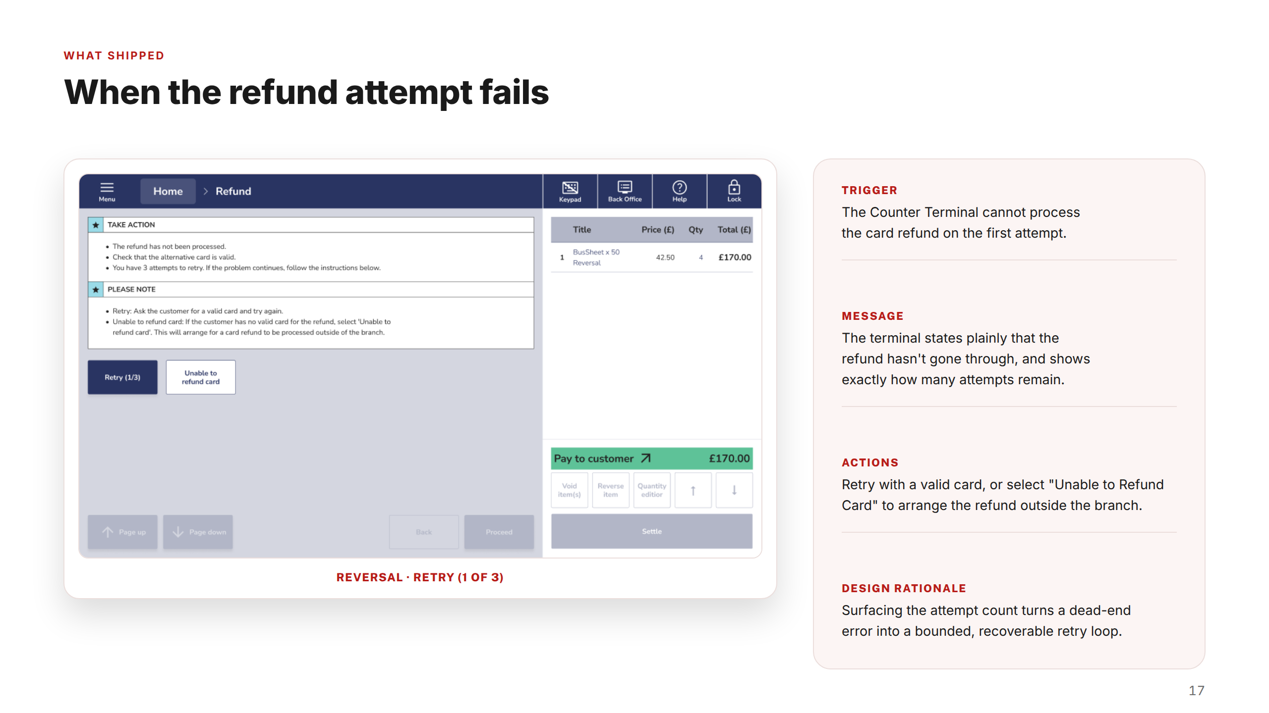
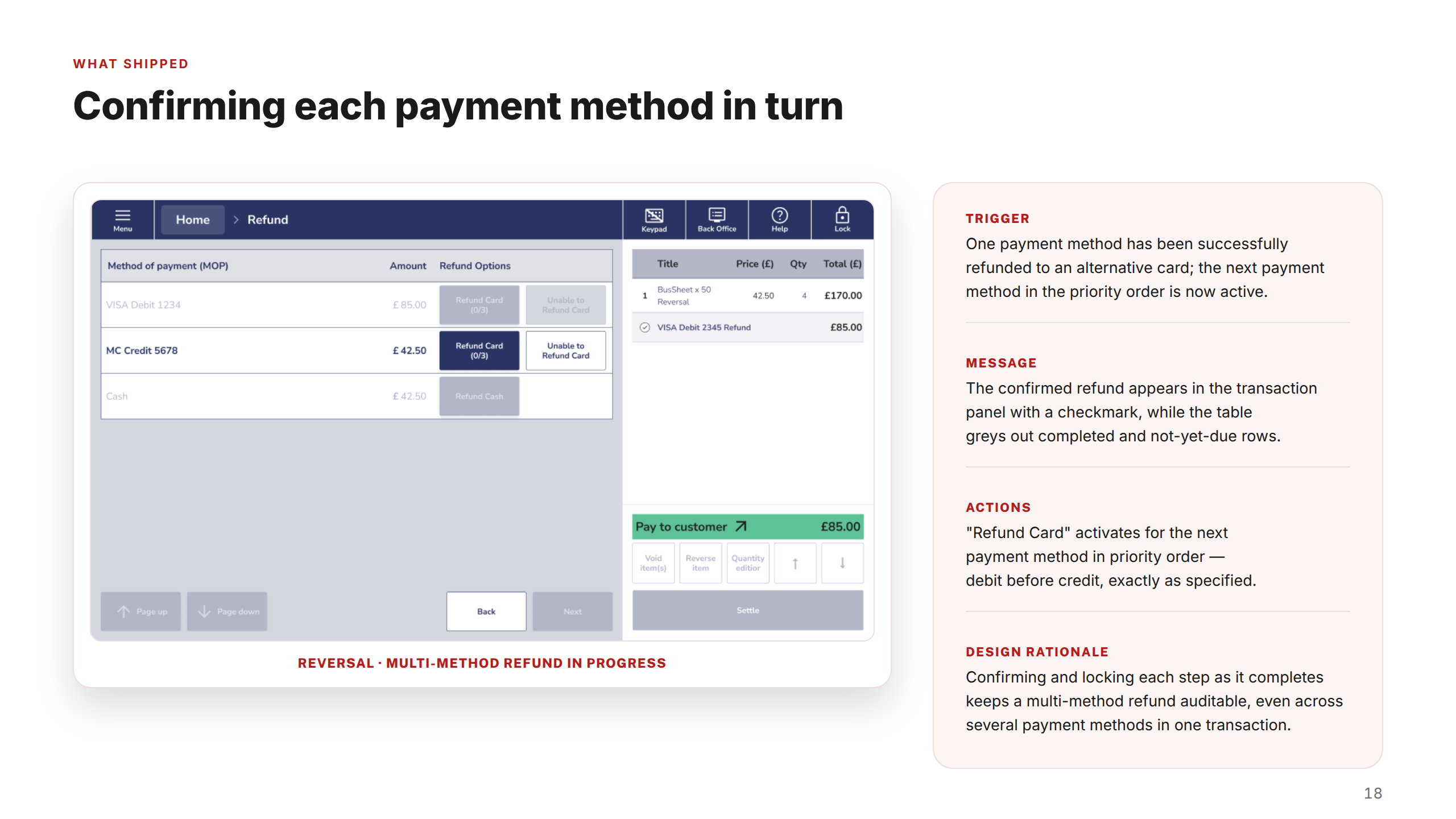
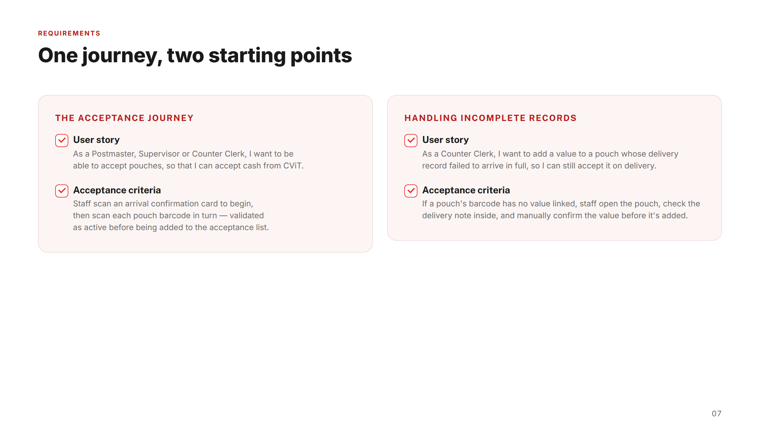
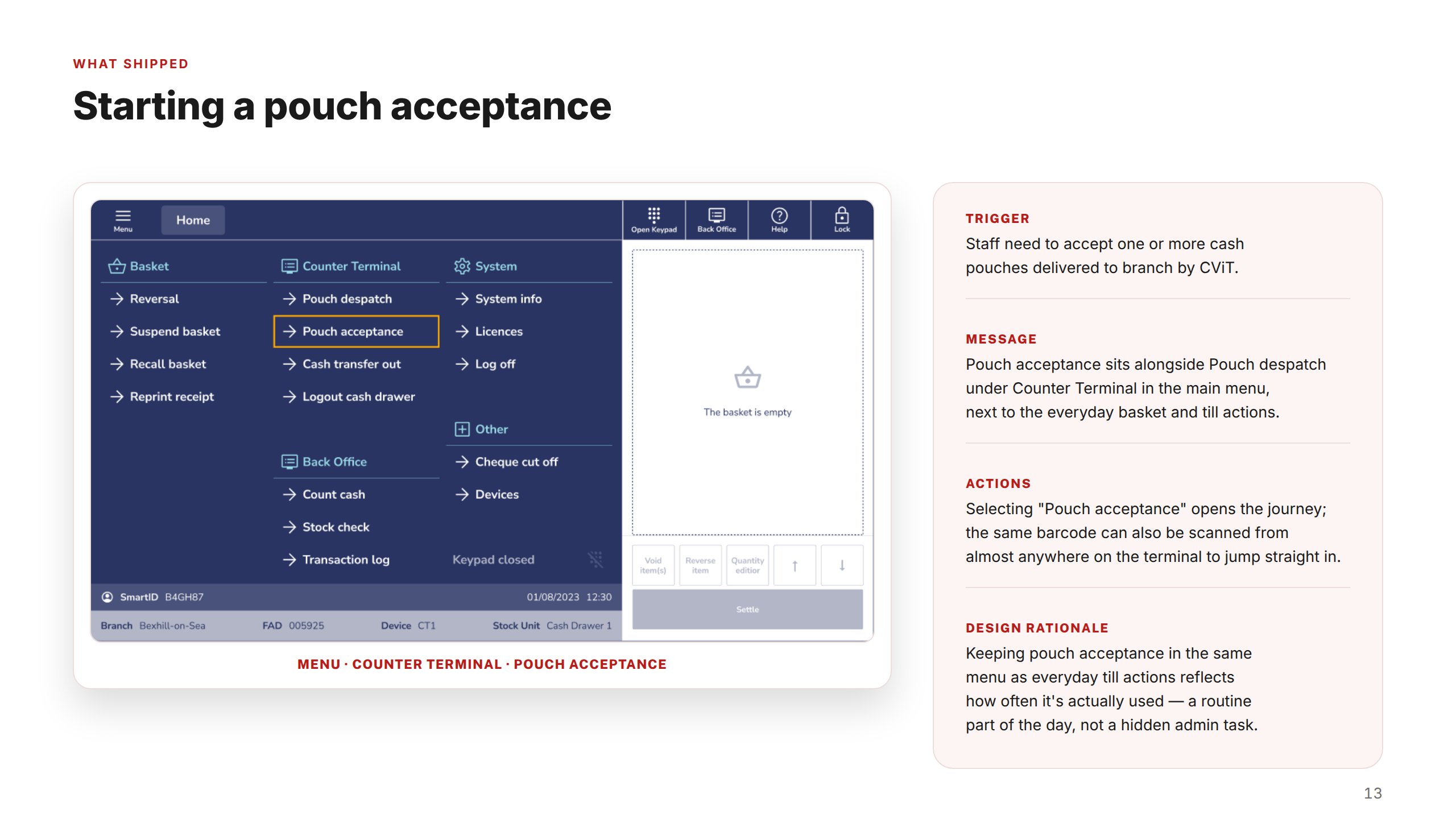
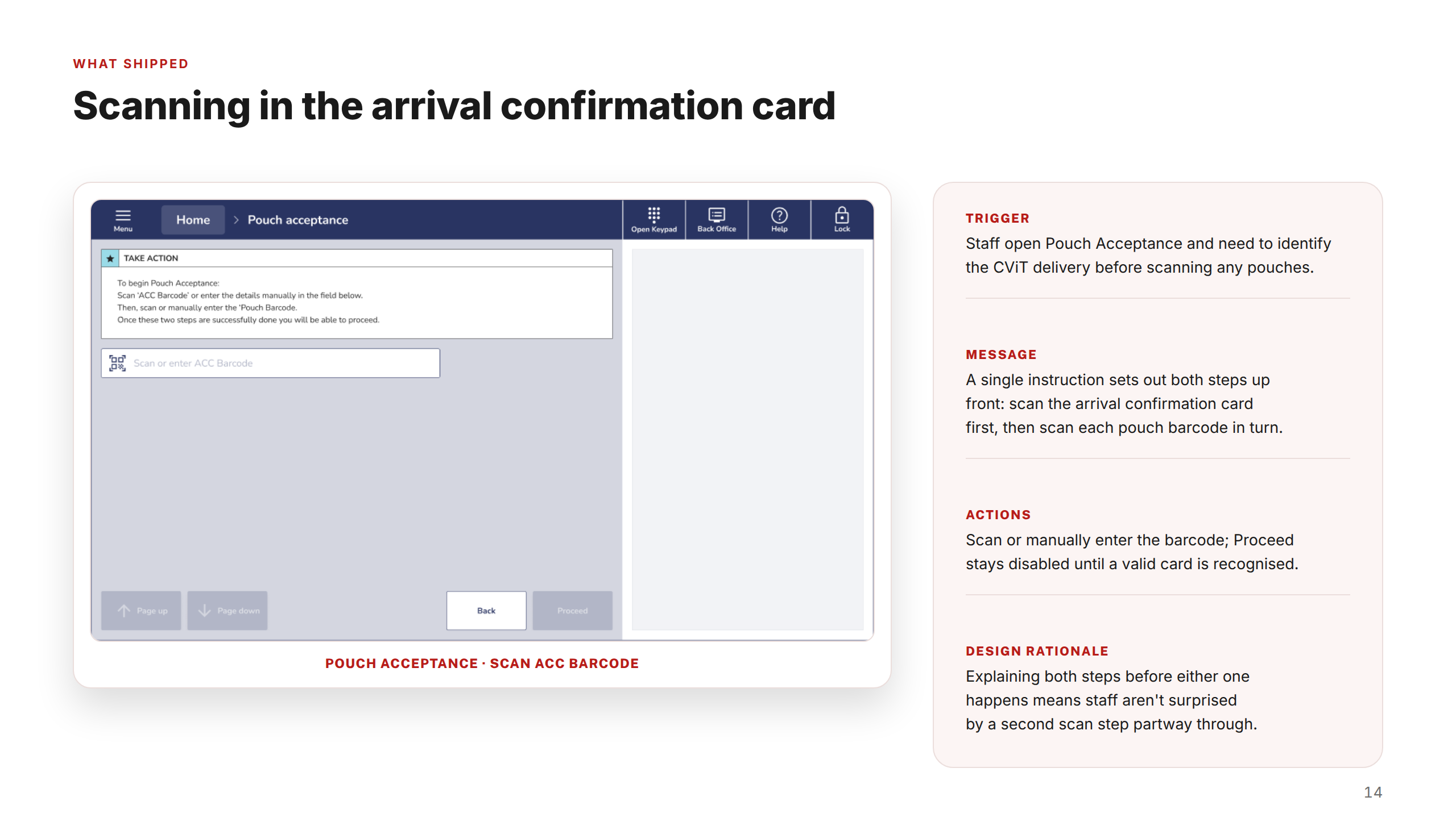
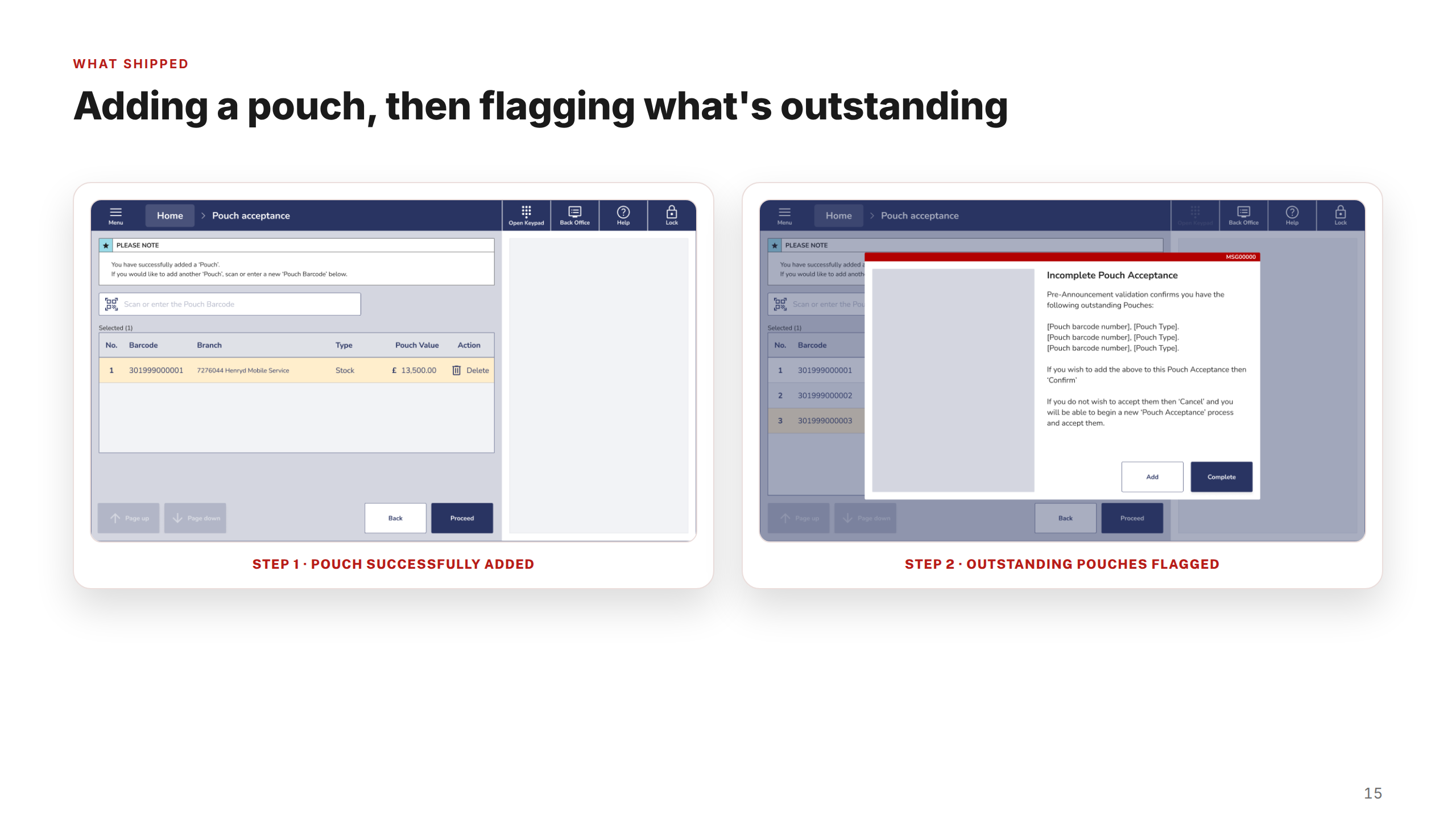
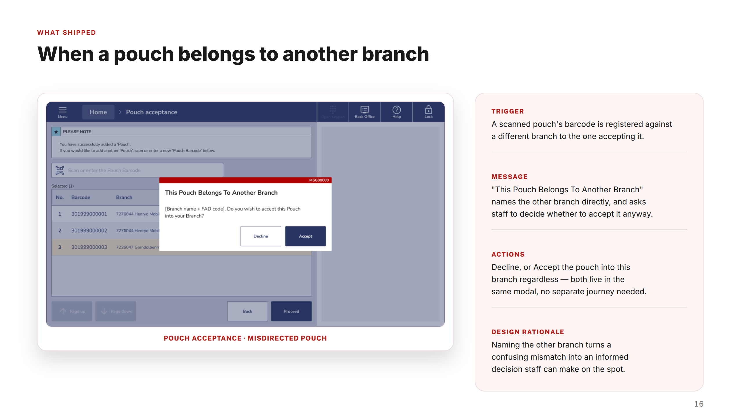
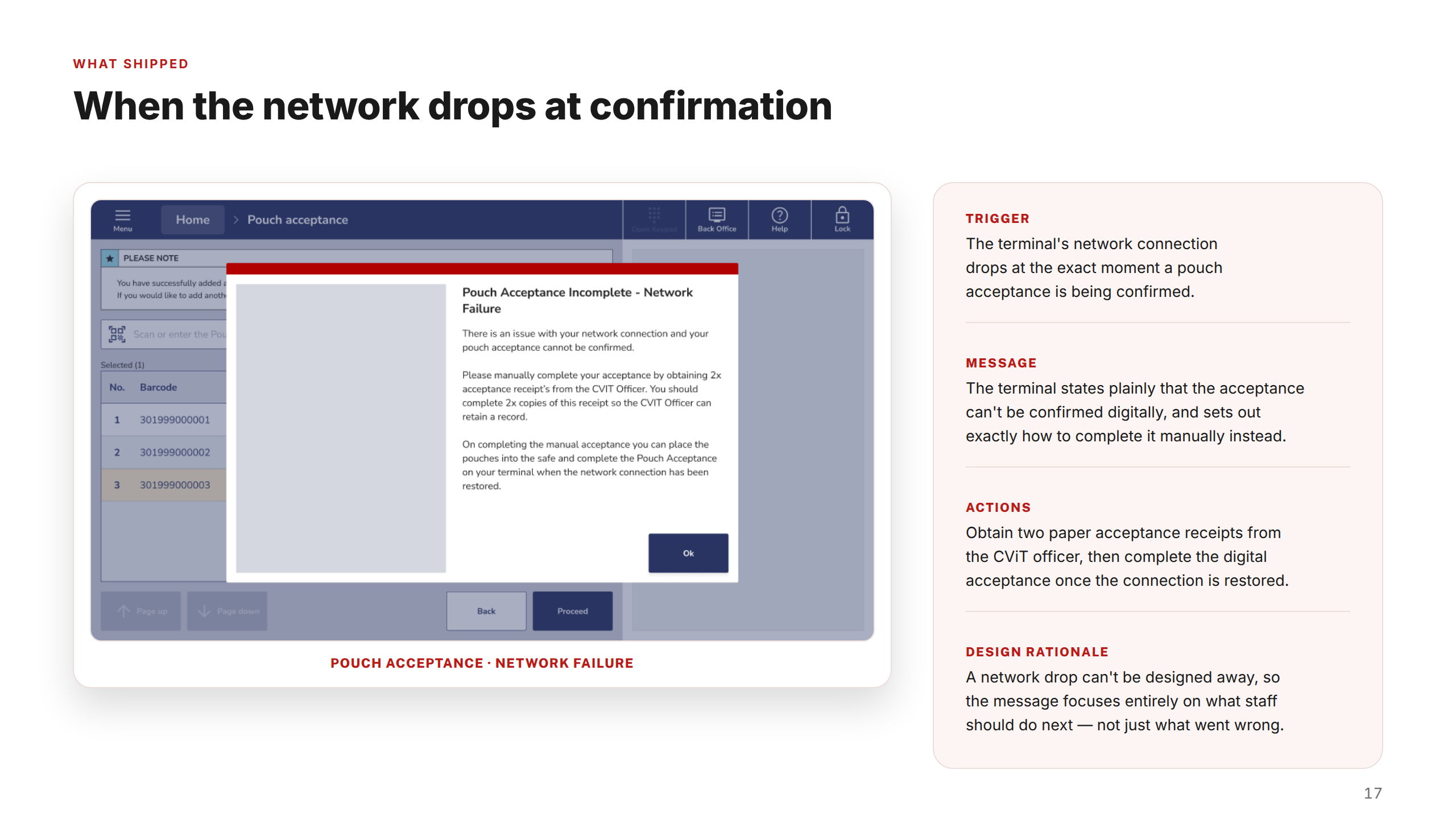
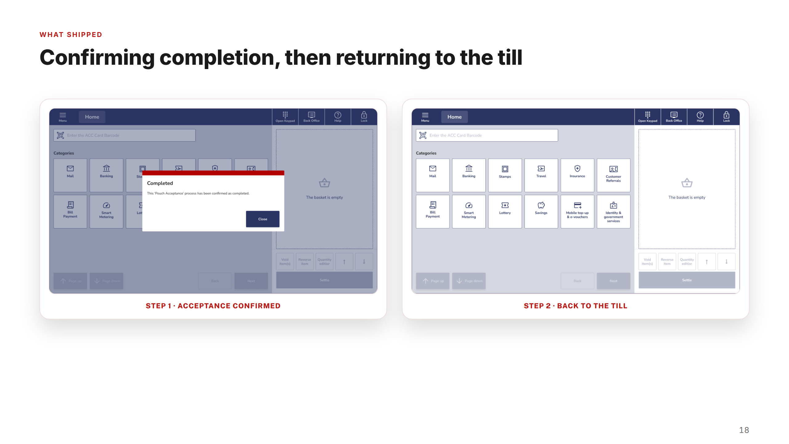
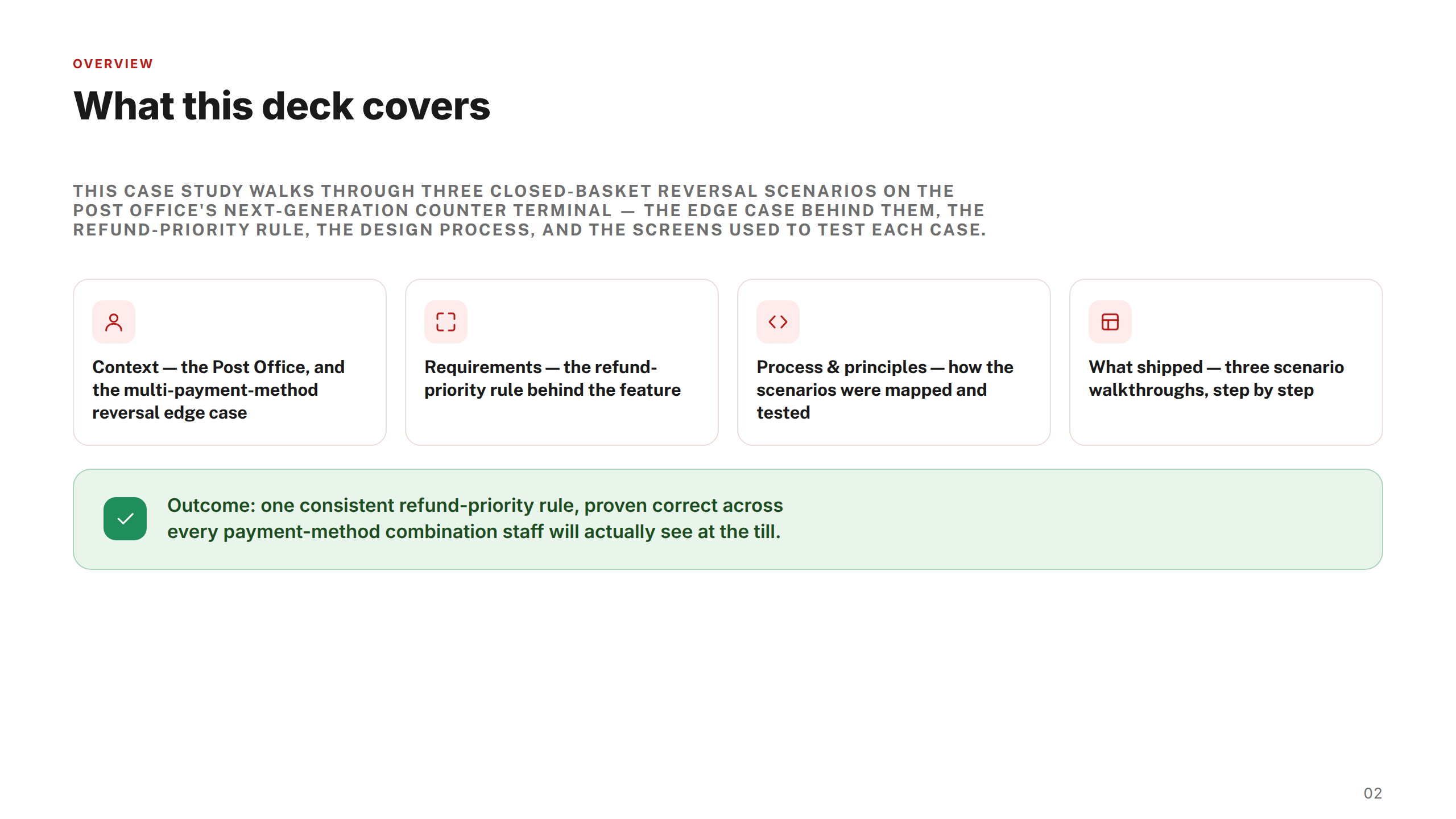
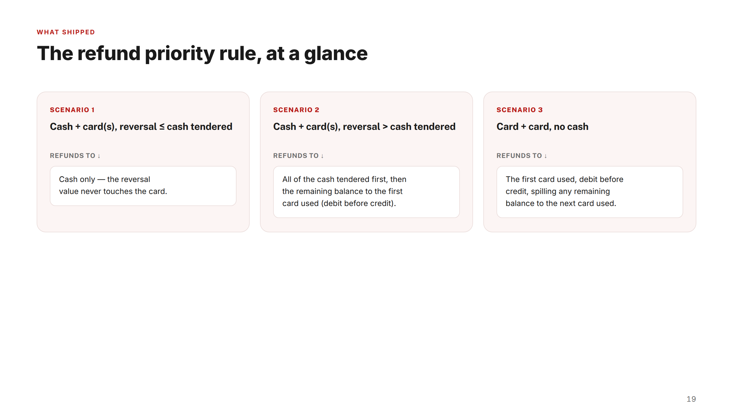
Four workstreams, each presented as a standalone case study deck. These cover Cash Drawer Association, Refund on Failed Transaction, Pouch Acceptance, and Closed Basket Reversals — sequenced in the order they were designed and delivered.
Post Office — Cash Drawer Association Case Study
1 / 20
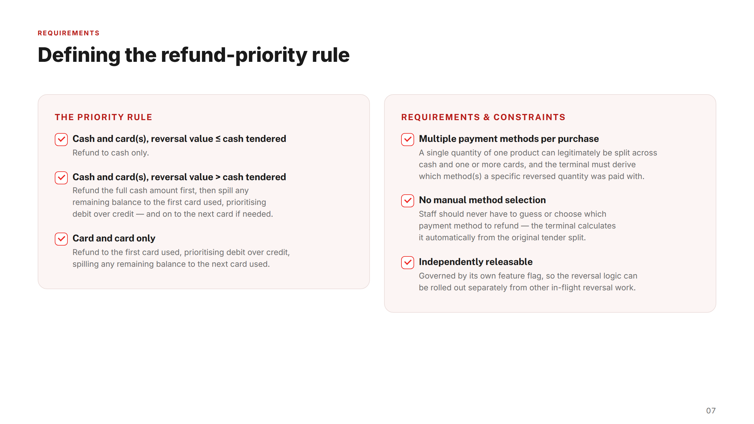
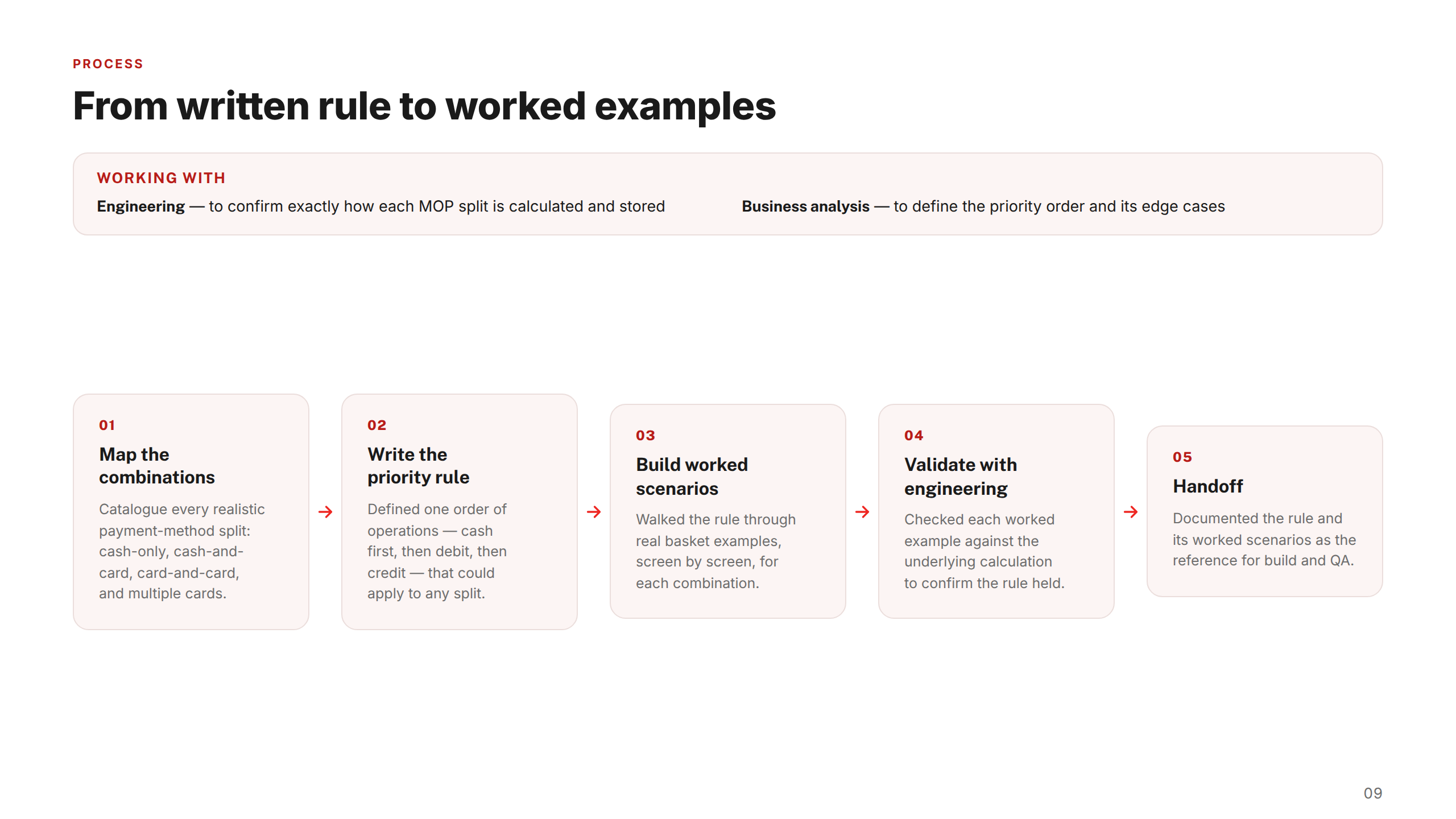
Post Office — Closed Basket Reversals Case Study
1 / 21
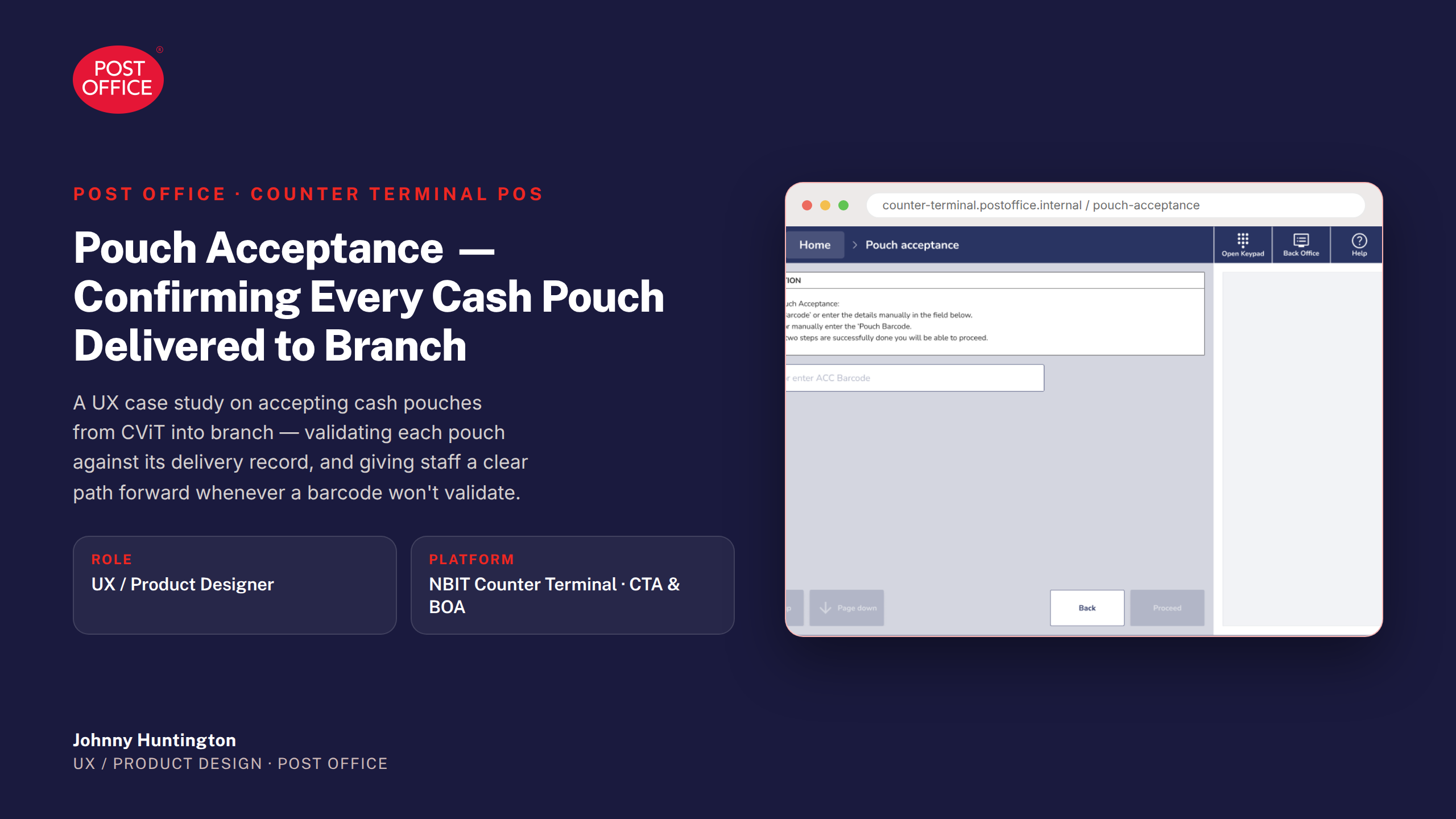
Post Office — Pouch Acceptance Case Study
1 / 21
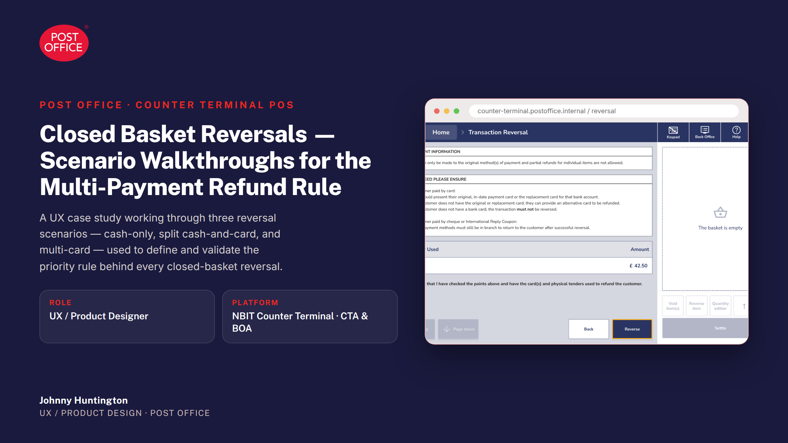
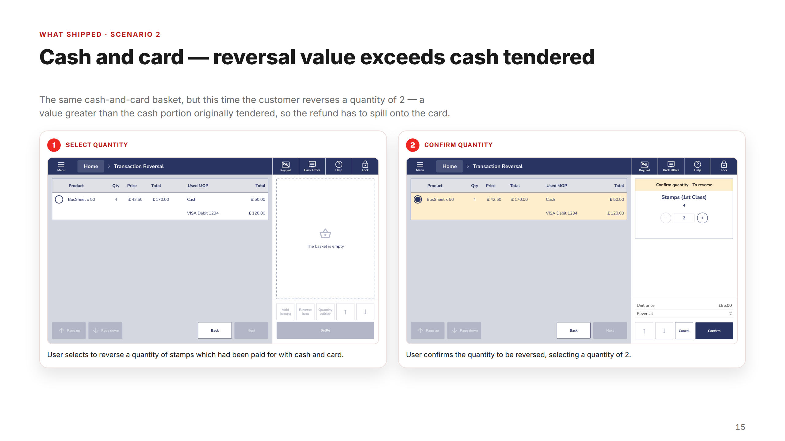
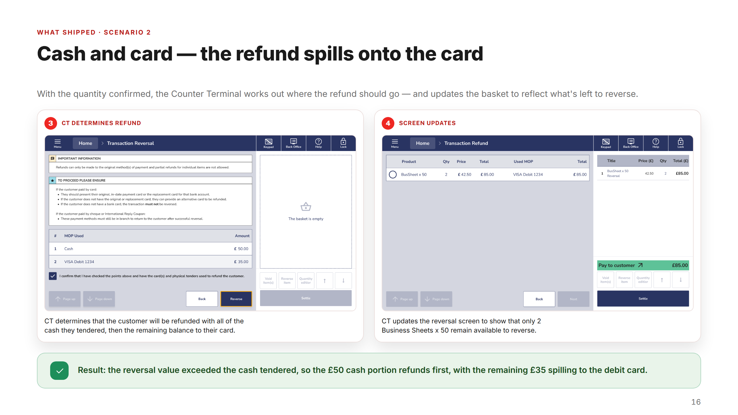
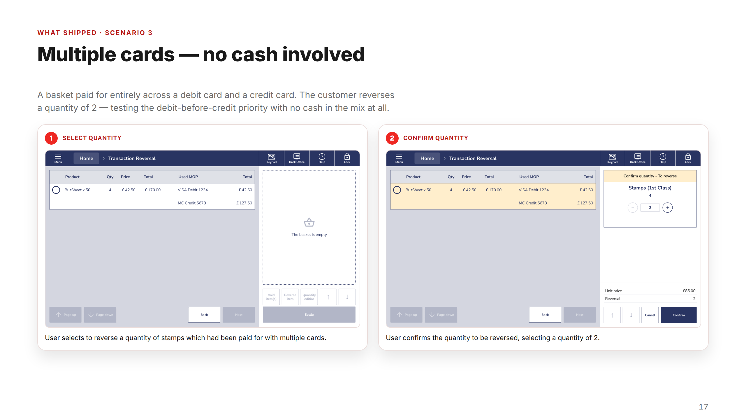
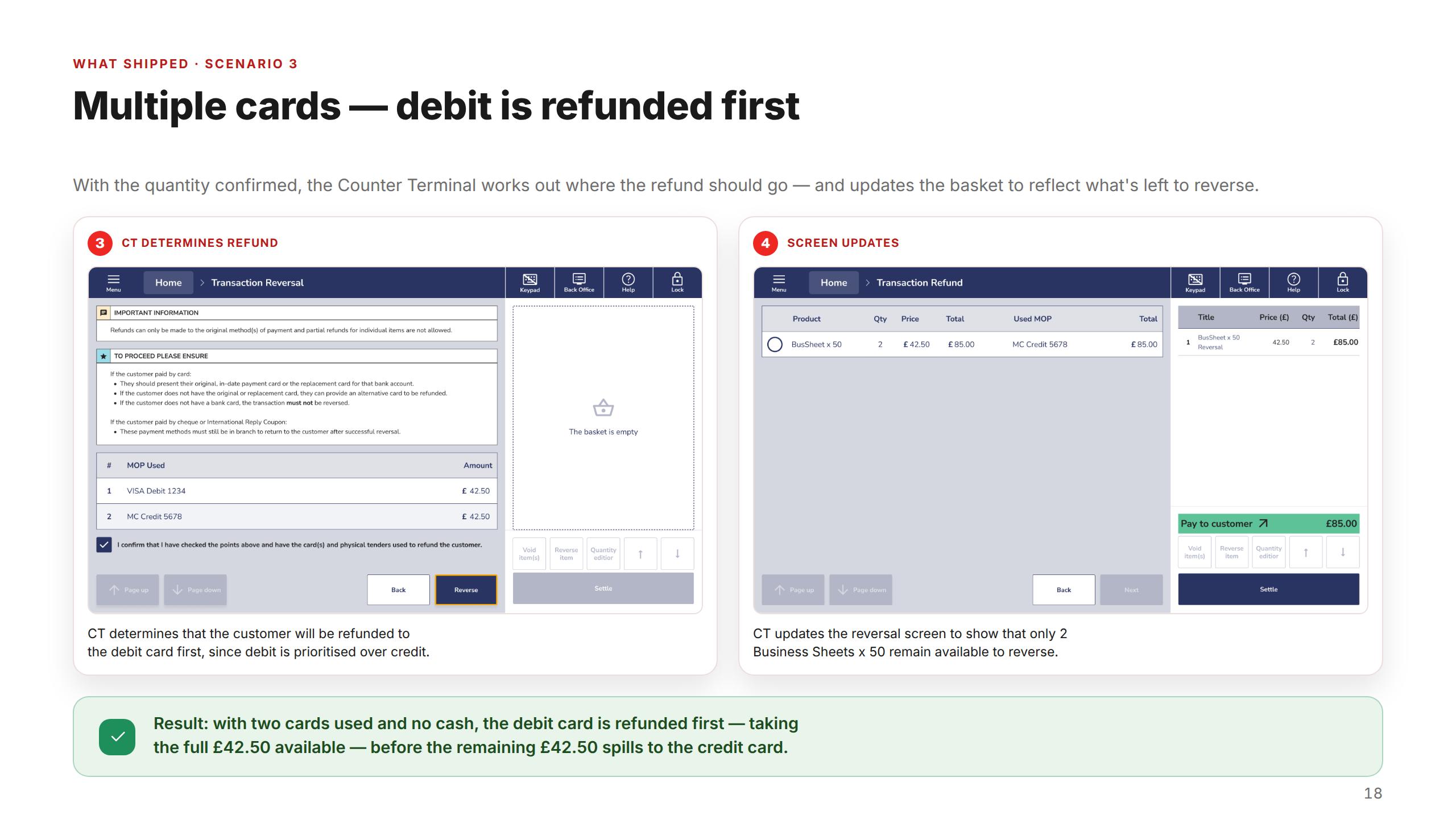
Post Office — Closed Basket Reversals Scenario Walkthroughs
1 / 22
Constraints & tradeoffs
What made this environment genuinely complex to design for.
Cross-application state
CTA and BOA are separate applications that each hold partial views of the same transaction. Designing for states that existed in one system but were invisible to the other required close engineering collaboration to map exactly what each application could and couldn't surface — before a single screen could be designed.
No established design system
The Counter Terminal had no mature component library at the start of the engagement. Each feature was designed within an emerging system — balancing internal consistency with delivery speed, and in doing so, contributing to system-level patterns that didn't yet exist.
Postmaster diversity
The 11,500-branch network spans high-street franchise managers and sole traders in rural communities. Designs had to work across highly variable digital literacy levels — with no assumption of familiarity beyond the core terminal workflow, and clear guidance at every step for both postmasters and counter clerks.
Explicit de-scoping under pressure
Three parallel workstreams meant some lower-frequency edge cases were deferred to later sprints. Every de-scoping decision was made explicitly — prioritised against real support-call volume, agreed with product and engineering, and documented — rather than quietly dropped.
Outcomes
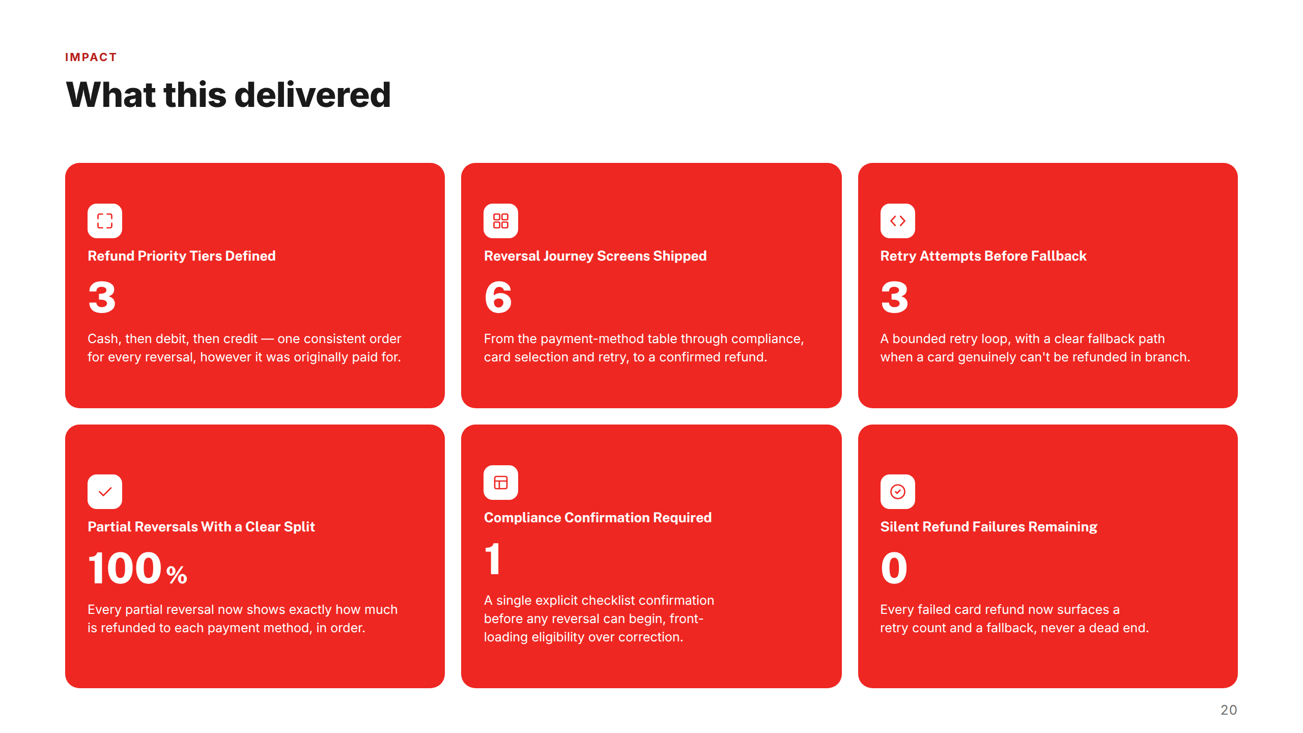
Scope & impact at a glance
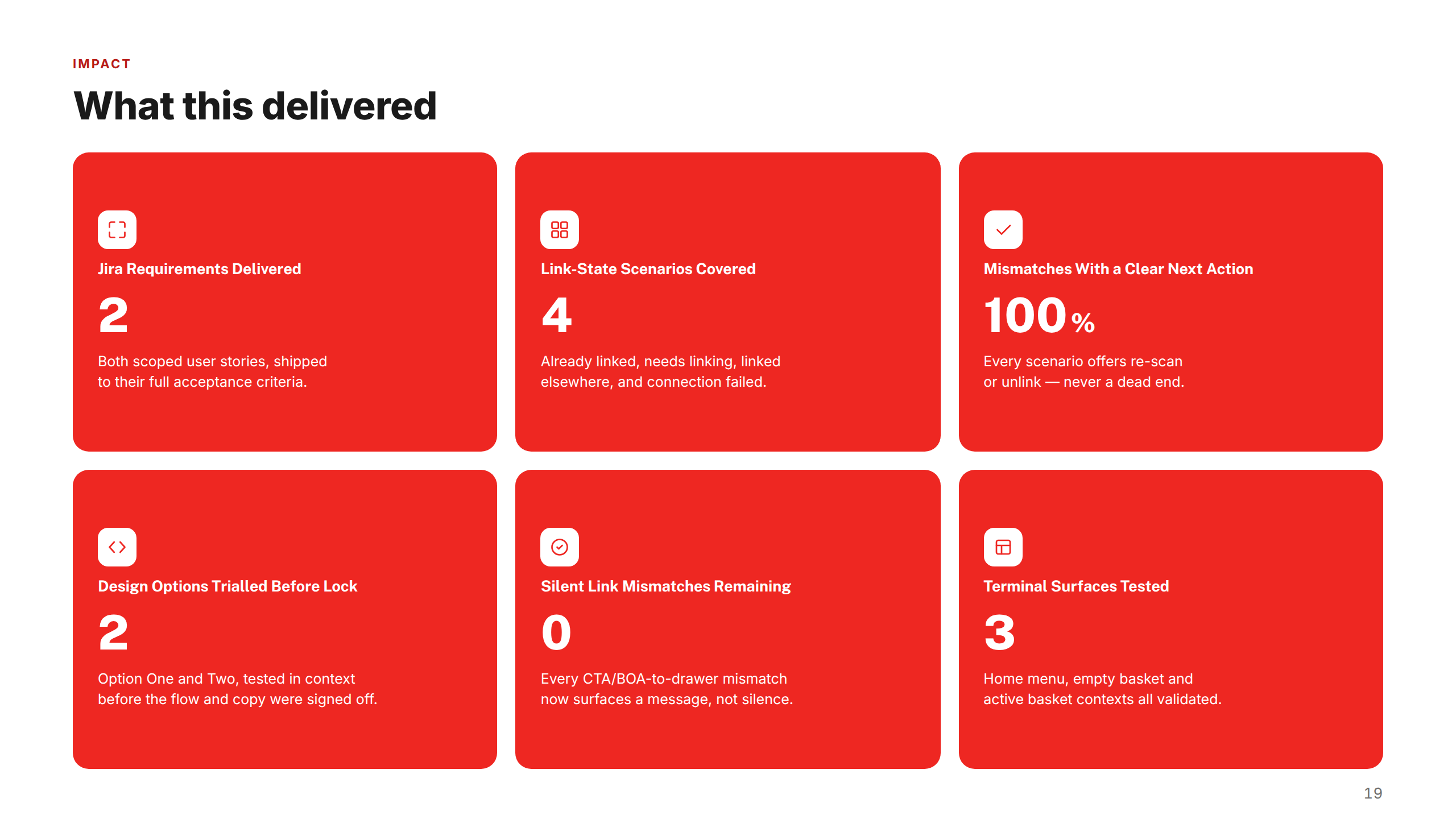
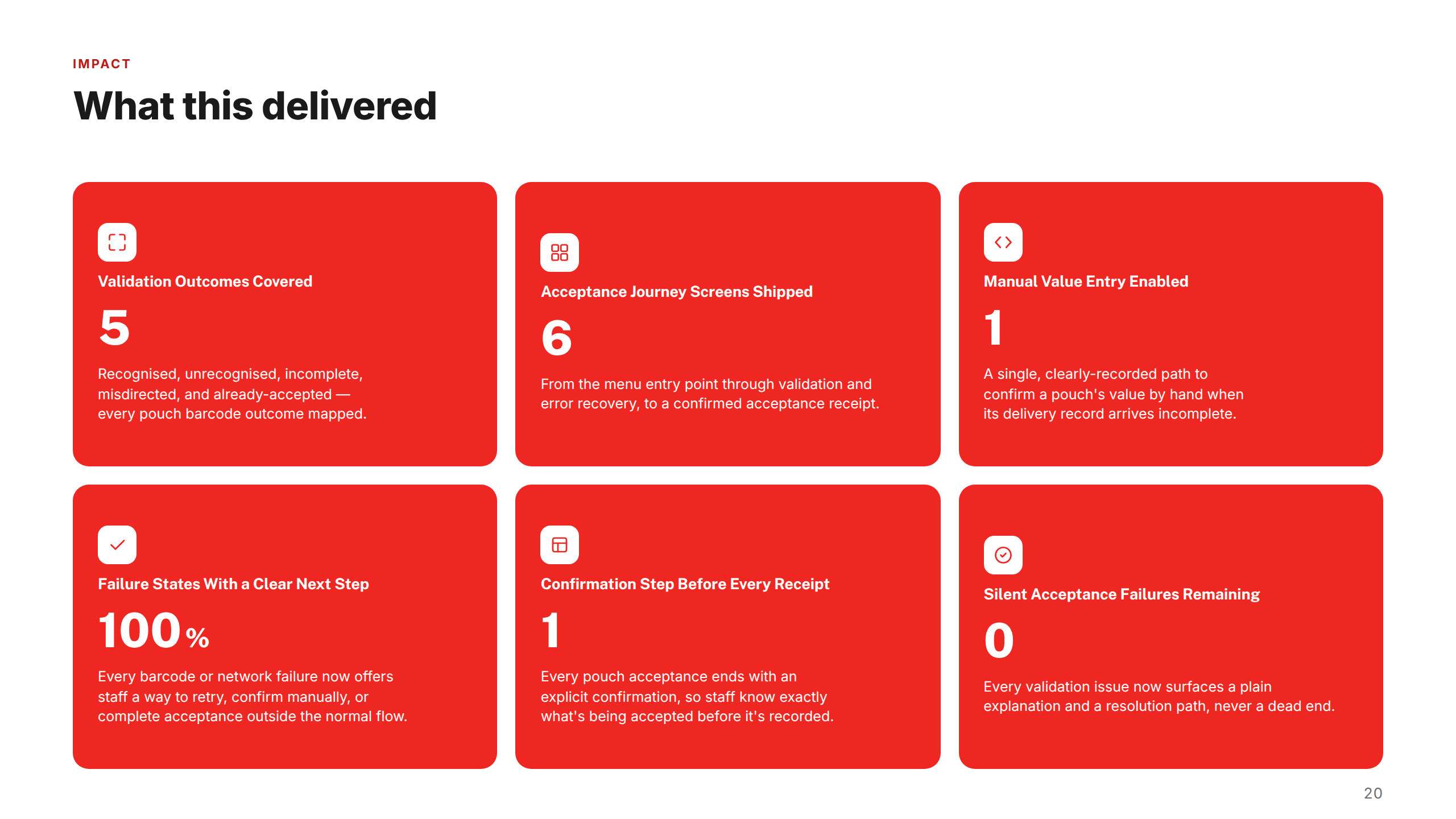
3
Features shipped
Cash Drawer Association, Closed Basket Reversals, and Pouch Acceptance — all delivered to full acceptance criteria across the Counter Terminal POS.
100%
Error states covered
Every link-state mismatch, reversal scenario, and pouch acceptance error now surfaces a clear message and a concrete next action — never a dead end.
0
Silent failures remaining
No CTA/BOA mismatch, closed basket reversal, or failed pouch scan leaves postmasters or clerks without guidance on what to do next.
"I am really pleased with his designs for our project. He has smashed it with understanding and creating the flows of each story fully. Really excellent work — this has come together really nicely now after we were a bit start/stop with previous UX folks. Johnny is an asset to the Counter Terminal team and a really lovely guy to work with!"
W. Zafar, Business Analyst, Post Office
"I just wanted to give Johnny and his UI/UX team mate a massive shout out for all their help with the 'Transaction Recovery' process. Both have been a massive help in forming this proposition."