Argos
About Argos
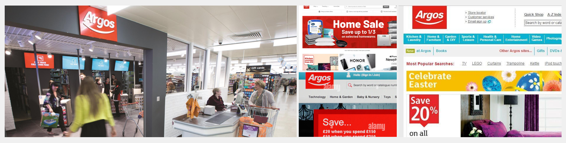
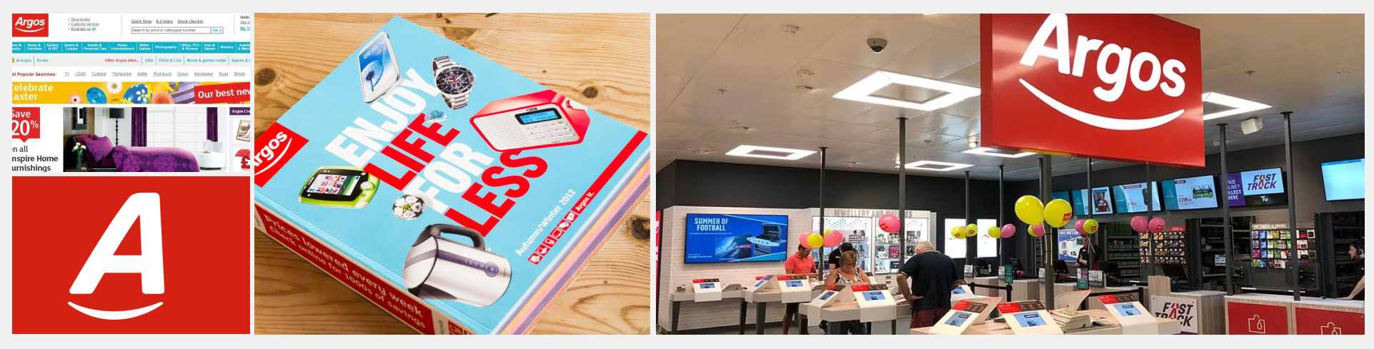
Argos is one of the UK’s leading digital retailers, known for its unique blend of high-street presence and fast, flexible fulfilment options. As part of the Sainsbury’s Group, Argos offers a wide range of products across technology, homeware, toys, and appliances, serving millions of customers both online and in-store.
With a strong focus on convenience, Argos pioneered same-day delivery and click & collect at scale, supported by its extensive logistics network and local store footprint. Its digital-first strategy continues to evolve, offering a seamless shopping experience across mobile, desktop, and over 800 physical locations nationwide.
Overview
I worked with the Argos team (part of the Sainsbury’s group) to develop re-usable components in Figma for designers across the business to use when constructing web interfaces. In this role, I was part of a design operations team that included specialists in accessibility, engineering, product design, and customer experience. All the components listed below are now actively used across the Argos user experience and UI, and are also available to other brands within the group including Habitat, Tu, Nectar, and Sainsbury’s.
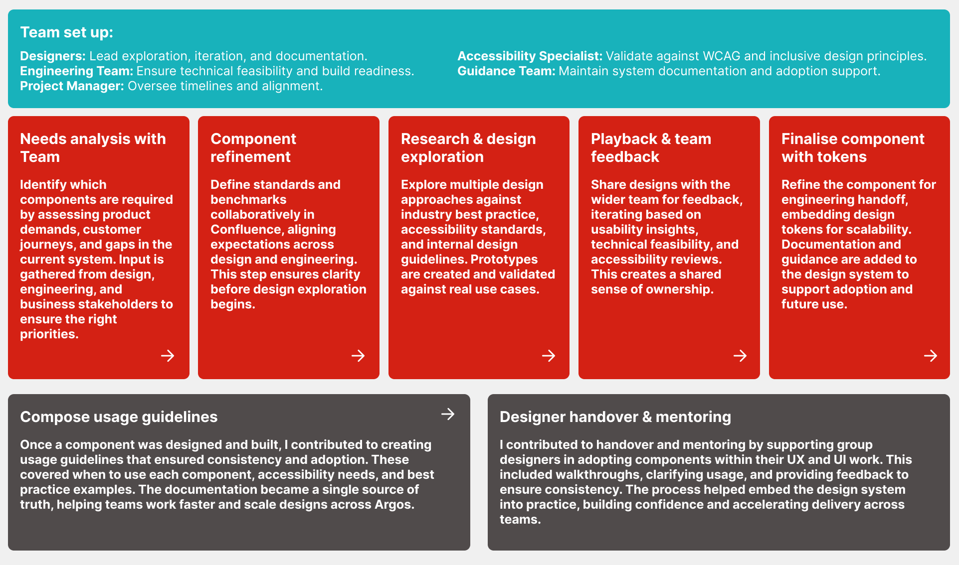
Component build process (high level)
This high-level process outlines how new components are identified, designed, tested, and finalised within the design system. By combining input from designers, engineers, accessibility specialists, and guidance teams, each component is built to meet business needs, follow best practice, and remain scalable across products.
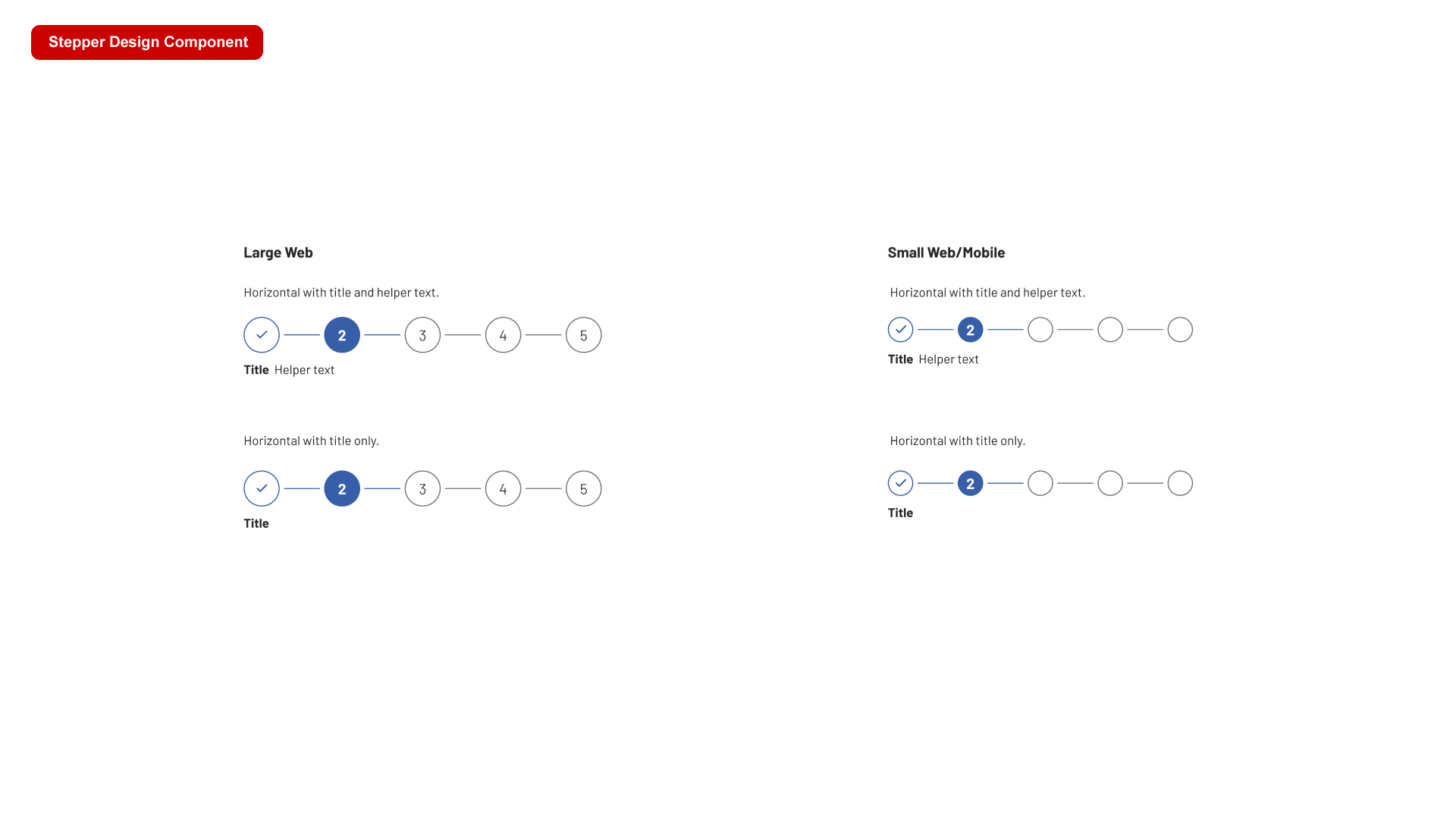
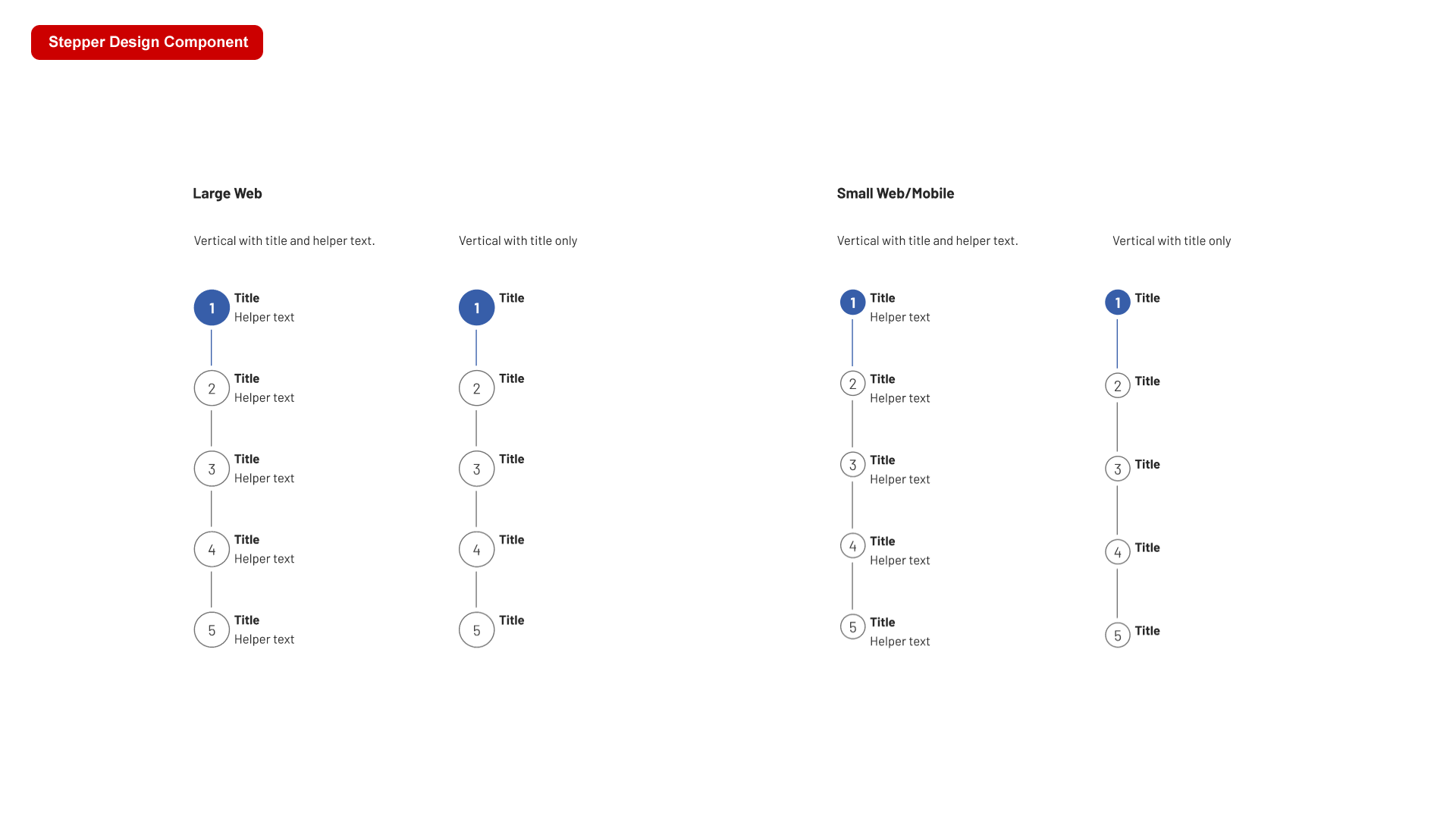
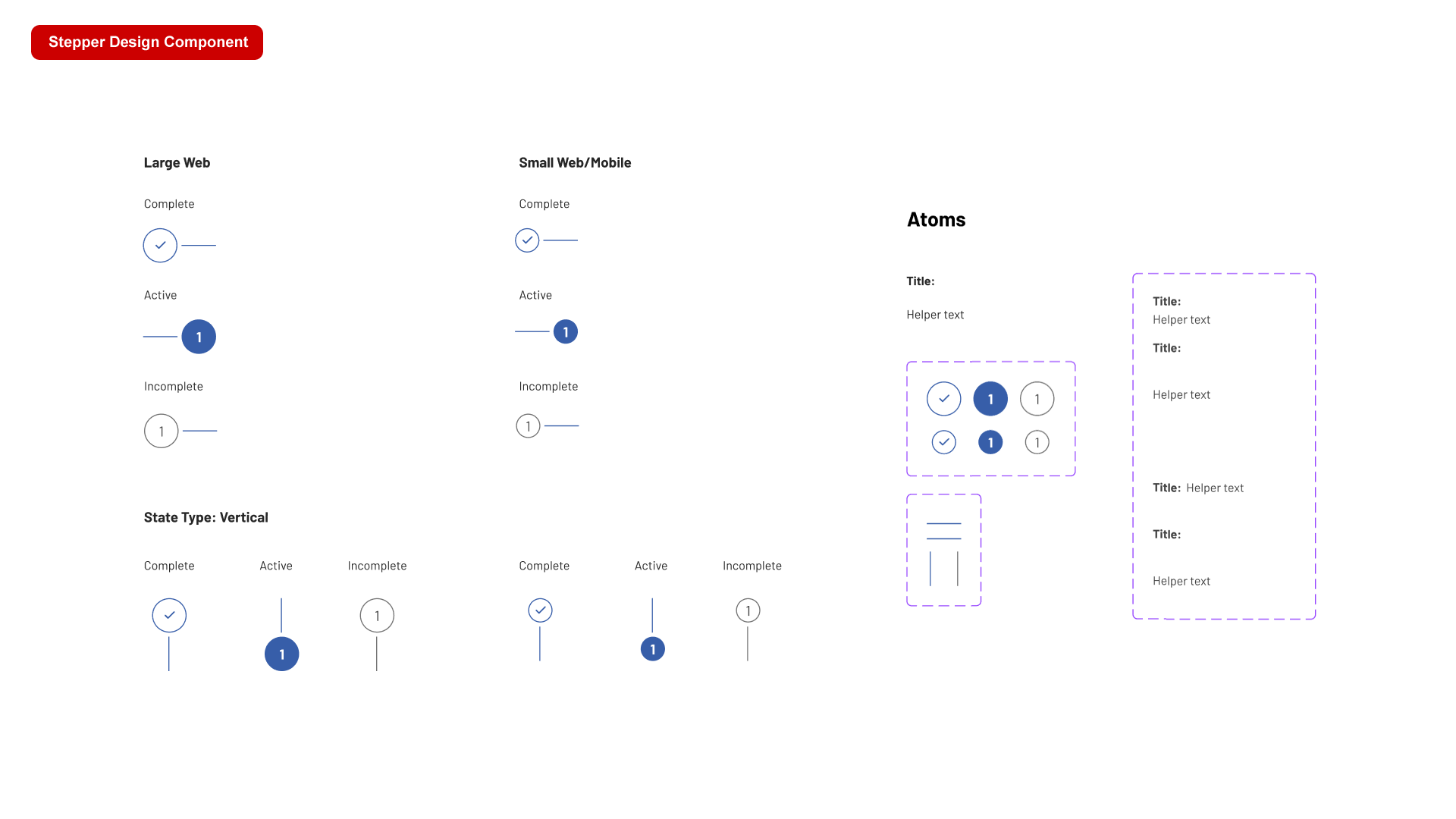
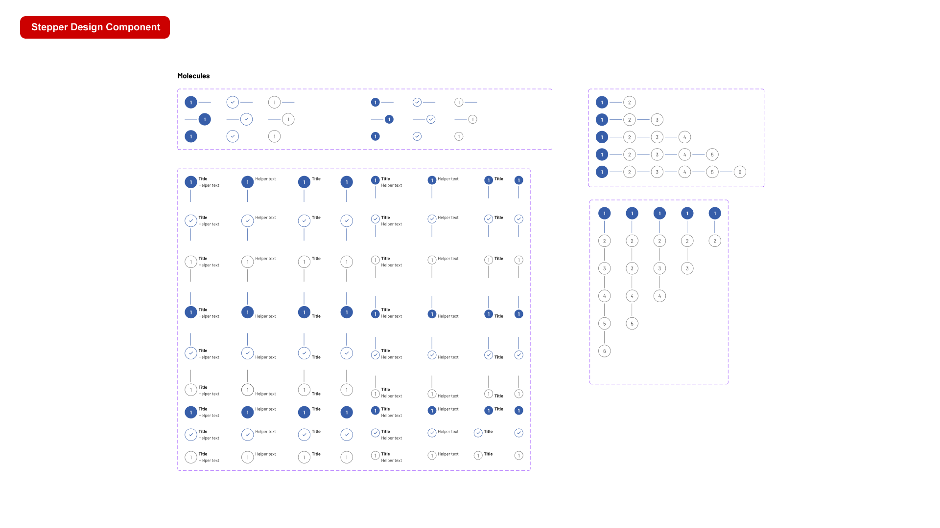
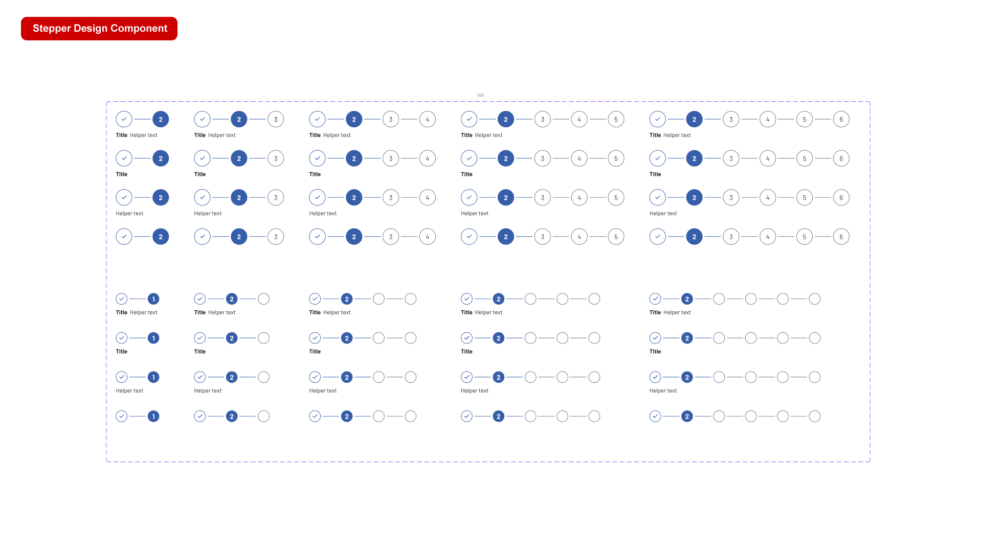
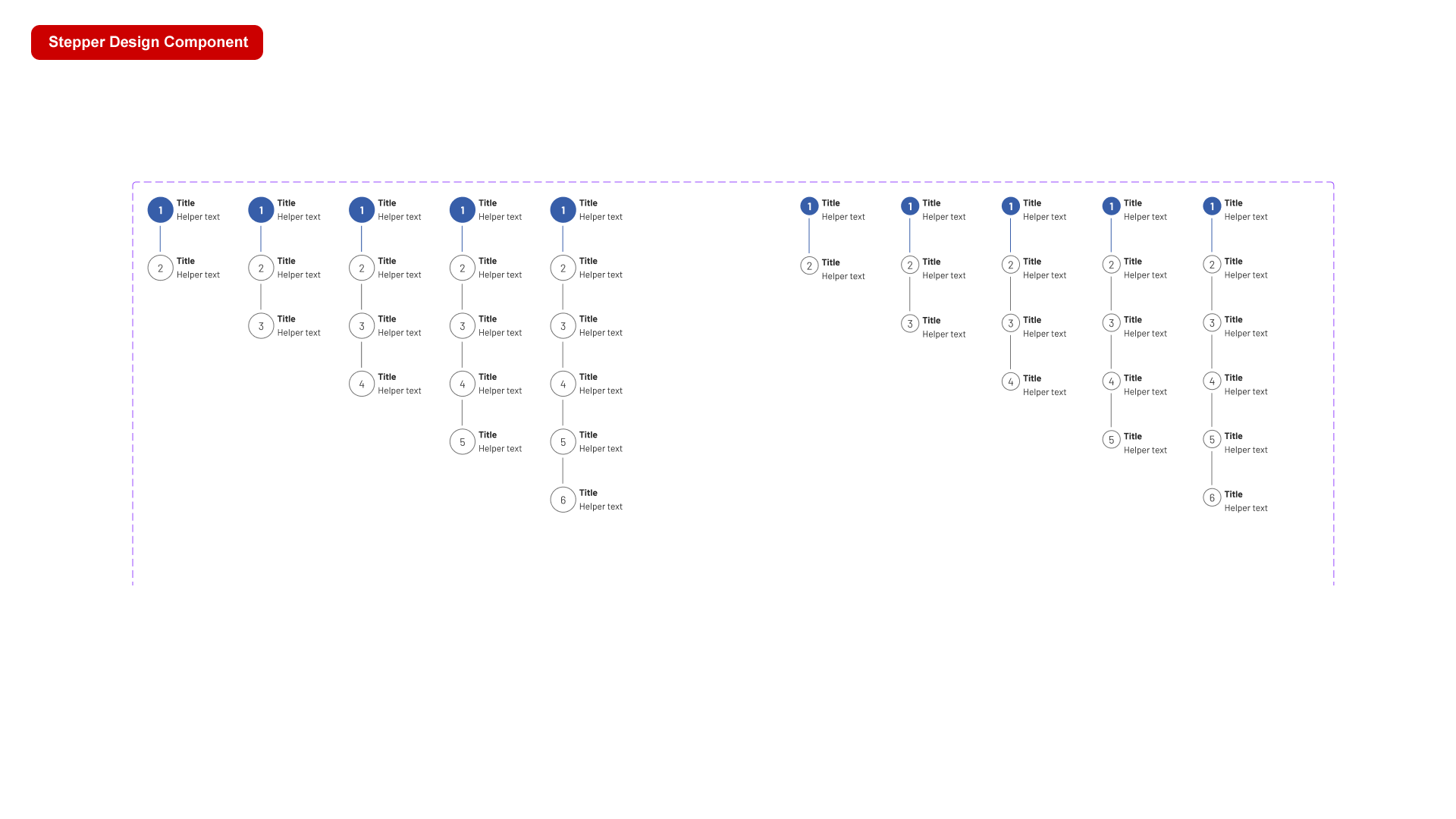
Stepper component
Steppers display progress through a sequence of logical and numbered steps. They may also be used for navigation. Steppers may display a transient feedback message after a step is saved.
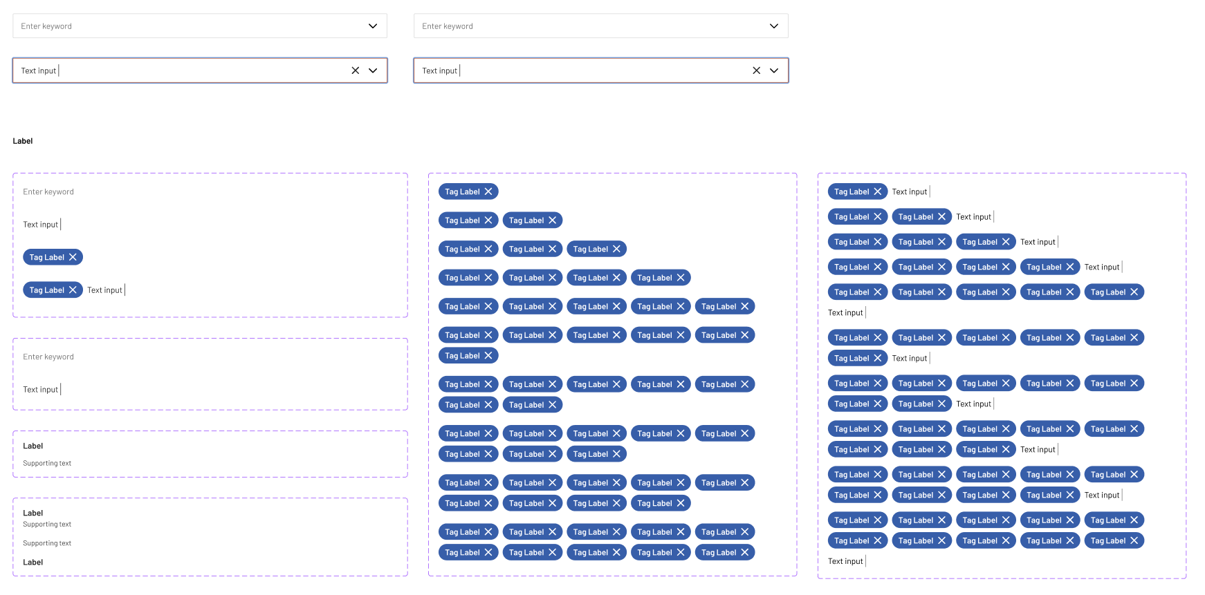
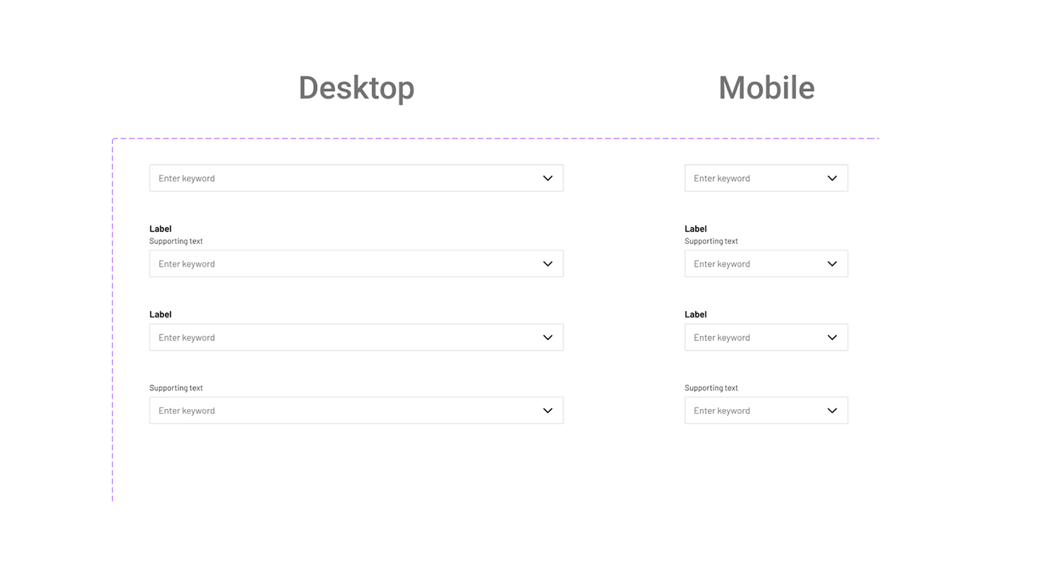
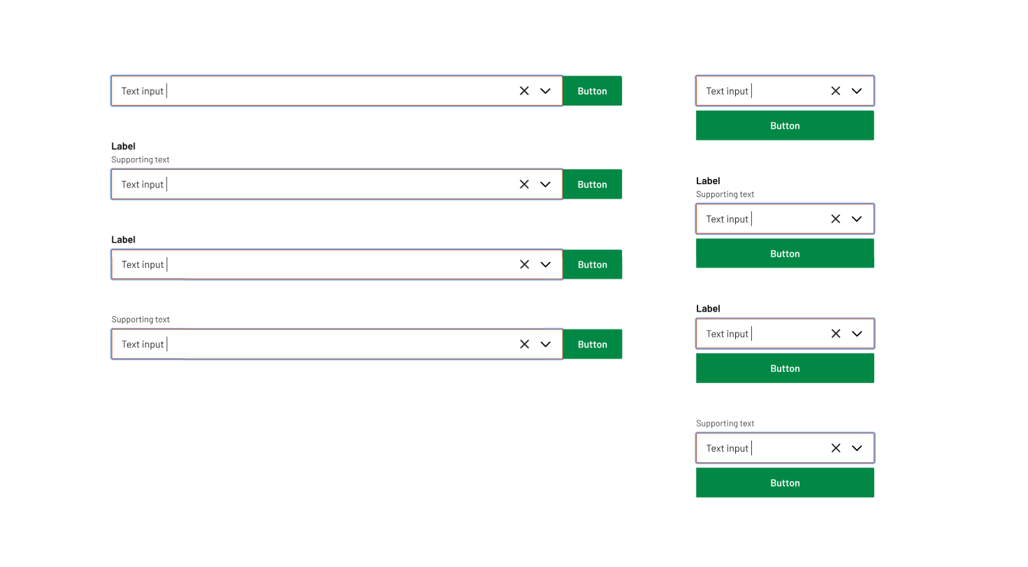
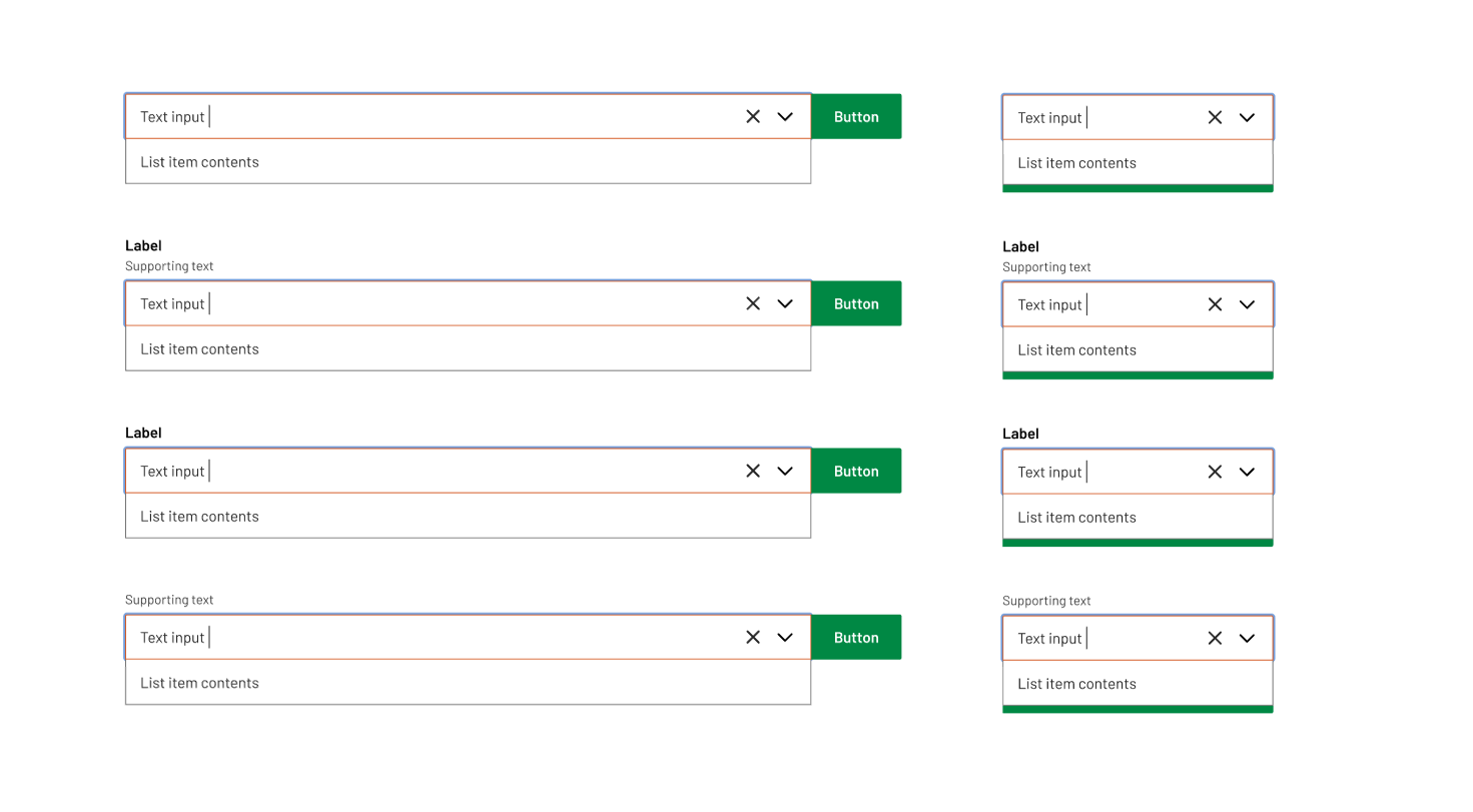
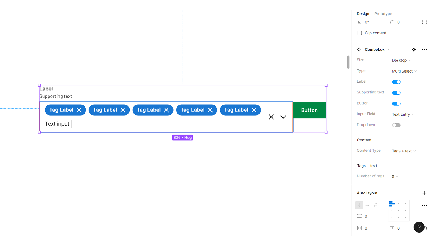
Combobox
A combo box is a text box with a list box attached. This type of control enables users to select a predefined value in a list or type their own value in the text box portion of the control. The list is hidden until the user clicks the arrow next to the box.
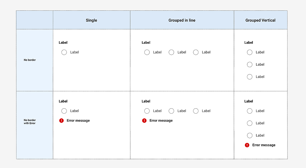
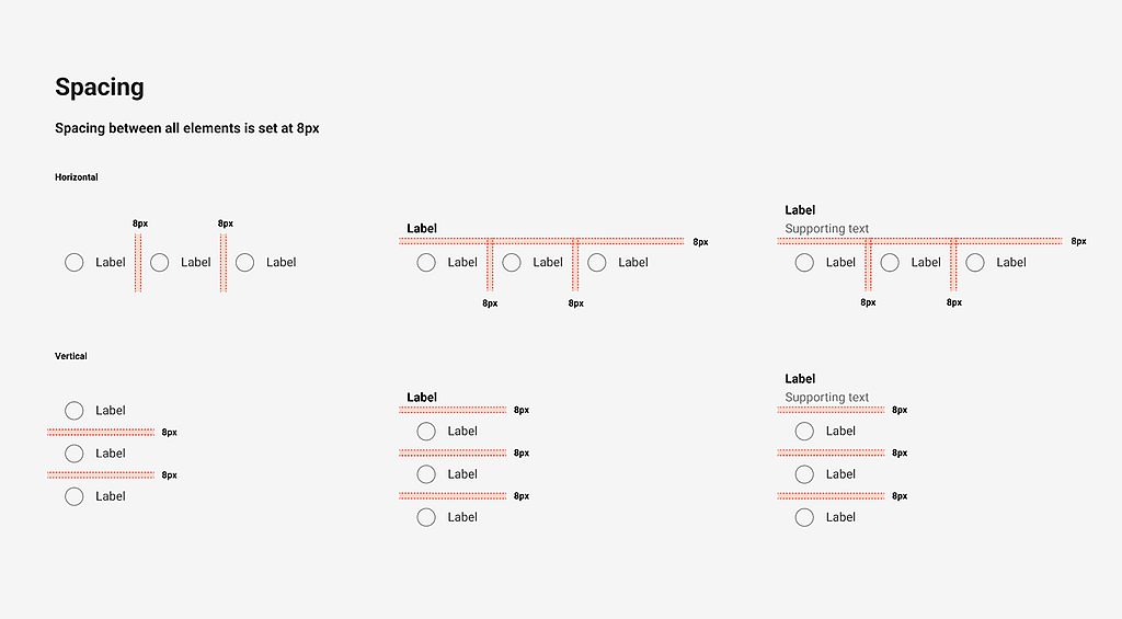
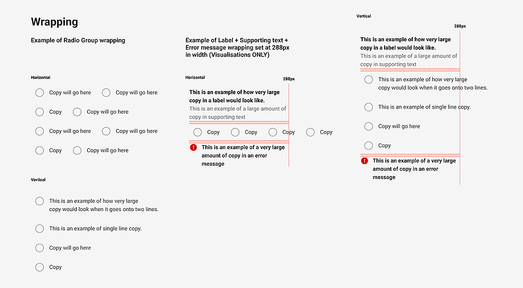
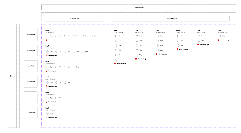
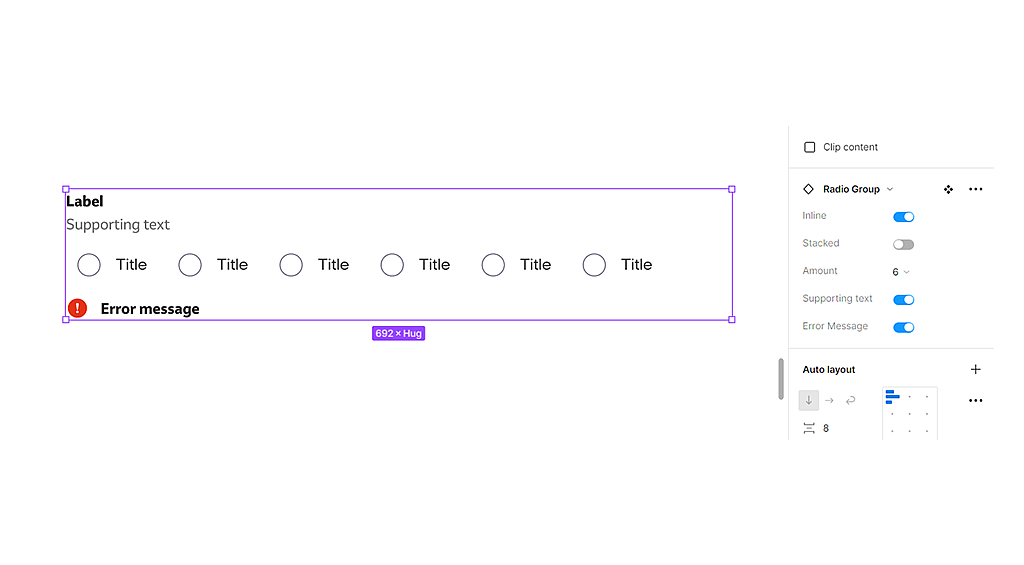
Radio group
The radio group component is comprised of a set of clickable circles (the inputs) with text labels positioned to the left/in-line.
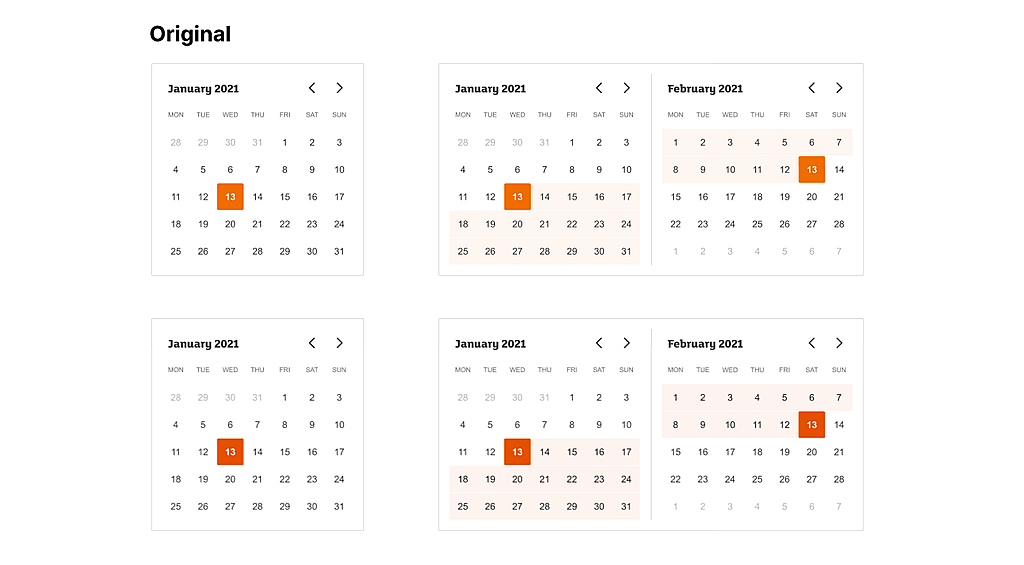
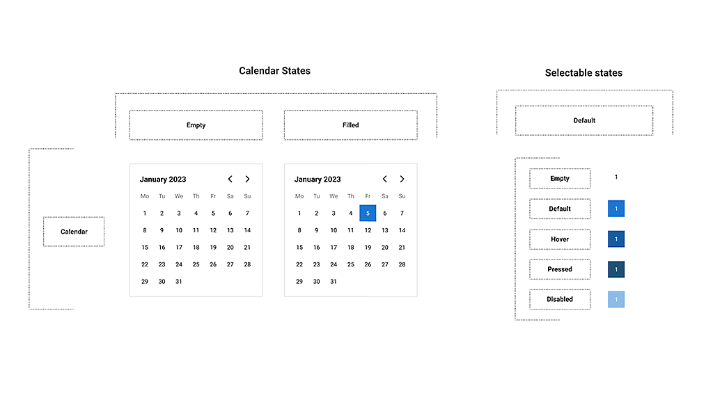
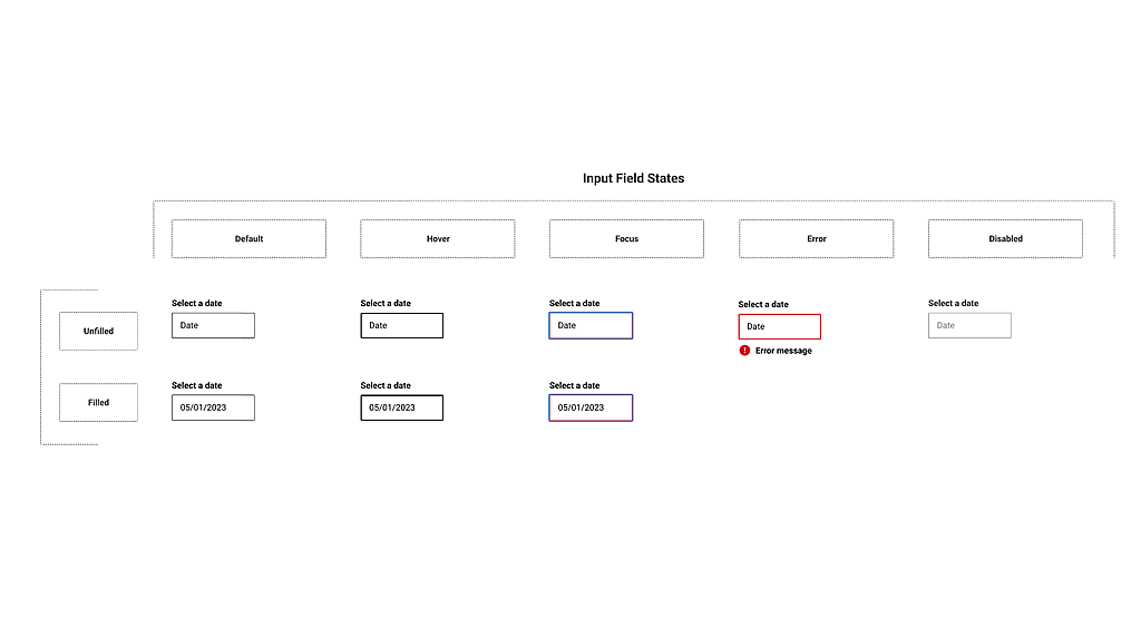
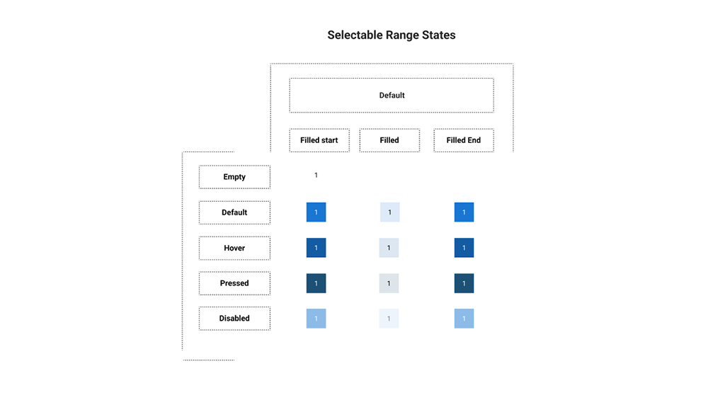
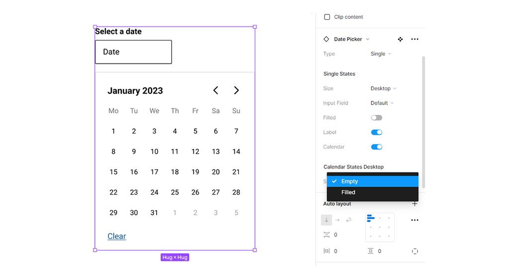
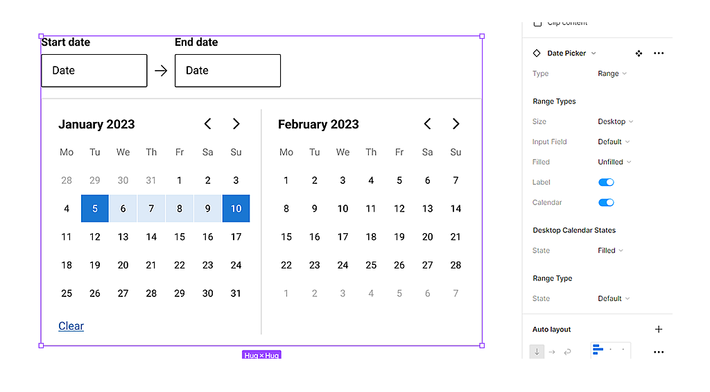
Date picker
Date pickers can display past, present, or future dates – as relevant to the task. They indicate important dates, such as current and selected days.

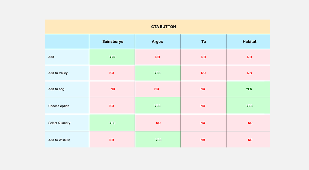
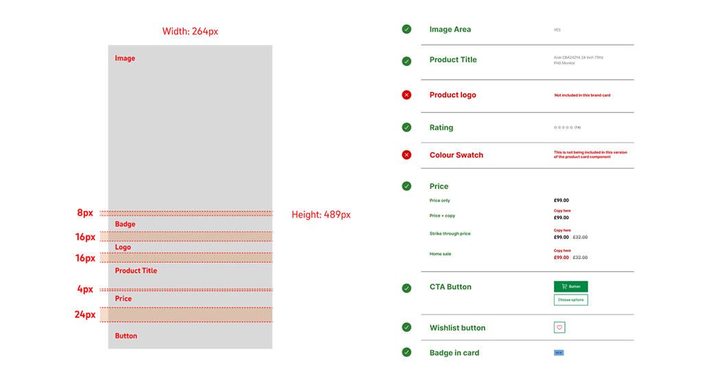
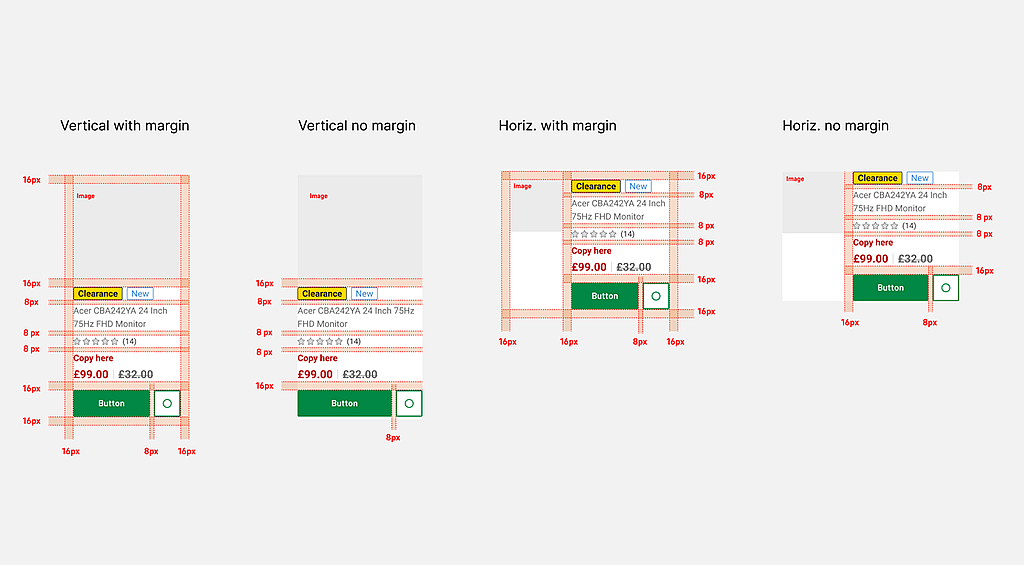
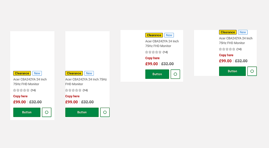
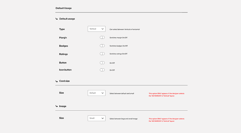
Product card
The Product Card component is an easy way to display content like product intros. This Product card component displays the featured image, title, price, description, add to cart button, and call to action button.
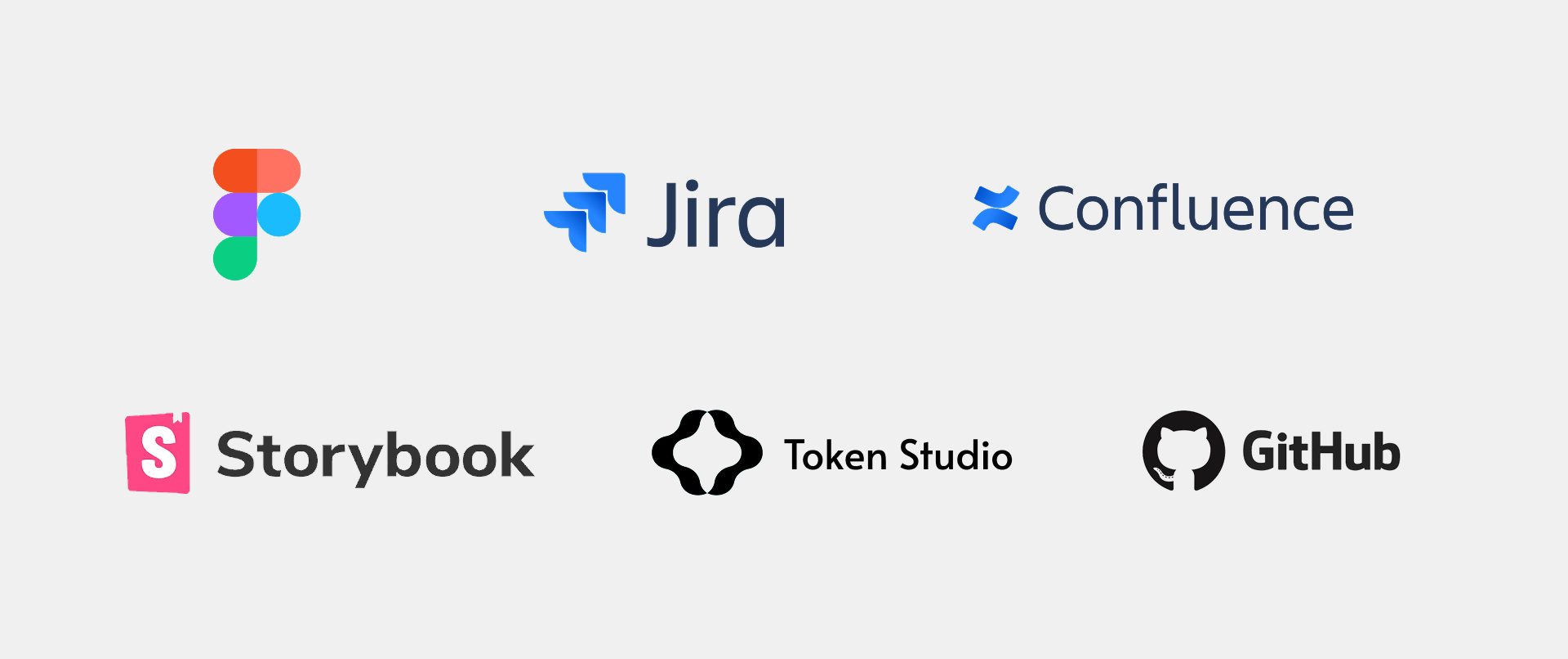
Software used
A range of industry-standard tools were used to design, document, and deliver the system — enabling close collaboration across design, engineering, and product teams.
Related projects in online retail
A selection of projects where I’ve contributed to design systems, product experiences, and customer journeys for leading global brands.
Boots.com: Customer Journeys
Sainsbury’s: Design systems work
Habitat: Design systems work
Nectar: Design systems work
Tesco: Ordering, Returns & refunds
British Telecom (BT): Business broadband ordering and contract renewals
Carrefour: UAE main website and Carrefour Clubcard site


