Sainsbury’s

About Sainsbury’s
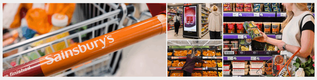
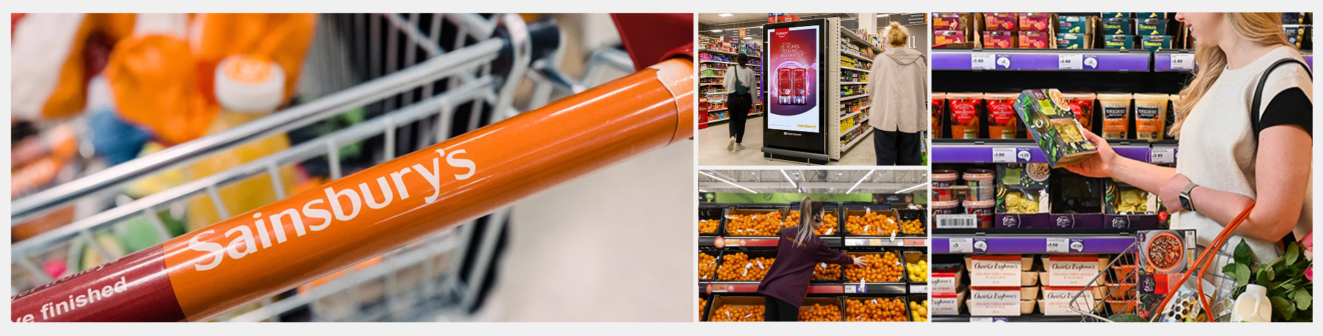
Sainsbury’s is one of the UK’s largest and most established retailers, serving millions of customers each week through its grocery, general merchandise, and financial services. Founded in 1869, it has grown into a multi-brand group that includes Sainsbury’s, Argos, Habitat, Tu, and Nectar.
Known for its commitment to quality, value, and customer service, Sainsbury’s operates a large national network of supermarkets, convenience stores, and an expansive online shopping platform. The company continues to invest in digital transformation, sustainability, and customer experience, positioning itself as a modern, purpose-led retailer in a competitive and rapidly changing landscape.
My contributions
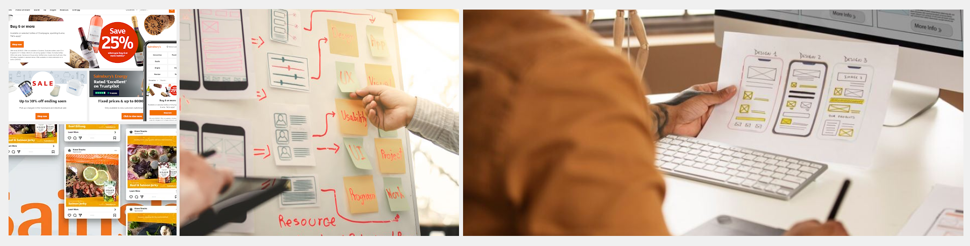
As part of Sainsbury’s Group Design Ops team, I was responsible for creating scalable, token-based Figma components used across web responsive and native platforms (iOS/Android). These reusable assets were designed to support brand consistency, accessibility, and speed of delivery across multiple teams and products.
Collaborating closely with engineers, product designers, accessibility specialists, and CX leads, I built a robust library of components that now power interfaces across the entire Sainsbury’s digital estate — including Argos, Habitat, Tu Clothing, and Nectar. This work helped standardise design practices, reduce duplication, and accelerate implementation across the group.

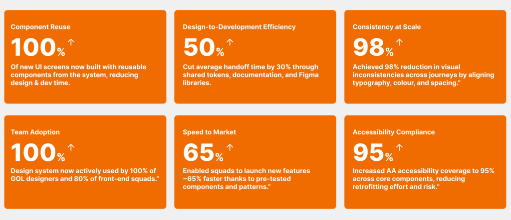
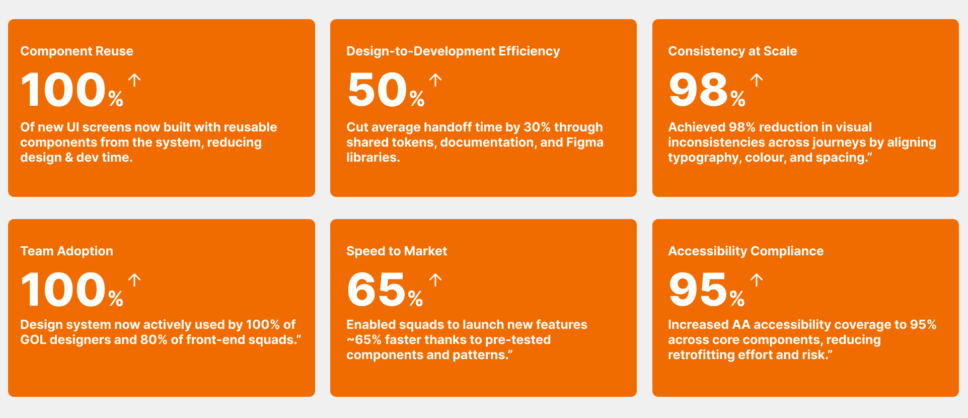
Business outcomes
These outcomes show how design system work contributed to faster delivery, greater consistency, and improved collaboration across teams — turning design into measurable business impact.
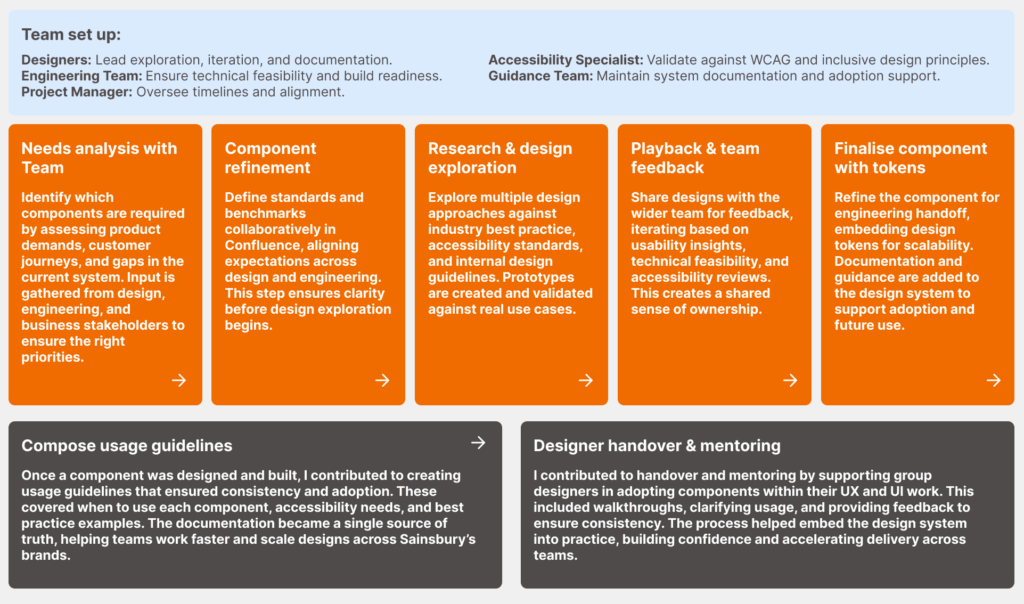
Component build process (high level)
This high-level process outlines how new components are identified, designed, tested, and finalised within the design system. By combining input from designers, engineers, accessibility specialists, and guidance teams, each component is built to meet business needs, follow best practice, and remain scalable across products.
Stepper Component
Steppers display progress through a sequence of logical and numbered steps. They may also be used for navigation. Steppers may display a transient feedback message after a step is saved.
Note: Use the left & right arrows to navigate through the deck.
Modal component
The modal component provides a solid foundation for creating dialogs, popovers, lightboxes, or whatever else. The component renders its children node in front of a backdrop component.
Note: Use the left & right arrows to navigate through the deck.
Combobox
A combo box is a commonly used graphical user interface widget (or control). Traditionally, it is a combination of a drop-down list or list box and a single-line editable textbox, allowing the user to either type a value directly or select a value from the list.
Note: Use the left & right arrows to navigate through the deck.
Radio group
The radio group component is comprised of a set of clickable circles (the inputs) with text labels positioned to the left/in-line.
Note: Use the left & right arrows to navigate through the deck.
Date picker
Date pickers can display past, present, or future dates – as relevant to the task. They indicate important dates, such as current and selected days.
Note: Use the left & right arrows to navigate through the deck.
Product card
The Product Card component is an easy way to display content like product intros. This Product card component displays the featured image, title, price, description, add to cart button, and call to action button.
Note: Use the left & right arrows to navigate through the deck.
Colour swatch
The Color Swatches component is used to show different color variations of a product.
Note: Use the left & right arrows to navigate through the deck.
Numeric stepper
The NumericStepper component allows a user to step through an ordered set of numbers. The component consists of a number in a text box displayed beside small up and down arrow buttons.
Note: Use the left & right arrows to navigate through the deck.
Search input
The search input component as a text field to allow users to enter search queries and receive relevant page results available in multiple styles and sizes.
Note: Use the left & right arrows to navigate through the deck.
Table
A table is a method of organizing data, and is usually portrayed as rows and columns. Tables can be simple, meaning the first row has headers and is not counted as data, or multidimensional, meaning there is no header row, and all of the information presented is tabular data.
Note: Use the left & right arrows to navigate through the deck.
Checkbox group
A checkbox group is a grouping of checkboxes that are related to each other.
Note: Use the left & right arrows to navigate through the deck.
Foundations guidance: Colour
I assisted in putting together the colour guidance documentation for designers which you can see below.
Note: Use the left & right arrows to navigate through the deck.
Foundations guidance: States
I assisted in putting together the states guidance documentation for designers which you can see below.
Note: Use the left & right arrows to navigate through the deck.
Foundations guidance: Layouts
I assisted in putting together the layouts guidance documentation for designers which you can see below.
Note: Use the left & right arrows to navigate through the deck.
Feedback

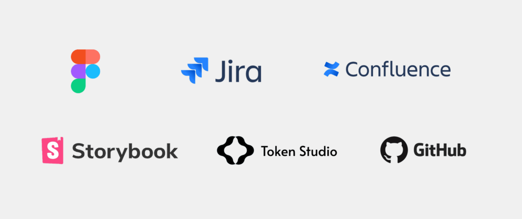
Software used
A range of industry-standard tools were used to design, document, and deliver the system — enabling close collaboration across design, engineering, and product teams.
Related projects in online retail
A selection of projects where I’ve contributed to design systems, product experiences, and customer journeys for leading global brands.


